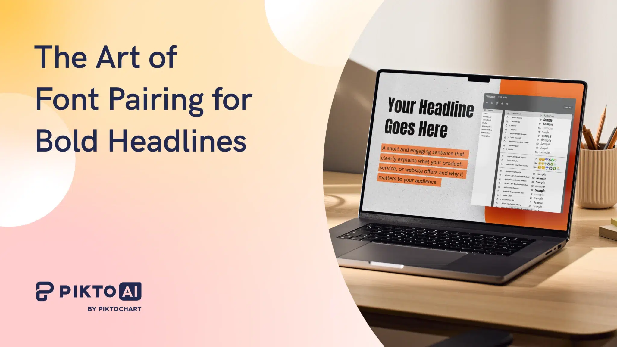
You’ve picked your headline font. It’s bold, it commands attention, and it looks exactly right on its own. Then you add the body text, and something goes wrong. The design feels cluttered. The fonts don’t agree. The whole thing looks less “professional presentation” and more “ransom note.”
This is less of a taste problem, and more of a pairing problem.
For a related read, see our guide on professional fonts.
Bold headlines are non-negotiable in high-impact visual communication. They create the entry point, the first signal that tells your reader where to look and why they should keep reading. Typographic hierarchy is the visual organization of text on a page to guide the reader and indicate the importance of different content sections.
Your headline font sets the top of that hierarchy. Every other font in your design has one job: support it without clashing with it.
Most designs collapse not at the headline, but at the second font choice. Designers, professional or otherwise, spend hours selecting the perfect bold display font, then spend 30 seconds picking a body font. That 30-second decision is where designs fall apart.
This guide gives you a repeatable framework for making that second choice correctly, every time.
The 4 Golden Rules of Pairing Fonts with Bold Headlines
1) Contrast Is the Foundation
A bold headline carries significant visual weight. The body font needs to sit beneath it, not beside it. For optimal typeface pairing, consider having ample difference or contrast between weight, width, style, or size of type – this creates both visual variety and clear typographic distinction.
In practice: pair a bold sans-serif headline with a light serif body, or a heavy serif headline with a clean, low-weight sans-serif. The contrast in stroke character – one geometric and uniform, the other with organic variation – gives the reader’s eye a clear signal about which text to process first and which to read next.
Contrast is the whole reason we create font pairings to begin with. Contrasting fonts enable the reader to easily differentiate between various parts of the text, such as headings and body copy. Contrast also makes the text more visually interesting, helping to keep the reader’s attention.
One qualifier matters here: contrast has a limit. Pairing Bebas Neue – ultra-condensed, all-caps, zero stroke variation – with a hairline serif body font creates a gap so extreme it destroys visual cohesion. Contrast is the goal. Contrast without a shared anchor creates noise, not hierarchy.
2) Mood Consistency: Match the Personality, Not Just the Style
Every typeface carries a semantic identity. Montserrat is geometric, rational, and modern. Pair it with a body font that shares those qualities – Open Sans, Source Sans Pro, or Inter – and the design speaks with one voice. Pair it with an ornate calligraphic serif and the design speaks with two conflicting accents.
The emotion and relationship between the fonts is what brings typography to life. Before selecting a body font, ask yourself: what mood does the headline font project? Then find a body font that operates in the same register – even if its classification is different.
A geometric headline needs a clean partner. A humanist serif headline can carry a warmer sans-serif body. A brutalist condensed display font should not be paired with a romantic script unless the contrast is deliberate and the design has enough white space to absorb the tension.
3) Avoid the Conflict Zone: Never Pair Two Bold Fonts
Multiple display typefaces used together can mix messages, while too many similar letterforms or weights together become a visually homogeneous soup.
When two fonts compete for dominance, neither wins. The reader’s eye stalls at the top of the page, unable to determine where to enter the design. Two bold fonts in a layout produce visual gridlock. One font leads. The other follows. This is not a stylistic preference – it’s the structural logic of hierarchy.
Each typeface or style should have a clear role and purpose. You can assign one typeface to headers and another to body copy. The moment both fonts occupy the same visual weight, those roles collapse.
You might also find our article on types of fonts useful.
4) The “One Family” Hack: When One Font Is Enough
One of the most frequently asked questions in non-designer typography is: can you use the same font family for both headline and body, and simply change the weight?
Yes, but only under specific conditions.
Many fonts come with multiple weights (light, regular, bold) and styles (italic, condensed). Use them to create variation while keeping your design cohesive. Roboto Black paired with Roboto Light works precisely because the weight contrast between the two is wide enough to establish clear hierarchy. The same family, radically different weights.
Here’s where this approach fails: font families with a narrow weight range. If the heaviest weight available is Bold and the lightest is Regular, the contrast between them is insufficient to carry a full design. The important thing is to make sure that there is enough contrast in weight between the fonts you pair. Check the weight range before committing to a single-family approach. Families like Roboto, Montserrat, and Source Sans Pro have wide enough ranges to make it work. Smaller families often don’t.
5 High-Impact Font Pairings for Bold Headlines (With Examples)
Each pairing below is built on the contrast and mood principles above. For each one, the “vibe” describes the semantic identity that the combination projects – the message your design sends before a single word is read. All fonts used here are available free via Google Fonts.
1) The Modern Professional: Bebas Neue + Source Sans Pro
Headline font: Bebas Neue (condensed, all-caps, geometric sans-serif)
Body font: Source Sans Pro (Light or Regular)
The vibe: Authoritative without being cold. Built for impact statements, corporate reports, and social media graphics where the headline needs to stop the scroll and the body needs to be absorbed quickly.
Bebas Neue is one of the most visually aggressive headline fonts available: fully condensed, zero stroke variation, no lowercase. It demands a body font with maximum openness. Source Sans Pro delivers exactly that – a humanist sans-serif with a generous x-height, open apertures, and clean letterforms that give the eye room to breathe after the headline’s intensity.
Source Sans Pro and Source Serif Pro were created to be used together in design and are another excellent example of typographic harmony. Source Sans Pro carries that same design philosophy into pairings with non-Source headline fonts: it was built to coexist, not compete.
Use Source Sans Pro at light weight for long-form body text and at regular weight for captions and callouts beneath the headline.
2) The Classic Authority: Playfair Display Bold + Lora
Headline font: Playfair Display Bold (high-contrast serif, editorial)
Body font: Lora (Regular)
The vibe: Established, credible, and considered. Built for annual reports, white papers, thought leadership content, and any design where the reader needs to trust the source before they trust the message.
Playfair Display features elegant, high-contrast serifs that create striking and sophisticated headlines and titles. Lora’s neutral and highly readable design gives body text a friendly tone.
The pairing works because both fonts are serif – but they operate at opposite ends of the contrast spectrum. Playfair Display has dramatic thick-thin stroke variation, creating visual tension at headline size. Lora is moderate-contrast and optimized for screen reading, making it the calm counterpart to Playfair’s drama.
The shared serif classification creates mood consistency. The difference in stroke contrast and weight creates the hierarchy. This pairing is best for editorial designs, luxury brands, or other projects that require a refined yet easy-to-read design style.
Set Lora at 16-18px for body text. Avoid pairing Playfair Display Bold with a sans-serif body in formal contexts – the mood contrast tends to undercut the authority the headline projects.
3) The Tech Disruptor: Archivo Black + Inter
Headline font: Archivo Black (geometric sans-serif, heavy weight)
Body font: Inter (Regular or Light)
The vibe: Confident, forward-looking, and precise. Built for SaaS pitch decks, tech startup presentations, product launch materials, and any design where the brand needs to signal capability without formality.
Archivo Black is a grotesque sans-serif with strong geometric structure and near-zero stroke variation – visually assertive at any size. Inter was designed specifically for screen legibility: its letterforms are optimized for pixel rendering at small sizes, with a tall x-height and open counters that maintain readability in dense body text blocks.
Inter’s streamlined design makes body text crisp and highly legible – a non-negotiable quality when it follows a headline as visually dominant as Archivo Black. The contrast between Archivo Black’s weight and Inter’s neutral lightness creates a clean power gradient from headline to body.
Use Inter at regular for body paragraphs and at light for supporting captions or data labels beneath charts and infographics.
4) The Friendly Startup: Montserrat Bold + Open Sans
Headline font: Montserrat Bold (geometric sans-serif, structured)
Body font: Open Sans (Regular or Light)
The vibe: Approachable, modern, and trustworthy. Built for HR communications, internal reports, marketing materials, and designs that need to feel professional without feeling distant.
Montserrat has a clean, structured and easy-to-read form. Its geometric construction – circular O forms, uniform stroke width, and precise spacing – gives it authority at headline size without the aggression of a condensed display font. Open Sans shares Montserrat’s geometric DNA while adding humanist warmth through slightly rounded terminals and a generous x-height.
The result is a pairing with strong mood consistency: both fonts speak the same visual language, but at different volumes. Montserrat Bold commands attention. Open Sans carries the conversation.
Two fonts with a similar x-height will often pair well. Montserrat and Open Sans share closely matched x-heights, which is a significant reason this pairing feels cohesive rather than arbitrary. The eye reads both as belonging to the same design system.
This is the pairing to reach for when you need a design to feel human-made rather than machine-generated.
5) The Elegant Impact: Bodoni + PT Sans
Headline font: Bodoni (high-contrast didone serif, display)
Body font: PT Sans (Regular)
The vibe: Sophisticated and editorial with a contemporary edge. Built for brand presentations, event materials, fashion and lifestyle content, and designs where visual tension is the point.
Bodoni is among the highest-contrast typefaces in existence: hairline thin strokes against near-slab thick strokes, creating extreme visual drama at display sizes. That drama is the entire point of the pairing – but it demands a body font that stands completely clear of it.
PT Sans is that body font. PT Sans anchors the design with its structured, neutral style for body text. Its low-contrast strokes, open apertures, and humanist construction sit at the opposite end of the typographic spectrum from Bodoni – creating a pairing where the headline dazzles and the body informs, with no competition between them.
One critical accessibility note: Bodoni’s hairline strokes can fail WCAG contrast standards at small sizes and on low-resolution screens. Use Bodoni exclusively at headline size (36pt minimum) and ensure sufficient color contrast between the text and background before publishing.
How to Pair Script and Decorative Fonts with Bold Headlines
Script fonts are the most misused category in non-designer typography. They get reached for because they signal elegance, warmth, and personality – all qualities that seem like natural complements to a bold, commanding headline. The instinct is understandable. The execution is almost always wrong.
Here’s the rule: script fonts are accent instruments, not body text. They work as sub-headlines, pull quotes, or single-word emphasis elements. They do not work as body copy when paired with a heavy display headline.
The reason is structural. Script typefaces make for lovely and embellished short headings. Too many words are hard to read, so it’s best to keep their application to a limited number of words. At body text sizes – 14px to 18px – script fonts lose the letterform definition that makes them legible. The connecting strokes that look fluid and elegant at 48pt become indistinct noise at 16pt.
When a script font sits beneath a bold headline, the visual flow breaks. The reader’s eye drops from the headline’s weight and encounters a body font that demands a different kind of visual processing: slow, careful, character-by-character reading rather than the fast scanning that clean sans-serif or serif body fonts allow.
The correct application: use a script font as a single accent word above or below the bold headline – a category label, a brand name, or a date. Keep it short. Keep it large enough to be legible (minimum 24pt). Then let a clean, high-legibility sans-serif or serif carry the body text.
Script fonts or unique display fonts can add personality, but use them sparingly and pair them with highly readable fonts for body text.
Visual flow is preserved when each font in a design has a defined role and a defined size range. Script fonts earn their place in that system as decorative anchors – not as workhorses.
Common Mistakes: 4 Reasons Why Your Bold Headlines Look Messy
1) Two Display Fonts in One Design
Display fonts are built for one purpose: maximum visual impact at large sizes. Put two of them in the same design and they don’t cooperate – they compete. When two styles are paired that are almost the same – but not quite – they begin to clash, like wearing two slightly different plaid patterns at once. The same is true of two display fonts with different personalities: the design sends two messages simultaneously and lands neither.
The fix: one display font per design. Everything else supports it.
2) Ignoring Line Height in the Body Text
A bold headline paired with a well-chosen body font can still look wrong if the line height (leading) is too tight. Dense body text blocks create visual weight that competes with the headline – the opposite of what the pairing is designed to achieve. Pay close attention to kerning (letter spacing) and leading (line height) to maintain readability and visual balance.
For body text on screen, a line height of 1.4x to 1.6x the font size gives the text room to breathe without creating disconnected lines.
3) Poor Color Contrast
A font pairing that works in black on white can fail entirely when color is introduced. Light body text on a mid-tone background, or a bold headline in a brand color that doesn’t meet minimum contrast requirements, creates a legibility problem that no font choice can fix.
WCAG 2.1 requires a minimum contrast ratio of 4.5:1 for body text and 3:1 for large text (18pt or 14pt bold). Check every color combination against these standards before publishing – particularly for Bodoni pairings, where hairline strokes are especially vulnerable to low contrast.
4) Overcrowding the Headline
Bold display fonts are designed to work with generous spacing. Condensed fonts like Bebas Neue and Oswald have tight default kerning that works at moderate character counts. Push too many characters into a single headline line and the letterforms begin to crowd each other, creating a visual density that undermines the headline’s impact and strains legibility. Keep bold headlines short. If the message needs more words, break it across two lines rather than compressing it into one.
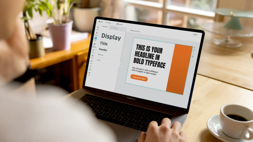
How to Implement Professional Font Pairings with Piktochart
Knowing the right pairing is one thing. Implementing it consistently across every design you produce is another problem entirely – particularly when you’re working across multiple projects, formats, and team members.
Piktochart solves this at two levels.
Text Frames are pre-built layout components with font pairings already configured. Open the Piktochart Editor, select a Text Frame, and the headline-to-body font relationship is set: the contrast, the weight, and the size ratio. You’re not starting from a blank typographic slate – you’re starting from a professionally considered pairing that you can customize to your content. This is the fastest path from brief to finished design for a non-designer working under deadline pressure.
For teams and repeat users, Brand Assets (available on Pro plans) takes this further. Upload your chosen font pairing – headline font, body font, weights, and sizes – and lock it into your brand kit. Every design your team creates pulls from the same typographic system automatically. No one reaches for the wrong font. No one ships a presentation that uses three different body fonts across 12 slides.
The result is typographic consistency without typographic expertise: your brand speaks with one voice across every format, every team member, and every deadline.
Start with a Text Frame. Save your pairing to Brand Assets. Ship designs that look considered – because they are.
Conclusion: Consistency Over Complexity
The best font pairing isn’t the most sophisticated one. It’s the one that “disappears” – where the reader absorbs the message without noticing the typography at all.
A bold headline paired with the right supporting font creates a clear path through your design. The reader enters at the headline, moves through the body, and reaches your conclusion without friction. A mismatched pairing creates friction at every step.
The good news is you don’t need to master typography. You need one reliable pairing per design context, applied consistently. Pick it once. Lock it in. Let the message do the work.
Ready to put it into practice? Start your next design with a perfectly paired template in Piktochart – and spend your time on the message, not worrying about the fonts.