Wheat color palettes offer a versatile range of hues that can transform any design project. From golden yellows to earthy browns, these palettes evoke a sense of warmth and natural beauty.
Whether you’re working on a rustic-themed infographic or a modern web design, wheat tones provide a subtle yet impactful touch. Their neutral shades blend seamlessly with various other colors, making them a favorite among designers.
Tips For Creating Wheat Color Palettes
Designing with wheat color palettes can elevate your project with a touch of elegance and warmth.
- Balance with Neutrals: Pair wheat tones with neutral colors like white, beige, or gray to create a harmonious and balanced look.
- Complementary Shades: Use complementary colors such as deep blues or greens to make the wheat tones stand out and add depth to your design.
- Layering Tones: Experiment with different shades of wheat, from light to dark, to add dimension and interest to your design.
- Accent Colors: Introduce accent colors like burnt orange or olive green to highlight specific elements and create focal points.
- Versatility: Wheat palettes are versatile and can be adapted to various themes, from rustic to modern, ensuring your design remains timeless.
- Texture and Patterns: Incorporate textures and patterns that mimic natural elements, such as wood grain or linen, to enhance the organic feel of wheat colors.
15 Wheat Color Palettes
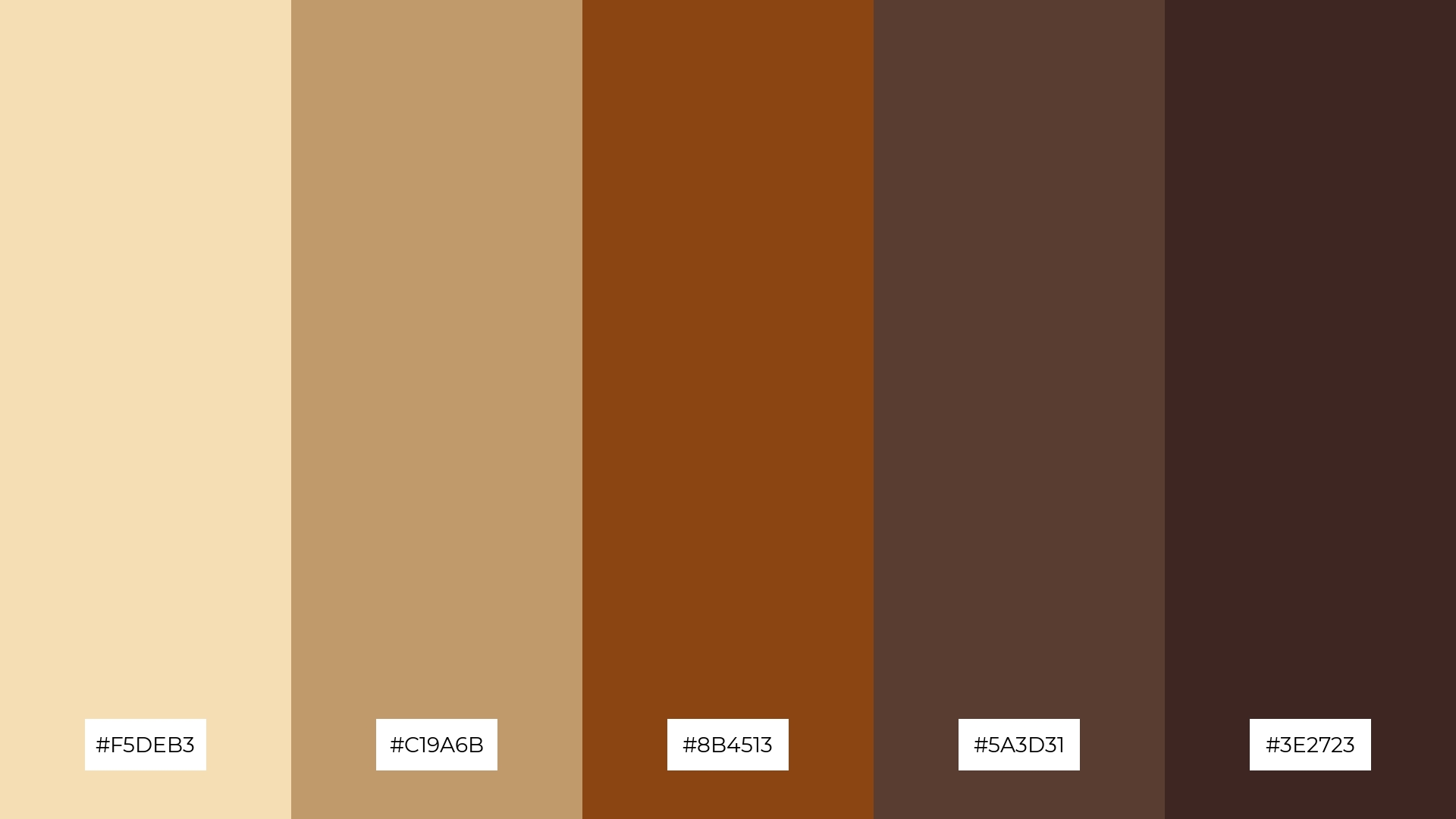
1) Golden Harvest
The ‘Golden Harvest’ palette, with its blend of soft wheat and rich brown tones, creates a warm and inviting mood that evokes the essence of autumn.
These colors interact harmoniously to produce a cohesive look, making them ideal for interior decor where they can transform a living space into a cozy, rustic retreat.
2) Autumn Fields
The ‘Autumn Fields’ palette, with its blend of wheat, sienna, and deep brown hues, evokes a sense of warmth and tranquility, reminiscent of a serene countryside landscape.
This palette would excel in product packaging for artisanal goods, where the earthy tones can convey a sense of handcrafted quality and natural ingredients.
3) Sunlit Prairie
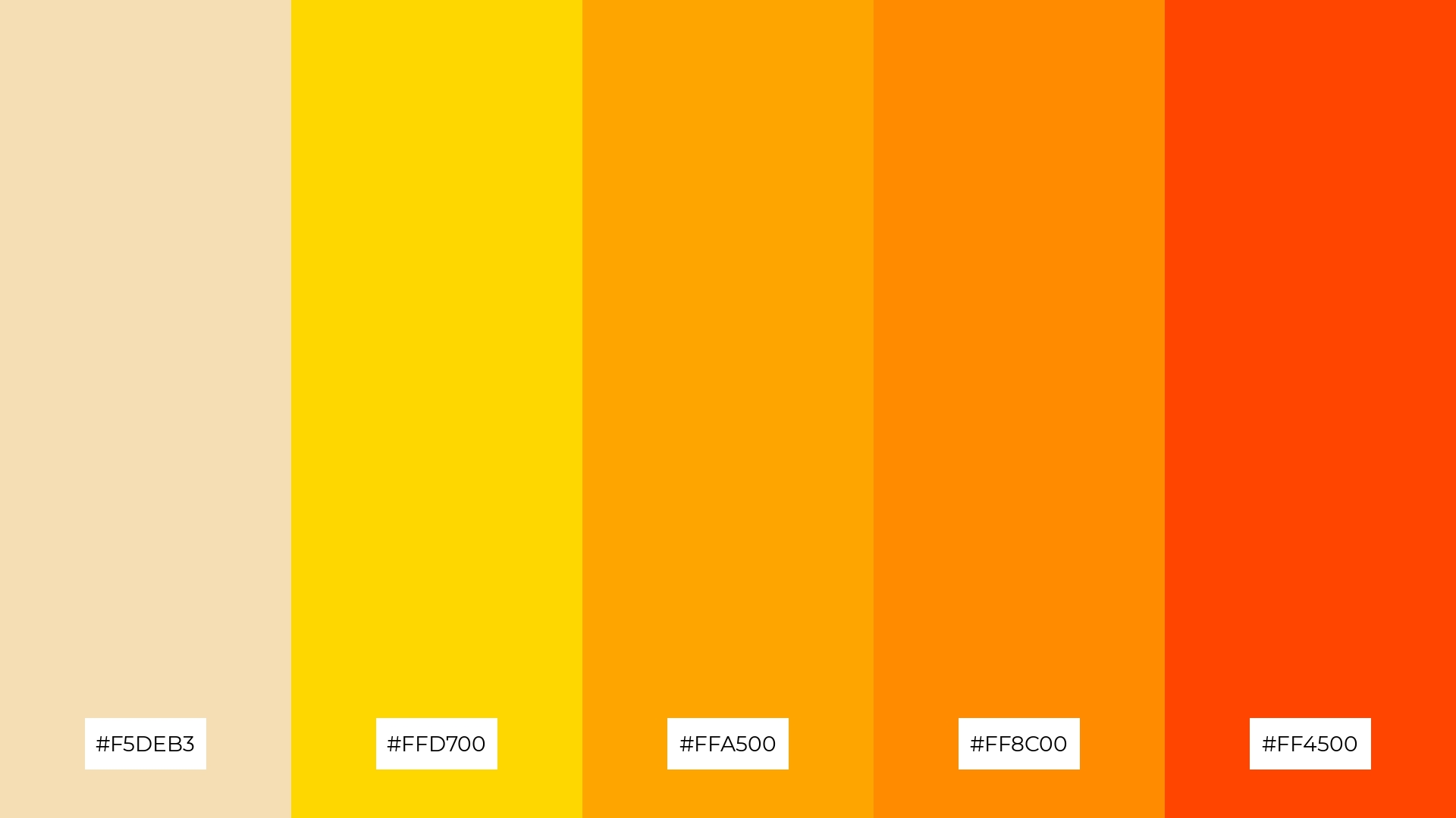
The ‘Sunlit Prairie’ palette features dominant colors such as wheat (#F5DEB3), gold (#FFD700), orange (#FFA500), dark orange (#FF8C00), and red-orange (#FF4500), creating a vibrant and energetic harmony.
This palette is particularly effective for wellness branding, where the warm and inviting hues can evoke feelings of vitality and positivity, making it ideal for promoting a healthy and balanced lifestyle.
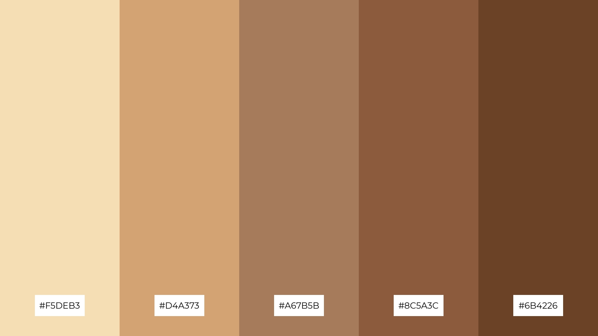
4) Rustic Charm
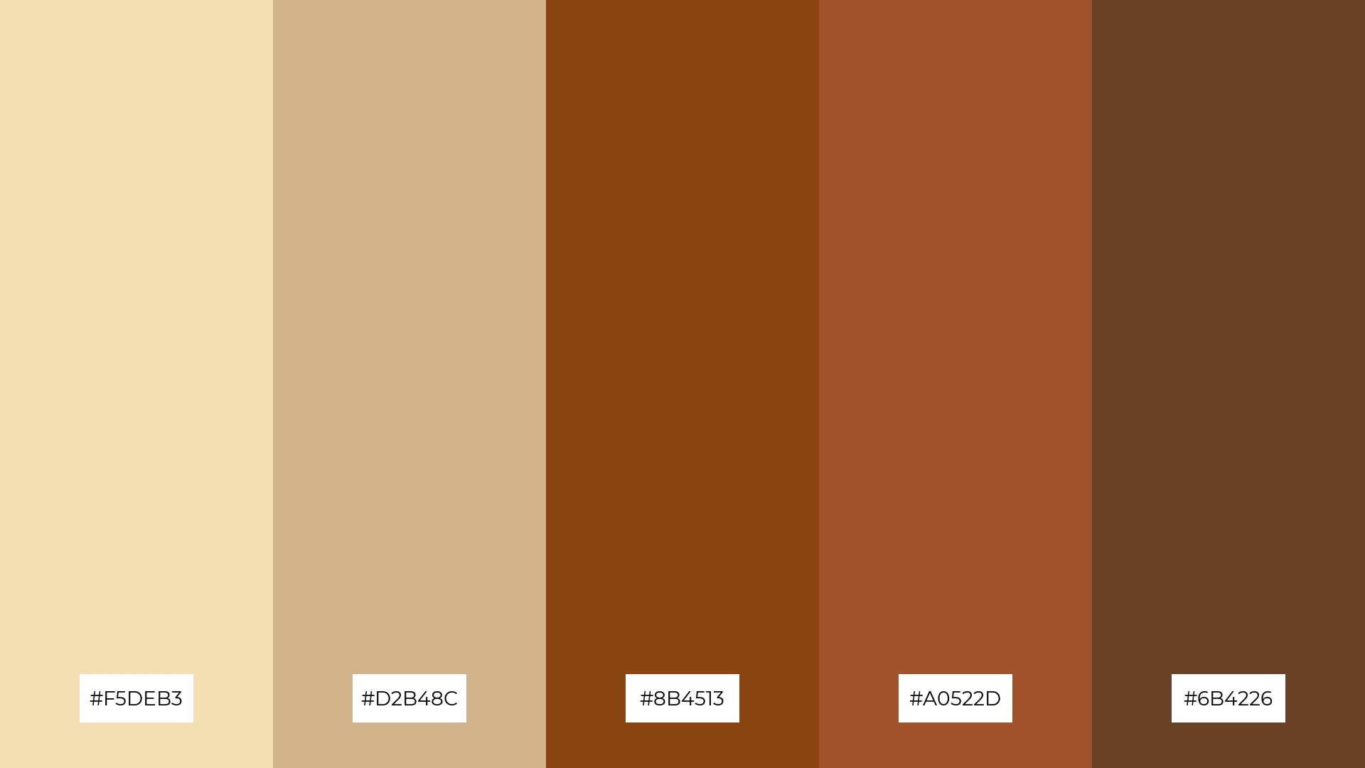
The ‘Rustic Charm’ palette, with its blend of soft wheat (#F5DEB3) and bold brown tones (#8B4513, #A0522D, #6B4226), offers a balanced and distinct mood that combines warmth with a touch of rugged elegance.
This palette is ideal for creating inviting retail spaces where the earthy hues can enhance the shopping experience, or for modern web designs that aim to evoke a sense of authenticity and comfort.
5) Wheat and Sky
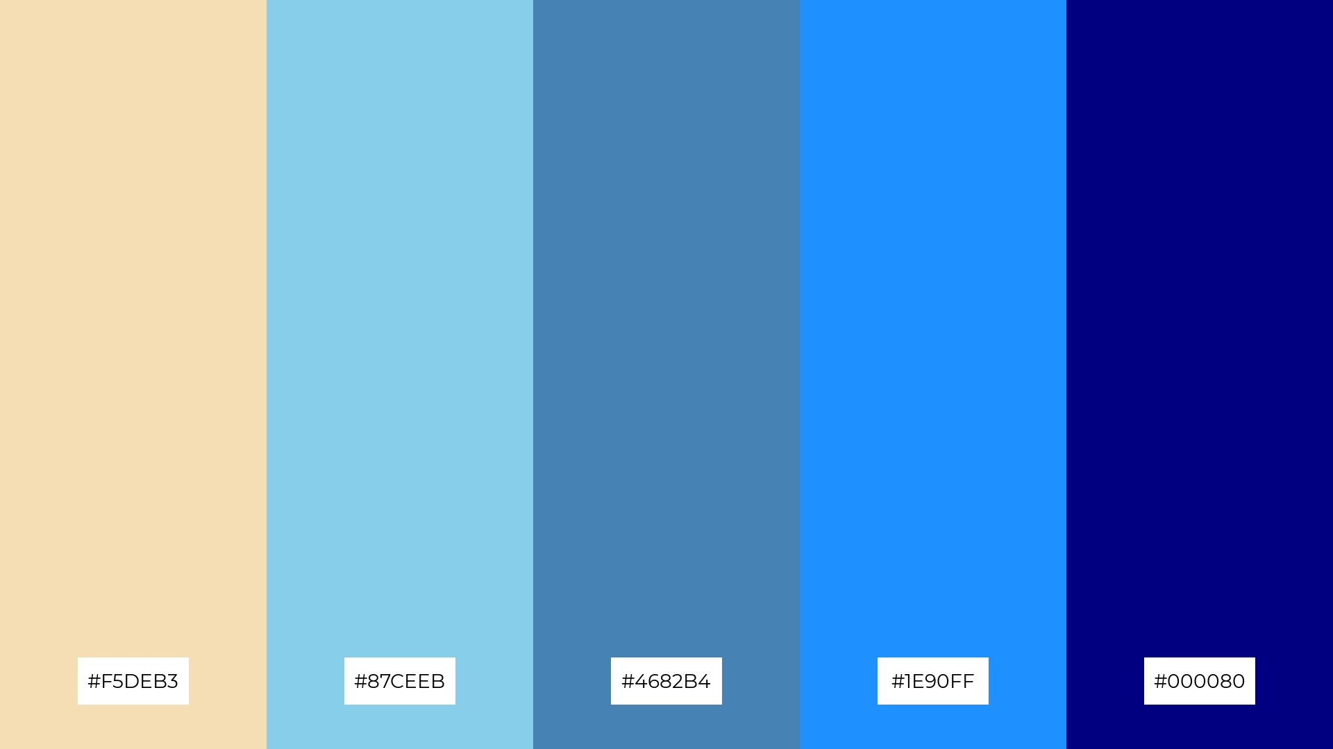
The ‘Wheat and Sky’ palette, with its blend of soft wheat (#F5DEB3) and varying shades of blue (#87CEEB, #4682B4, #1E90FF, #000080), creates a serene and calming ambiance reminiscent of a peaceful countryside under a clear sky.
This palette is perfect for wedding themes, where the gentle wheat tones can provide a warm, inviting backdrop, while the blues add a touch of elegance and tranquility, making the event feel both intimate and sophisticated.
6) Desert Mirage
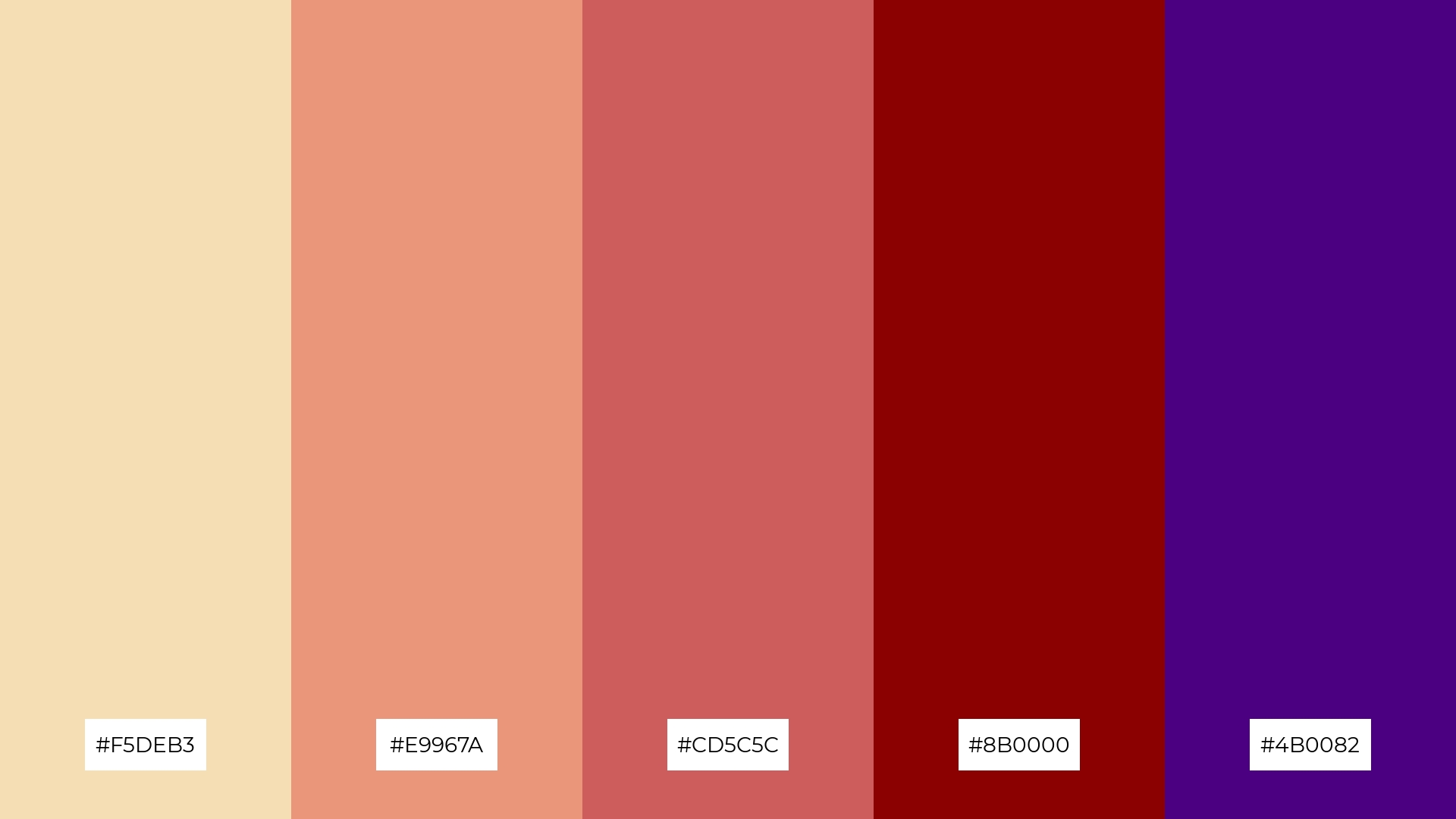
The ‘Desert Mirage’ palette, with its blend of soft wheat (#F5DEB3), light salmon (#E9967A), Indian red (#CD5C5C), dark red (#8B0000), and indigo (#4B0082), creates a sophisticated and dramatic mood that can elevate any design project.
This palette is particularly effective for bold event designs, where the rich and contrasting hues can create a striking visual impact, making the event feel both luxurious and memorable.
7) Vintage Wheat
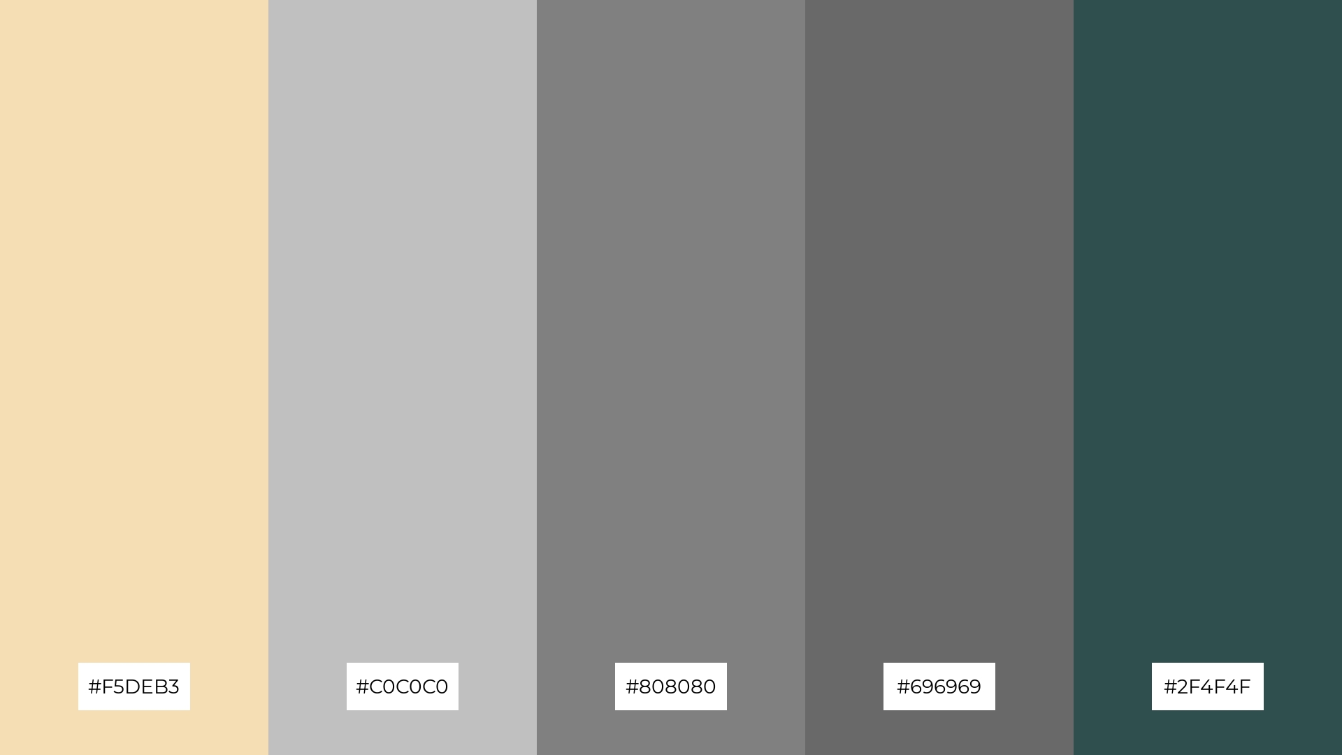
The ‘Vintage Wheat’ palette, with its blend of soft wheat (#F5DEB3) and contrasting shades of gray (#C0C0C0, #808080, #696969, #2F4F4F), creates a dynamic visual interest through the interplay of light and dark tones.
This palette is ideal for creative projects like magazine layouts or artistic websites, where the subtle wheat tones can provide a warm backdrop while the varying grays add depth and sophistication.
8) Wheat and Lavender
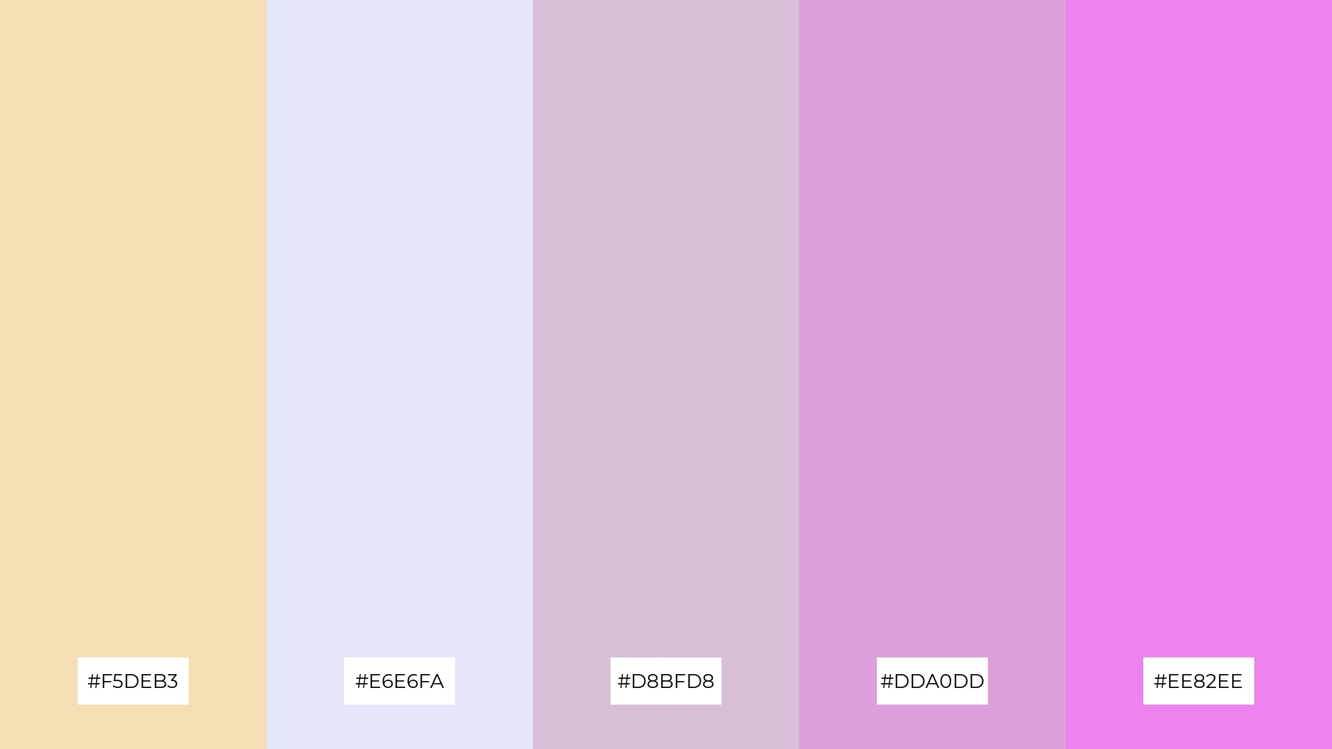
The ‘Wheat and Lavender’ palette, with its blend of soft wheat (#F5DEB3) and various shades of lavender (#E6E6FA, #D8BFD8, #DDA0DD, #EE82EE), can evoke a sense of calm and serenity when the lighter tones are combined, making it perfect for spa branding where tranquility is key.
Conversely, the more vibrant lavender hues can be paired with wheat to create an exciting and eye-catching combination, ideal for vibrant marketing campaigns that aim to capture attention and convey a sense of creativity and energy.
9) Wheat and Forest
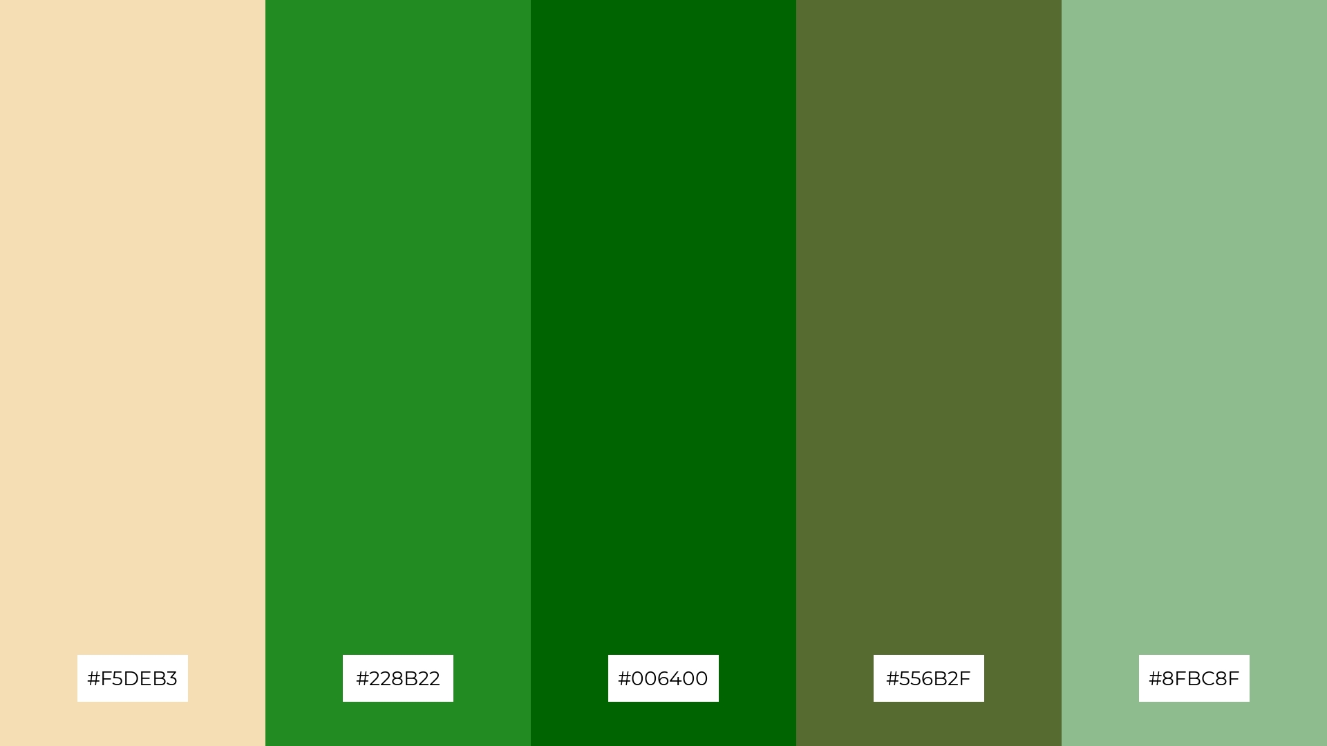
The ‘Wheat and Forest’ palette, with its blend of soft wheat (#F5DEB3) and brighter forest greens (#228B22, #8FBC8F), creates a refreshing and invigorating mood that evokes the essence of nature.
This combination is ideal for home decor, where the natural hues can bring a sense of tranquility and rejuvenation to living spaces, or for seasonal promotions that aim to capture the vibrant energy of spring and summer.
10) Wheat and Coral
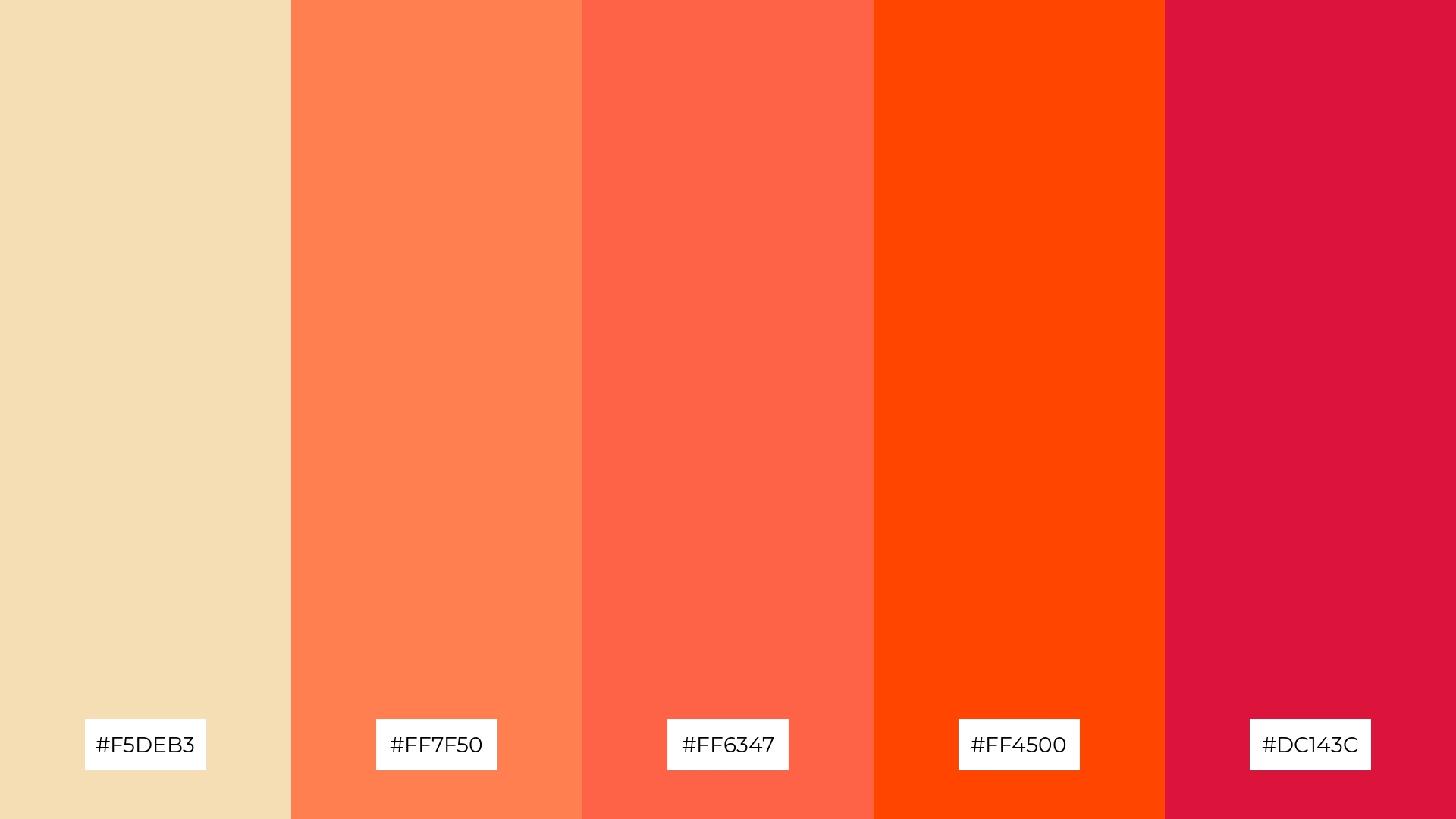
The ‘Wheat and Coral’ palette, with its blend of soft wheat (#F5DEB3) and vibrant coral tones (#FF7F50, #FF6347, #FF4500, #DC143C), creates a dynamic visual flow that evokes feelings of joy and energy, making it perfect for designs that aim to uplift and inspire.
This palette is particularly effective for lifestyle branding, where the warm and inviting hues can convey a sense of vitality and positivity, or for tech product packaging, where the bold coral tones can capture attention and convey innovation and excitement.
11) Wheat and Ocean
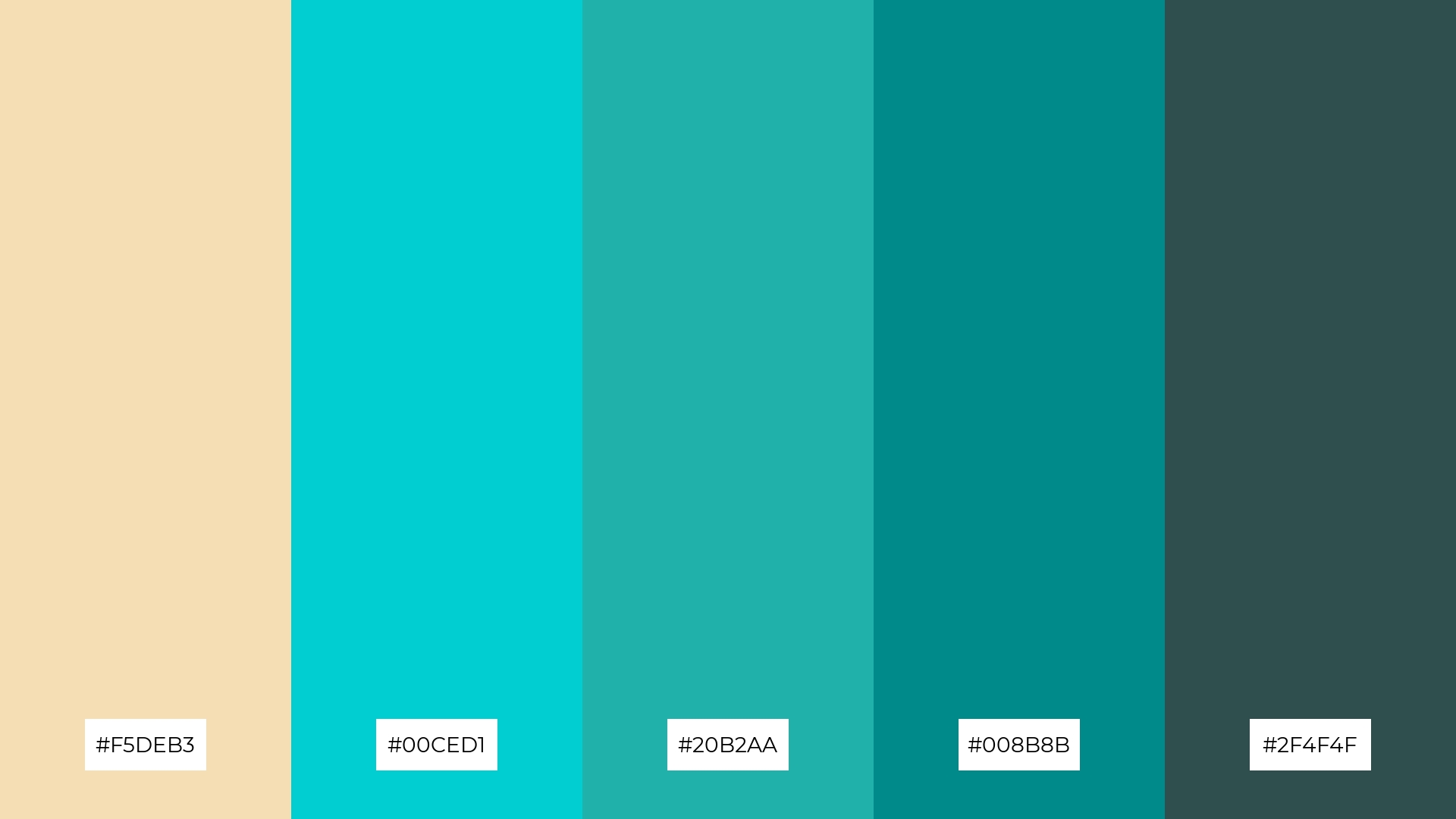
The ‘Wheat and Ocean’ palette, with its blend of soft wheat (#F5DEB3) and varying shades of teal and dark cyan (#00CED1, #20B2AA, #008B8B, #2F4F4F), creates a welcoming effect by combining warm and cool tones that evoke a sense of balance and tranquility.
This palette shines in boutique interiors, where the soothing wheat tones can create a cozy atmosphere, while the oceanic hues add a touch of sophistication and modernity, making the space feel both inviting and luxurious.
12) Wheat and Rose
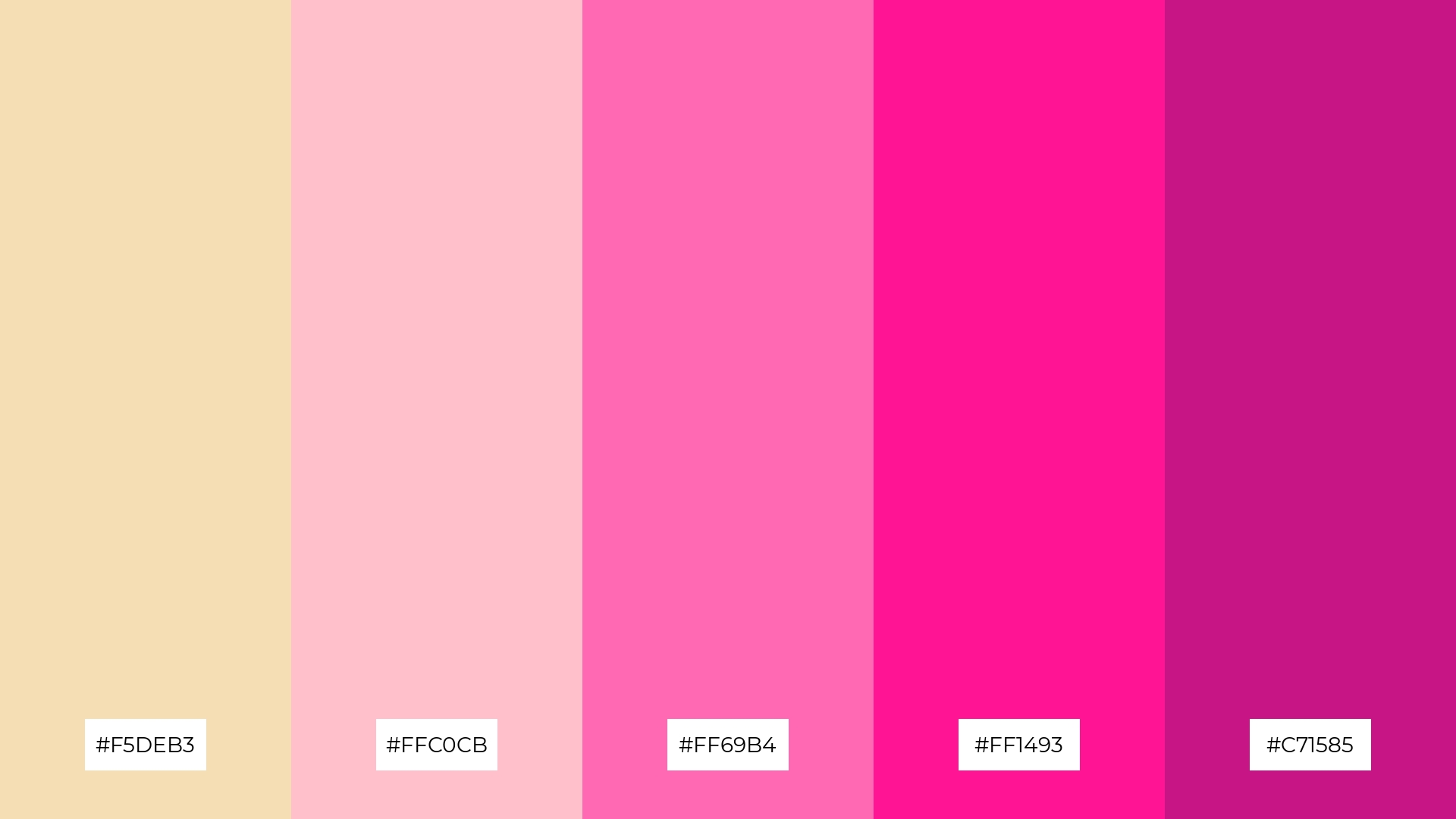
The ‘Wheat and Rose’ palette, with its blend of soft wheat (#F5DEB3) and varying shades of pink (#FFC0CB, #FF69B4, #FF1493, #C71585), creates a harmonious balance where the gentle wheat tones provide a calming backdrop, allowing the vibrant pinks to add a touch of playful contrast.
This palette is particularly fitting for casual apparel lines, where the warm and inviting hues can evoke a sense of comfort and style, making the clothing feel both trendy and approachable.
13) Wheat and Plum
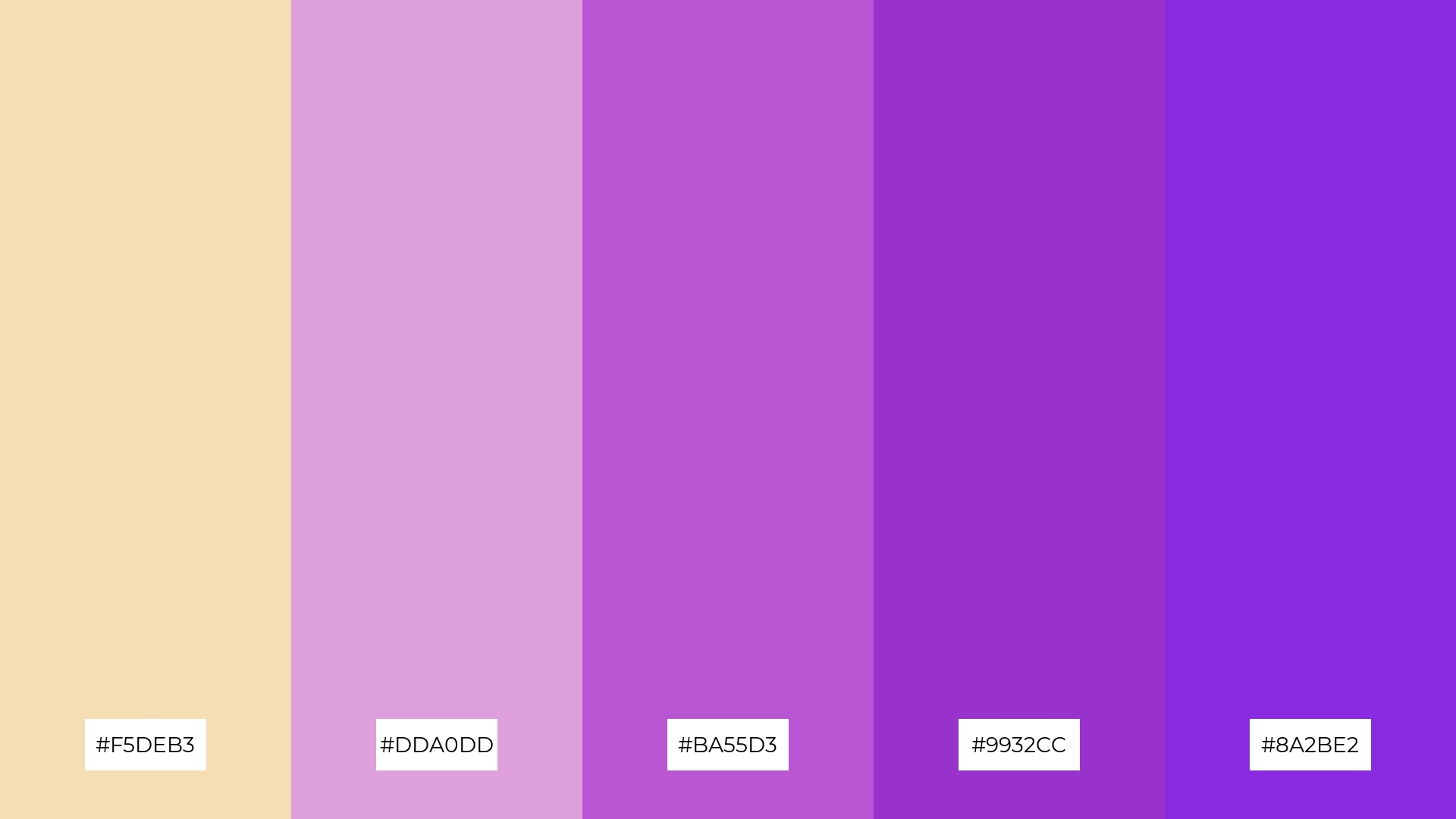
The ‘Wheat and Plum’ palette, with its blend of warm wheat (#F5DEB3) and cool plum tones (#DDA0DD, #BA55D3, #9932CC, #8A2BE2), creates a sophisticated and balanced mood that evokes both comfort and elegance.
This palette is particularly effective for artisan product branding, where the warm wheat tones can convey a sense of handcrafted quality, while the rich plum hues add a touch of luxury and refinement.
14) Wheat and Mint
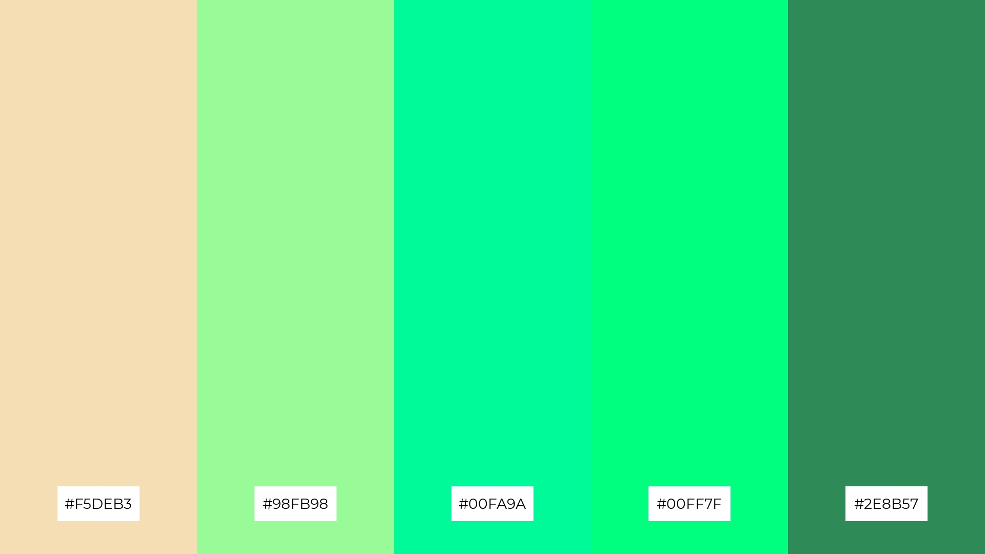
The ‘Wheat and Mint’ palette, with its blend of soft wheat (#F5DEB3) and refreshing mint tones (#98FB98, #00FA9A, #00FF7F, #2E8B57), creates a dynamic interaction that can be both bold and subtle, depending on the balance of hues used.
This palette is particularly effective for restaurant menus, where the soothing wheat tones can provide a warm and inviting backdrop, while the vibrant mint hues add a touch of freshness and modernity, making the dining experience feel both comforting and contemporary.
15) Wheat and Slate
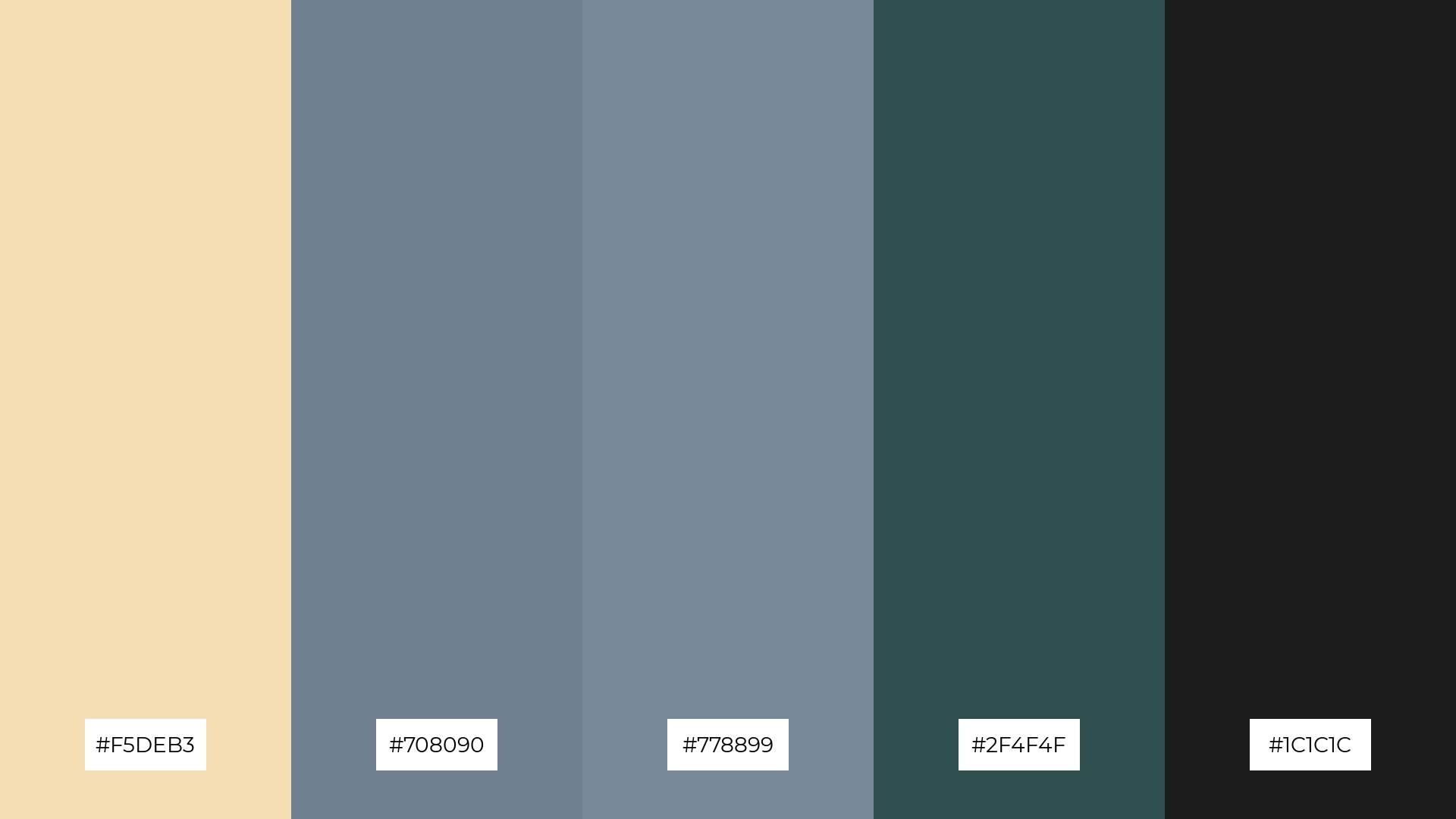
The ‘Wheat and Slate’ palette, with its blend of soft wheat (#F5DEB3) and varying shades of slate gray (#708090, #778899, #2F4F4F, #1C1C1C), conveys a sense of harmony when the lighter tones are used to create a balanced and cohesive look.
This palette is ideal for tech startups aiming to project a modern and professional image, or for cozy interior makeovers where the warm wheat tones can provide a welcoming atmosphere, while the slate grays add a touch of sophistication and depth.
How to Use Wheat Patterns in Design
Wheat color palettes can be a game-changer in home decor, offering a warm and inviting atmosphere. Pairing wheat tones with natural materials like wood and linen can enhance the organic feel of a space, making it cozy and welcoming. Consider using wheat hues for accent walls or soft furnishings to create a balanced and harmonious look.
In marketing materials, wheat palettes can convey a sense of authenticity and reliability. Use these tones in backgrounds or as part of your brand’s color scheme to evoke feelings of trust and warmth. Combining wheat with bold accent colors can also help highlight key information and draw attention to important elements.
For clothing design, wheat tones offer a versatile and timeless appeal. These colors can be used in both casual and formal wear, providing a neutral base that complements a variety of other hues. Experiment with layering different shades of wheat to add depth and interest to your designs.
Ready to transform your design projects with wheat color palettes? Try creating your own using Piktochart and see the difference it can make!


