Turquoise color palettes are a versatile and vibrant choice for any design project, offering a refreshing blend of blue and green hues. This captivating color can evoke feelings of tranquility and energy, making it a popular option for various applications.
Whether you’re designing a website, creating an infographic, or working on a marketing campaign, incorporating turquoise can add a touch of sophistication and modernity. Explore the endless possibilities of turquoise to elevate your visual content and captivate your audience.
Tips For Creating Turquoise Color Palettes
Designing with turquoise can be both exciting and challenging, but with the right approach, you can create stunning and versatile color palettes.
- Balance with Neutrals: Pair turquoise with neutral colors like white, gray, or beige to create a balanced and harmonious look.
- Complementary Shades: Use complementary colors such as coral or peach to make the turquoise pop and add visual interest.
- Gradients and Shades: Experiment with different shades and gradients of turquoise to add depth and dimension to your design.
- Accent Colors: Incorporate accent colors like gold or silver to enhance the elegance and sophistication of your palette.
- Versatility: Ensure your palette is versatile by including both warm and cool tones, allowing for flexibility in various design contexts.
- Consistency: Maintain consistency in your color choices to create a cohesive and professional look across all design elements.
15 Turquoise Color Palettes
1) Ocean Breeze

The ‘Ocean Breeze’ color palette, with its blend of turquoise, sea green, and deep blue hues, creates a serene and invigorating mood reminiscent of a tranquil seaside escape.
These colors interact harmoniously to produce a cohesive look, making them ideal for interior decor where a calming yet refreshing atmosphere is desired, such as in a coastal-themed living room.
2) Tropical Lagoon

The ‘Tropical Lagoon’ color palette, featuring hues like turquoise, tomato red, gold, green-yellow, and spring green, evokes a vibrant and energetic feeling, perfect for capturing attention and sparking excitement.
This lively palette would excel in product packaging for summer-themed items or digital branding for travel and adventure companies, where a sense of fun and dynamism is essential.
3) Mystic Waters
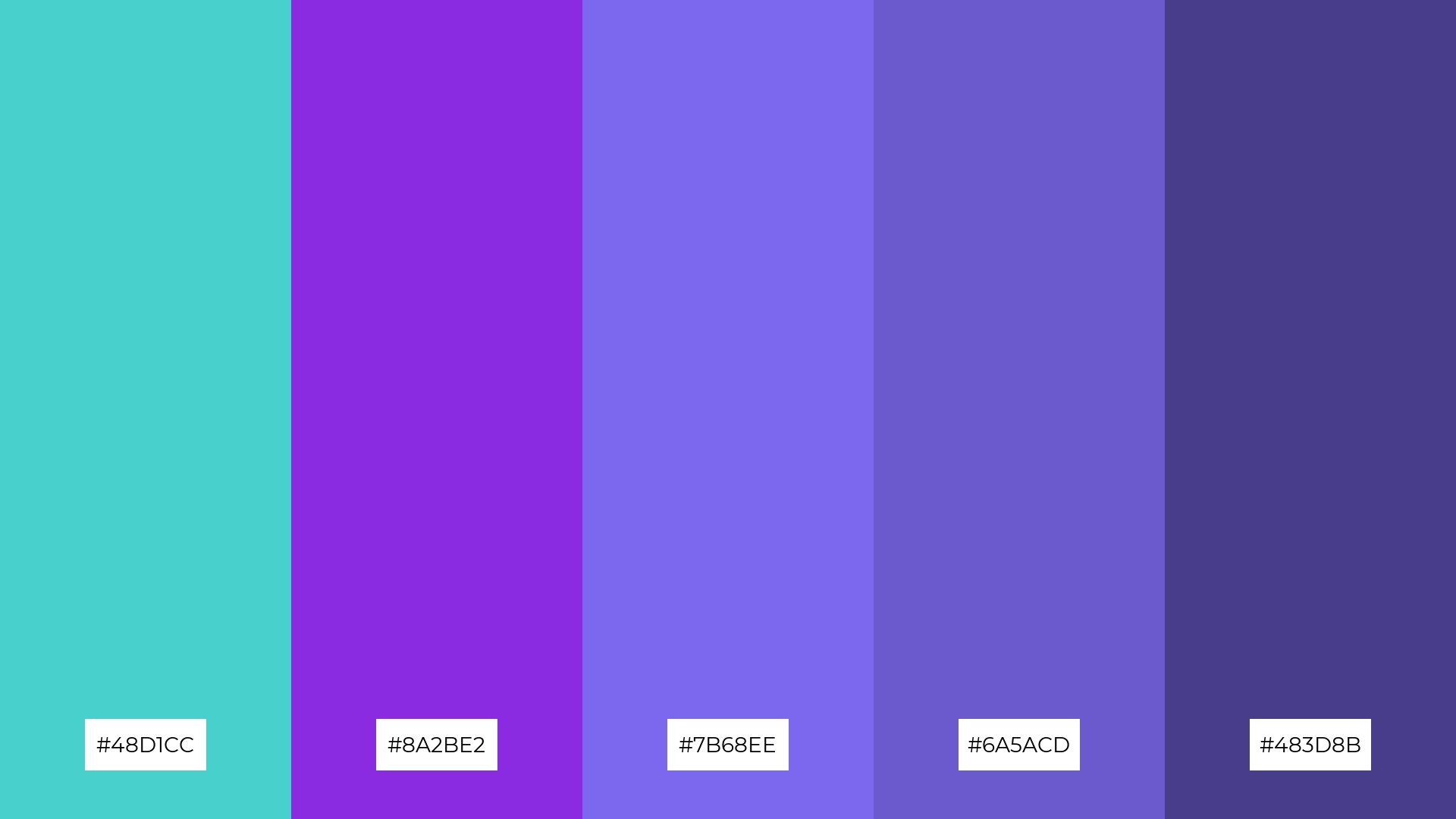
The ‘Mystic Waters’ color palette, featuring dominant shades like turquoise (#48D1CC), blue-violet (#8A2BE2), medium slate blue (#7B68EE), slate blue (#6A5ACD), and dark slate blue (#483D8B), creates a harmonious blend of cool and calming tones.
This palette is particularly well-suited for wellness branding, where the tranquil and soothing colors can evoke a sense of peace and relaxation, making it ideal for spas or eco-friendly interior spaces aiming to promote serenity and well-being.
4) Coral Reef
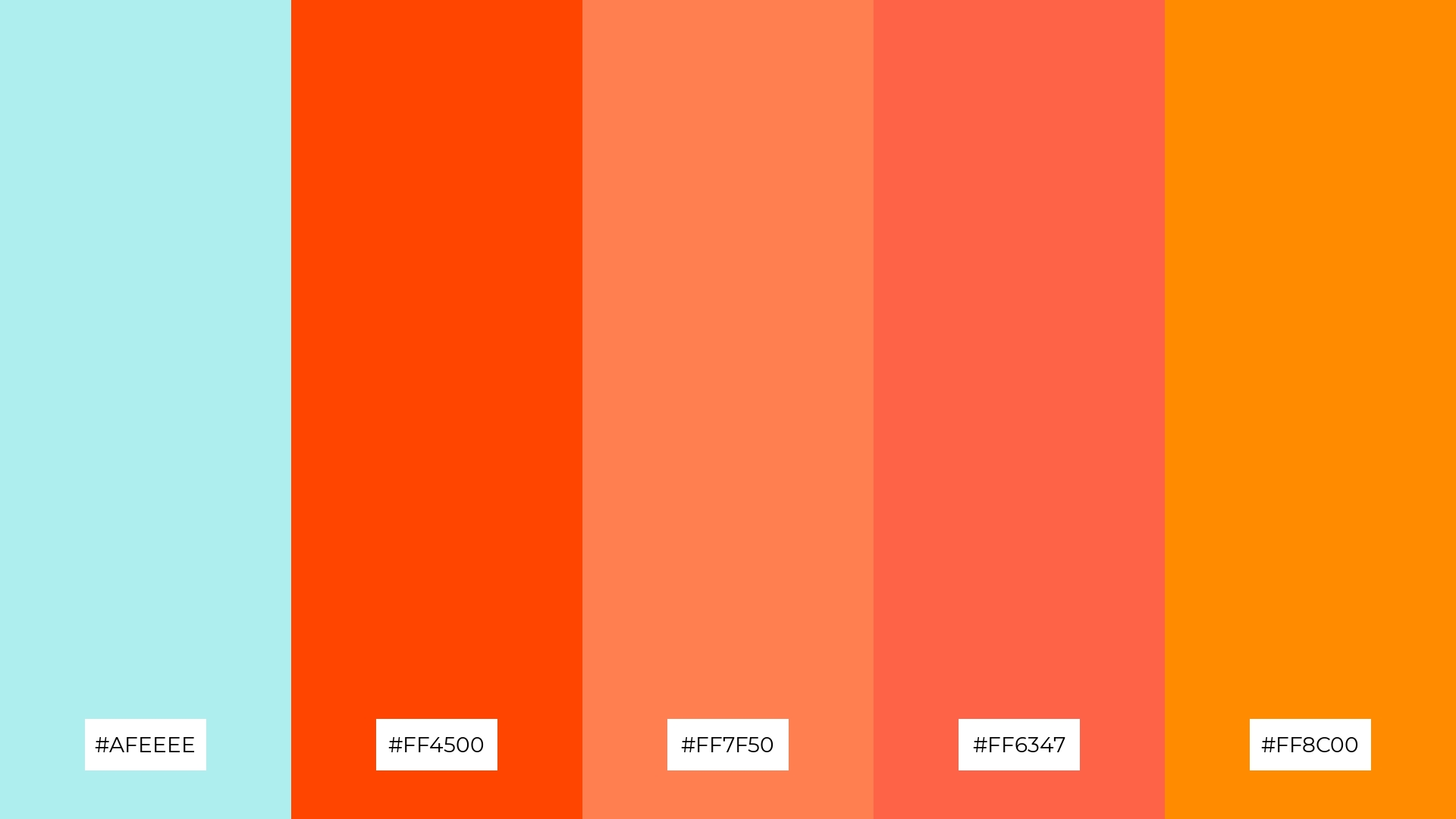
The ‘Coral Reef’ color palette, with its mix of soft tones like pale turquoise (#AFEEEE) and bold hues such as orange-red (#FF4500), coral (#FF7F50), tomato (#FF6347), and dark orange (#FF8C00), offers a balanced and distinct mood that is both inviting and energetic.
This palette is ideal for creating inviting retail spaces or modern web designs, where the combination of soft and bold tones can captivate and engage customers or users effectively.
5) Desert Oasis

The ‘Desert Oasis’ color palette, featuring shades like cyan (#00FFFF), gold (#FFD700), dark orange (#FF8C00), orange-red (#FF4500), and tomato (#FF6347), creates a vibrant and warm ambiance reminiscent of a sunlit desert landscape.
This dynamic palette is perfect for luxury fashion campaigns, where the rich and bold colors can evoke a sense of opulence and exotic allure, capturing the attention of discerning audiences.
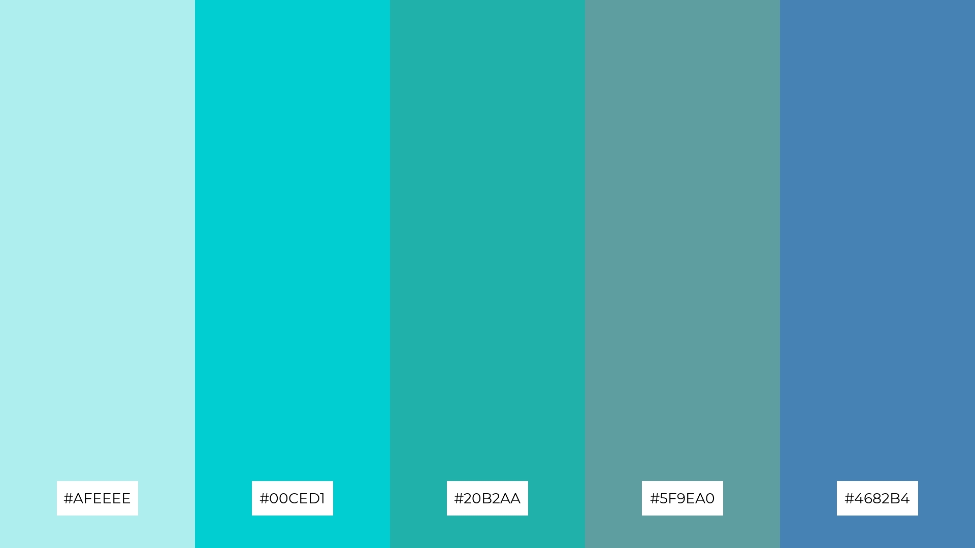
6) Arctic Chill

The ‘Arctic Chill’ color palette, with its blend of turquoise (#00CED1), steel blue (#4682B4), cadet blue (#5F9EA0), light steel blue (#B0C4DE), and light blue (#ADD8E6), creates a sophisticated and serene mood, perfect for minimalistic branding that aims to convey calmness and professionalism.
This harmonious combination of cool tones can also be effectively used in bold event designs, where the refreshing and tranquil colors can evoke a sense of elegance and modernity, making it ideal for upscale gatherings or corporate events.
7) Sunset Beach
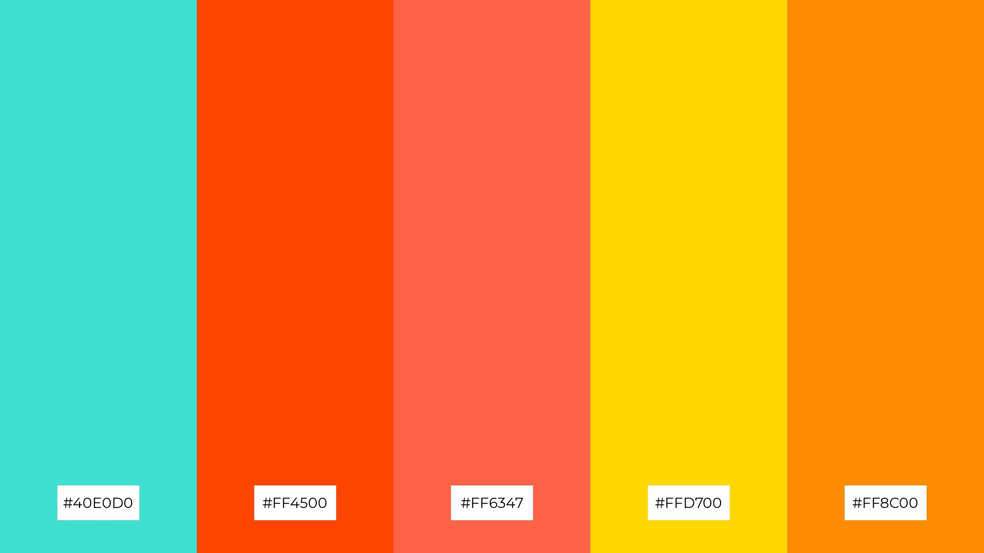
The ‘Sunset Beach’ color palette, with its contrasting elements of turquoise (#40E0D0) and vibrant warm hues like orange-red (#FF4500), tomato (#FF6347), gold (#FFD700), and dark orange (#FF8C00), creates a striking visual interest by blending cool and warm tones harmoniously.
This dynamic palette is ideal for creative projects such as magazine layouts or artistic websites, where the bold and captivating colors can draw attention and enhance the overall aesthetic appeal.
8) Enchanted Forest
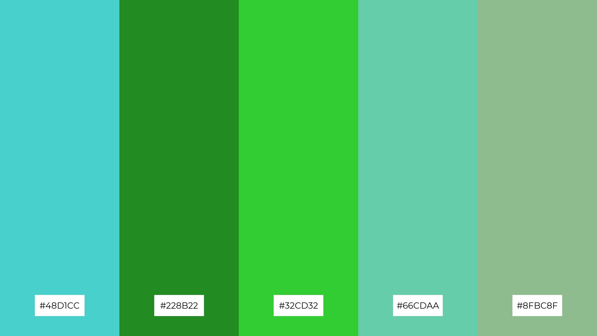
The ‘Enchanted Forest’ color palette, with its blend of turquoise (#48D1CC), forest green (#228B22), lime green (#32CD32), medium aquamarine (#66CDAA), and dark sea green (#8FBC8F), can evoke a sense of calm when used in harmonious combinations, making it ideal for spa branding where tranquility and relaxation are paramount.
Alternatively, the vibrant greens and aquamarine hues can be combined to create an exciting and energetic atmosphere, perfect for dynamic marketing campaigns that aim to capture attention and convey a sense of freshness and vitality.
9) Crystal Clear
The ‘Crystal Clear’ color palette, featuring softer tones like pale turquoise (#AFEEEE) and brighter shades such as dark turquoise (#00CED1), creates a refreshing and invigorating mood that can uplift any design.
This harmonious blend of hues is ideal for home decor, where the calming and vibrant colors can transform living spaces into serene and inviting environments, or for seasonal promotions that aim to capture the essence of freshness and renewal.
10) Summer Splash
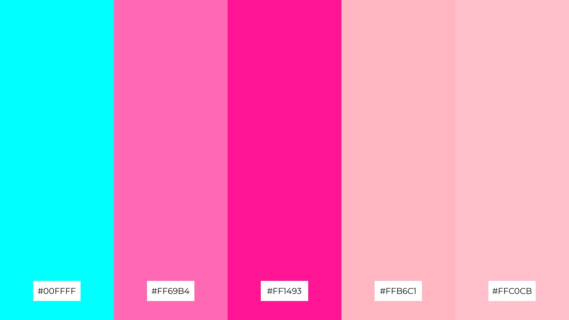
The ‘Summer Splash’ color palette, with its vibrant mix of cyan (#00FFFF), hot pink (#FF69B4), deep pink (#FF1493), light pink (#FFB6C1), and pink (#FFC0CB), creates a joyful and energetic visual flow that can evoke feelings of happiness and excitement.
This lively combination is perfect for lifestyle branding or tech product packaging, where the bright and playful colors can capture attention and convey a sense of fun and innovation.
11) Deep Sea
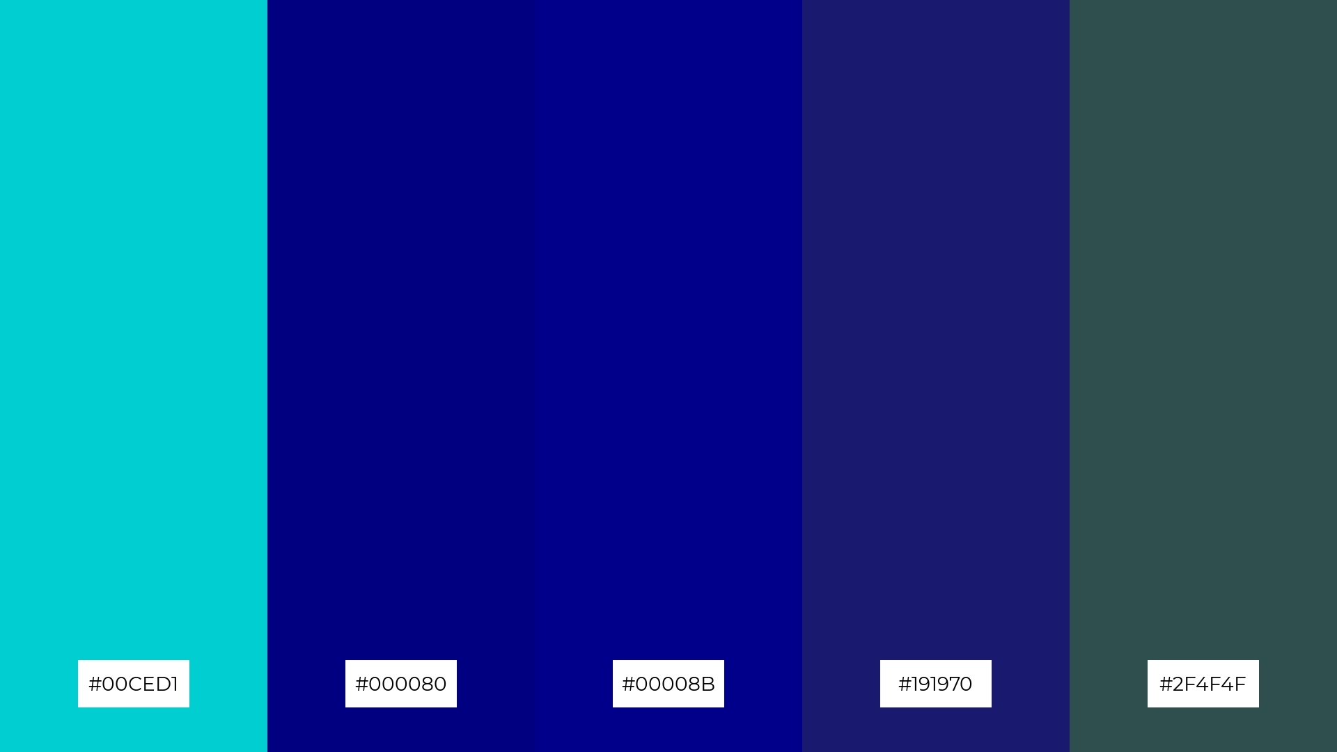
The ‘Deep Sea’ color palette, with its rich blend of turquoise (#00CED1) and deep navy hues (#000080, #00008B, #191970, #2F4F4F), creates a dramatic and sophisticated effect that can evoke a sense of depth and mystery in design.
This palette shines in luxury e-commerce sites, where the combination of dark and vibrant tones can create a welcoming yet opulent atmosphere, captivating discerning customers and enhancing the overall shopping experience.
12) Fresh Mint
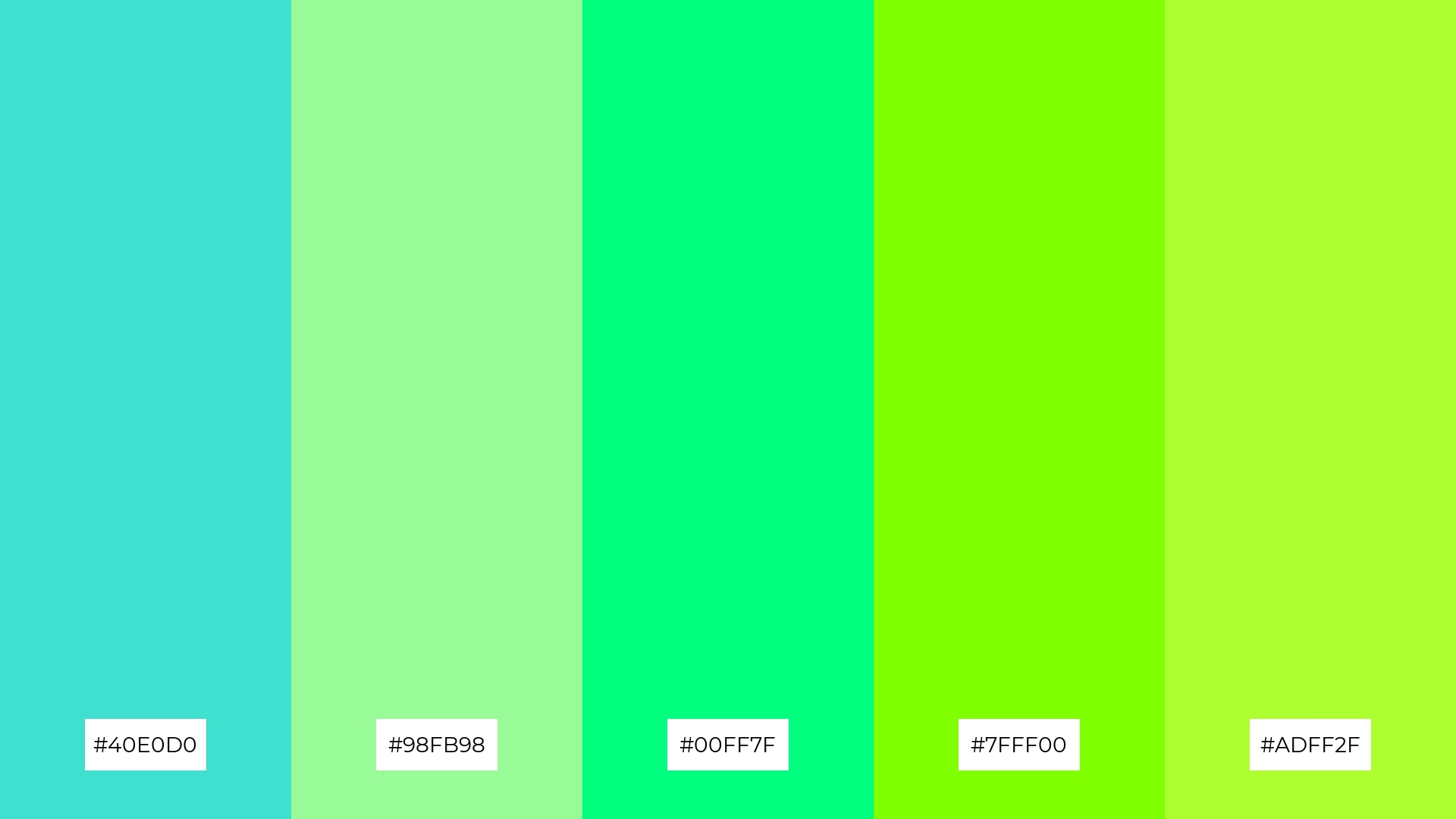
The ‘Fresh Mint’ color palette, with its blend of turquoise (#40E0D0), pale green (#98FB98), spring green (#00FF7F), chartreuse (#7FFF00), and green-yellow (#ADFF2F), creates a refreshing and balanced visual experience by harmonizing cool and warm tones.
This palette is ideal for casual apparel lines, where the vibrant and soothing hues can evoke a sense of freshness and vitality, making the clothing line appealing and trendy.
13) Serene Sky
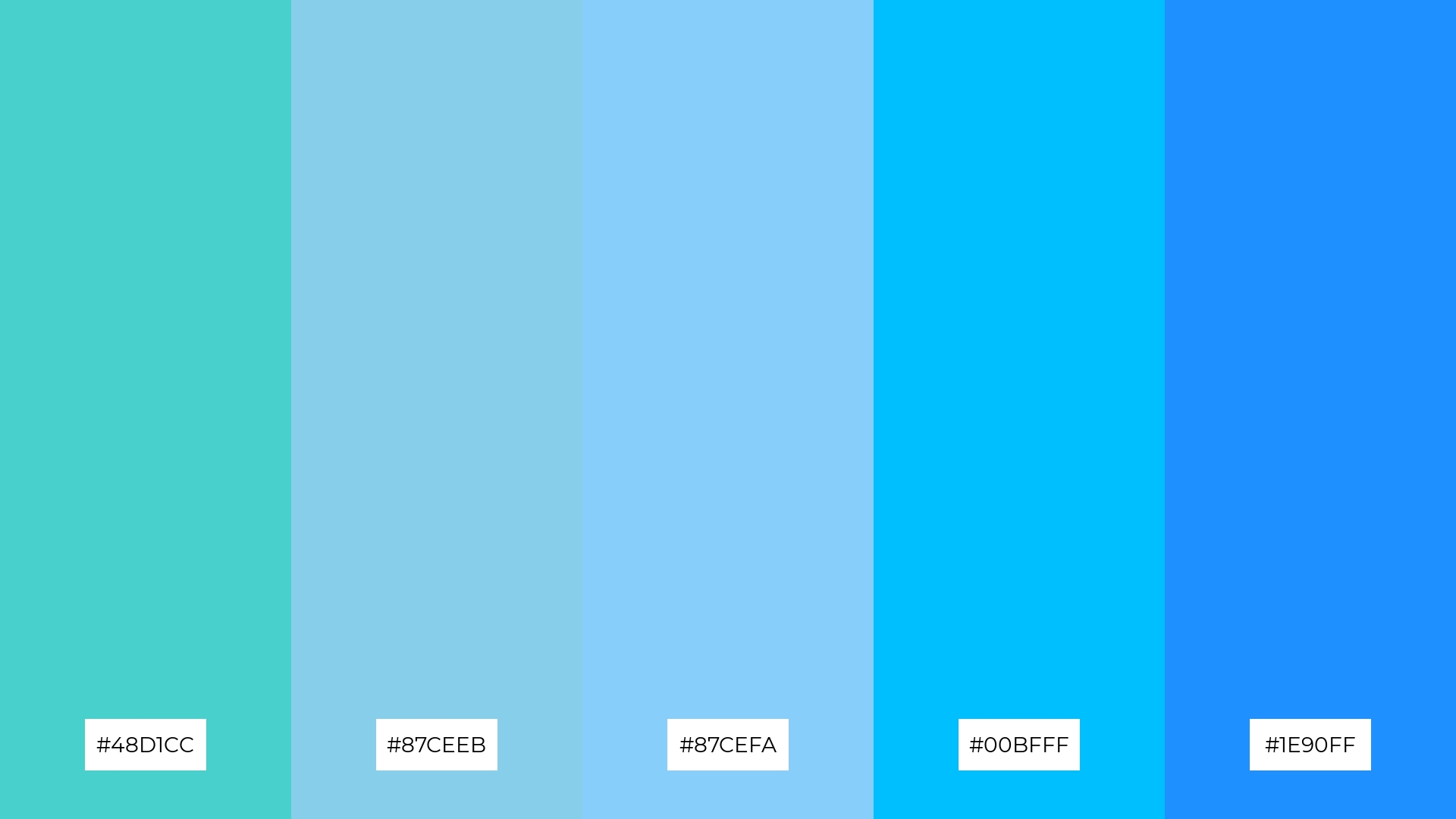
The ‘Serene Sky’ color palette, with its blend of turquoise (#48D1CC), sky blue (#87CEEB), light sky blue (#87CEFA), deep sky blue (#00BFFF), and dodger blue (#1E90FF), harmonizes warm and cool tones to evoke a mood of calmness and inspiration.
This soothing palette is perfect for artisan product branding, where the tranquil and uplifting colors can convey a sense of craftsmanship and creativity, making the products stand out in a serene and elegant manner.
14) Vibrant Tropics
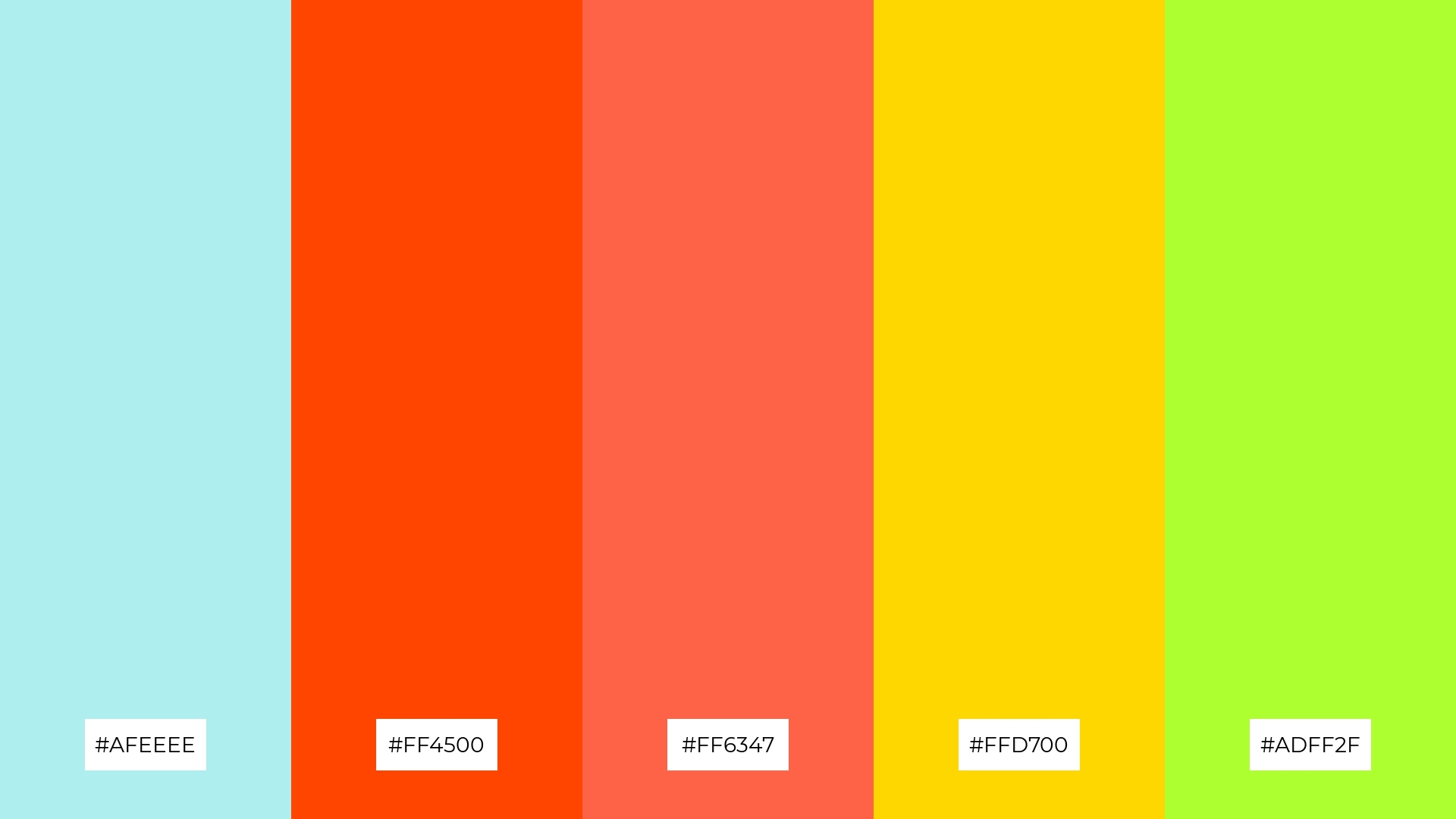
The ‘Vibrant Tropics’ color palette, with its mix of pale turquoise (#AFEEEE), orange-red (#FF4500), tomato (#FF6347), gold (#FFD700), and green-yellow (#ADFF2F), creates a dynamic interplay of bold and subtle hues that can evoke a sense of excitement and energy.
This lively combination is perfect for festival marketing, where the vibrant colors can capture attention and convey a sense of fun and celebration, making the event stand out and attract a diverse audience.
15) Cool Waves
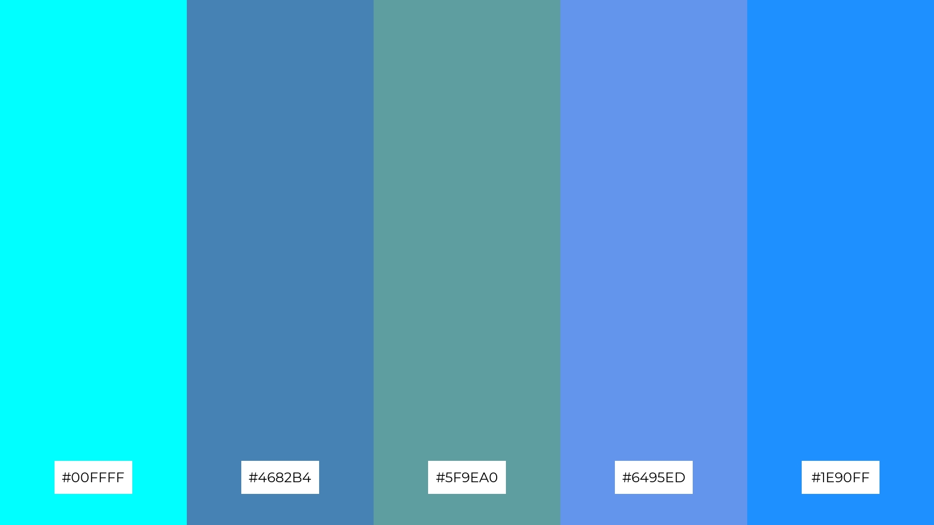
The ‘Cool Waves’ color palette, with its blend of cyan (#00FFFF), steel blue (#4682B4), cadet blue (#5F9EA0), cornflower blue (#6495ED), and dodger blue (#1E90FF), conveys a sense of harmony through its cohesive and calming blue tones, making it perfect for tech startups aiming to create a serene and professional atmosphere.
Alternatively, this palette can create a striking contrast when used in cozy interior makeovers, where the vibrant blues can stand out against neutral backgrounds, adding a refreshing and modern touch to living spaces.
How to Use Turquoise Patterns in Design
In home decor, turquoise color palettes can be used to create a serene and inviting atmosphere. Pairing turquoise with neutral tones like white or beige can enhance the calming effect, making it perfect for bedrooms or living spaces. Adding accents of gold or silver can elevate the sophistication of the room.
For marketing materials, turquoise can be a powerful tool to capture attention and convey a sense of modernity. Use it as a primary color in infographics or digital ads to create a fresh and energetic look. Complementing turquoise with warm colors like coral or peach can add visual interest and make your content stand out.
In clothing design, turquoise palettes can evoke a sense of freshness and vitality. Combining turquoise with vibrant colors like hot pink or deep navy can create trendy and eye-catching apparel. This versatile color can be used in both casual and formal wear, making it a staple in any fashion collection.
Ready to experiment with turquoise color palettes in your next design project? Try creating stunning visuals with Piktochart today! Get started here.


