Sky blue color palettes evoke a sense of calm and serenity, making them a popular choice in design. These palettes can transform any project, adding a touch of tranquility and freshness.
From web design to infographics, incorporating sky blue hues can enhance visual appeal and readability. Explore the versatility of sky blue and discover how it can elevate your creative work.
Tips For Creating Sky Blue Color Palettes
Designing with sky blue can be both exciting and challenging. Here are some practical tips to help you create stunning color palettes:
- Balance with Neutrals: Pair sky blue with neutral colors like white, gray, or beige to maintain a clean and sophisticated look.
- Complementary Colors: Use complementary shades such as coral or peach to add warmth and contrast to your design.
- Gradients and Shades: Experiment with different gradients and shades of sky blue to add depth and dimension to your project.
- Accent Colors: Incorporate accent colors like navy or gold to highlight key elements and create visual interest.
- Versatility: Sky blue works well in various design contexts, from corporate presentations to playful infographics, making it a versatile choice.
- Consistency: Ensure consistency across your design by using a limited color palette and repeating key colors throughout your project.
15 Sky Blue Color Palettes
1) Ocean Breeze
The ‘Ocean Breeze’ color palette, with its blend of light and deep blues, creates a refreshing and invigorating mood reminiscent of a serene seaside escape.
These colors interact harmoniously to produce a cohesive look, perfect for coastal-themed interior decor that emphasizes tranquility and natural beauty.
2) Morning Mist
The ‘Morning Mist’ color palette, with its soft and airy blues, evokes a sense of calmness and clarity, reminiscent of a peaceful morning sky.
This palette would excel in digital branding for wellness apps, where the soothing hues can create a serene and inviting user experience.
3) Tropical Lagoon
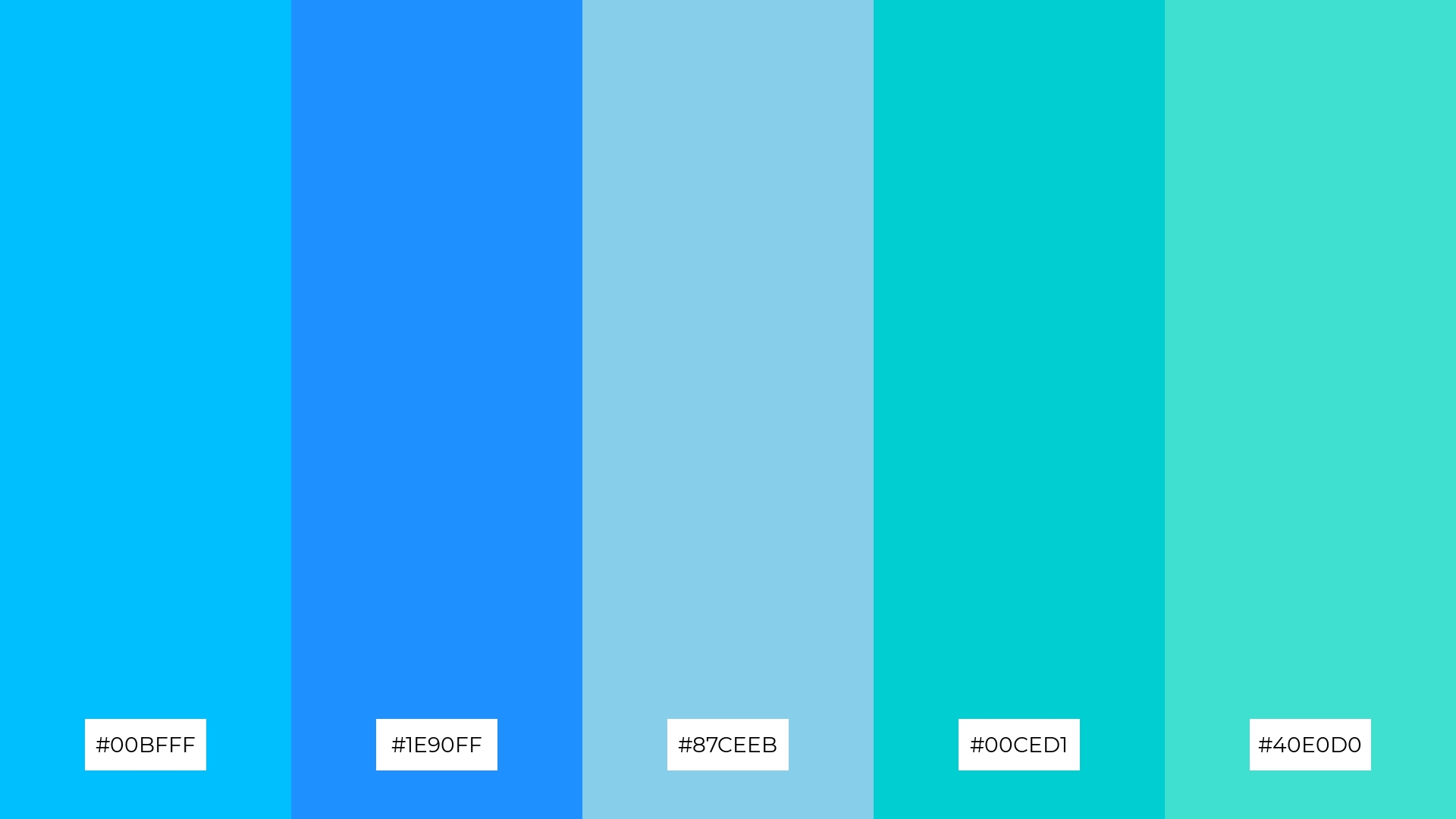
The ‘Tropical Lagoon’ color palette, featuring dominant shades like #00BFFF and #1E90FF, creates a vibrant and refreshing visual experience.
These colors, combined with #87CEEB, #00CED1, and #40E0D0, harmonize to evoke a sense of tropical tranquility, making them ideal for eco-friendly interior spaces that aim to bring the outdoors inside.
4) Sky at Dusk
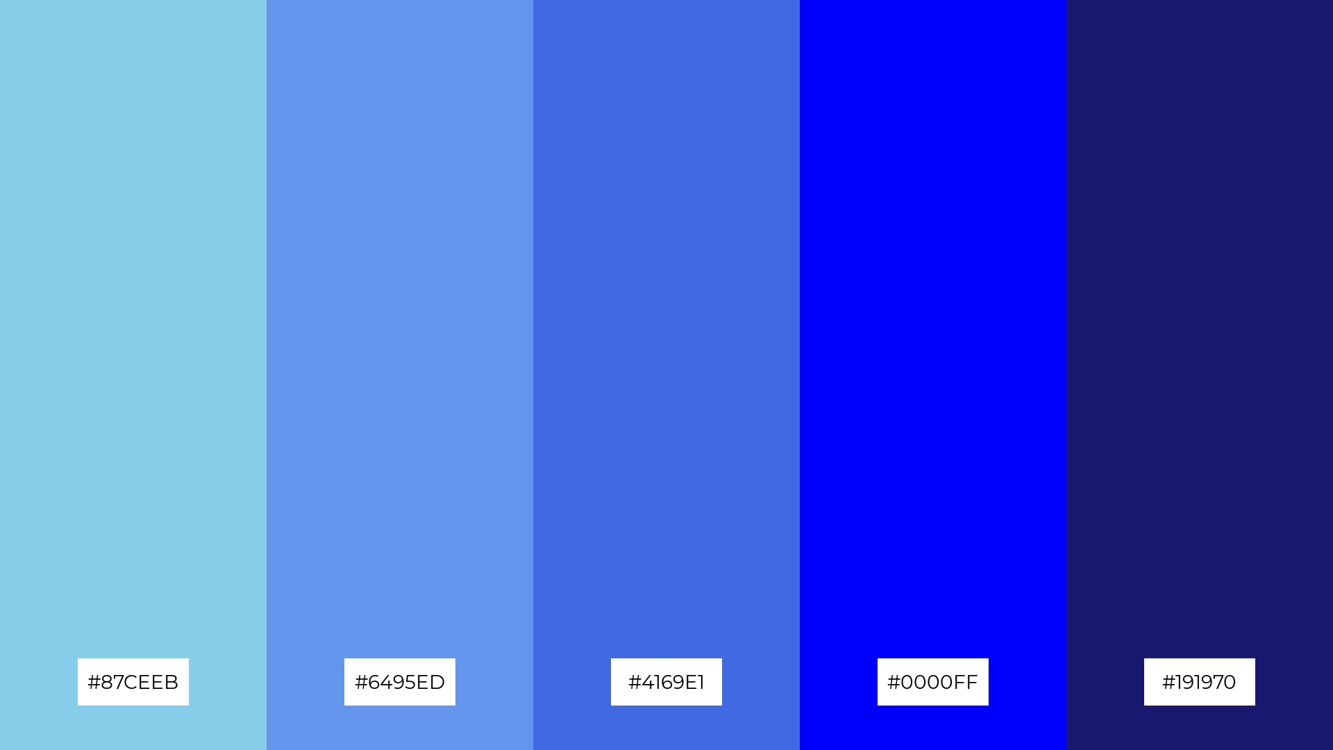
The ‘Sky at Dusk’ color palette, with its blend of soft and bold tones like #87CEEB and #191970, creates a distinct mood that balances tranquility with intensity.
This palette is ideal for modern web designs, where the combination of serene and striking hues can create an inviting and dynamic user experience.
5) Spring Sky
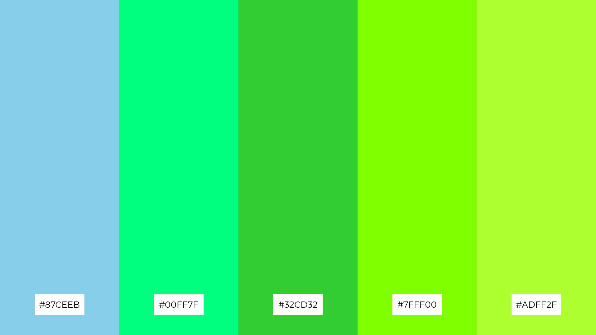
The ‘Spring Sky’ color palette, with its blend of #87CEEB, #00FF7F, #32CD32, #7FFF00, and #ADFF2F, creates a vibrant and refreshing ambiance that evokes the rejuvenating essence of springtime.
This palette is perfect for wedding themes, where the lively greens and serene blues can create a joyful and harmonious atmosphere, making the event feel both elegant and full of life.
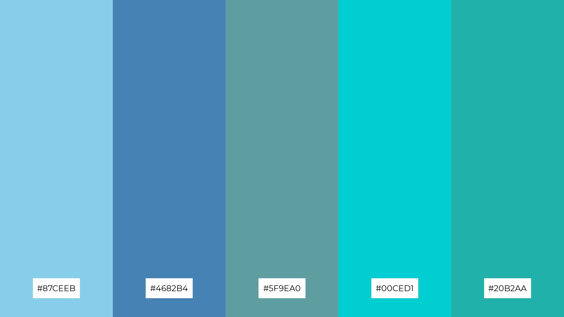
6) Winter Chill

The ‘Winter Chill’ color palette, with its blend of #87CEEB, #4682B4, #5F9EA0, #B0C4DE, and #708090, creates a sophisticated and serene atmosphere, perfect for minimalistic branding that aims to convey elegance and calm.
This palette’s harmonious interaction of cool blues and grays can also be utilized in bold event designs, where the subtle yet striking hues can set a refined and tranquil mood, making the event feel both modern and inviting.
7) Sunset Glow
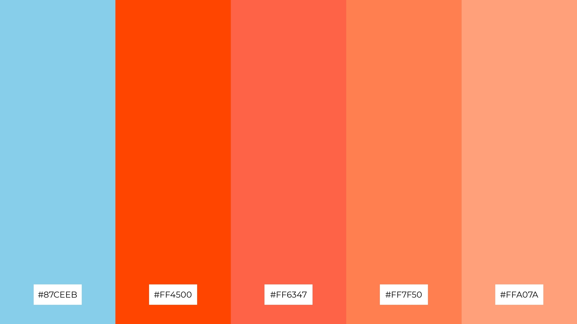
The ‘Sunset Glow’ color palette, with its blend of serene sky blue (#87CEEB) and vibrant warm tones like #FF4500, #FF6347, #FF7F50, and #FFA07A, creates a striking contrast that captures the dynamic essence of a sunset, adding visual interest and depth to any design.
This palette is ideal for creative projects such as magazine layouts or artistic websites, where the interplay of cool and warm hues can draw attention and evoke a sense of energy and creativity, making the content both engaging and visually appealing.
8) Pastel Dream
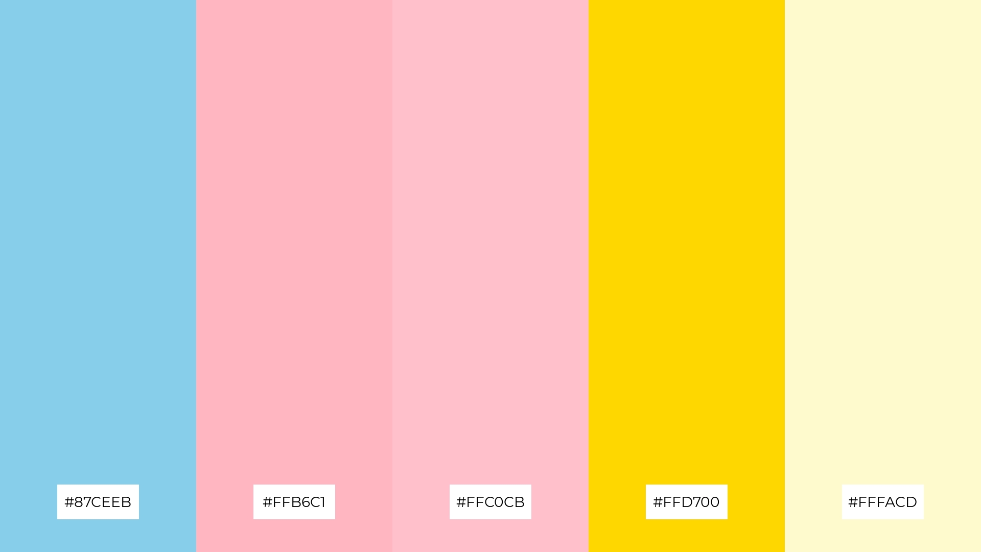
The ‘Pastel Dream’ color palette, with its blend of #87CEEB, #FFB6C1, #FFC0CB, #FFD700, and #FFFACD, can evoke a sense of calm when the soft blues and pinks are combined, creating a soothing and gentle visual experience.
Alternatively, the inclusion of vibrant yellow and gold tones can bring excitement and energy, making this palette perfect for vibrant marketing campaigns that aim to capture attention and convey a lively, upbeat message.
9) Forest Stream
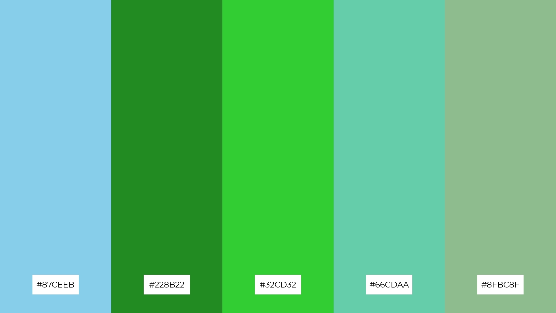
The ‘Forest Stream’ color palette, with its mix of softer tones like #87CEEB and brighter shades such as #32CD32, creates a refreshing and invigorating visual experience that evokes the tranquility of a forest stream.
This blend of colors is ideal for home decor, where the harmonious interaction of cool blues and vibrant greens can create a serene and natural ambiance, perfect for spaces that aim to bring the calming essence of nature indoors.
10) Candy Sky
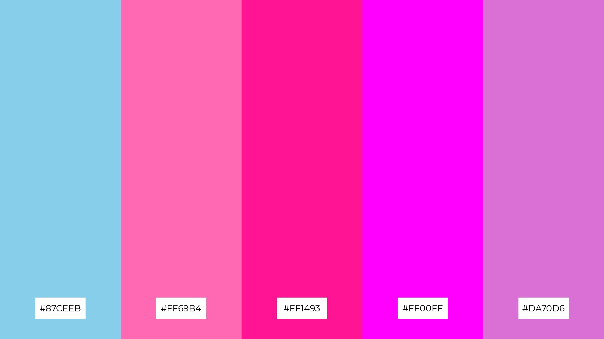
The ‘Candy Sky’ color palette, with its blend of #87CEEB, #FF69B4, #FF1493, #FF00FF, and #DA70D6, creates a vibrant and playful visual flow that evokes feelings of joy and excitement, making it perfect for designs that aim to capture a youthful and energetic spirit.
This palette’s dynamic interaction of bright pinks and serene blues can be effectively utilized in lifestyle branding or tech product packaging, where the lively colors can attract attention and convey a sense of fun and innovation, making the product stand out in a competitive market.
11) Autumn Sky
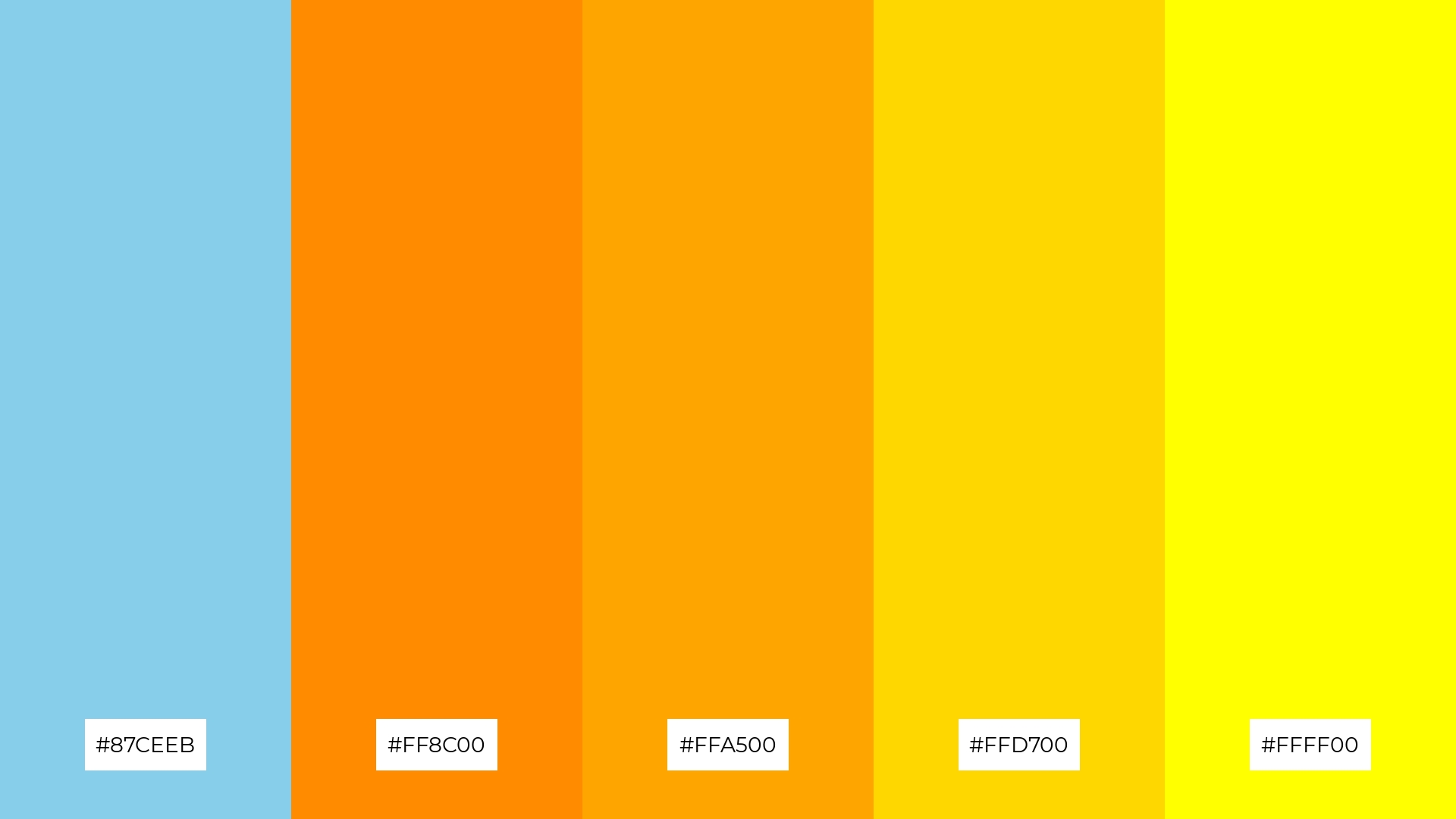
The ‘Autumn Sky’ color palette, with its blend of serene sky blue (#87CEEB) and warm autumnal tones like #FF8C00, #FFA500, #FFD700, and #FFFF00, creates a welcoming and dramatic effect by combining the tranquility of blue with the vibrant energy of orange and yellow hues.
This palette shines in boutique interiors, where the harmonious interaction of cool and warm tones can create an inviting and luxurious atmosphere, perfect for spaces that aim to evoke a sense of elegance and comfort.
12) Twilight Hues
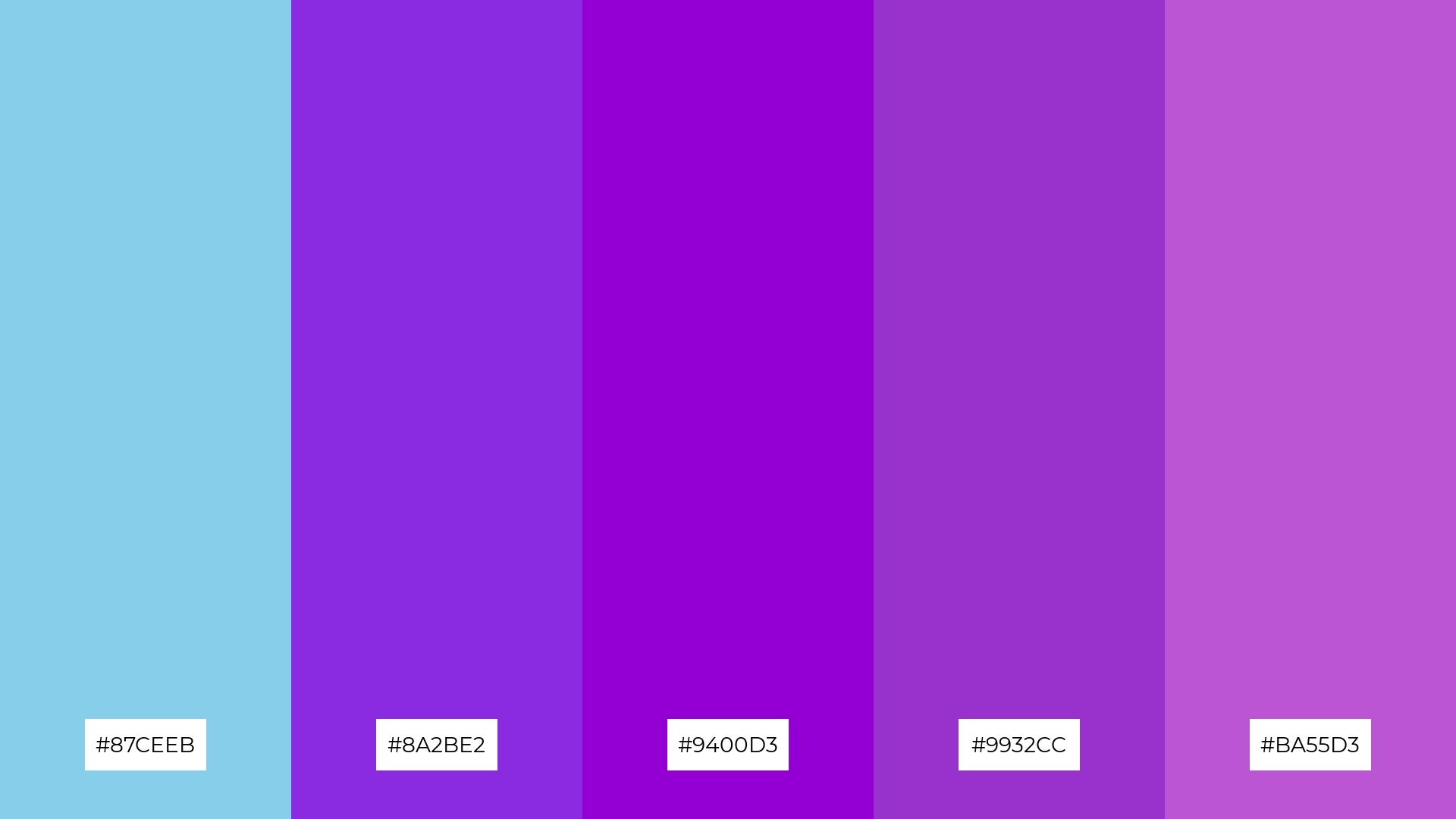
The ‘Twilight Hues’ color palette, with its blend of serene sky blue (#87CEEB) and rich purples like #8A2BE2, #9400D3, #9932CC, and #BA55D3, creates a striking balance between calm and vibrancy, making it perfect for designs that aim to evoke both tranquility and energy.
This palette is ideal for sleek corporate branding, where the harmonious interaction of cool blues and bold purples can convey a sense of professionalism and innovation, making the brand stand out with a modern and sophisticated look.
13) Coral Reef
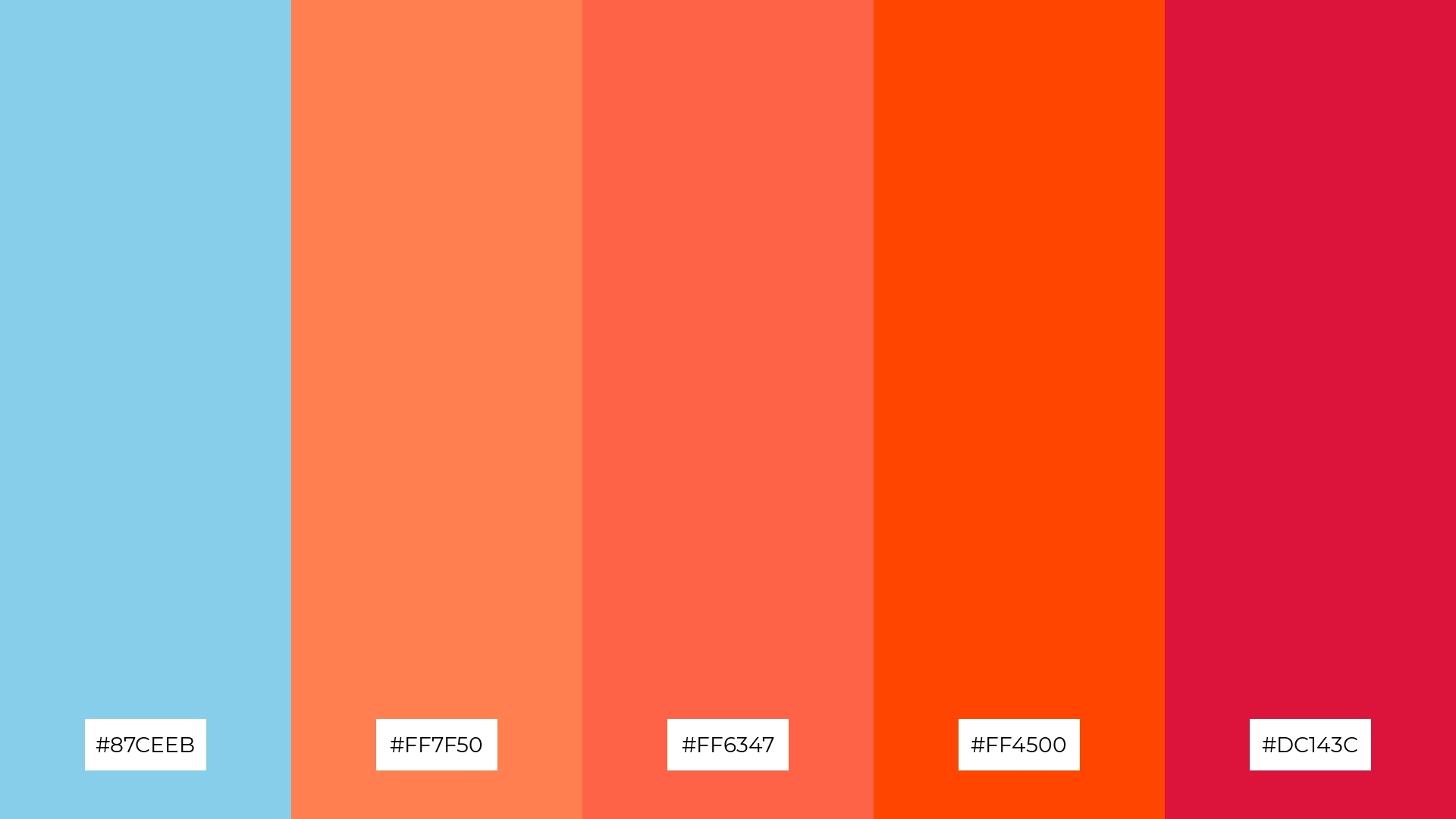
The ‘Coral Reef’ color palette, with its blend of serene sky blue (#87CEEB) and vibrant warm tones like #FF7F50, #FF6347, #FF4500, and #DC143C, creates a dynamic and energetic mood that captures the essence of a lively underwater scene.
This palette is perfect for artisan product branding, where the harmonious interaction of cool and warm hues can convey a sense of creativity and craftsmanship, making the products stand out with a unique and captivating visual appeal.
14) Desert Mirage
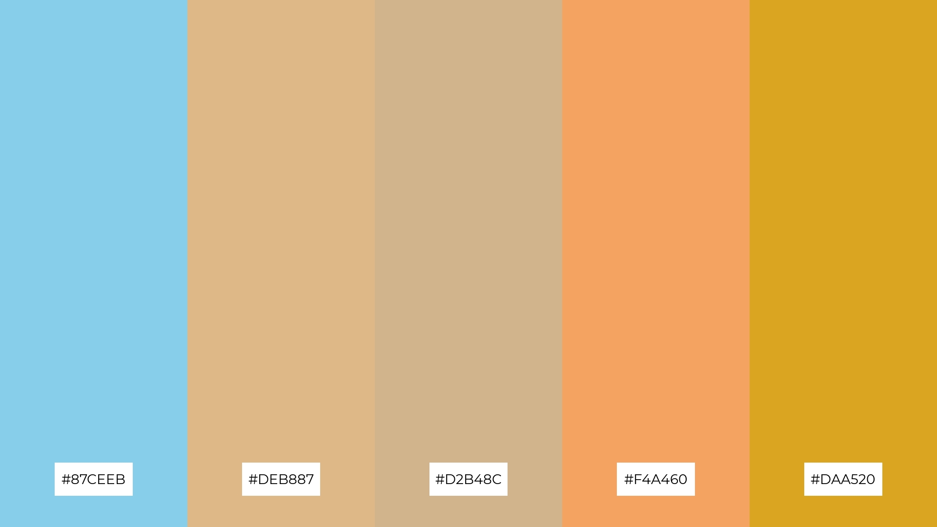
The ‘Desert Mirage’ color palette, with its blend of serene sky blue (#87CEEB) and warm earthy tones like #DEB887, #D2B48C, #F4A460, and #DAA520, creates a dynamic interaction that balances boldness with subtlety, evoking the essence of a sunlit desert landscape.
This palette is ideal for festival marketing, where the harmonious mix of cool and warm hues can capture attention and convey a sense of excitement and adventure, making the event feel both inviting and vibrant.
15) Berry Sky
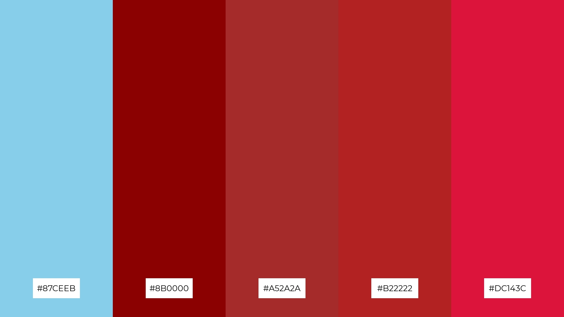
The ‘Berry Sky’ color palette, with its blend of serene sky blue (#87CEEB) and rich berry tones like #8B0000, #A52A2A, #B22222, and #DC143C, creates a striking contrast that can evoke both harmony and vibrancy, depending on its application.
This palette is ideal for tech startups aiming to convey innovation and energy, or for cozy interior makeovers where the warm berry hues can create a welcoming and intimate atmosphere, balanced by the calming sky blue.
How to Use Sky Blue Patterns in Design
Sky blue color palettes can be a game-changer in various design applications. In home decor, pairing sky blue with neutral tones like white or beige can create a serene and inviting atmosphere, perfect for living rooms or bedrooms. For marketing materials, combining sky blue with vibrant accent colors like coral or gold can make your content stand out and capture attention.
In the realm of fashion, sky blue hues can be used to create fresh and stylish clothing collections that evoke a sense of calm and sophistication. Whether it’s a summer dress or a casual shirt, incorporating sky blue can add a touch of elegance and modernity. For digital designs, using gradients of sky blue can enhance the visual appeal and readability of websites or apps, making them more user-friendly and engaging.
Ready to elevate your designs with sky blue color palettes? Try creating stunning palettes using Piktochart and see how these versatile hues can transform your projects. Get started with Piktochart today!


