Powder blue is a versatile and calming color that can transform any design project. Its soft, muted tones make it a favorite among designers looking to create serene and sophisticated visuals.
Whether you’re working on a website, an infographic, or a presentation, incorporating powder blue can add a touch of elegance and tranquility. This article explores various powder blue color palettes to inspire your next creative endeavor.
Tips For Creating Powder Blue Color Palettes
Designing with powder blue can be both exciting and challenging. Here are some practical tips to help you create stunning color palettes:
- Balance with Neutrals: Pair powder blue with neutral colors like white, gray, or beige to maintain a clean and sophisticated look.
- Complementary Shades: Use complementary colors such as soft pinks or muted greens to create a harmonious and visually appealing palette.
- Accent with Bold Colors: Introduce bold colors like navy blue or deep coral as accents to add depth and interest to your design.
- Consider the Mood: Think about the mood you want to convey. Powder blue can evoke calmness and serenity, making it ideal for designs aimed at relaxation or professionalism.
- Test Versatility: Experiment with different shades and tints of powder blue to see how versatile it can be in various design contexts, from backgrounds to text highlights.
- Use Gradients: Incorporate gradients that blend powder blue with other colors to create a smooth and dynamic visual effect.
15 Powder Blue Color Palettes
1) Ocean Breeze
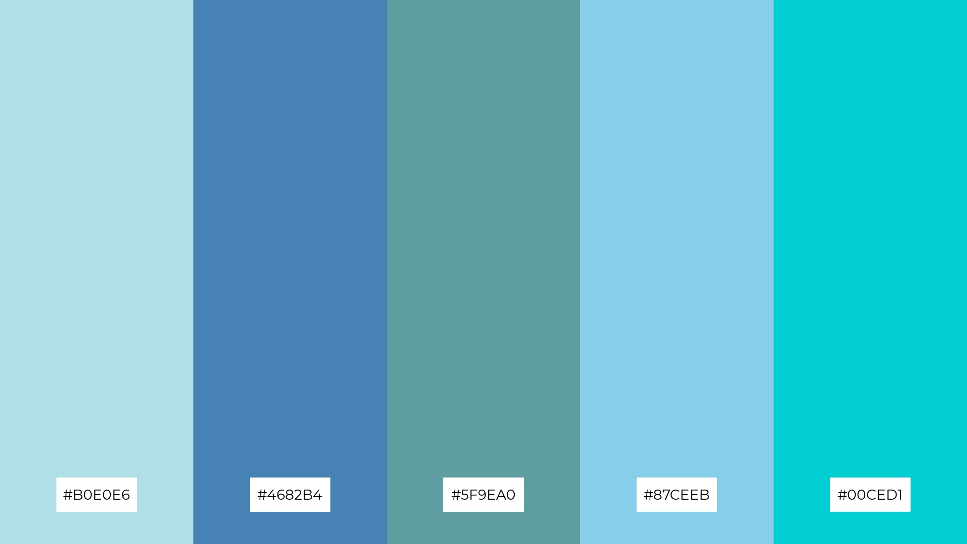
The ‘Ocean Breeze’ palette, with its blend of #B0E0E6, #4682B4, #5F9EA0, #87CEEB, and #00CED1, evokes a refreshing and tranquil mood reminiscent of a serene seaside escape.
These colors interact harmoniously to create a cohesive look, making them perfect for interior decor in spaces designed for relaxation, such as a coastal-themed living room or a spa retreat.
2) Powdered Pastels
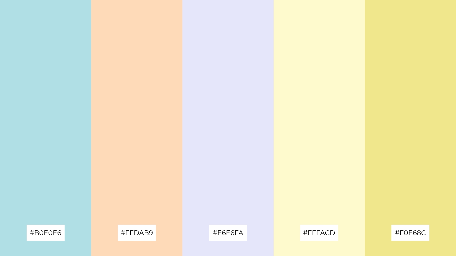
The ‘Powdered Pastels’ palette, featuring #B0E0E6, #FFDAB9, #E6E6FA, #FFFACD, and #F0E68C, evokes a sense of warmth and calmness, making it ideal for creating inviting and soothing visuals.
This palette would excel in digital branding for wellness apps or product packaging for skincare lines, where a gentle and comforting aesthetic is essential.
3) Winter Wonderland
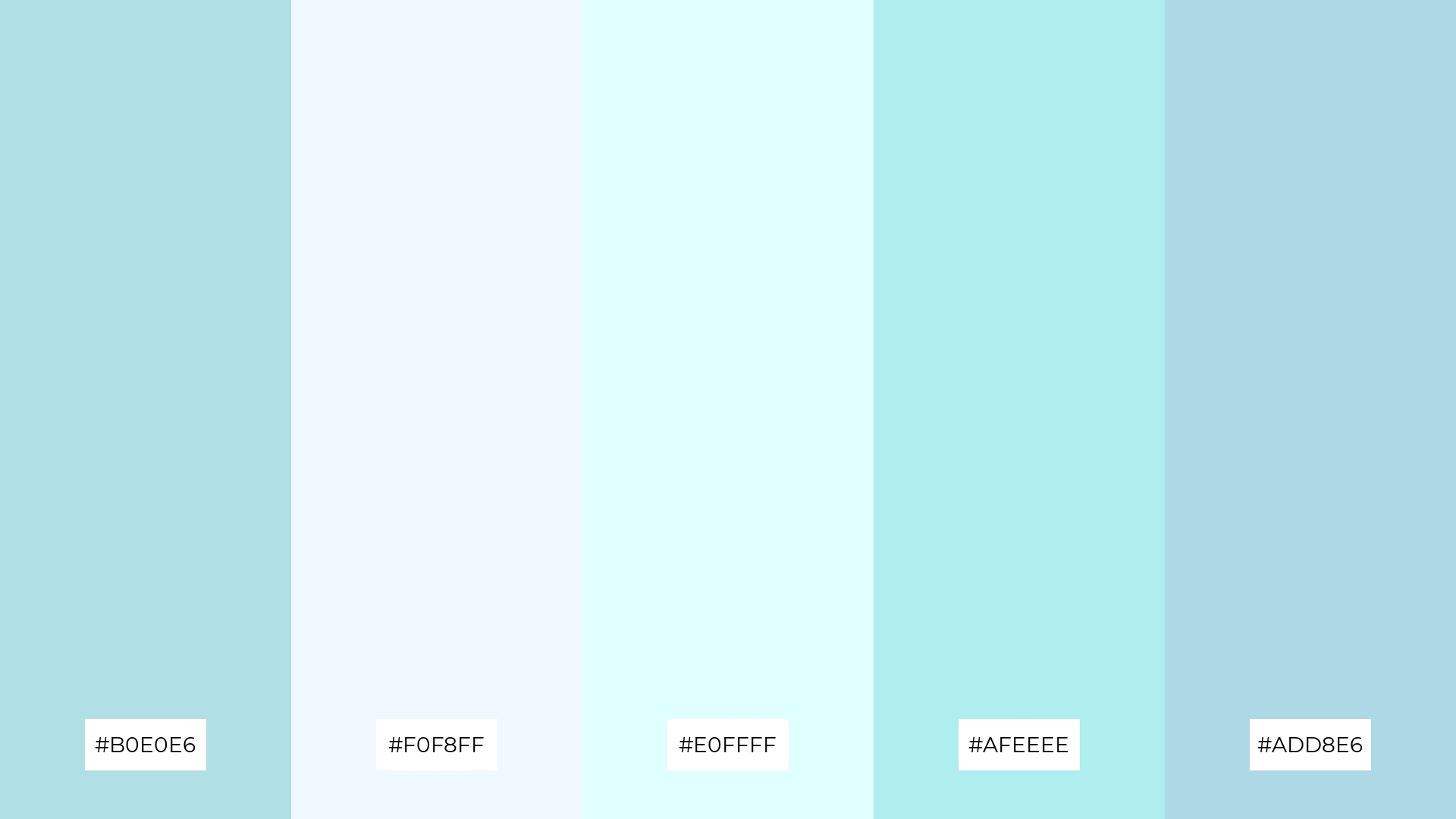
The ‘Winter Wonderland’ palette, featuring dominant colors like #B0E0E6, #F0F8FF, #E0FFFF, #AFEEEE, and #ADD8E6, creates a cohesive and serene visual experience reminiscent of a tranquil winter landscape.
This harmonious blend of cool, icy tones is perfect for wellness branding, where a calming and refreshing aesthetic can enhance the sense of peace and relaxation.
4) Soft Serenity
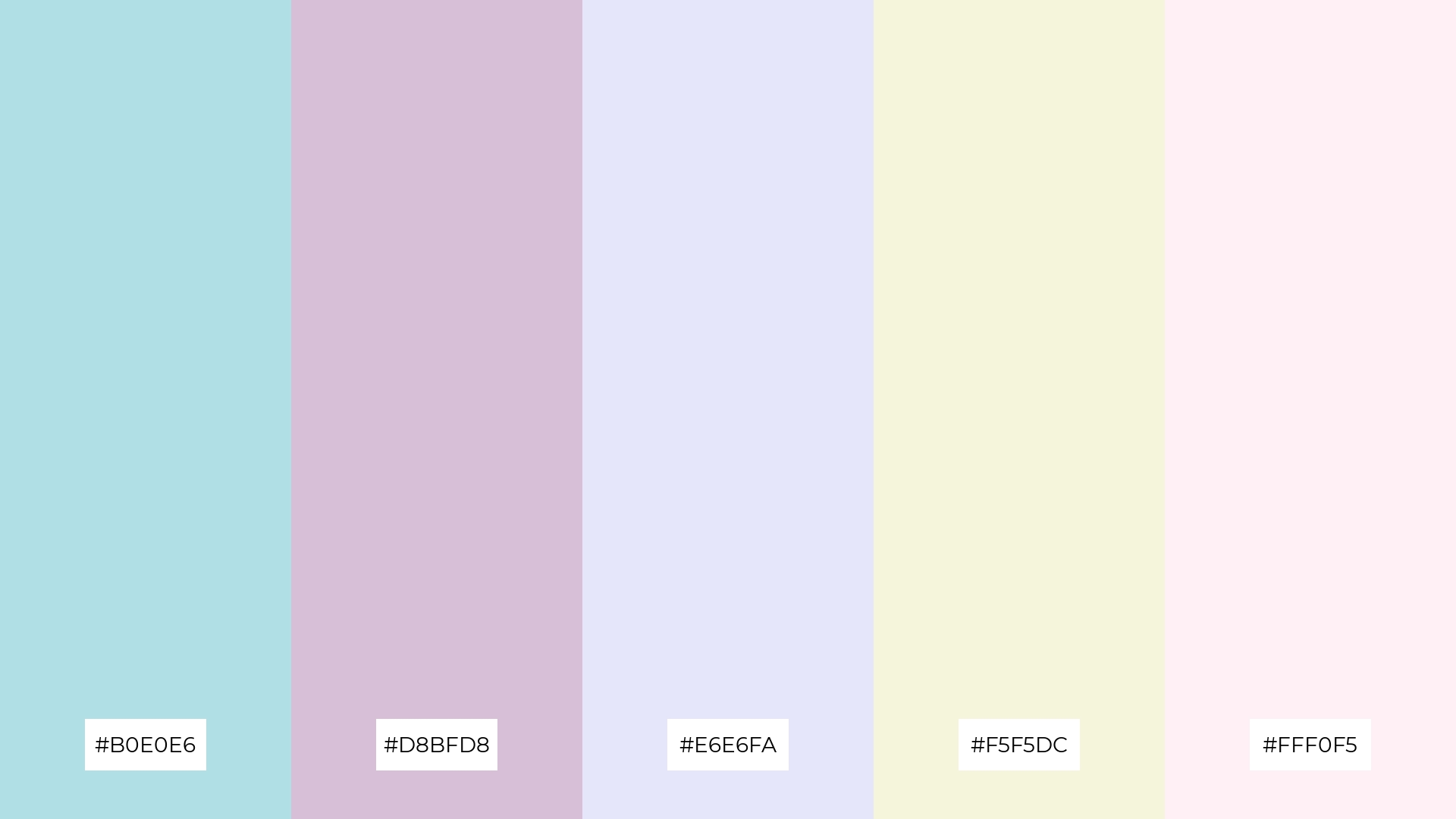
The ‘Soft Serenity’ palette, with its blend of #B0E0E6, #D8BFD8, #E6E6FA, #F5F5DC, and #FFF0F5, offers a balance of soft and bold tones, creating a distinct mood that is both calming and sophisticated.
This palette is ideal for creating inviting retail spaces or modern web designs, where a gentle yet striking aesthetic can enhance the overall user experience.
5) Coastal Calm
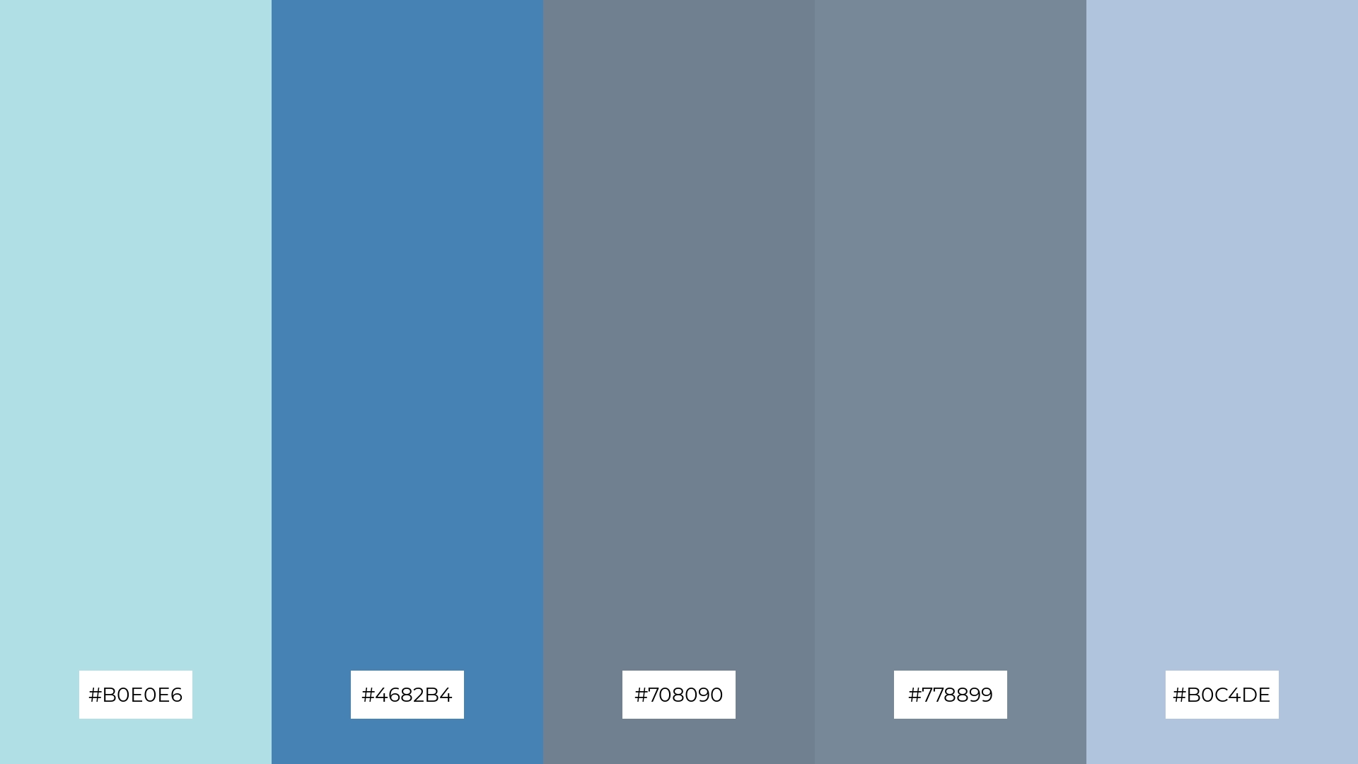
The ‘Coastal Calm’ palette, featuring #B0E0E6, #4682B4, #708090, #778899, and #B0C4DE, works together to evoke a serene and tranquil ambiance reminiscent of a peaceful seaside retreat.
This harmonious blend of colors is perfect for wedding themes, where the calming and elegant tones can create a sophisticated and romantic atmosphere for the special day.
6) Powdered Sunset
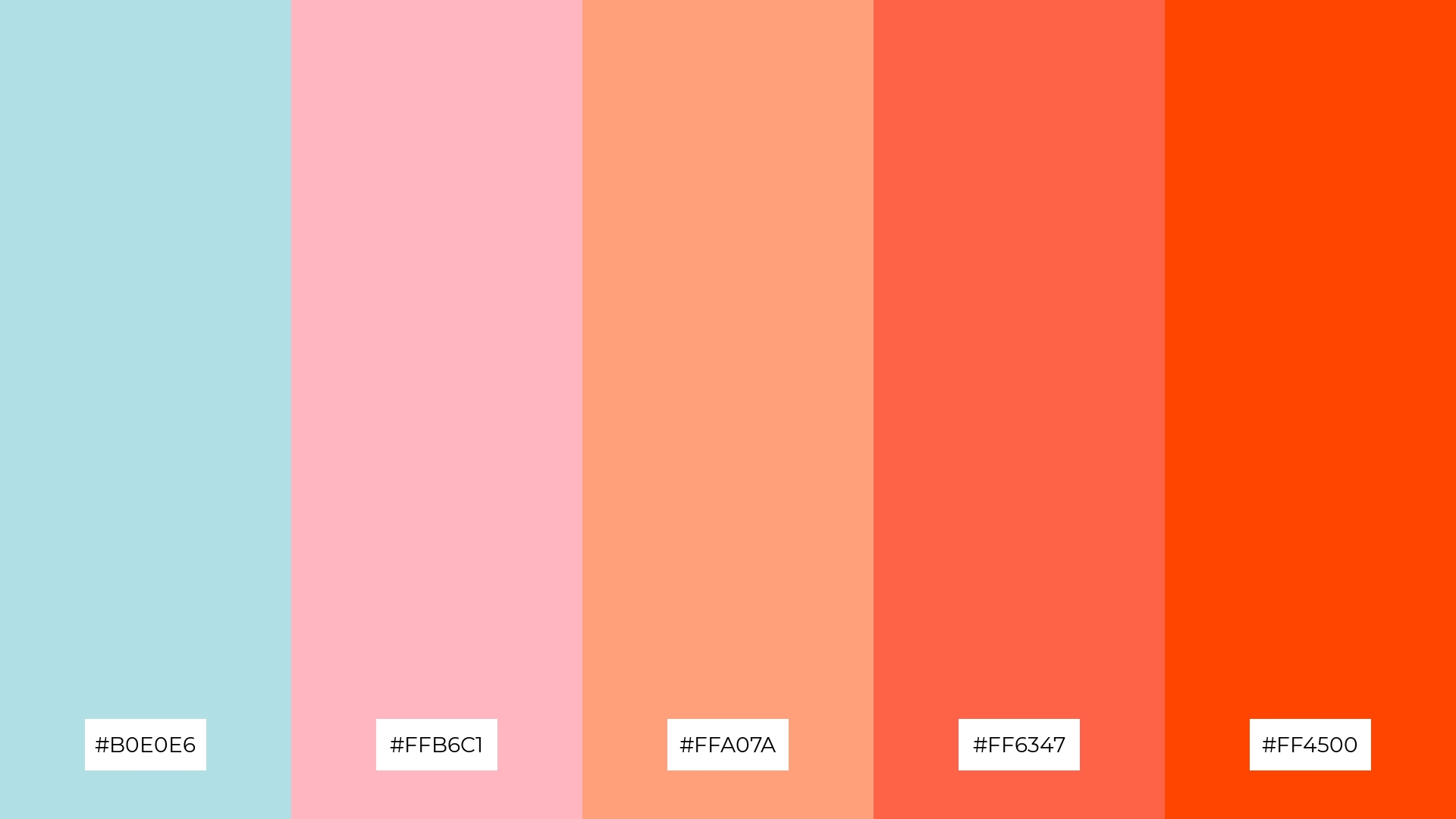
The ‘Powdered Sunset’ palette, with its blend of #B0E0E6, #FFB6C1, #FFA07A, #FF6347, and #FF4500, creates a vibrant and dynamic harmony that can evoke a sense of playfulness and energy, making it ideal for bold event designs.
This palette’s striking combination of soft and vivid hues can also be utilized in minimalistic branding to add a touch of sophistication and warmth, perfect for modern lifestyle brands aiming to stand out with a unique and engaging visual identity.
7) Powdered Garden
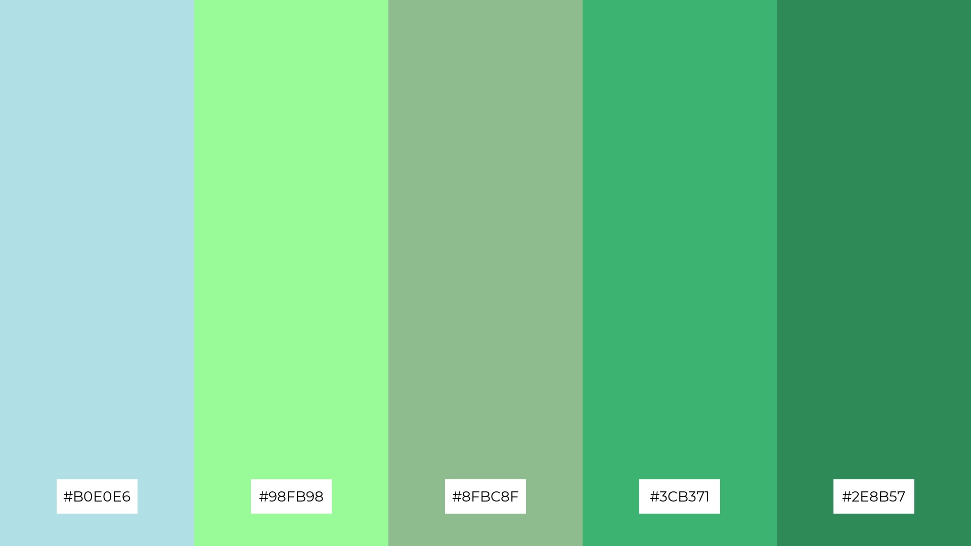
The ‘Powdered Garden’ palette, with its mix of #B0E0E6, #98FB98, #8FBC8F, #3CB371, and #2E8B57, combines soft powder blue with vibrant greens to create a visually stimulating contrast that captures attention and adds depth.
This dynamic palette is perfect for creative projects like magazine layouts or artistic websites, where the interplay of calming blues and lively greens can enhance the overall aesthetic and engage the audience effectively.
8) Powdered Twilight
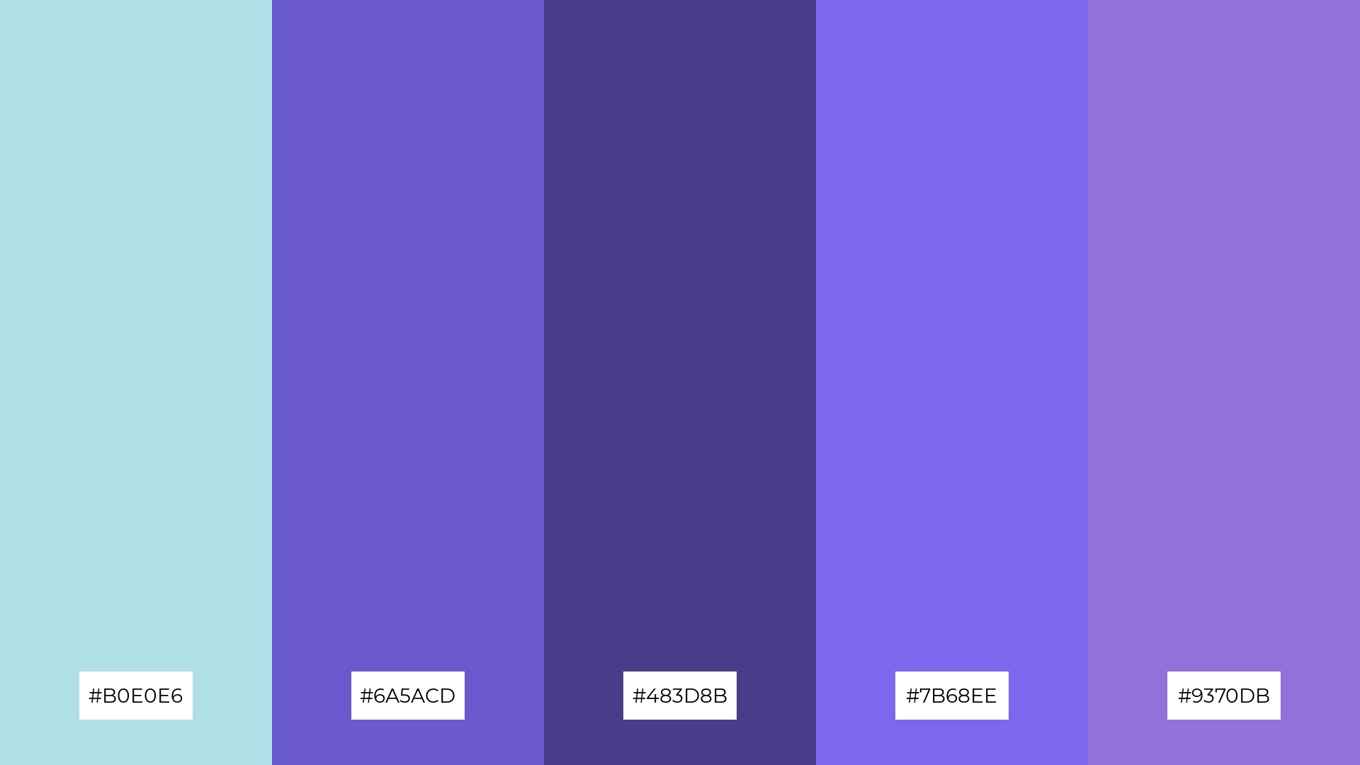
The ‘Powdered Twilight’ palette, with its blend of #B0E0E6, #6A5ACD, #483D8B, #7B68EE, and #9370DB, can evoke a sense of calm when the softer shades are paired together, creating a serene and tranquil atmosphere perfect for spa branding.
Conversely, combining the more vibrant hues in this palette can generate excitement and energy, making it ideal for vibrant marketing campaigns that aim to capture attention and convey a dynamic, engaging message.
9) Powdered Earth

The ‘Powdered Earth’ palette, featuring a mix of soft powder blue and brighter earth tones like #DEB887 and #F4A460, creates a warm and inviting atmosphere that balances tranquility with a touch of vibrancy.
This blend is ideal for home decor, where the combination of calming blues and rich, earthy hues can enhance the coziness and comfort of living spaces, making it perfect for seasonal promotions aimed at creating a welcoming and stylish environment.
10) Powdered Sky
The ‘Powdered Sky’ palette, with its gradient from soft powder blue to vibrant sky blue, creates a visual flow that evokes a sense of tranquility and optimism, making it perfect for designs aimed at promoting relaxation and well-being.
This harmonious blend of colors is ideal for lifestyle branding or tech product packaging, where the calming yet uplifting hues can enhance the user experience and convey a message of innovation and serenity.
11) Powdered Forest
The ‘Powdered Forest’ palette, with its blend of soft powder blue and rich forest greens, creates a welcoming and serene atmosphere that can transform any design into a tranquil retreat.
This palette shines in boutique interiors, where the calming blues and vibrant greens can enhance the shopping experience by creating a sophisticated and inviting environment.
12) Powdered Coral
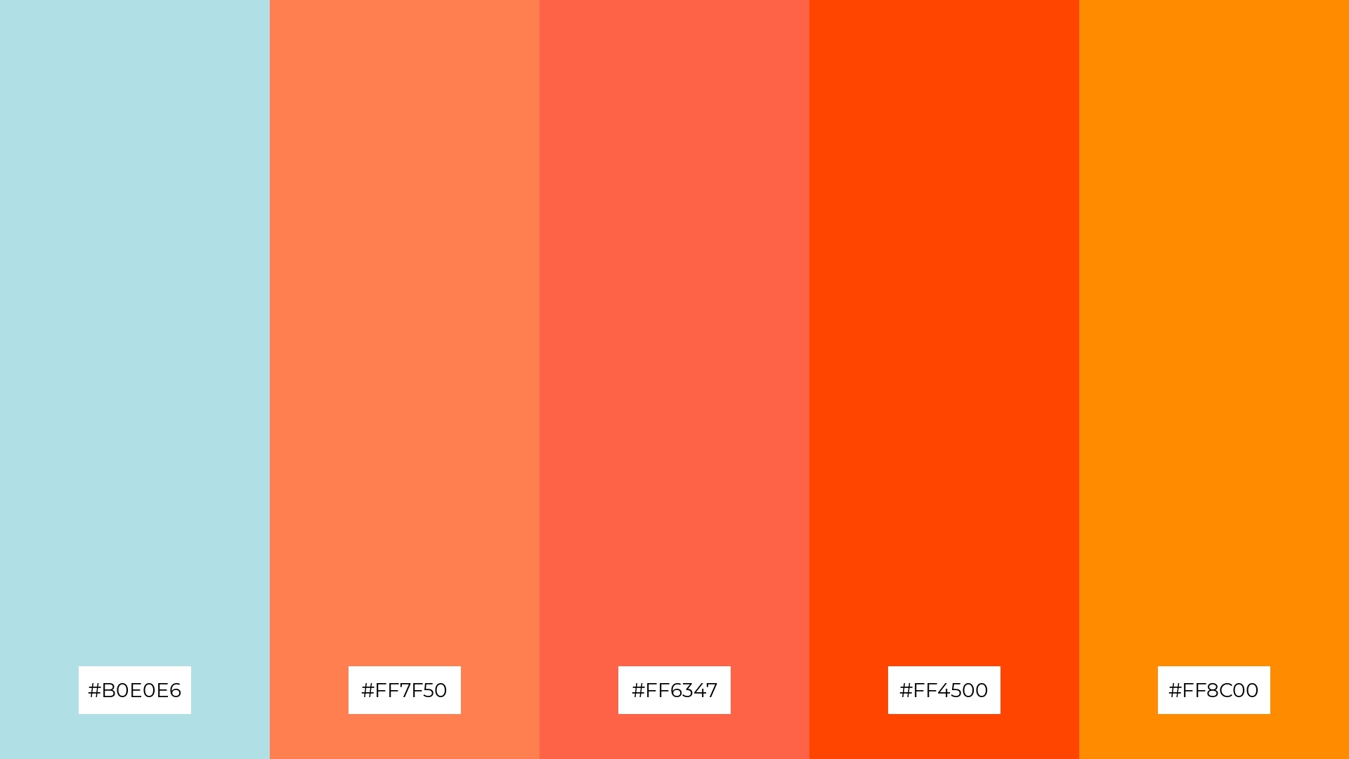
The ‘Powdered Coral’ palette, with its blend of #B0E0E6, #FF7F50, #FF6347, #FF4500, and #FF8C00, creates a striking balance between the calming powder blue and the vibrant coral hues, resulting in a visually engaging and harmonious design.
This dynamic palette is perfect for casual apparel lines, where the interplay of soft and bold colors can add a touch of sophistication and energy, making the clothing stand out while maintaining a relaxed and stylish vibe.
13) Powdered Lavender
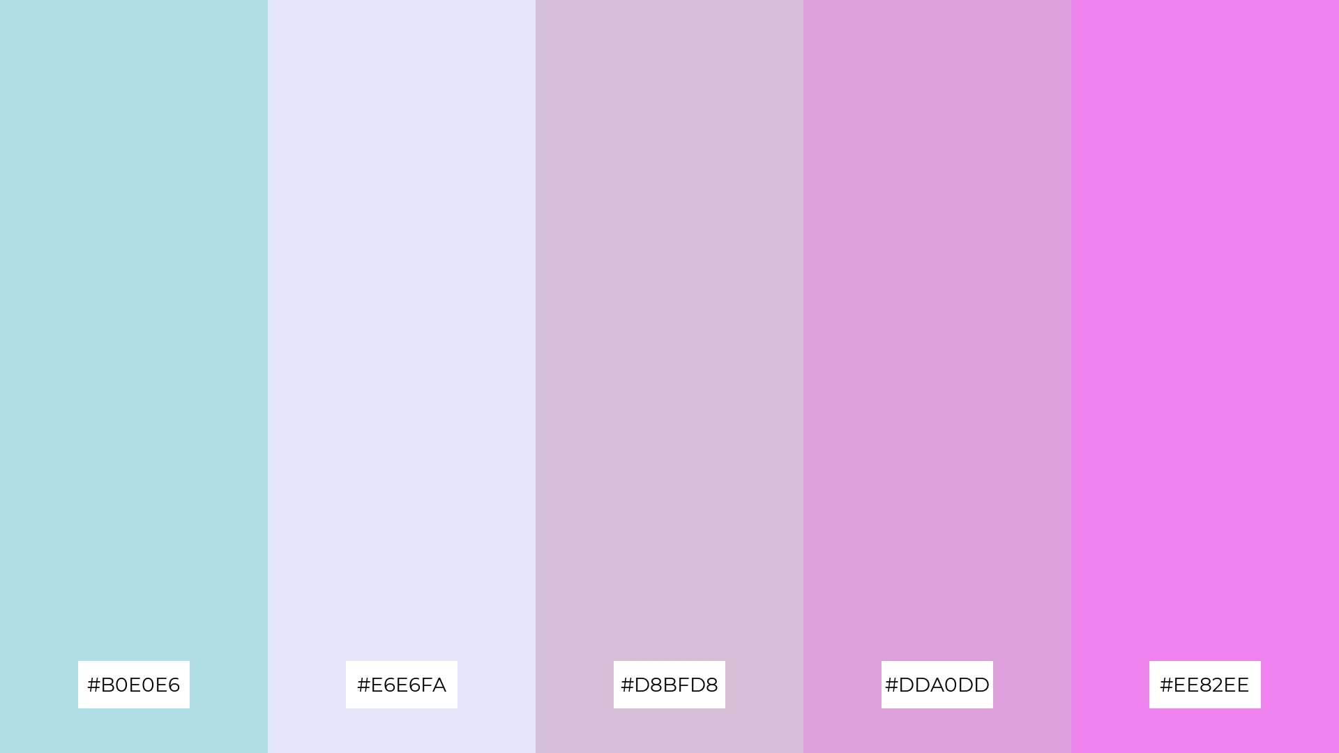
The ‘Powdered Lavender’ palette, with its blend of #B0E0E6, #E6E6FA, #D8BFD8, #DDA0DD, and #EE82EE, masterfully combines warm and cool tones to evoke a mood of gentle sophistication and serene elegance.
This unique palette is perfect for artisan product branding, where the harmonious interplay of soft blues and purples can enhance the handcrafted appeal and create a visually captivating and inviting aesthetic.
14) Powdered Autumn
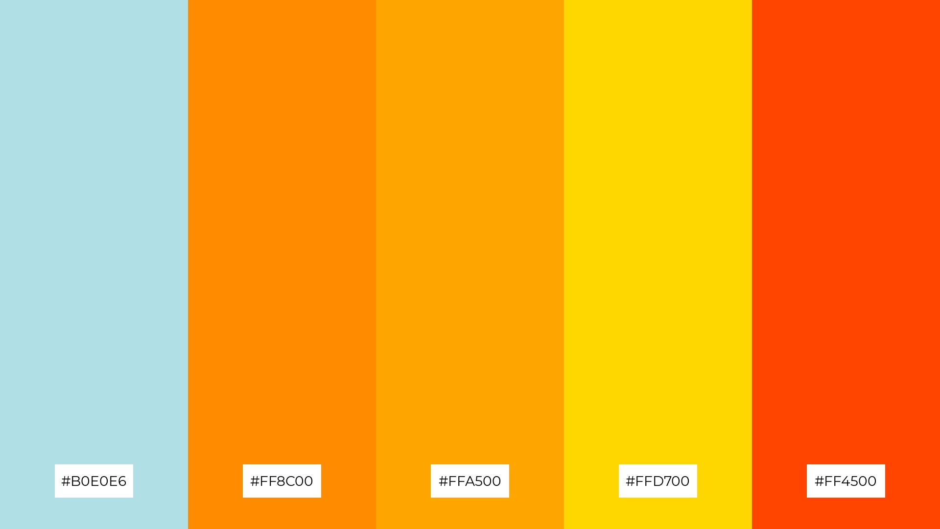
The ‘Powdered Autumn’ palette, with its blend of #B0E0E6, #FF8C00, #FFA500, #FFD700, and #FF4500, creates a dynamic interplay of soft powder blue and vibrant autumnal hues, offering both bold and subtle characteristics that can enhance any design.
This palette is perfect for festival marketing, where the striking combination of calming blues and lively oranges and yellows can capture attention and convey a sense of excitement and warmth, making the event visually appealing and inviting.
15) Powdered Mint
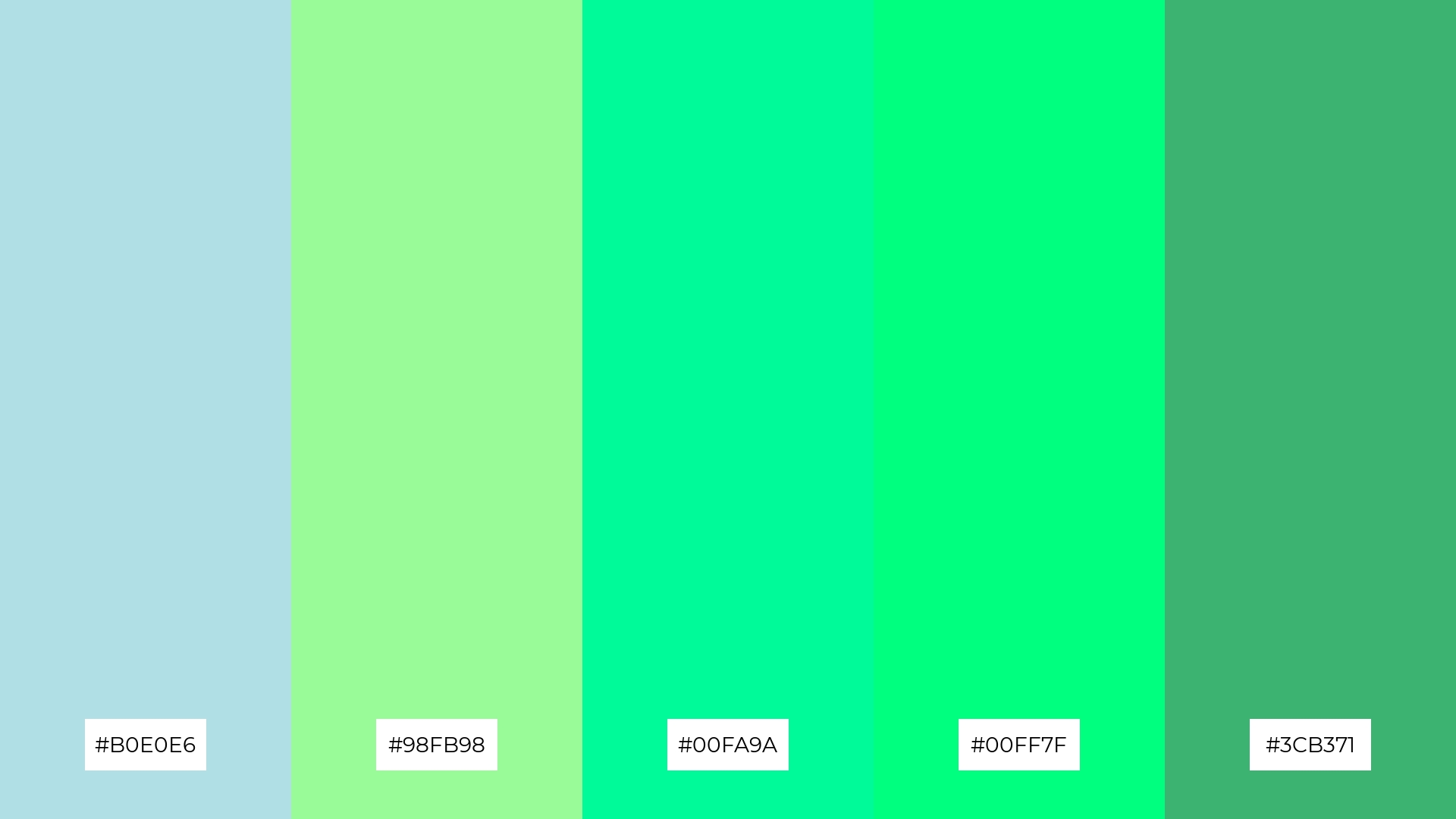
The ‘Powdered Mint’ palette, with its blend of #B0E0E6, #98FB98, #00FA9A, #00FF7F, and #3CB371, conveys a sense of harmony when the softer shades are paired together, creating a serene and refreshing atmosphere perfect for tech startups aiming to promote innovation and tranquility.
Conversely, the vibrant greens in this palette can create a striking contrast when used alongside the calming powder blue, making it ideal for cozy interior makeovers where a dynamic yet balanced aesthetic can enhance the comfort and visual appeal of living spaces.
How to Use Powder Blue Patterns in Design
In home decor, powder blue color palettes can create a serene and inviting atmosphere. Pairing powder blue with neutral tones like beige or white can enhance the tranquility of living spaces, making them perfect for bedrooms or relaxation areas.
For marketing materials, incorporating powder blue can convey professionalism and calmness. Use it as a background color to make text and images pop, or combine it with bold accent colors to draw attention to key elements in your design.
In clothing design, powder blue offers a versatile and stylish option. It can be used to create both casual and formal looks, pairing well with both soft pastels and vibrant hues to add a touch of sophistication and elegance to any outfit.
Ready to experiment with powder blue palettes in your next design project? Try creating stunning visuals with Piktochart today by visiting Piktochart.


