Choosing the right color palette for your library can significantly impact its visual appeal and user experience. A well-curated color scheme not only enhances readability but also sets the tone for the entire space.
From calming blues to vibrant reds, the colors you select can evoke different emotions and reactions. Understanding the psychology behind colors can help you create a more inviting and effective library environment.
Tips For Creating Library Color Palettes
Designing a color palette for your library requires a thoughtful approach to ensure a harmonious and engaging space.
- Balance Colors: Aim for a balanced mix of light and dark shades to create depth and contrast. This helps in making the space feel dynamic without overwhelming the senses.
- Match Complementary Shades: Use a color wheel to find complementary colors that work well together. Pairing these shades can create a visually appealing and cohesive look.
- Consider Versatility: Choose colors that can adapt to different themes and seasons. Versatile colors ensure that your library remains relevant and fresh throughout the year.
- Test Before Finalizing: Always test your color choices in the actual space. Lighting can significantly affect how colors appear, so it’s crucial to see them in context.
- Use Neutral Bases: Incorporate neutral colors like whites, grays, and beiges as a base. These colors provide a clean backdrop that allows accent colors to stand out.
15 Library Color Palettes
1) Cozy Reading Nook

The colors in ‘Cozy Reading Nook’ create a warm and inviting atmosphere, perfect for a tranquil escape. The rich browns and soft beiges interact seamlessly to form a cohesive look that exudes comfort and relaxation.
This palette is ideal for interior decor, particularly in a home library or reading corner, where the earthy tones can enhance the sense of coziness and intimacy.
2) Vintage Bookshelf
The ‘Vintage Bookshelf’ palette, with its rich browns and muted golds, evokes a sense of warmth and nostalgia, reminiscent of classic literature and timeless elegance.
This color scheme would excel in product packaging for artisanal goods or digital branding for a boutique bookstore, where the vintage tones can enhance the brand’s heritage and sophistication.
3) Serene Study

The ‘Serene Study’ palette features dominant colors like soft greens and muted beiges, creating a tranquil and balanced atmosphere.
This harmonious blend is perfect for wellness branding or eco-friendly interior spaces, where the calming and natural tones can enhance a sense of peace and sustainability.
4) Midnight Library

The ‘Midnight Library’ palette, with its blend of deep blues and vibrant teals, offers a perfect balance of soft and bold tones, creating a distinct and sophisticated mood.
This color scheme is ideal for modern web designs or creating inviting retail spaces, where the dynamic interplay of colors can enhance visual interest and user engagement.
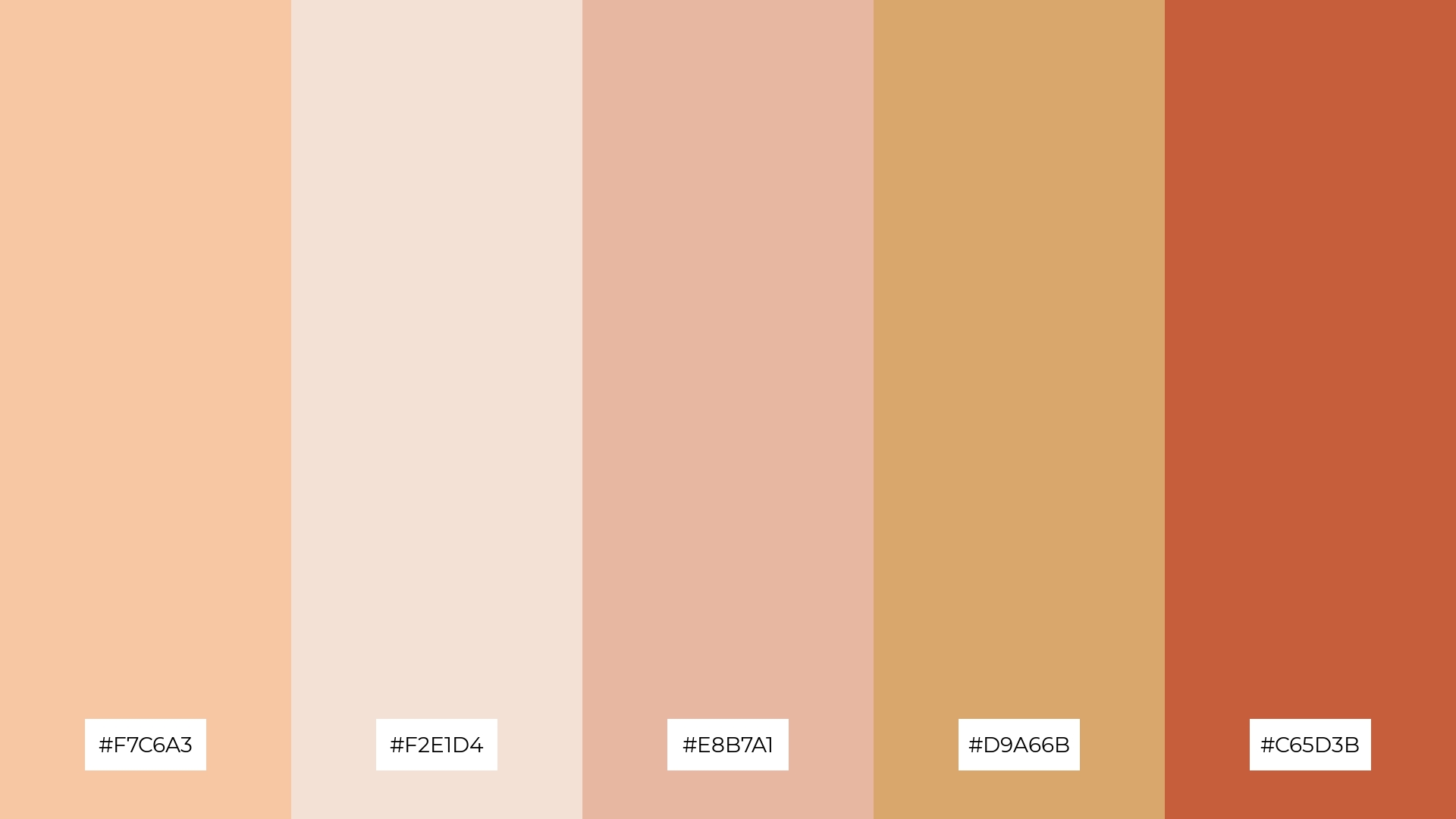
5) Autumn Leaves
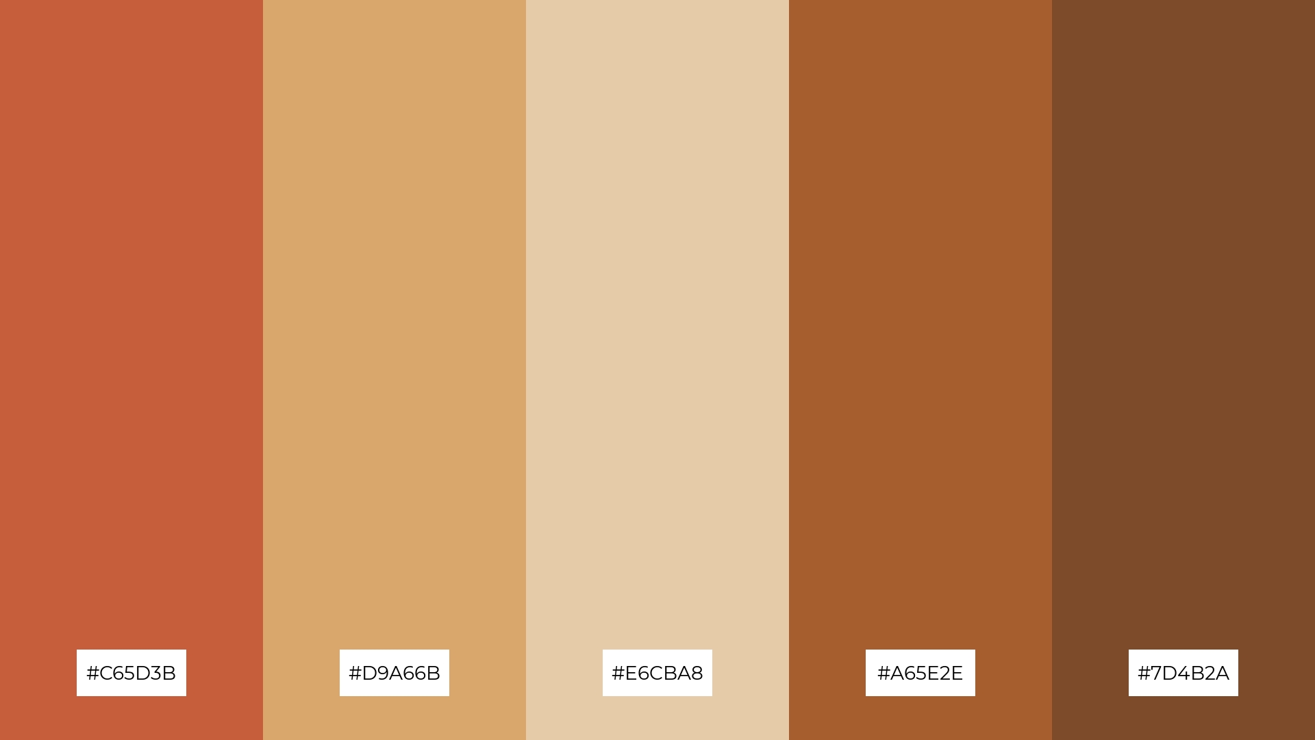
The ‘Autumn Leaves’ palette, with its rich hues of #C65D3B, #D9A66B, #E6CBA8, #A65E2E, and #7D4B2A, creates a warm and inviting ambiance that evokes the serene beauty of fall foliage.
This color scheme is perfect for wedding themes, where the earthy tones can enhance the romantic and intimate atmosphere, making it an ideal choice for autumn nuptials.
6) Classic Literature
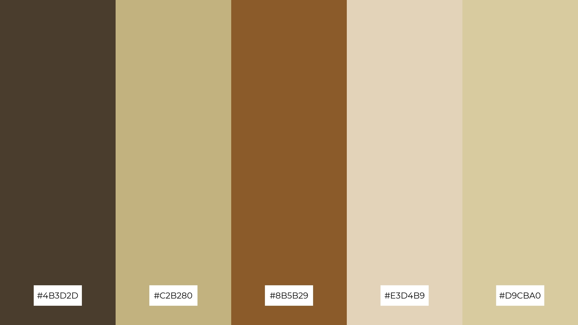
The ‘Classic Literature’ palette, with its blend of #4B3D2D, #C2B280, #8B5B29, #E3D4B9, and #D9CBA0, creates a sophisticated and timeless mood, perfect for evoking a sense of elegance and refinement.
This color scheme is ideal for minimalistic branding, where the muted and harmonious tones can enhance a brand’s understated yet luxurious appeal.
7) Whimsical Wonderland
The ‘Whimsical Wonderland’ palette, with its contrasting elements of soft pastels and rich earth tones, creates a visually captivating and dynamic aesthetic.
This color scheme is perfect for creative projects like magazine layouts or artistic websites, where the playful yet sophisticated hues can enhance visual storytelling and user engagement.
8) Tranquil Escape
The ‘Tranquil Escape’ palette, with its soothing blend of #A8D8B9 and #F0E3D7, brings a sense of calm and serenity, making it perfect for spa branding where relaxation and peace are paramount.
Conversely, the vibrant combination of #4A7C2A and #D1E8D2 can inject excitement and energy, ideal for dynamic marketing campaigns that aim to captivate and invigorate the audience.
9) Enchanted Forest
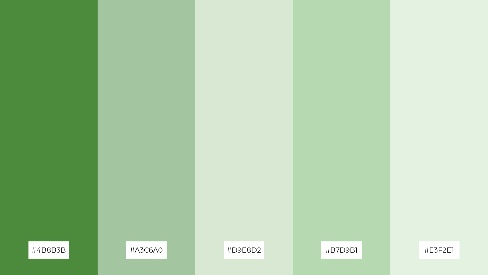
The ‘Enchanted Forest’ palette, with its softer tones of #A3C6A0 and #D9E8D2, creates a serene and refreshing atmosphere that evokes the tranquility of nature.
This harmonious blend is perfect for home decor or seasonal promotions, where the calming and rejuvenating hues can enhance a sense of peace and renewal.
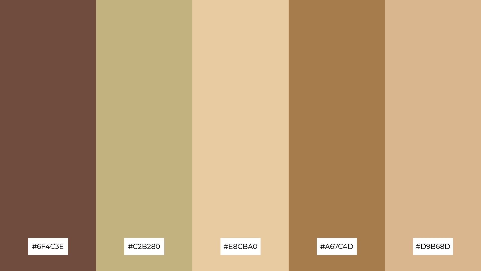
10) Timeless Classics
The ‘Timeless Classics’ palette, with its harmonious blend of #6F4C3E, #C2B280, #E8CBA0, #A67C4D, and #D9B68D, creates a visual flow that evokes a sense of warmth and understated elegance, fostering feelings of comfort and tranquility.
This sophisticated color scheme is ideal for lifestyle branding, where its timeless appeal can enhance the perception of quality and refinement, or for tech product packaging, where the muted yet rich tones can convey reliability and premium craftsmanship.
11) Soft Pastels
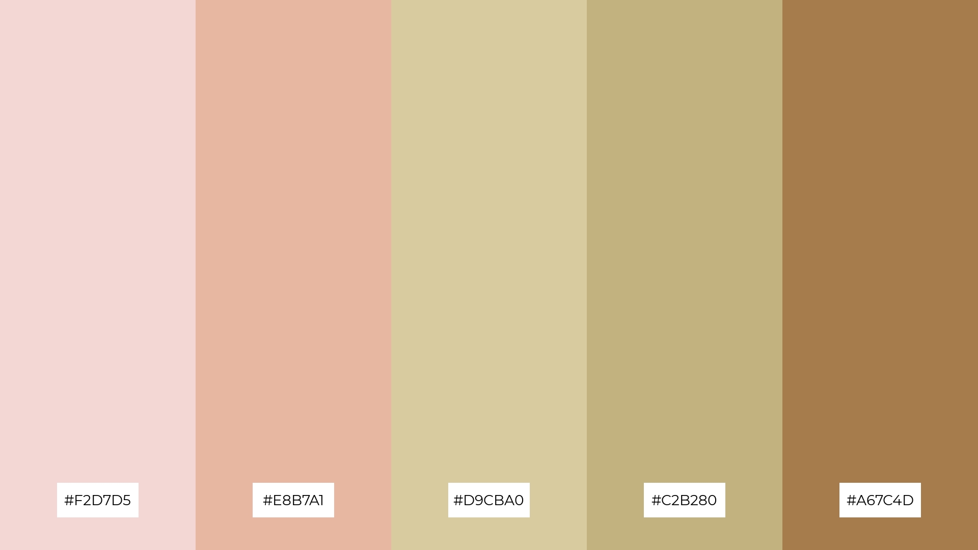
The ‘Soft Pastels’ palette, with its gentle blend of #F2D7D5, #E8B7A1, #D9CBA0, #C2B280, and #A67C4D, creates a welcoming and serene atmosphere that can make any space feel inviting and comfortable.
This color scheme is perfect for boutique interiors, where the soft and elegant tones can enhance the sense of luxury and sophistication, making it an ideal choice for creating a memorable shopping experience.
12) Rustic Charm
The hues in ‘Rustic Charm’ interact to create a feeling of balance through the warm, earthy tones of #8B5B29 and #A67C4D, contrasted by the softer, neutral shades of #D9CBA0 and #E3D4B9, with #4B3D2D adding depth and richness.
This color scheme is perfect for casual apparel lines, where the harmonious blend of warm and neutral tones can enhance the brand’s approachable and stylish appeal.
13) Oceanic Inspiration
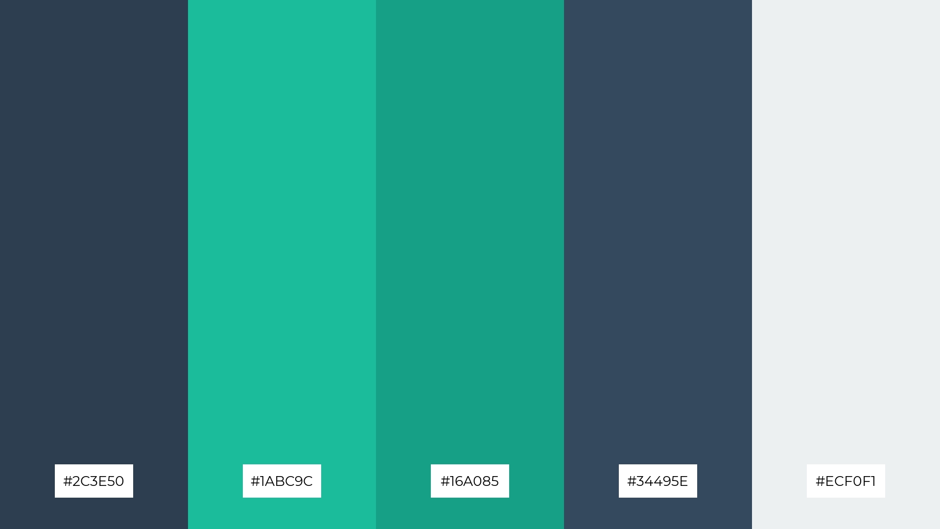
The ‘Oceanic Inspiration’ palette, with its blend of warm and cool tones like #2C3E50 and #1ABC9C, evokes a sense of tranquility and depth, reminiscent of the serene beauty of the ocean.
This color scheme is perfect for artisan product branding, where the harmonious interplay of hues can enhance the perception of craftsmanship and quality, creating a visually captivating and memorable brand identity.
14) Dreamy Dusk
The ‘Dreamy Dusk’ palette, with its blend of #6F4C3E, #C2B280, #E8CBA0, #A67C4D, and #D9B68D, creates a dynamic interplay of bold and subtle tones that evoke a sense of warmth and sophistication.
This color scheme is perfect for restaurant menus, where the rich and inviting hues can enhance the dining experience by creating an elegant and appetizing visual appeal.
15) Scholarly Vibes
The ‘Scholarly Vibes’ palette, with its blend of #4B3D2D, #C2B280, #8B5B29, #E3D4B9, and #D9CBA0, conveys a sense of harmony through its balanced mix of warm and neutral tones, creating a cohesive and inviting atmosphere.
This color scheme is ideal for cozy interior makeovers, where the rich and muted hues can enhance a sense of comfort and sophistication, making it perfect for transforming a home office or study into a serene and productive space.
How to Use Library Patterns in Design
Library color palettes can be a game-changer in various design applications. For home decor, consider using neutral bases with accent colors to create a balanced and inviting atmosphere. This approach allows for flexibility in updating the space with seasonal or thematic changes.
In marketing materials, vibrant and contrasting colors can capture attention and convey the brand’s message effectively. Use complementary shades to create visually appealing layouts that guide the viewer’s eye through the content seamlessly.
For clothing design, a harmonious blend of warm and cool tones can enhance the overall aesthetic and appeal of the collection. Experiment with different color combinations to find the perfect balance that resonates with your target audience.
Ready to bring your design ideas to life? Try creating your own library color palettes using Piktochart and see the difference it makes!


