
Jade color palettes offer a refreshing and versatile range of hues that can elevate any design project. From deep, rich greens to soft, muted tones, jade provides a unique blend of elegance and tranquility.
Whether you’re working on a digital graphic, an infographic, or a print design, incorporating jade can add a touch of sophistication and natural beauty. Explore the endless possibilities that jade color palettes bring to your creative endeavors.
Tips For Creating Jade Color Palettes
Designing with jade color palettes can be both exciting and challenging, but with the right approach, you can create stunning visuals.
- Balance your colors: Use jade as a primary color and balance it with neutral tones like white, gray, or beige to avoid overwhelming the design.
- Match complementary shades: Pair jade with complementary colors such as coral or peach to create a harmonious and visually appealing palette.
- Incorporate gradients: Use gradients that transition from jade to lighter or darker shades to add depth and dimension to your design.
- Consider the context: Think about where your design will be used and choose jade shades that fit the mood and purpose of the project.
- Test versatility: Ensure your jade palette works well across different mediums, from digital screens to printed materials, by testing it in various formats.
15 Jade Color Palettes
1) Tropical Jade
The ‘Tropical Jade’ palette, with its vibrant and deep greens, evokes a sense of lush tranquility and exotic freshness, making it perfect for creating a serene yet invigorating atmosphere.
In interior decor, this palette can transform a living space into a tropical oasis, with the varying shades of jade interacting harmoniously to create a cohesive and refreshing look that highlights the natural beauty of the environment.
2) Ocean Breeze
The ‘Ocean Breeze’ palette, with its blend of teal and blue hues, evokes a sense of calmness and serenity, reminiscent of a tranquil seaside escape.
This palette would excel in digital branding for wellness apps, where the soothing colors can create a relaxing user experience that promotes mental well-being.
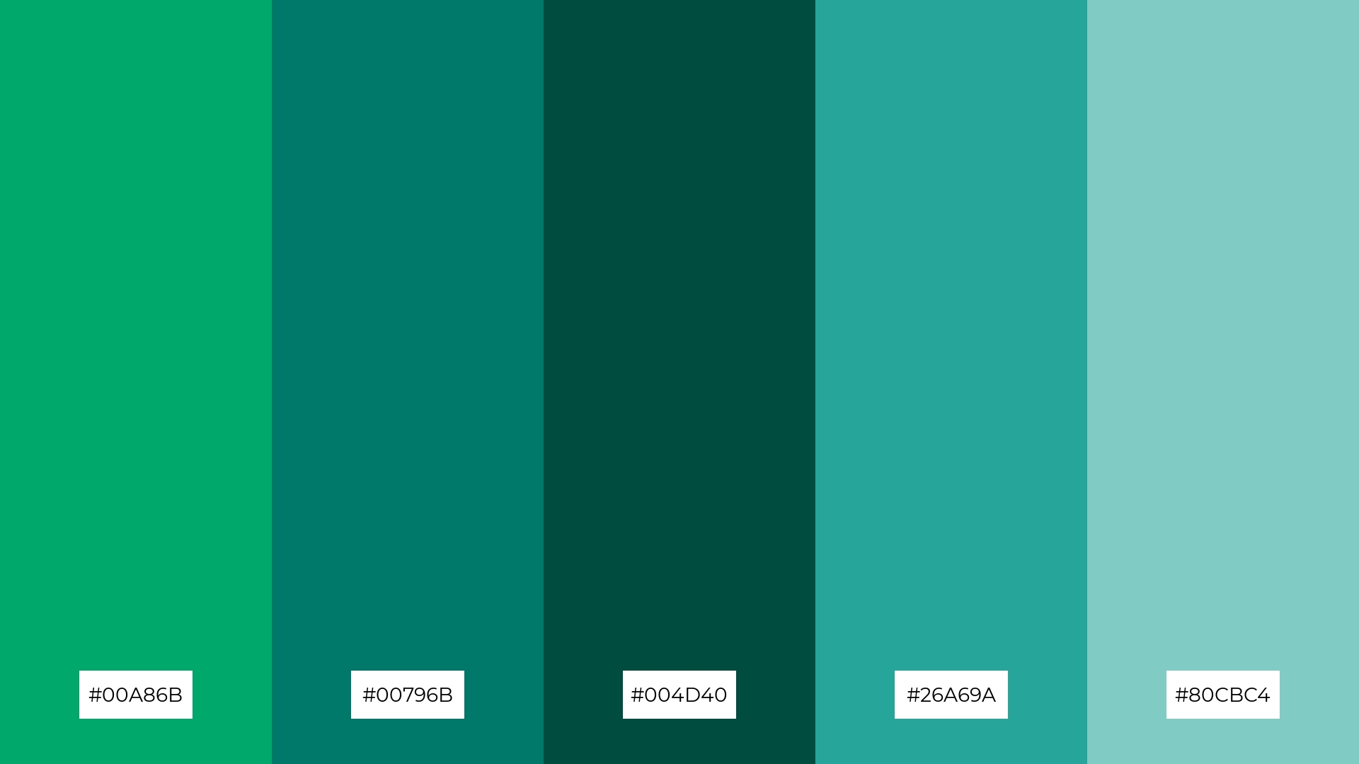
3) Forest Canopy
The ‘Forest Canopy’ palette, dominated by shades like #00A86B and #2E7D32, creates a rich and grounded visual experience that evokes the essence of lush, verdant forests.
These deep greens harmonize beautifully, making the palette ideal for eco-friendly interior spaces where the natural, calming effect of the colors can enhance the ambiance and promote a sense of well-being.
4) Jade Sunset
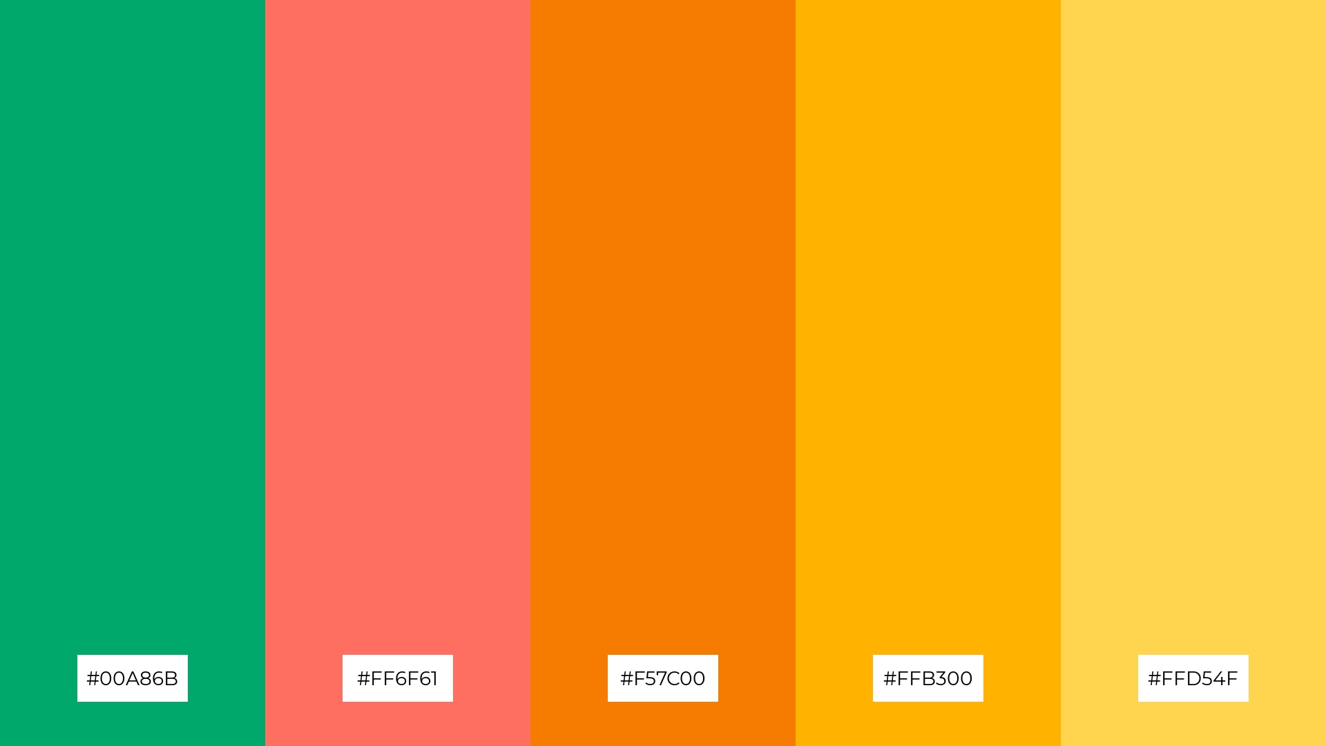
The ‘Jade Sunset’ palette, with its mix of soft jade and bold sunset hues, offers a balanced and distinct mood that combines tranquility with vibrant energy.
This palette is ideal for creating inviting retail spaces or modern web designs, where the harmonious blend of colors can attract and engage customers effectively.
5) Mystic Jade
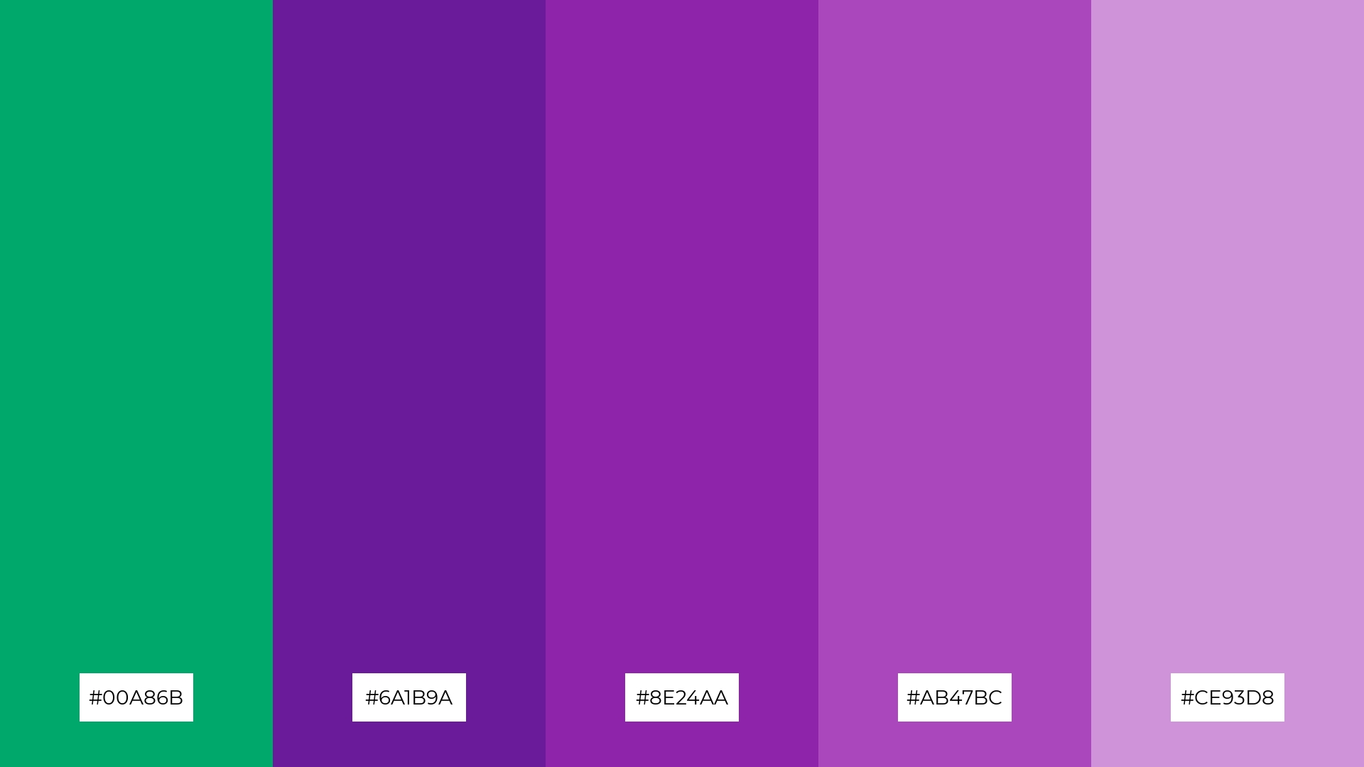
The ‘Mystic Jade’ palette, with its blend of deep jade and rich purples, creates an ambiance of mystical elegance and serene sophistication.
This palette is perfect for luxury fashion campaigns, where the harmonious interplay of these colors can evoke a sense of opulence and timeless beauty.
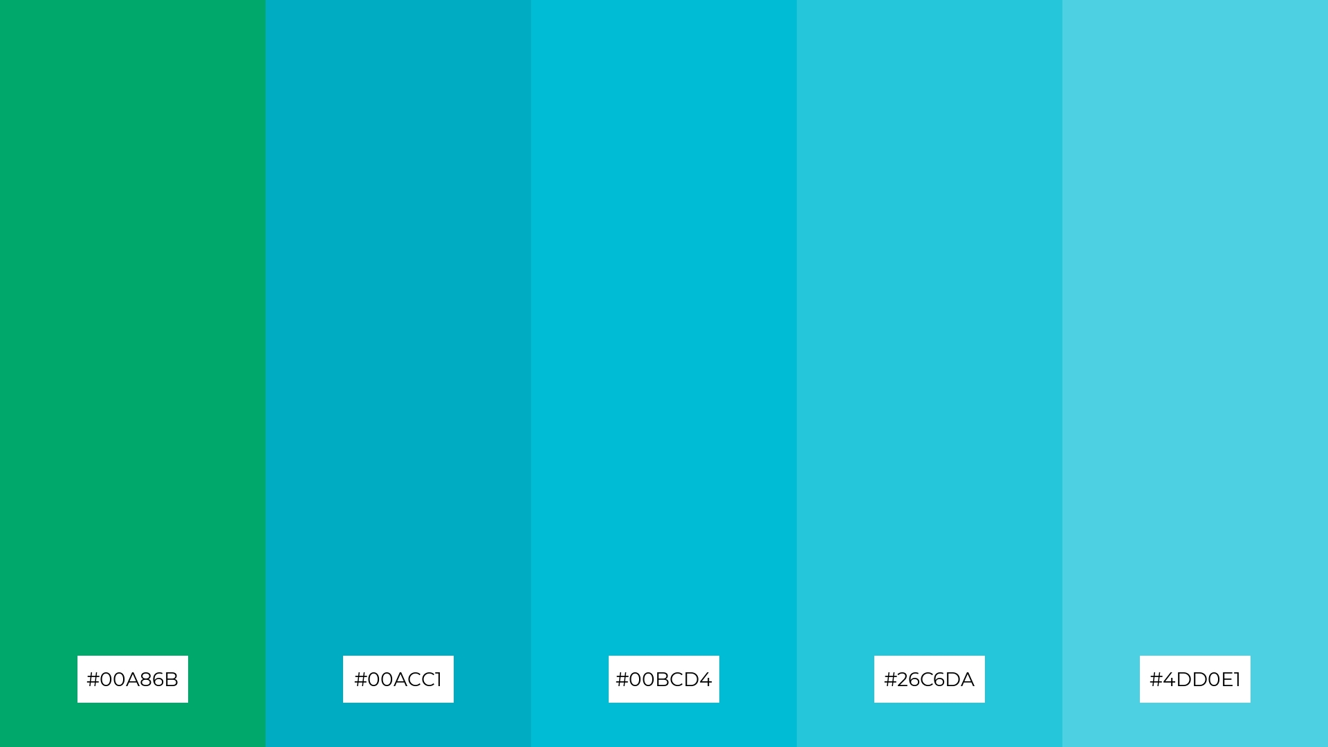
6) Jade Lagoon
The ‘Jade Lagoon’ palette, with its harmonious blend of jade and various shades of blue, creates a sophisticated yet refreshing mood that can elevate any design project.
This palette is particularly effective for minimalistic branding, where the clean and cohesive color scheme can convey a sense of modern elegance and clarity.
7) Jade Blossom
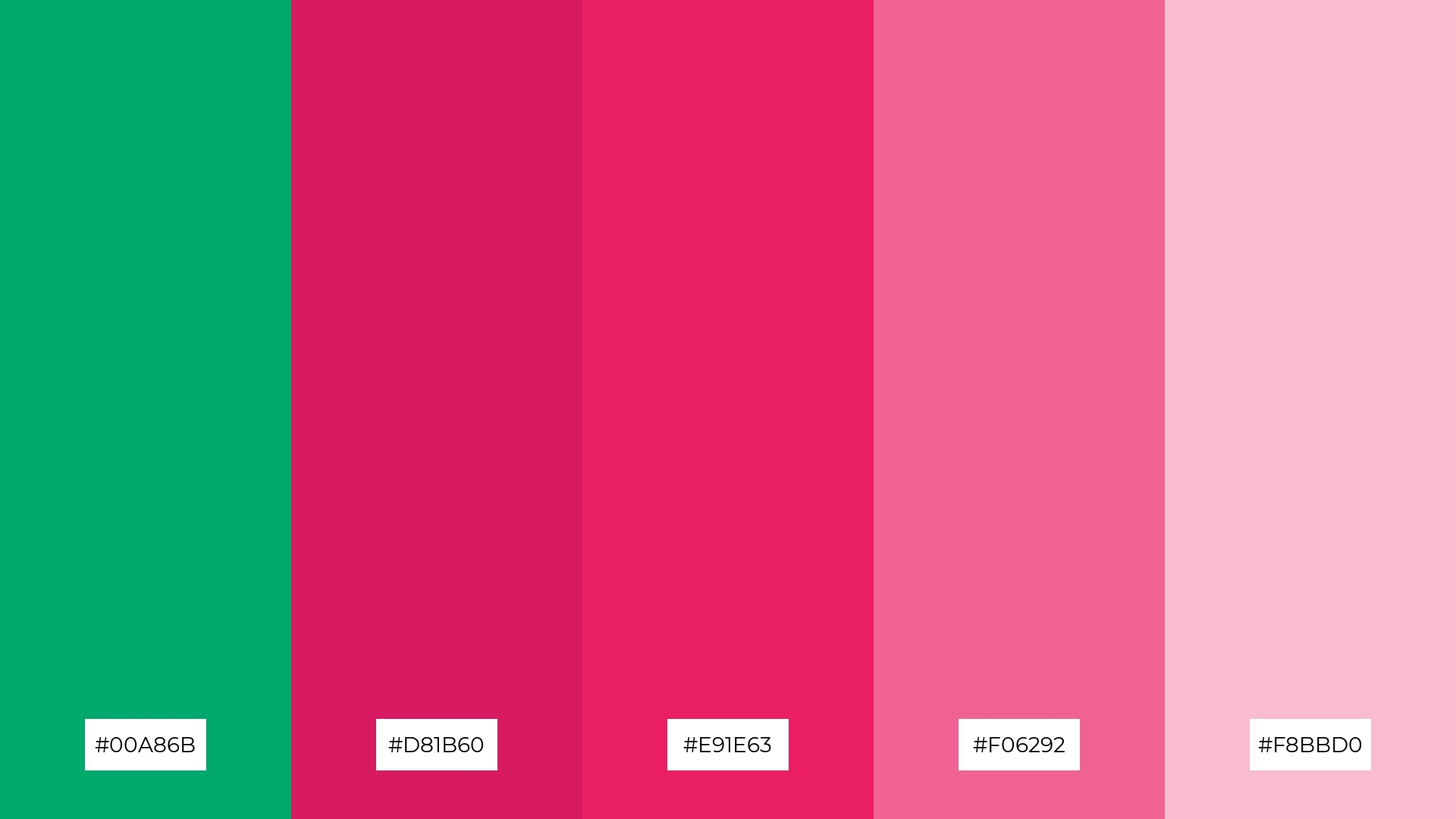
The ‘Jade Blossom’ palette, with its striking contrast between the deep jade (#00A86B) and vibrant pinks (#D81B60, #E91E63, #F06292, #F8BBD0), creates a dynamic visual interest that captivates the viewer’s attention.
This palette is ideal for creative projects like magazine layouts or artistic websites, where the bold interplay of colors can enhance the overall aesthetic and engage the audience effectively.
8) Jade Twilight
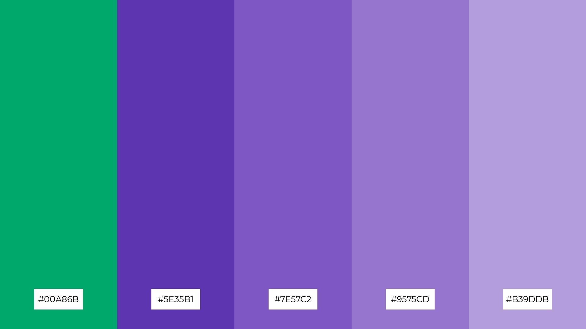
The ‘Jade Twilight’ palette, with its blend of deep jade and varying shades of purple, can evoke a sense of calm or excitement depending on the combination, making it versatile for different design needs.
This palette is particularly distinctive for spa branding, where the soothing jade and soft purples can create a tranquil atmosphere, or for vibrant marketing campaigns, where the bold interplay of colors can capture attention and energize the audience.
9) Jade Harmony
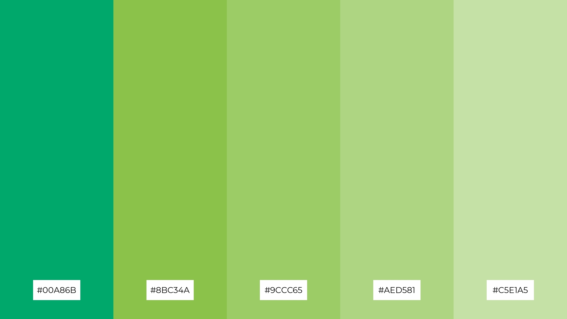
The ‘Jade Harmony’ palette, with its softer and brighter tones like #8BC34A and #C5E1A5, creates a refreshing and uplifting mood that can invigorate any space.
This blend is ideal for home decor, where the harmonious and vibrant colors can bring a sense of renewal and tranquility, or for seasonal promotions, where the lively hues can capture the essence of spring and rejuvenation.
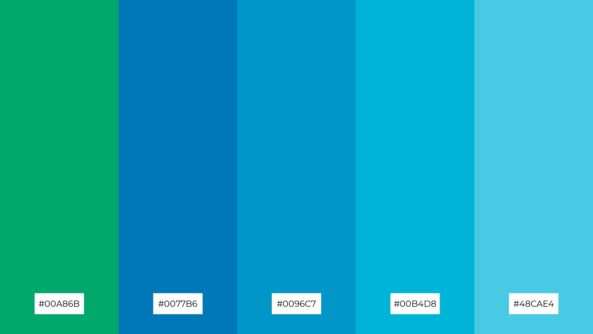
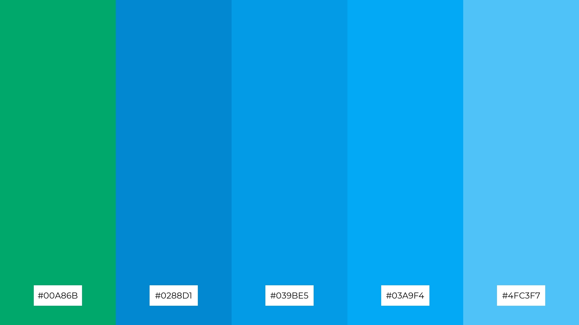
10) Jade Frost
The ‘Jade Frost’ palette, with its cool and refreshing shades of jade and blue, creates a visual flow that evokes a sense of tranquility and calm, making it perfect for designs aimed at promoting relaxation and mental clarity.
This palette would be particularly effective in lifestyle branding for wellness products or tech product packaging, where the serene and cohesive color scheme can convey a sense of modern sophistication and peacefulness, appealing to consumers seeking both style and serenity.
11) Jade Ember
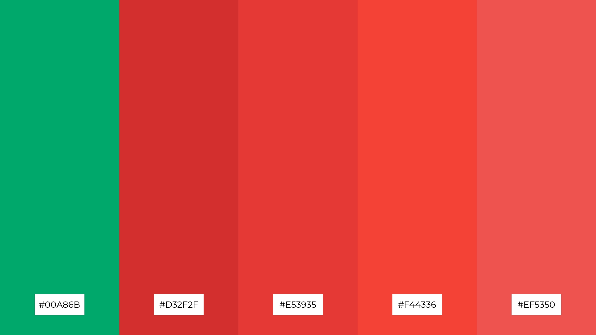
The ‘Jade Ember’ palette, with its striking combination of deep jade and fiery reds, creates a dramatic and inviting effect that can captivate and engage viewers instantly.
This palette shines in luxury e-commerce sites, where the bold and contrasting colors can highlight premium products and create a memorable shopping experience.
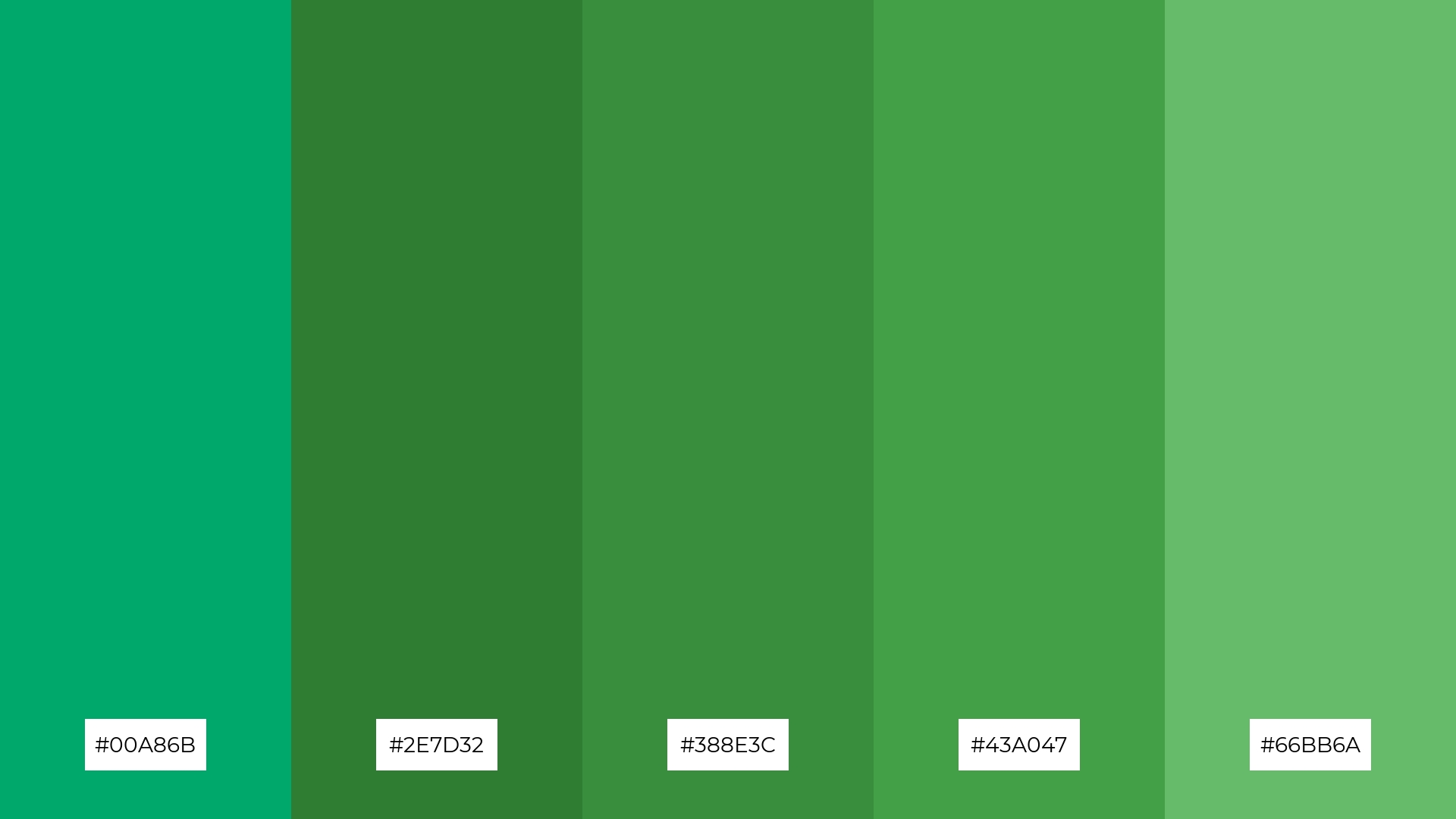
12) Jade Meadow

The hues in the ‘Jade Meadow’ palette, ranging from the deep #00A86B to the lighter #81C784, interact harmoniously to create a balanced and refreshing visual experience.
This palette is particularly fitting for sleek corporate branding, where the cohesive blend of greens can convey a sense of stability and growth, or for casual apparel lines, where the vibrant yet soothing colors can appeal to a broad audience seeking both style and comfort.
13) Jade Sky
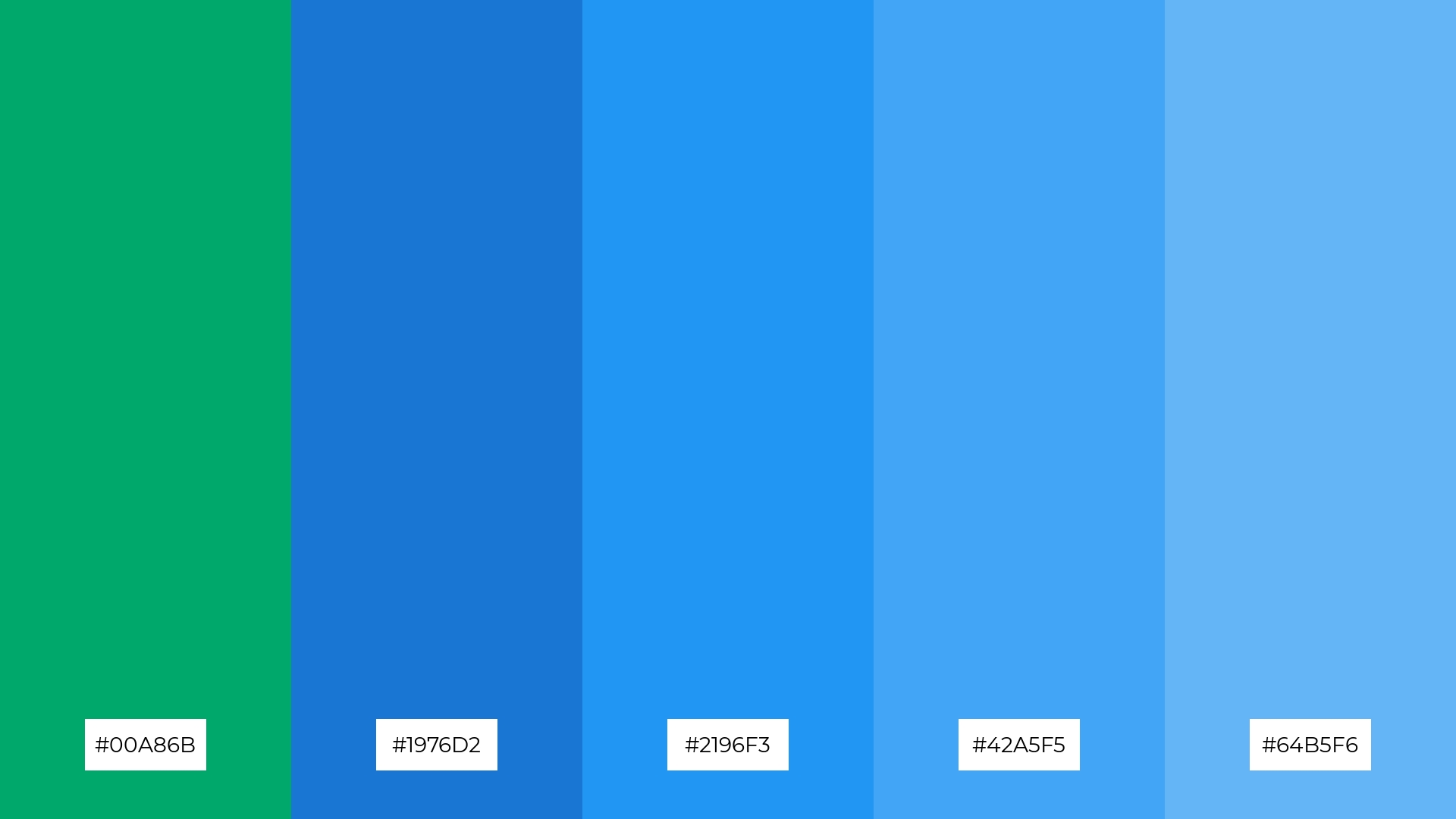
The ‘Jade Sky’ palette, with its blend of warm jade (#00A86B) and cool blues (#1976D2, #2196F3, #42A5F5, #64B5F6), creates a balanced and serene mood that evokes both tranquility and subtle energy.
This palette is uniquely suited for artisan product branding, where the harmonious interplay of colors can highlight the craftsmanship and authenticity of handmade goods, or for editorial layouts, where the soothing yet vibrant tones can enhance readability and visual appeal.
14) Jade Earth
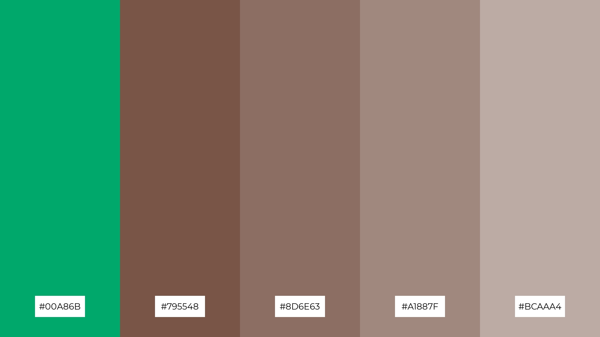
The ‘Jade Earth’ palette, with its rich jade (#00A86B) and earthy browns (#795548, #8D6E63, #A1887F, #BCAAA4), creates a dynamic interplay of bold and subtle tones that evoke a sense of natural elegance and grounded sophistication.
This palette is particularly effective for restaurant menus, where the harmonious blend of colors can enhance the visual appeal of the dishes and create an inviting dining atmosphere that reflects both warmth and refinement.
15) Jade Glow
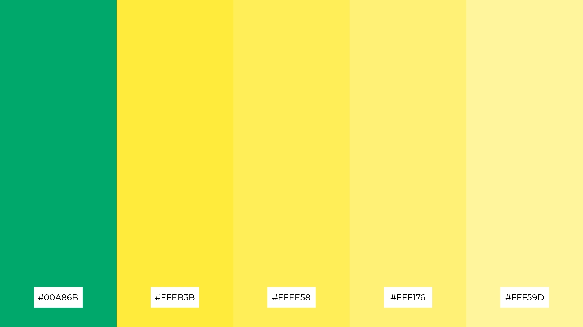
The ‘Jade Glow’ palette, with its vibrant jade (#00A86B) and sunny yellows (#FFEB3B, #FFEE58, #FFF176, #FFF59D), can convey a sense of harmony when used in balanced proportions, creating a cheerful and cohesive visual experience.
This palette is ideal for tech startups aiming to create an inviting and energetic brand identity, or for cozy interior makeovers where the warm and lively colors can brighten up the space and evoke a sense of comfort and positivity.
How to Use Jade Patterns in Design
Jade color palettes can be a game-changer in home decor, offering a refreshing and tranquil ambiance. Use deep jade tones for accent walls or furniture pieces to create a focal point, while lighter shades can be incorporated through textiles and accessories to maintain a balanced and cohesive look.
In marketing materials, jade hues can evoke a sense of sophistication and calm. Pair jade with neutral backgrounds to highlight key messages or products, and use gradients to add depth and visual interest to your designs. This approach can make your marketing campaigns more engaging and visually appealing.
For clothing design, jade palettes can bring a touch of elegance and natural beauty. Combine deep jade with complementary colors like coral or peach for a harmonious look, or use lighter jade shades for a fresh and modern aesthetic. Experiment with different combinations to find the perfect balance for your collection.
Ready to elevate your designs with jade color palettes? Try creating your own stunning palettes using Piktochart and see the difference it can make in your projects.


