Exploring copper color palettes can add a touch of warmth and sophistication to your designs. This versatile hue ranges from deep, rich tones to lighter, more subtle shades.
Whether you’re designing infographics, presentations, or social media graphics, incorporating copper can elevate your visual storytelling. Let’s delve into the world of copper and discover how to effectively use this stunning color in your projects.
Tips For Creating Copper Color Palettes
Designing with copper can transform your visuals, but it’s essential to use it wisely to achieve the best results.
- Balance with Neutrals: Pair copper with neutral colors like white, beige, or gray to create a harmonious and sophisticated look.
- Complementary Shades: Use complementary colors such as teal or navy blue to make the copper elements stand out and add depth to your design.
- Gradients and Textures: Incorporate gradients and textures to add dimension and interest to your copper color palette, making it more dynamic.
- Accent Use: Use copper as an accent color rather than the primary hue to avoid overwhelming the design and to highlight key elements.
- Versatility: Ensure your copper palette is versatile by testing it across different mediums, such as print and digital, to maintain consistency.
- Contrast: Maintain good contrast between copper and other colors to ensure readability and visual appeal, especially in text-heavy designs.
15 Copper Color Palettes
1) Autumn Glow
The ‘Autumn Glow’ palette evokes a warm, inviting mood with its blend of earthy and vibrant tones, reminiscent of a cozy fall evening.
These colors interact seamlessly to create a cohesive look, perfect for interior decor where the rich hues can transform a space into a welcoming retreat.
2) Rustic Charm

The ‘Rustic Charm’ palette, with its blend of deep reds and earthy browns, evokes a sense of warmth and nostalgia, reminiscent of cozy cabins and autumn leaves.
This palette would excel in product packaging for artisanal goods, where the rich, inviting colors can convey a handcrafted, authentic feel to potential customers.
3) Sunset Hues
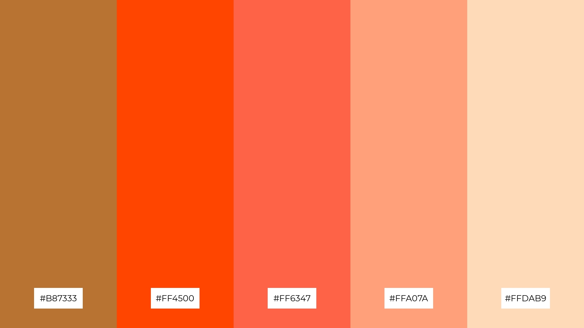
The ‘Sunset Hues’ palette features dominant colors such as #B87333, #FF4500, #FF6347, #FFA07A, and #FFDAB9, which blend together to create a vibrant and harmonious visual experience.
This palette is ideal for wellness branding, where the warm and inviting tones can evoke feelings of comfort and tranquility, making it perfect for creating a serene and welcoming atmosphere.
4) Vintage Elegance
The ‘Vintage Elegance’ palette, with its mix of soft and bold tones, creates a distinct mood that balances sophistication and warmth.
This palette is ideal for creating inviting retail spaces or modern web designs, where the harmonious blend of colors can enhance the overall aesthetic and appeal.
5) Copper Patina
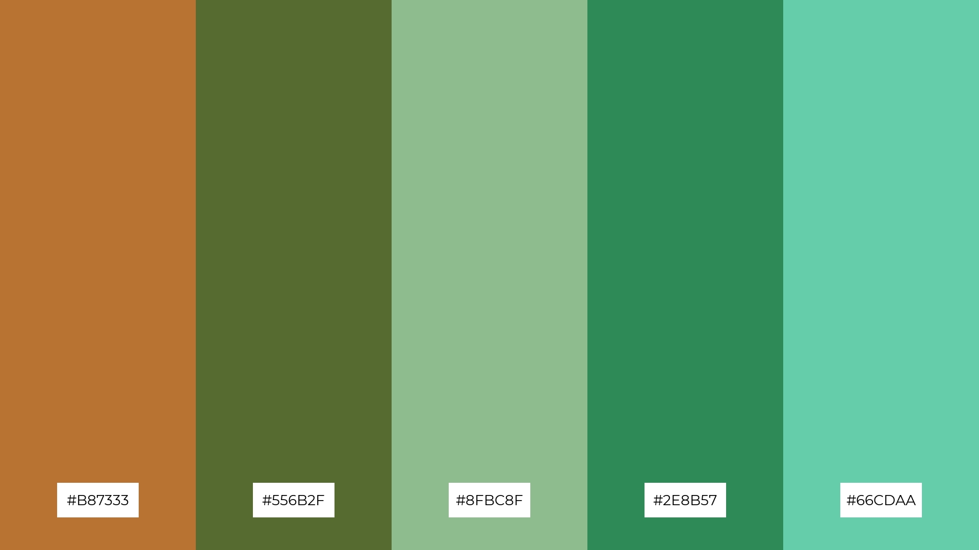
The ‘Copper Patina’ palette, with its blend of #B87333, #556B2F, #8FBC8F, #2E8B57, and #66CDAA, creates a serene and sophisticated ambiance, reminiscent of aged metals and natural patinas.
This palette is perfect for luxury fashion campaigns, where the harmonious mix of earthy and metallic tones can convey a sense of timeless elegance and refined style.
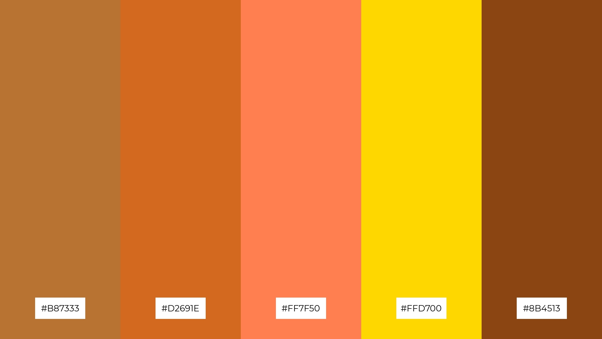
6) Earthy Tones
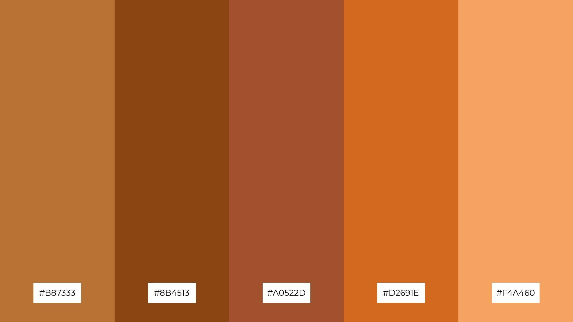
The ‘Earthy Tones’ palette, with its blend of #B87333, #8B4513, #A0522D, #D2691E, and #F4A460, creates a harmonious and grounded aesthetic that can evoke a sense of sophistication and natural elegance.
This palette is ideal for minimalistic branding, where the rich, warm hues can convey a refined and understated charm, making it perfect for eco-friendly products or artisanal crafts.
7) Warm Embrace
The ‘Warm Embrace’ palette, with its contrasting elements of deep copper (#B87333) and bright gold (#FFD700), creates a dynamic visual interest that captures attention and evokes a sense of warmth and energy.
This palette is perfect for creative projects like magazine layouts or artistic websites, where the vibrant and harmonious colors can enhance the overall aesthetic and engage the audience effectively.
8) Desert Mirage
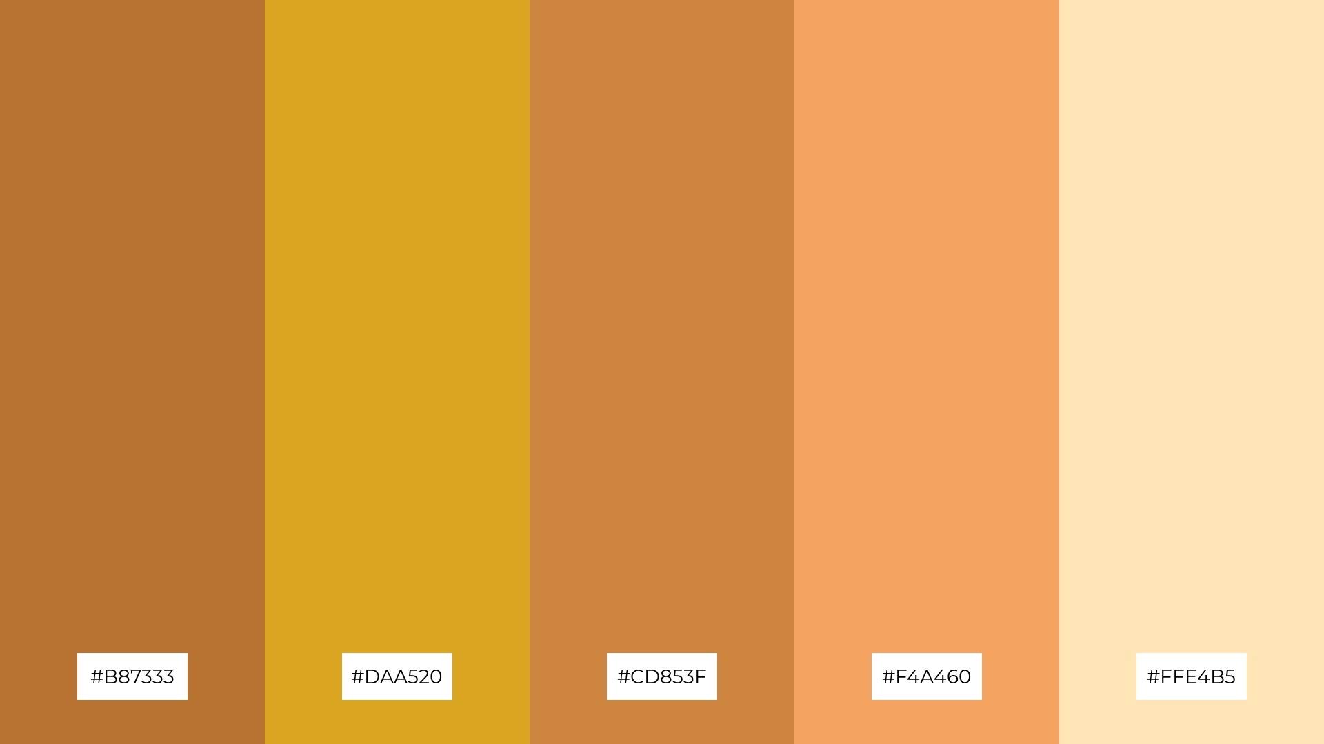
The ‘Desert Mirage’ palette, with its blend of #B87333, #DAA520, #CD853F, #F4A460, and #FFE4B5, can evoke a sense of calm when the softer tones are combined, creating a serene and soothing atmosphere.
Alternatively, the vibrant hues in this palette can be used to generate excitement and energy, making it perfect for dynamic marketing campaigns that aim to capture attention and inspire action.
9) Copper and Teal
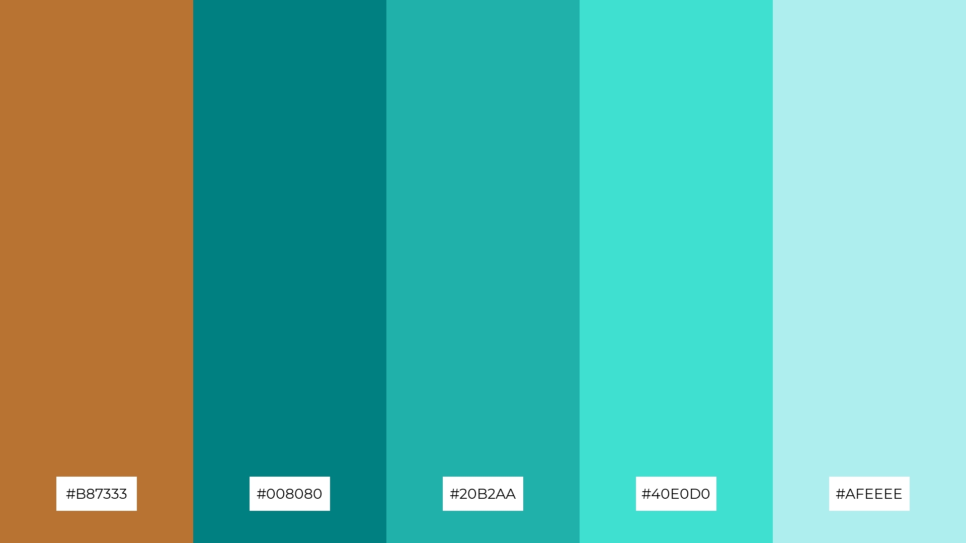
The ‘Copper and Teal’ palette, with its mix of softer tones like #AFEEEE and brighter hues such as #40E0D0, creates a refreshing and balanced visual experience.
This blend of colors evokes a sense of tranquility and vibrancy, making it ideal for home decor or seasonal promotions where a lively yet calming atmosphere is desired.
10) Forest Copper
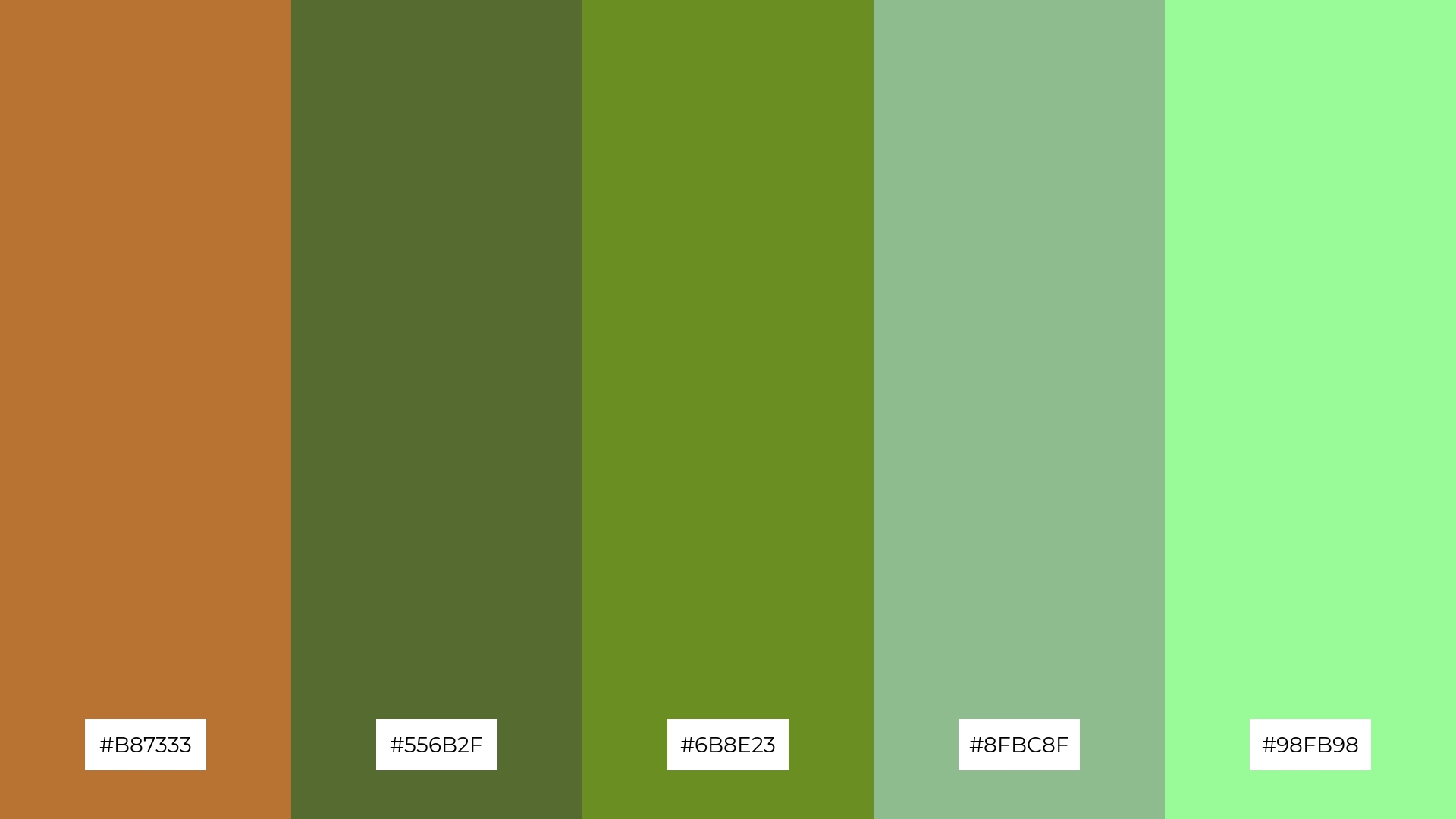
The ‘Forest Copper’ palette, with its harmonious blend of #B87333, #556B2F, #6B8E23, #8FBC8F, and #98FB98, creates a visual flow that evokes a sense of tranquility and connection to nature, making it perfect for designs that aim to soothe and relax the viewer.
This palette would be ideal for lifestyle branding, such as eco-friendly product lines or wellness apps, where the calming and earthy tones can enhance the brand’s message of sustainability and well-being.
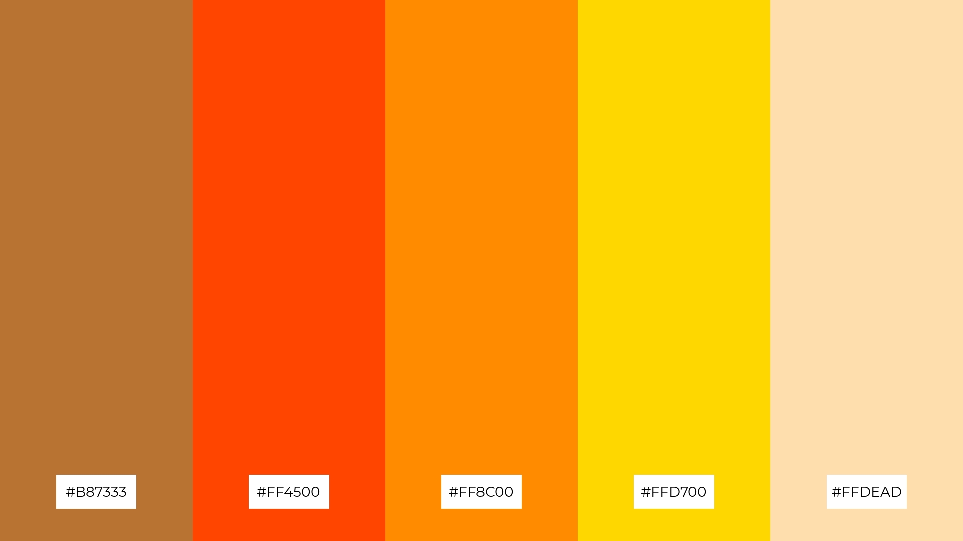
11) Copper Sunset
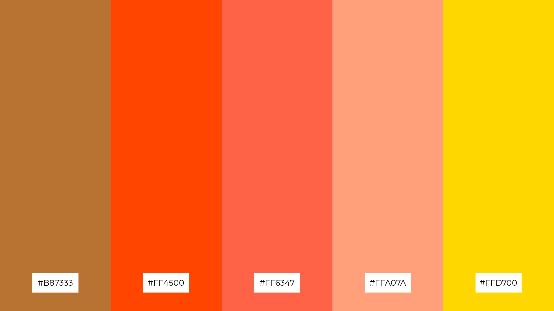
The ‘Copper Sunset’ palette, with its blend of #B87333, #FF4500, #FF6347, #FFA07A, and #FFD700, creates a welcoming effect by combining warm and vibrant tones that evoke the comforting glow of a sunset.
This palette shines in boutique interiors, where the rich and inviting colors can create a dramatic yet cozy atmosphere, enhancing the overall shopping experience and making the space feel both luxurious and approachable.
12) Copper and Blue
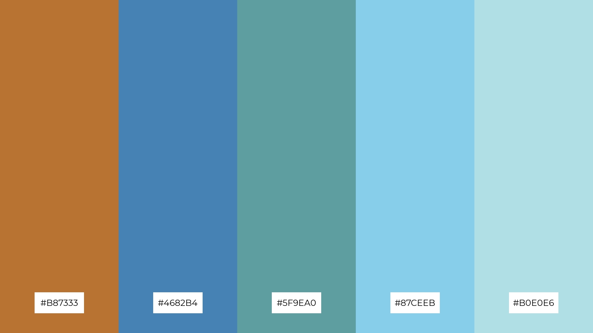
The ‘Copper and Blue’ palette, with its mix of #B87333, #4682B4, #5F9EA0, #87CEEB, and #B0E0E6, creates a striking balance by combining the warmth of copper with the coolness of blue, resulting in a visually appealing contrast that is both dynamic and harmonious.
This palette is perfect for sleek corporate branding, where the sophisticated blend of warm and cool tones can convey professionalism and modernity, making a strong impression on clients and stakeholders.
13) Copper and Lavender
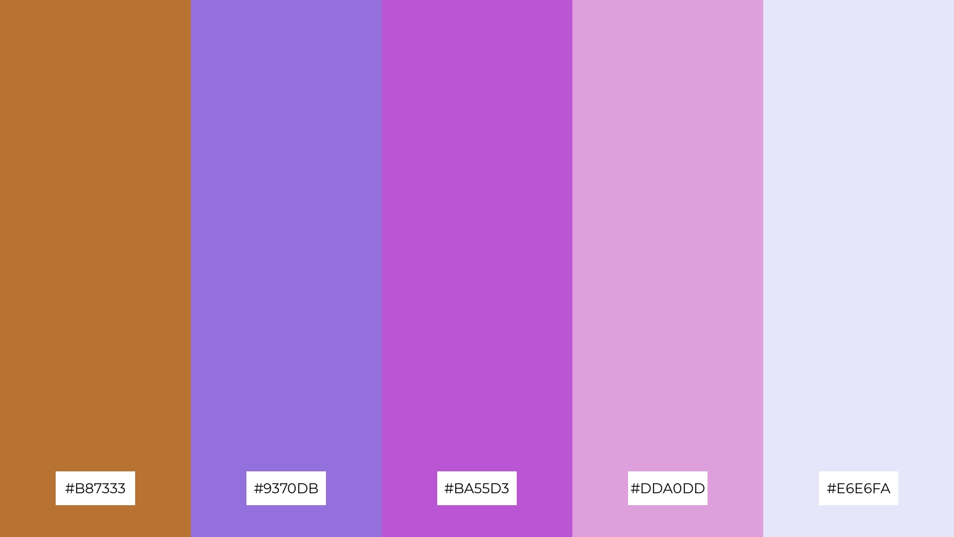
The ‘Copper and Lavender’ palette, with its blend of warm copper (#B87333) and cool lavender tones (#9370DB, #BA55D3, #DDA0DD, #E6E6FA), creates a balanced and serene mood that is both inviting and sophisticated.
This unique combination is perfect for artisan product branding, where the harmonious mix of warm and cool hues can convey a sense of handcrafted elegance and modern charm, making the products stand out in a crowded market.
14) Copper and Coral
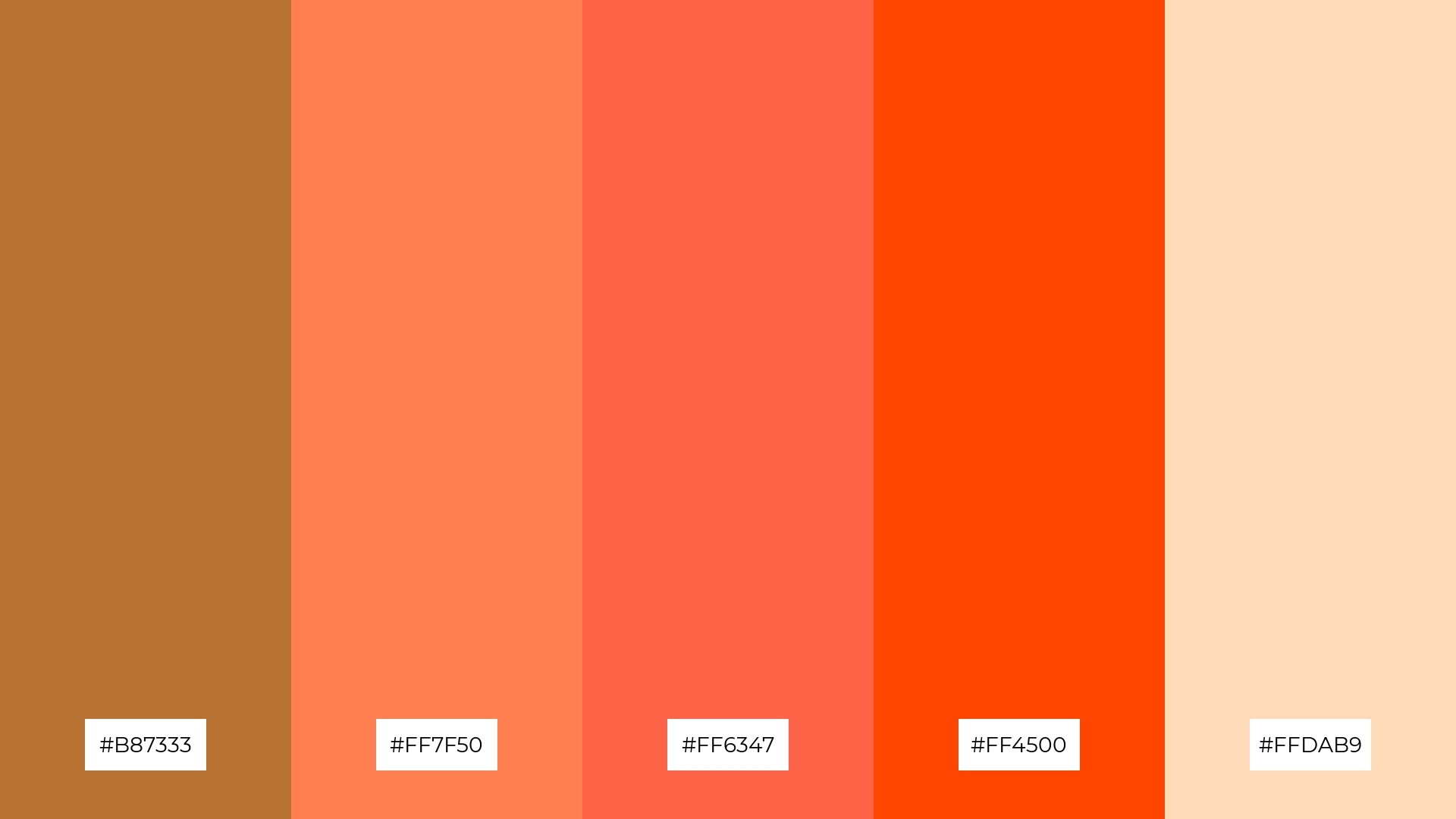
The ‘Copper and Coral’ palette, with its vibrant mix of #B87333, #FF7F50, #FF6347, #FF4500, and #FFDAB9, creates a dynamic interplay of warm hues that can either stand out boldly or blend subtly, depending on the design context.
This palette is perfect for festival marketing, where the energetic and inviting colors can capture attention and evoke a sense of excitement and celebration, making promotional materials visually compelling and memorable.
15) Copper and Olive
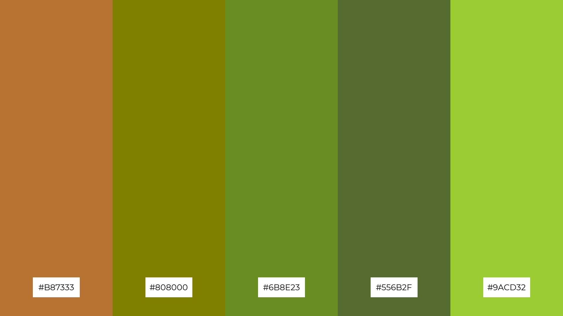
The ‘Copper and Olive’ palette, with its blend of #B87333, #808000, #6B8E23, #556B2F, and #9ACD32, conveys a sense of harmony through its earthy and natural tones, creating a balanced and soothing visual experience.
This palette is ideal for cozy interior makeovers, where the warm copper and calming olive hues can transform a space into a welcoming retreat, or for tech startups looking to create a modern yet grounded brand identity that stands out in a competitive market.
How to Use Copper Patterns in Design
Incorporating copper color palettes into your design can add a touch of elegance and warmth, making it a versatile choice for various applications. For home decor, consider using copper accents in combination with neutral tones to create a sophisticated and inviting atmosphere. In marketing materials, copper can be used to highlight key elements and draw attention, especially when paired with complementary colors like teal or navy blue.
When designing clothing, copper hues can evoke a sense of luxury and timeless style. Use copper as an accent color in accessories or as a primary color in statement pieces to create a bold and fashionable look. Additionally, incorporating gradients and textures can add depth and interest to your designs, making them more dynamic and visually appealing.
Ready to elevate your designs with stunning copper color palettes? Try creating your own using Piktochart, a web-based graphic design tool and infographic maker. Get started today and bring your creative vision to life!


