Chocolate color palettes offer a rich and versatile range of hues that can elevate any design project. From deep, velvety browns to creamy, light tans, these palettes evoke warmth and sophistication.
Whether you’re designing for a brand, creating an infographic, or simply looking to add a touch of elegance, chocolate tones provide a timeless appeal. Explore the endless possibilities that chocolate color palettes can bring to your creative endeavors.
Tips For Creating Chocolate Color Palettes
Designing with chocolate color palettes can be both exciting and challenging. Here are some practical tips to help you create stunning and versatile designs:
- Balance your colors: Use a mix of light and dark chocolate tones to create depth and contrast in your design.
- Match complementary shades: Pair chocolate hues with complementary colors like teal, gold, or soft pink to enhance visual interest.
- Consider the context: Think about where your design will be used and choose chocolate tones that fit the mood and purpose of the project.
- Use accent colors sparingly: Incorporate bright or bold colors as accents to avoid overwhelming the chocolate palette.
- Test your palette: Experiment with different combinations and get feedback to ensure your color choices work well together.
- Stay versatile: Create a palette that can be easily adapted for various design elements, from backgrounds to text and graphics.
15 Chocolate Color Palettes
1) Autumn Delight
The ‘Autumn Delight’ palette, with its warm and earthy tones, evokes a cozy and inviting mood reminiscent of fall foliage and rustic charm.
These colors interact harmoniously to create a cohesive look, perfect for interior decor that aims to bring the warmth and comfort of autumn indoors.
2) Cocoa Dream
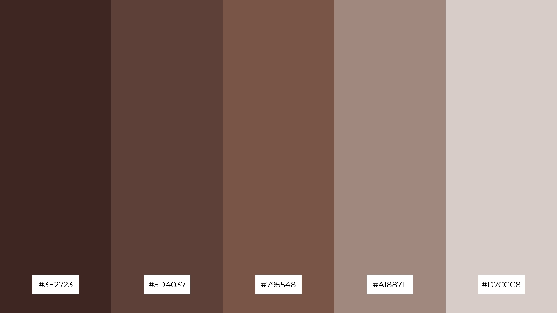
The ‘Cocoa Dream’ palette, with its deep and rich browns (#3E2723, #5D4037, #795548), evokes a sense of warmth and comfort, making it ideal for creating inviting and cozy atmospheres.
In the context of product packaging, these colors can enhance the perception of quality and luxury, making them perfect for gourmet food items or artisanal products.
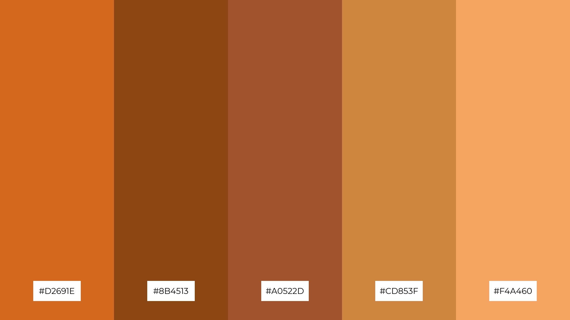
3) Sweet Caramel
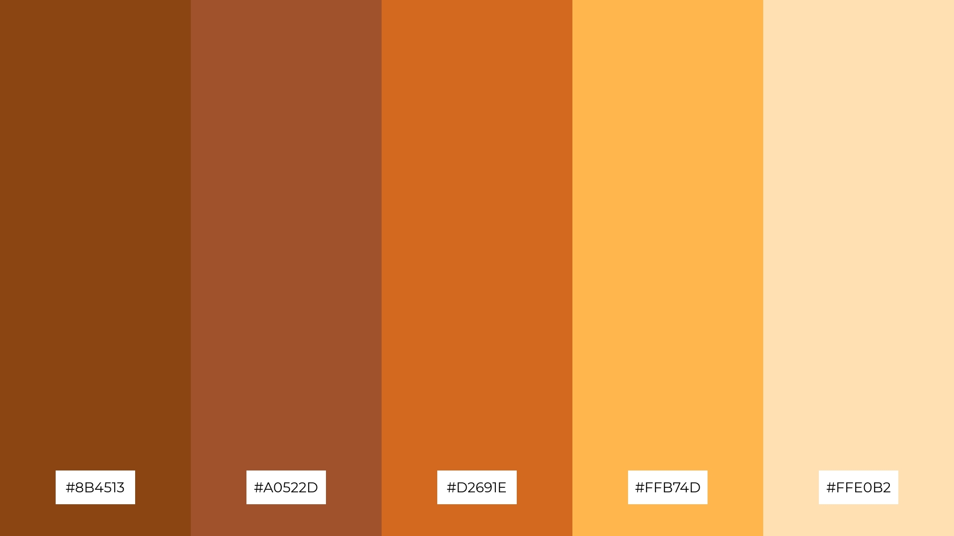
The ‘Sweet Caramel’ palette, featuring dominant colors like #8B4513, #A0522D, #D2691E, #FFB74D, and #FFE0B2, creates a harmonious blend of rich, earthy tones and soft, inviting hues.
This palette is particularly effective for wellness branding, where the warm and soothing colors can evoke feelings of comfort and natural well-being, making it ideal for eco-friendly interior spaces.
4) Mocha Bliss

The ‘Mocha Bliss’ palette, with its blend of soft and bold tones (#4E342E, #6D4C41, #8D6E63, #BCAAA4, #D7CCC8), creates a distinct mood that is both sophisticated and inviting.
This palette is ideal for designing modern web interfaces or creating inviting retail spaces that aim to offer a warm and welcoming atmosphere.
5) Rustic Charm
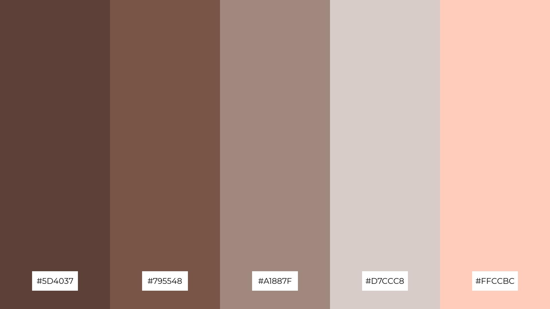
The ‘Rustic Charm’ palette, with its blend of earthy browns and soft neutrals (#5D4037, #795548, #A1887F, #D7CCC8, #FFCCBC), creates a serene and grounded ambiance, perfect for evoking a sense of natural elegance.
This harmonious combination is ideal for wedding themes, where the warm and inviting tones can enhance the romantic and intimate atmosphere of the celebration.
6) Chocolate Mint
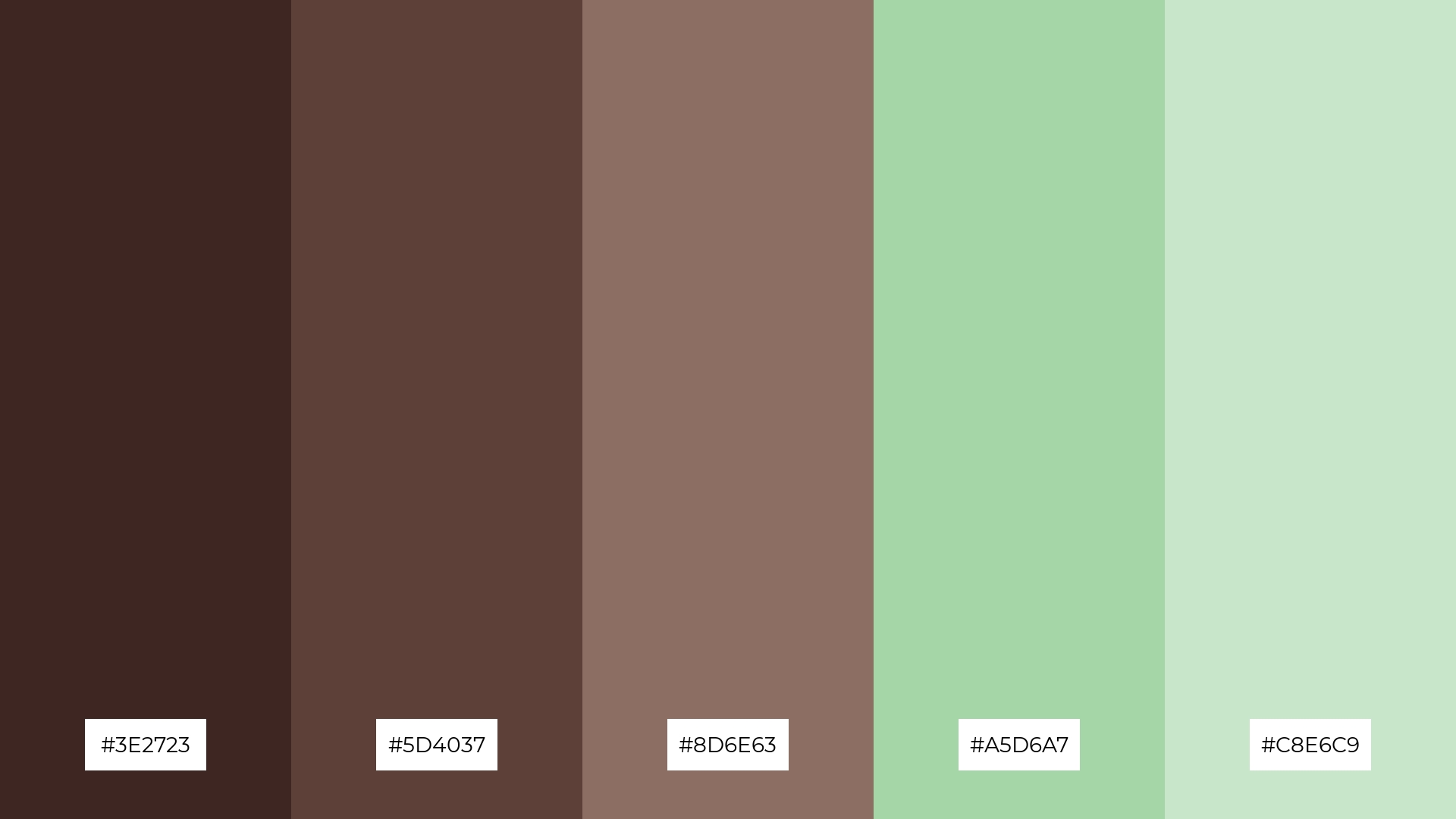
The ‘Chocolate Mint’ palette, with its rich browns and refreshing mint greens (#3E2723, #5D4037, #8D6E63, #A5D6A7, #C8E6C9), creates a sophisticated yet playful mood, balancing warmth and freshness effortlessly.
This harmonious blend is perfect for minimalistic branding, where the contrast between deep chocolate tones and light mint hues can convey both elegance and a touch of modernity.
7) Berry Chocolate
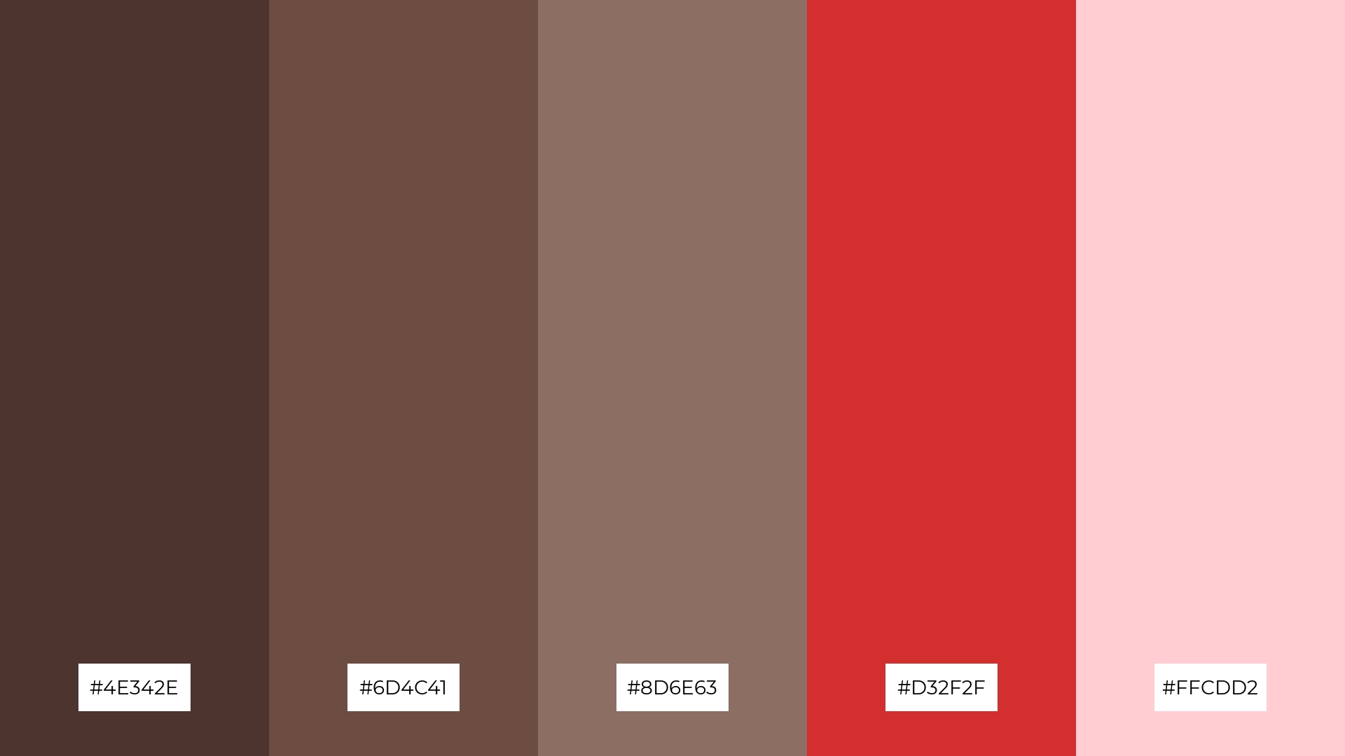
The ‘Berry Chocolate’ palette, with its deep browns and vibrant reds (#4E342E, #6D4C41, #8D6E63, #D32F2F, #FFCDD2), creates a striking contrast that adds visual interest and depth to any design.
This dynamic combination is perfect for creative projects like magazine layouts or artistic websites, where the bold interplay of colors can captivate and engage the audience.
8) Golden Cocoa
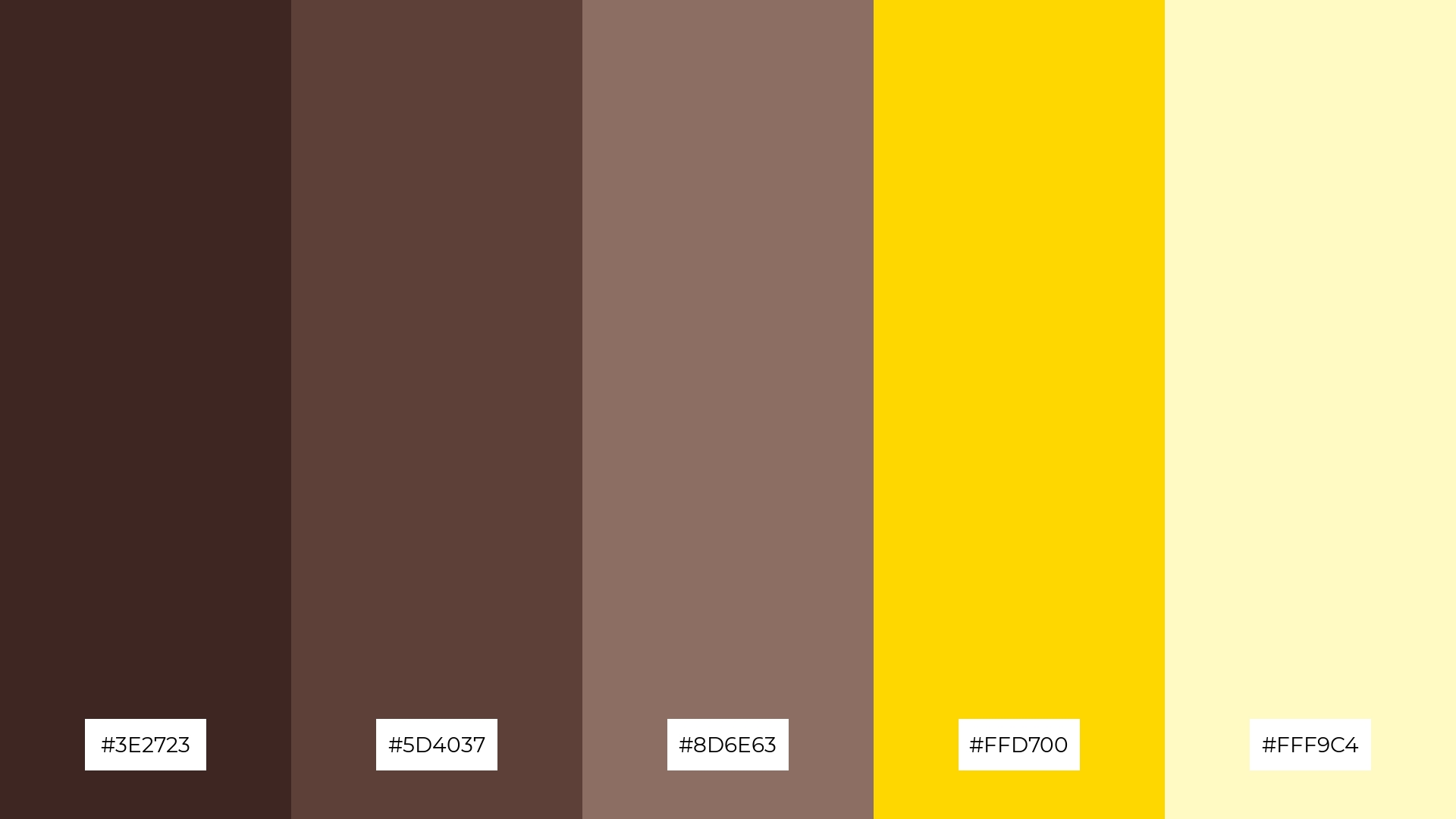
The ‘Golden Cocoa’ palette, with its deep browns and golden hues, can evoke a sense of calm when the darker tones are paired with the soft, creamy shades, creating a serene and grounded atmosphere.
Conversely, the vibrant gold and light yellow tones can bring excitement and energy to a design, making this palette ideal for vibrant marketing campaigns that aim to capture attention and convey a sense of luxury and dynamism.
9) Chocolate Sunset
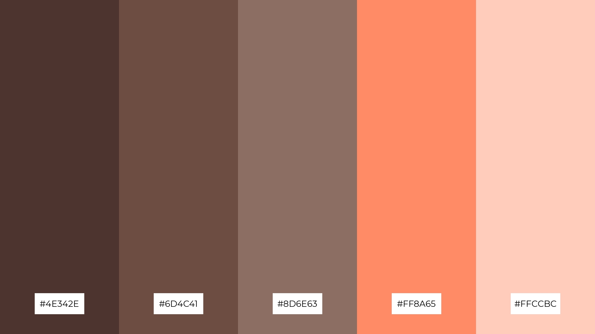
The ‘Chocolate Sunset’ palette, with its softer tones like #FFCCBC and brighter hues such as #FF8A65, creates a warm and inviting atmosphere that feels both cozy and uplifting.
This blend of colors is ideal for home decor, where the combination of rich browns and vibrant accents can enhance the comfort and aesthetic appeal of living spaces, or for seasonal promotions that aim to evoke a sense of warmth and joy.
10) Forest Chocolate

The ‘Forest Chocolate’ palette, with its deep browns and refreshing greens (#3E2723, #5D4037, #8D6E63, #388E3C, #C8E6C9), creates a visual flow that evokes a sense of tranquility and natural harmony, making it perfect for designs that aim to soothe and relax.
This palette is ideal for lifestyle branding, where the calming and earthy tones can enhance the perception of wellness and sustainability, or for tech product packaging, where the blend of rich and fresh hues can convey both sophistication and innovation.
11) Chocolate Rose

The ‘Chocolate Rose’ palette, with its deep browns and vibrant pinks (#4E342E, #6D4C41, #8D6E63, #E91E63, #F8BBD0), creates a welcoming yet dramatic effect by blending warmth with bold, eye-catching accents.
This palette shines in boutique interiors, where the rich and inviting tones can enhance the luxurious and intimate atmosphere, or in luxury e-commerce sites, where the striking contrast can captivate and engage high-end shoppers.
12) Chocolate Ocean

The ‘Chocolate Ocean’ palette, with its deep browns and refreshing blues (#3E2723, #5D4037, #8D6E63, #0288D1, #B3E5FC), creates a striking balance between warmth and coolness, evoking a sense of both stability and tranquility.
This harmonious blend is perfect for sleek corporate branding, where the rich chocolate tones can convey reliability and professionalism, while the vibrant blues add a touch of modernity and innovation.
13) Chocolate Lavender
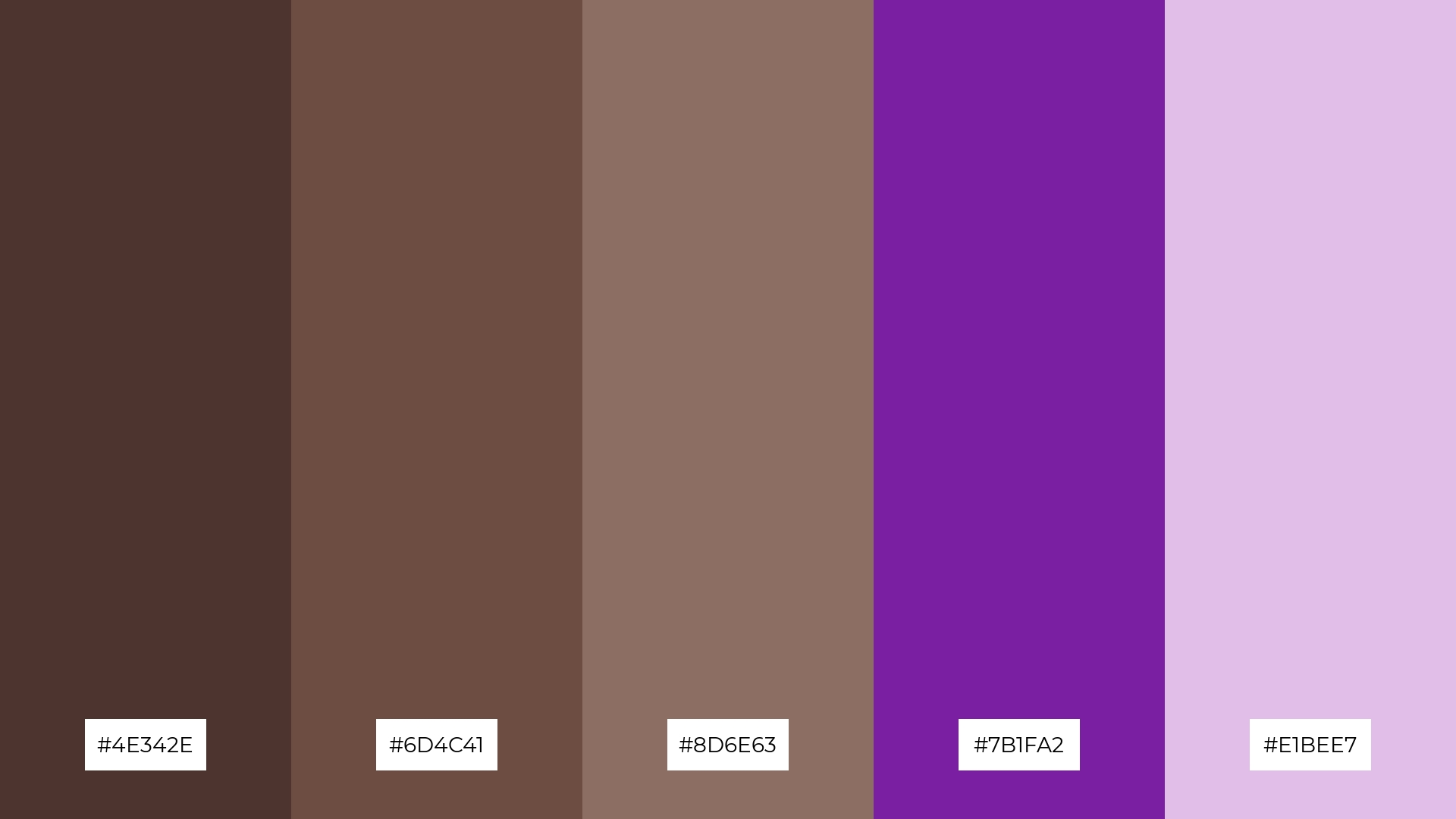
The ‘Chocolate Lavender’ palette, with its blend of warm browns and cool purples (#4E342E, #6D4C41, #8D6E63, #7B1FA2, #E1BEE7), creates a sophisticated and calming mood that balances richness with a touch of elegance.
This unique combination is perfect for artisan product branding, where the warm and inviting browns can convey quality and craftsmanship, while the cool purples add a modern and luxurious twist.
14) Chocolate Citrus
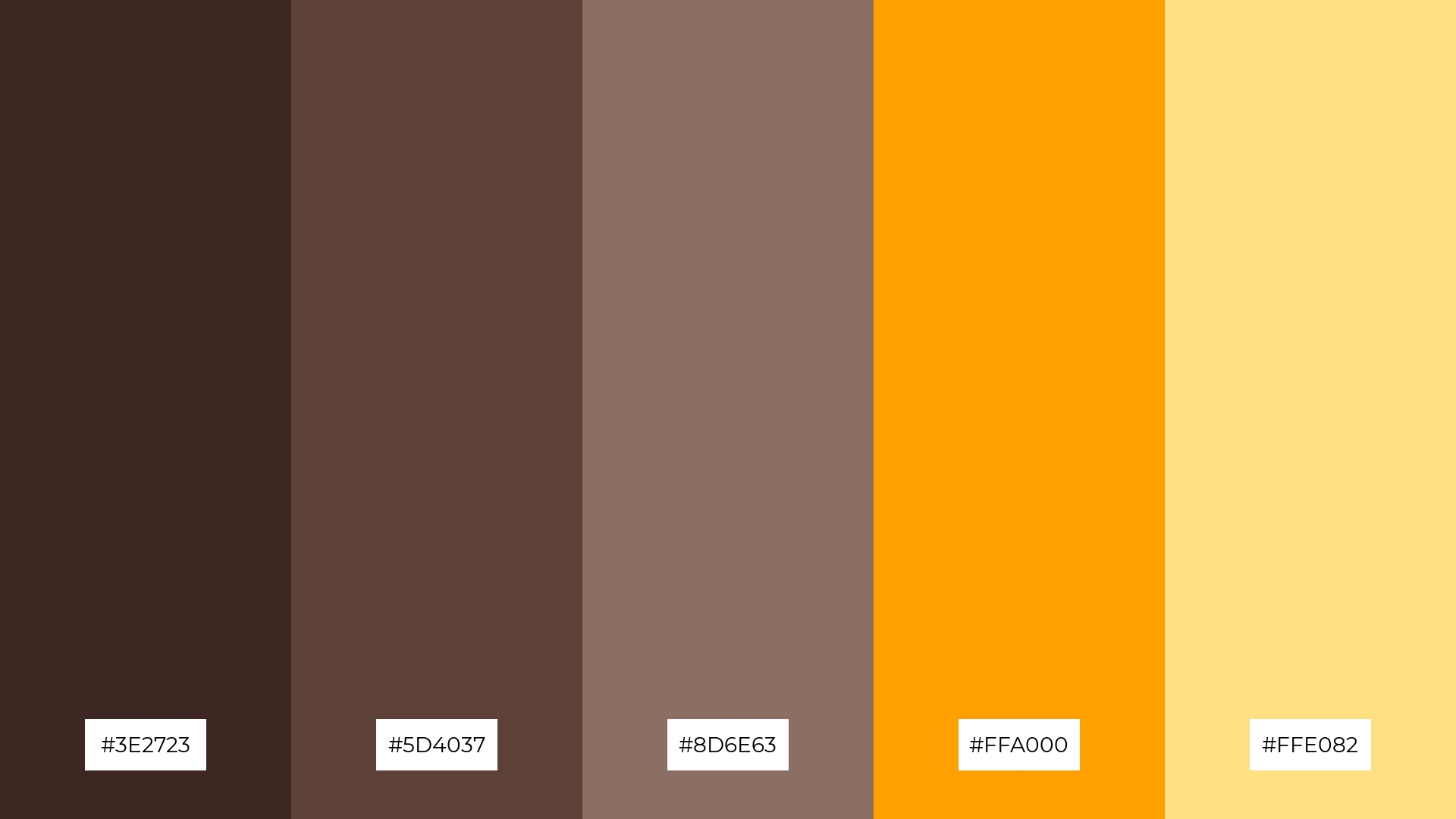
The ‘Chocolate Citrus’ palette, with its deep browns and vibrant oranges (#3E2723, #5D4037, #8D6E63, #FFA000, #FFE082), creates a dynamic interplay of warmth and energy, making it perfect for designs that aim to captivate and invigorate.
This bold yet balanced combination is ideal for restaurant menus, where the rich chocolate tones can evoke a sense of sophistication and quality, while the bright citrus hues add a lively and appetizing touch.
15) Chocolate Sky
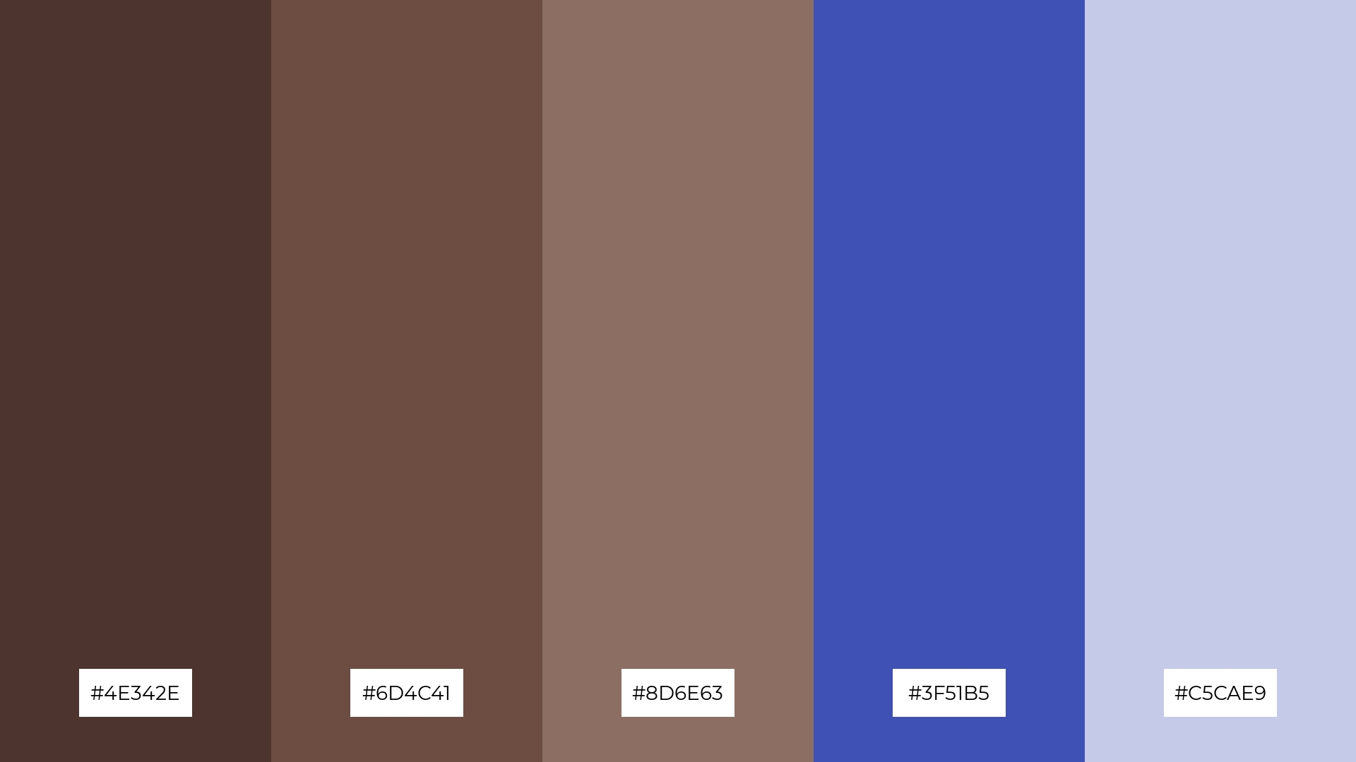
The ‘Chocolate Sky’ palette, with its blend of deep browns and cool blues (#4E342E, #6D4C41, #8D6E63, #3F51B5, #C5CAE9), conveys a sense of harmony by balancing warmth and tranquility, making it perfect for creating serene and inviting environments.
This versatile combination is ideal for tech startups aiming to project reliability and innovation, or for cozy interior makeovers where the rich browns can add warmth and the cool blues can introduce a calming, modern touch.
How to Use Chocolate Patterns in Design
Chocolate color palettes can be a game-changer in home decor, offering a warm and inviting atmosphere. Use deep browns for furniture and accents to create a cozy, grounded feel, while lighter tans can be applied to walls and textiles to add a touch of elegance and openness.
In marketing materials, chocolate tones can convey sophistication and quality. Pair rich browns with vibrant accent colors like gold or teal to capture attention and create a luxurious, high-end look that stands out.
For clothing design, chocolate hues offer versatility and timeless appeal. Combine dark chocolate tones with lighter shades for a balanced, stylish ensemble that works for both casual and formal settings.
Ready to elevate your designs with chocolate color palettes? Try creating your own stunning palettes using Piktochart today!


