Bone color palettes are a unique and versatile tool for designers looking to add a touch of sophistication to their projects. These palettes draw inspiration from the natural hues found in bones, offering a range of neutral and earthy tones.
Whether you’re working on a minimalist design or aiming for a more organic feel, bone color palettes provide a subtle yet impactful way to enhance your visuals. Their understated elegance makes them suitable for a variety of applications, from web design to print media.
Tips For Creating Bone Color Palettes
Designing with bone color palettes can elevate your project with a refined and natural aesthetic. Here are some practical tips to get you started:
- Balance your colors: Use a mix of light and dark bone shades to create depth and contrast in your design. This helps in making key elements stand out while maintaining a cohesive look.
- Match complementary shades: Pair bone tones with complementary colors like soft blues or muted greens to add a touch of vibrancy without overpowering the natural palette.
- Use accent colors sparingly: Introduce accent colors in small doses to highlight important features or calls to action. This ensures that the bone palette remains the focal point.
- Consider texture: Incorporate textures that mimic natural materials like stone or wood to enhance the organic feel of your bone color palette.
- Test in different lighting: Check how your bone color palette looks under various lighting conditions to ensure it maintains its elegance and readability in all environments.
- Keep it versatile: Design your palette to be adaptable across different mediums, from digital screens to printed materials, ensuring consistency and versatility.
15 Bone Color Palettes
1) Classic Bone
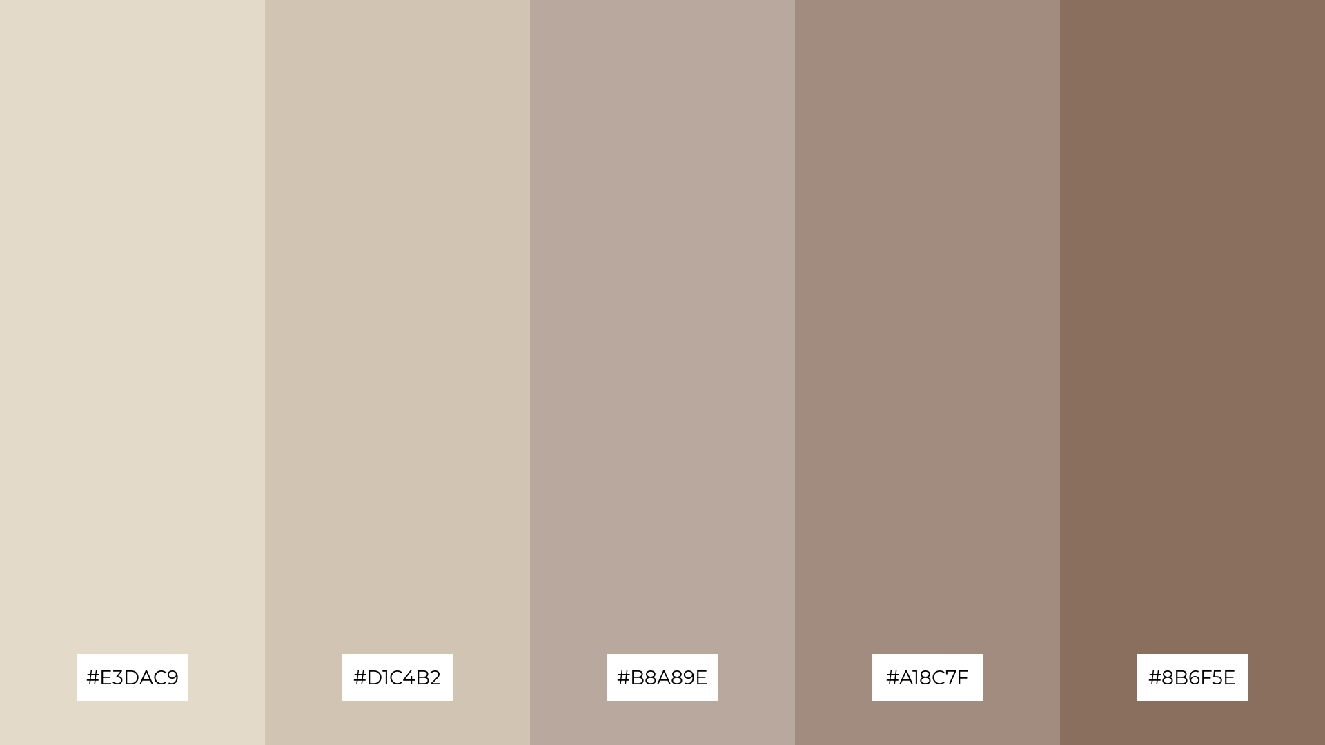
The ‘Classic Bone’ color palette, with its soft and muted tones, creates a calming and timeless mood that evokes a sense of understated elegance and warmth.
These colors interact harmoniously to form a cohesive look, making them ideal for interior decor where a serene and sophisticated atmosphere is desired, such as in a cozy living room or a chic bedroom.
2) Bone Sunset
The ‘Bone Sunset’ color palette, with its blend of soft pinks, warm beiges, and cool greens, evokes a feeling of serene warmth and gentle energy, reminiscent of a tranquil sunset.
This palette would excel in digital branding for wellness apps or product packaging for organic skincare lines, where a calming yet invigorating aesthetic is essential to convey a sense of natural well-being and rejuvenation.
3) Bone Forest
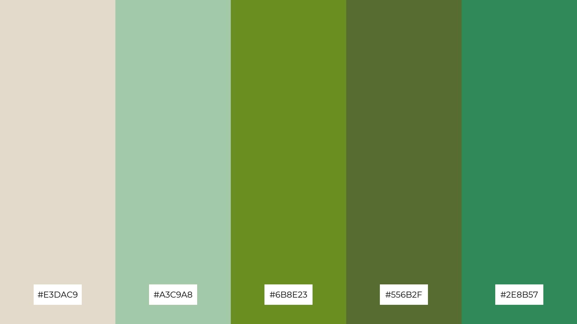
The ‘Bone Forest’ color palette features dominant hues such as the soft beige of #E3DAC9, the soothing green of #A3C9A8, and the deep, earthy tones of #6B8E23, #556B2F, and #2E8B57, which together create a balanced and harmonious look.
This palette is particularly well-suited for eco-friendly interior spaces, where the natural and calming colors can foster a sense of tranquility and connection to nature.
4) Bone Ocean
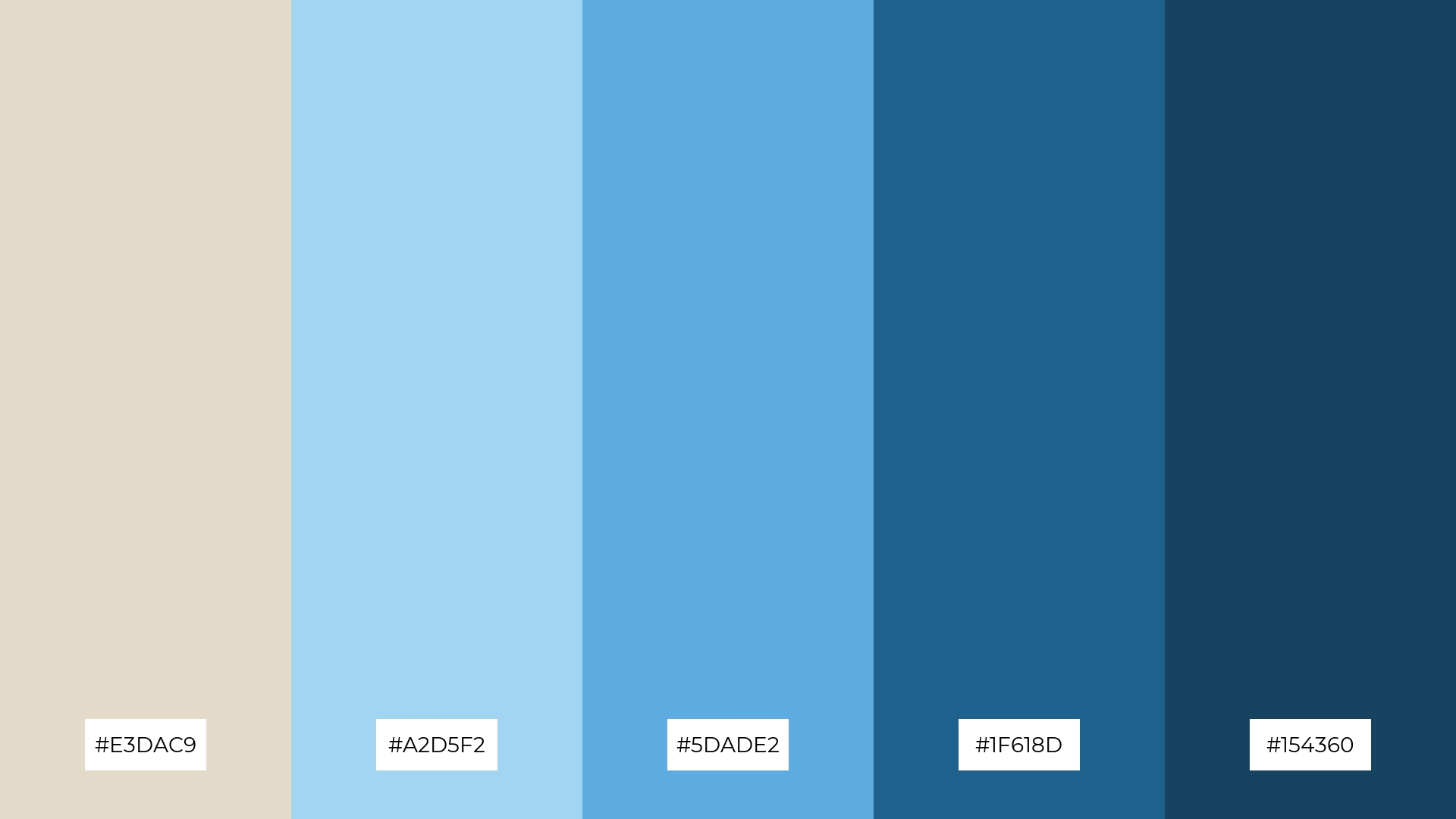
The ‘Bone Ocean’ color palette, with its blend of soft beige (#E3DAC9) and bold blues (#A2D5F2, #5DADE2, #1F618D, #154360), offers a balanced and distinct mood that is both calming and invigorating.
This palette is ideal for creating inviting retail spaces or modern web designs, where the combination of soothing and dynamic tones can enhance the overall aesthetic and user experience.
5) Bone Autumn
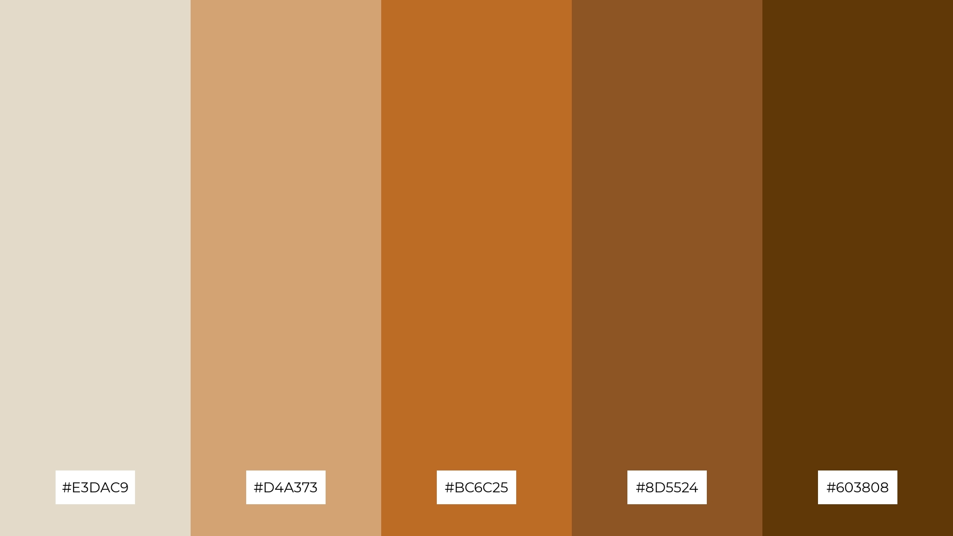
The ‘Bone Autumn’ color palette, with its blend of soft beige (#E3DAC9), warm amber (#D4A373), rich chestnut (#BC6C25), deep brown (#8D5524), and dark chocolate (#603808), creates a cozy and inviting ambiance that evokes the essence of a serene autumn day.
This palette is perfect for luxury fashion campaigns, where the warm and earthy tones can convey a sense of timeless elegance and sophistication, making it ideal for showcasing high-end fall collections.
6) Bone Pastel
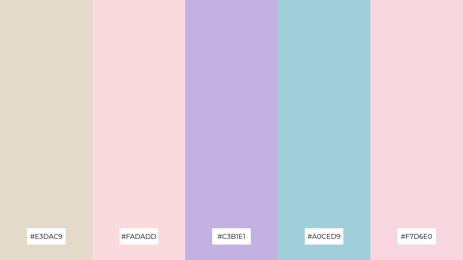
The ‘Bone Pastel’ color palette, with its soft and muted tones of #E3DAC9, #FADADD, #C3B1E1, #A0CED9, and #F7D6E0, creates a harmonious blend that exudes a sense of gentle sophistication and understated elegance, making it ideal for minimalistic branding where a refined and delicate aesthetic is desired.
This palette’s subtle yet playful hues can also be effectively utilized in bold event designs, where the combination of pastel shades can evoke a whimsical and inviting atmosphere, perfect for creating memorable and visually appealing experiences.
7) Bone Earth
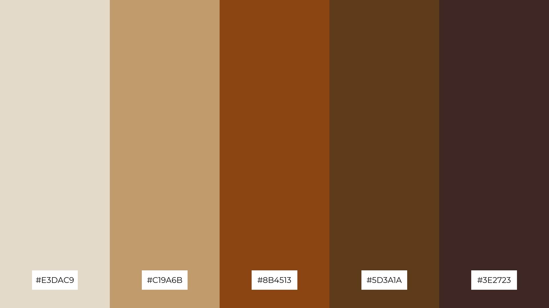
The ‘Bone Earth’ color palette, with its blend of soft beige (#E3DAC9), warm tan (#C19A6B), rich sienna (#8B4513), deep brown (#5D3A1A), and dark espresso (#3E2723), creates a striking contrast that adds depth and visual interest to any design.
This palette is particularly well-suited for creative projects like magazine layouts or artistic websites, where the interplay of light and dark tones can enhance the overall aesthetic and draw the viewer’s attention to key elements.
8) Bone Blush
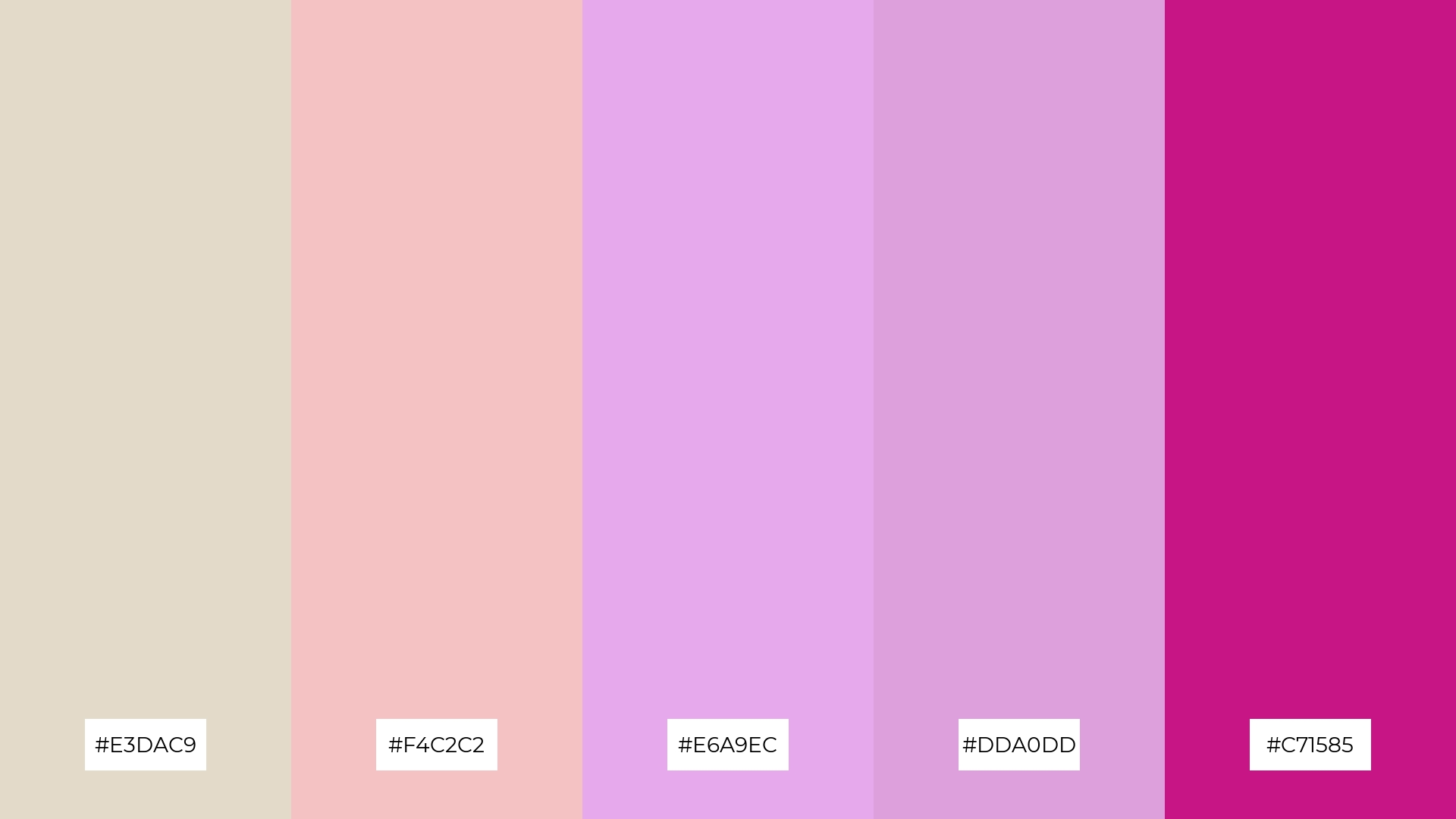
The ‘Bone Blush’ color palette, with its blend of soft beige (#E3DAC9), gentle pink (#F4C2C2), and vibrant magenta (#C71585), can evoke a sense of calm or excitement depending on the combination, making it versatile for various design needs.
This palette is particularly well-suited for spa branding, where the soothing tones can create a tranquil atmosphere, or for vibrant marketing campaigns, where the bold hues can capture attention and convey energy.
9) Bone Night
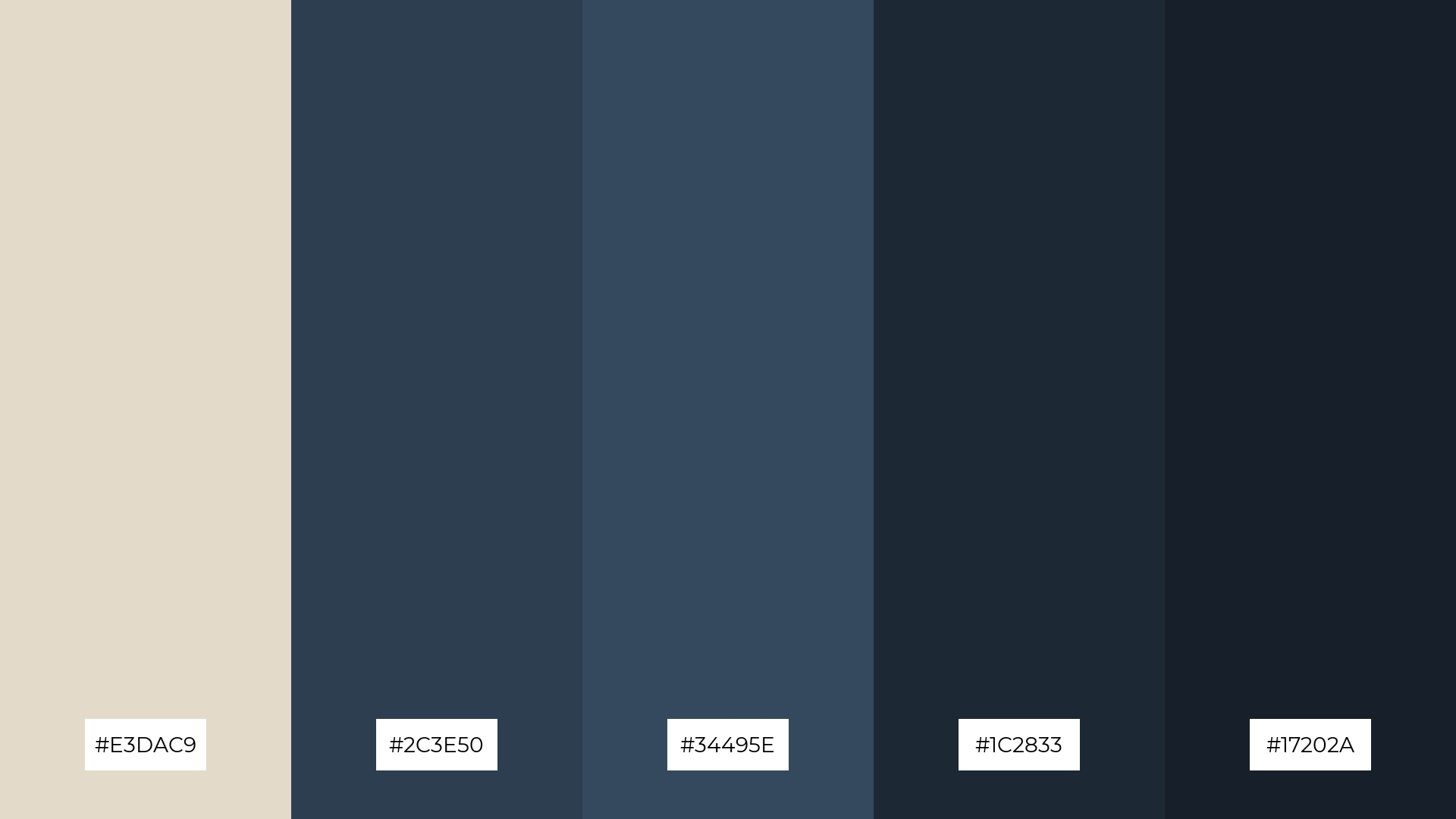
The ‘Bone Night’ color palette, with its blend of soft beige (#E3DAC9) and deep, moody blues (#2C3E50, #34495E, #1C2833, #17202A), creates a striking contrast that balances warmth and depth, resulting in a sophisticated and serene mood.
This palette is ideal for home decor, where the interplay of softer and darker tones can create a cozy yet elegant atmosphere, perfect for a modern living room or a tranquil bedroom retreat.
10) Bone Spring
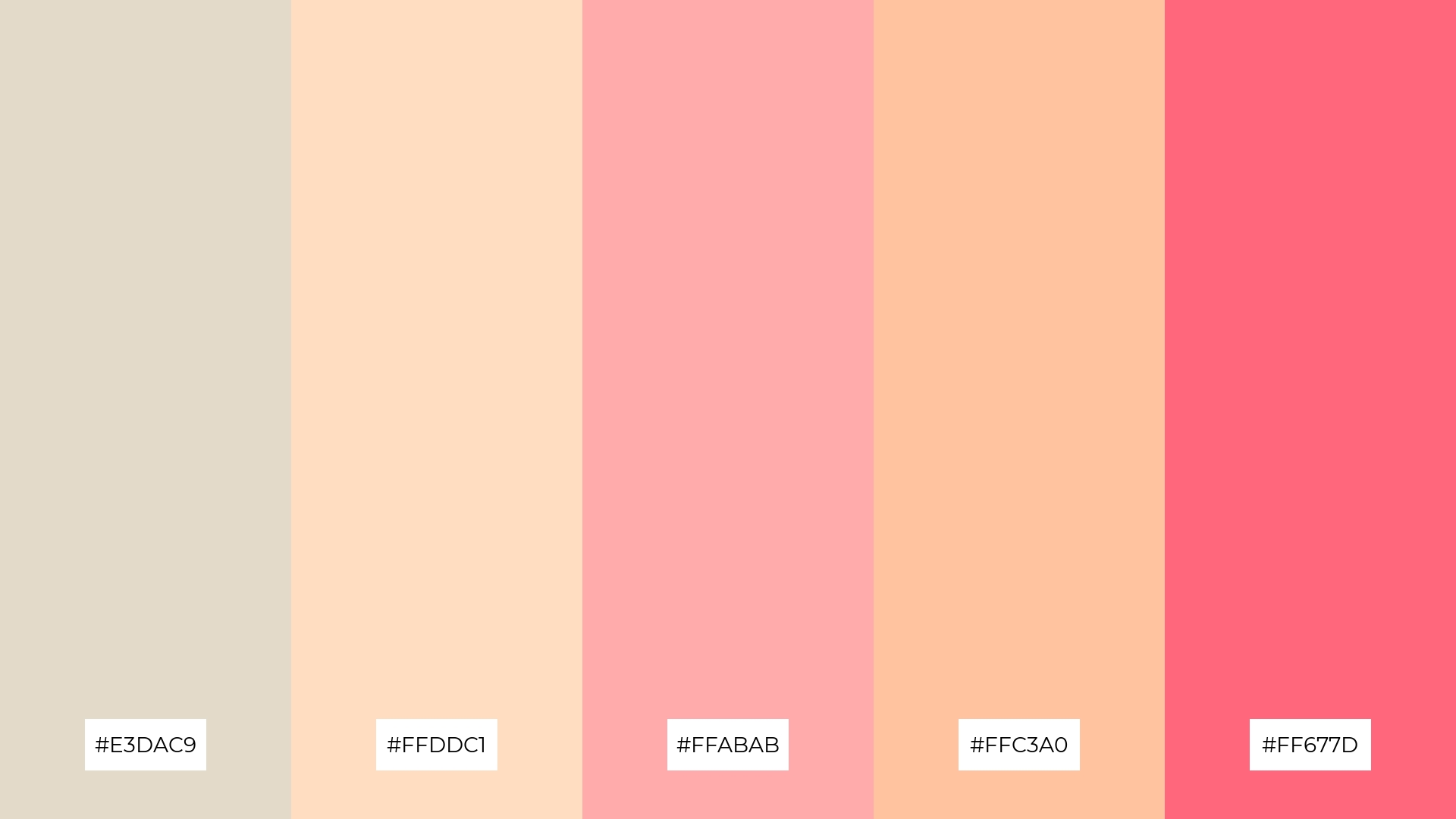
The ‘Bone Spring’ color palette, with its blend of soft beige (#E3DAC9), warm peach (#FFDDC1), gentle pink (#FFABAB), light coral (#FFC3A0), and vibrant rose (#FF677D), creates a visual flow that evokes feelings of joy and renewal, reminiscent of the blossoming energy of springtime.
This palette is ideal for lifestyle branding, where the cheerful and uplifting hues can enhance the appeal of wellness products, or for tech product packaging, where the vibrant colors can convey innovation and a fresh, modern aesthetic.
11) Bone Jewel
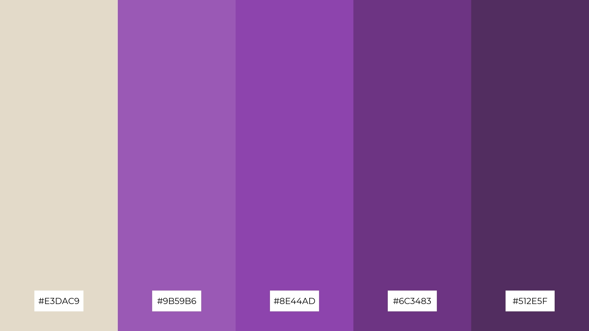
The ‘Bone Jewel’ color palette, with its blend of soft beige (#E3DAC9) and rich purples (#9B59B6, #8E44AD, #6C3483, #512E5F), creates a dramatic yet welcoming effect by combining the warmth of neutral tones with the depth and vibrancy of jewel hues.
This palette is particularly well-suited for luxury e-commerce sites, where the sophisticated and striking colors can enhance the visual appeal and create an inviting atmosphere that draws customers in.
12) Bone Vintage
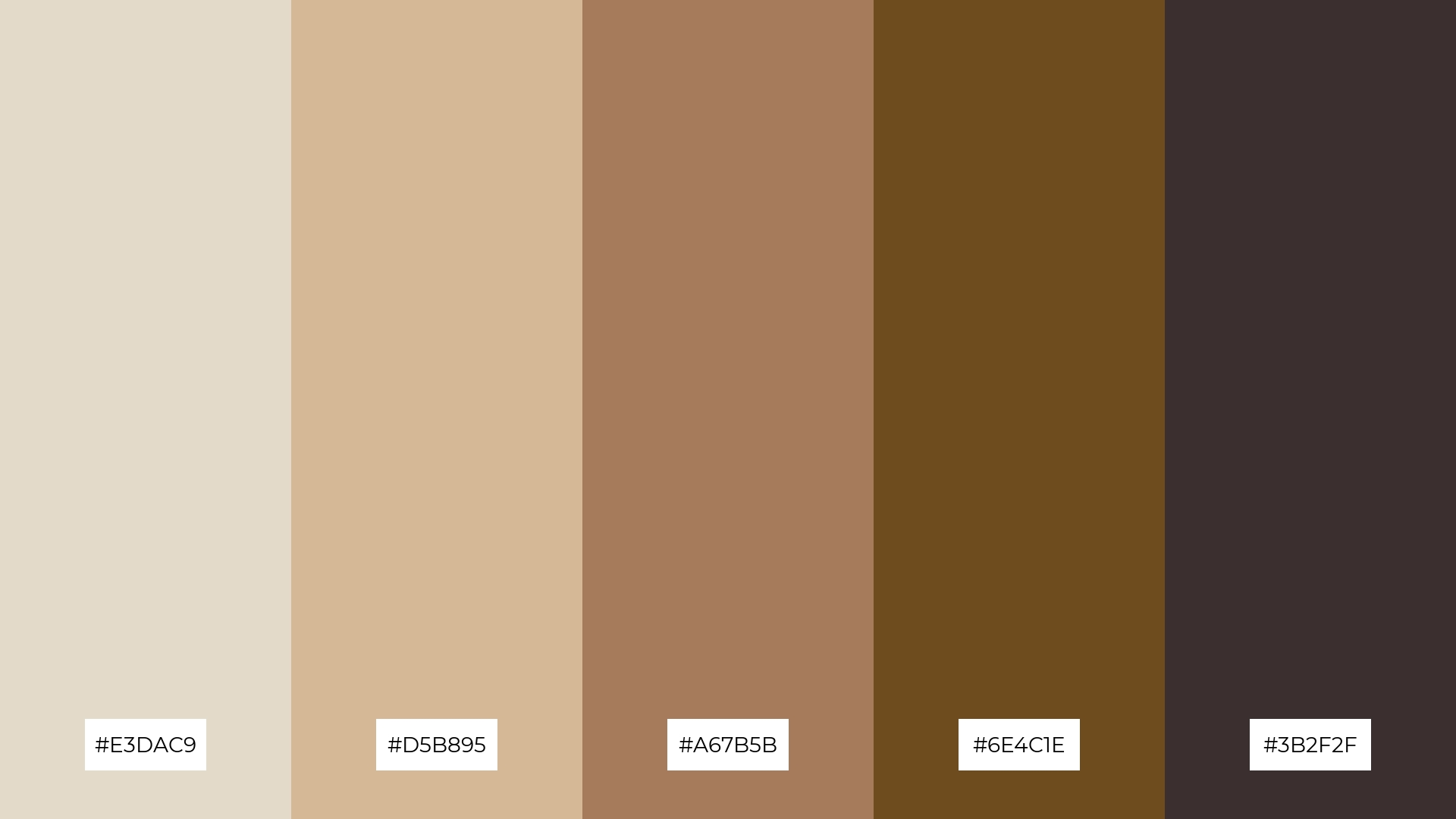
The ‘Bone Vintage’ color palette, with its blend of soft beige (#E3DAC9), warm tan (#D5B895), rich sienna (#A67B5B), deep brown (#6E4C1E), and dark espresso (#3B2F2F), creates a harmonious balance by combining light and dark hues that evoke a sense of timeless elegance and depth.
This palette is particularly well-suited for casual apparel lines, where the warm and earthy tones can convey a relaxed yet sophisticated vibe, making it ideal for creating stylish and versatile clothing collections.
13) Bone Ice
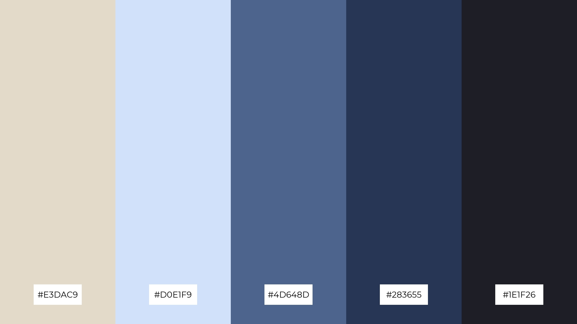
The ‘Bone Ice’ color palette, with its blend of soft beige (#E3DAC9), cool blue (#D0E1F9), deep blue (#4D648D), dark navy (#283655), and almost black (#1E1F26), creates a balanced and serene mood by harmonizing warm and cool tones.
This palette is particularly well-suited for artisan product branding, where the combination of soothing and sophisticated hues can convey a sense of handcrafted quality and timeless elegance.
14) Bone Garden
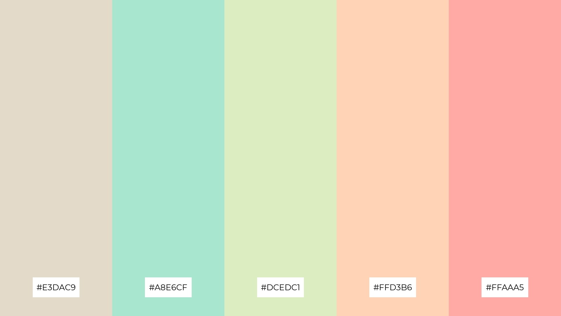
The ‘Bone Garden’ color palette, with its blend of soft beige (#E3DAC9), fresh mint (#A8E6CF), light lime (#DCEDC1), warm peach (#FFD3B6), and soft coral (#FFAAA5), creates a dynamic interplay of colors that can be both bold and subtle, depending on the combination and context.
This palette is particularly well-suited for festival marketing, where the vibrant and harmonious hues can evoke a sense of joy and celebration, making it ideal for creating eye-catching posters, banners, and promotional materials that capture the festive spirit.
15) Bone Metallic
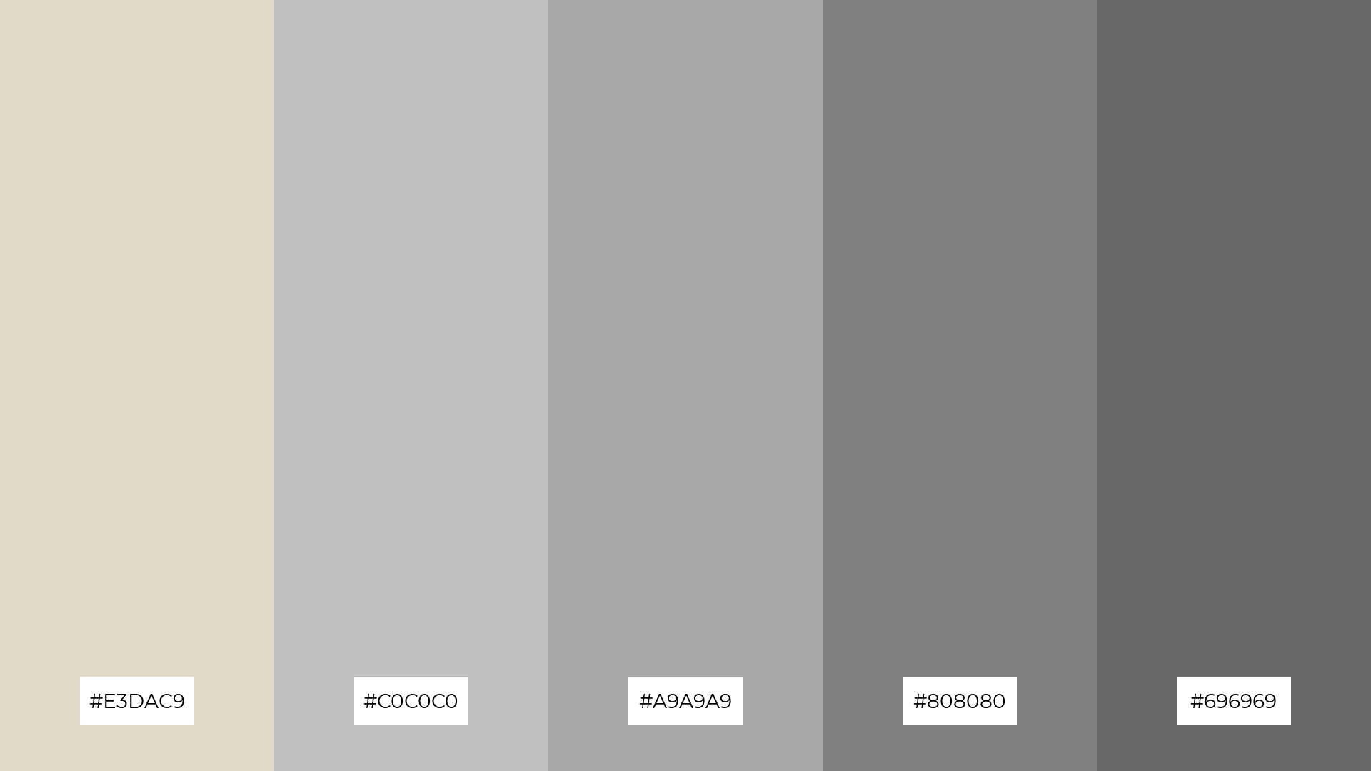
The ‘Bone Metallic’ color palette, with its blend of soft beige (#E3DAC9) and varying shades of gray (#C0C0C0, #A9A9A9, #808080, #696969), can convey a sense of harmony through its balanced and cohesive tones, or create striking contrast when the darker grays are used to highlight key elements.
This palette is ideal for tech startups aiming to project a sleek and modern image, or for cozy interior makeovers where the metallic hues can add a touch of contemporary elegance and sophistication.
How to Use Bone Patterns in Design
In home decor, bone color palettes can be used to create a serene and sophisticated atmosphere. Pairing soft beige tones with deeper hues like navy or forest green can add depth and contrast, making spaces feel both cozy and elegant.
For marketing materials, bone color palettes offer a versatile and professional look. Use muted tones as a backdrop to make text and images pop, ensuring your message stands out without overwhelming the viewer. Adding subtle accent colors can guide the viewer’s attention to key information or calls to action.
In clothing design, bone color palettes can convey a sense of timeless elegance and versatility. Combining neutral shades with rich, earthy tones can create stylish and adaptable pieces suitable for various occasions. This approach not only enhances the aesthetic appeal but also broadens the marketability of the collection.
Ready to elevate your designs with bone color palettes? Try creating your own using Piktochart and see how these sophisticated hues can transform your projects.


