Apple. Nike. FedEx. Each of these brands ensured their logos stopped trying to say everything and started saying one thing perfectly.
While we can break down the different elements of what makes a good logo, creating a minimalist logo is not a shortcut for quicker production. It isn’t what you design when you run out of ideas, but rather when you’ve refined your ideas down to their most essential form. A logo with less visual noise demands more strategic thinking, not less.
Key takeaways
- Before opening any design tool, write one word your brand represents. Every visual decision flows from that.
- To avoid an empty-looking logo, define your concept first, then remove every element that doesn’t serve it.
- Use negative space intentionally by designing the gaps between elements to carry a second meaning or reinforce your concept.
- Choose your typeface based on brand personality: sans-serif for modern and accessible, serif for established and authoritative.
- Limit your color palette to one or two colors; more than that undermines the mark.
- A strong minimalist logo works in monochrome and scales cleanly from favicon to billboard.
- Test your logo at 16×16 pixels – if it’s still recognizable at favicon size, it’s built to scale.
What Makes a Logo “Minimalist”?
Minimalism is a set of constraints that force every visual decision to earn its place.
Strip away the aesthetic label and what’s left is a design philosophy built on three structural pillars: negative space, flat design, and geometric shapes.
Each one serves a specific function. Together, they create logos that communicate instantly, scale infinitely, and are timeless.
Negative Space
Negative space is the area around and between the aspects of an image.
This effect is a cognitive engagement mechanism. When a viewer finds the hidden meaning, their brain registers a small reward. That reward becomes associated with the brand.
For example, the FedEx logo contains a hidden arrow formed entirely by the white space between the letters E and x. The arrow points forward, communicating speed and precision without adding a single graphic element. The viewer’s brain completes the image, and in doing so, forms a stronger cognitive bond with the brand than any illustrated arrow could create.
Flat Design
Flat design eliminates gradients, drop shadows, bevels, and three-dimensional effects. Every element exists on a single visual plane.
This isn’t purely aesthetic. Flat design is a functional response to the environments where logos actually live: mobile screens, browser favicons, app icons, social media thumbnails.
Geometric Shapes
Think of geometry is the “grammar” of minimalist logo design. Circles, triangles, squares, and their derivative shapes carry inherent psychological associations: circles suggest unity and continuity; triangles suggest direction and ambition; and squares suggest stability and reliability.
Geometric shapes are also mathematically precise, which means they scale without distortion. A circle remains a circle at 16 pixels or 16 feet.
The One Concept Rule
Underlying all three pillars is a single governing principle: a minimalist logo communicates one idea.
Visual hierarchy in a minimalist logo is not about layering multiple messages. It’s about directing the viewer’s attention to a single symbol, a single shape, or a single typographic statement with complete clarity. The moment a logo tries to communicate two concepts simultaneously, it communicates neither effectively.
Before any visual decision is made, the concept must be decided. Everything else is execution.
Why Minimalism Is the Best Choice for Startups and Small Businesses
Some design trends can quickly burn bright and fade away into obscurity again. History has shown us that minimalism is evergreen.
The logos built on geometric shapes, flat color, and negative space in the 1960s and 1970s are the same logos considered modern today. And that longevity is not coincidence, but the natural outcome of designing around principles rather than trends.
This matters more for a startup or small business than it does for an enterprise with a dedicated rebrand budget. A minimalist logo is a long-term asset. A trend-chasing logo is an expensive liability with a limited shelf life.
Scalability
A minimalist logo works on small surfaces (like a pen) and larger ones (like an ad on a building). It works on a 16×16 pixel favicon as well as on a 40-foot billboard.
Complex logos with fine details, multiple colors, and intricate illustrations collapse at small sizes. The details merge, the colors muddy, and the mark becomes unrecognizable. A geometric symbol or clean wordmark retains its integrity at any dimension because there’s nothing extraneous to degrade.
Versatility
A minimalist logo functions in monochrome without losing meaning. Remove the color from a complex logo and you often remove its identity. Remove the color from a minimalist logo and the form holds.
This matters for print costs, embroidery, single-color merchandise, and any context where your brand palette cannot be reproduced. A logo dependent on color to communicate is a fragile brand asset.
Cognitive Load
Minimalist logos reduce the cognitive load placed on your audience. A viewer encountering a complex logo must process multiple visual elements simultaneously, while someone looking at a minimalist logo only processes one.
Lower cognitive load means faster recognition. Faster recognition means stronger brand recall. For a brand with limited marketing spend and limited audience touchpoints, recall efficiency is your competitive advantage.
Iconic Examples of Minimalist Logos (And What We Can Learn From Them)
We’ve rounded up some famous and memorable minimalist logos because each one demonstrates a specific minimalist principle that you can apply directly to your own design process.
👀➡️ Discover the seven elements that make a good logo.
Apple: The Discipline of Subtraction
Apple’s original 1976 logo was a detailed engraving of Isaac Newton sitting beneath an apple tree, complete with a ribbon border and a quote from Wordsworth. It communicated history, intellectualism, and complexity. However, it was also completely unusable at small sizes and impossible to reproduce consistently.
Rob Janoff redesigned it in 1977: a single apple silhouette with a bite taken out of it, rendered in a rainbow stripe. By 1998, Steve Jobs stripped it further to a monochromatic finish. Each iteration removed something. Each removal made the logo more powerful.
The lesson: subtraction isn’t loss; it’s refinement. Each element you remove forces the remaining elements to carry more meaning. The bite in the apple prevents it from reading as a cherry or any other fruit. One deliberate detail does more work than ten decorative ones.
Nike: The Power of Pure Symbol
Carolyn Davidson designed the iconic Nike swoosh in 1971 for $35. Phil Knight, Nike’s co-founder, reportedly said “I don’t love it, but it will grow on me.” It did. And not just on him – on everyone.
The swoosh communicates motion without literally depicting motion. It suggests speed, forward momentum, and athletic energy through a single curved line. No explanation required.
The lesson: a symbol doesn’t need to be literal to be understood. Abstract shapes carry meaning when the brand context reinforces them consistently over time. The swoosh means nothing without Nike.
FedEx: Negative Space as Strategic Communication
The FedEx logo, designed by Lindon Leader in 1994, contains a forward-pointing arrow hidden in the negative space between the E and the x. Most people don’t notice it consciously on first viewing, but once you see it, you can’t unsee it.
The arrow wasn’t accidental. It was the result of extensive typographic refinement, choosing a typeface and letter spacing specifically to create that negative space geometry. The hidden meaning communicates speed and forward direction without adding a single graphic element to the logo.
The lesson: negative space isn’t always empty; it can be a design surface. The space between and around your elements is as available for communication as well as the elements themselves.
Mastercard: Geometry as Identity
Two overlapping circles. One red, one yellow, with an orange overlap zone. That’s it.
Mastercard’s logo works because geometry carries inherent visual logic. The overlap of two circles creates a third implied shape. The color relationship creates warmth and accessibility. The form is so simple it borders on abstract, yet it’s one of the most recognized marks on the planet.
The lesson: geometric simplicity isn’t generic when the color relationship and proportions are precise. The difference between a generic circle and the Mastercard mark is mathematical specificity. Proportions, overlap percentage, and color values are identity, not arbitrary.
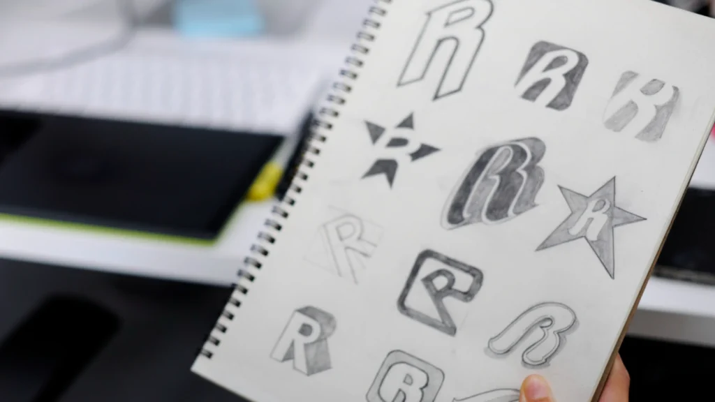
How to Design a Minimalist Logo in 5 Easy Steps
The most common reason minimalist logos look empty is usually because they lack conceptual clarity. A logo looks empty when the designer didn’t decide what it was supposed to say before deciding how it should look.
These five steps address concept before craft.
Step 1: Define Your Core Message
Get an empty canvas of your choice (digital or paper) and write one word that your brand represents. Not a sentence. Not a list of values. One word.
If your answer is “quality,” keep going. Quality isn’t a differentiator; it’s a baseline expectation. If your answer is “speed,” ask what kind of speed. Urgent speed or effortless speed? Aggressive speed or precise speed? The more specific the word, the more specific the logo can be.
This word becomes your design brief. Every visual decision in the steps that follow should serve it. If a shape, color, or typeface doesn’t reinforce your one word, it doesn’t belong in the logo.
Step 2: Choose Your Typography
For many minimalist logos, the typeface is the logo. A wordmark –- a logo built entirely from the brand name in a distinctive typeface –- can be more powerful than any symbol, provided the typeface choice is intentional.
Sans-serif typefaces (like Helvetica, Futura, and Gill Sans) communicate modernity, accessibility, and clarity. They’re the default choice for technology brands, startups, and any brand positioning itself as forward-facing. Serif typefaces (such as Garamond, Times New Roman, and Bodoni) communicate heritage, authority, and permanence. They suit law firms, financial institutions, and brands whose credibility rests on history.
Choose based on your one word from Step 1, not based on personal preference. If your word is “trust,” a serif may serve it better. If your word is “speed,” a geometric sans-serif almost certainly will.
Step 3: Strip Away the Fluff
Take your initial concept and remove everything that isn’t doing specific communicative work.
Gradients: remove them. They add visual complexity and degrade at small sizes.
Drop shadows: delete them. They’re a relic of skeuomorphic design and signal visual immaturity to a trained eye.
Outlines on top of outlines: take them out. Each additional stroke adds noise without adding meaning.
Decorative flourishes: drop them… unless they directly reinforce your one word.
After each removal, ask: ‘does the logo still communicate my one word?’ If yes, keep removing. If no, restore the last element you removed. Stop there. That’s your threshold.
Step 4: Focus on Color
Limit your palette to one or two colors. This isn’t a stylistic preference. It’s a functional constraint.
A single color forces the form to carry the identity. Two colors allow for contrast and relationship. Three or more colors introduce complexity that competes with the simplicity of the mark itself.
Choose colors with specific psychological intent. Blue communicates trust and stability. Red communicates urgency and energy. Black communicates sophistication and authority. Green communicates growth and health. Your color choice should reinforce your one word from Step 1, not contradict it.
Always design a monochromatic version. If your logo only works in color, it’s not finished. A monochrome version isn’t a secondary asset. It’s a test of whether your form is strong enough to stand alone.
Step 5: Test for Scalability
Resize your logo to 16×16 pixels. This is favicon size: the smallest context in which your brand will appear online. If the mark is still recognizable at this size, it passes the minimum threshold for scalability.
Now scale it to the largest format you anticipate using, whether a banner, a billboard mockup, or a large-format print file. If the edges remain crisp and the form remains intact, your logo is built correctly.
If your logo pixelates when enlarged, it’s saved as a raster file (JPEG, PNG) rather than a vector file. Vector graphics are mathematically defined, which means they scale to any size without quality loss. Your final logo files must be in vector format (SVG, AI, or EPS) for professional use.
This is where Piktochart removes a significant technical barrier. The Pikto AI Logo Generator outputs production-ready files and provides professionally structured templates that give you the correct proportions, spacing, and format from the start, so the scalability work is largely done before you begin customizing.
Choosing the Right Typography for a Minimalist Look
In a minimalist logo, typography is often the primary communication vehicle.
The two dominant typeface categories in minimalist logo design are geometric sans-serifs and classical serifs, and the choice between them defines the brand’s perceived personality more than almost any other single decision.
Helvetica became the typeface of the twentieth century’s corporate identity movement because of its neutrality: it communicates without intruding. Futura, with its geometric construction and precise proportions, became the choice for brands wanting to signal forward-thinking rationality. Both remain staples of minimalist logo design because they were built on mathematical principles rather than calligraphic tradition, which means they age without looking dated.
When the brand name itself becomes the logo, the wordmark format, the typeface must work harder than any symbol could. Letter spacing, weight, and capitalization become the design. Adjust them with the same intentionality you would apply to any graphic element.
Common Mistakes to Avoid in Minimalist Design
Minimalism has a failure mode that its opposite does not. A badly designed complex logo looks busy. A badly designed minimalist logo looks generic.
The Vague Circle Problem
The most common minimalist logo mistake is choosing a geometric shape without attaching a specific concept to it. A circle with a letter inside it isn’t a minimalist logo. It’s an unfinished one. Geometry becomes identity only when the proportions, relationships, and color choices are specific enough to be unrepeatable.
Before finalizing any geometric mark, ask: ‘could this logo belong to any company in my industry?’ If the answer is yes, it isn’t specific enough.
Alignment and Balance
Minimalist logos have nowhere to hide. In a complex illustration, a slightly off-center element disappears into the visual noise. In a minimalist mark, it’s the only thing the viewer sees.
Every element must be mathematically aligned. Optical alignment (where something *looks* centered) and mathematical alignment (where something *is* centered) are not always the same. Trust the mathematics, then adjust optically if necessary.
Trademarkability
A minimalist logo must be distinctive enough to be legally protected. Generic geometric shapes in isolation –- a plain circle, a plain triangle, or a plain square –- cannot be trademarked because they belong to the visual commons.
Your logo needs at least one element specific enough to distinguish it from every other mark in your category. That element doesn’t need to be complex. It just needs to be yours.
Start Your Minimalist Brand Journey
Minimalism isn’t a design trend you apply to your logo. It’s a strategic discipline you apply to your thinking before the design begins.
The brands that endure are the ones that made a single clear decision and defended it. One concept. One or two colors. One typeface. One mark that works at every size, in every context, without explanation.
You now have the framework to make those decisions. The only step remaining is execution.
Ready to build your minimalist logo? Piktochart’s AI Logo Maker gives non-designers a professional starting point: structured templates, scalable output, and the design guardrails to keep your mark clean, specific, and built to last.