
Your infographic color palette determines whether someone reads your content or scrolls right past it. Research from the Seoul International Color Expo found that up to 90% of snap judgments about a product are based on color alone. The same principle applies to infographics: the right 3 to 5 colors can guide attention, signal credibility, and make complex data easy to absorb.
This guide breaks down everything you need to pick an infographic color palette that works. You will learn the color theory basics behind strong palettes, see curated palette examples you can copy (with hex codes), and get practical tips on color psychology, accessibility, and the free tools that make palette selection fast. Whether you are designing your first infographic in Piktochart’s infographic maker or refining one for a client, start here.
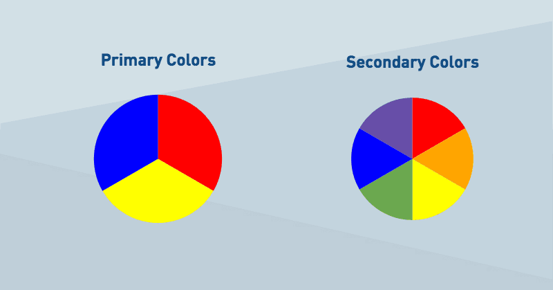
Primary colors
To get color theory, first we need to go back to the basics. To preschool, when Miss Robinson taught you the three primary colors – red, blue, and yellow. They are easy identifiable as the colors that can’t be created by combining other colors. In turn, you can create all other colors by combining the primary ones with white and black.
On the other hand, secondary colors are the 3 colors that are formed by combining the 3 primary colors. In the image below, you’ll see how blue and red create purple; blue and yellow, green and red and yellow make orange.
There are also tertiary colors, which you get when you combine the secondary colors but we’ll leave that for a different post. From here, color theory gets a bit more complicated so bear with me.
Hue, tint, tone, and shadows
Now a days, primary, secondary and tertiary colors are rarely used in web or graphic design. Instead, prolific designers use all the colors in between, which look much better on a screen or print.
To understand color, is important to grasp the concept of ‘hue’. Hue is basically a fancy synonym for color. For instance, primary & secondary colors are hues, but also all the color combinations between them (for instance, combining green with purple).
Once we add black and white into the mixture, things get interesting. This allows designer to create millions of variations. These variations are categorized in tone, tint and shadow, and you can create them by combining a specific hue with white, black or grey.
Tint is when you mix a hue with white. This creates a softer, lighter spectrum of colors, and is how you can play around with light and dark colors.
Tone is when you mix a hue with grey (or black and white). Essentially, what you get is a slightly different tone of your hue.
Finally, shadow is when you mix a hue with black. This creates a darker and stronger color.
The graphic below portrays the difference between hue, tint, tone and shadow. Now, do you see how these color shade combinations look much more closer to real design than the primary colors?

3 rules for creating your color palette
Now that you know the basic theory behind color in the web, it’s time to start applying your skills and pick a beautiful color palette of your own! For that, we are going to keep things simple, and abide by only 3 short rules. Let’s see.
First, match the overall tone of your infographic
When creating an infographic, I’m certain you have a specific goal in mind. You may want to convey a message, offer some valuable information to the reader, or simply entertain them. The first step for creating your color palette is to think about what your goal is, and what your infographic is about.
Last week we discovered how a simple image can confuse readers. The same thing occurs with colors. If your infographic is about a horror movie, go for dark, shadow colors. If you are talking about boats, then picking blue as a hue and playing with tint, tone and shadow will work. If it’s a business infographic, don’t go for bright, funny colors like yellow or orange. Instead, pick more serious colors that match your brand.
Second, pick colors that work great together
Colors are like typefaces. Some of them work great together, while some of them simply don’t. Take a look at the example below – which color palette looks more pleasing to the eye?

You guessed it: the first one.
With Piktochart Pro, you can also upload your own fonts and use them! You can get started by signing up for free.
Designers know intuitively which ones work seamlessly together, but there is actually a bit of science behind it. The first step is understanding and visualizing the color wheel. This graphic shows different hues and it’s tones, tints, and shadows, and how they relate to each other.


Monochromatic. The first idea for picking colors that work well together is going for a monochromatic palette. This means you work with one hue, and the variation of tints, tones and shades.
Complimentary. Colors that are opposite to each other in the color wheel are considered complementary. By combining these two colors, you are conveying contrast and interest. This are tricky to use in large doses, but they are specially good when you want to highlight something, like a call to action.

Analogous. Colors that are next to each other on the color wheel feel comfortable working together. They are the perfect combination, as they are great for any use, including highlighting and giving contrast to a specific element without much disturbance. As a rule of thumb, choose one color to dominate, a second to support and a third as an accent.

If you are a bit lost, ColourLovers most loved palettes is great place to visit in search for inspiration.
Third, pick 2-3 colors
Sometimes, simplicity is the right path. A common beginner’s mistake is to pick 5 or 6 colors for your design. Instead, stick to just 2 or 3 – one should be clear and bold and the foundation of your design, and the second or third one should be a complement of the first one, that’s easily identifiable to be used as a call to action, or to highlight something important.
When in doubt, don’t cave. Instead of picking 4-5 colors, stay with your two initial choices and play with the tones, tints and shadows. A little goes a long way.
This post is part of August’s Design Tip Series: 8 Insightful Posts That Will Help You Become A Creative Designer in Piktochart. Feel free to check it out!
With Piktochart, you can create presentations, reports, infographics, posters, social media graphics and more. Create an account for free and put your Color Theory knowledge into practice!
Infographic Color Palette Examples (with Hex Codes)
Picking colors from scratch is time-consuming. The palettes below give you a tested starting point for the most common infographic types. Copy the hex codes into your design tool and adjust from there.
For Data and Analytics Infographics
Data infographics rely on color to separate categories and direct the reader’s eye to key numbers.
1. Blue Spectrum — #003F5C, #2F4B7C, #665191, #A05195, #F95D6A
Five distinct hues with enough contrast to label individual data series in bar charts, line graphs, and pie charts. Blue-to-pink progression reads naturally from left to right.
2. Sequential Green — #F7FCF5, #C7E9C0, #74C476, #238B45, #00441B
A single-hue sequential scale for maps, heatmaps, and any visualization where values range from low to high. The lightest value (#F7FCF5) works as a background; the darkest (#00441B) marks the peak.
3. Diverging Red-Blue — #B2182B, #EF8A62, #F7F7F7, #67A9CF, #2166AC
A diverging palette with a neutral midpoint. Use when your data has a meaningful center (e.g., above/below average, positive/negative sentiment). The neutral white center (#F7F7F7) signals the zero line.
For Corporate and Business Infographics
Business audiences expect palettes that project competence without distraction.
4. Executive Blue — #1A2744, #34506E, #5B8FB9, #B8D4E3, #F2F7FB
A dark-to-light blue ramp. Apply #1A2744 to section headers, #5B8FB9 to icons, and #F2F7FB to the page background. The monochromatic structure keeps the design cohesive across multi-page reports.
5. Charcoal and Gold — #2B2D42, #8D99AE, #EDF2F4, #EF233C, #FFD60A
A mostly neutral palette with a bold red and gold reserved for callouts and CTAs. The restrained use of bright color (only in two accent shades) prevents visual clutter while still drawing the eye where it needs to go.
For Marketing and Social Media Infographics
Social content competes with everything else in a feed. Higher saturation and bolder contrasts earn attention.
6. Tropical Punch — #FF595E, #FFCA3A, #8AC926, #1982C4, #6A4C93
Five saturated colors spaced across the spectrum. Each color is distinct enough to represent its own data category or section without a legend. Strong for comparison infographics and “vs.” layouts.
7. Peach and Plum — #FFCDB2, #FFB4A2, #E5989B, #B5838D, #6D6875
An analogous palette in warm pinks and mauves. Softer than the tropical option but still eye-catching. Use for wellness, beauty, HR, and lifestyle-oriented content on Instagram and LinkedIn.
For Education and Nonprofit Infographics
Readability and warmth matter more than flash when the goal is understanding.
8. Chalkboard — #FAFAFA, #333333, #4ECDC4, #FF6B6B, #FFE66D
A high-contrast base (near-white and near-black) with three accent colors. The accents are cheerful without being distracting. Works for step-by-step explainers and process diagrams.
9. Nature Classroom — #264653, #2A9D8F, #E9C46A, #F4A261, #E76F51
A palette drawn from earth and ocean tones. Warm oranges pair with cool teals for natural contrast. Effective for geography, science, and environmental education infographics.
For Dark-Background Infographics
Dark backgrounds reduce eye strain in data-heavy layouts and give colors more visual weight.
10. Midnight Data — #0B0C10 (background), #00D2FF, #7B61FF, #FF6E6E, #00E676
Neon accents on a near-black base. Each accent passes WCAG AA contrast requirements against the dark background. Use for analytics dashboards, cybersecurity topics, and tech industry content.
Applying these palettes: Open Piktochart’s color picker, paste the hex codes, and assign colors using the 60-30-10 rule: 60% to your dominant color (typically the background or lightest shade), 30% to a supporting color (headers, borders, section fills), and 10% to your accent (CTAs, data highlights, key numbers).
Create visuals that leave an impact.
Make presentations, reports, infographics, posters and more.
Sign up for free


