Maroon color palettes offer a rich and sophisticated touch to any design project. This deep, reddish-brown hue can evoke feelings of warmth, elegance, and timelessness.
Whether you’re creating infographics, presentations, or social media graphics, incorporating maroon can add a layer of depth and refinement. Explore the versatility of maroon to elevate your visual storytelling.
Tips For Creating Maroon Color Palettes
Designing with maroon can transform your visuals into compelling and elegant masterpieces.
- Balance with Neutrals: Pair maroon with neutral colors like beige, gray, or white to create a balanced and sophisticated look.
- Complementary Shades: Use complementary colors such as teal or turquoise to make maroon pop and add vibrancy to your design.
- Accent with Metallics: Incorporate metallic shades like gold or bronze to enhance the richness of maroon and add a touch of luxury.
- Gradients and Shades: Experiment with different shades of maroon and gradients to add depth and dimension to your design.
- Versatile Combinations: Combine maroon with pastel colors for a softer look or with bold colors for a more dramatic effect.
- Consistent Theme: Ensure that the use of maroon aligns with the overall theme and message of your design to maintain coherence.
15 Maroon Color Palettes
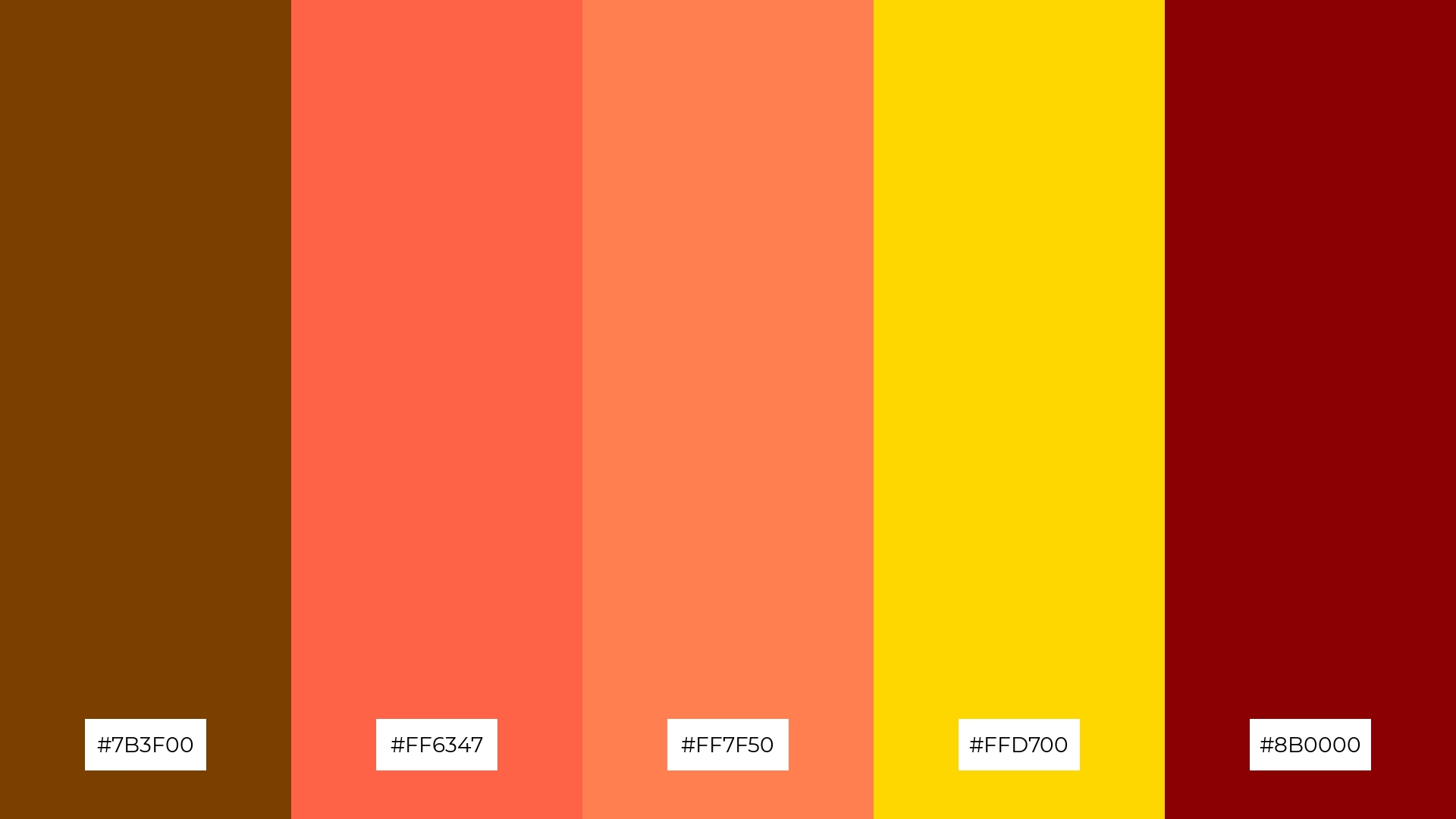
1) Autumn Leaves
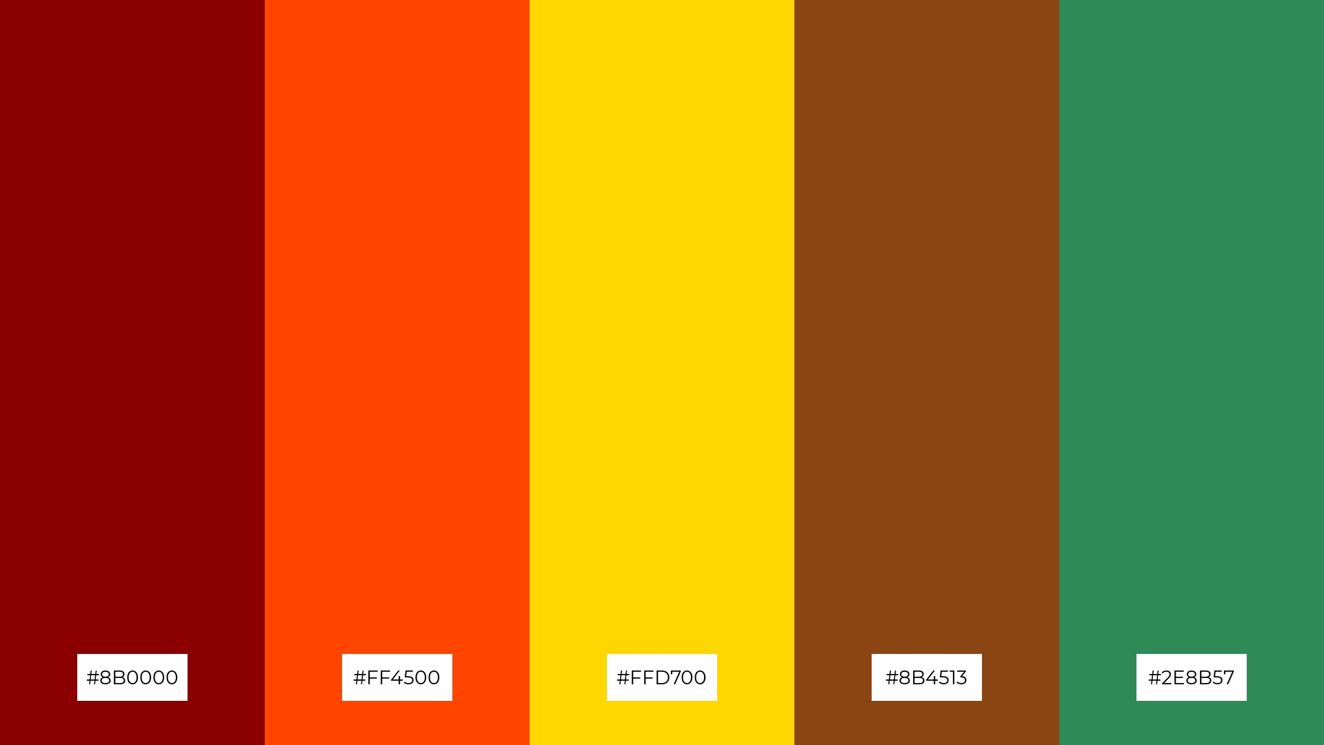
The ‘Autumn Leaves’ palette, with its deep reds, vibrant oranges, golden yellows, rich browns, and lush greens, evokes a warm and inviting mood reminiscent of a crisp fall day.
These colors interact harmoniously to create a cohesive look, perfect for interior decor that aims to bring the cozy and comforting essence of autumn indoors.
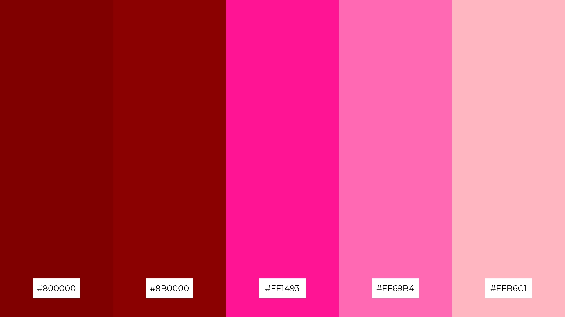
2) Vintage Romance
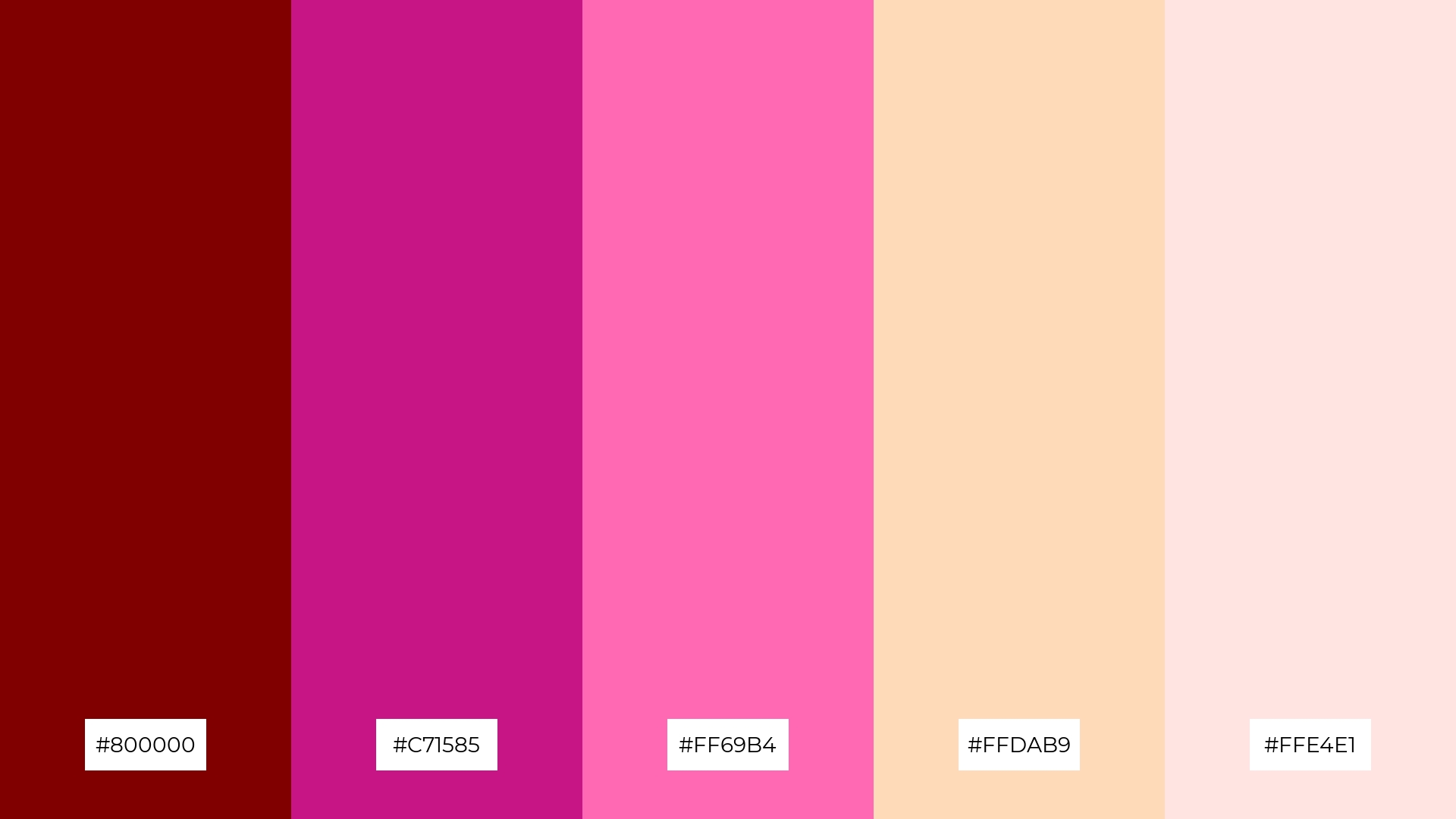
The ‘Vintage Romance’ palette, featuring hues like deep maroon (#800000) and hot pink (#FF69B4), evokes a sense of warmth and nostalgic charm, making it ideal for creating an inviting and sentimental atmosphere.
This palette would excel in digital branding for boutique businesses or product packaging for artisanal goods, where the blend of soft peach (#FFDAB9) and misty rose (#FFE4E1) can convey elegance and sophistication.
3) Rustic Charm
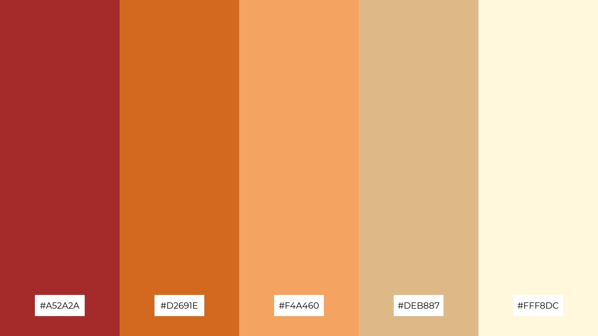
The ‘Rustic Charm’ palette, featuring dominant colors like brown (#A52A2A), chocolate (#D2691E), sandy brown (#F4A460), burly wood (#DEB887), and cornsilk (#FFF8DC), creates a warm and earthy aesthetic that exudes a sense of natural comfort and simplicity.
This harmonious blend is perfect for wellness branding, where the soothing and grounded tones can evoke feelings of tranquility and connection to nature, making it ideal for eco-friendly interior spaces.
4) Twilight Glow
The ‘Twilight Glow’ palette, with its mix of soft coral (#FF7F50) and bold crimson (#8B0000), offers a balanced blend of warmth and intensity, creating a distinct and inviting mood.
This palette is ideal for modern web designs, where the combination of vibrant and subdued tones can enhance user engagement and create a visually appealing experience.
5) Royal Elegance
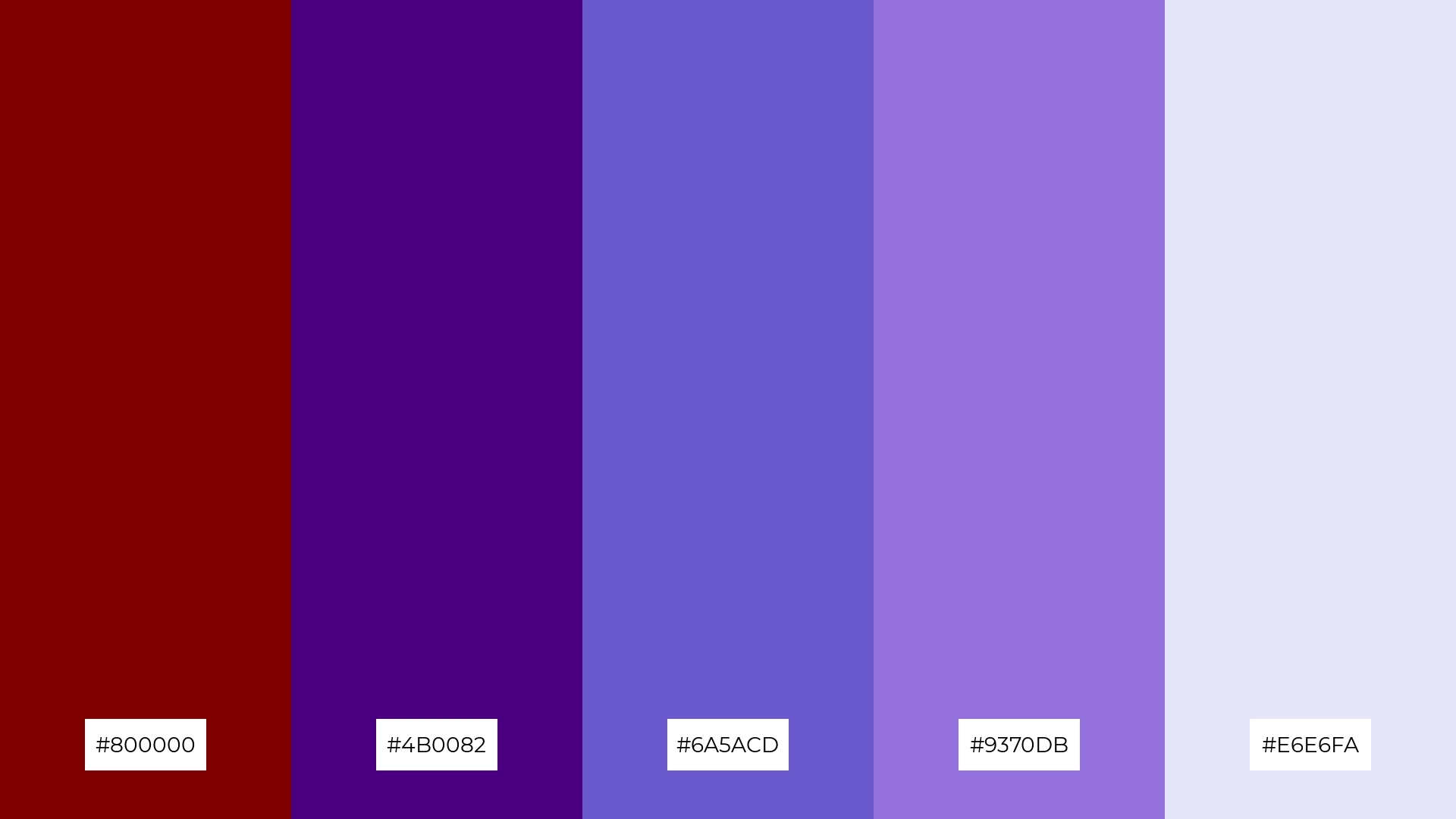
The ‘Royal Elegance’ palette, with its deep maroon (#800000), indigo (#4B0082), slate blue (#6A5ACD), medium purple (#9370DB), and lavender (#E6E6FA), creates an ambiance of opulence and sophistication, perfect for evoking a sense of regal serenity.
This harmonious blend of rich and soft hues is ideal for luxury fashion campaigns, where the combination of bold and delicate colors can enhance the allure and exclusivity of high-end designs.
6) Cozy Cabin
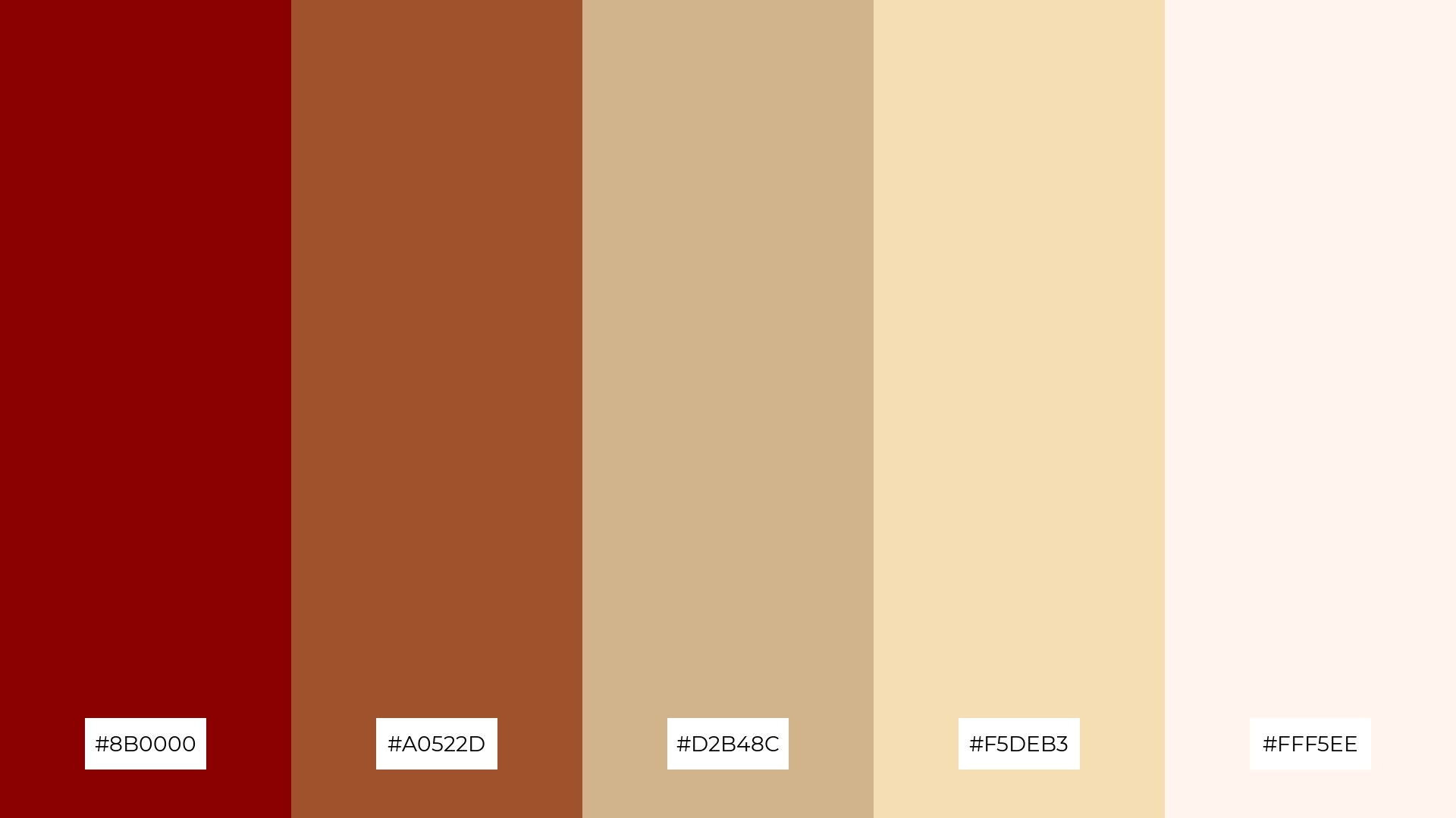
The ‘Cozy Cabin’ palette, with its deep crimson (#8B0000), sienna (#A0522D), tan (#D2B48C), wheat (#F5DEB3), and seashell (#FFF5EE), creates a harmonious blend that evokes a sense of rustic sophistication and warmth.
This palette is perfect for minimalistic branding in the hospitality industry, where the earthy and inviting tones can enhance the ambiance of boutique hotels or cozy cafes, making guests feel right at home.
7) Sunset Boulevard
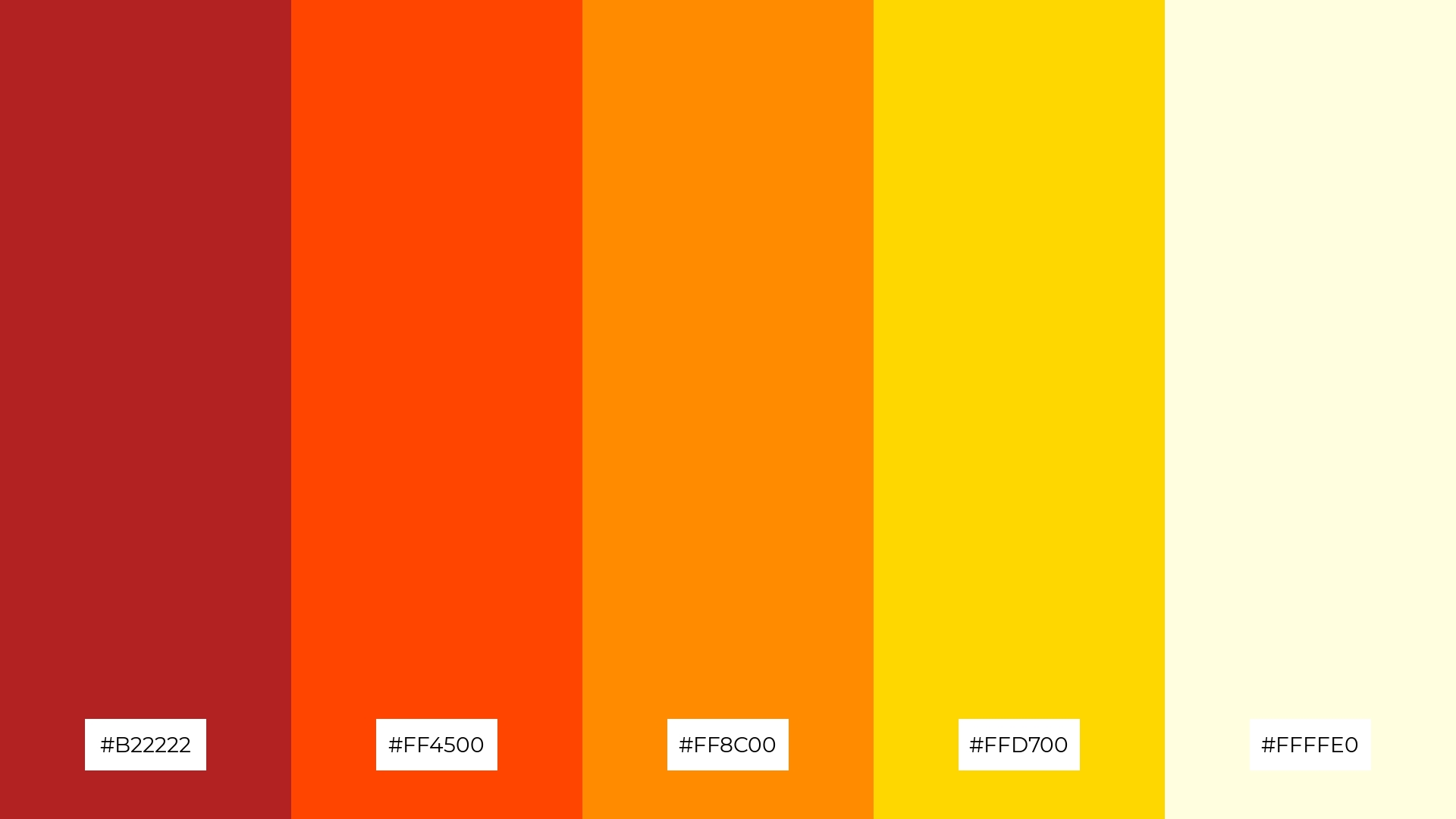
The ‘Sunset Boulevard’ palette, with its fiery reds (#B22222), vibrant oranges (#FF4500, #FF8C00), golden yellows (#FFD700), and soft light yellow (#FFFFE0), creates a striking contrast that captures the dynamic and captivating essence of a sunset.
This palette is perfect for creative projects like magazine layouts or artistic websites, where the bold and warm hues can draw attention and evoke a sense of energy and excitement, making the visuals truly stand out.
8) Berry Bliss
The ‘Berry Bliss’ palette, with its deep maroon (#800000) and crimson (#8B0000), can create a calming and serene atmosphere, perfect for spa branding that aims to evoke relaxation and tranquility.
Conversely, the vibrant pinks (#FF1493, #FF69B4) and light pink (#FFB6C1) in the palette can infuse energy and excitement into vibrant marketing campaigns, making them ideal for attracting attention and creating a lively, engaging visual experience.
9) Earthy Tones
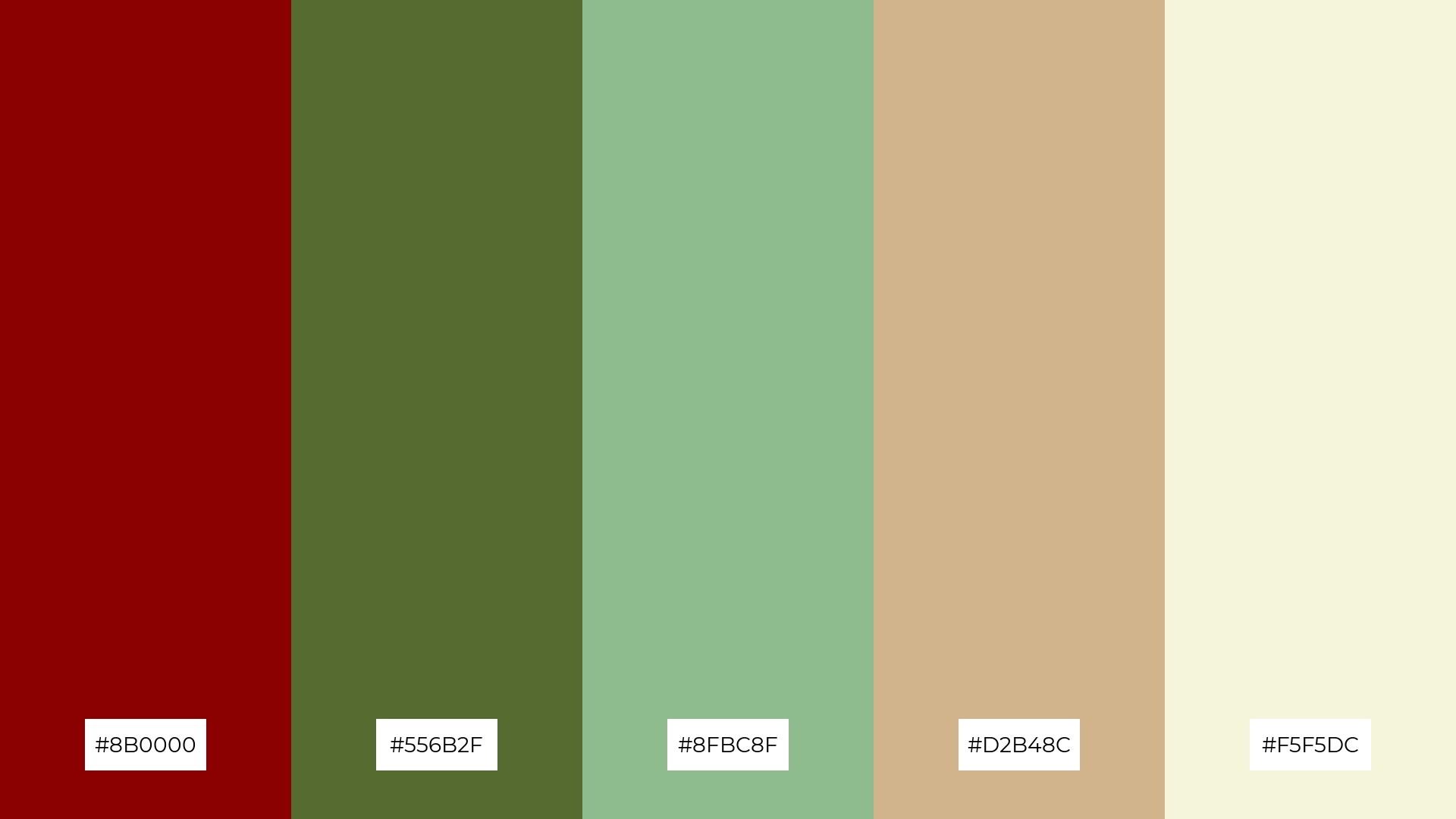
The ‘Earthy Tones’ palette, featuring softer hues like pale green (#8FBC8F) and beige (#F5F5DC), creates a calming and grounded atmosphere that evokes a sense of natural tranquility.
This harmonious blend is perfect for home decor or seasonal promotions, where the mix of bright and muted tones can enhance the cozy and inviting mood of any space or campaign.
10) Festive Cheer
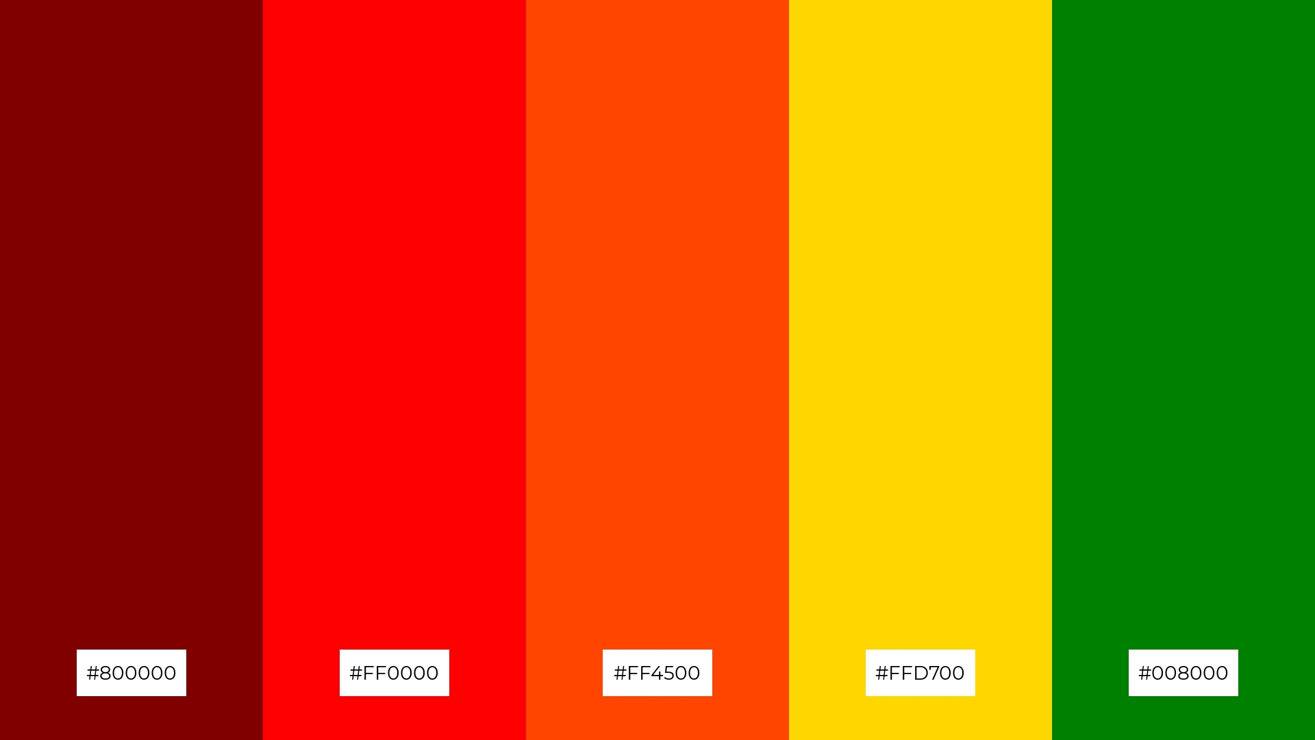
The ‘Festive Cheer’ palette, with its deep maroon (#800000), vibrant red (#FF0000), fiery orange (#FF4500), golden yellow (#FFD700), and rich green (#008000), creates a dynamic visual flow that evokes feelings of joy, excitement, and celebration.
This palette is ideal for lifestyle branding or tech product packaging, where the bold and lively colors can capture attention and convey a sense of energy and festivity, making the products stand out in a competitive market.
11) Warm Embrace
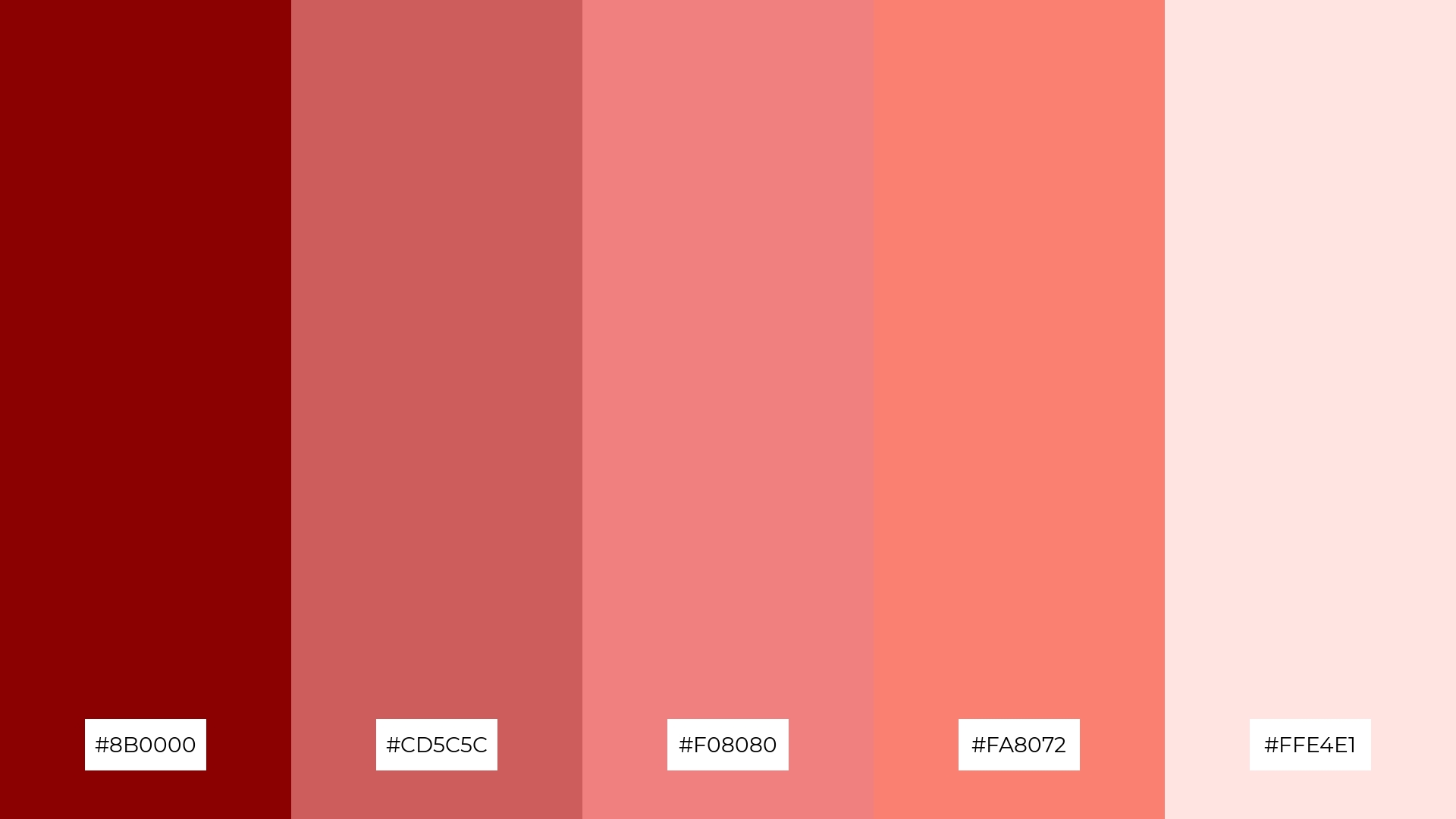
The ‘Warm Embrace’ palette, with its deep crimson (#8B0000), rosy brown (#CD5C5C), light coral (#F08080), salmon (#FA8072), and misty rose (#FFE4E1), creates a welcoming and dramatic effect by blending rich, warm tones that evoke feelings of comfort and passion.
This palette shines in boutique interiors, where the combination of bold and soft hues can create an inviting and luxurious atmosphere, perfect for enhancing the customer experience and making the space feel both elegant and cozy.
12) Enchanted Forest
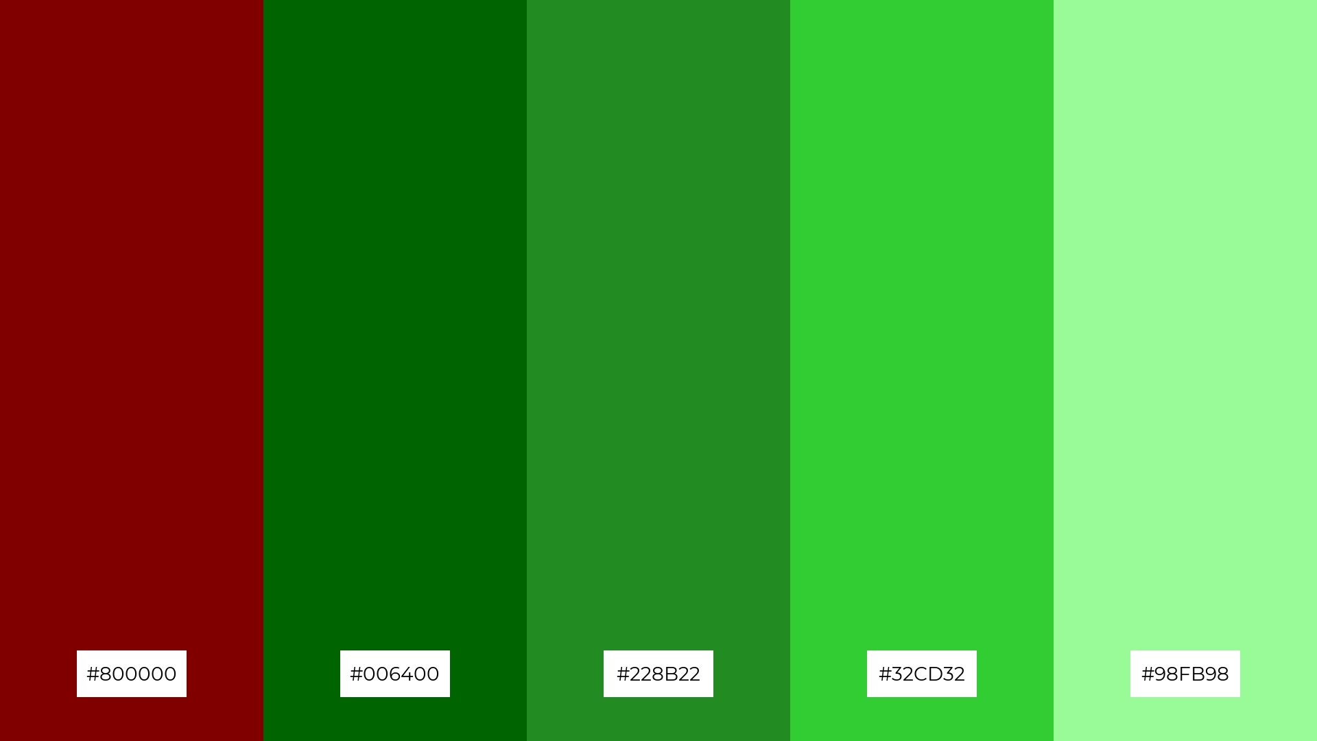
The ‘Enchanted Forest’ palette, with its deep maroon (#800000) and varying shades of green (#006400, #228B22, #32CD32, #98FB98), creates a harmonious balance that evokes a sense of natural tranquility and sophistication.
This palette is ideal for casual apparel lines, where the blend of rich and vibrant hues can create a stylish yet relaxed aesthetic, perfect for capturing the essence of nature-inspired fashion.
13) Desert Mirage
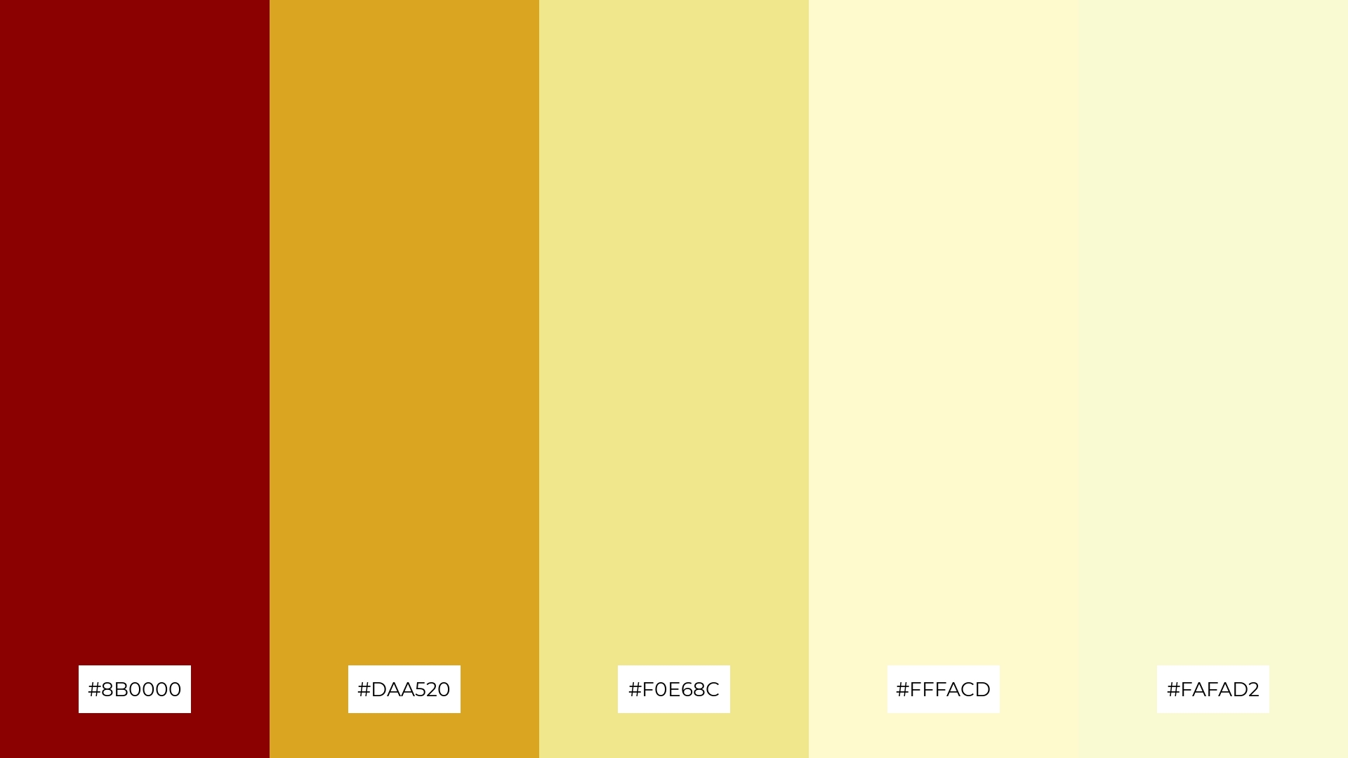
The ‘Desert Mirage’ palette, with its deep crimson (#8B0000), goldenrod (#DAA520), khaki (#F0E68C), lemon chiffon (#FFFACD), and light goldenrod yellow (#FAFAD2), masterfully blends warm and cool tones to evoke a serene yet vibrant mood.
This unique combination is perfect for artisan product branding, where the harmonious mix of rich and soft hues can create an inviting and sophisticated visual identity that stands out in a crowded market.
14) Midnight Magic
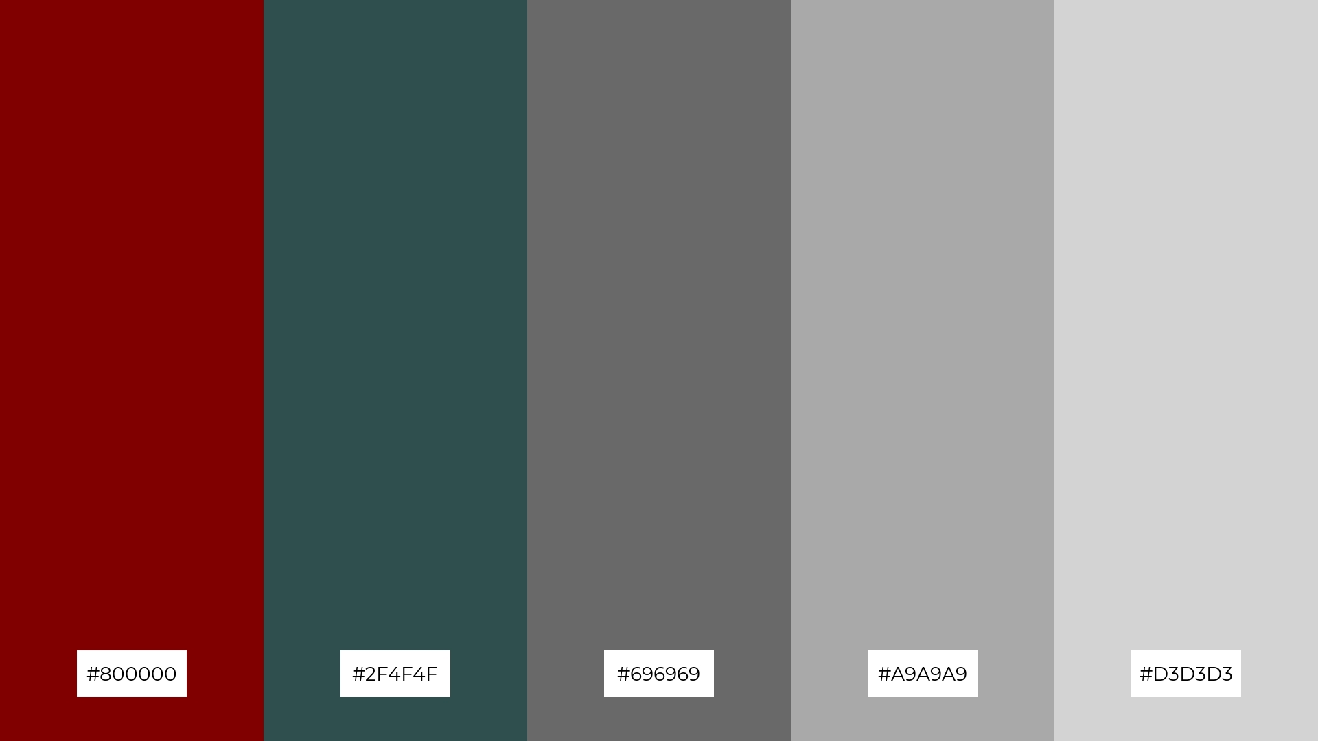
The ‘Midnight Magic’ palette, with its deep maroon (#800000), dark slate gray (#2F4F4F), dim gray (#696969), dark gray (#A9A9A9), and light gray (#D3D3D3), creates a striking contrast that can evoke a sense of mystery and sophistication.
This palette is perfect for restaurant menus, where the bold and subtle hues can enhance the dining experience by creating an elegant and inviting atmosphere.
15) Ocean Depths
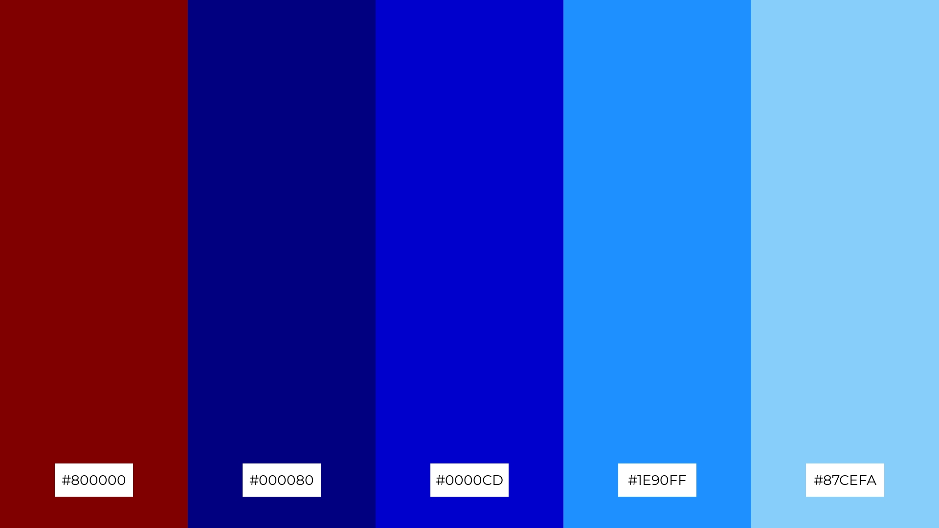
The ‘Ocean Depths’ palette, with its deep maroon (#800000) and varying shades of blue (#000080, #0000CD, #1E90FF, #87CEFA), can convey a sense of harmony by blending rich and calming hues that evoke the tranquility of the ocean.
This palette is ideal for tech startups aiming to create a sleek and modern visual identity or for cozy interior makeovers where the combination of bold and soft tones can enhance the ambiance and create a serene yet dynamic atmosphere.
How to Use Maroon Patterns in Design
Maroon color palettes can be a game-changer in home decor, adding a touch of elegance and warmth to any space. Use maroon as an accent color in throw pillows, rugs, or wall art to create a cozy and inviting atmosphere. Pair it with neutral tones like beige or gray to balance the richness of maroon and maintain a sophisticated look.
In marketing materials, maroon can evoke a sense of luxury and reliability. Incorporate maroon in your brand’s logo, brochures, or social media graphics to create a strong visual impact. Complement it with metallic accents like gold or bronze to enhance the overall appeal and convey a sense of exclusivity.
For clothing, maroon offers a versatile option that can be both bold and understated. Use maroon in statement pieces like jackets or dresses for a striking look, or in accessories like scarves and ties for a subtle yet stylish touch. Pair it with complementary colors like teal or navy to create a balanced and fashionable ensemble.
Ready to elevate your designs with maroon color palettes? Try creating your own stunning palettes using Piktochart. Get started now and transform your visual storytelling.


