Magenta, a vibrant and eye-catching color, has the power to transform any design project. Its unique blend of red and blue hues makes it a versatile choice for various applications.
From infographics to marketing materials, magenta color palettes can add a touch of sophistication and energy. Discover how to effectively incorporate this striking color into your designs.
Tips For Creating Magenta Color Palettes
Designing with magenta can be both exciting and challenging. Here are some practical tips to help you create stunning color palettes:
- Balance with Neutrals: Pair magenta with neutral colors like white, gray, or black to create a balanced and sophisticated look.
- Complementary Colors: Use complementary shades such as green or teal to make magenta pop and add visual interest to your design.
- Gradients and Shades: Experiment with different gradients and shades of magenta to add depth and dimension to your project.
- Accent Colors: Use magenta as an accent color to highlight key elements without overwhelming the overall design.
- Versatility: Combine magenta with other vibrant colors like yellow or orange for a bold and energetic palette, or with pastels for a softer, more versatile look.
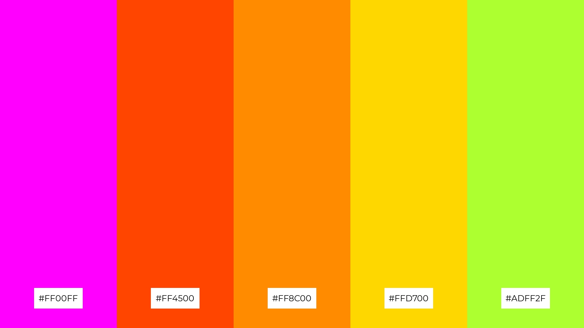
- Consistency: Ensure consistency by using the same shade of magenta across all design elements to maintain a cohesive and professional appearance.
15 Magenta Color Palettes
1) Sunset Bloom
The ‘Sunset Bloom’ palette, with its vibrant magentas and pinks, evokes a mood of warmth and romance, reminiscent of a serene evening sky.
These colors interact harmoniously to create a cohesive and inviting look, making them perfect for fashion designs that aim to capture attention and exude elegance.
2) Neon Vibes
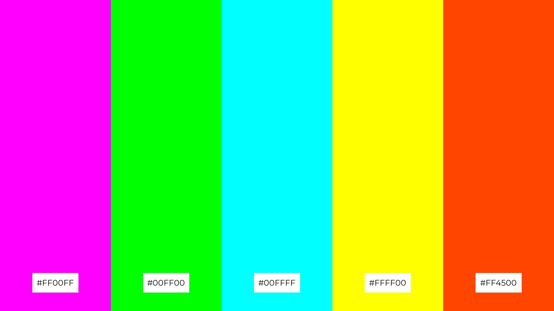
The ‘Neon Vibes’ palette, with its electrifying mix of magenta, lime green, cyan, yellow, and orange-red, evokes a sense of high energy and excitement, perfect for grabbing attention and creating a dynamic visual impact.
This vibrant color scheme would excel in digital branding for tech startups or product packaging for energy drinks, where the goal is to convey innovation, vitality, and a forward-thinking attitude.
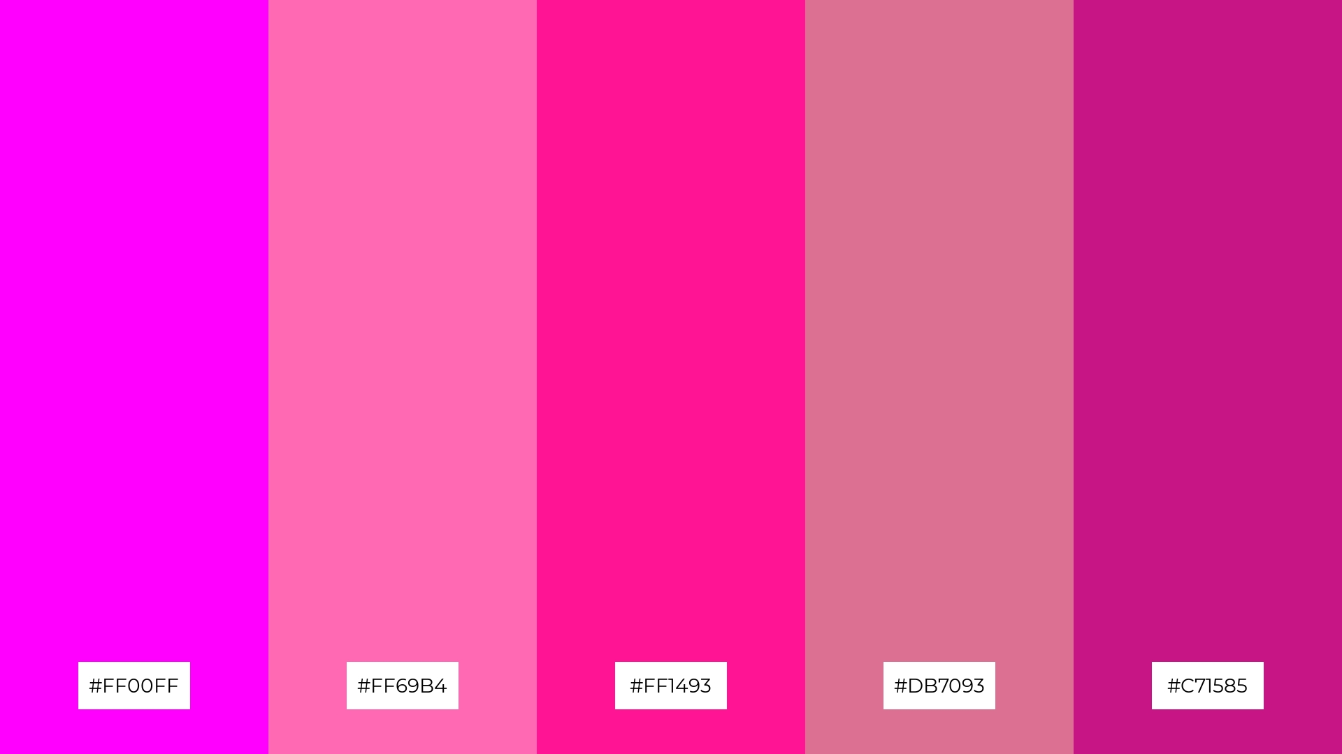
3) Floral Fantasy
The ‘Floral Fantasy’ palette, featuring dominant colors like magenta (#FF00FF), light pink (#FFB6C1), hot pink (#FF69B4), deep pink (#FF1493), and medium violet-red (#C71585), creates a vibrant and cohesive look.
This harmonious blend of pinks and magentas is ideal for wellness branding, where the soothing yet energetic tones can evoke feelings of calmness and rejuvenation.
4) Electric Dreams
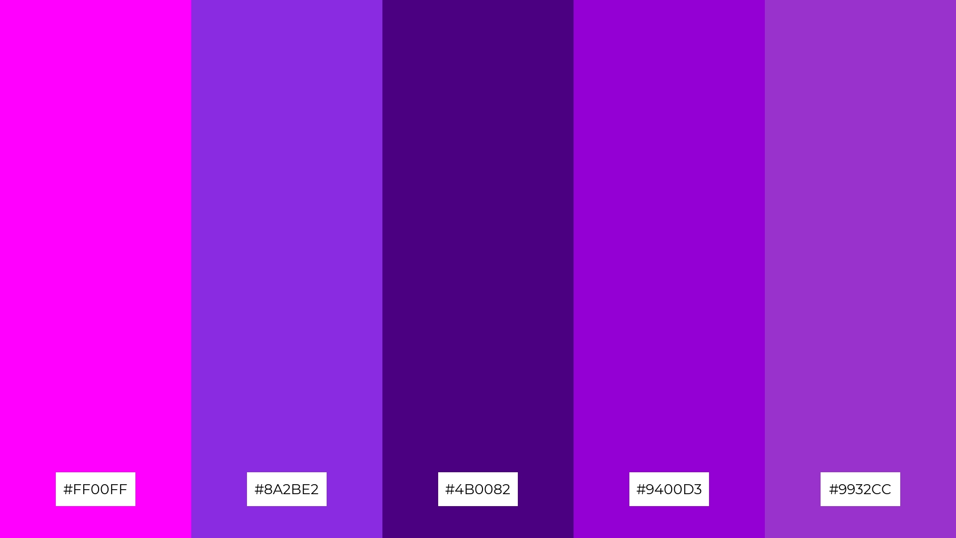
The ‘Electric Dreams’ palette, with its mix of magenta (#FF00FF), blue-violet (#8A2BE2), indigo (#4B0082), dark violet (#9400D3), and dark orchid (#9932CC), offers a balance of soft and bold tones, creating a distinct and captivating mood.
This versatile color scheme is ideal for creating inviting retail spaces or modern web designs, where the combination of vibrant and subdued hues can attract attention while maintaining a sophisticated and contemporary feel.
5) Candy Crush
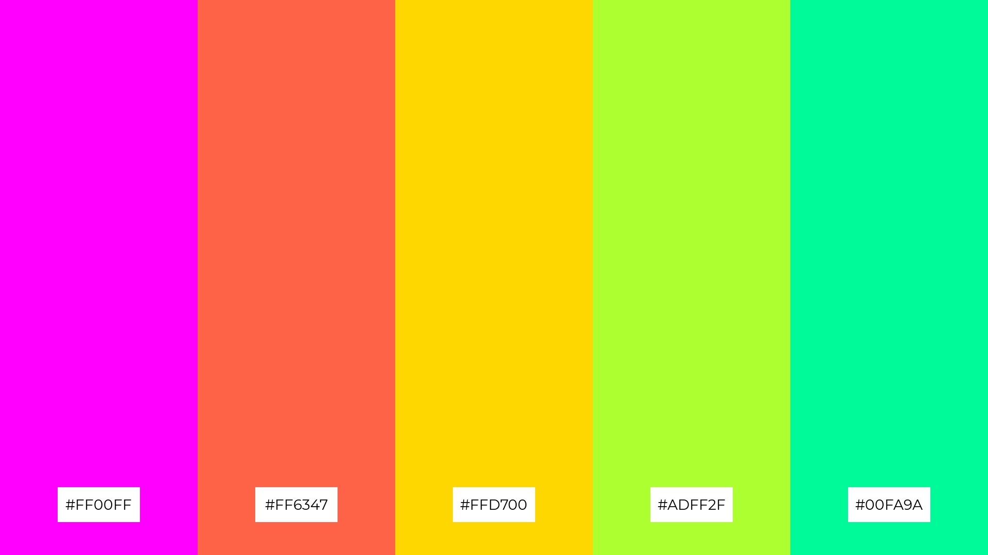
The ‘Candy Crush’ palette, with its playful mix of magenta (#FF00FF), tomato (#FF6347), gold (#FFD700), green-yellow (#ADFF2F), and medium spring green (#00FA9A), creates a vibrant and cheerful ambiance, perfect for children’s party invitations or playful event decor.
This lively combination of colors can also be effectively used in luxury fashion campaigns, where the bold and energetic hues can make a striking statement and capture the attention of a sophisticated audience.
6) Mystic Forest
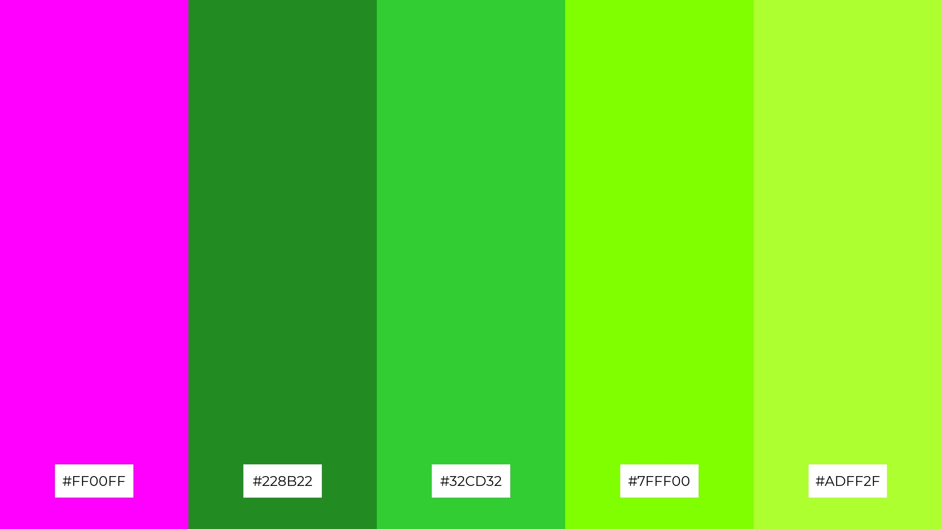
The ‘Mystic Forest’ palette, with its blend of magenta (#FF00FF) and various shades of green (#228B22, #32CD32, #7FFF00, #ADFF2F), creates a striking contrast that can evoke a sense of sophistication and natural elegance.
This harmonious combination is perfect for minimalistic branding, where the vibrant magenta can serve as an eye-catching accent against the calming greens, creating a balanced and refined visual identity.
7) Ocean Breeze

The ‘Ocean Breeze’ palette, with its striking contrast between vibrant magenta (#FF00FF) and various shades of teal (#00CED1, #20B2AA, #48D1CC, #40E0D0), creates a visually captivating and dynamic effect.
This unique combination is ideal for creative projects like magazine layouts or artistic websites, where the bold interplay of colors can draw attention and enhance the overall aesthetic appeal.
8) Galactic Glow
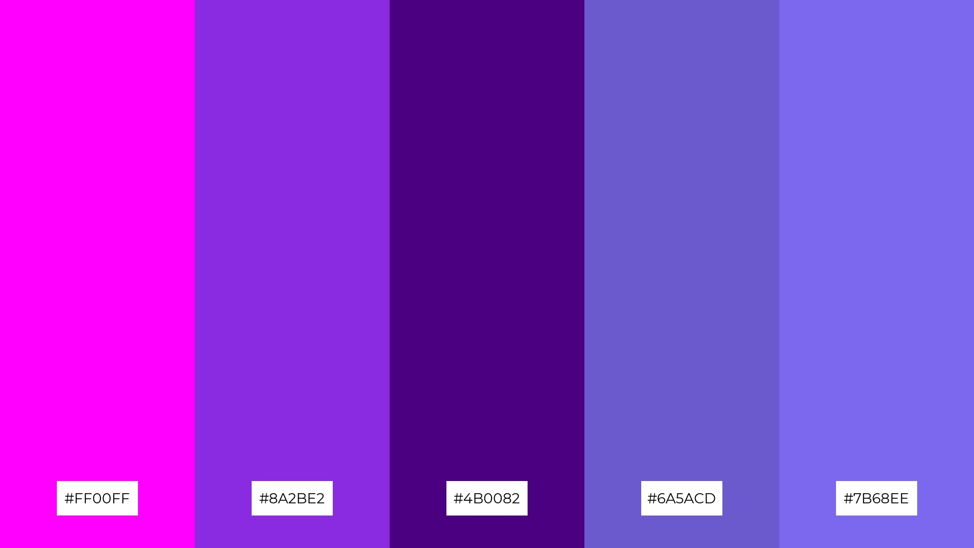
The ‘Galactic Glow’ palette, with its mix of magenta (#FF00FF), blue-violet (#8A2BE2), indigo (#4B0082), slate blue (#6A5ACD), and medium slate blue (#7B68EE), can evoke a sense of calm when the cooler shades are emphasized, making it ideal for spa branding where tranquility and relaxation are key.
Conversely, when the vibrant magenta and blue-violet are highlighted, this palette can create an exciting and dynamic visual impact, perfect for vibrant marketing campaigns that aim to capture attention and convey a sense of innovation and energy.
9) Tropical Punch
The ‘Tropical Punch’ palette, with its softer tones of gold (#FFD700) and green-yellow (#ADFF2F) alongside the brighter magenta (#FF00FF) and orange-red (#FF4500), creates a lively and cheerful mood that can instantly uplift any design.
This vibrant blend is ideal for seasonal promotions or home decor, where the energetic hues can evoke a sense of warmth and excitement, making spaces feel welcoming and festive.
10) Berry Delight
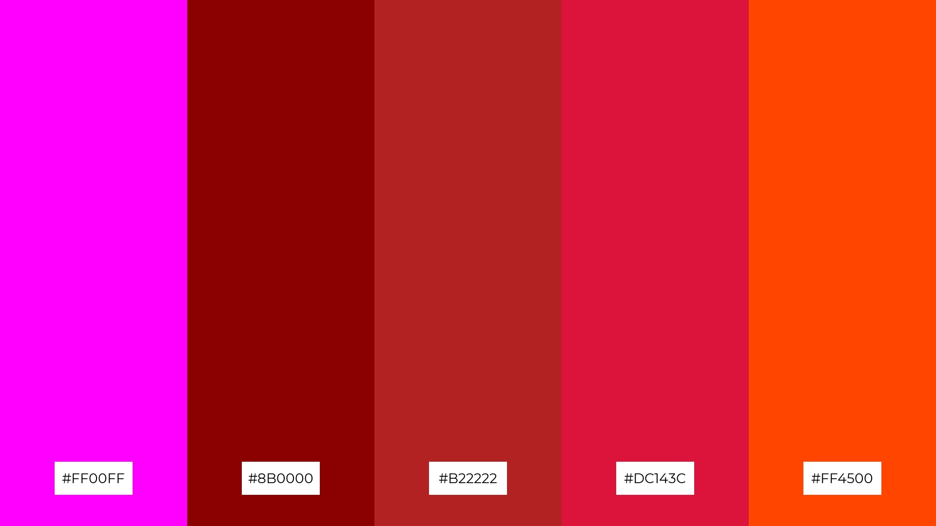
The ‘Berry Delight’ palette, with its rich magenta (#FF00FF) and deep reds (#8B0000, #B22222, #DC143C), creates a visual flow that evokes feelings of passion and energy, while the bright orange-red (#FF4500) adds a touch of excitement and warmth.
This emotionally impactful combination is perfect for lifestyle branding, where the vibrant hues can convey a sense of joy and vitality, or for tech product packaging, where the bold colors can capture attention and suggest innovation and dynamism.
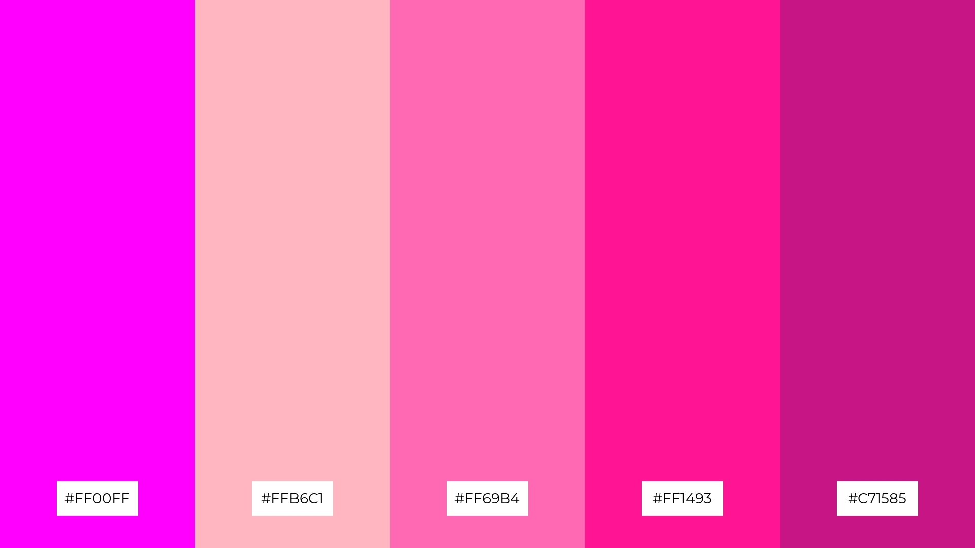
11) Cosmic Candy
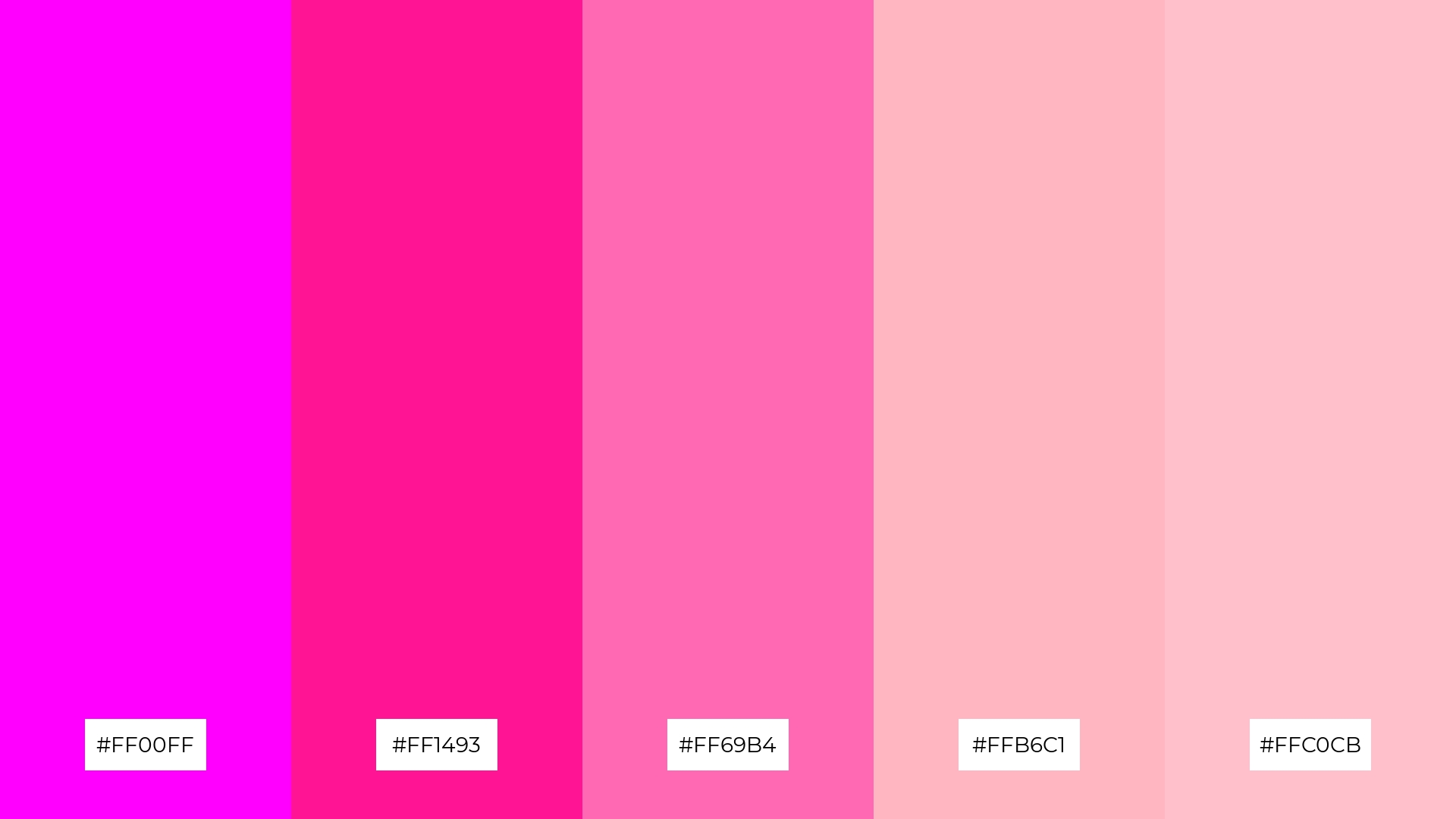
The ‘Cosmic Candy’ palette, with its vibrant magenta (#FF00FF) and various shades of pink (#FF1493, #FF69B4, #FFB6C1, #FFC0CB), creates a welcoming and playful effect that can instantly uplift any design.
This dynamic combination is perfect for boutique interiors or luxury e-commerce sites, where the bold and cheerful hues can evoke a sense of sophistication and excitement, making spaces feel inviting and visually captivating.
12) Enchanted Garden
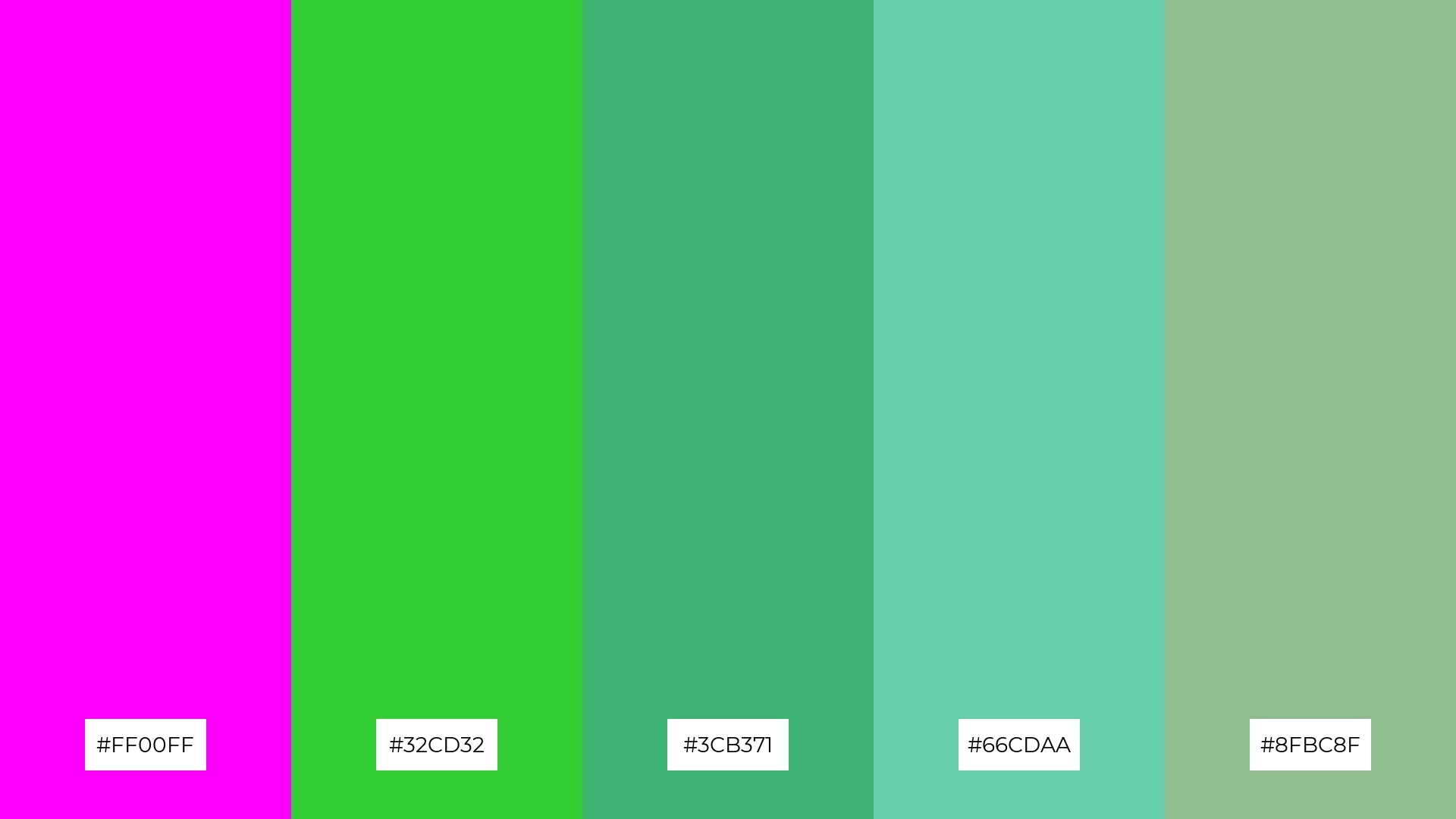
The ‘Enchanted Garden’ palette, with its vibrant magenta (#FF00FF) and various shades of green (#32CD32, #3CB371, #66CDAA, #8FBC8F), creates a harmonious balance where the bold magenta contrasts beautifully with the calming greens, evoking a sense of natural elegance and vitality.
This balanced yet striking combination is perfect for casual apparel lines, where the vibrant hues can add a touch of sophistication and energy to everyday wear, making the designs both eye-catching and stylish.
13) Aurora Lights
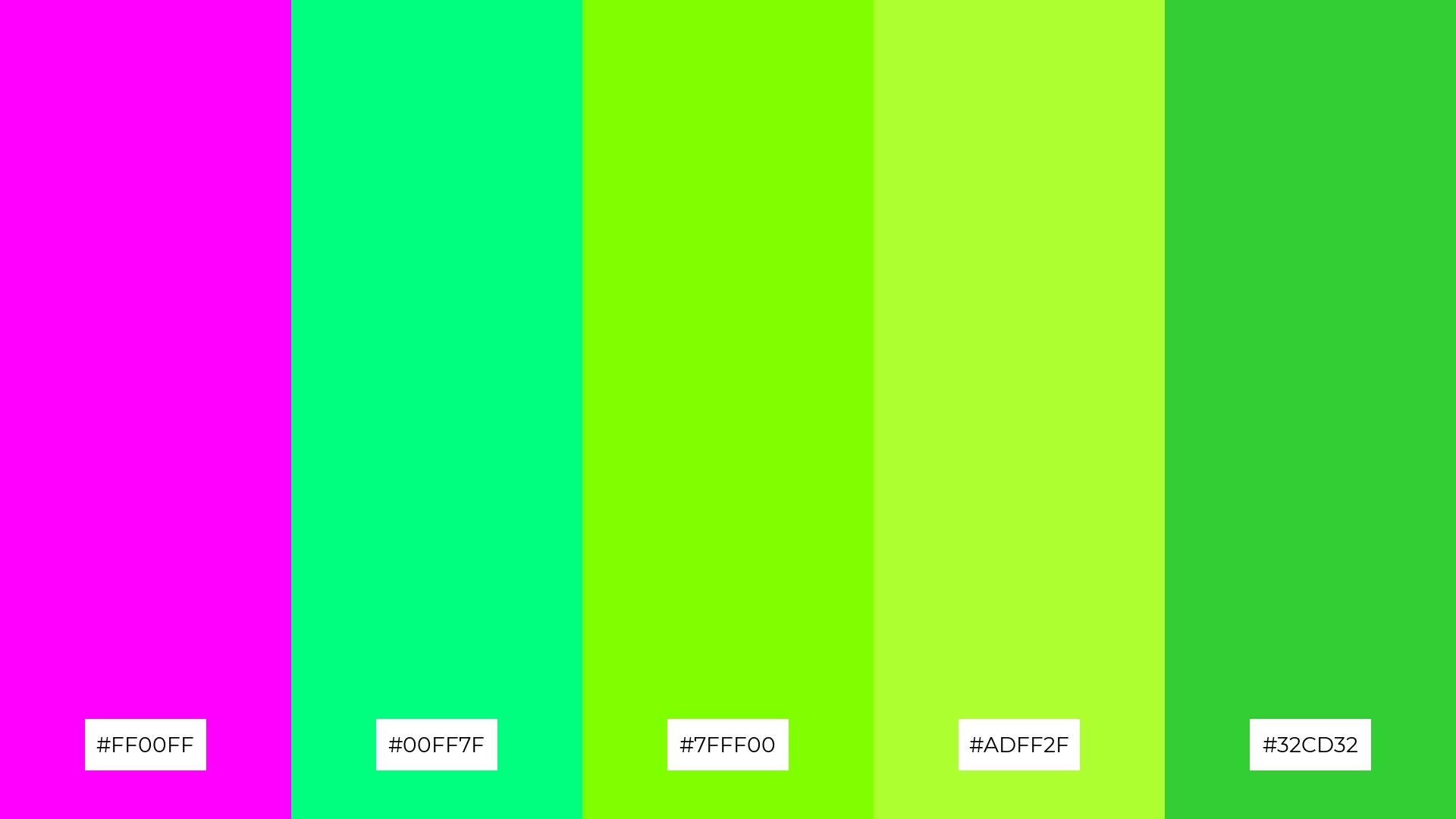
The ‘Aurora Lights’ palette, with its blend of warm magenta (#FF00FF) and cool greens (#00FF7F, #7FFF00, #ADFF2F, #32CD32), creates a dynamic and balanced mood that evokes both energy and tranquility.
This versatile combination is perfect for artisan product branding, where the vibrant hues can highlight the craftsmanship and uniqueness of handmade goods, making them stand out in a crowded market.
14) Royal Affair
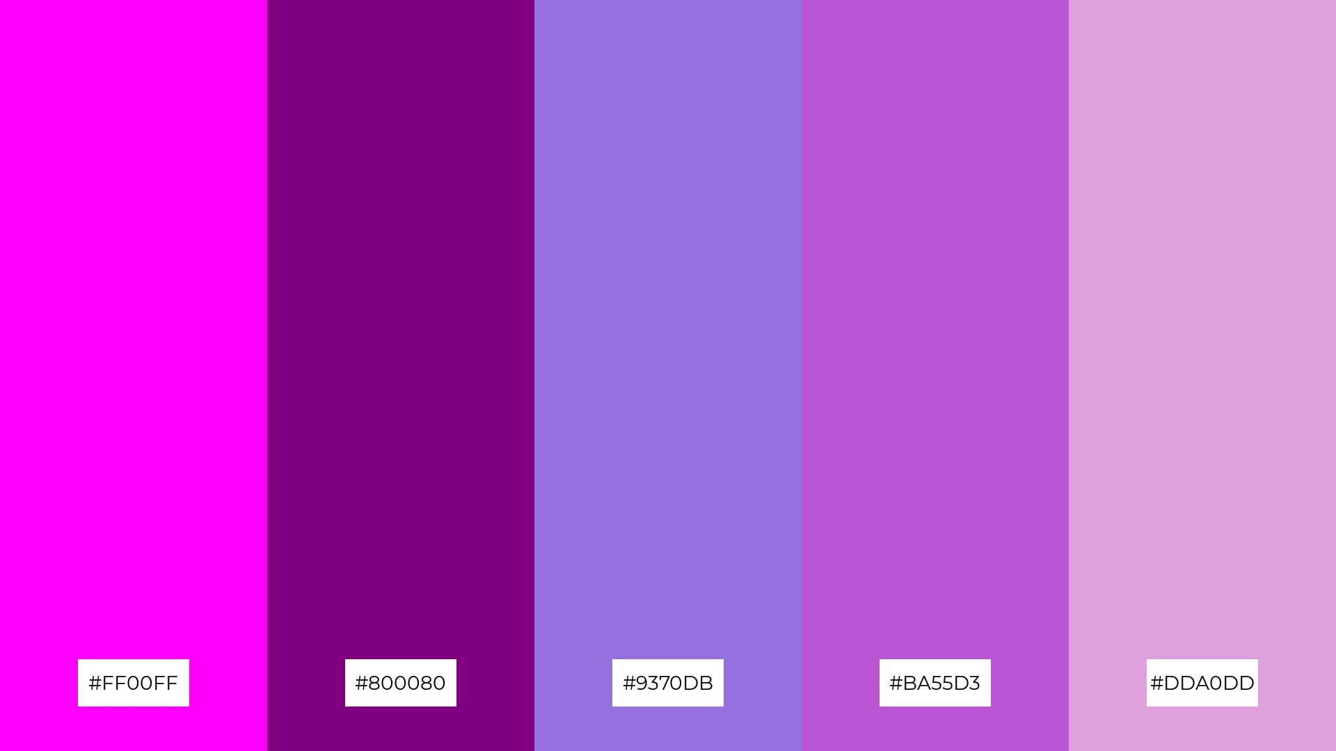
The ‘Royal Affair’ palette, with its rich magenta (#FF00FF), deep purple (#800080), medium purple (#9370DB), orchid (#BA55D3), and plum (#DDA0DD), creates a luxurious and sophisticated visual experience, perfect for high-end restaurant menus where the bold and subtle hues can evoke a sense of elegance and refinement.
This dynamic combination of colors can also be effectively used in festival marketing, where the vibrant magenta and purples can capture attention and convey a sense of excitement and celebration, making the event feel both grand and inviting.
15) Citrus Splash
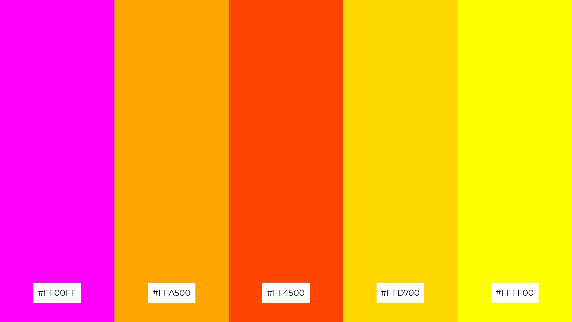
The ‘Citrus Splash’ palette, with its vibrant magenta (#FF00FF), orange (#FFA500), orange-red (#FF4500), gold (#FFD700), and yellow (#FFFF00), can convey a sense of harmony when used in balanced proportions, creating a cohesive and inviting visual experience.
This dynamic combination is ideal for tech startups aiming to convey innovation and energy, or for cozy interior makeovers where the warm and cheerful hues can create a welcoming and lively atmosphere.
How to Use Magenta Patterns in Design
Magenta color palettes can bring a vibrant and dynamic touch to home decor. Use magenta as an accent color in throw pillows, rugs, or wall art to create focal points that energize the space. Pairing magenta with neutral tones like gray or beige can balance the boldness and maintain a sophisticated look.
In marketing materials, magenta can be used to draw attention to key elements such as call-to-action buttons, headlines, or promotional banners. Combining magenta with complementary colors like teal or lime green can create a visually striking and memorable design. This approach can help your marketing campaigns stand out and effectively convey your brand’s message.
For clothing design, magenta can add a touch of elegance and modernity. Use it in patterns or as a primary color for statement pieces to create a bold fashion statement. Mixing magenta with softer pastels can also result in a versatile and stylish palette suitable for various occasions.
Ready to experiment with magenta color palettes in your designs? Try creating stunning visuals with Piktochart’s easy-to-use tools. Get started today and bring your creative ideas to life!


