Crimson red is a bold and captivating color that can add a touch of elegance and intensity to any design. Its rich, deep hue makes it a popular choice for creating striking visual statements.
Whether you’re designing a website, an infographic, or a marketing campaign, incorporating crimson red can evoke strong emotions and draw attention. In this article, we’ll explore various crimson red color palettes to inspire your next project.
Tips For Creating Crimson Red Color Palettes
Designing with crimson red can be both exciting and challenging. Here are some practical tips to help you create stunning color palettes:
- Balance with Neutrals: Pair crimson red with neutral colors like white, black, or gray to create a balanced and sophisticated look.
- Complementary Colors: Use complementary shades such as teal or turquoise to make the crimson red pop and add visual interest.
- Gradients and Shades: Experiment with different gradients and shades of crimson red to add depth and dimension to your design.
- Accent Colors: Incorporate accent colors like gold or silver to enhance the richness of crimson red and create a luxurious feel.
- Versatility: Ensure your color palette is versatile by including both warm and cool tones, allowing for flexibility in various design contexts.
- Consistency: Maintain consistency in your color usage to create a cohesive and professional look across all design elements.
15 Crimson Red Color Palettes
1) Sunset Blaze
The ‘Sunset Blaze’ palette, with its vibrant oranges and deep reds, creates a warm and energetic mood that evokes the beauty of a fiery sunset.
These colors interact harmoniously to produce a cohesive and dynamic look, making them perfect for fashion designs that aim to make a bold statement.
2) Autumn Leaves
The ‘Autumn Leaves’ palette, with its rich hues of deep red, crimson, dark orange, gold, and saddle brown, evokes a sense of warmth and nostalgia, reminiscent of cozy fall days and the changing seasons.
This palette would excel in product packaging for artisanal goods or seasonal digital branding, where the colors can convey a feeling of comfort and natural beauty.
3) Berry Burst
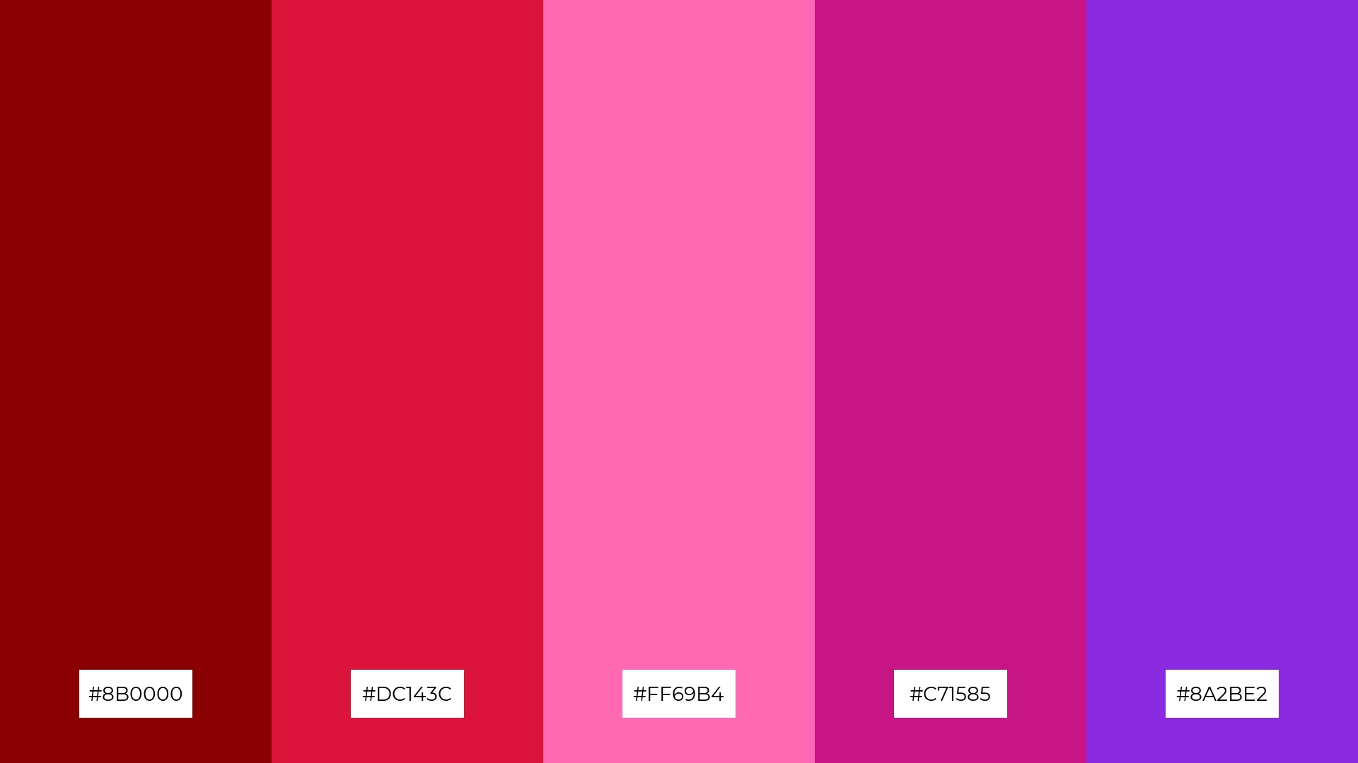
The ‘Berry Burst’ palette features dominant colors such as deep red (#8B0000), crimson (#DC143C), hot pink (#FF69B4), medium violet-red (#C71585), and blue violet (#8A2BE2), creating a vibrant and energetic visual experience.
This combination of bold and lively hues can be particularly effective in wellness branding, where the colors’ dynamic harmony can evoke feelings of vitality and rejuvenation.
4) Crimson Twilight
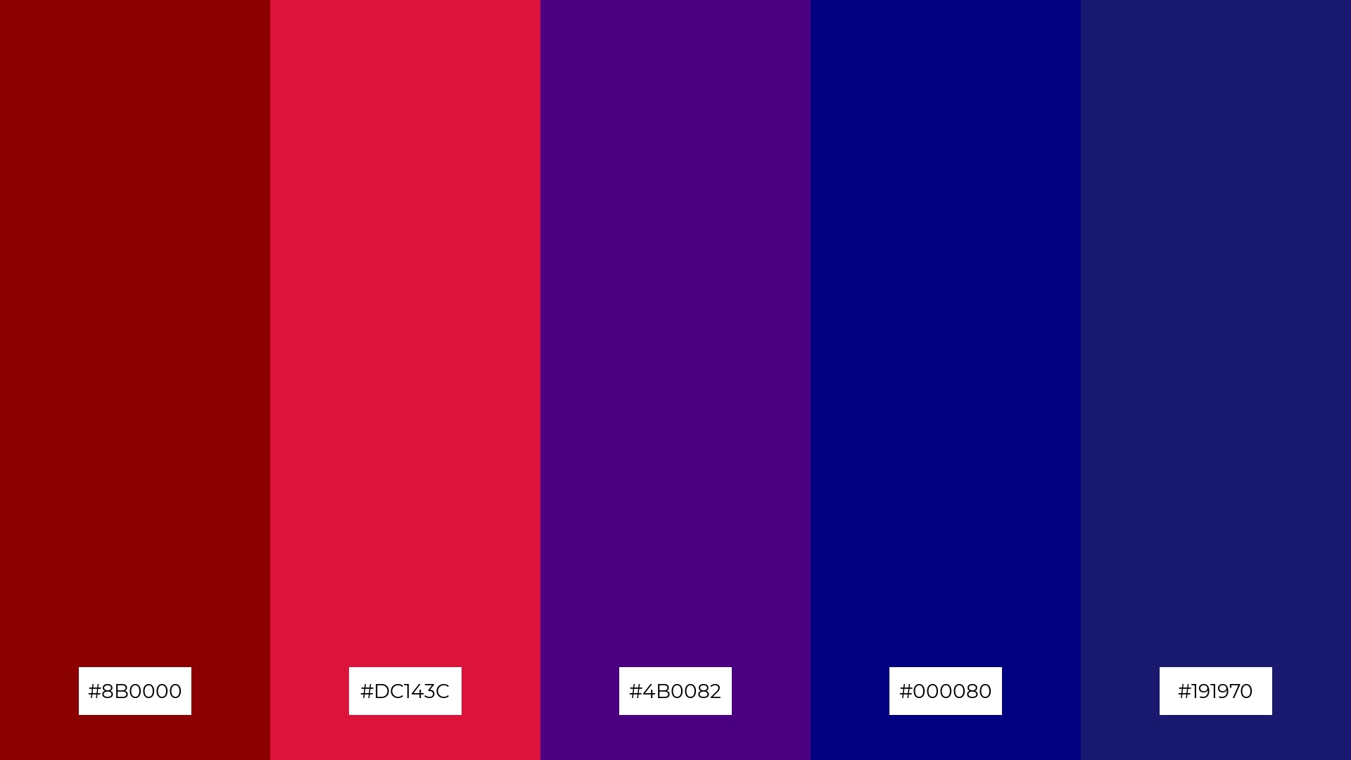
The ‘Crimson Twilight’ palette, with its blend of deep red (#8B0000), crimson (#DC143C), indigo (#4B0082), navy (#000080), and midnight blue (#191970), offers a balance of soft and bold tones, creating a distinct and captivating mood.
This palette is ideal for creating inviting retail spaces or modern web designs, where the harmonious interplay of colors can draw in customers and enhance the overall aesthetic experience.
5) Rose Garden
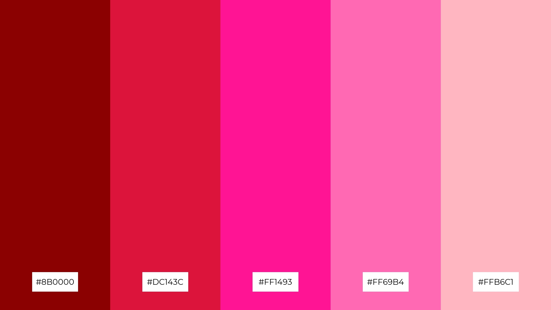
The ‘Rose Garden’ palette, with its blend of deep red (#8B0000), crimson (#DC143C), deep pink (#FF1493), hot pink (#FF69B4), and light pink (#FFB6C1), creates a serene and romantic ambiance that is perfect for wedding themes.
These harmonious colors can be used to design elegant invitations, floral arrangements, and decor, ensuring a cohesive and enchanting atmosphere for the special day.
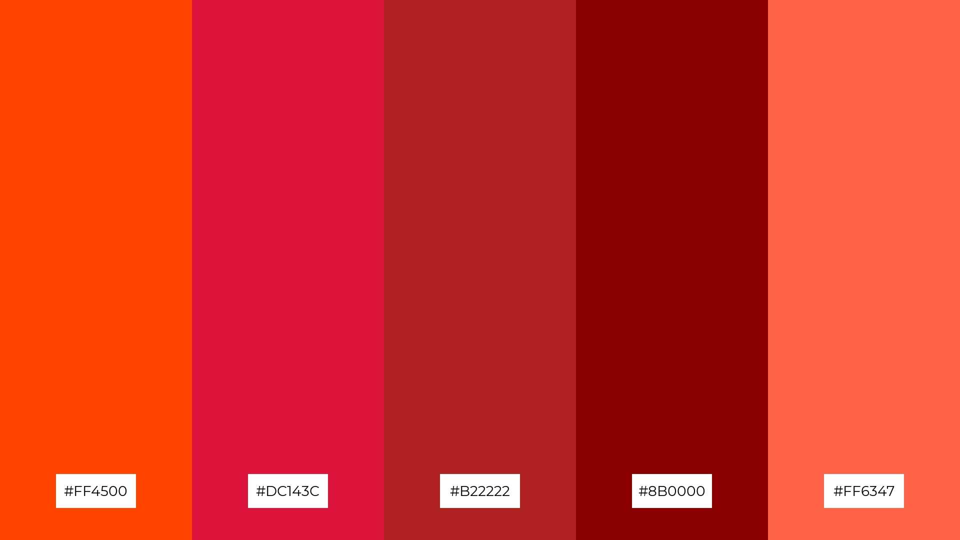
6) Fiery Passion
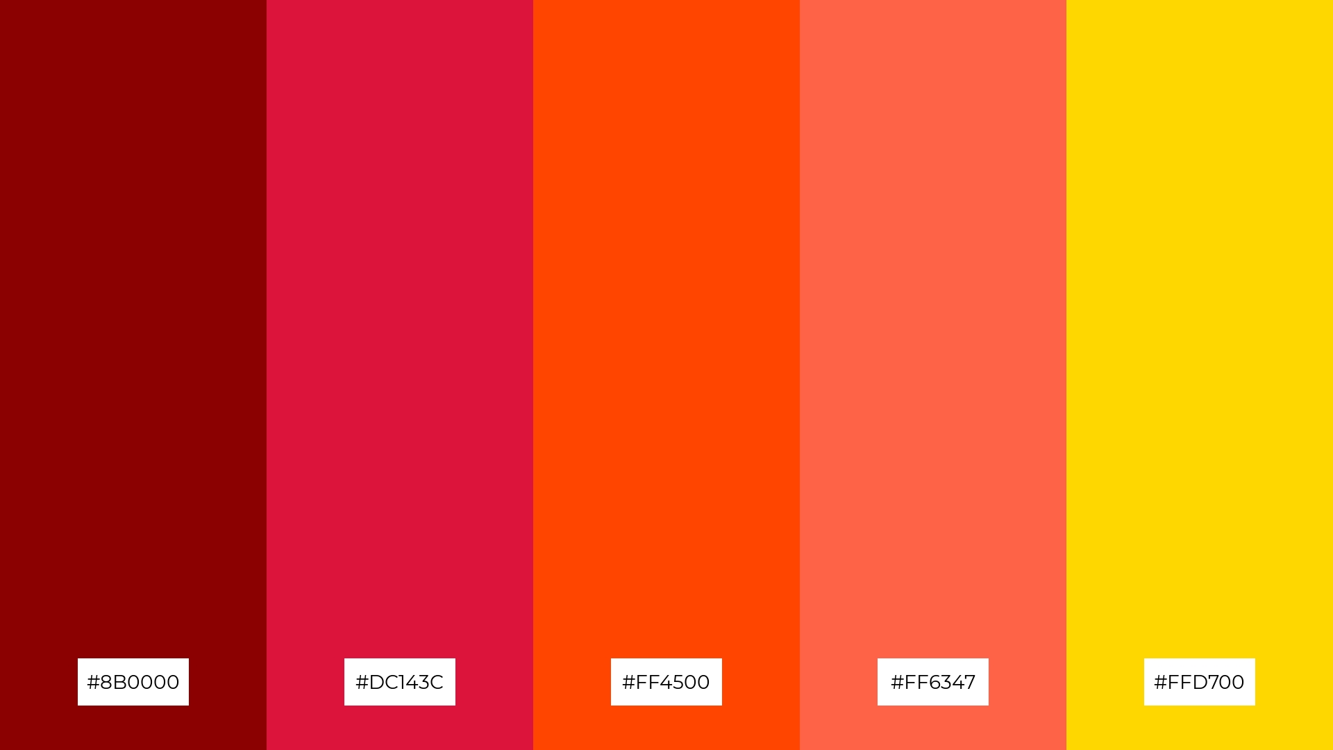
The ‘Fiery Passion’ palette, with its blend of deep red (#8B0000), crimson (#DC143C), orange-red (#FF4500), tomato (#FF6347), and gold (#FFD700), creates a dynamic and sophisticated mood that can elevate any design project.
This vibrant combination is perfect for bold event designs, where the interplay of warm and intense hues can captivate the audience and create an unforgettable visual experience.
7) Royal Elegance
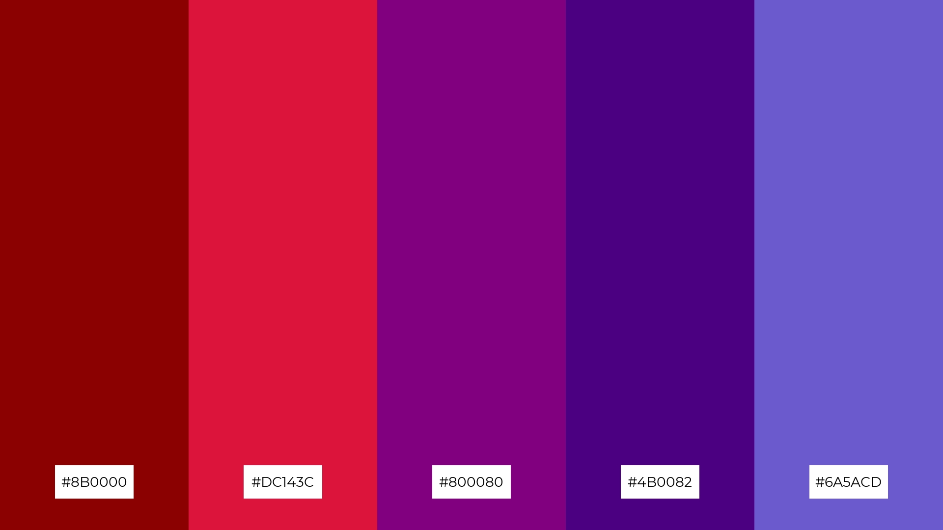
The ‘Royal Elegance’ palette, with its mix of deep red (#8B0000), crimson (#DC143C), purple (#800080), indigo (#4B0082), and slate blue (#6A5ACD), combines contrasting elements that create a visually captivating and sophisticated look.
This palette is ideal for creative projects like magazine layouts or artistic websites, where the interplay of rich and varied hues can add depth, intrigue, and a touch of luxury to the overall design.
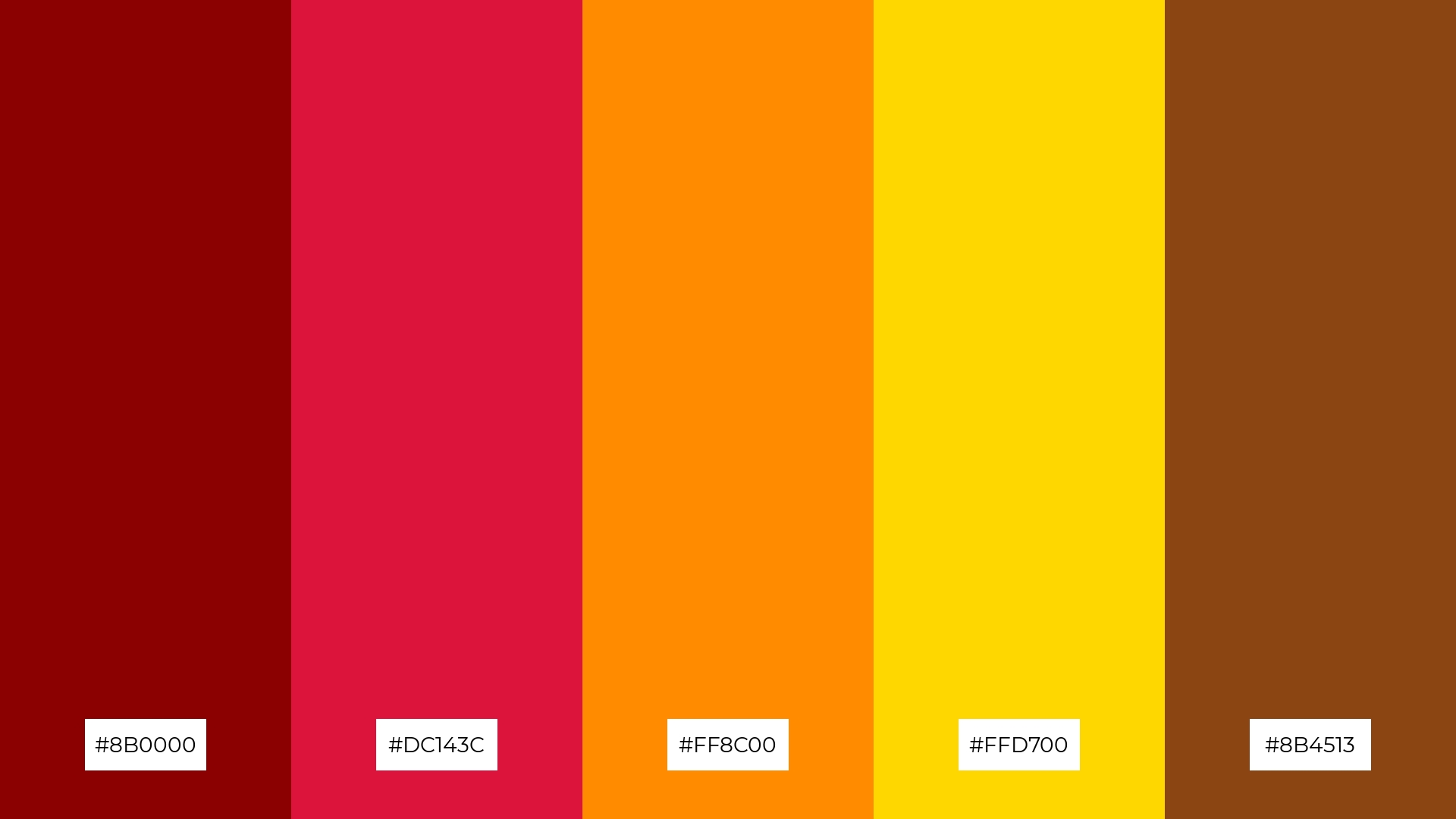
8) Vintage Charm
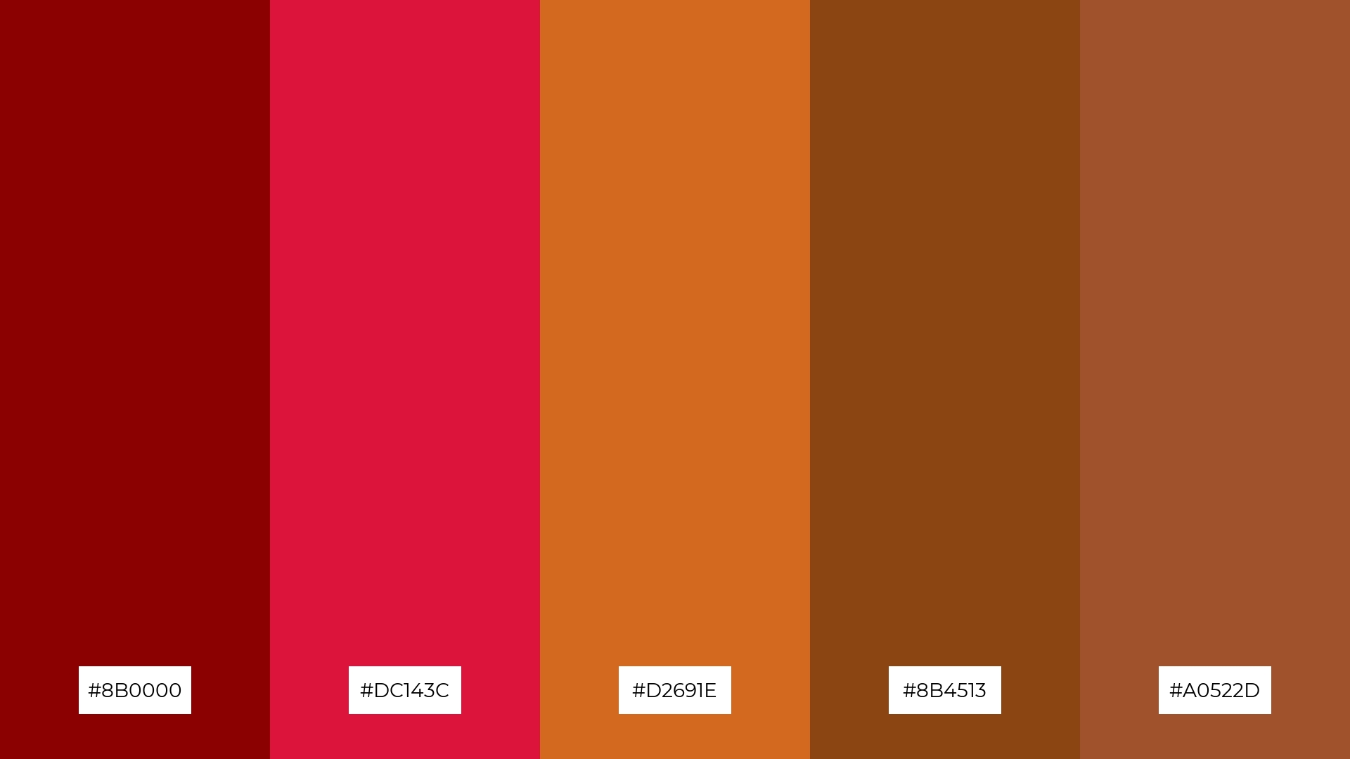
The ‘Vintage Charm’ palette, with its blend of deep red (#8B0000), crimson (#DC143C), chocolate (#D2691E), saddle brown (#8B4513), and sienna (#A0522D), can evoke a sense of calm when used in muted combinations, making it ideal for spa branding that aims to create a serene and relaxing atmosphere.
Conversely, the same colors can bring excitement and energy when paired in vibrant contrasts, making them perfect for dynamic marketing campaigns that seek to capture attention and convey a sense of boldness and creativity.
9) Mystic Forest
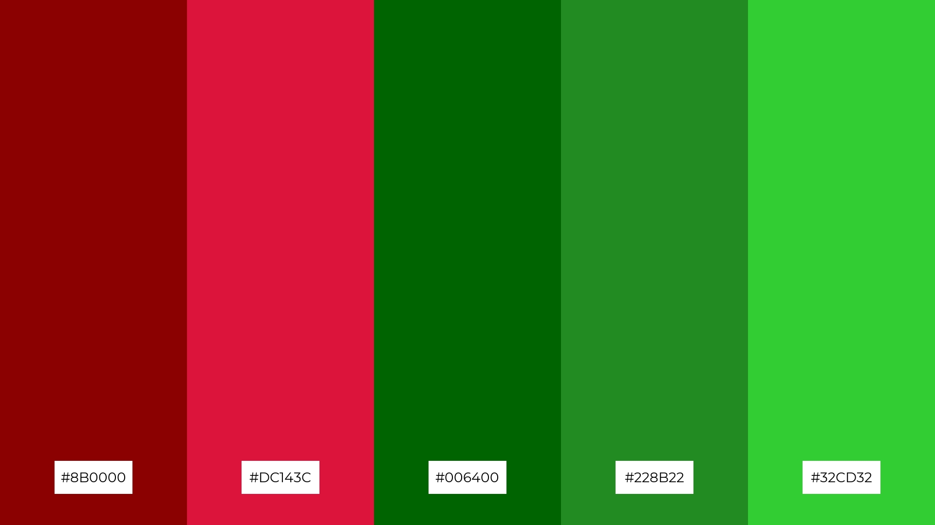
The ‘Mystic Forest’ palette, with its softer tones of forest green (#228B22) and lime green (#32CD32), creates a refreshing and tranquil atmosphere that can evoke a sense of calm and rejuvenation.
This blend of colors is ideal for home decor, where the harmonious interplay of deep reds and vibrant greens can bring a touch of nature indoors, making spaces feel both inviting and serene.
10) Ocean Depths
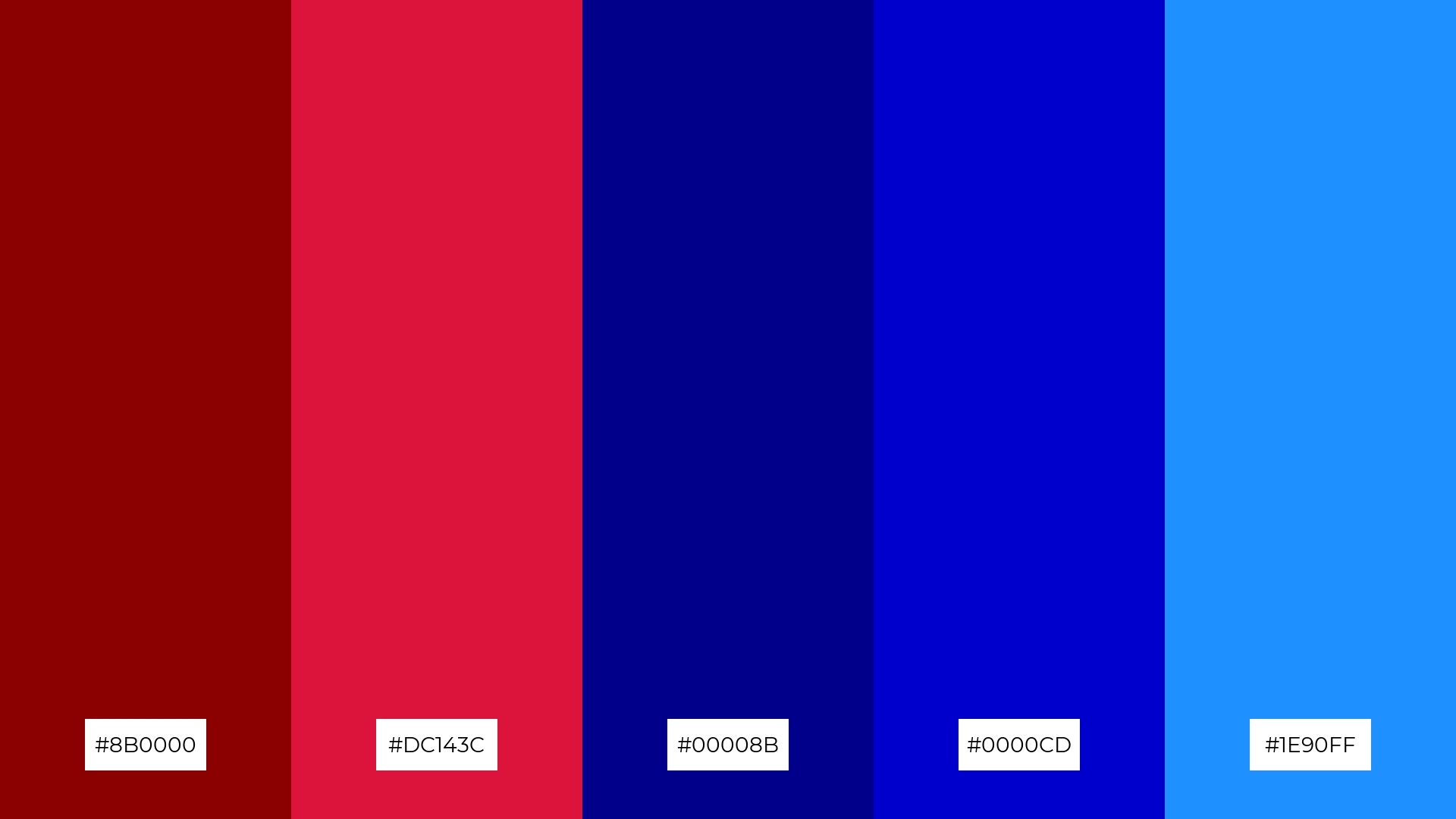
The ‘Ocean Depths’ palette, with its blend of deep red (#8B0000), crimson (#DC143C), dark blue (#00008B), medium blue (#0000CD), and dodger blue (#1E90FF), creates a visual flow that evokes a sense of depth and tranquility, reminiscent of the serene and mysterious nature of the ocean.
This harmonious combination of colors can be particularly effective in lifestyle branding or tech product packaging, where the calming blues can convey reliability and innovation, while the touches of red add a dynamic and engaging element to the overall design.
11) Enchanted Night
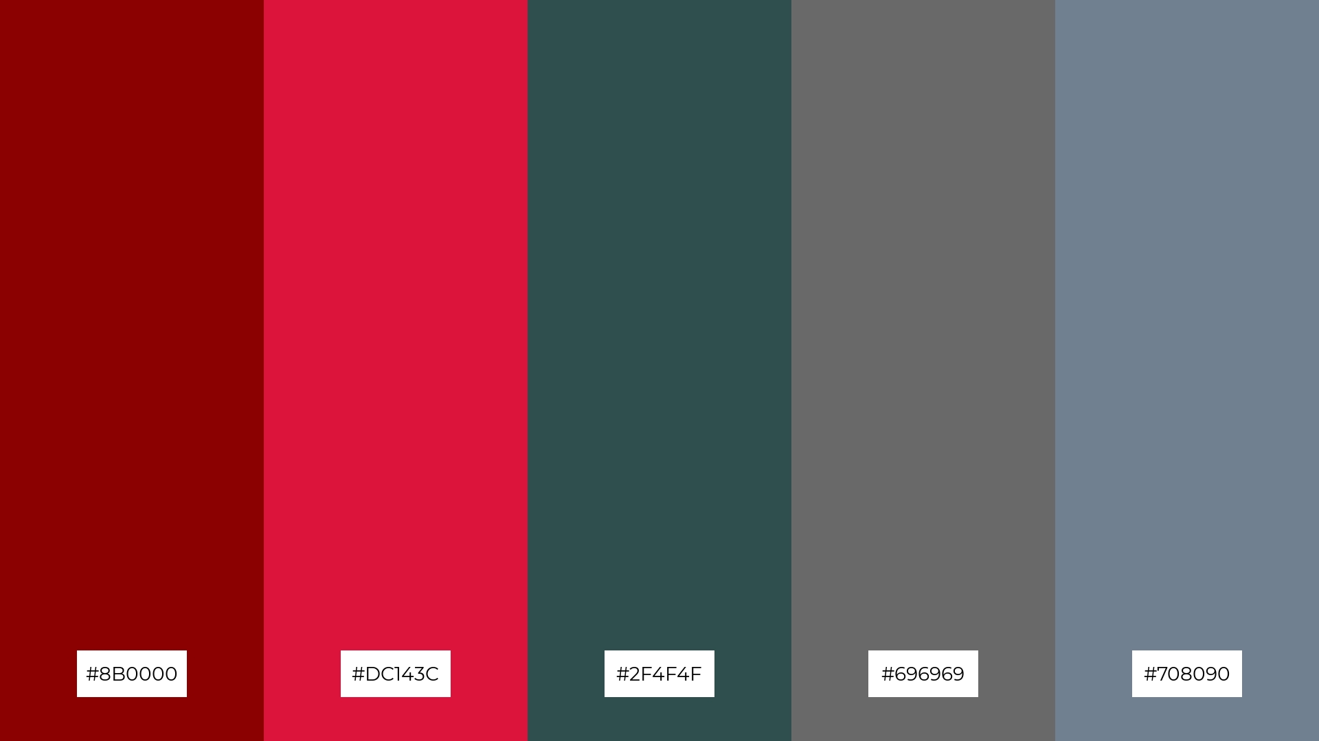
The ‘Enchanted Night’ palette, with its deep red (#8B0000), crimson (#DC143C), dark slate gray (#2F4F4F), dim gray (#696969), and slate gray (#708090), creates a dramatic and inviting atmosphere that can captivate and draw in viewers.
This sophisticated combination of rich and muted tones is perfect for luxury e-commerce sites, where the interplay of colors can enhance the sense of exclusivity and elegance, making the shopping experience feel both premium and welcoming.
12) Desert Mirage
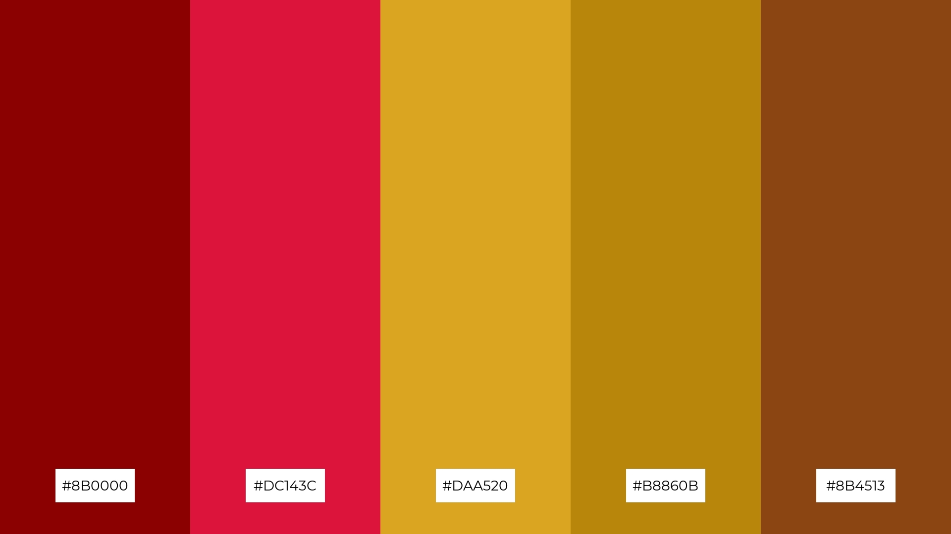
The ‘Desert Mirage’ palette, with its deep red (#8B0000), crimson (#DC143C), goldenrod (#DAA520), dark goldenrod (#B8860B), and saddle brown (#8B4513), creates a striking balance between warm and earthy tones, evoking a sense of harmony and natural beauty.
This palette is particularly well-suited for casual apparel lines, where the rich and varied hues can add a touch of sophistication and warmth, making the designs both stylish and inviting.
13) Winter Wonderland
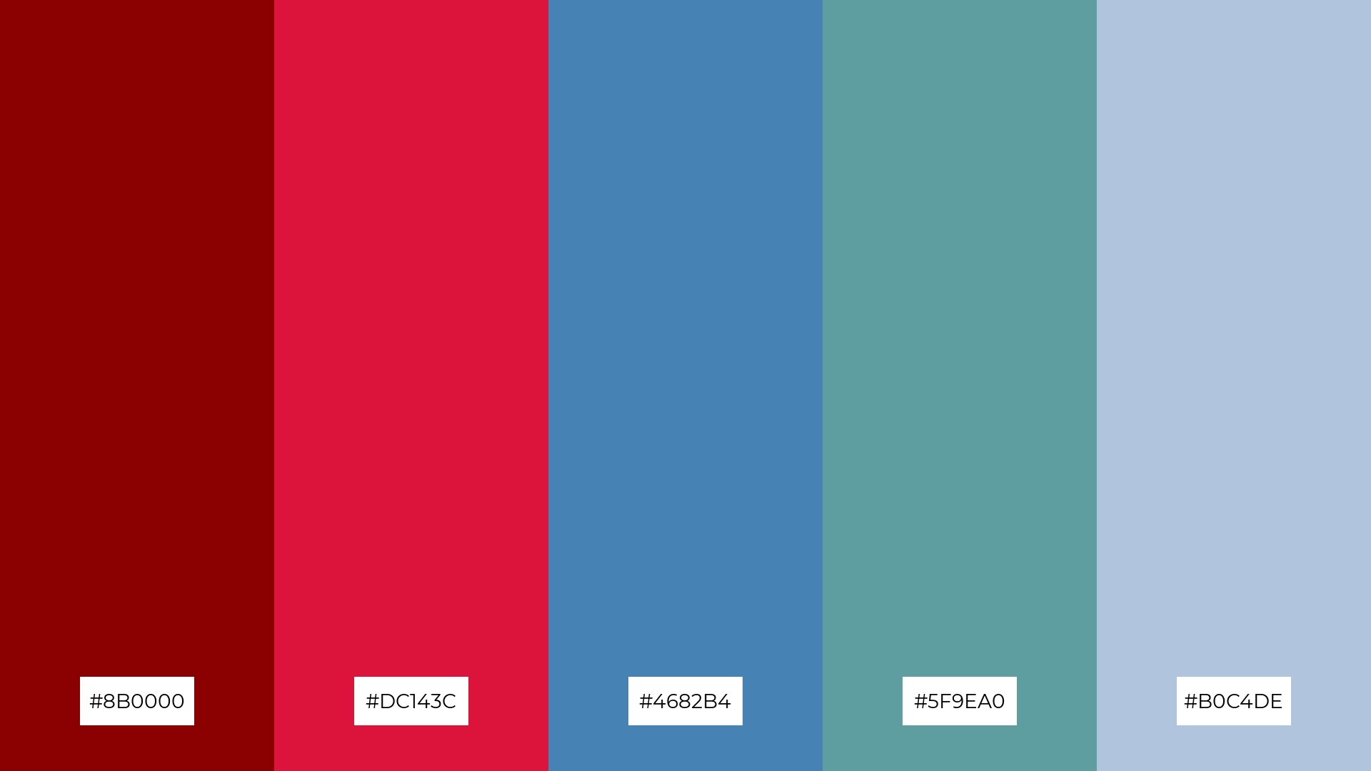
The ‘Winter Wonderland’ palette, with its blend of deep red (#8B0000), crimson (#DC143C), steel blue (#4682B4), cadet blue (#5F9EA0), and light steel blue (#B0C4DE), masterfully combines warm and cool tones to evoke a serene and festive mood.
This harmonious mix of colors is perfect for artisan product branding, where the interplay of rich reds and soothing blues can create a visually captivating and inviting aesthetic that resonates with the cozy and magical essence of winter.
14) Tropical Sunset
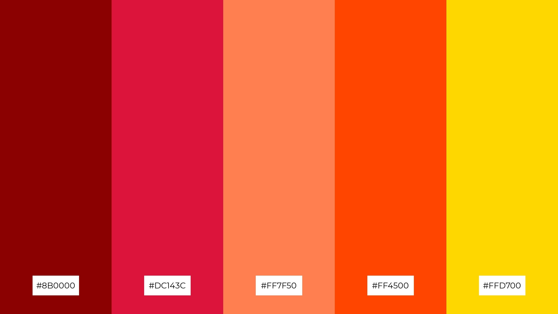
The ‘Tropical Sunset’ palette, with its blend of deep red (#8B0000), crimson (#DC143C), coral (#FF7F50), orange-red (#FF4500), and gold (#FFD700), creates a vibrant and energetic visual experience that can captivate and engage viewers.
This dynamic combination of bold and warm hues is perfect for festival marketing, where the lively colors can evoke excitement and a sense of celebration, making promotional materials stand out and attract attention.
15) Midnight Romance
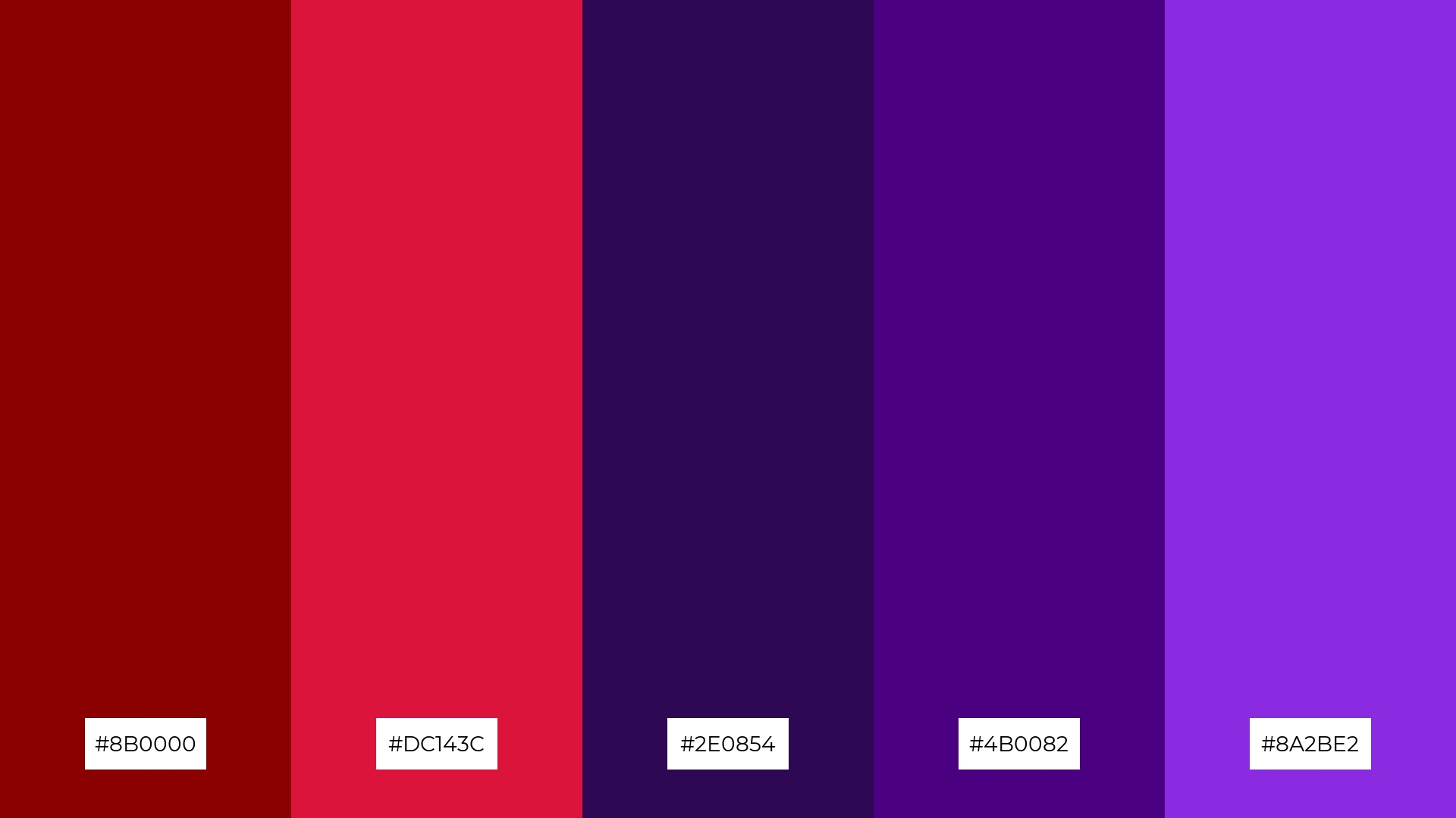
The ‘Midnight Romance’ palette, with its blend of deep red (#8B0000), crimson (#DC143C), dark purple (#2E0854), indigo (#4B0082), and blue violet (#8A2BE2), conveys a sense of harmony through its rich and complementary hues, creating a visually cohesive and elegant look.
This palette is ideal for cozy interior makeovers, where the interplay of warm and cool tones can create a serene and inviting atmosphere, perfect for transforming living spaces into tranquil retreats.
How to Use Crimson Red Patterns in Design
Crimson red color palettes can be a game-changer in home decor, adding a touch of warmth and sophistication to any space. Use deep reds as accent walls or in decorative elements like cushions and rugs to create a cozy and inviting atmosphere. Pairing crimson with neutral tones like beige or gray can balance the intensity and make the space feel harmonious.
In marketing materials, crimson red can draw attention and evoke strong emotions, making it perfect for call-to-action buttons, banners, and promotional graphics. Combine crimson with complementary colors like teal or gold to create visually striking and memorable designs. This approach can enhance brand recognition and engagement, making your marketing efforts more effective.
For clothing design, crimson red can add a bold and stylish flair to any collection. Use it as a primary color for statement pieces or as an accent in patterns and accessories. The versatility of crimson red allows it to be paired with both warm and cool tones, making it suitable for various fashion styles and seasons.
Ready to bring your design ideas to life? Try creating stunning crimson red color palettes using Piktochart and elevate your projects to the next level!


