Exploring the world of purple-gray color palettes opens up a realm of sophisticated and versatile design possibilities. These hues blend the calmness of gray with the vibrancy of purple, creating a unique aesthetic that can elevate any project.
Whether you’re designing a website, crafting an infographic, or redecorating a space, purple-gray palettes offer a modern and elegant touch. Their subtle yet impactful nature makes them a favorite among designers looking to make a statement without overwhelming the viewer.
Tips For Creating Purple Gray Color Palettes
Designing with purple-gray can be both exciting and challenging, but with the right approach, you can create stunning visuals.
- Balance is Key: Ensure that the purple-gray doesn’t dominate your design. Pair it with neutral tones like white or beige to maintain harmony.
- Complementary Shades: Match purple-gray with complementary colors such as soft pinks or muted greens to create a cohesive look.
- Versatility: Use purple-gray as a background color to make other elements pop, or as an accent to add depth and interest.
- Texture and Patterns: Incorporate textures and patterns in purple-gray to add dimension and avoid a flat appearance.
- Test and Iterate: Experiment with different shades and combinations to find the perfect balance for your project. Don’t be afraid to make adjustments as needed.
15 Purple Gray Color Palettes
1) Mystic Twilight
The ‘Mystic Twilight’ palette evokes a serene and mysterious mood, blending deep indigo and vibrant blue-violet with soft grays to create a balanced and harmonious atmosphere.
Perfect for a chic living room, this palette’s interplay of bold and muted tones adds depth and sophistication, making it ideal for creating a stylish and inviting space.
2) Urban Elegance
The ‘Urban Elegance’ palette, with its rich purples and silvers, evokes a sense of modern sophistication and understated luxury, making it perfect for high-end product packaging.
In digital branding, these colors can create a sleek and professional look, ideal for tech companies or fashion brands aiming to convey a blend of innovation and elegance.
3) Lavender Dream

The ‘Lavender Dream’ palette features dominant colors such as soft lavender (#E6E6FA) and rich blue-violet (#8A2BE2), which together create a soothing yet vibrant visual experience.
Ideal for wellness branding, this harmonious blend of hues promotes a sense of calm and rejuvenation, making it perfect for creating serene and inviting spaces.
4) Silver Lining
The ‘Silver Lining’ palette, with its mix of soft grays and bold purples, offers a balanced and distinct mood that can elevate any design project.
Ideal for creating inviting retail spaces or modern web designs, this palette’s harmonious blend of hues ensures a sophisticated and welcoming atmosphere.
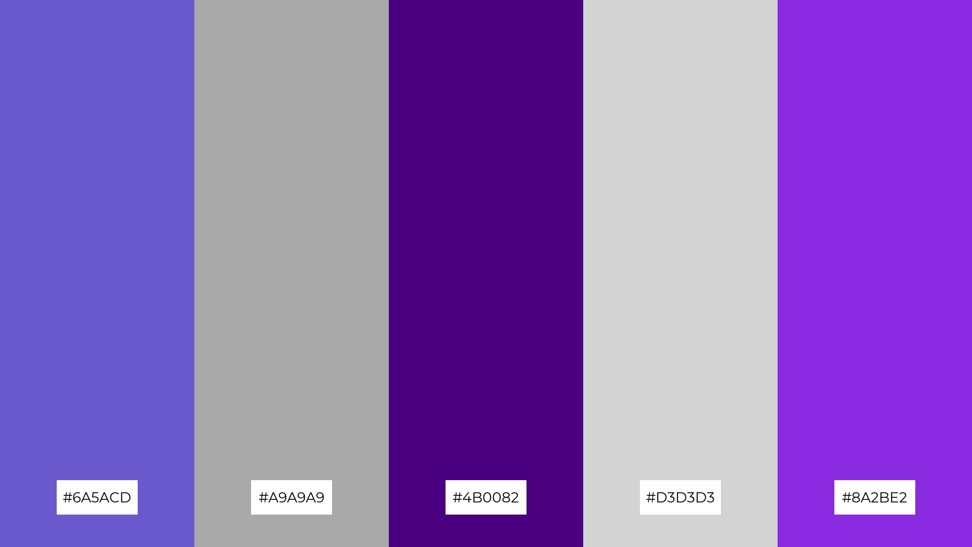
5) Enchanted Forest
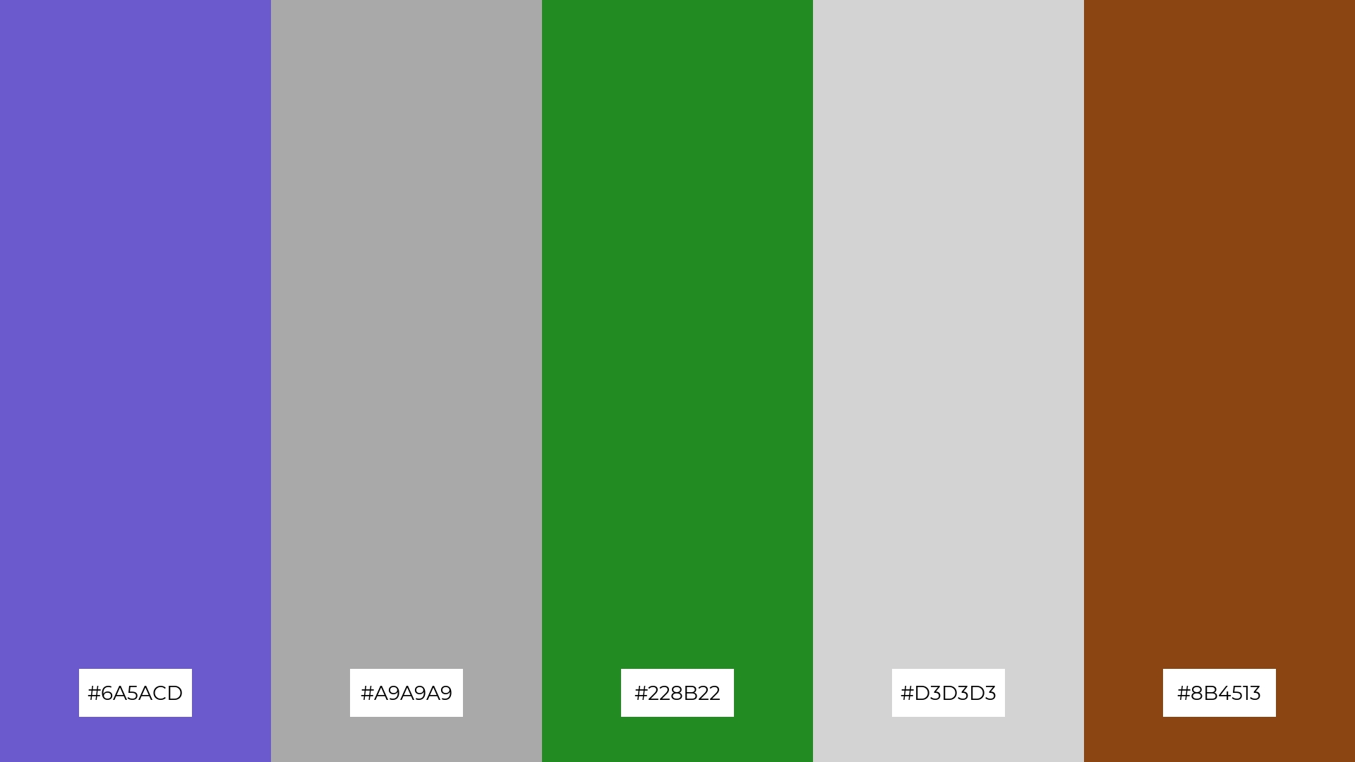
The ‘Enchanted Forest’ palette, with its blend of slate blue (#6A5ACD), dark gray (#A9A9A9), forest green (#228B22), light gray (#D3D3D3), and saddle brown (#8B4513), creates a serene and earthy ambiance that evokes the tranquility of nature.
Perfect for a rustic wedding theme, this palette’s harmonious mix of cool and warm tones adds a touch of elegance and natural beauty, making it ideal for creating a memorable and enchanting celebration.
6) Cosmic Harmony
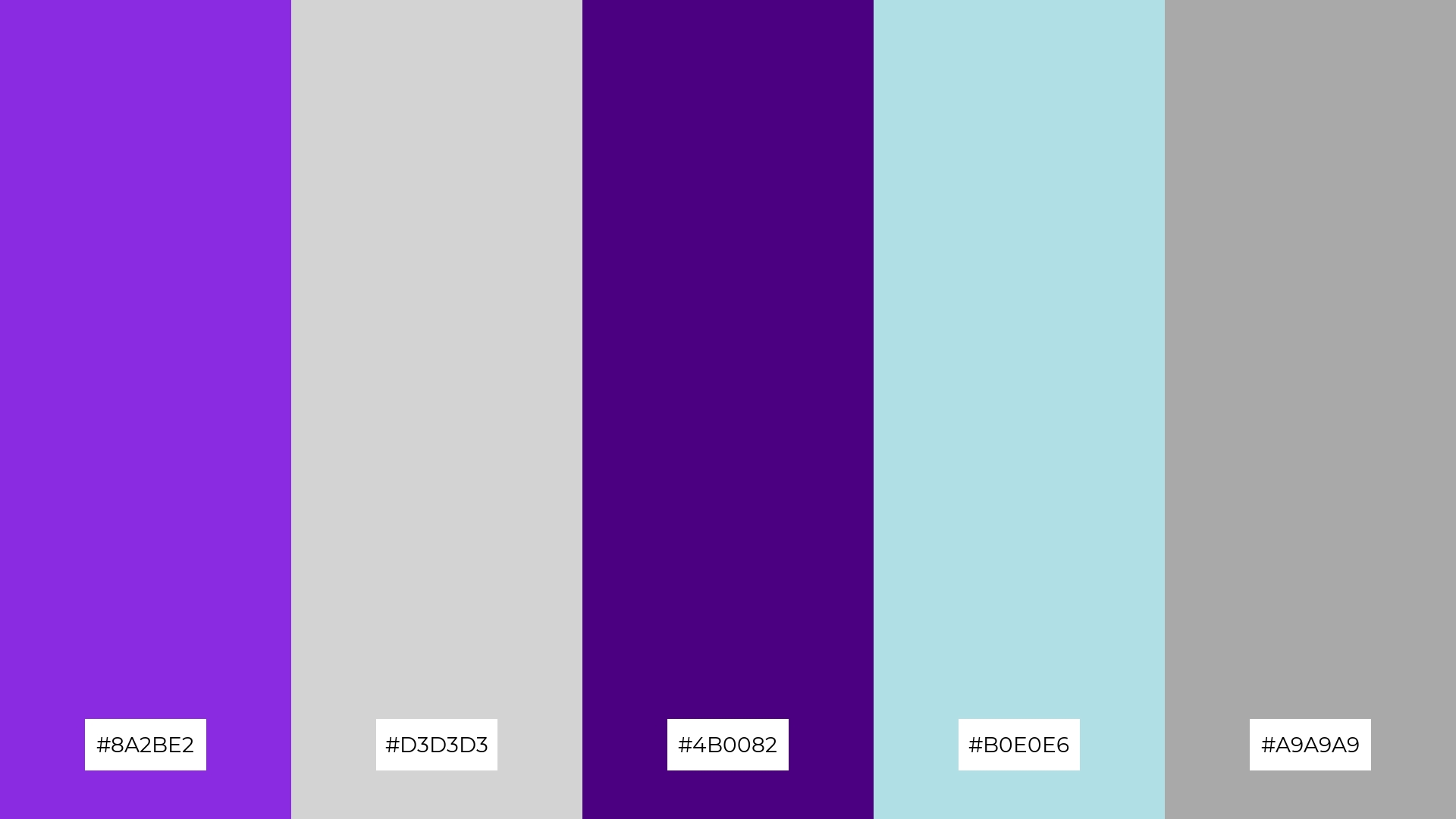
The ‘Cosmic Harmony’ palette, with its blend of rich blue-violet (#8A2BE2), soft gray (#D3D3D3), deep indigo (#4B0082), powder blue (#B0E0E6), and dark gray (#A9A9A9), creates a sophisticated and balanced aesthetic that can evoke a sense of calm and elegance.
Ideal for minimalistic branding, this palette’s harmonious mix of bold and muted tones ensures a sleek and modern look, making it perfect for tech startups or contemporary fashion brands aiming to convey innovation and refinement.
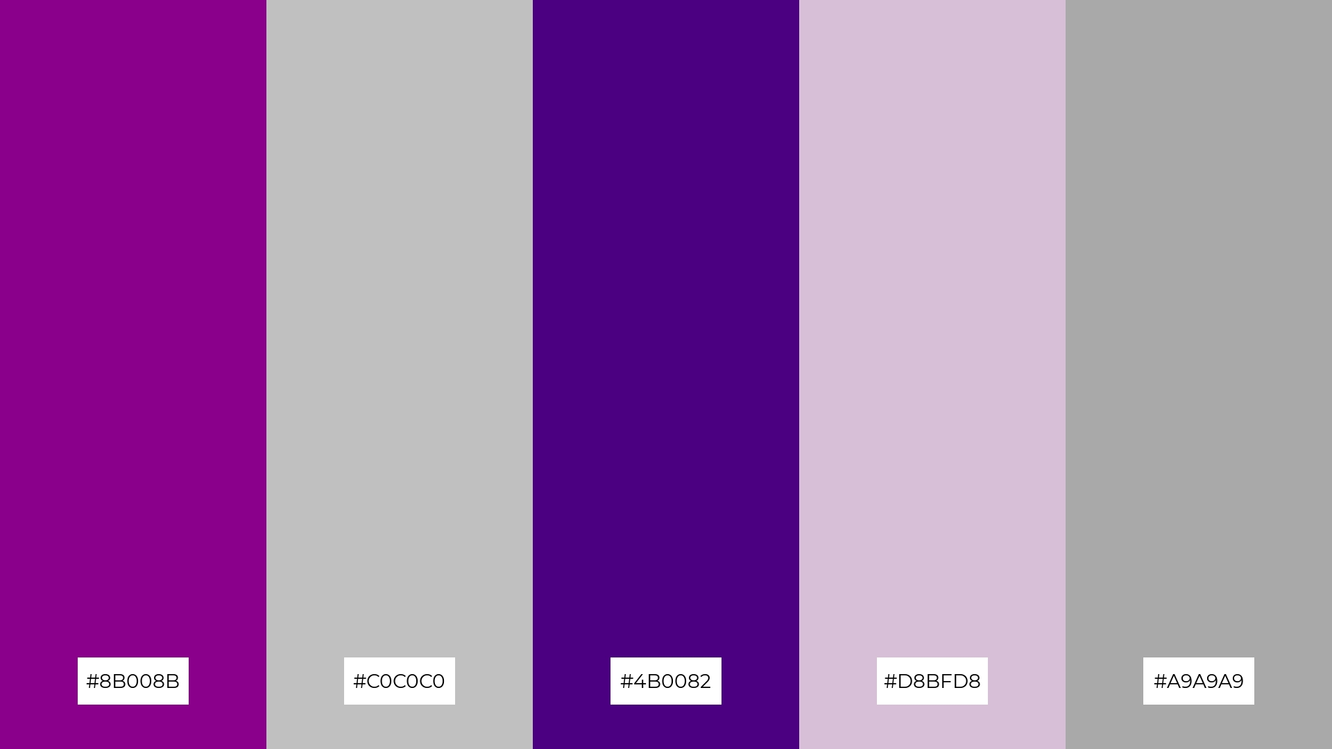
7) Vintage Charm
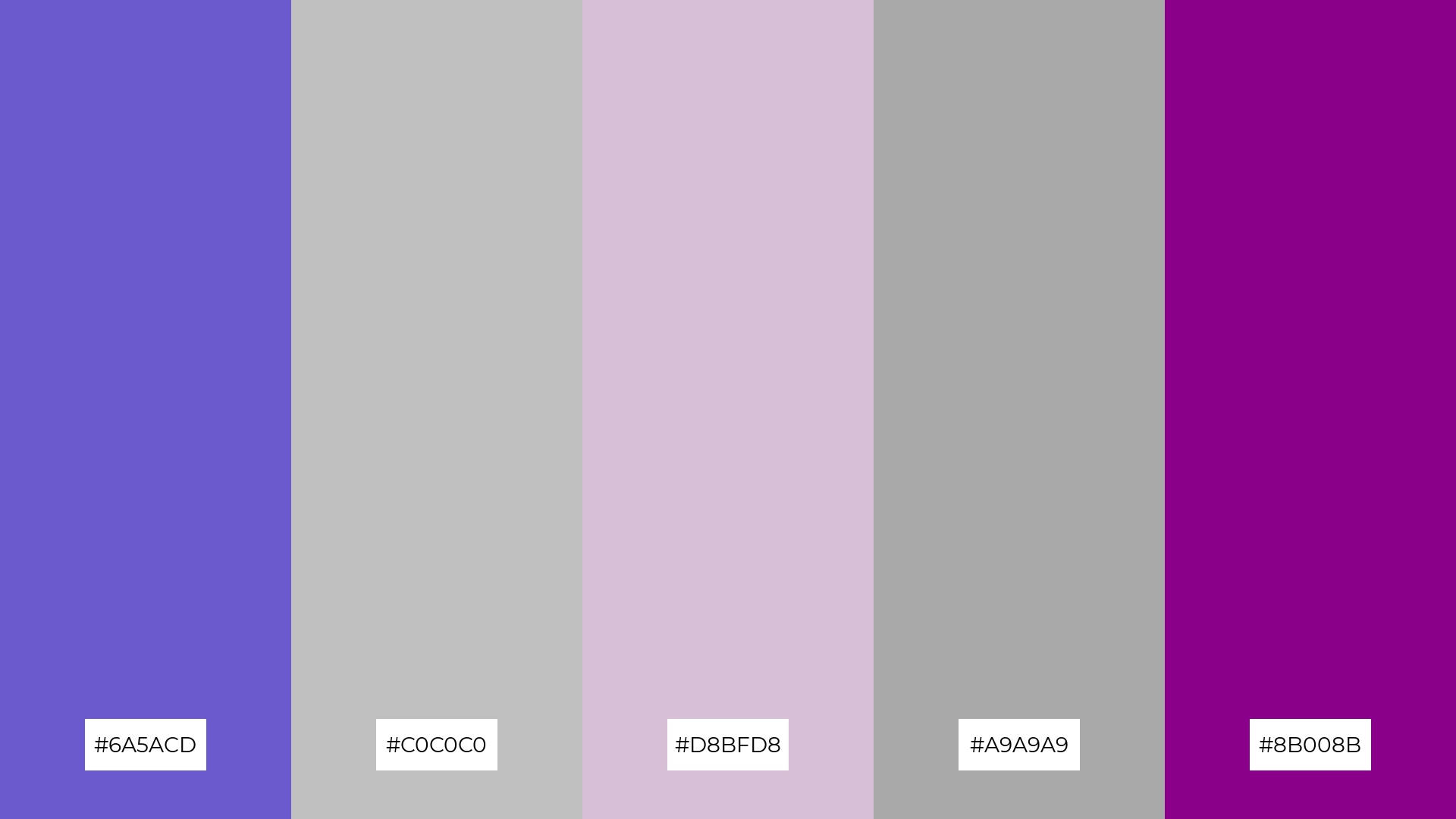
The ‘Vintage Charm’ palette, with its blend of deep slate blue (#6A5ACD), shimmering silver (#C0C0C0), soft thistle (#D8BFD8), dark gray (#A9A9A9), and bold dark magenta (#8B008B), creates visual interest through the contrast of muted and vibrant tones.
Ideal for creative projects like magazine layouts or artistic websites, this palette’s harmonious yet striking combination of colors can add a touch of elegance and sophistication, making your designs stand out.
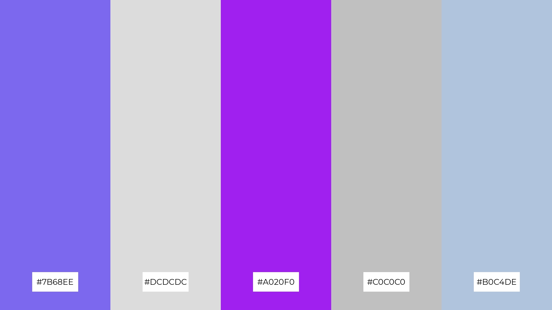
8) Soft Serenity

The ‘Soft Serenity’ palette, with its blend of soft lavender (#E6E6FA), dark gray (#A9A9A9), light gray (#D3D3D3), light steel blue (#B0C4DE), and rich blue-violet (#8A2BE2), can evoke a sense of calm when the lighter shades are used predominantly, making it perfect for spa branding that aims to promote relaxation and tranquility.
Conversely, incorporating the vibrant blue-violet (#8A2BE2) as a dominant color can inject excitement and energy into the palette, making it ideal for vibrant marketing campaigns that seek to capture attention and convey a dynamic, modern aesthetic.
9) Urban Sunset
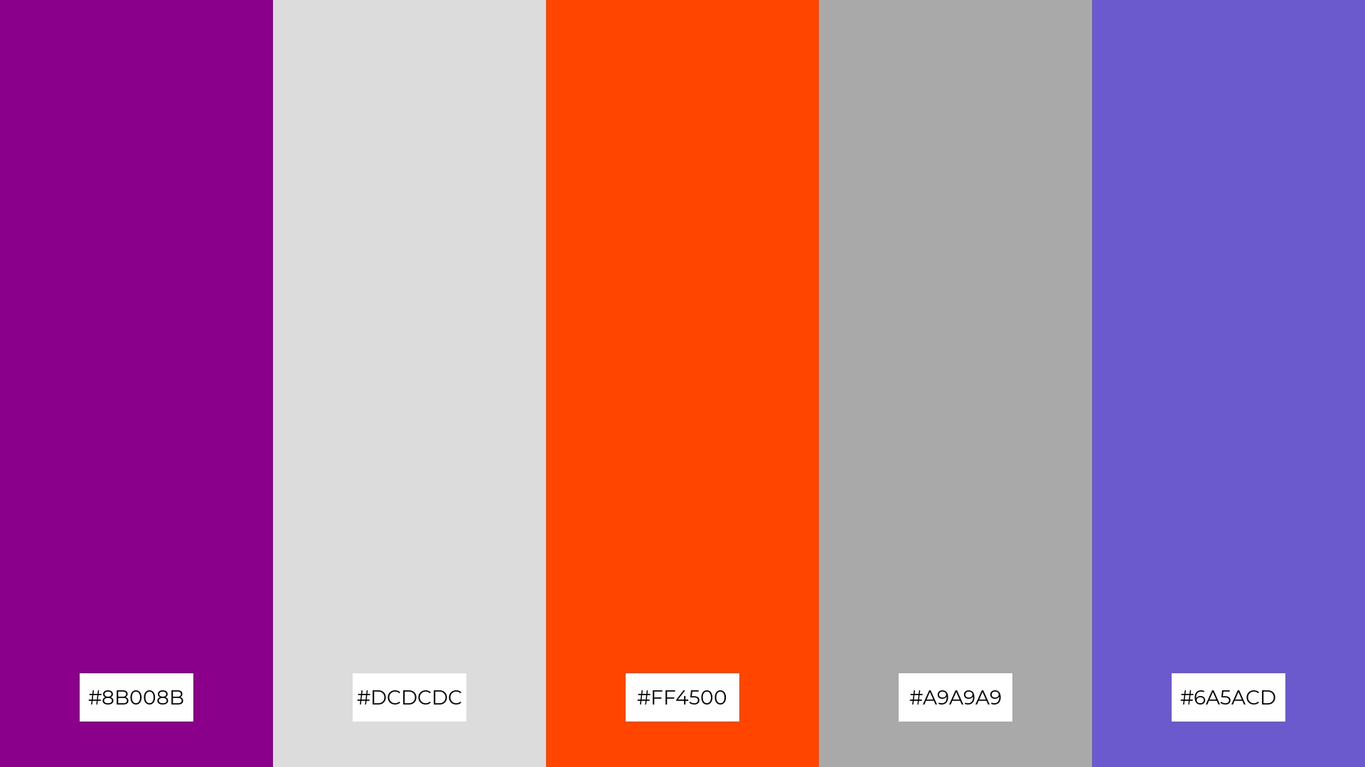
The ‘Urban Sunset’ palette, with its mix of bright orange (#FF4500) and soft gray (#DCDCDC), creates a vibrant yet balanced mood that can energize and uplift any space.
Ideal for seasonal promotions, this blend of hues can evoke a sense of warmth and excitement, making it perfect for capturing the essence of autumn or summer in your designs.
10) Whimsical Garden
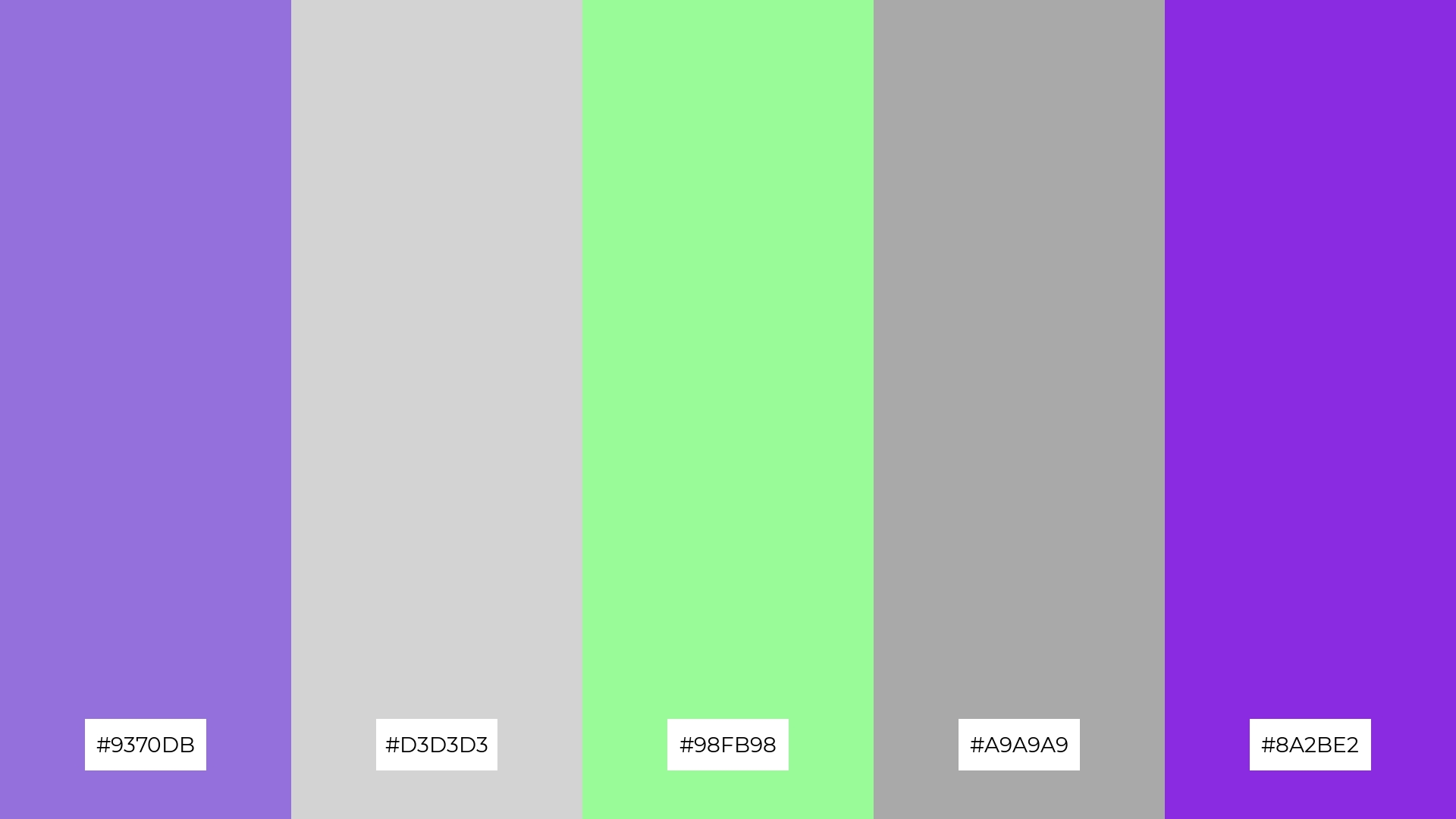
The ‘Whimsical Garden’ palette, with its blend of medium purple (#9370DB), light gray (#D3D3D3), pale green (#98FB98), dark gray (#A9A9A9), and blue-violet (#8A2BE2), creates a visual flow that evokes a sense of joy and tranquility, making it perfect for designs that aim to uplift and soothe the viewer.
This harmonious mix of colors is ideal for lifestyle branding, such as wellness products or eco-friendly packaging, as well as tech product packaging that seeks to convey a blend of innovation and serenity.
11) Frosted Plum
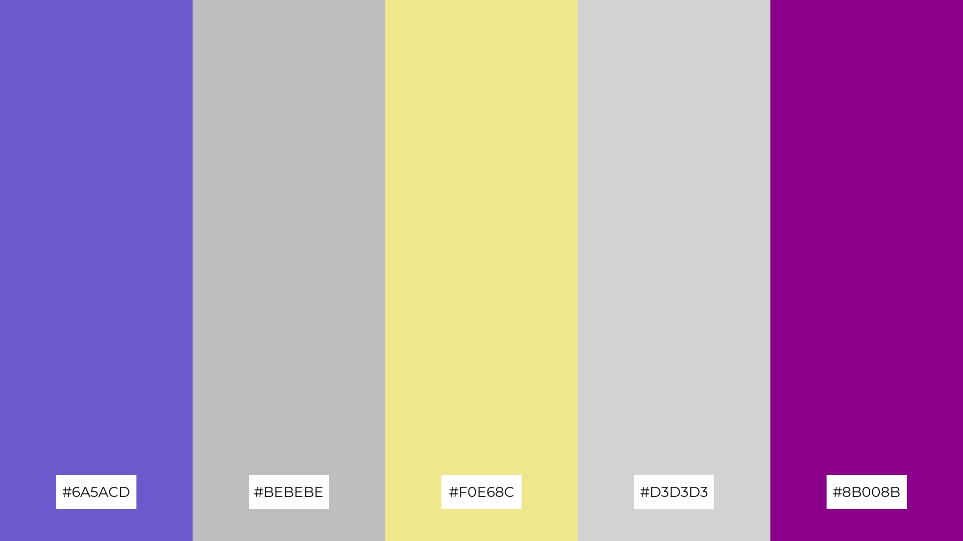
The ‘Frosted Plum’ palette, with its blend of deep slate blue (#6A5ACD), soft gray (#BEBEBE), khaki (#F0E68C), light gray (#D3D3D3), and dark magenta (#8B008B), creates a welcoming yet dramatic effect by balancing muted tones with bold accents.
This palette shines in luxury e-commerce sites, where the rich and sophisticated colors can enhance the perception of high-end products and create an inviting shopping experience.
12) Celestial Night

The ‘Celestial Night’ palette, with its interplay of deep indigo (#4B0082), shimmering silver (#C0C0C0), rich blue-violet (#8A2BE2), soft gray (#D3D3D3), and dark gray (#A9A9A9), creates a balanced yet dynamic visual experience through the contrast of bold and muted tones.
Ideal for sleek corporate branding, this palette’s sophisticated mix of colors can convey professionalism and modernity, making it perfect for companies aiming to project a refined and innovative image.
13) Ethereal Glow
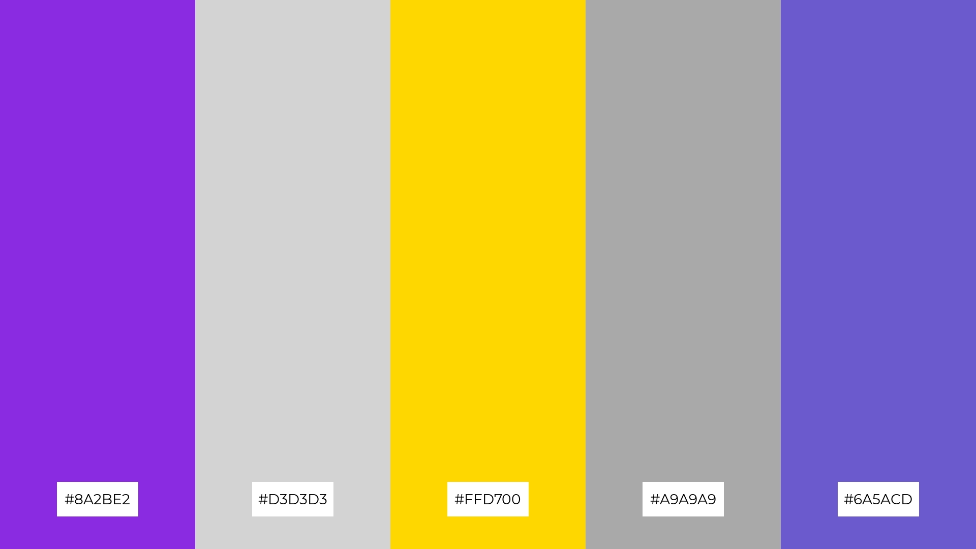
The ‘Ethereal Glow’ palette, with its blend of rich blue-violet (#8A2BE2), soft gray (#D3D3D3), vibrant gold (#FFD700), dark gray (#A9A9A9), and deep slate blue (#6A5ACD), masterfully combines warm and cool tones to evoke a mood of balanced elegance and subtle opulence.
Ideal for artisan product branding, this palette’s harmonious mix of hues can enhance the perception of handcrafted quality and timeless sophistication, making it perfect for creating visually captivating and memorable packaging.
14) Dreamy Pastels
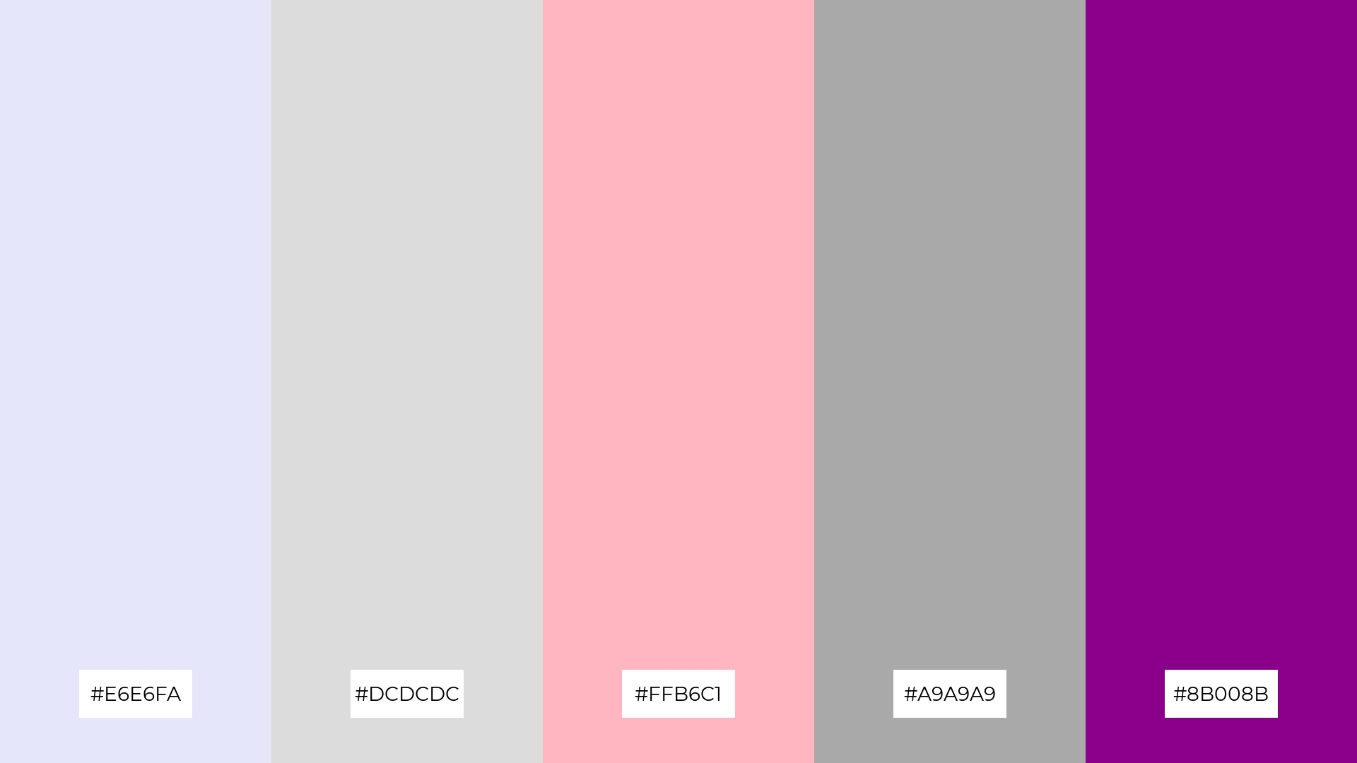
The ‘Dreamy Pastels’ palette, with its blend of soft lavender (#E6E6FA), light gray (#DCDCDC), light pink (#FFB6C1), dark gray (#A9A9A9), and dark magenta (#8B008B), creates a dynamic interplay of subtle and bold hues that can evoke a sense of whimsy and sophistication.
Ideal for festival marketing, this palette’s harmonious mix of colors can capture the festive spirit while maintaining an elegant and inviting aesthetic, making it perfect for creating eye-catching and memorable promotional materials.
15) Radiant Harmony
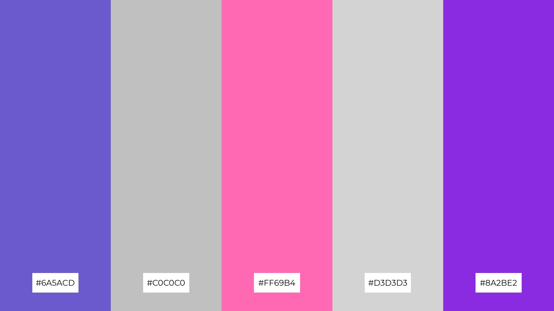
The ‘Radiant Harmony’ palette, with its blend of deep slate blue (#6A5ACD), shimmering silver (#C0C0C0), hot pink (#FF69B4), light gray (#D3D3D3), and rich blue-violet (#8A2BE2), can convey a sense of harmony through its balanced mix of bold and muted tones, creating a cohesive and visually appealing design.
Ideal for tech startups aiming to project innovation and creativity, or cozy interior makeovers that seek to blend modernity with comfort, this palette’s versatile nature ensures it can adapt to various design needs while maintaining a sophisticated and inviting atmosphere.
How to Use Purple Gray Patterns in Design
In home decor, purple-gray color palettes can create a serene and sophisticated atmosphere. Use these hues for accent walls or furniture pieces to add depth and elegance to your space without overwhelming it. Pairing purple-gray with neutral tones like beige or white can maintain a balanced and inviting environment.
For marketing materials, purple-gray palettes can convey a sense of modernity and professionalism. Incorporate these colors in your branding to create sleek and cohesive visuals that stand out. Use purple-gray as a background color to make text and other elements pop, ensuring your message is both clear and visually appealing.
In clothing design, purple-gray palettes offer a versatile and stylish option. These hues can be used to create chic and timeless pieces that appeal to a wide audience. Combine purple-gray with complementary colors like soft pinks or muted greens to add variety and interest to your designs.
Ready to experiment with purple-gray palettes in your next project? Try creating these stunning color combinations using Piktochart and elevate your designs today!


