Indigo, a deep and rich color, has long been a favorite in design for its versatility and elegance. This article explores the various ways you can incorporate indigo color palettes into your projects to create stunning visuals.
From web design to infographics, indigo offers a unique blend of sophistication and modernity. Discover how this captivating hue can elevate your designs and make them stand out.
Tips For Creating Indigo Color Palettes
Designing with indigo can be both exciting and challenging. Here are some practical tips to help you create stunning color palettes:
- Balance with Neutrals: Pair indigo with neutral colors like white, gray, or beige to create a balanced and harmonious look.
- Complementary Shades: Use complementary colors such as orange or yellow to make indigo pop and add vibrancy to your design.
- Gradients and Shades: Experiment with different shades of indigo and gradients to add depth and dimension to your visuals.
- Accent Colors: Incorporate indigo as an accent color to highlight key elements without overwhelming the overall design.
- Versatility in Design: Utilize indigo in various design elements, from backgrounds to typography, to create a cohesive and versatile look.
- Test and Iterate: Always test your color palette in different contexts and iterate based on feedback to ensure it works well across various mediums.
15 Indigo Color Palettes
1) Twilight Dreams

The ‘Twilight Dreams’ palette, with its blend of deep indigo and soft purples, evokes a sense of mystery and tranquility, creating a mood that is both calming and enchanting.
These colors interact harmoniously to produce a cohesive look, making them ideal for creating a serene yet sophisticated atmosphere in interior decor, particularly in a bedroom setting where relaxation is paramount.
2) Oceanic Depths
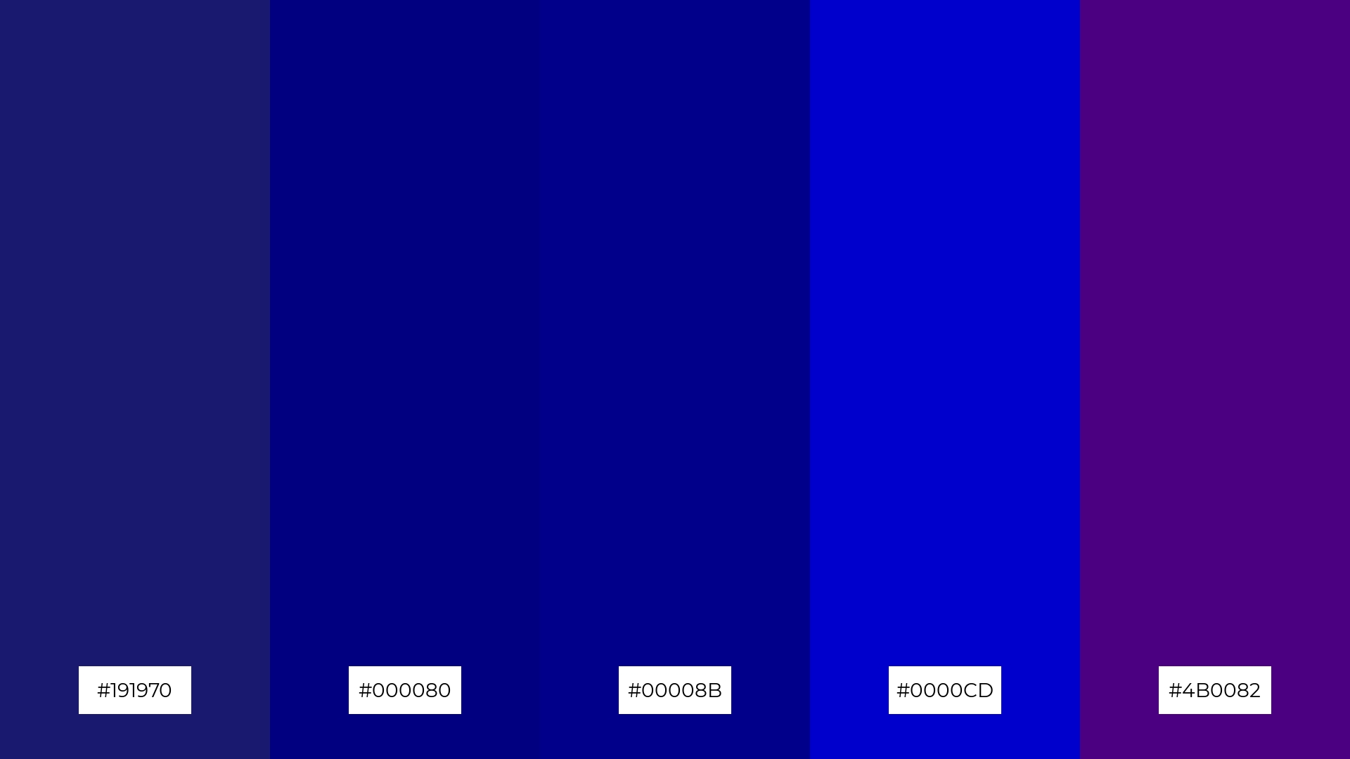
The ‘Oceanic Depths’ palette, with its range of deep blues and indigos, evokes a profound sense of calmness and introspection, reminiscent of the tranquil depths of the ocean.
This palette would excel in digital branding for wellness apps or meditation platforms, where creating a serene and focused user experience is essential.
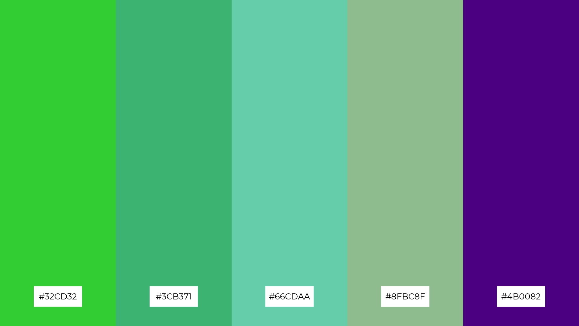
3) Mystic Forest
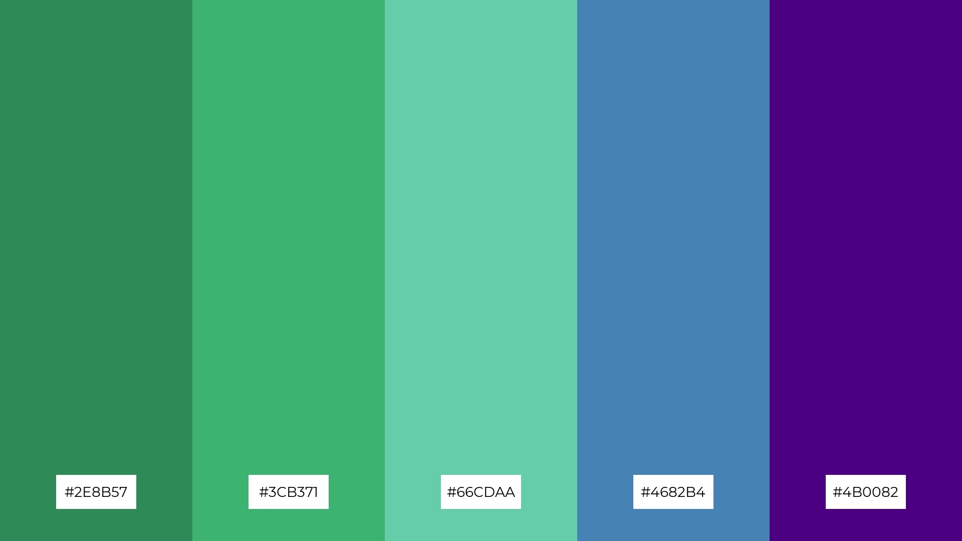
The ‘Mystic Forest’ palette, featuring dominant colors like #2E8B57 (Sea Green), #3CB371 (Medium Sea Green), #66CDAA (Medium Aquamarine), #4682B4 (Steel Blue), and #4B0082 (Indigo), creates a harmonious blend that evokes the tranquility and lushness of a forest.
This palette is particularly well-suited for eco-friendly interior spaces, where the combination of greens and blues can foster a sense of calm and connection to nature.
4) Sunset Horizon
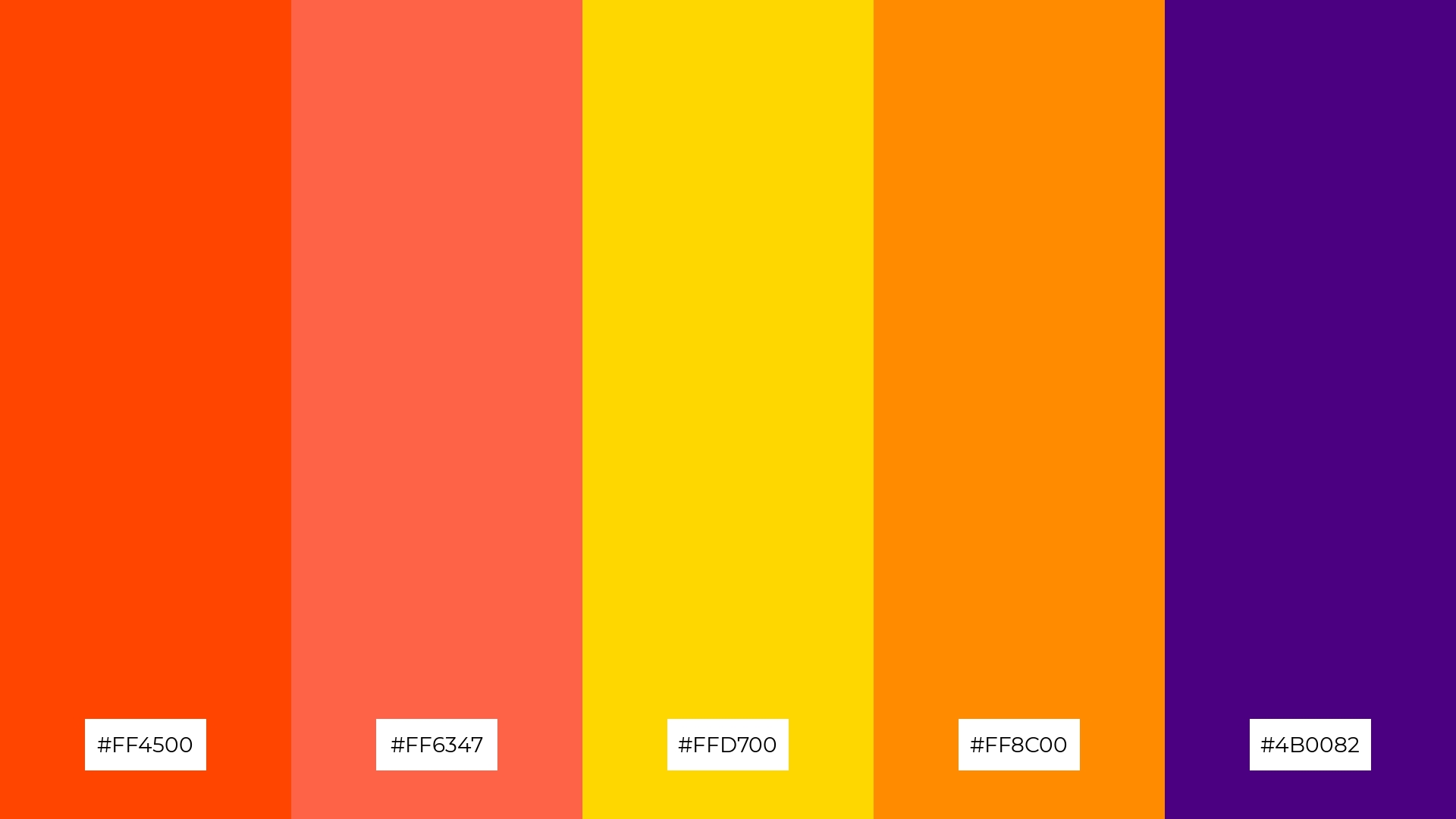
The ‘Sunset Horizon’ palette, with its mix of vibrant oranges, warm yellows, and deep indigo, offers a balance of soft and bold tones, creating a distinct and inviting mood.
This palette is ideal for creating inviting retail spaces or modern web designs, where the combination of warmth and depth can captivate and engage the audience.
5) Urban Night
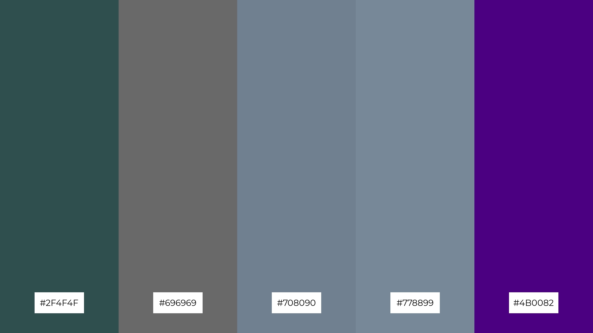
The ‘Urban Night’ palette, with its blend of #2F4F4F (Dark Slate Gray), #696969 (Dim Gray), #708090 (Slate Gray), #778899 (Light Slate Gray), and #4B0082 (Indigo), creates a sophisticated and serene ambiance, perfect for modern urban settings.
This palette is ideal for luxury fashion campaigns, where the combination of muted grays and rich indigo can evoke a sense of elegance and contemporary style.
6) Royal Elegance
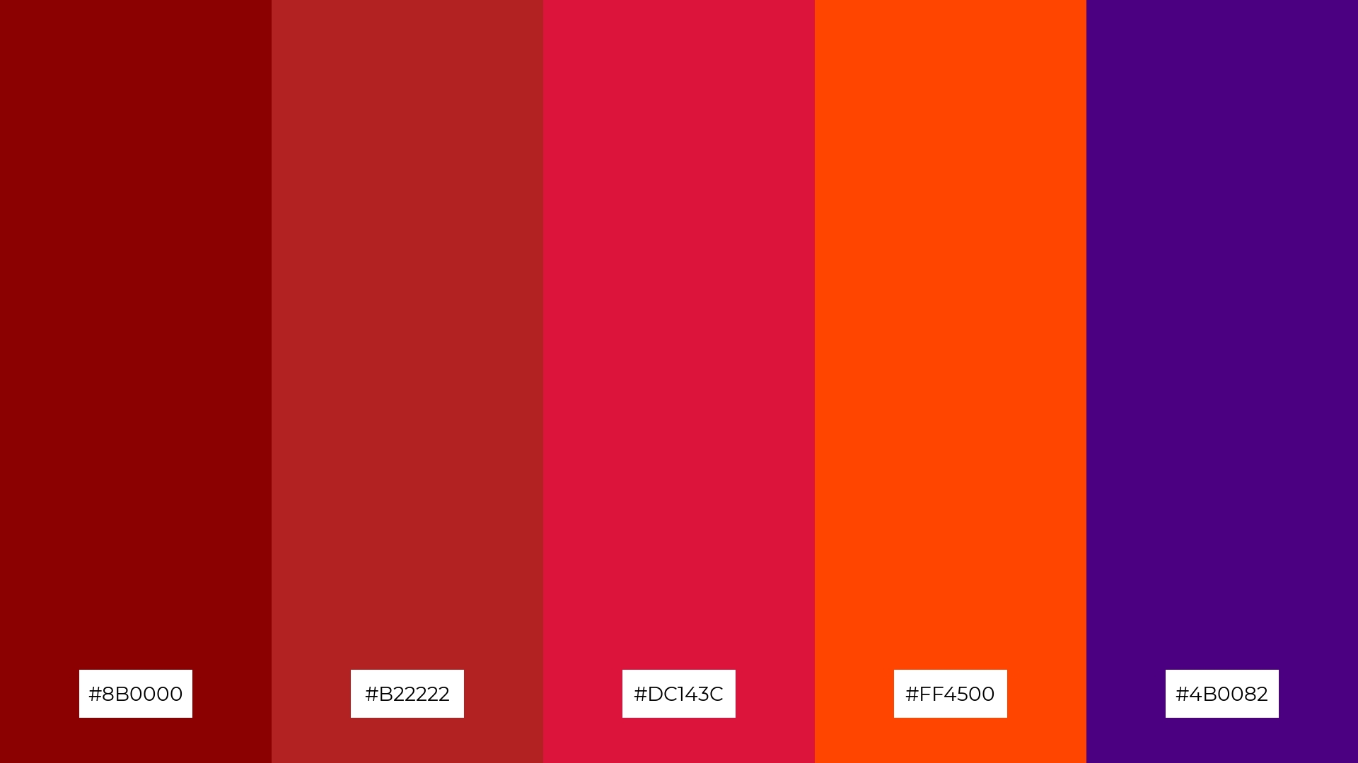
The ‘Royal Elegance’ palette, with its rich reds and deep indigo, creates a striking balance that exudes sophistication and regality, making it perfect for high-end branding or luxury product packaging.
This combination of bold and elegant hues can also be utilized in event designs, where the vibrant colors can set a dramatic and memorable atmosphere, ideal for gala dinners or upscale parties.
7) Autumn Leaves
The ‘Autumn Leaves’ palette, with its warm browns and vibrant indigo, creates a striking contrast that adds visual interest and depth to any design.
This palette is perfect for creative projects like magazine layouts or artistic websites, where the blend of earthy tones and bold indigo can captivate and engage the audience.
8) Spring Blossom
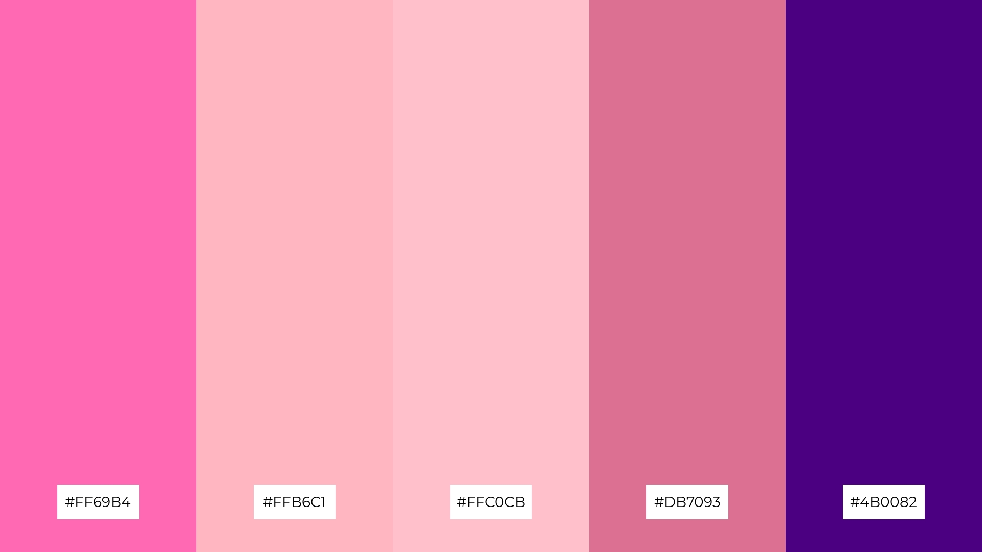
The ‘Spring Blossom’ palette, with its mix of #FF69B4 (Hot Pink), #FFB6C1 (Light Pink), #FFC0CB (Pink), #DB7093 (Pale Violet Red), and #4B0082 (Indigo), can evoke a sense of calm when the softer pinks are paired with the deep indigo, creating a soothing and balanced visual experience.
Conversely, combining the vibrant hot pink with pale violet red can inject excitement and energy into designs, making this palette ideal for vibrant marketing campaigns or eye-catching spa branding that aims to rejuvenate and invigorate clients.
9) Winter Chill
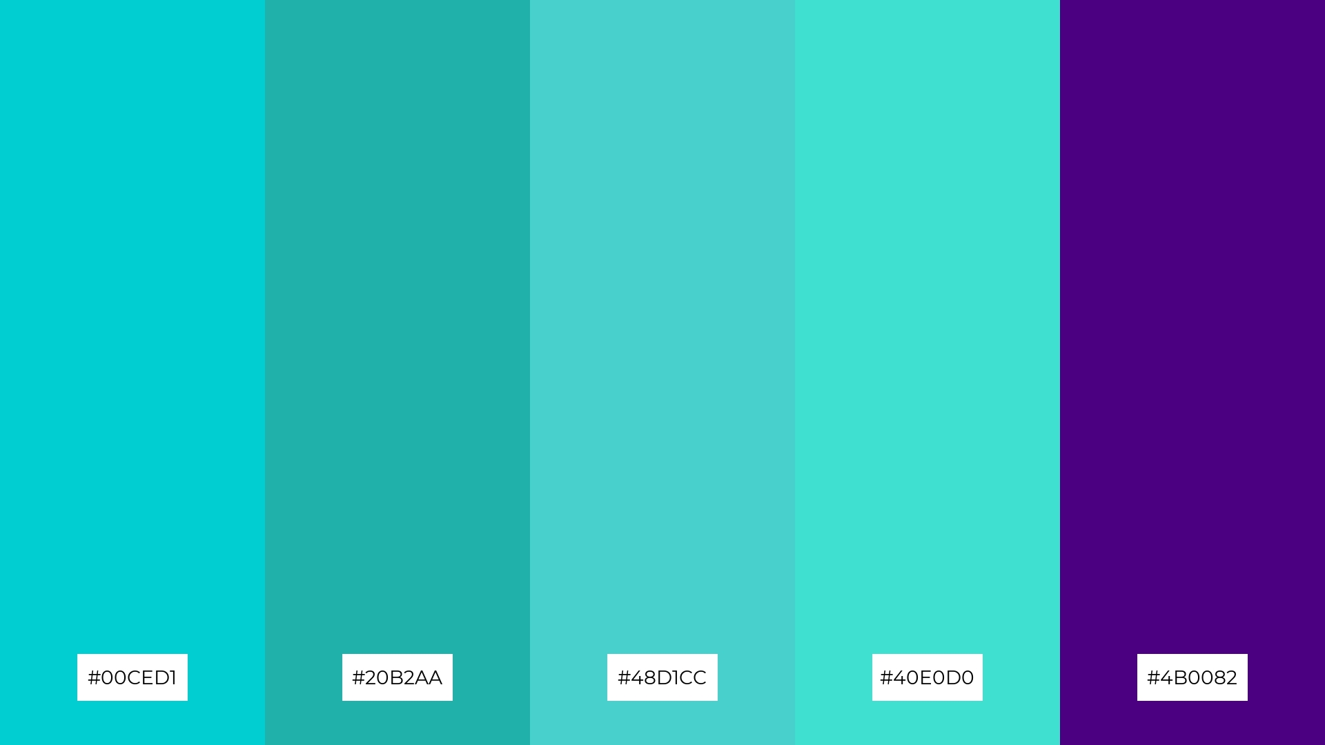
The ‘Winter Chill’ palette, featuring softer tones like #00CED1 (Dark Turquoise) and #40E0D0 (Turquoise), creates a refreshing and invigorating mood that evokes the crispness of a winter morning.
This blend of bright and cool hues is ideal for seasonal promotions or home decor, where the combination of these colors can bring a sense of calm and rejuvenation to any space.
10) Desert Mirage
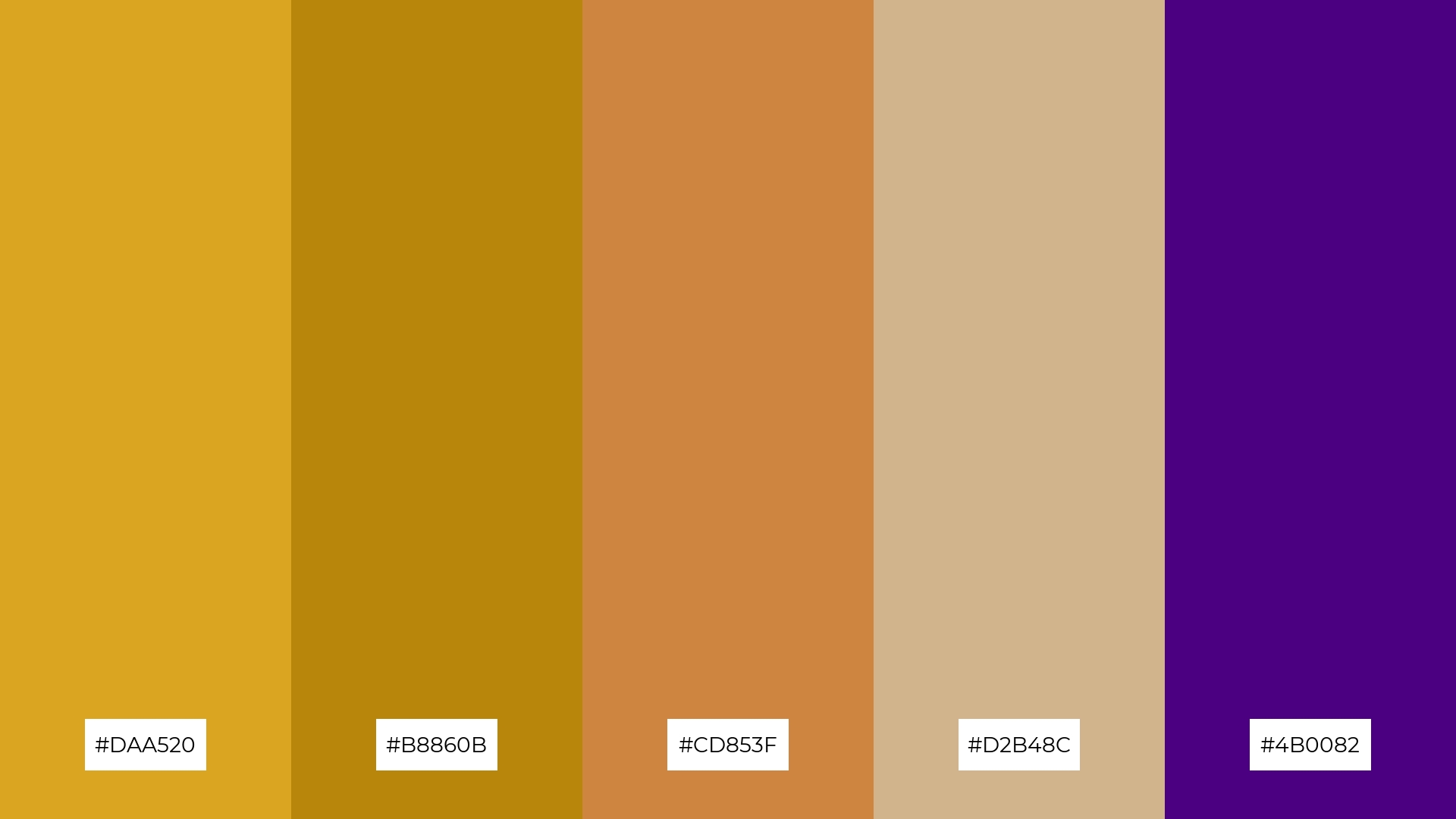
The ‘Desert Mirage’ palette, with its blend of #DAA520 (Goldenrod), #B8860B (Dark Goldenrod), #CD853F (Peru), #D2B48C (Tan), and #4B0082 (Indigo), creates a visual flow that evokes a sense of warmth and adventure, reminiscent of sunlit dunes and twilight skies.
This palette is ideal for lifestyle branding or tech product packaging, where the combination of earthy tones and deep indigo can convey a sense of reliability and innovation, appealing to consumers seeking both comfort and cutting-edge design.
11) Cosmic Vibes
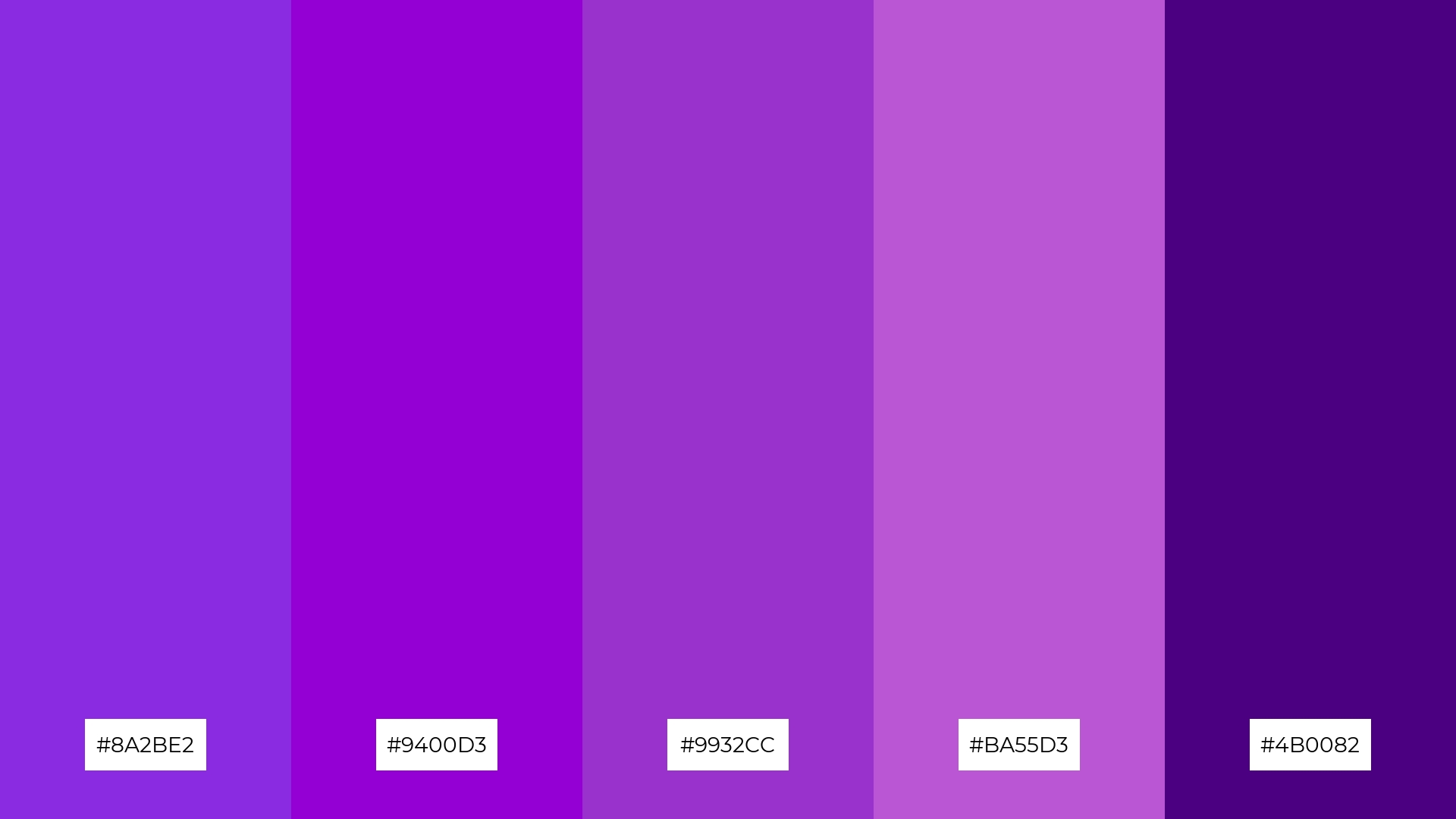
The ‘Cosmic Vibes’ palette, with its rich purples and deep indigo, creates a dramatic and inviting atmosphere that can captivate and engage viewers.
This palette is particularly well-suited for luxury e-commerce sites, where the combination of bold and elegant hues can enhance the perception of exclusivity and sophistication.
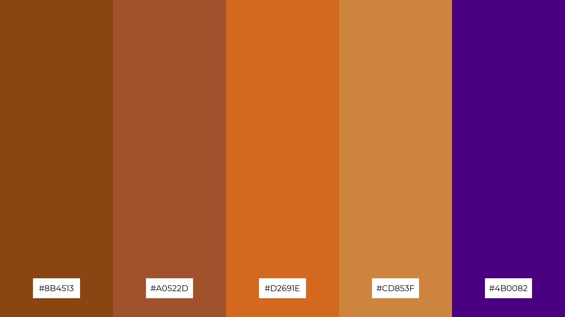
12) Vintage Charm
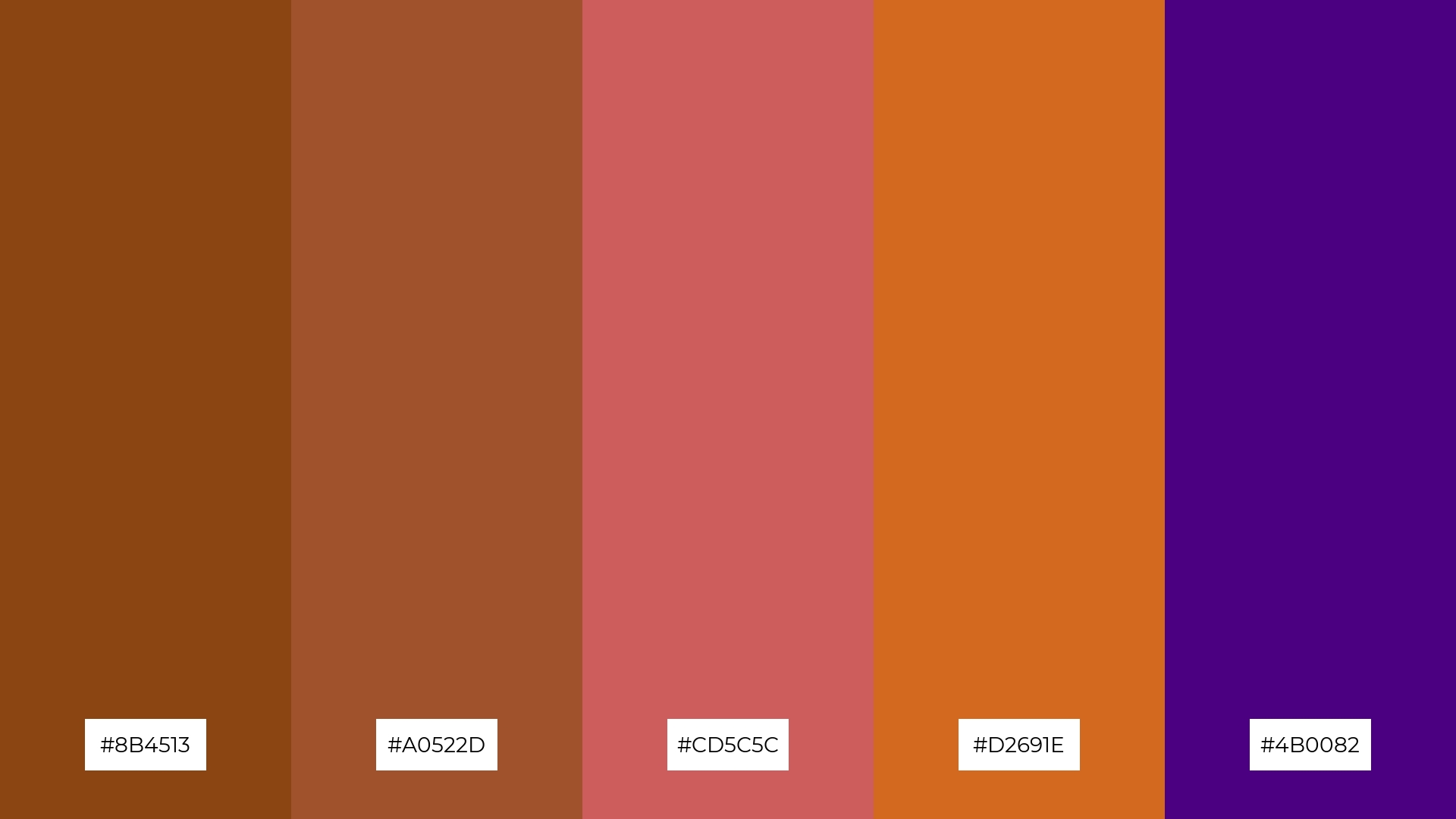
The ‘Vintage Charm’ palette, with its blend of #8B4513 (Saddle Brown), #A0522D (Sienna), #CD5C5C (Indian Red), #D2691E (Chocolate), and #4B0082 (Indigo), creates a harmonious balance between warm earthy tones and the deep, rich indigo, evoking a sense of nostalgia and sophistication.
This palette is ideal for casual apparel lines, where the combination of warm and cool hues can create a timeless and versatile look that appeals to a wide range of consumers.
13) Tropical Paradise
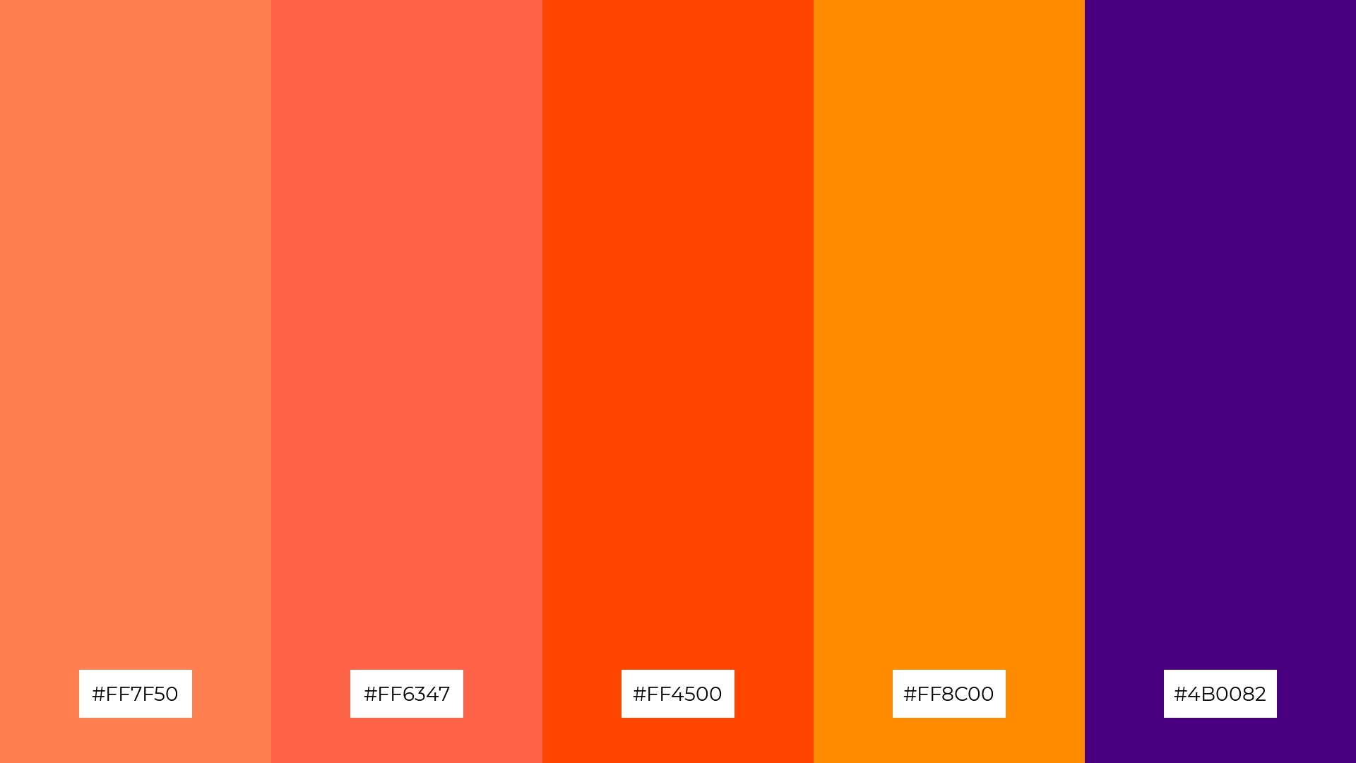
The ‘Tropical Paradise’ palette, with its blend of warm tones like #FF7F50 (Coral) and #FF6347 (Tomato) alongside the cool depth of #4B0082 (Indigo), evokes a vibrant and energetic mood that is both inviting and dynamic.
This palette is particularly well-suited for artisan product branding, where the combination of lively and rich hues can create a visually captivating and memorable identity that stands out in a crowded market.
14) Enchanted Garden
The ‘Enchanted Garden’ palette, with its vibrant greens and deep indigo, creates a dynamic interplay of bold and subtle hues that can evoke a sense of lush tranquility and mystique.
This palette is perfect for festival marketing, where the combination of lively greens and rich indigo can capture the essence of nature and enchantment, drawing in audiences with its captivating and harmonious visuals.
15) Arctic Aurora
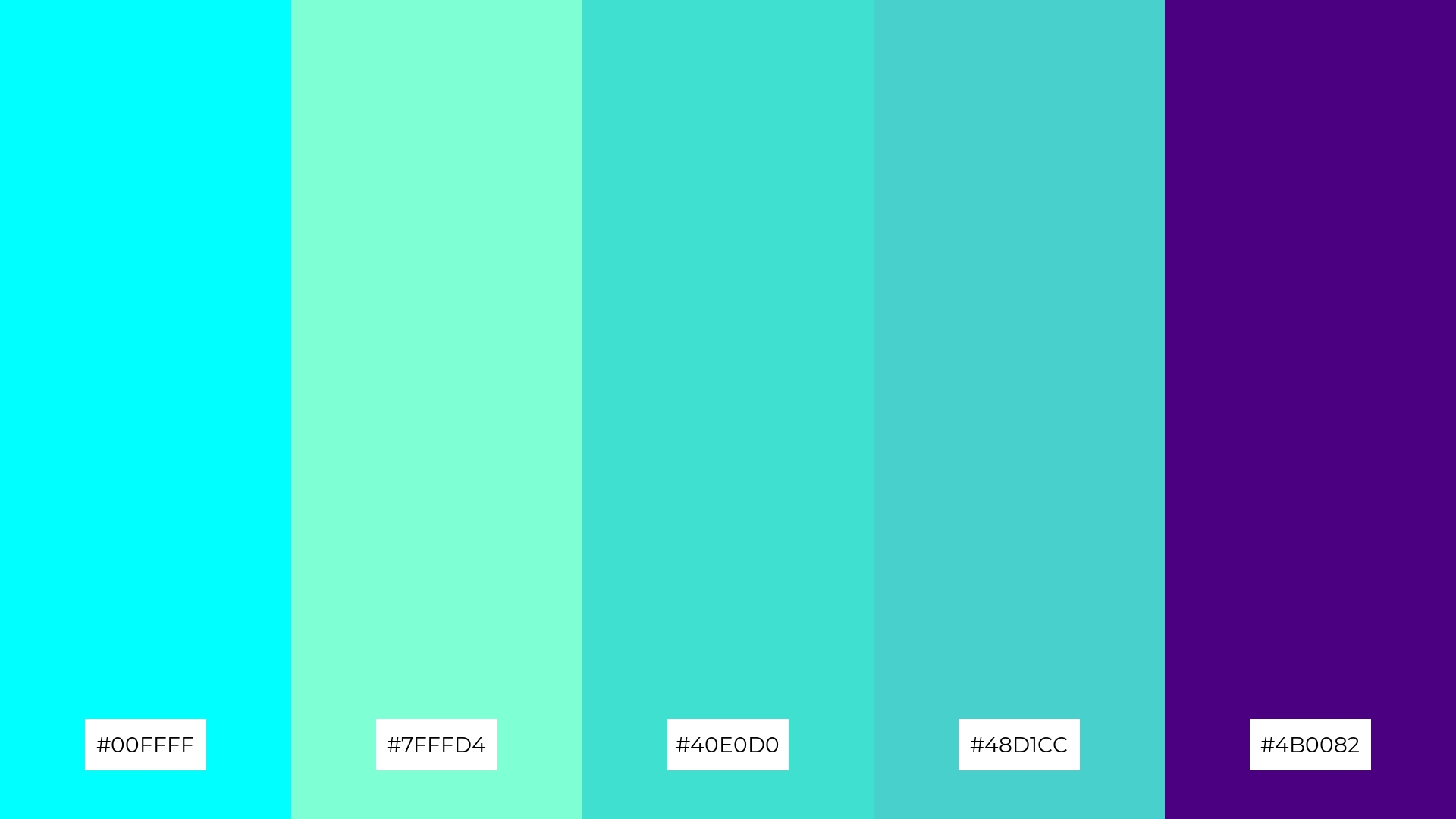
The ‘Arctic Aurora’ palette, with its blend of cool cyan and turquoise tones alongside deep indigo, conveys a sense of harmony when used in tech startups, creating a sleek and modern aesthetic that promotes focus and innovation.
Conversely, this palette can create a striking contrast in cozy interior makeovers, where the vibrant cool tones juxtaposed with rich indigo can add a refreshing and dynamic touch to living spaces.
How to Use Indigo Patterns in Design
Indigo color palettes can transform home decor by adding a touch of elegance and tranquility. Use indigo as a primary color for walls or large furniture pieces, and balance it with neutral accents like white or beige to create a serene and sophisticated atmosphere. For a bolder look, incorporate complementary colors such as gold or mustard in throw pillows or artwork.
In marketing materials, indigo can convey a sense of professionalism and modernity. Utilize indigo backgrounds with white or light gray text to ensure readability while maintaining a sleek and polished appearance. For added visual interest, integrate gradients or patterns that include various shades of indigo.
When designing clothing, indigo offers versatility and timeless appeal. Create striking outfits by pairing indigo garments with contrasting colors like coral or turquoise. Alternatively, use indigo as an accent color in accessories to add depth and richness to any ensemble.
Ready to elevate your designs with indigo color palettes? Try creating your own stunning visuals using Piktochart today!


