Dark olive green is a versatile and sophisticated color that can add depth and richness to any design. Its earthy tones make it a popular choice for both digital and print media.
Whether you’re creating infographics, presentations, or social media graphics, incorporating dark olive green can elevate your visual content. This article explores various dark olive green color palettes to inspire your next project.
Tips For Creating Dark Olive Green Color Palettes
Designing with dark olive green can be both exciting and challenging. Here are some practical tips to help you create stunning color palettes:
- Balance with Neutrals: Pair dark olive green with neutral colors like beige, gray, or white to create a balanced and harmonious look.
- Complementary Shades: Use complementary colors such as deep reds or purples to make dark olive green pop and add visual interest.
- Accent Colors: Incorporate accent colors like gold or mustard yellow to add warmth and sophistication to your design.
- Layering Tones: Experiment with different shades of green, from light to dark, to create depth and dimension in your palette.
- Versatility: Dark olive green works well in both modern and traditional designs, making it a versatile choice for various projects.
- Test and Adjust: Always test your color combinations in different lighting conditions to ensure they look good in all settings.
15 Dark Olive Green Color Palettes
1) Forest Canopy

The ‘Forest Canopy’ palette, with its blend of deep and muted greens, evokes a serene and refreshing mood, reminiscent of a tranquil walk through a lush forest.
These colors interact harmoniously to create a cohesive and natural look, making them ideal for interior decor where a calming and earthy atmosphere is desired.
2) Mossy Grove
The ‘Mossy Grove’ palette, with its rich greens and earthy browns, evokes a sense of warmth and calmness, reminiscent of a peaceful woodland retreat.
This palette would excel in product packaging for organic or eco-friendly brands, where the natural tones can convey sustainability and a connection to nature.
3) Autumn Leaves
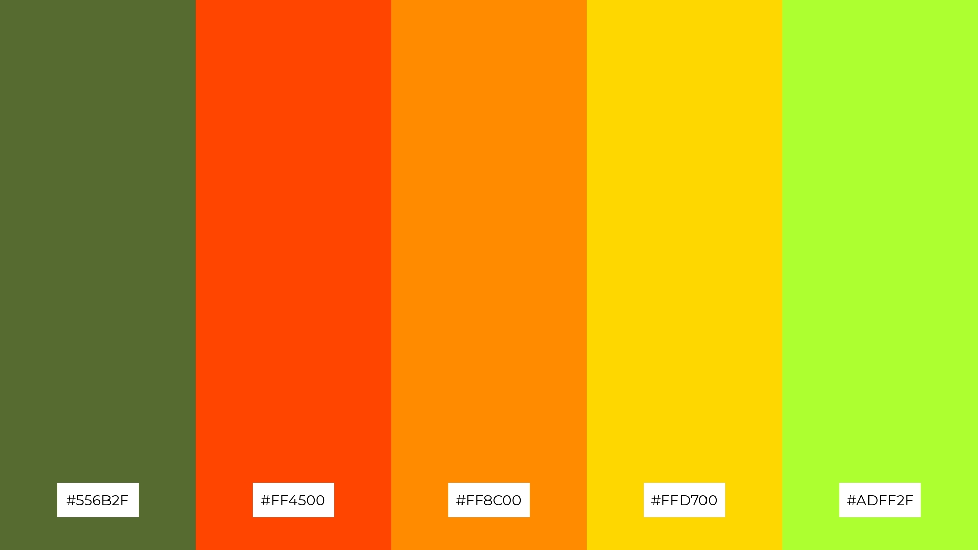
The ‘Autumn Leaves’ palette features dominant colors such as dark olive green (#556B2F), orange-red (#FF4500), dark orange (#FF8C00), gold (#FFD700), and green-yellow (#ADFF2F), creating a vibrant and warm visual experience.
This harmonious blend of colors is perfect for wellness branding, where the earthy and energetic tones can evoke feelings of vitality and rejuvenation.
4) Woodland Walk
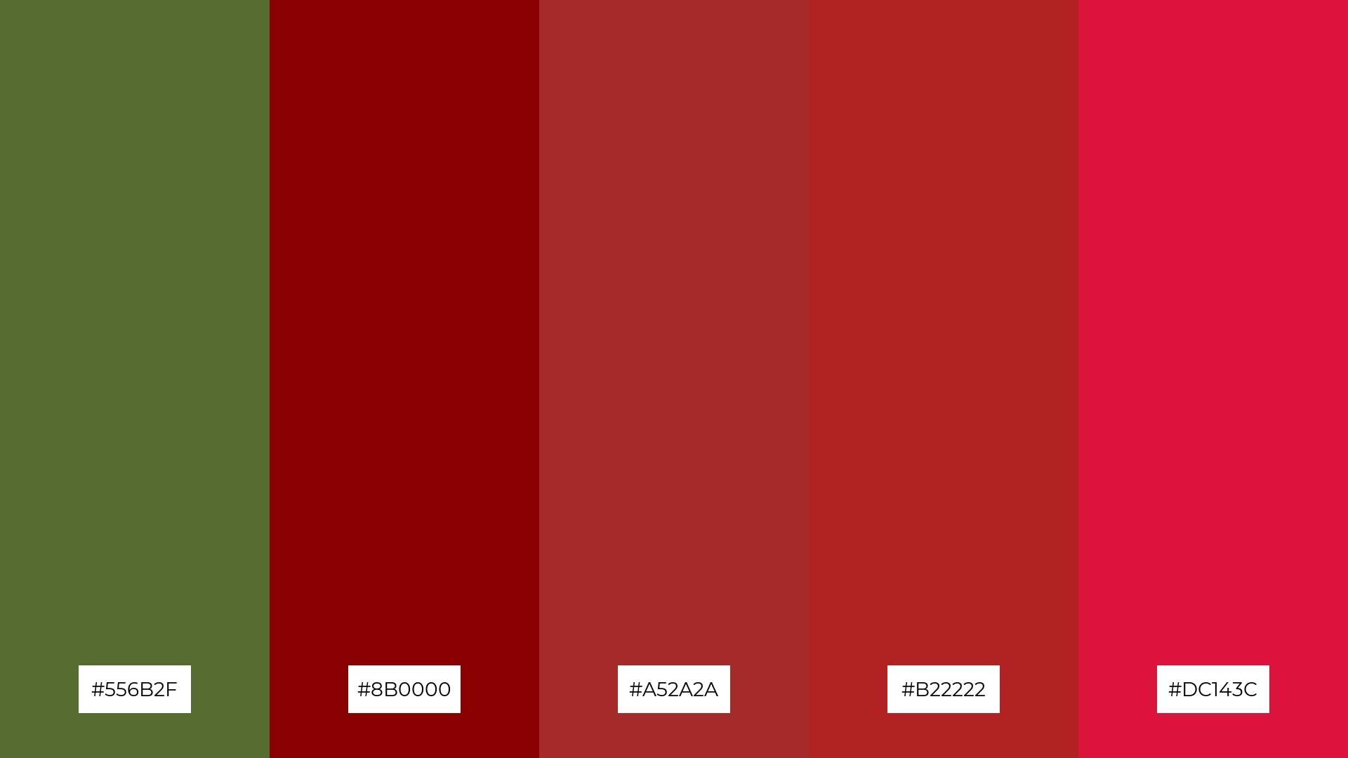
The ‘Woodland Walk’ palette, with its mix of dark olive green (#556B2F) and various shades of red (#8B0000, #A52A2A, #B22222, #DC143C), offers a balance of soft and bold tones, creating a distinct and inviting mood.
This palette is ideal for creating inviting retail spaces or modern web designs, where the combination of earthy and vibrant colors can draw attention and evoke a sense of warmth and sophistication.
5) Olive Orchard
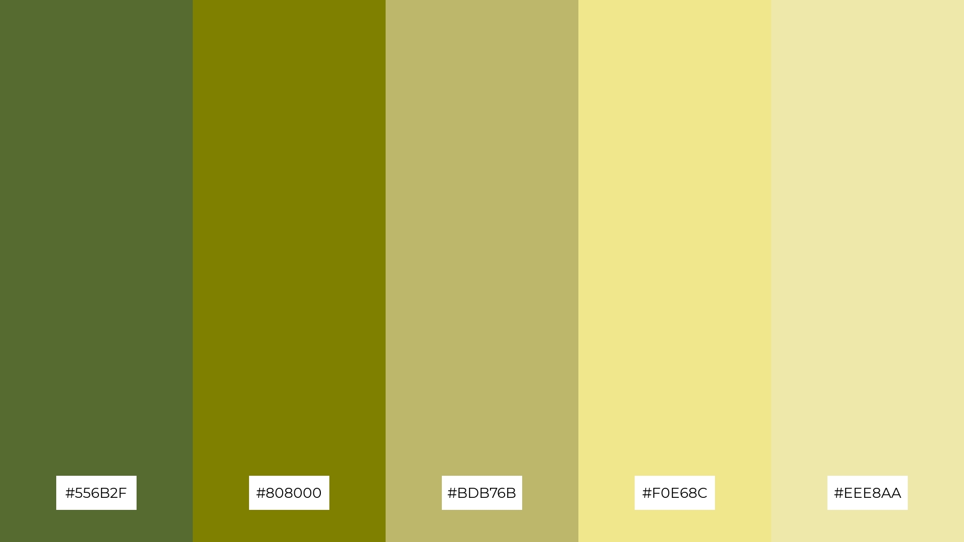
The ‘Olive Orchard’ palette, with its blend of dark olive green (#556B2F), olive (#808000), dark khaki (#BDB76B), khaki (#F0E68C), and pale goldenrod (#EEE8AA), creates a serene and timeless ambiance, perfect for wedding themes that aim to evoke a sense of natural elegance and tranquility.
This harmonious combination of earthy and muted tones can also be effectively utilized in luxury fashion campaigns, where the subtle yet sophisticated colors can convey a message of understated opulence and refined taste.
6) Enchanted Forest
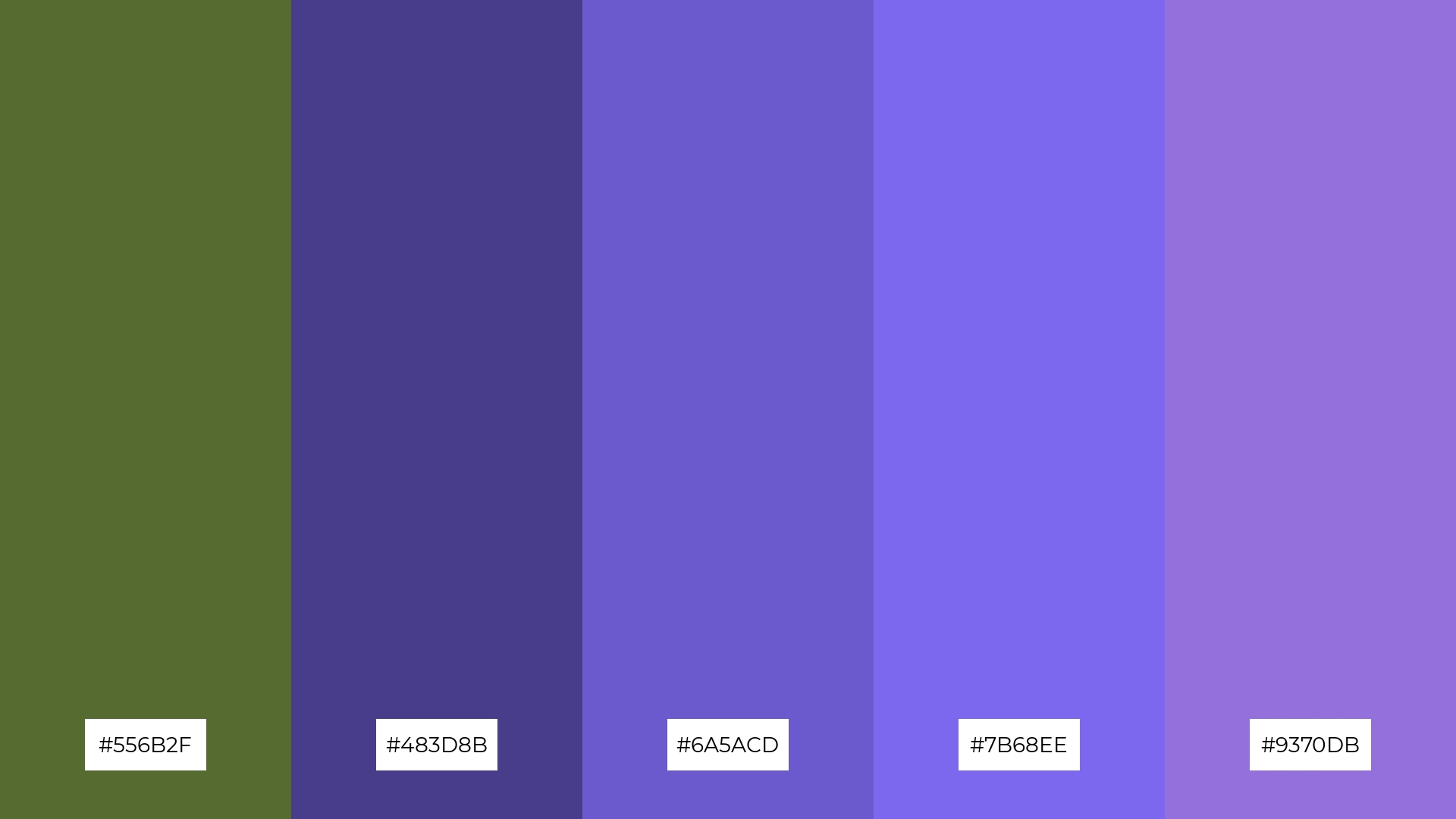
The ‘Enchanted Forest’ palette, with its blend of dark olive green (#556B2F) and various shades of purple (#483D8B, #6A5ACD, #7B68EE, #9370DB), creates a sophisticated and mysterious mood, perfect for designs that aim to evoke a sense of elegance and intrigue.
This harmonious combination of earthy and regal tones is ideal for minimalistic branding, where the subtle yet striking colors can convey a message of refined luxury and timeless appeal.
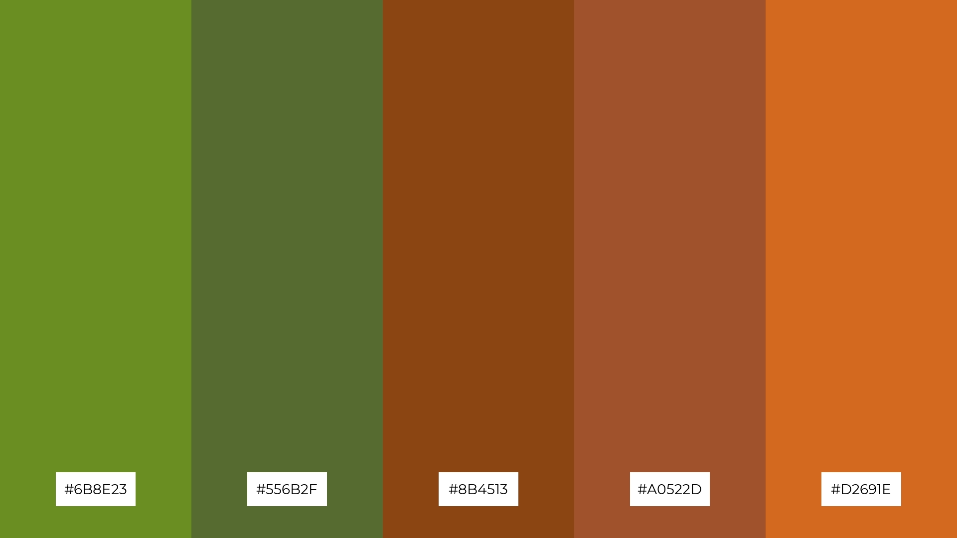
7) Earthy Tones
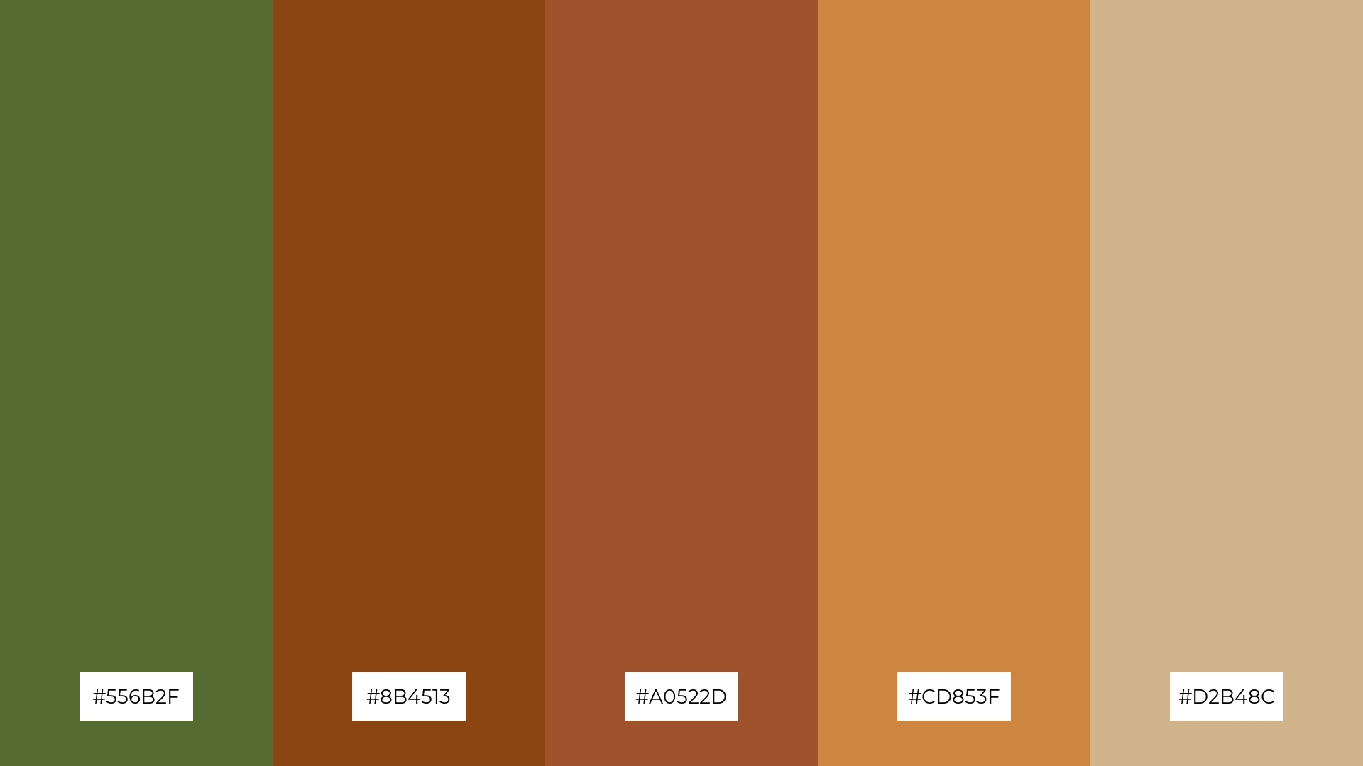
The ‘Earthy Tones’ palette, with its mix of dark olive green (#556B2F), saddle brown (#8B4513), sienna (#A0522D), peru (#CD853F), and tan (#D2B48C), offers a striking contrast between deep, rich hues and lighter, more muted shades, creating a dynamic and visually engaging composition.
This palette is perfect for creative projects like magazine layouts or artistic websites, where the interplay of bold and subtle colors can draw attention and add depth, making the overall design more captivating and memorable.
8) Meadow Breeze
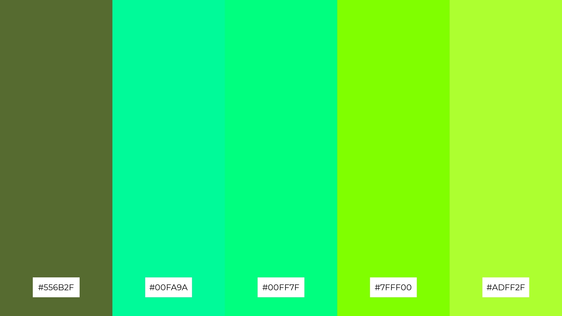
The ‘Meadow Breeze’ palette, with its mix of dark olive green (#556B2F) and vibrant greens (#00FA9A, #00FF7F, #7FFF00, #ADFF2F), can evoke a sense of calm when paired with softer shades, making it ideal for spa branding where tranquility and relaxation are key.
Conversely, the same palette can bring excitement and energy when the brighter greens dominate, making it perfect for vibrant marketing campaigns that aim to capture attention and convey a lively, fresh message.
9) Rustic Charm
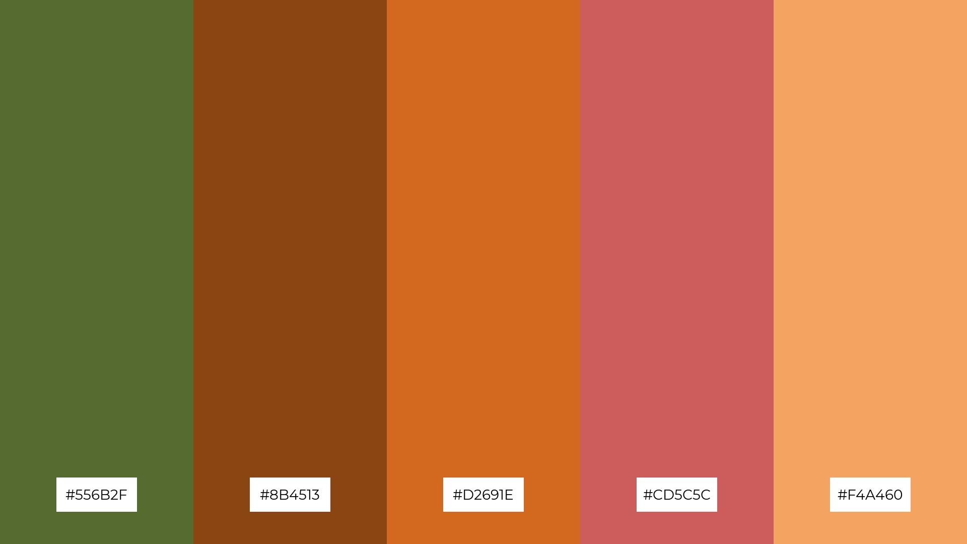
The ‘Rustic Charm’ palette, with its mix of dark olive green (#556B2F), saddle brown (#8B4513), chocolate (#D2691E), Indian red (#CD5C5C), and sandy brown (#F4A460), features both softer and brighter tones that create a warm and inviting atmosphere.
This blend of earthy and vibrant colors is perfect for home decor, where the combination can evoke a cozy and welcoming mood, or for seasonal promotions that aim to capture the essence of autumn’s rich and comforting hues.
10) Twilight Woods
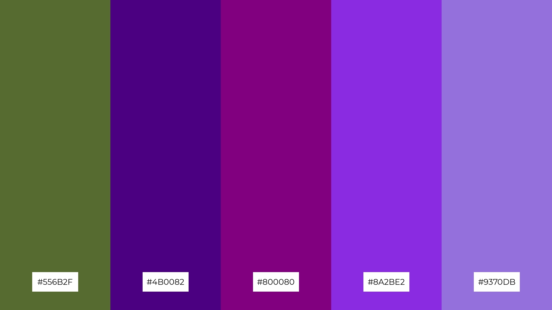
The ‘Twilight Woods’ palette, with its blend of dark olive green (#556B2F) and various shades of purple (#4B0082, #800080, #8A2BE2, #9370DB), creates a visual flow that evokes a sense of tranquility and mystique, making it perfect for designs that aim to convey calmness and depth.
This harmonious combination of earthy and regal tones is ideal for lifestyle branding, where the subtle yet striking colors can enhance the perception of luxury and sophistication, or for tech product packaging, where the rich hues can convey innovation and elegance.
11) Vintage Olive
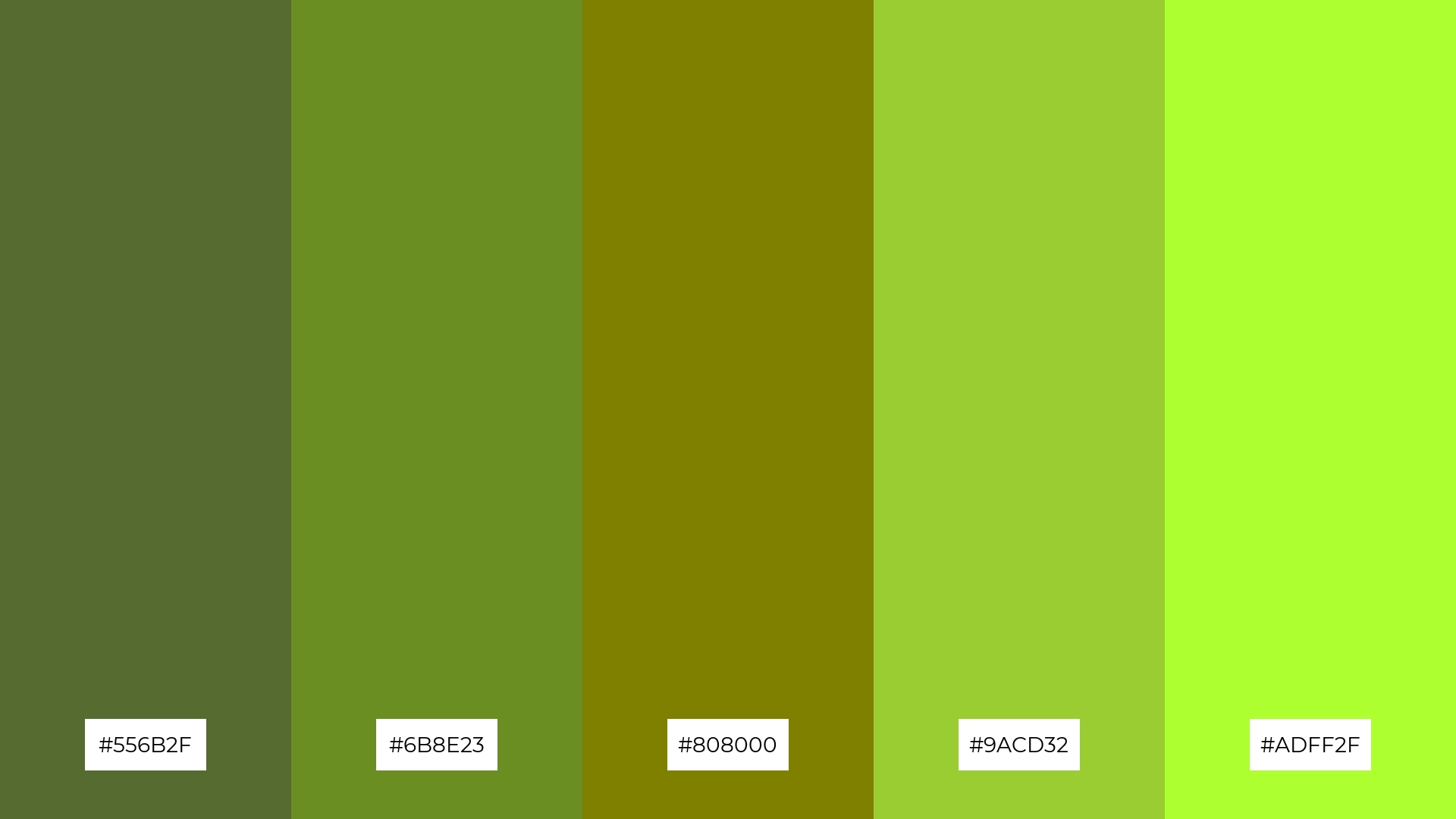
The ‘Vintage Olive’ palette, with its blend of dark olive green (#556B2F), olive drab (#6B8E23), olive (#808000), yellow-green (#9ACD32), and green-yellow (#ADFF2F), creates a welcoming effect by combining earthy and vibrant tones that evoke a sense of warmth and natural elegance.
This palette shines in boutique interiors, where the harmonious mix of colors can create an inviting and sophisticated atmosphere, perfect for enhancing the shopping experience and highlighting unique, high-quality products.
12) Desert Oasis
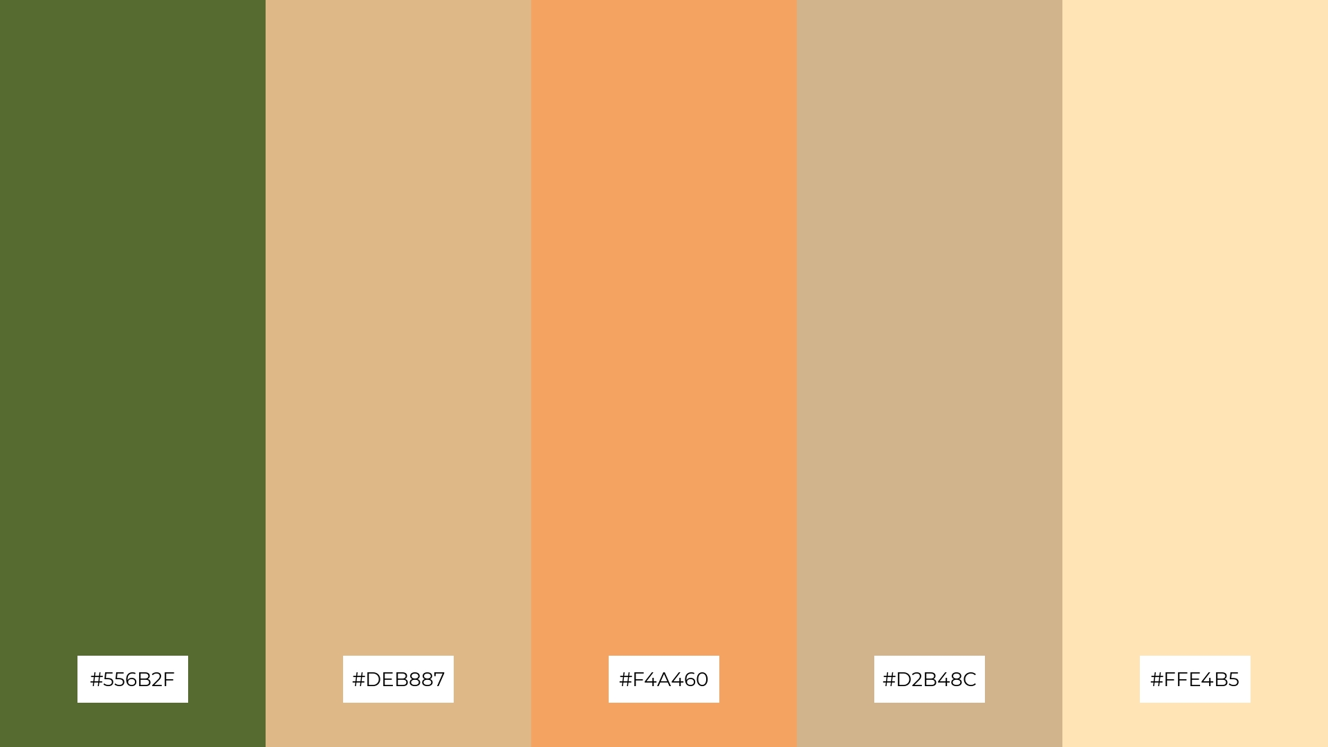
The ‘Desert Oasis’ palette, with its mix of dark olive green (#556B2F), burlywood (#DEB887), sandy brown (#F4A460), tan (#D2B48C), and moccasin (#FFE4B5), creates a harmonious balance by blending earthy and warm tones that evoke a sense of natural tranquility.
This palette is ideal for casual apparel lines, where the soothing and cohesive colors can convey a relaxed and effortless style, perfect for everyday wear that aims to combine comfort with understated elegance.
13) Rainforest Mist
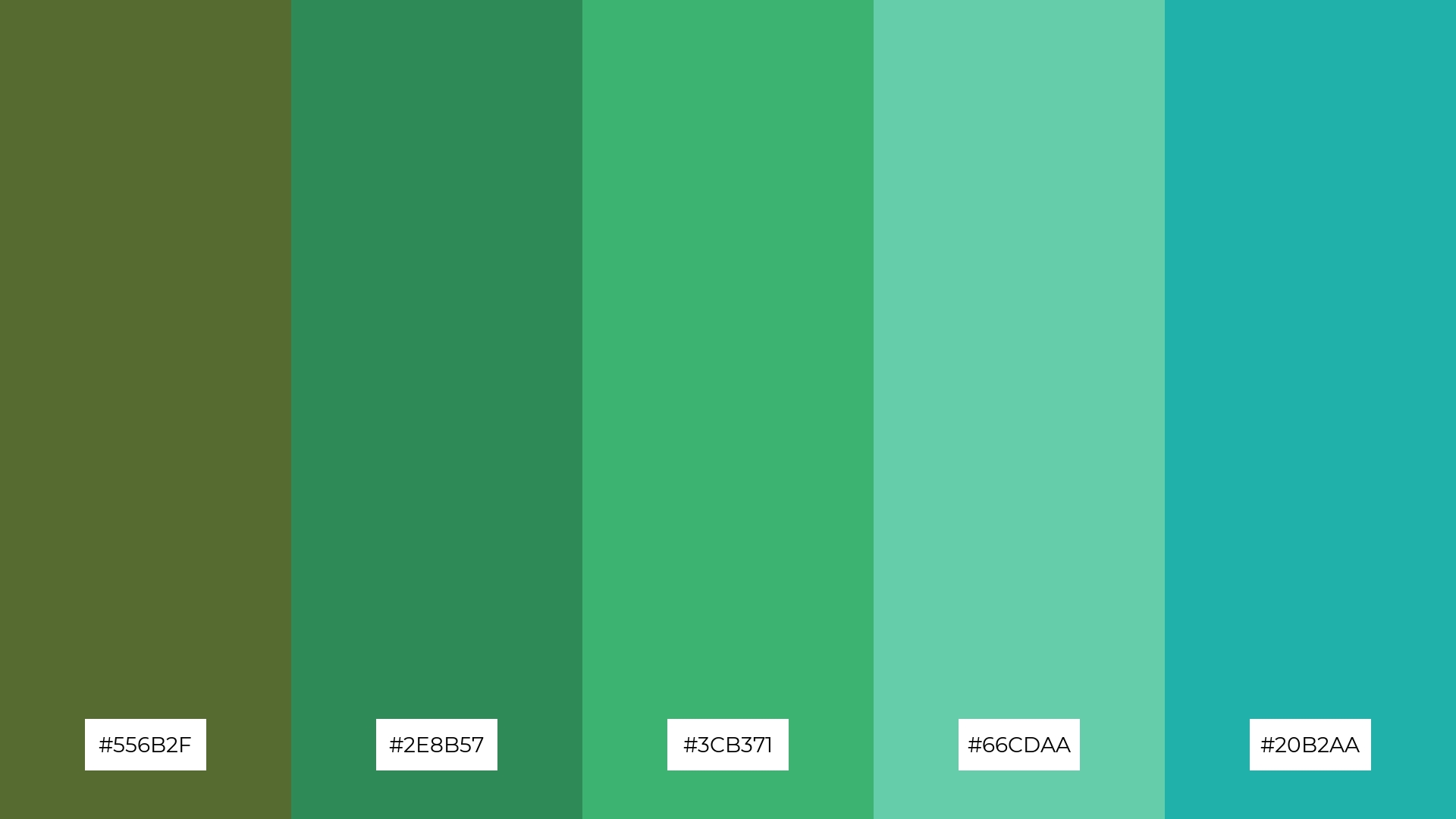
The ‘Rainforest Mist’ palette, with its blend of dark olive green (#556B2F), sea green (#2E8B57), medium sea green (#3CB371), medium aquamarine (#66CDAA), and light sea green (#20B2AA), masterfully combines warm and cool tones to evoke a serene and refreshing mood.
This harmonious mix of colors is perfect for artisan product branding, where the natural and calming hues can convey a sense of handcrafted quality and eco-friendly values, making the products stand out in a crowded market.
14) Urban Jungle
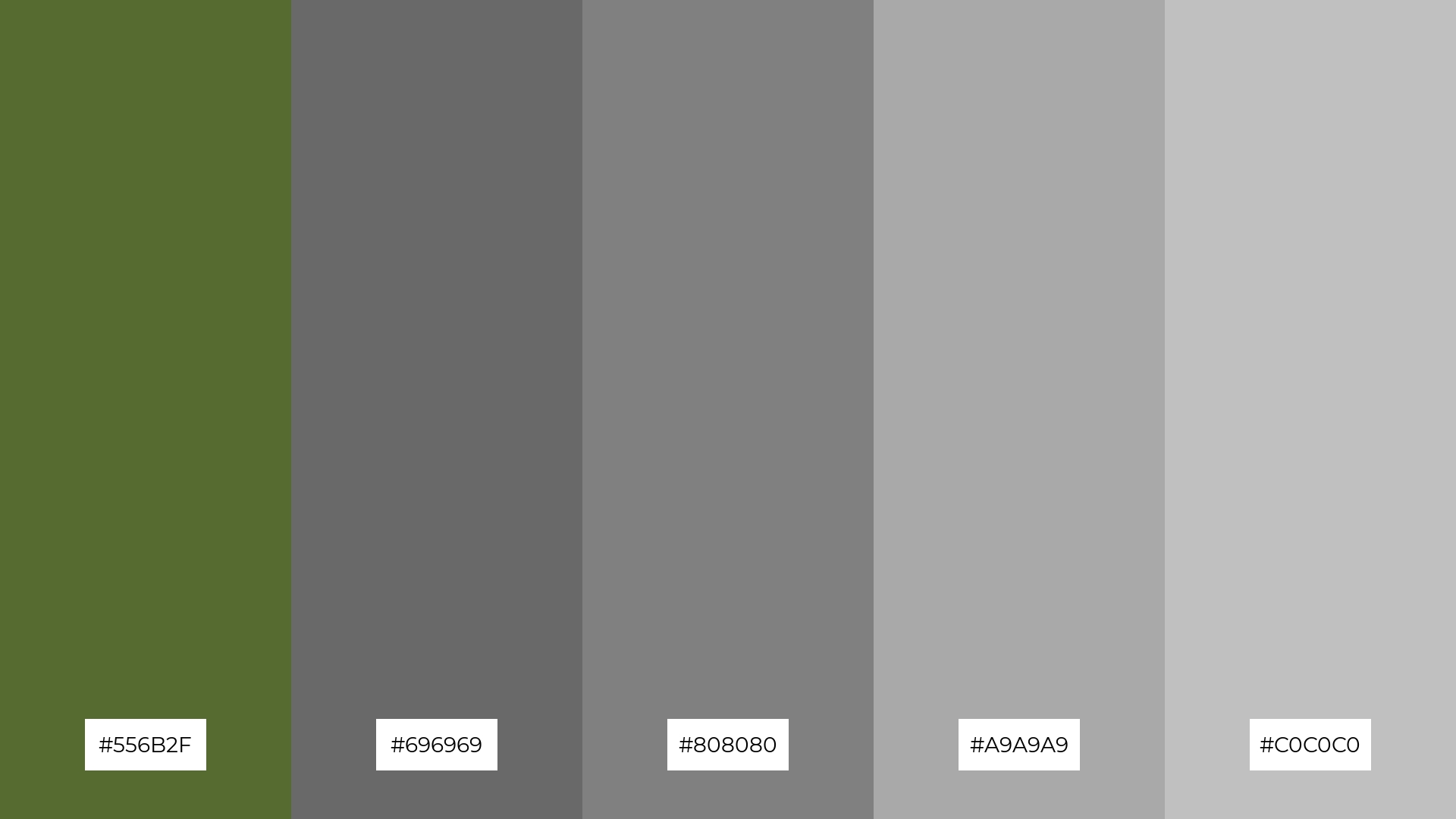
The ‘Urban Jungle’ palette, with its mix of dark olive green (#556B2F) and various shades of gray (#696969, #808080, #A9A9A9, #C0C0C0), creates a striking contrast between bold and subtle tones, making it perfect for designs that aim to convey modernity and sophistication.
This dynamic combination of earthy and neutral colors is ideal for restaurant menus, where the interplay of rich and muted hues can enhance the visual appeal and create a chic, contemporary dining experience.
15) Coastal Retreat
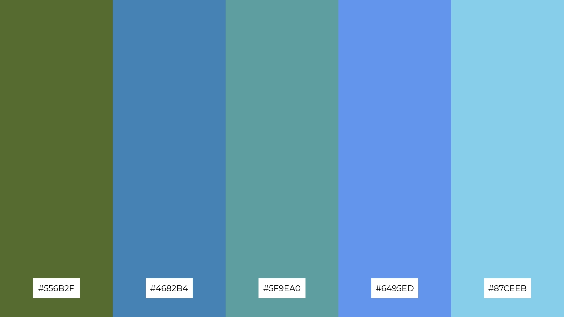
The ‘Coastal Retreat’ palette, with its blend of dark olive green (#556B2F) and various shades of blue (#4682B4, #5F9EA0, #6495ED, #87CEEB), conveys a sense of harmony by combining earthy and aquatic tones that evoke a serene and balanced atmosphere.
This palette is ideal for tech startups aiming to create a calming yet innovative workspace, or for cozy interior makeovers where the soothing colors can transform a space into a tranquil and inviting retreat.
How to Use Dark Olive Green Patterns in Design
Dark olive green color palettes can be a game-changer in various design applications. For home decor, consider pairing dark olive green with neutral tones like beige or cream to create a cozy and inviting atmosphere. This combination can add a touch of sophistication and warmth to living spaces, making them feel both elegant and comfortable.
In marketing materials, dark olive green can be used to convey a sense of reliability and natural elegance. Pair it with complementary colors like gold or mustard yellow to create eye-catching and memorable designs. This approach is particularly effective for brands that want to emphasize sustainability and eco-friendliness.
For clothing, dark olive green works well in both casual and formal wear. Combine it with earthy tones like brown or tan for a relaxed, everyday look, or with rich colors like burgundy for a more polished and refined appearance. This versatile color can easily adapt to different styles and seasons.
Ready to elevate your designs with dark olive green color palettes? Try creating your own stunning palettes using Piktochart and see how this versatile color can transform your projects.


