
Black and gray color palettes are timeless choices in design, offering a sophisticated and versatile aesthetic. These neutral tones can create striking contrasts or subtle elegance, making them ideal for various applications.
Whether you’re designing a sleek website, a modern infographic, or a professional presentation, black and gray hues provide a foundation that complements any color scheme. Their adaptability ensures they remain a staple in the designer’s toolkit.
Tips For Creating Black Gray Color Palettes
Designing with black and gray can elevate your projects with a touch of sophistication and versatility.
- Balance your colors: Use black and gray as base colors, then add pops of brighter hues to create visual interest without overwhelming the design.
- Match complementary shades: Pair black and gray with complementary colors like white, gold, or pastel tones to achieve a harmonious look.
- Utilize gradients: Create depth and dimension by blending black and gray gradients, which can add a modern and sleek feel to your design.
- Consider texture: Incorporate textures such as matte, glossy, or metallic finishes to enhance the visual appeal of black and gray palettes.
- Maintain versatility: Ensure your design remains adaptable by using black and gray as a neutral backdrop, allowing for easy updates and modifications with different accent colors.
- Test in different lighting: Check how your black and gray designs appear under various lighting conditions to ensure they maintain their intended impact.
15 Black Gray Color Palettes
1) Midnight Elegance
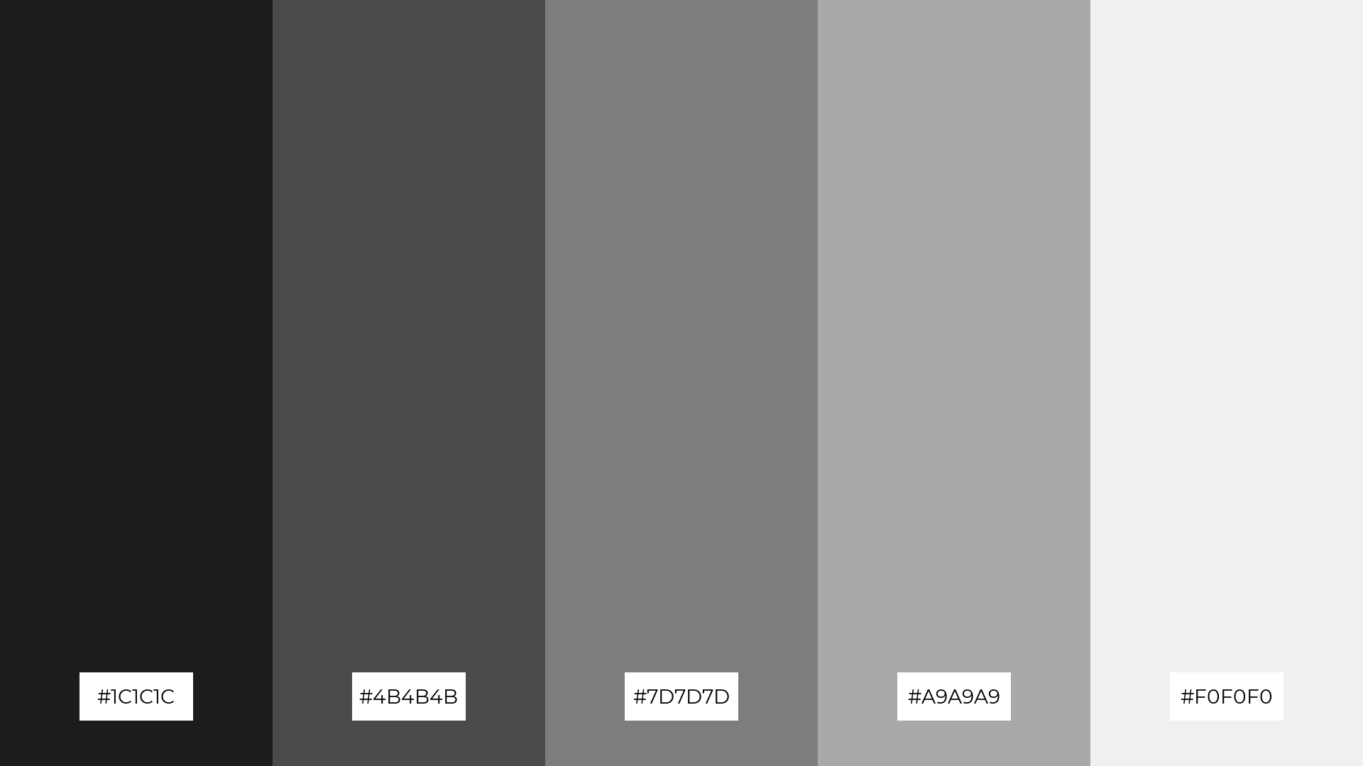
The ‘Midnight Elegance’ palette, with its deep blacks and varying shades of gray, evokes a mood of refined sophistication and understated luxury.
In interior decor, this palette creates a cohesive look by seamlessly blending dark and light tones, making it perfect for a modern living room that exudes both comfort and style.
2) Urban Shadows
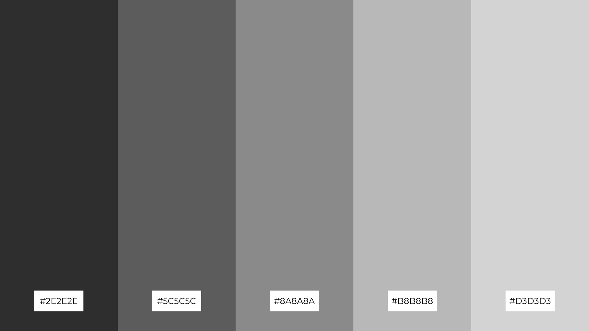
The ‘Urban Shadows’ palette, with its gradient of grays from deep charcoal to light silver, evokes a sense of calmness and modernity, making it ideal for creating a serene yet contemporary atmosphere.
This palette would excel in digital branding for tech startups, where the sleek and professional tones can convey innovation and reliability.
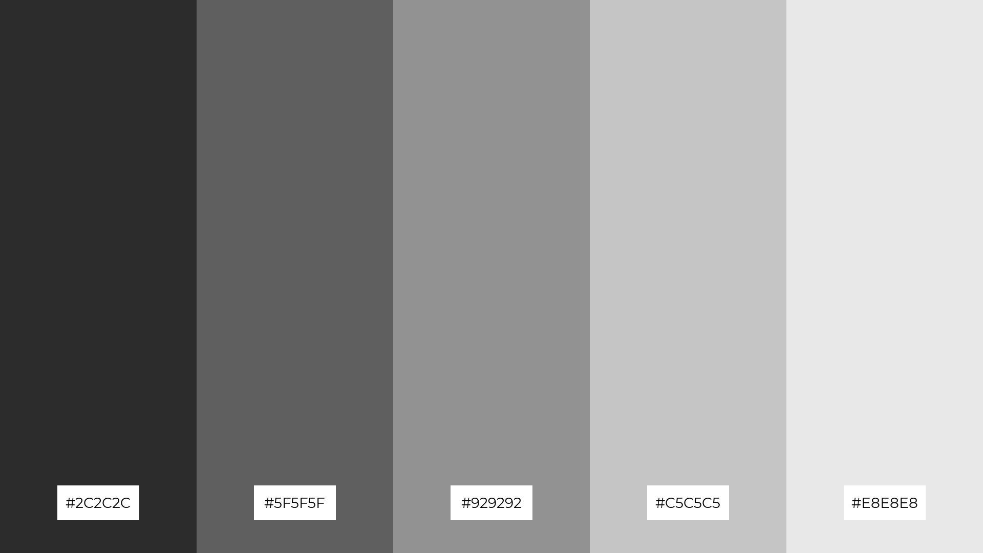
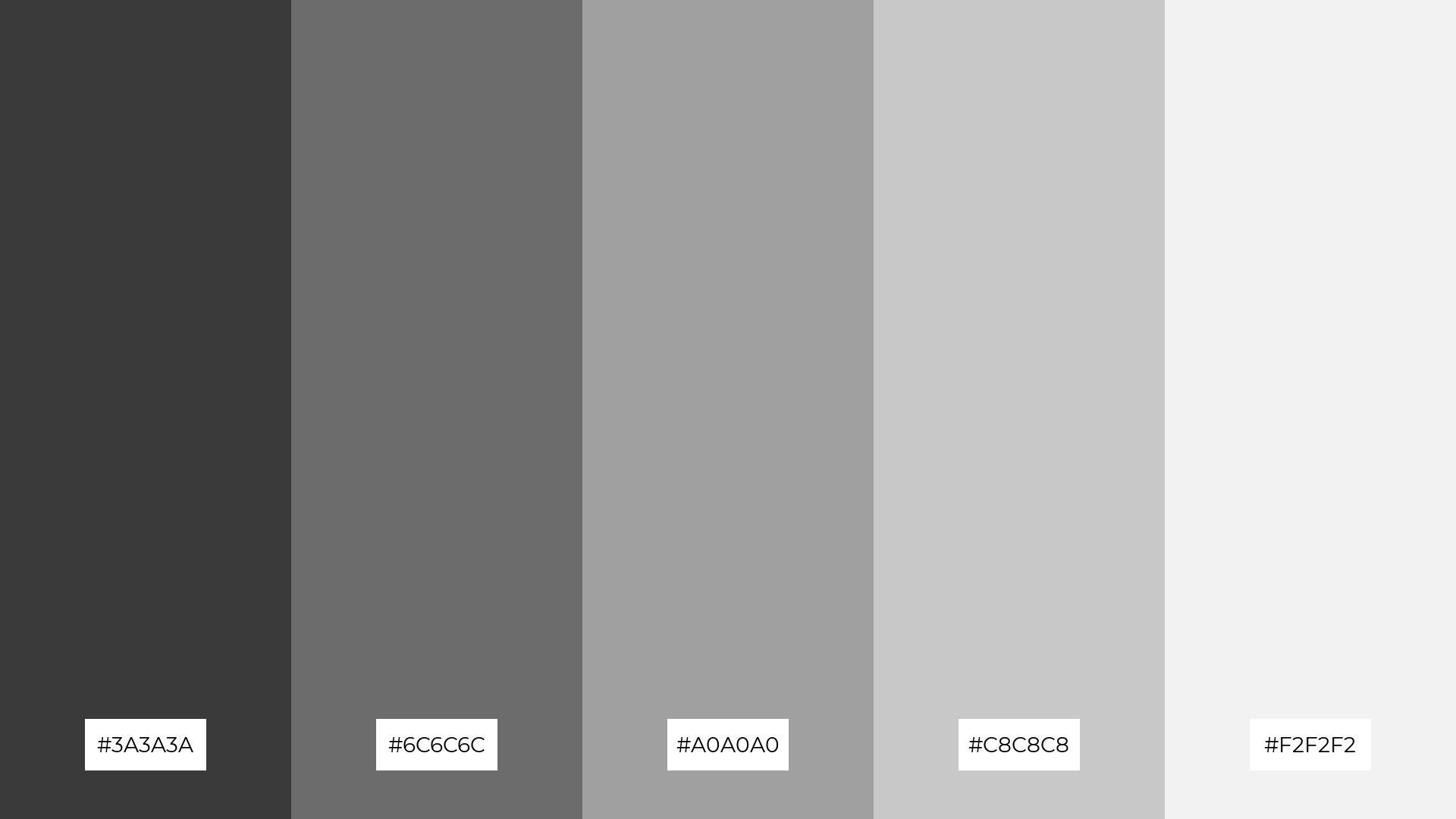
3) Charcoal Dream
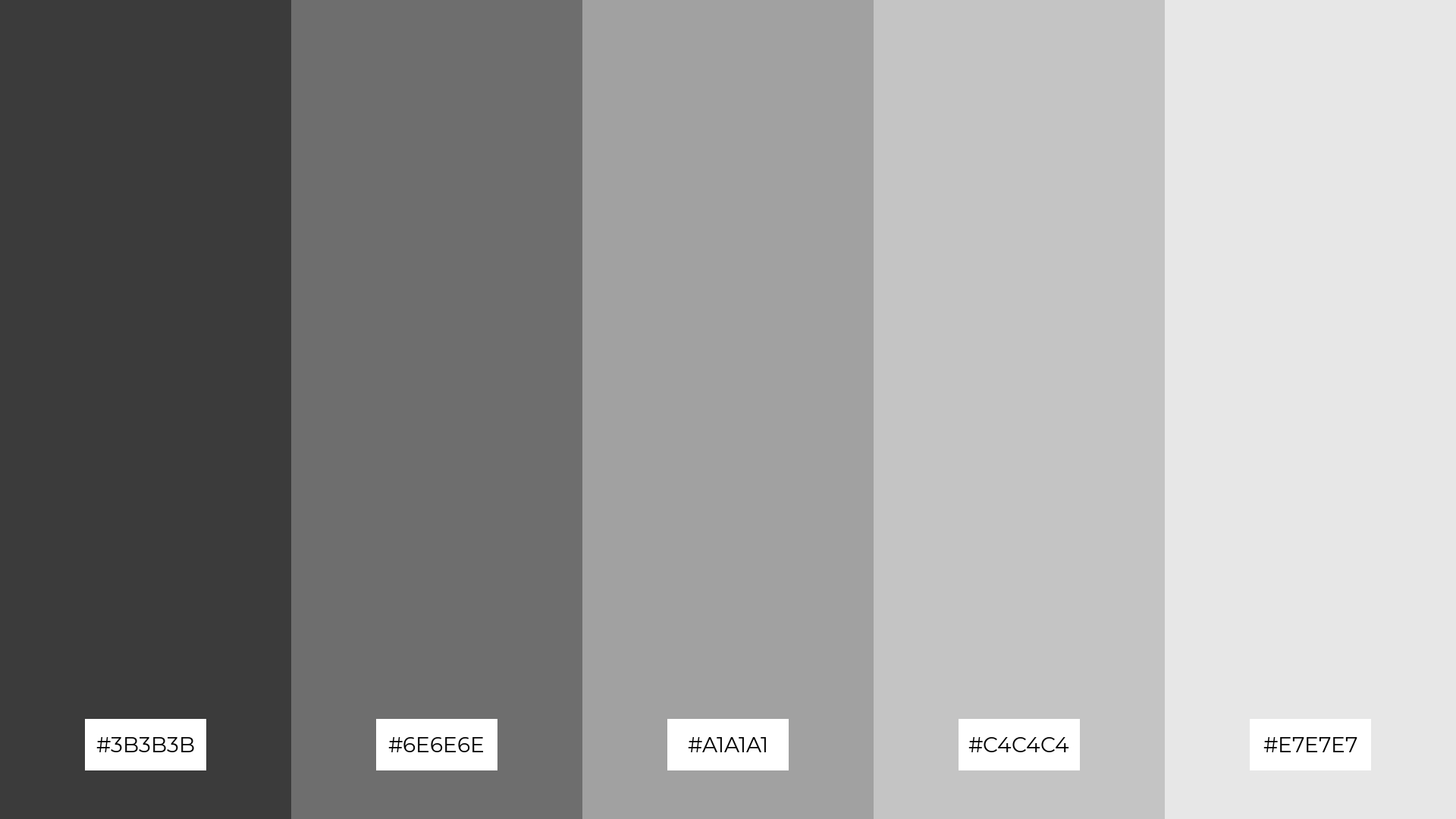
The ‘Charcoal Dream’ palette, featuring dominant colors like #3B3B3B, #6E6E6E, #A1A1A1, #C4C4C4, and #E7E7E7, creates a balanced and harmonious visual experience through its gradient of grays.
This palette is particularly effective in wellness branding, where the soothing and neutral tones can evoke a sense of calm and tranquility, making it ideal for creating serene and inviting spaces.
4) Steel and Stone
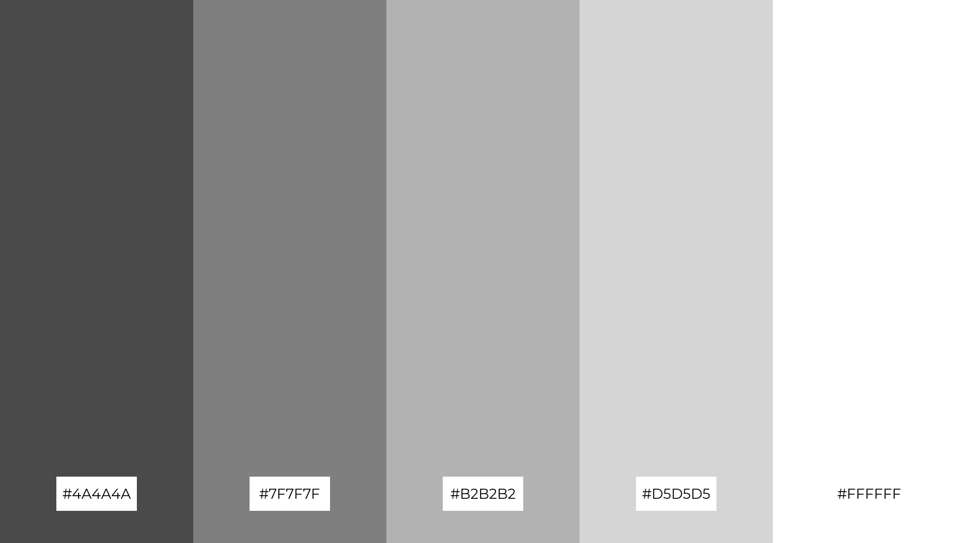
The ‘Steel and Stone’ palette, with its blend of soft grays and bold whites, offers a balanced aesthetic that can create a distinct and inviting mood.
This palette is ideal for modern web designs, where the combination of these tones can enhance user experience by providing a clean, professional, and visually appealing interface.
5) Graphite Glow

The ‘Graphite Glow’ palette, with its spectrum from deep charcoal to soft white, creates a serene and sophisticated ambiance, perfect for evoking a sense of calm and elegance.
This palette is ideal for luxury fashion campaigns, where the subtle gradation of grays can highlight the intricate details of high-end garments, enhancing their allure and exclusivity.
6) Ashen Twilight
The ‘Ashen Twilight’ palette, with its gradient from deep charcoal to light gray, creates a harmonious blend that exudes sophistication and modernity, making it perfect for minimalistic branding that aims to convey a sleek and professional image.
This palette’s balanced tones can also be utilized in bold event designs, where the subtle shifts in gray can add depth and dimension, creating an atmosphere of understated elegance and refined style.
7) Noir Chic
The ‘Noir Chic’ palette, with its stark contrasts between deep blacks and light grays, creates a dynamic visual interest that captivates the viewer’s attention.
This palette is perfect for creative projects like magazine layouts or artistic websites, where the interplay of dark and light tones can enhance the overall aesthetic and draw focus to key elements.
8) Slate Serenity
The ‘Slate Serenity’ palette, with its gradient from deep charcoal to soft white, can evoke a sense of calm when used in spa branding, creating a tranquil and soothing environment for relaxation.
Conversely, this palette can bring excitement to vibrant marketing campaigns by strategically combining the darker and lighter shades to create dynamic contrasts that capture attention and convey energy.
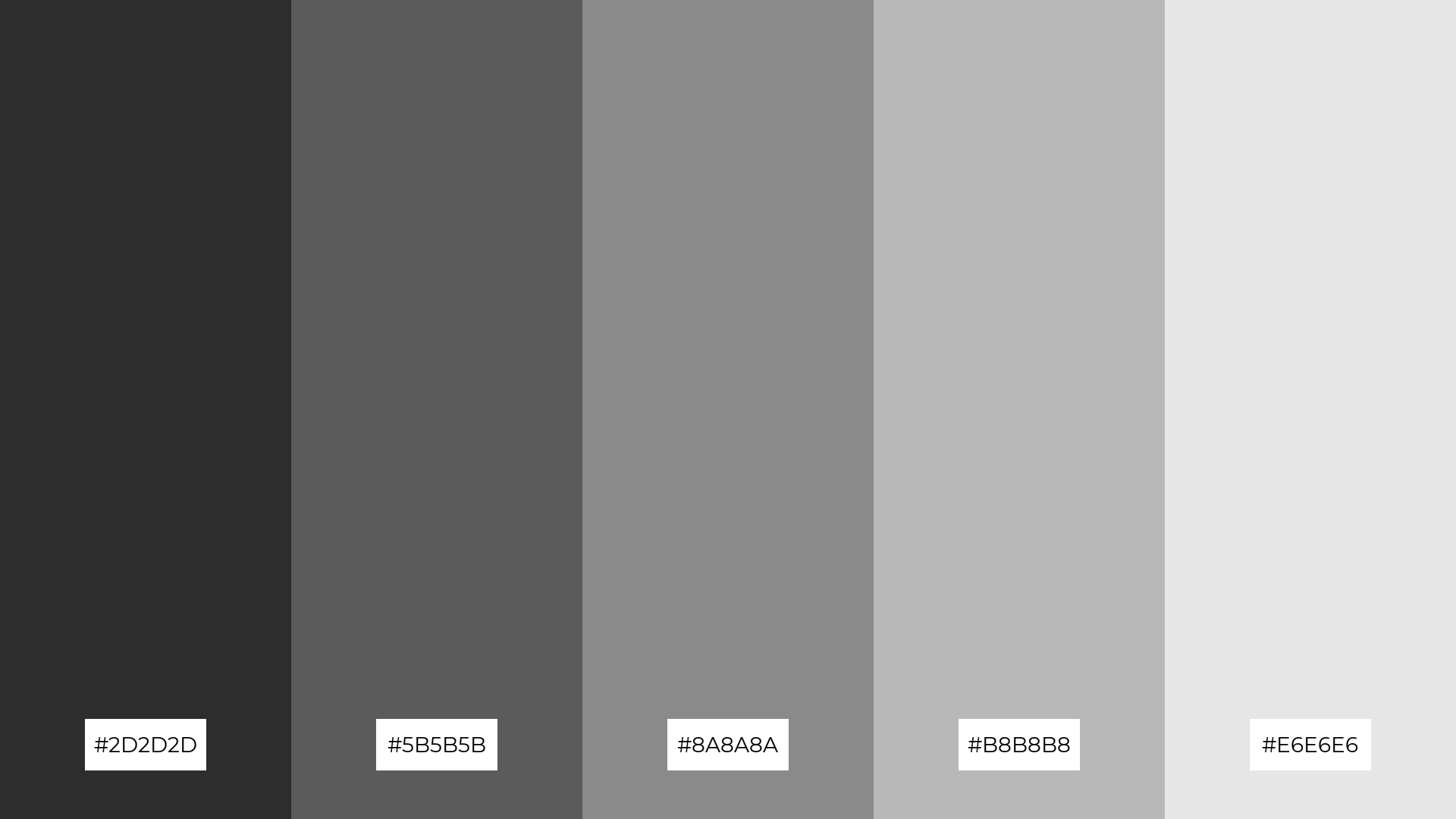
9) Onyx Oasis
The ‘Onyx Oasis’ palette, with its softer tones like #B1B1B1 and #E4E4E4, introduces a gentle brightness that balances the deeper shades, creating a harmonious and inviting atmosphere.
This blend of hues is ideal for seasonal promotions, where the interplay of light and dark tones can evoke a sense of warmth and coziness, making it perfect for capturing the essence of festive home decor.
10) Phantom Mist
The ‘Phantom Mist’ palette, with its seamless transition from deep charcoal to soft white, creates a visual flow that evokes a sense of tranquility and understated elegance.
This calming gradient is ideal for lifestyle branding, where its soothing tones can enhance the perception of wellness and relaxation, or for tech product packaging, where the sleek and modern aesthetic can convey innovation and sophistication.
11) Graphene Glow
The tones in the ‘Graphene Glow’ palette, ranging from deep charcoal to soft white, create a welcoming effect by offering a balanced and harmonious visual experience that can make any space feel inviting and comfortable.
This palette shines in luxury e-commerce sites, where the dramatic contrasts and subtle gradations can enhance the perception of high-end products, making them appear more exclusive and desirable.
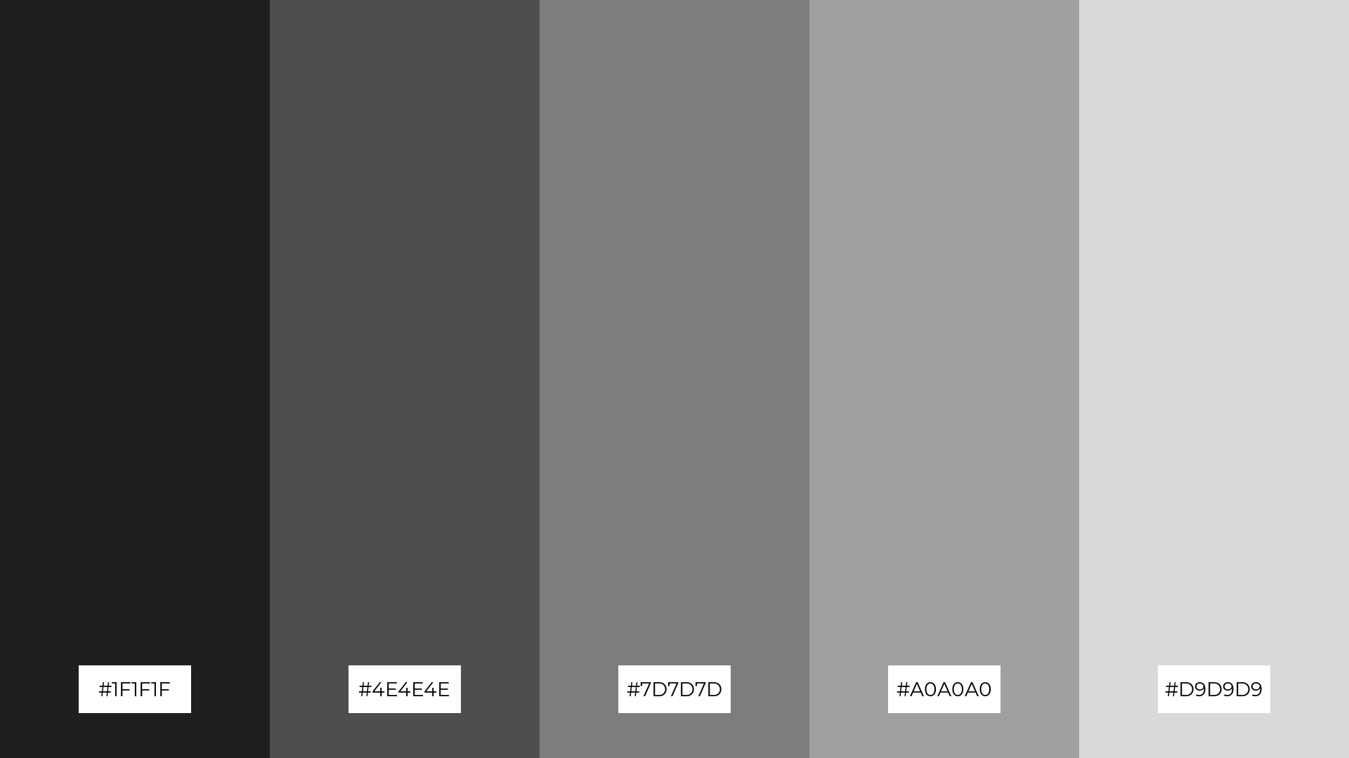
12) Obsidian Whisper
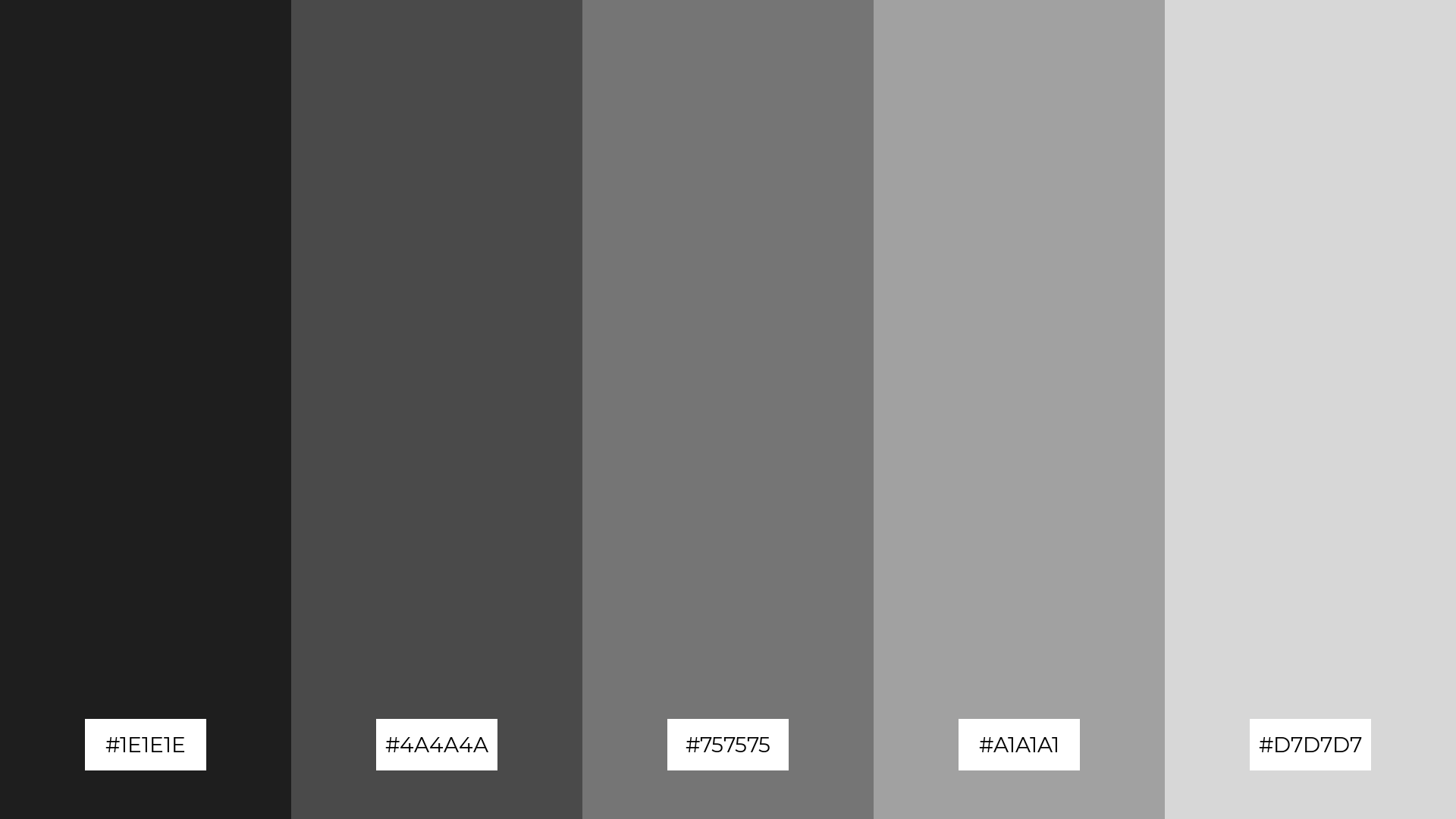
The hues in the ‘Obsidian Whisper’ palette, ranging from deep black (#1E1E1E) to light gray (#D7D7D7), interact to create a balanced visual experience through their seamless gradation and subtle contrasts.
This palette is particularly fitting for sleek corporate branding, where the interplay of dark and light tones can convey professionalism and modernity, enhancing the brand’s sophisticated image.
13) Shadowed Harmony
The ‘Shadowed Harmony’ palette, with its blend of warm and cool tones ranging from deep charcoal to soft white, creates a balanced and inviting atmosphere that evokes a sense of calm and sophistication.
This palette is particularly effective in artisan product branding, where the harmonious interplay of these hues can highlight the craftsmanship and quality of handmade goods, enhancing their appeal and exclusivity.
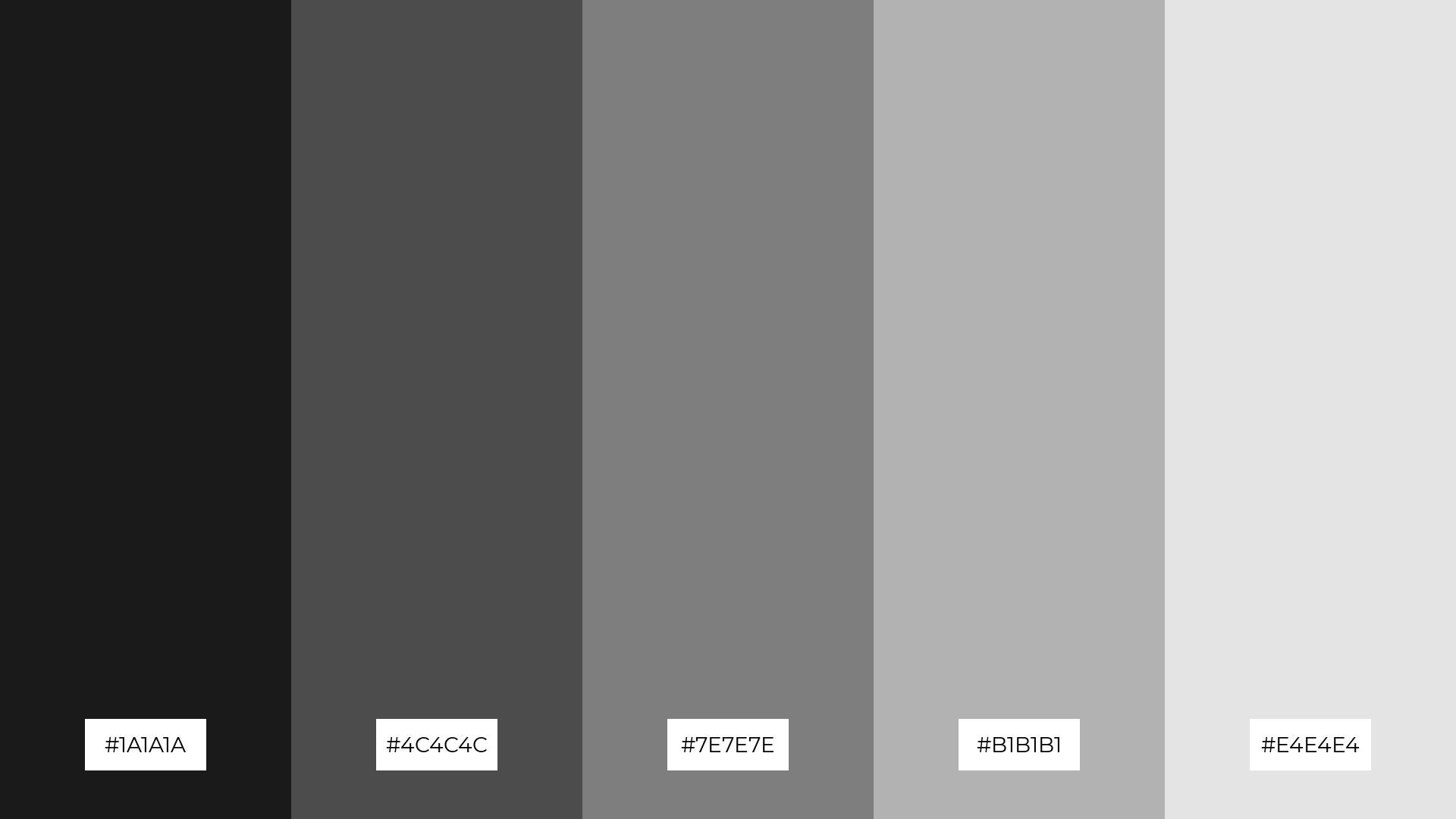
14) Sable Serenity
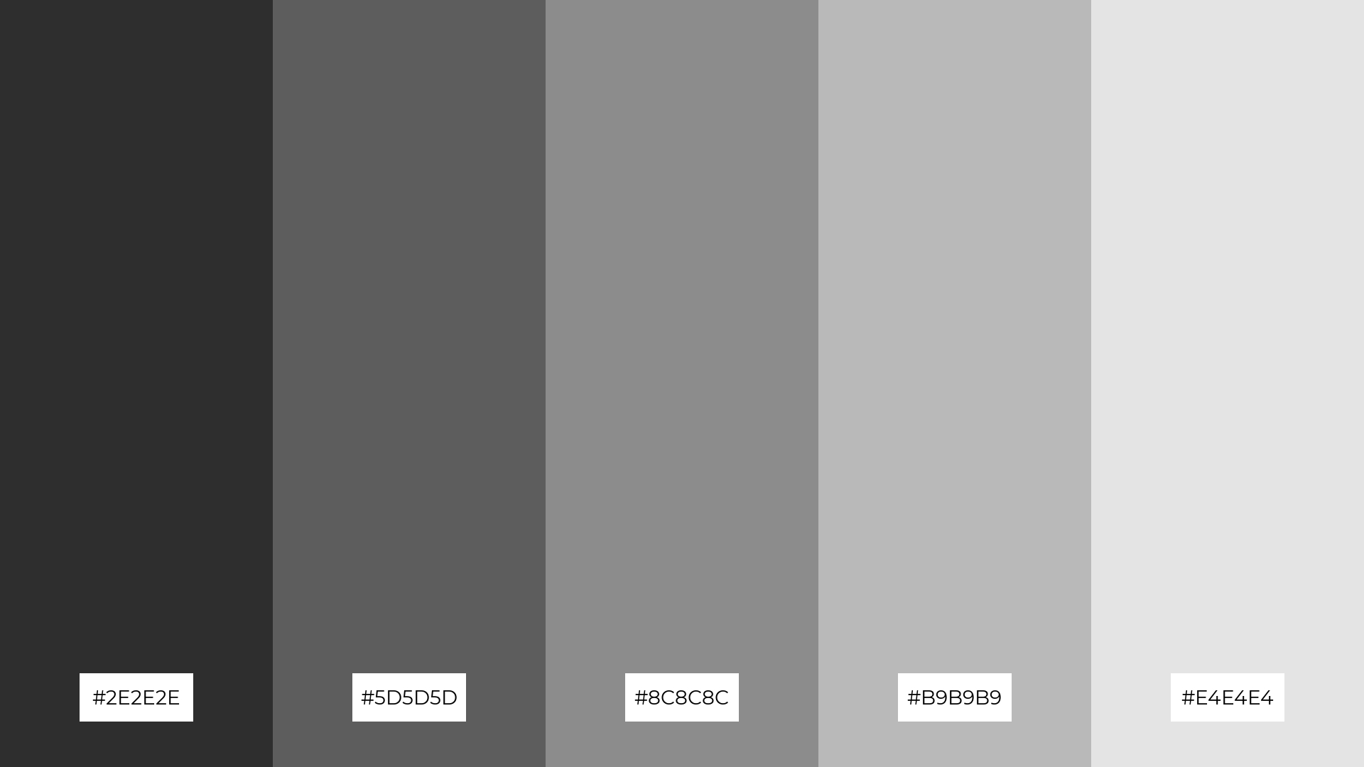
The ‘Sable Serenity’ palette, with its gradient from deep charcoal (#2E2E2E) to soft white (#E4E4E4), offers a dynamic interplay of bold and subtle tones that can create a visually captivating experience.
This palette is particularly effective for restaurant menus, where the rich contrasts and harmonious transitions can enhance the presentation of dishes, making the dining experience feel both sophisticated and inviting.
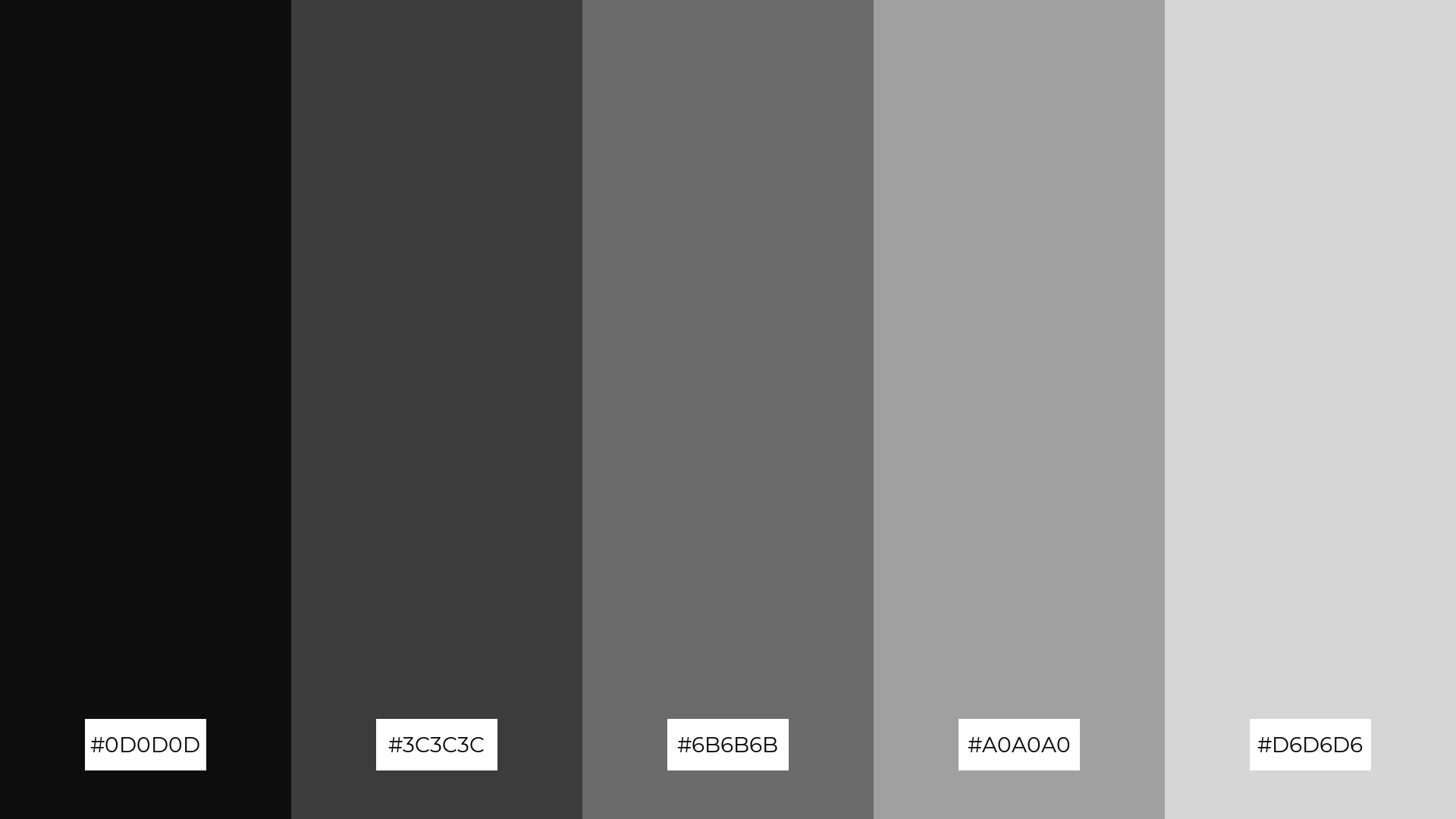
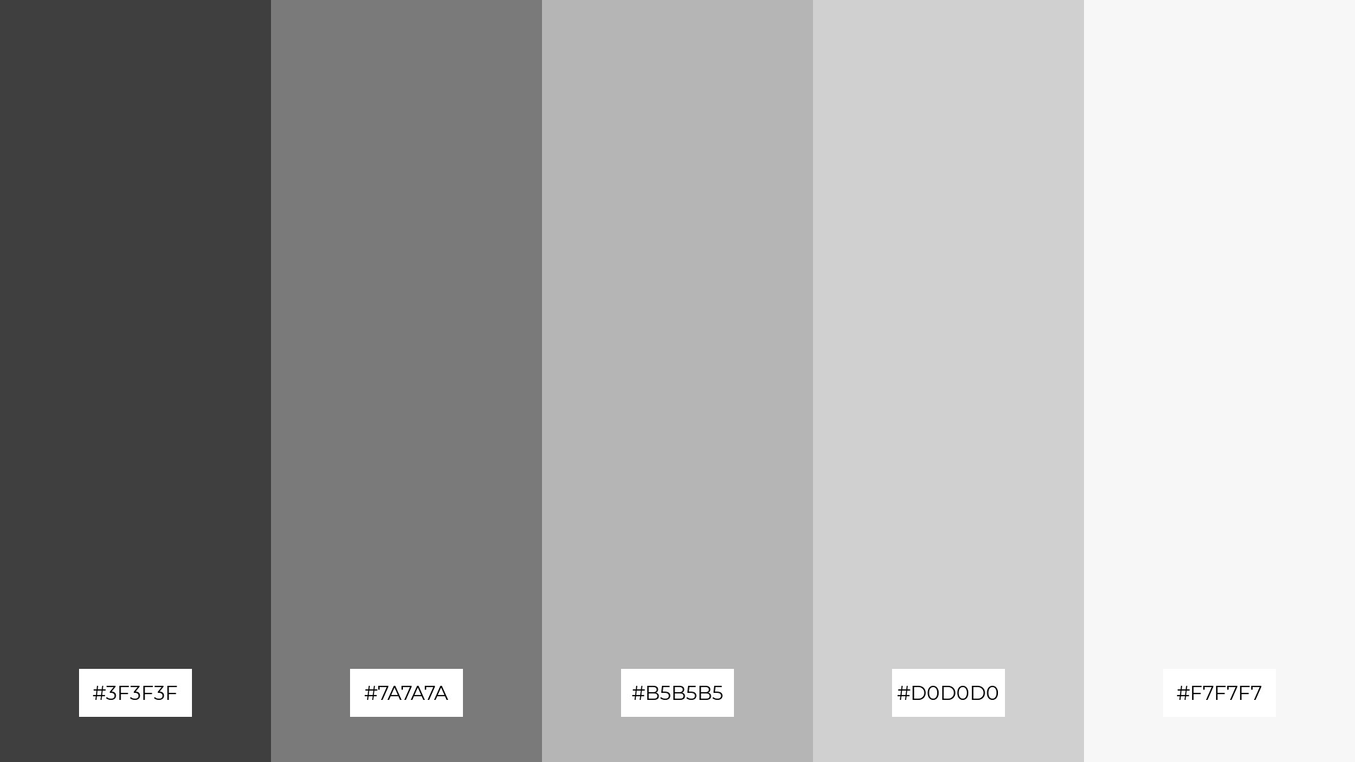
15) Carbon Cascade
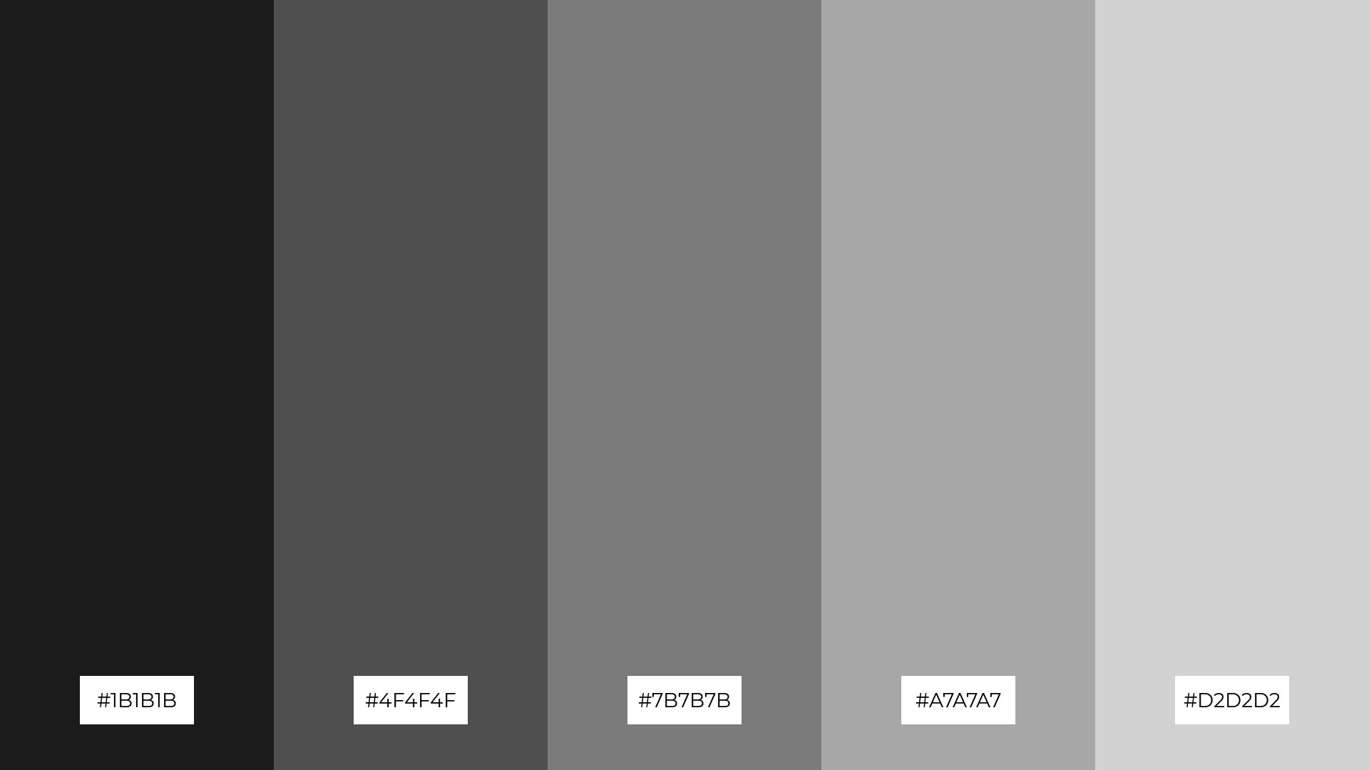
The ‘Carbon Cascade’ palette, with its gradient from deep black (#1B1B1B) to light gray (#D2D2D2), conveys a sense of harmony through its seamless transitions, making it perfect for tech startups aiming to project a sleek and modern image.
Alternatively, the contrasting tones in the ‘Carbon Cascade’ palette can create a dynamic visual interest, ideal for cozy interior makeovers where the interplay of dark and light shades can add depth and warmth to the space.
How to Use Black Gray Patterns in Design
In home decor, black and gray color palettes can create a modern and sophisticated atmosphere. Use deep charcoal for accent walls and lighter grays for furniture and accessories to achieve a balanced and cohesive look. Adding metallic finishes can further enhance the elegance of the space.
For marketing materials, black and gray palettes can convey professionalism and reliability. Use bold black for headlines and lighter grays for background elements to create a clean and impactful design. Incorporate pops of color to draw attention to key information without overwhelming the viewer.
In clothing design, black and gray hues offer timeless versatility. Pairing these shades with different textures, such as matte and glossy fabrics, can add depth and interest to the garments. This palette is perfect for creating chic and sophisticated fashion pieces that stand out.
Ready to elevate your designs with black and gray palettes? Try creating these stunning color schemes using Piktochart today!


