Sea blue color palettes evoke the serene and refreshing essence of the ocean, making them a popular choice for various design projects. These palettes can range from deep navy blues to light, airy aquas, offering a versatile spectrum of hues.
Incorporating sea blue tones can bring a sense of calm and tranquility to your designs, whether for digital media, print, or interior decor. Let’s explore the different shades and combinations that make sea blue palettes so captivating.
Tips For Creating Sea Blue Color Palettes
Designing with sea blue color palettes can transform your project into a visually soothing masterpiece. Here are some practical tips to help you get started:
- Balance with Neutrals: Pair sea blue with neutral colors like white, beige, or gray to create a balanced and harmonious look.
- Complementary Shades: Use complementary colors such as coral or peach to add a pop of contrast and make the sea blue stand out.
- Gradient Effects: Experiment with gradient effects by blending different shades of blue, from deep navy to light aqua, for a dynamic and engaging design.
- Accent Colors: Introduce accent colors like gold or silver to add a touch of elegance and sophistication to your palette.
- Versatility: Ensure your palette is versatile by including both warm and cool tones, allowing for flexibility across various design elements.
- Consistency: Maintain consistency in your color choices to create a cohesive and professional look throughout your project.
15 Sea Blue Color Palettes
1) Ocean Depths

The ‘Ocean Depths’ color palette, with its rich and deep blues, creates a mood of profound tranquility and introspection, reminiscent of the mysterious and calming nature of the deep sea.
These shades interact seamlessly to form a cohesive and sophisticated look, making them ideal for creating a serene and elegant atmosphere in interior decor, particularly in spaces like bedrooms or living rooms where relaxation is paramount.
2) Coral Reef
The ‘Coral Reef’ color palette, with its vibrant mix of coral, orange, and blue hues, evokes a sense of warmth and energy, reminiscent of a lively underwater ecosystem.
This palette would excel in digital branding for travel agencies or tropical-themed product packaging, where the dynamic and inviting colors can capture the adventurous spirit and allure of exotic destinations.
3) Tropical Lagoon
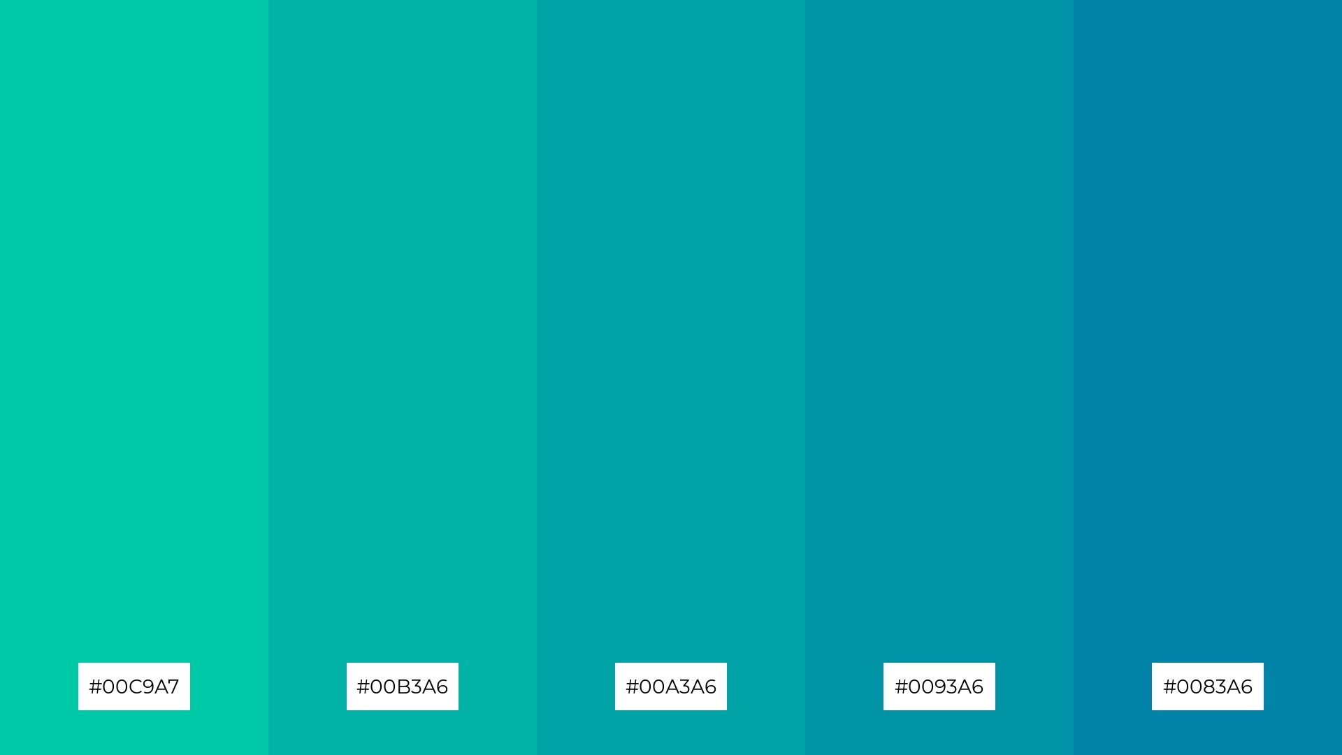
The ‘Tropical Lagoon’ color palette, featuring dominant shades of teal and aqua (#00C9A7, #00B3A6, #00A3A6, #0093A6, #0083A6), creates a refreshing and invigorating visual experience.
These harmonious hues are perfect for wellness branding, as they evoke a sense of calm and rejuvenation, making them ideal for eco-friendly interior spaces that aim to promote tranquility and sustainability.
4) Midnight Tide

The ‘Midnight Tide’ color palette, with its blend of soft and bold tones, creates a distinct mood that is both sophisticated and inviting.
This palette is ideal for modern web designs or creating inviting retail spaces, where the balance of hues can enhance the overall aesthetic and draw in customers.
5) Arctic Chill
The ‘Arctic Chill’ color palette, with its cool and crisp shades of blue, evokes a serene and refreshing ambiance, reminiscent of a tranquil winter landscape.
This palette is perfect for luxury fashion campaigns, where the elegant and sophisticated hues can create a sense of calm and exclusivity, making the designs stand out in a crowded market.
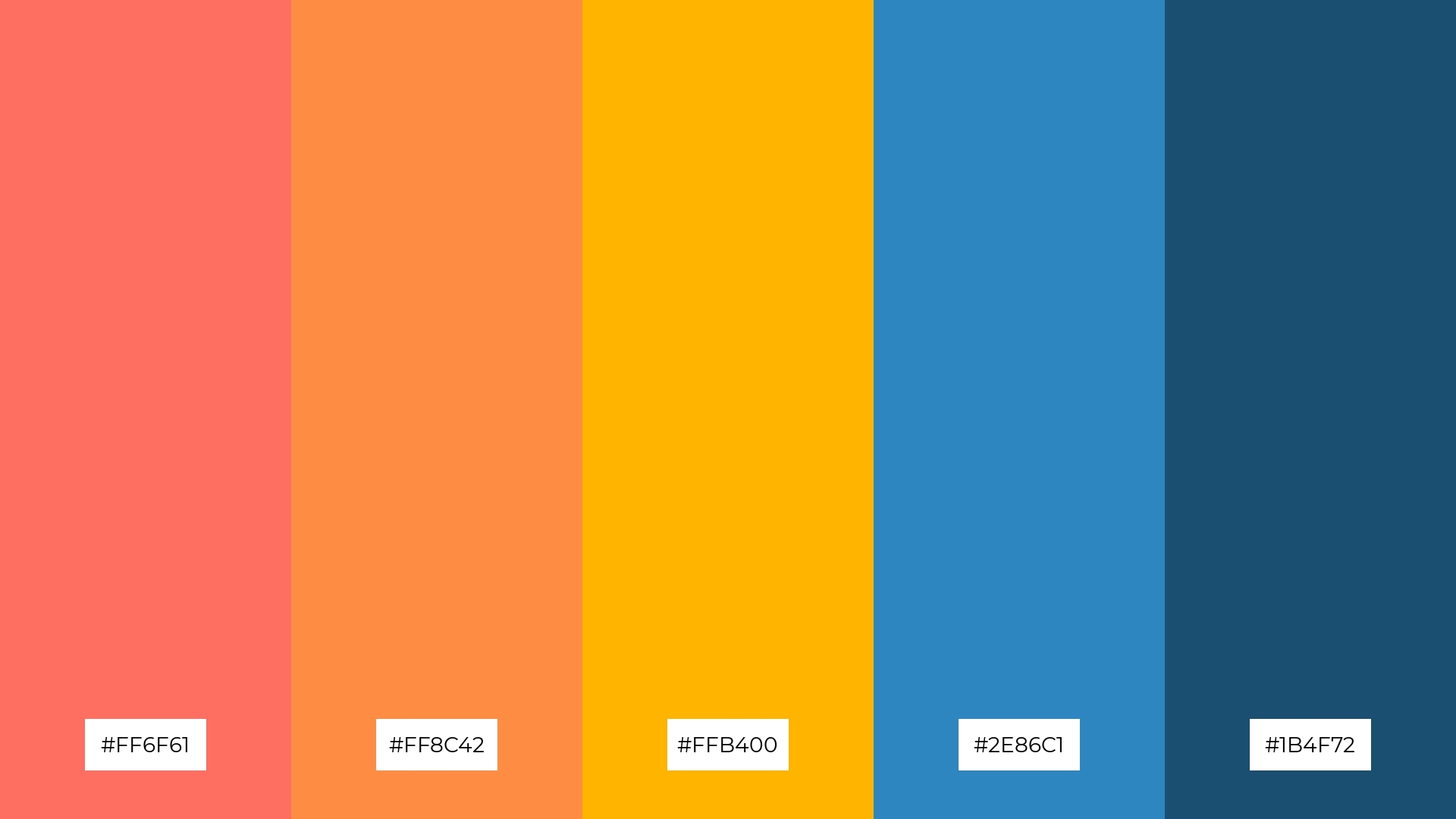
6) Sunset Bay
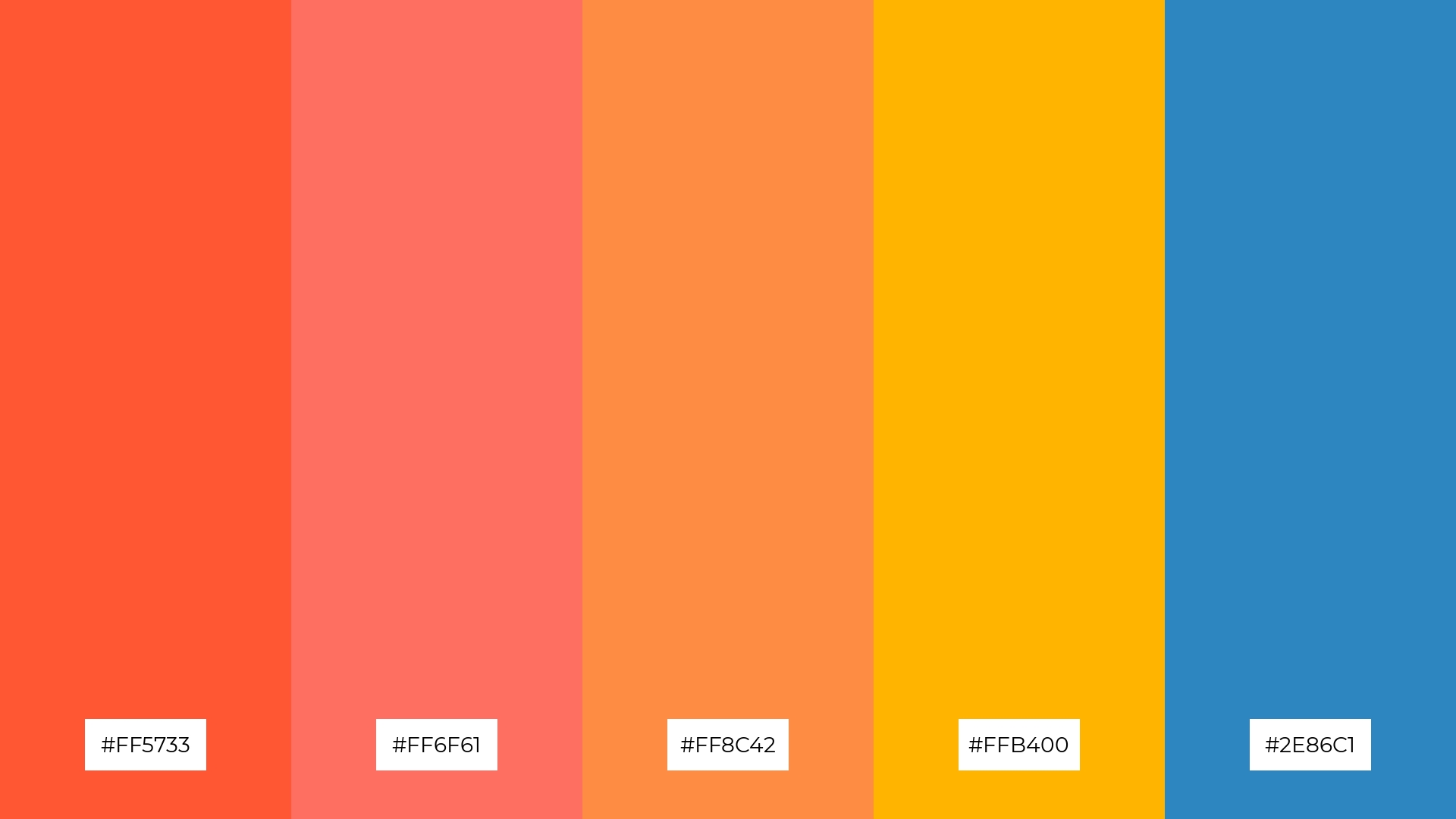
The ‘Sunset Bay’ color palette, with its vibrant mix of warm oranges and cool blue (#FF5733, #FF6F61, #FF8C42, #FFB400, #2E86C1), creates a harmonious blend that can evoke a mood of playful sophistication, perfect for capturing attention and sparking creativity.
This palette is ideal for bold event designs, where the dynamic and contrasting hues can create an energetic and inviting atmosphere, making any occasion feel both lively and stylish.
7) Deep Sea
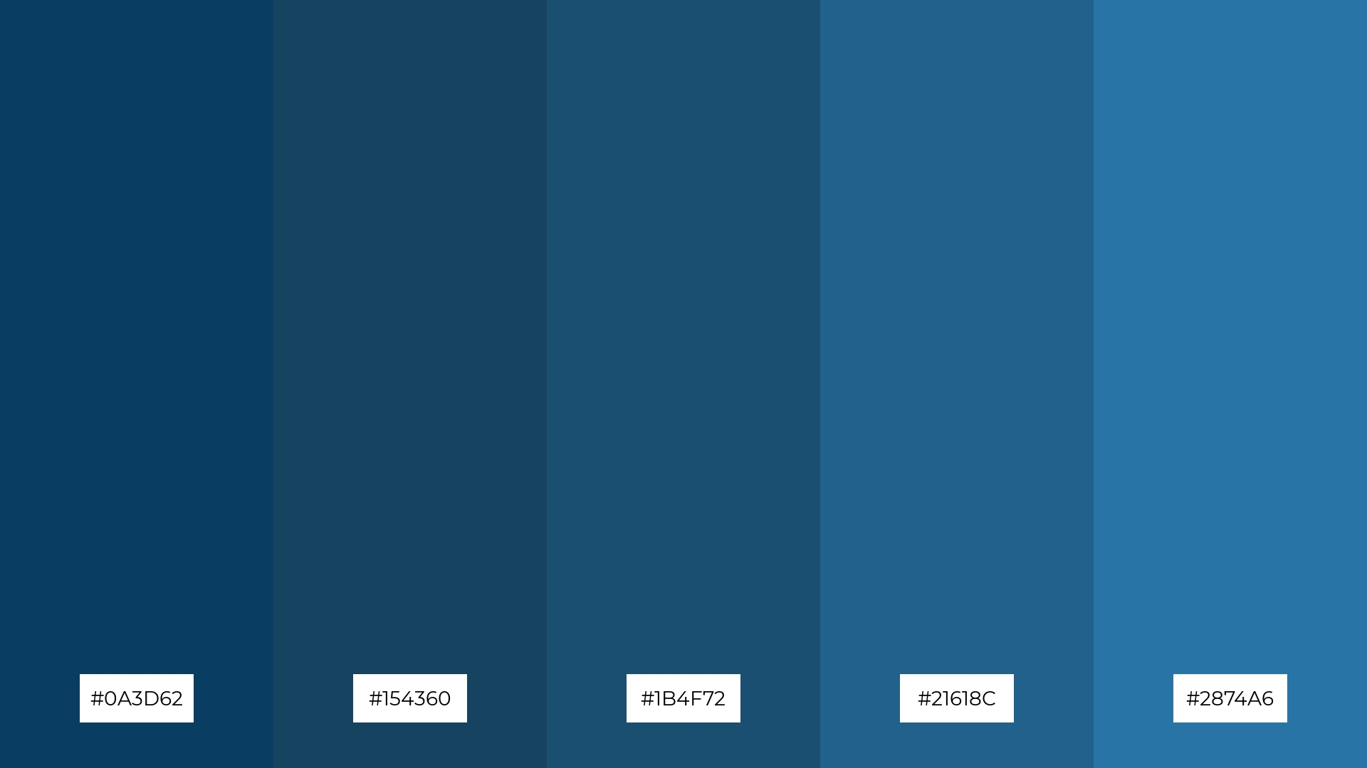
The ‘Deep Sea’ color palette, with its contrasting elements of dark and light blues (#0A3D62, #154360, #1B4F72, #21618C, #2874A6), creates visual interest by blending depth and vibrancy, reminiscent of the ocean’s mysterious depths and shimmering surface.
This palette is ideal for creative projects like magazine layouts or artistic websites, where the dynamic interplay of hues can captivate readers and enhance the overall aesthetic appeal.
8) Marine Mist
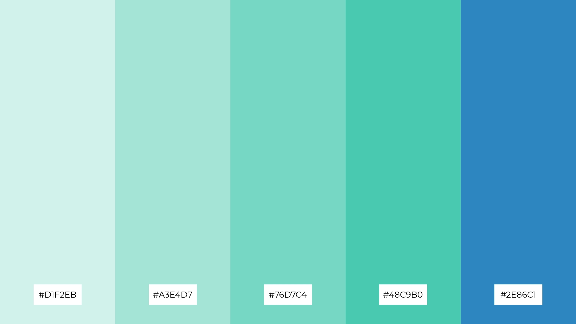
The ‘Marine Mist’ color palette, with its soothing blend of light and dark blues (#D1F2EB, #A3E4D7, #76D7C4, #48C9B0, #2E86C1), can evoke a sense of calm and relaxation, making it perfect for spa branding where tranquility is paramount.
Alternatively, the vibrant and dynamic combinations within the ‘Marine Mist’ palette can inject excitement and energy into marketing campaigns, capturing attention and creating a memorable visual impact.
9) Coastal Breeze
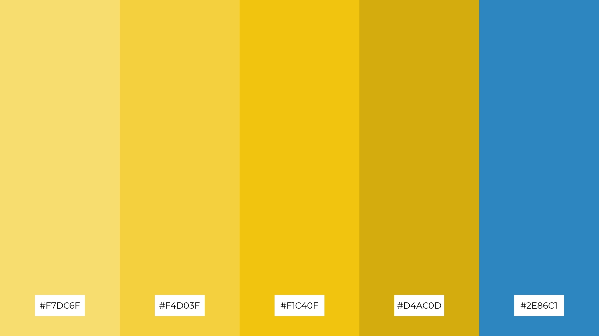
The ‘Coastal Breeze’ color palette, with its softer yellows and brighter blues (#F7DC6F, #F4D03F, #F1C40F, #D4AC0D, #2E86C1), creates a cheerful and uplifting mood, reminiscent of sunny beach days and clear skies.
This blend of hues is ideal for home decor, where the vibrant and soothing tones can bring a sense of warmth and relaxation to living spaces, or for seasonal promotions that aim to capture the essence of summer and evoke a sense of joy and freshness.
10) Nautical Night
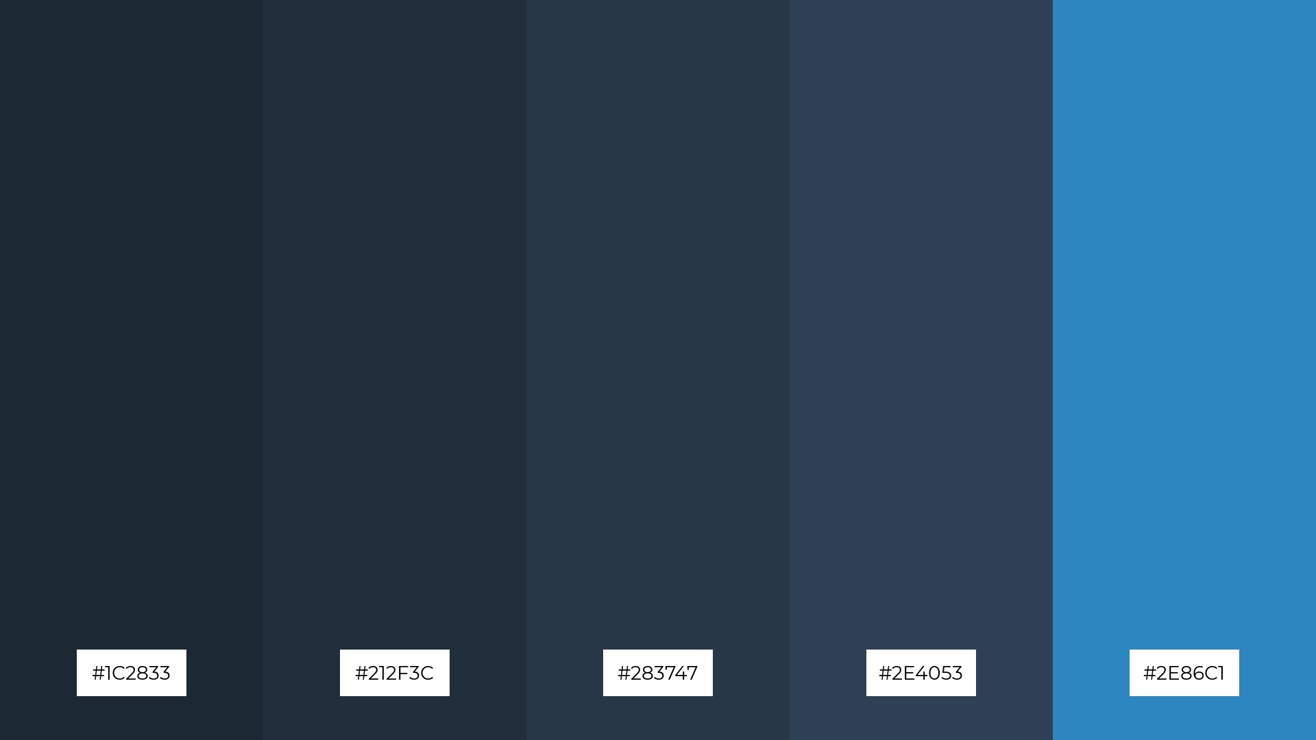
The ‘Nautical Night’ color palette, with its deep and moody blues (#1C2833, #212F3C, #283747, #2E4053, #2E86C1), creates a visual flow that evokes a sense of calm and introspection, reminiscent of a serene night by the sea.
This palette is ideal for lifestyle branding, where the tranquil and sophisticated hues can enhance the perception of luxury and relaxation, or for tech product packaging, where the cool and modern tones can convey innovation and reliability.
11) Seaside Serenity
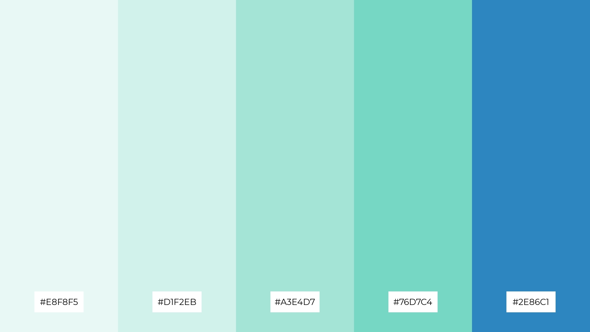
The ‘Seaside Serenity’ color palette, with its gentle blend of light and dark blues (#E8F8F5, #D1F2EB, #A3E4D7, #76D7C4, #2E86C1), creates a welcoming and tranquil effect, perfect for spaces that aim to evoke a sense of calm and relaxation.
This palette shines in boutique interiors, where the soothing tones can enhance the shopping experience, or in luxury e-commerce sites, where the elegant hues can convey sophistication and exclusivity.
12) Caribbean Dream
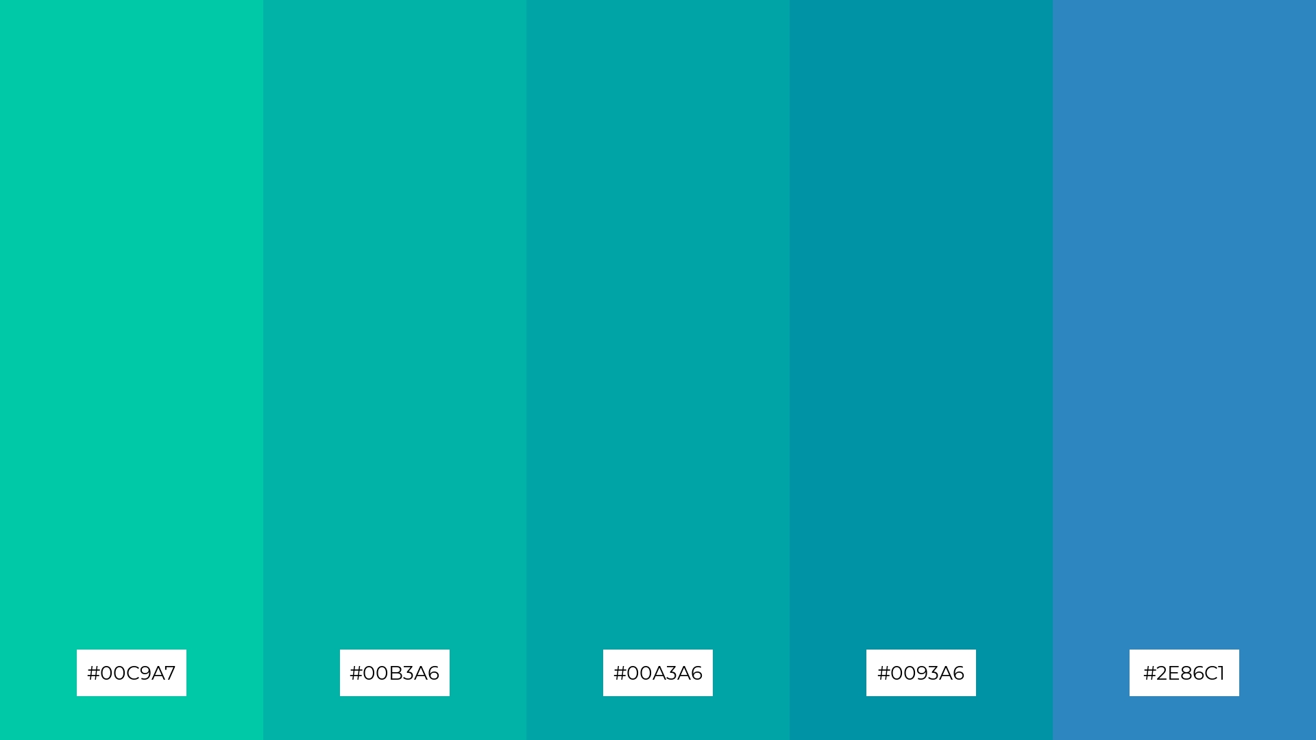
The ‘Caribbean Dream’ color palette, with its harmonious blend of teal and blue hues (#00C9A7, #00B3A6, #00A3A6, #0093A6, #2E86C1), creates a balanced and refreshing visual experience that evokes the serene beauty of tropical waters.
This palette is perfect for casual apparel lines, where the vibrant yet soothing colors can convey a sense of relaxation and style, or for sleek corporate branding, where the cool tones can project professionalism and modernity.
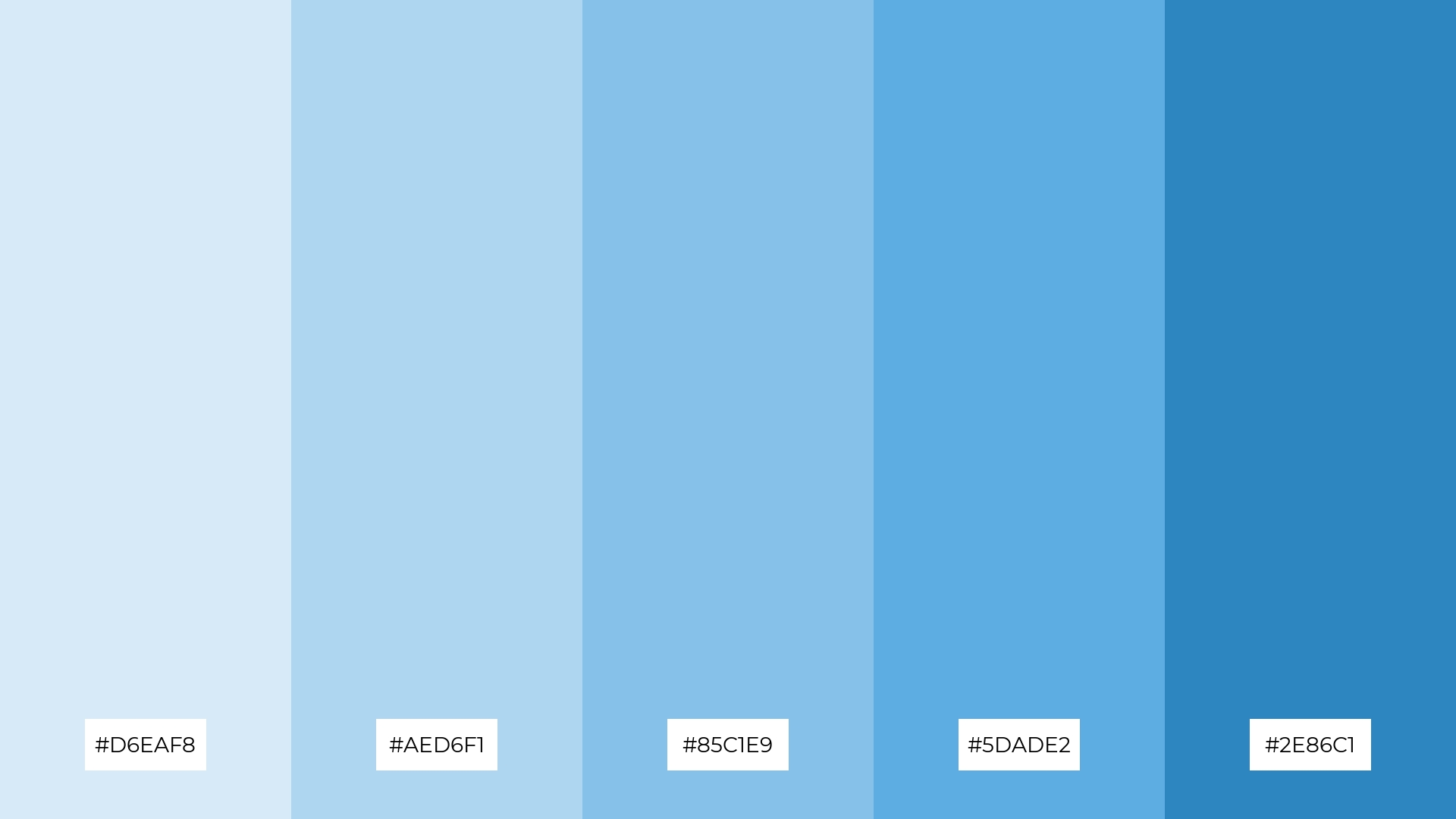
13) Azure Waves
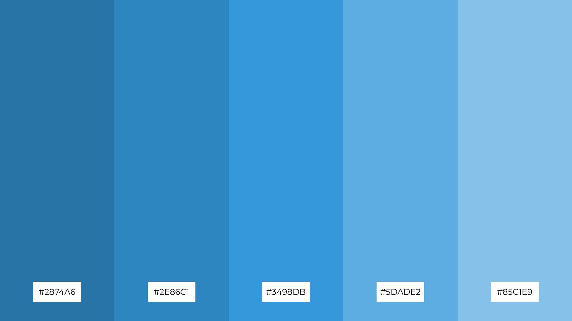
The ‘Azure Waves’ color palette, with its blend of warm and cool tones (#2874A6, #2E86C1, #3498DB, #5DADE2, #85C1E9), evokes a mood of serene sophistication, reminiscent of a tranquil seaside escape.
This palette is ideal for artisan product branding, where the harmonious hues can convey a sense of handcrafted quality and timeless elegance, or for editorial layouts, where the dynamic interplay of colors can enhance visual storytelling and captivate readers.
14) Pacific Horizon
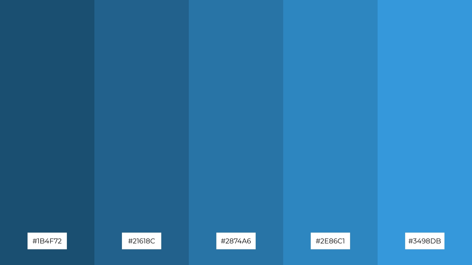
The ‘Pacific Horizon’ color palette, with its dynamic interplay of deep and vibrant blues (#1B4F72, #21618C, #2874A6, #2E86C1, #3498DB), creates a visually striking effect that can be both bold and subtle, depending on the context.
This palette is perfect for festival marketing, where the energetic and harmonious hues can capture the excitement and vibrancy of the event, drawing in attendees with its captivating visual appeal.
15) Blue Lagoon
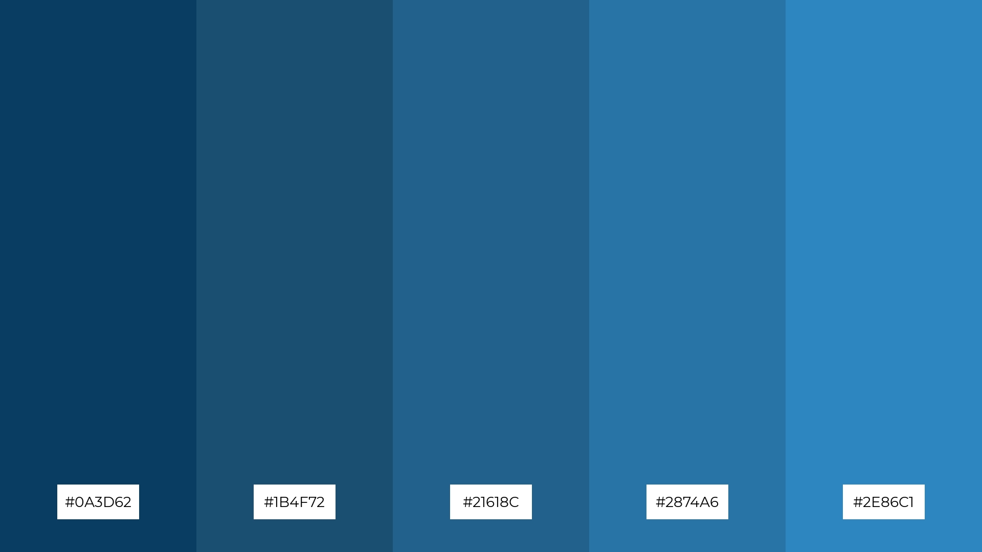
The ‘Blue Lagoon’ color palette, with its harmonious blend of deep and vibrant blues (#0A3D62, #1B4F72, #21618C, #2874A6, #2E86C1), can convey a sense of calm and unity, making it perfect for tech startups aiming to project reliability and innovation.
Alternatively, the contrasting shades within the ‘Blue Lagoon’ palette can create a dynamic and inviting atmosphere, ideal for cozy interior makeovers where the interplay of hues can enhance the warmth and comfort of living spaces.
How to Use Sea Blue Patterns in Design
Sea blue color palettes can transform home decor by creating a serene and inviting atmosphere. Use shades of aqua and teal for accent walls or decorative elements to evoke a sense of calm and relaxation. Pair these hues with neutral furniture and natural textures to enhance the coastal vibe.
In marketing materials, sea blue tones can convey trust and professionalism. Incorporate deep navy and light blue gradients in your branding to create a visually appealing and cohesive look. These colors work well for corporate brochures, social media graphics, and website designs, making your brand stand out.
For clothing, sea blue palettes offer a versatile and stylish option. Combine different shades of blue in your apparel designs to create a fresh and modern look. These hues are perfect for casual wear, activewear, and even formal attire, adding a touch of sophistication and elegance.
Ready to bring your designs to life with sea blue color palettes? Try creating your own stunning palettes using Piktochart today!


