 Piktochart Team
·

Updated on
November 21, 2024
Published on
November 15, 2024

Yellow peach color palettes bring a warm, inviting touch to any design project. These palettes blend the soft, sunny hues of yellow with the delicate, blush tones of peach.
Perfect for creating a cheerful and cozy atmosphere, yellow peach color palettes are versatile and can be used in various contexts. From branding to interior design, these colors evoke a sense of comfort and positivity.
Designing with yellow peach color palettes can elevate your project with a touch of warmth and elegance.

The 'Sunlit Orchard' palette, with its vibrant yellows and warm oranges, creates an uplifting and energetic mood that feels both refreshing and invigorating.
These colors interact harmoniously to produce a cohesive look, making them ideal for a lively kitchen design where the bright hues can stimulate creativity and joy in cooking.
The 'Golden Dawn' palette, with its blend of soft yellows and warm oranges, evokes a sense of warmth and optimism, making it perfect for creating inviting and cheerful designs.
This palette would excel in product packaging for wellness and beauty products, where the vibrant yet soothing colors can attract attention and convey a sense of natural vitality.

The 'Peachy Breeze' palette features dominant colors like soft peach (#FFB3A0) and warm yellow (#F2C94C), which create a gentle and inviting atmosphere.
These hues harmonize beautifully to evoke a sense of calm and positivity, making the palette ideal for wellness branding or eco-friendly interior spaces where a soothing and natural ambiance is desired.

The 'Citrus Glow' palette, with its mix of soft yellows and bold oranges, offers a balanced blend of warmth and vibrancy, creating a distinct and lively mood.
This palette is ideal for designing inviting retail spaces or modern web designs, where the energetic colors can attract attention and create a welcoming atmosphere.

The 'Summer Sunset' palette, with its blend of soft pinks, vibrant oranges, and warm yellows, creates a serene yet lively ambiance that captures the essence of a tranquil evening sky.
This harmonious combination is perfect for luxury fashion campaigns, where the rich and inviting colors can evoke a sense of elegance and sophistication, making the designs stand out with a touch of sunset-inspired glamour.
The 'Warm Embrace' palette, with its blend of soft yellows and warm oranges, creates a harmonious and inviting atmosphere that exudes both sophistication and playfulness.
This palette is perfect for bold event designs, where the vibrant colors can energize the space and create a memorable, lively experience for attendees.

The 'Honeyed Peach' palette, with its mix of bright yellow (#FAD02E) and soft peach (#FFB3A0), alongside neutral tones like #F6E7D7, #F9D5A0, and #F4C300, creates a striking contrast that adds depth and visual interest to any design.
This dynamic combination is ideal for creative projects such as magazine layouts or artistic websites, where the vibrant and soothing hues can draw attention and enhance the overall aesthetic appeal.

The 'Tropical Delight' palette, with its vibrant mix of coral (#FF6F61), soft yellow (#F9D56D), and warm gold (#F2C94C), can evoke a sense of excitement and energy, making it perfect for vibrant marketing campaigns that aim to capture attention and convey a lively atmosphere.
Alternatively, the combination of gentle pink (#F6A6A1) and pale yellow (#F9EBAE) within the same palette can create a calming and soothing effect, ideal for spa branding where a serene and relaxing ambiance is desired.

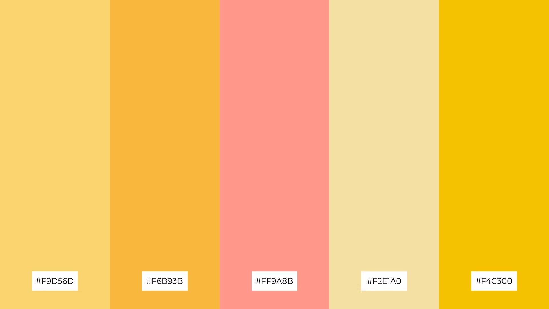
The 'Radiant Harvest' palette, featuring softer tones like #F2E1A0 and #F9D5A0 alongside brighter hues such as #F6B93B and #FF9A8B, creates a balanced and inviting atmosphere.
This blend of colors evokes a warm and cheerful mood, making it ideal for home decor or seasonal promotions where a cozy and festive ambiance is desired.

The 'Golden Petals' palette, with its blend of soft yellow (#F9EBAE), gentle pink (#F6A6A1), and vibrant golds (#FFB74D, #F2C94C, #F4C300), creates a visual flow that evokes feelings of joy and warmth, making it perfect for designs that aim to uplift and energize.
This harmonious combination is ideal for lifestyle branding, where the cheerful and inviting colors can enhance the appeal of wellness products, or for tech product packaging, where the vibrant hues can attract attention and convey a sense of innovation and positivity.

The 'Peach Blossom' palette, with its blend of soft peach (#FFB3A0), warm yellow (#FAD02E), and gentle neutrals (#F9D5A0, #F6E7D7), creates a welcoming and inviting atmosphere that exudes warmth and comfort.
This harmonious combination is perfect for boutique interiors, where the soothing and elegant tones can enhance the shopping experience and create a luxurious, yet cozy ambiance.

The 'Lemonade Dream' palette, with its blend of soft yellow (#F9D56D), bright yellow (#FFEA00), warm gold (#F6B93B), and vibrant golds (#F2C94C, #F4C300), creates a harmonious balance that evokes a sense of freshness and vitality.
This dynamic combination is perfect for casual apparel lines, where the cheerful and energetic hues can enhance the appeal of everyday wear, making the designs feel both lively and approachable.

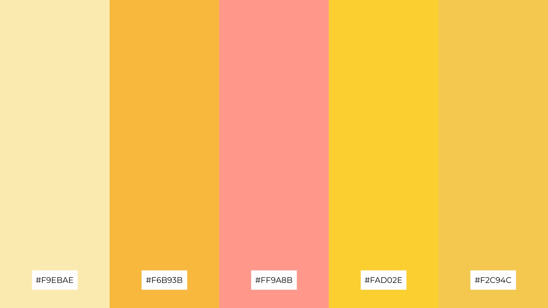
The 'Sunset Serenade' palette, with its blend of warm tones like #FF6F20 and #FAD02E alongside cooler hues such as #F9EBAE and #F6A6A1, creates a balanced and serene mood that evokes the tranquility of a sunset.
This harmonious combination is perfect for artisan product branding, where the rich and inviting colors can enhance the handcrafted appeal and convey a sense of warmth and authenticity.

The 'Orchard Bliss' palette, with its mix of soft peach (#FFB3A0), warm yellow (#F2C94C), and vibrant gold (#F4C300), creates a dynamic interplay of colors that can be both bold and subtle, depending on their application.
This versatile combination is perfect for festival marketing, where the energetic hues can attract attention and convey a sense of celebration and joy, making the event feel lively and inviting.

The 'Warm Glow' palette, with its blend of soft yellow (#FAD02E), warm gold (#F6B93B), vibrant pink (#FF9A8B), pale yellow (#F9EBAE), and rich gold (#F2C94C), can convey a sense of harmony when used in balanced proportions, creating a cohesive and inviting atmosphere.
This versatile palette is ideal for tech startups aiming to create a welcoming and innovative office space, or for cozy interior makeovers where the warm and vibrant hues can enhance the comfort and appeal of living areas.
In home decor, yellow peach color palettes can be used to create a warm and inviting atmosphere. Consider using soft peach tones for walls and vibrant yellow accents in furniture or decor pieces to add a cheerful touch. This combination can make living spaces feel cozy and welcoming.
For marketing materials, yellow peach palettes can help convey positivity and energy. Use bold yellow for headlines and soft peach for background elements to create a visually appealing contrast. This approach can make your promotional content stand out and attract attention.
In clothing design, yellow peach palettes can evoke a sense of freshness and vitality. Incorporate these colors into casual wear to create lively and approachable outfits. The blend of soft peach and vibrant yellow can make your apparel line feel both trendy and comfortable.
Ready to bring these vibrant palettes to life? Try creating your own yellow peach color palettes using Piktochart and elevate your design projects today!
The latest industry news, interviews, technologies, and resources.

Published on
November 25, 2024


