Yellow and gray color palettes have become a popular choice in modern design, offering a balance of warmth and neutrality. This combination can create visually appealing and versatile designs suitable for various applications.
Whether you’re designing a website, an infographic, or a marketing campaign, yellow and gray can provide a sophisticated yet approachable aesthetic. Let’s explore how these colors can be effectively used together to enhance your projects.
Tips For Creating Yellow Gray Color Palettes
Designing with yellow and gray can be both exciting and challenging. Here are some practical tips to help you create stunning color palettes:
- Balance the Colors: Ensure that neither yellow nor gray dominates the design. Use yellow as an accent color to highlight key elements, while gray can serve as a neutral background.
- Match Complementary Shades: Pair different shades of yellow and gray to find the perfect combination. For instance, a soft pastel yellow can work well with a light gray, while a bold mustard yellow can complement a dark charcoal gray.
- Consider the Mood: Yellow is often associated with energy and positivity, while gray is more subdued and calming. Use this to your advantage by adjusting the intensity of each color to match the desired mood of your design.
- Use Neutral Tones: Incorporate neutral tones like white or black to add depth and contrast. This can help to break up the yellow and gray, making the overall design more dynamic.
- Test Different Combinations: Experiment with various shades and proportions of yellow and gray. Create multiple versions of your design to see which combination works best for your specific project.
- Keep Accessibility in Mind: Ensure that your color choices are accessible to all users. Use tools to check color contrast and readability, especially for text elements.
15 Yellow Gray Color Palettes
1) Sunlit Meadow

The ‘Sunlit Meadow’ palette, with its blend of bright yellows and calming grays, creates a mood that is both uplifting and serene, making it perfect for spaces that aim to evoke a sense of tranquility and joy.
This harmonious interaction of colors is ideal for interior decor, where the vibrant yellows can energize a room while the neutral grays provide a balanced backdrop, resulting in a cohesive and inviting atmosphere.
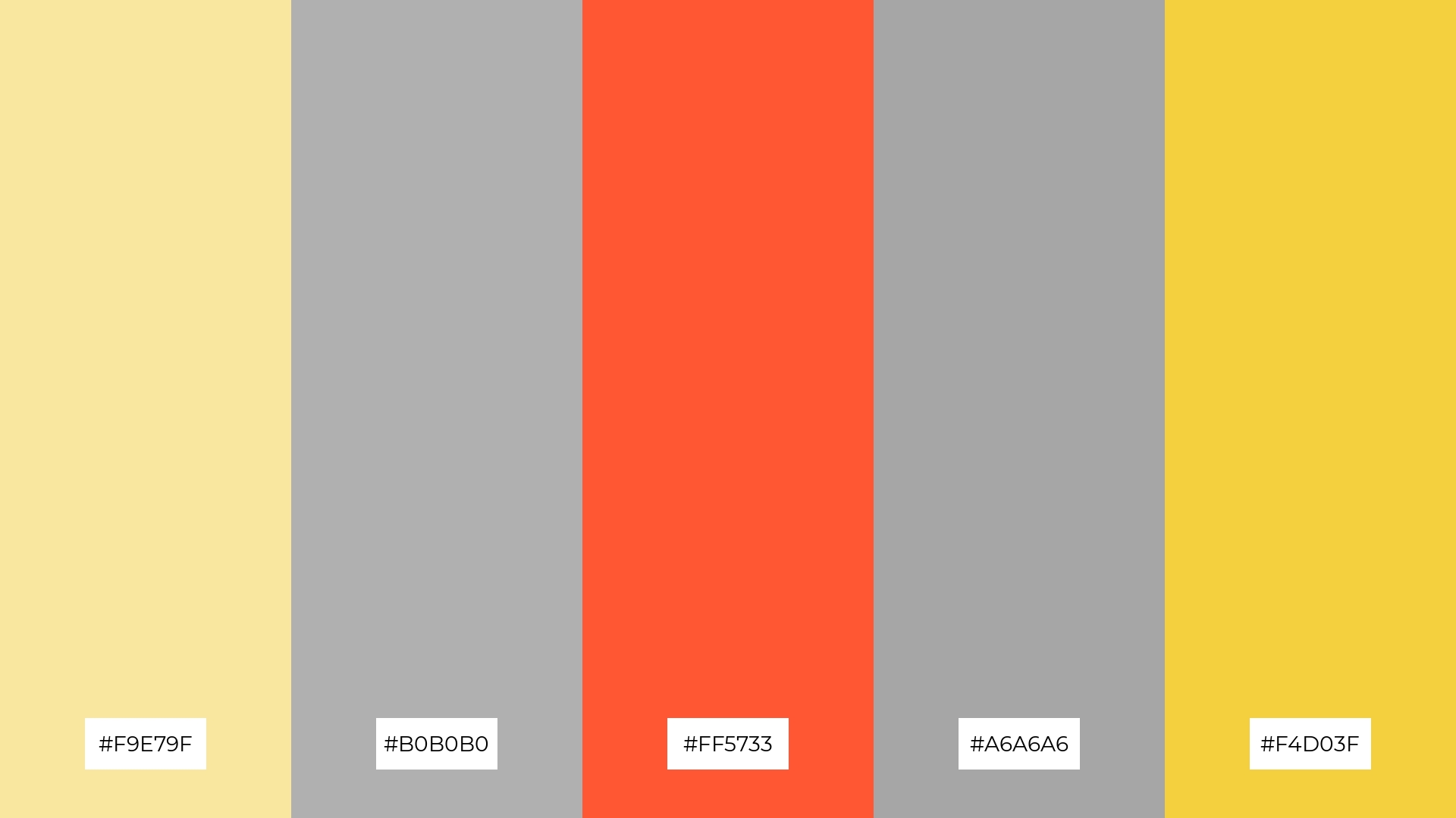
2) Urban Dawn

The ‘Urban Dawn’ palette, with its vibrant mix of #FFC300, #B0B0B0, #FF5733, #C0C0C0, and #F1C40F, evokes a sense of dynamic energy and modern sophistication, making it perfect for digital branding that aims to capture attention and convey innovation.
This color combination excels in product packaging, where the bright yellows and oranges can highlight key features, while the grays provide a sleek and professional look, ensuring the product stands out on the shelves.
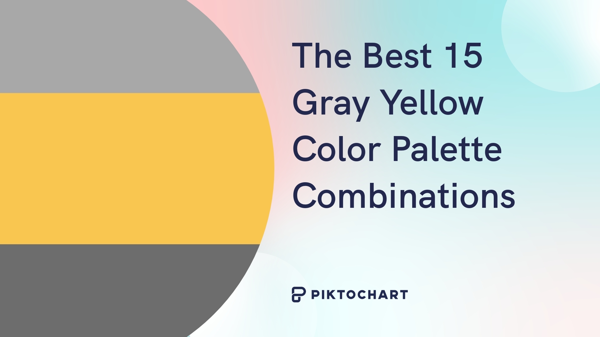
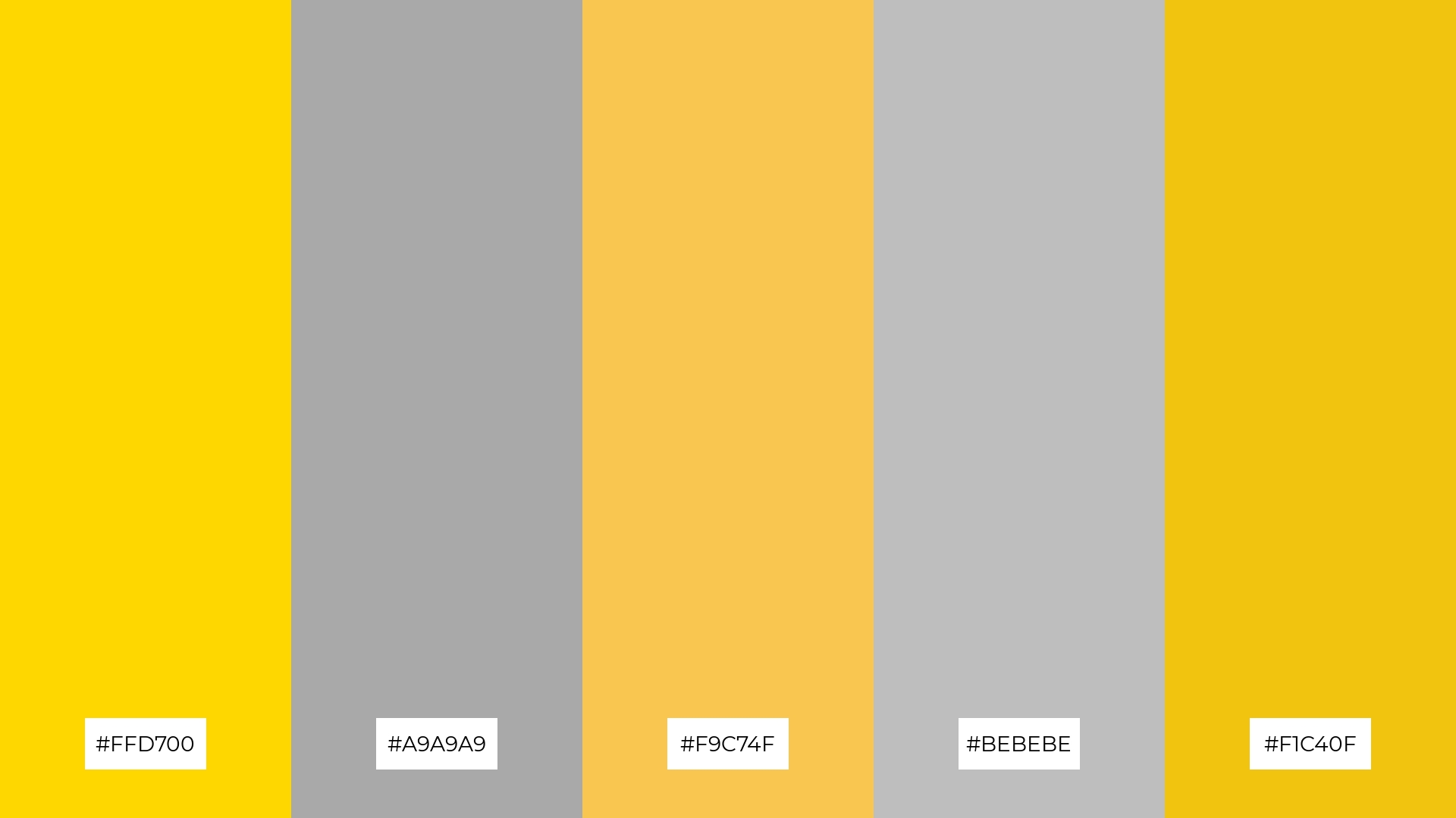
3) Golden Hour
The ‘Golden Hour’ palette, featuring dominant colors like #FFD700 and #FFDA44, radiates warmth and positivity, creating a vibrant yet balanced visual experience.
These golden hues, complemented by the neutral grays of #7D7D7D and #BEBEBE, enhance the palette’s harmony, making it ideal for wellness branding that seeks to evoke a sense of calm and rejuvenation.
4) Misty Morning
The ‘Misty Morning’ palette, with its blend of soft yellows and bold grays, offers a unique balance that creates a distinct and inviting mood.
This combination is ideal for modern web designs, where the soft tones can provide a welcoming atmosphere while the bold grays add a touch of sophistication and clarity.
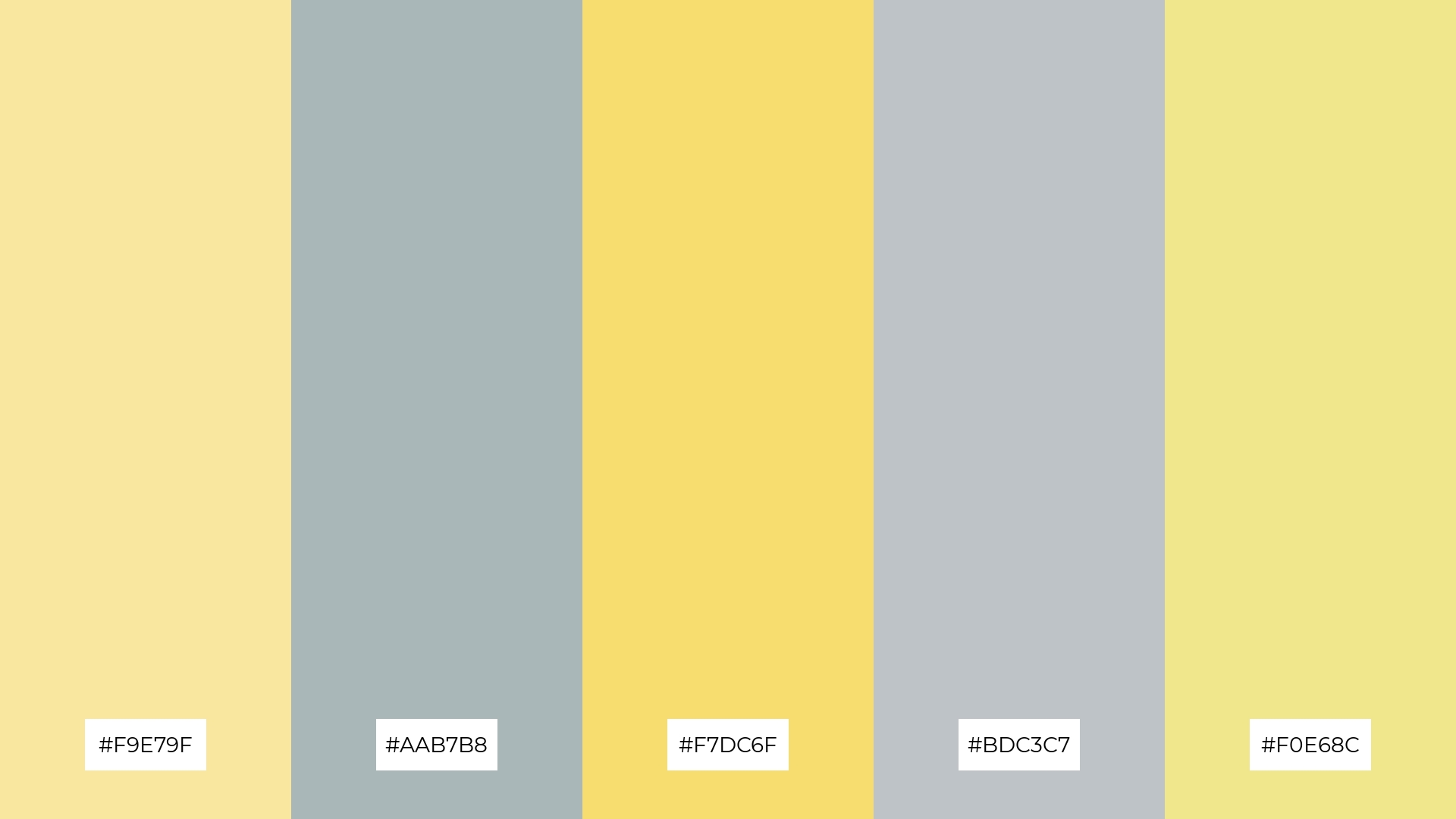
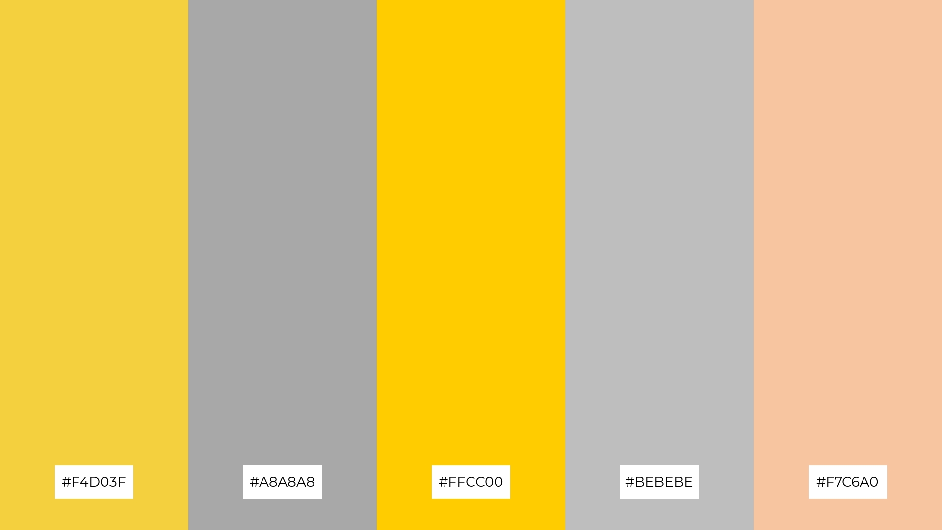
5) Lemonade Breeze
The ‘Lemonade Breeze’ palette, with its blend of #F4D03F, #C0C0C0, #F9E79F, #7D7D7D, and #F7C6A0, creates a serene and refreshing ambiance, perfect for wedding themes that aim to evoke a sense of timeless elegance and joy.
This harmonious mix of soft yellows and grays, complemented by subtle peach tones, can be effectively used in luxury fashion campaigns to convey a sophisticated yet approachable aesthetic, ensuring the designs stand out with a touch of understated glamour.
6) Soft Sunset
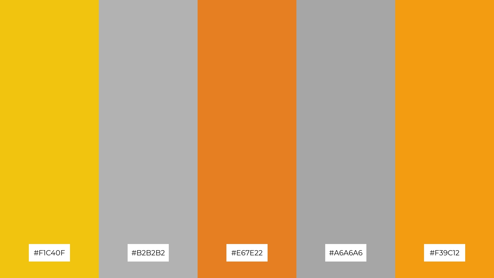
The ‘Soft Sunset’ palette, with its blend of #F1C40F, #B2B2B2, #E67E22, #A6A6A6, and #F39C12, creates a harmonious balance that can evoke a mood of sophisticated warmth, making it ideal for minimalistic branding that seeks to convey elegance and subtlety.
This combination of warm yellows and oranges with neutral grays can also be effectively used in bold event designs, where the vibrant hues can energize the space while the grays provide a sleek and modern backdrop, ensuring a visually striking yet cohesive atmosphere.
7) Bright Horizon
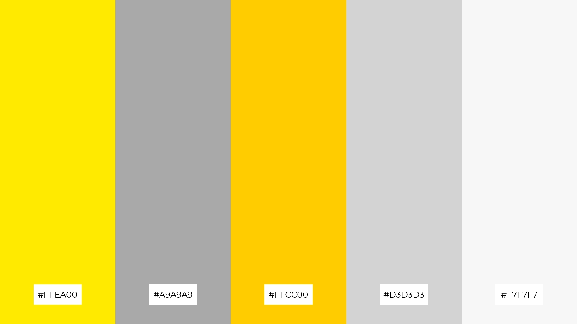
The ‘Bright Horizon’ palette, with its vibrant yellows like #FFEA00 and #FFCC00 contrasted against the neutral grays of #A9A9A9 and #D3D3D3, creates a dynamic visual interest that captures attention and adds depth to any design.
This striking combination is perfect for creative projects such as magazine layouts or artistic websites, where the bold yellows can highlight key elements and the subtle grays provide a balanced and sophisticated backdrop.
8) Urban Jungle
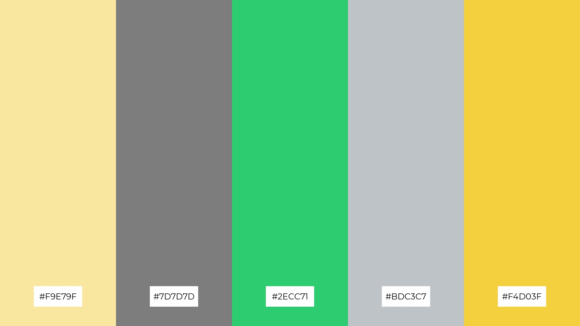
The ‘Urban Jungle’ palette, with its mix of #F9E79F, #7D7D7D, #2ECC71, #BDC3C7, and #F4D03F, can evoke a sense of calm when the soft yellows and grays are paired together, creating a soothing and balanced atmosphere perfect for spa branding.
Conversely, the vibrant greens and yellows in this palette can be combined to generate excitement and energy, making it ideal for vibrant marketing campaigns that aim to capture attention and convey a lively, dynamic message.
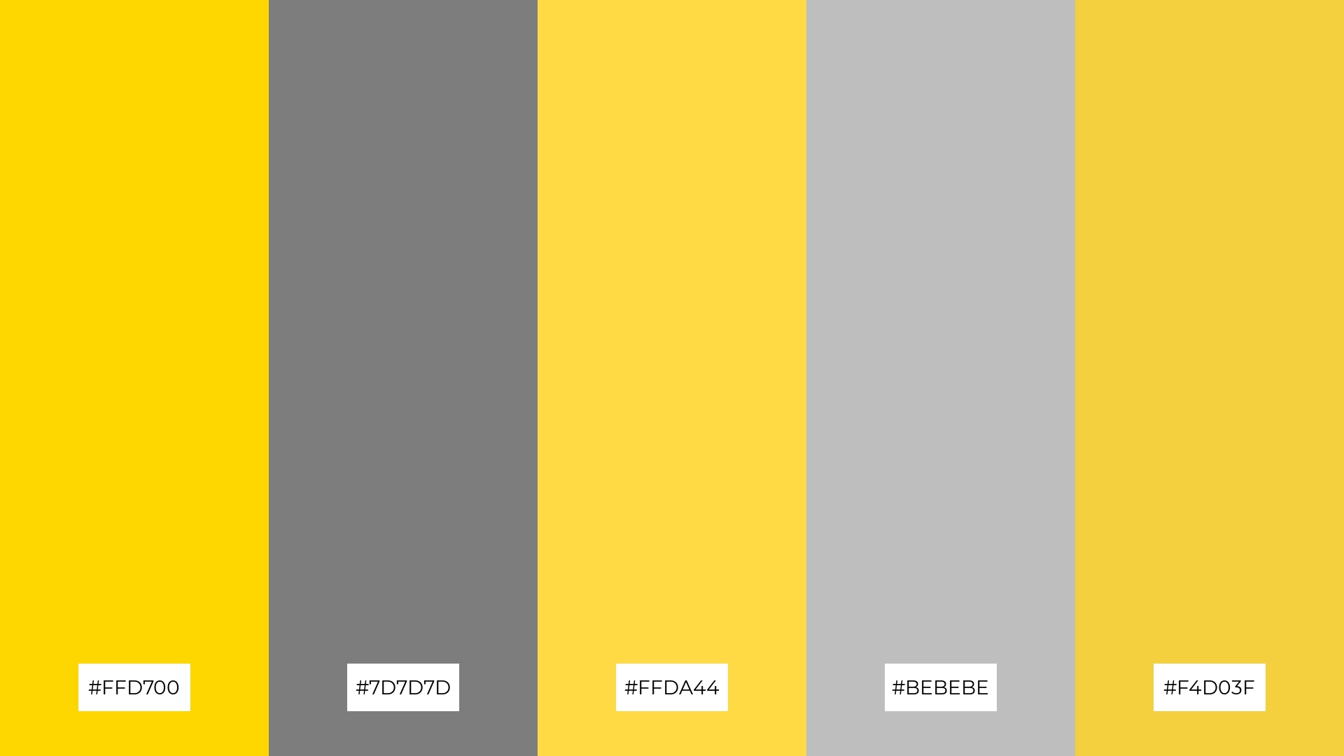
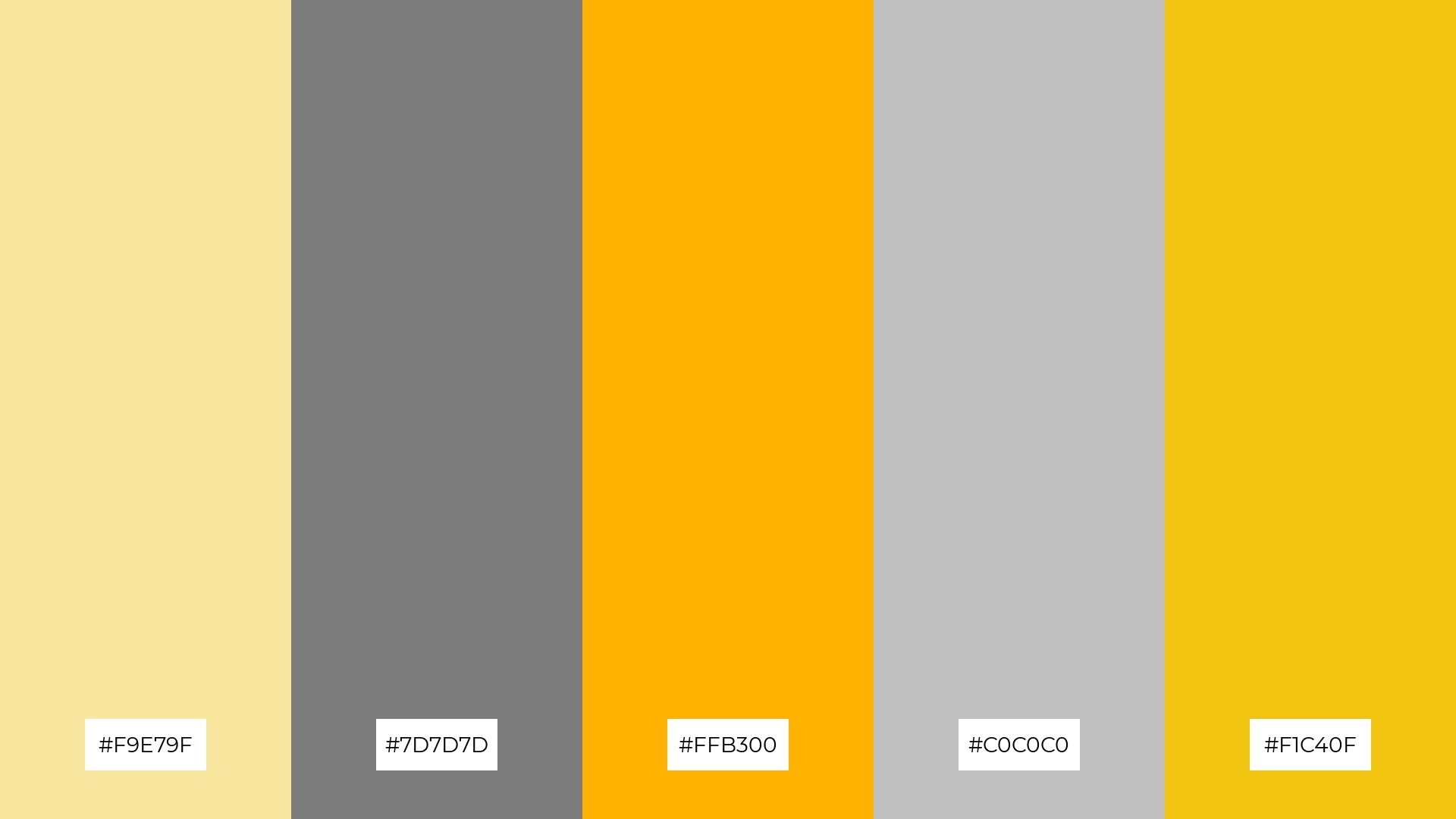
9) Cheerful Palette
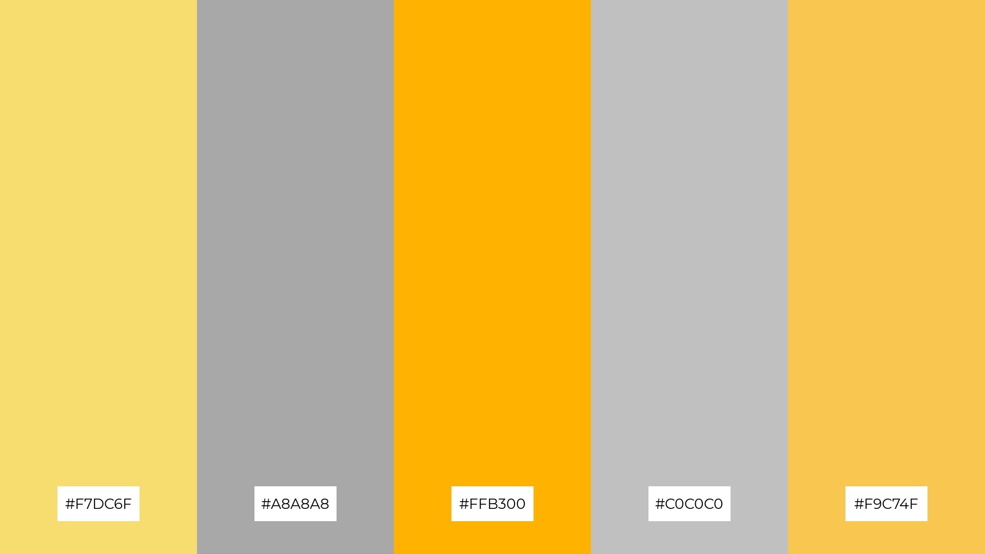
The ‘Cheerful Palette,’ with its blend of softer tones like #F7DC6F and #C0C0C0, alongside brighter hues such as #FFB300 and #F9C74F, creates a mood that is both uplifting and balanced.
This harmonious mix is ideal for seasonal promotions, where the vibrant yellows can capture attention and the neutral grays provide a sophisticated backdrop, ensuring a visually appealing and cohesive design.
10) Radiant Sky
The ‘Radiant Sky’ palette, with its blend of #F9E79F, #B0B0B0, #FF5733, #A6A6A6, and #F4D03F, creates a visual flow that transitions from soft yellows to bold oranges and neutral grays, evoking a sense of joy and dynamic energy.
This vibrant combination is perfect for lifestyle branding, where the cheerful yellows and striking oranges can capture attention and convey positivity, while the neutral grays add a touch of sophistication, making it equally effective for tech product packaging that aims to stand out with a modern and energetic appeal.
11) Golden Fields
The ‘Golden Fields’ palette, with its rich golds and balanced grays, creates a welcoming effect by combining warmth and neutrality, making it perfect for boutique interiors that aim to evoke a sense of elegance and comfort.
This dramatic yet inviting combination also shines in luxury e-commerce sites, where the vibrant golds can highlight premium products while the subtle grays provide a sophisticated backdrop, ensuring a visually appealing and cohesive shopping experience.
12) Dappled Light
The ‘Dappled Light’ palette, with its blend of soft yellows and neutral grays, creates a harmonious balance that evokes a sense of calm and sophistication.
This versatile combination is perfect for casual apparel lines, where the warm yellows can add a touch of vibrancy while the grays provide a sleek and modern backdrop, ensuring a stylish yet approachable aesthetic.
13) Autumn Glow
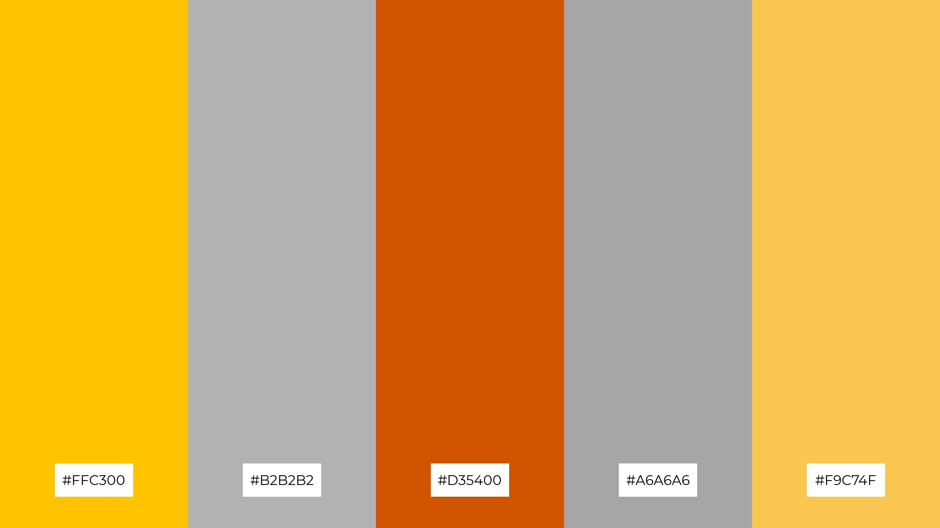
The ‘Autumn Glow’ palette, with its blend of warm hues like #FFC300 and #D35400 alongside cool tones such as #B2B2B2 and #A6A6A6, creates a mood that is both inviting and balanced, perfect for evoking a sense of cozy sophistication.
This harmonious combination is ideal for artisan product branding, where the warm yellows and oranges can highlight the handcrafted quality of the products, while the neutral grays provide a sleek and modern backdrop, ensuring a visually appealing and cohesive design.
14) Lemon Zest
The ‘Lemon Zest’ palette, with its vibrant yellows and balanced grays, creates a dynamic interplay that can be both bold and subtle, making it perfect for designs that need to capture attention while maintaining a sophisticated look.
This striking combination is ideal for festival marketing, where the bright yellows can energize and attract, while the neutral grays provide a sleek and modern backdrop, ensuring a visually appealing and cohesive promotional material.
15) Warm Embrace
The ‘Warm Embrace’ palette, with its blend of soft yellows and neutral grays, conveys a sense of harmony by creating a balanced and inviting atmosphere, perfect for cozy interior makeovers that aim to evoke warmth and comfort.
Conversely, the vibrant yellows and bold grays in this palette can create a striking contrast, making it ideal for tech startups looking to capture attention and convey innovation through dynamic and modern branding.
How to Use Yellow Gray Patterns in Design
In home decor, yellow and gray color palettes can create a welcoming and balanced atmosphere. Use yellow accents like cushions or artwork to add warmth and energy, while gray walls or furniture provide a neutral backdrop that enhances the overall aesthetic.
For marketing materials, this color combination can be both eye-catching and professional. Incorporate bold yellow elements to highlight key information or calls-to-action, while using gray for text and backgrounds to maintain readability and sophistication.
In clothing design, yellow and gray can offer a stylish and modern look. Pair a yellow top with gray pants or accessories to create a balanced outfit that stands out without being overwhelming.
Ready to experiment with yellow and gray color palettes in your next design project? Try creating these stunning combinations using Piktochart and see how they can elevate your designs.


