Blue and yellow color palettes are a timeless combination that can evoke a range of emotions and atmospheres. From the serene and calming to the vibrant and energetic, this duo offers endless possibilities for design.
Whether you’re creating a graphic for a business presentation or an infographic for social media, understanding how to balance these colors can make your visuals more compelling. Let’s explore the versatility and impact of blue and yellow color palettes in design.
Tips For Creating Blue Yellow Color Palettes
Designing with blue and yellow can be both exciting and challenging. Here are some practical tips to help you create stunning color palettes:
- Balance the Colors: Use blue as a dominant color and yellow as an accent to create a calming effect, or reverse the roles for a more vibrant look.
- Match Complementary Shades: Pair navy blue with mustard yellow for a sophisticated feel, or sky blue with lemon yellow for a fresh and lively design.
- Consider the Context: Think about where your design will be used. For digital screens, opt for brighter shades, while muted tones work better for print.
- Use Neutral Colors: Incorporate whites, grays, or blacks to balance the intensity of blue and yellow, making your design more versatile.
- Experiment with Gradients: Blend blue and yellow to create gradients that add depth and interest to your visuals.
- Test for Accessibility: Ensure your color choices are accessible to all viewers by checking contrast ratios and readability.
15 Blue Yellow Color Palettes
1) Ocean Breeze

The ‘Ocean Breeze’ palette, with its blend of deep blues and golden yellows, creates a refreshing and invigorating mood reminiscent of a sunny day by the sea.
Perfect for coastal-themed interior decor, this palette’s harmonious interaction of colors brings a sense of tranquility and brightness to any space, making it ideal for living rooms or beach houses.
2) Sunny Skies
The ‘Sunny Skies’ palette, featuring shades like sky blue (#87CEEB) and golden yellow (#FFD700), evokes a sense of warmth and optimism, making it perfect for designs that aim to uplift and energize.
This vibrant combination excels in digital branding for wellness apps or product packaging for summer-themed goods, where the colors can instantly capture attention and convey a positive, lively atmosphere.
3) Golden Waves
The ‘Golden Waves’ palette, featuring dominant colors like deep sky blue (#00BFFF) and golden yellow (#FFD700), creates a striking balance that exudes both energy and warmth.
This harmonious blend is ideal for eco-friendly interior spaces, where the vibrant yet soothing colors can foster a sense of well-being and connection to nature.
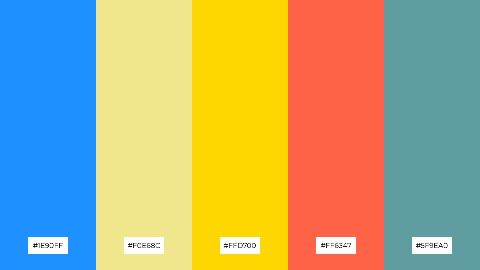
4) Bright Horizon
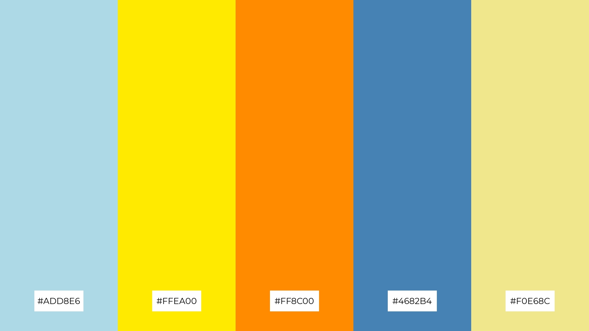
The ‘Bright Horizon’ palette, with its mix of light blue (#ADD8E6), bright yellow (#FFEA00), dark orange (#FF8C00), steel blue (#4682B4), and khaki (#F0E68C), offers a balance of soft and bold tones, creating a distinct and inviting mood.
This versatile combination is ideal for creating inviting retail spaces or modern web designs, where the interplay of colors can attract attention while maintaining a welcoming atmosphere.
5) Summer Fields
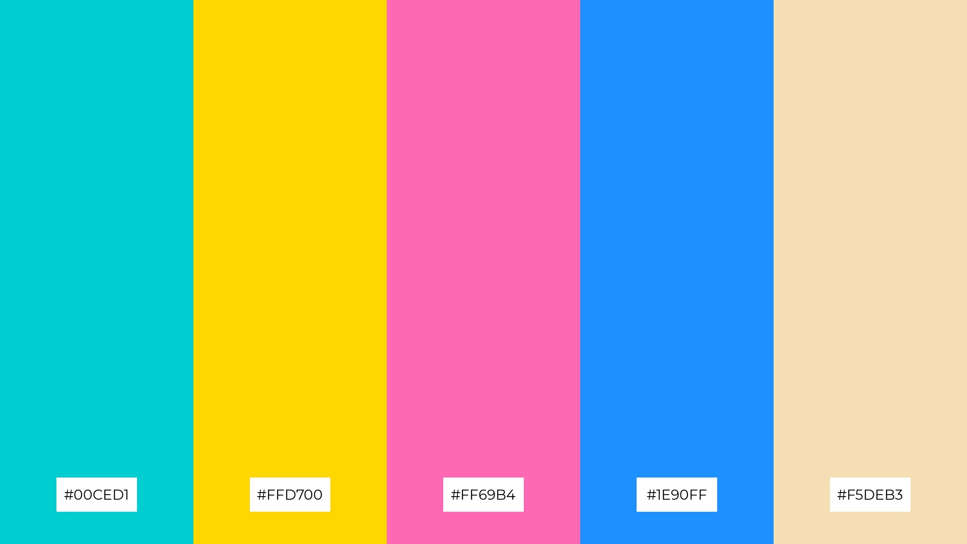
The ‘Summer Fields’ palette, with its blend of turquoise (#00CED1), golden yellow (#FFD700), hot pink (#FF69B4), dodger blue (#1E90FF), and wheat (#F5DEB3), creates a vibrant and cheerful ambiance that is perfect for lively and joyful occasions.
This dynamic combination is ideal for wedding themes, where the bright and contrasting colors can add a touch of elegance and festivity, making the event memorable and visually stunning.
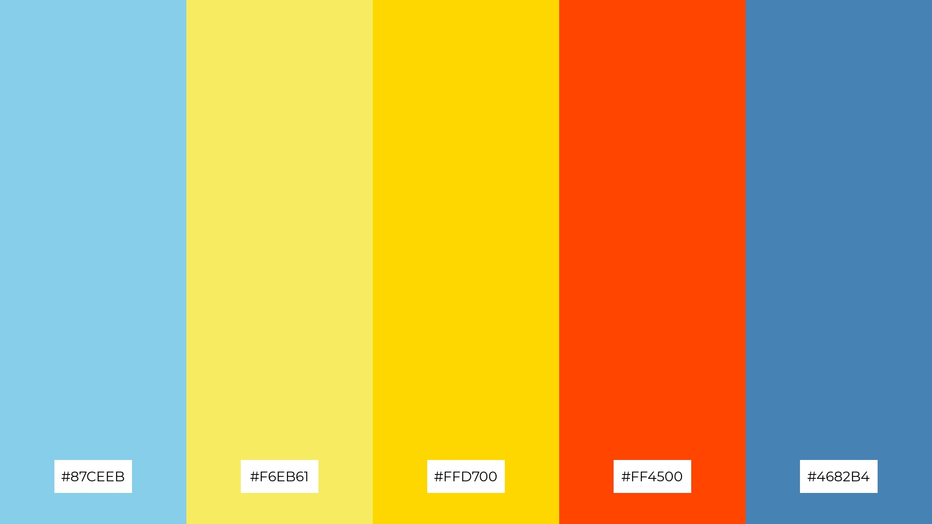
6) Twilight Glow
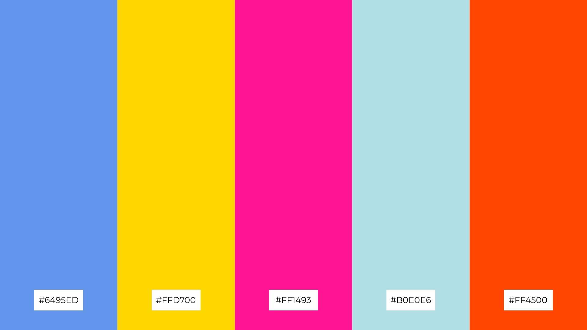
The ‘Twilight Glow’ palette, with its blend of cornflower blue (#6495ED), golden yellow (#FFD700), deep pink (#FF1493), powder blue (#B0E0E6), and orange-red (#FF4500), creates a harmonious balance that can evoke a sense of both sophistication and playfulness, making it versatile for various design needs.
This vibrant combination is perfect for bold event designs, where the striking contrast and lively hues can capture attention and set an energetic, festive mood, ensuring the event is memorable and visually captivating.
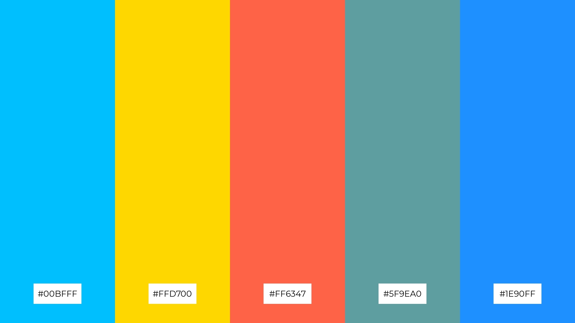
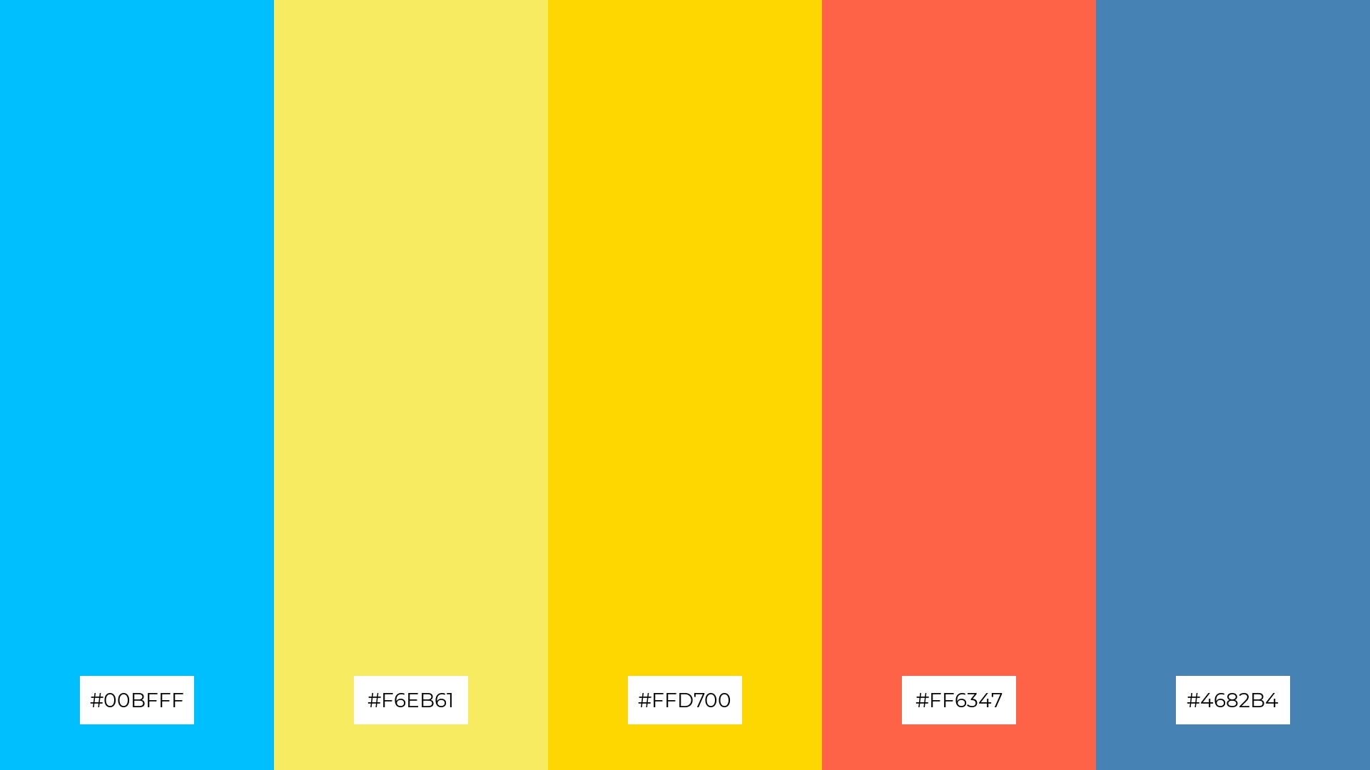
7) Lemonade Splash
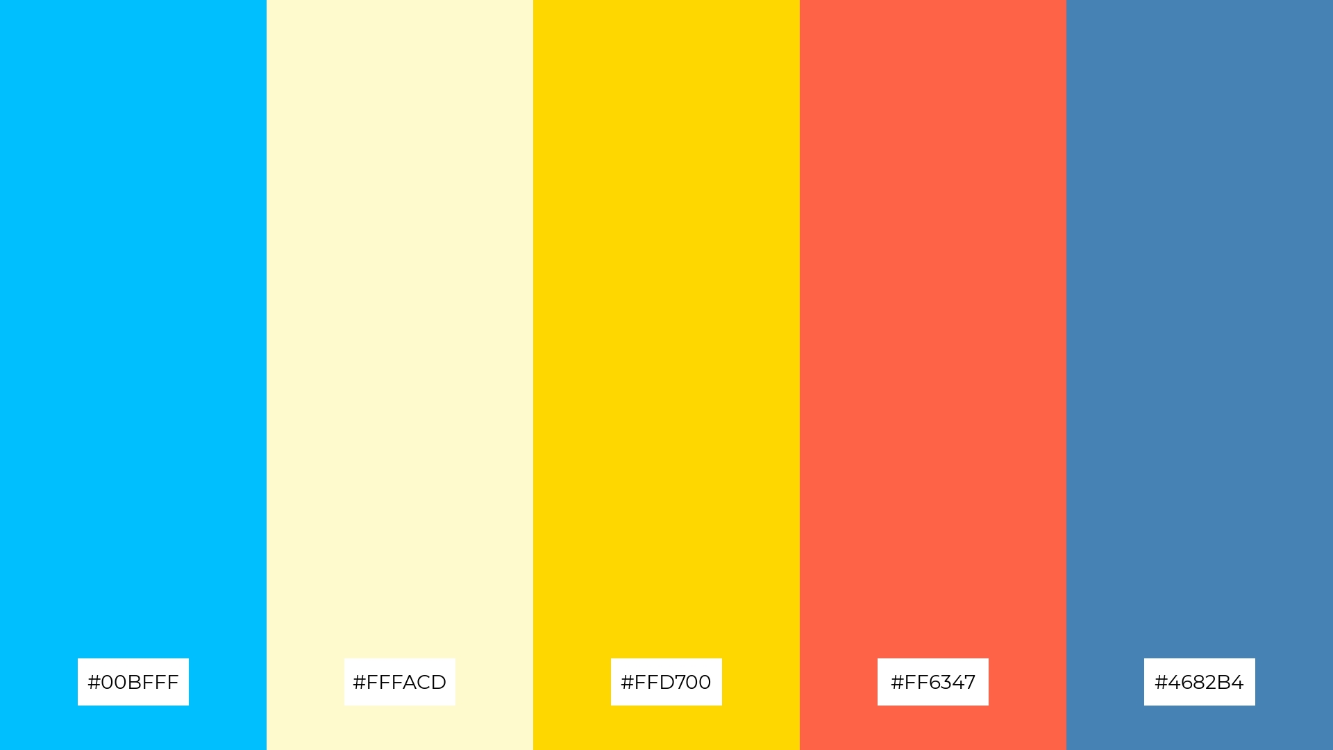
The ‘Lemonade Splash’ palette, with its mix of deep sky blue (#00BFFF), light yellow (#FFFACD), golden yellow (#FFD700), tomato red (#FF6347), and steel blue (#4682B4), combines contrasting elements that create a dynamic and visually engaging design.
This vibrant and eclectic combination is perfect for creative projects like magazine layouts or artistic websites, where the bold contrasts can capture attention and add a lively, energetic feel to the overall aesthetic.
8) Azure Dreams
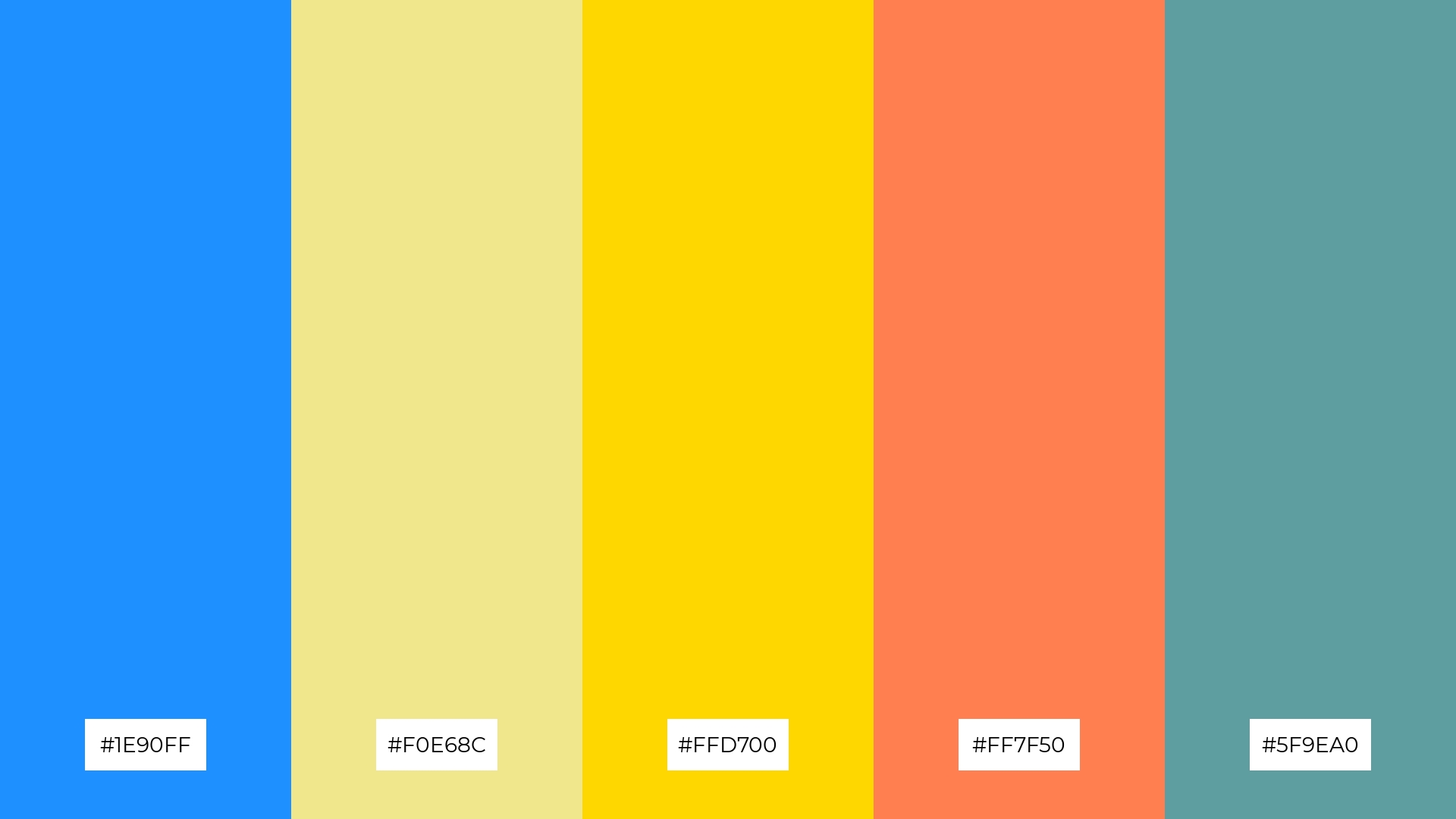
The ‘Azure Dreams’ palette, with its blend of dodger blue (#1E90FF), khaki (#F0E68C), golden yellow (#FFD700), coral (#FF7F50), and cadet blue (#5F9EA0), can evoke a sense of calm when the cooler tones are emphasized, creating a serene and relaxing atmosphere perfect for spa branding.
Conversely, by highlighting the warmer hues, this palette can bring a burst of excitement and energy, making it ideal for vibrant marketing campaigns that aim to capture attention and convey a lively, dynamic message.
9) Daffodil Sky
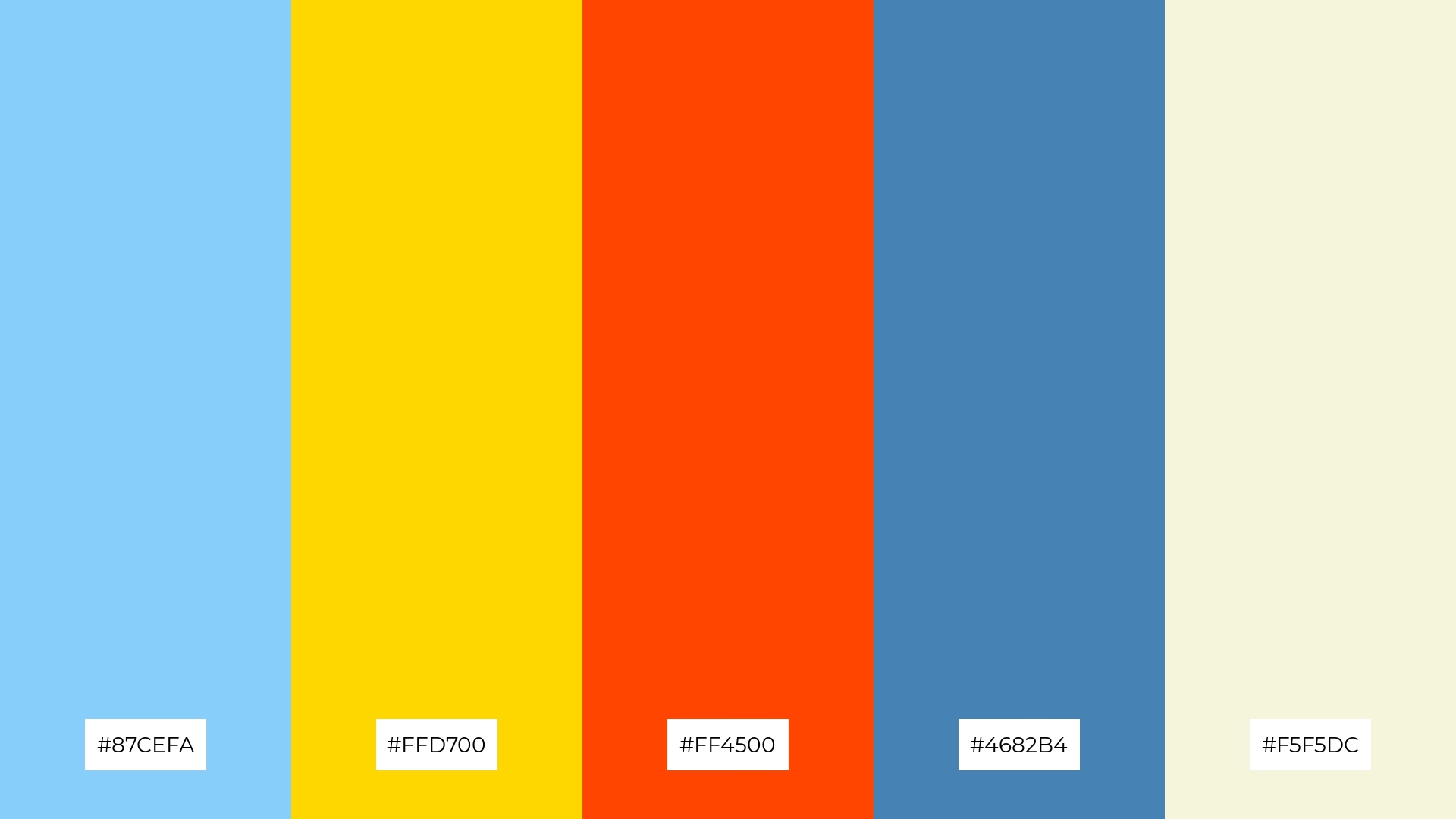
The ‘Daffodil Sky’ palette, with its blend of soft sky blue (#87CEFA), bright golden yellow (#FFD700), and warm orange-red (#FF4500), creates a cheerful and inviting mood that can instantly uplift any space.
This harmonious combination is perfect for seasonal promotions, where the vibrant yet soothing tones can attract attention and evoke a sense of warmth and optimism, making it ideal for spring or summer-themed campaigns.
10) Radiant Sun

The ‘Radiant Sun’ palette, with its blend of deep sky blue (#00BFFF), golden yellow (#FFD700), dark orange (#FF8C00), powder blue (#B0E0E6), and hot pink (#FF69B4), creates a vibrant visual flow that evokes feelings of joy and energy, making it perfect for designs that aim to uplift and inspire.
This dynamic combination is ideal for lifestyle branding or tech product packaging, where the lively and engaging colors can capture attention and convey a sense of innovation and excitement, ensuring the product stands out in a competitive market.
11) Coastal Vibes
The ‘Coastal Vibes’ palette, with its blend of dodger blue (#1E90FF), khaki (#F0E68C), golden yellow (#FFD700), tomato red (#FF6347), and cadet blue (#5F9EA0), creates a welcoming effect by combining soothing and vibrant tones that evoke a sense of warmth and relaxation.
This harmonious combination is perfect for boutique interiors, where the inviting colors can create a cozy and stylish atmosphere, making customers feel at ease while enhancing the overall shopping experience.
12) Citrus Burst
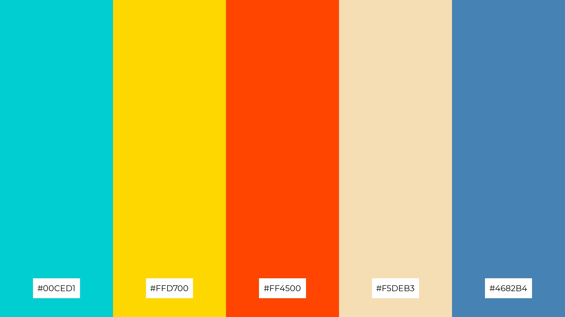
The ‘Citrus Burst’ palette, with its blend of turquoise (#00CED1), golden yellow (#FFD700), orange-red (#FF4500), wheat (#F5DEB3), and steel blue (#4682B4), creates a dynamic interplay of warm and cool tones that evoke a sense of both balance and contrast.
This vibrant combination is ideal for casual apparel lines, where the energetic hues can capture attention and convey a playful yet stylish vibe, making the clothing line stand out in a competitive market.
13) Bright Meadow
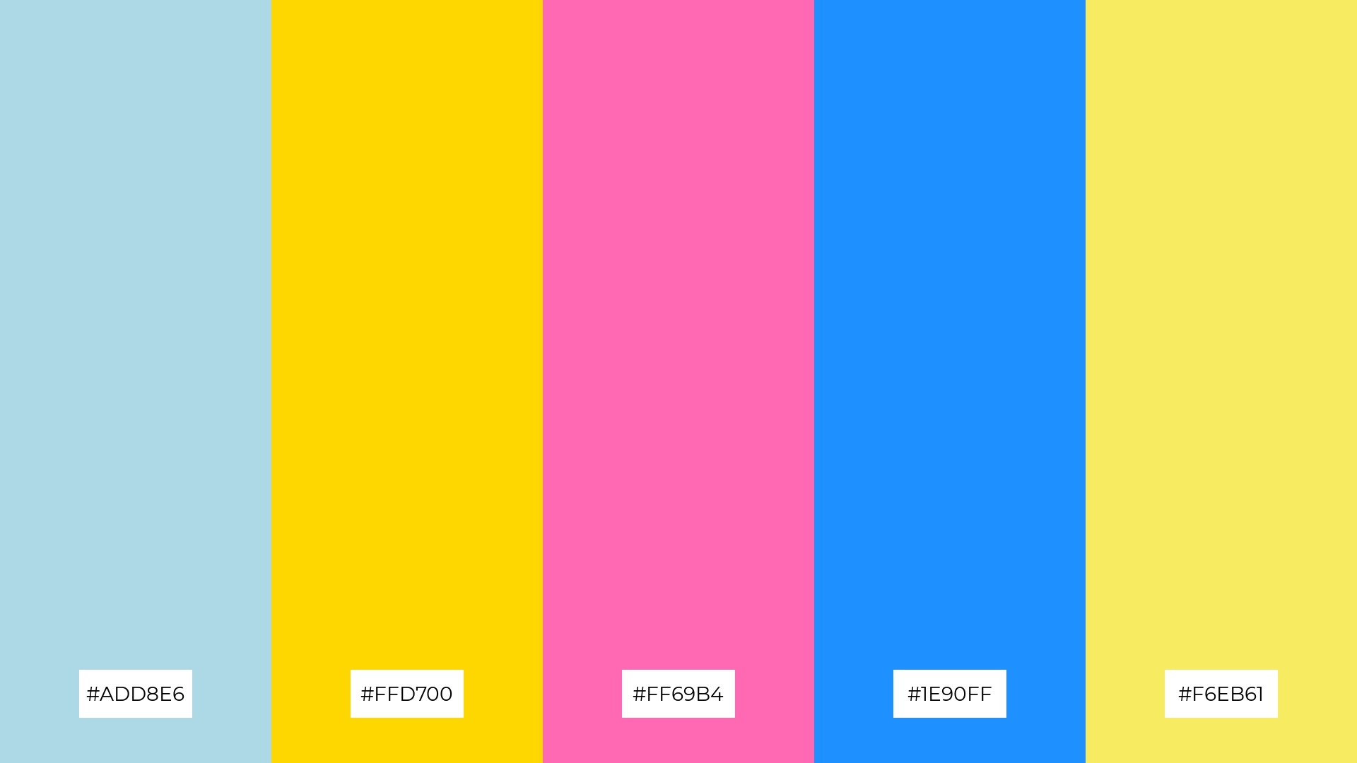
The ‘Bright Meadow’ palette, with its blend of light blue (#ADD8E6), golden yellow (#FFD700), hot pink (#FF69B4), dodger blue (#1E90FF), and light yellow (#F6EB61), masterfully combines warm and cool tones to evoke a mood of cheerful sophistication and balanced energy.
This unique combination is perfect for artisan product branding, where the harmonious interplay of colors can convey a sense of handcrafted quality and vibrant creativity, making the products stand out in a crowded marketplace.
14) Sunlit Ocean

The ‘Sunlit Ocean’ palette, with its blend of cornflower blue (#6495ED), golden yellow (#FFD700), coral (#FF7F50), powder blue (#B0E0E6), and bright yellow (#FFEA00), creates a dynamic interplay of bold and subtle hues that can evoke both energy and tranquility.
This vibrant combination is perfect for festival marketing, where the striking contrasts and lively colors can capture attention and convey a sense of excitement and celebration, ensuring the event stands out and attracts a diverse audience.
15) Vibrant Sunrise
The ‘Vibrant Sunrise’ palette, with its blend of deep sky blue (#00BFFF), light yellow (#F6EB61), golden yellow (#FFD700), tomato red (#FF6347), and steel blue (#4682B4), can convey a sense of harmony when the cooler tones are emphasized, creating a balanced and soothing visual experience.
This dynamic combination is ideal for tech startups aiming to create an inviting yet innovative office space, where the vibrant colors can foster creativity and energy, or for cozy interior makeovers that seek to blend warmth and tranquility seamlessly.
How to Use Blue Yellow Patterns in Design
In home decor, blue and yellow color palettes can create a serene yet vibrant atmosphere. Use deep blues for walls and furniture to establish a calming base, then add pops of yellow through accessories like cushions and artwork to inject energy and warmth into the space.
For marketing materials, this color combination can be highly effective in capturing attention and conveying a message. Utilize blue for backgrounds and text to maintain readability and professionalism, while incorporating yellow in call-to-action buttons and highlights to draw the viewer’s eye to key information.
In clothing design, blue and yellow can create striking and fashionable pieces. Pair navy blue with mustard yellow for a sophisticated look, or combine sky blue with lemon yellow for a fresh and playful ensemble. Ready to experiment with these vibrant palettes? Try creating your own designs using Piktochart today!


