Yellow and white color palettes are a timeless combination that exudes warmth and elegance. These hues can transform any design into a visually appealing masterpiece.
Whether you’re working on a website, a presentation, or an infographic, incorporating yellow and white can create a clean and inviting look. This article explores the versatility and charm of yellow and white color palettes.
Tips For Creating Yellow White Color Palettes
Designing with yellow and white can be both exciting and challenging. Here are some practical tips to help you create stunning color palettes:
- Balance the Colors: Ensure that neither yellow nor white dominates the design. Use white for backgrounds and yellow for accents to maintain harmony.
- Complementary Shades: Pair yellow and white with complementary colors like gray or navy blue to add depth and contrast.
- Use Gradients: Incorporate gradients to blend yellow and white seamlessly, creating a smooth transition that adds visual interest.
- Consider Typography: Use bold, dark fonts to ensure text stands out against the light background, enhancing readability.
- Test in Different Lighting: Check how your design looks in various lighting conditions to ensure the colors remain vibrant and clear.
- Versatile Designs: Create multiple versions of your design with slight variations in the yellow and white balance to suit different contexts and preferences.
15 Yellow White Color Palettes
1) Sunlit Meadow
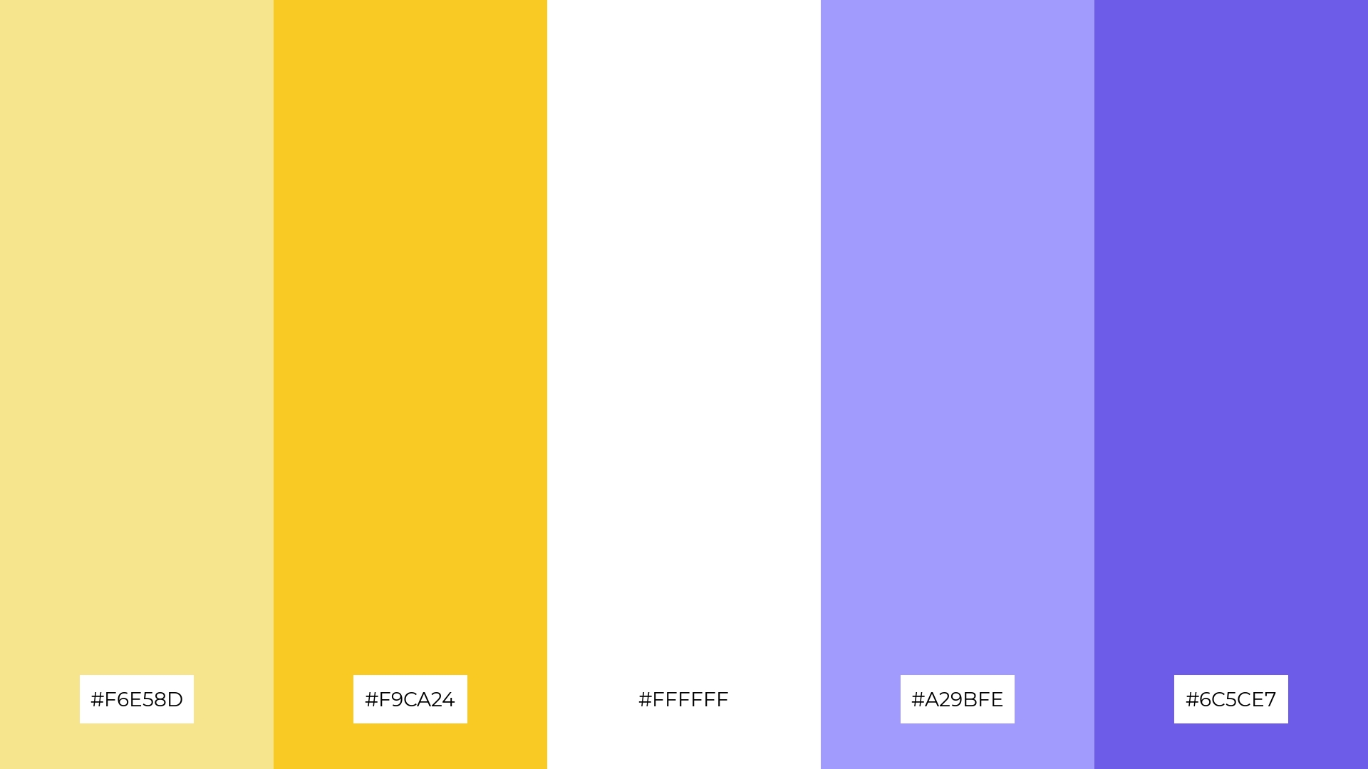
The ‘Sunlit Meadow’ palette, with its blend of soft yellows, crisp white, and calming purples, evokes a serene and uplifting mood, reminiscent of a peaceful day in nature.
Perfect for interior decor, this palette creates a cohesive look by balancing the warmth of yellow with the tranquility of purple, making it ideal for creating a welcoming and harmonious living space.
2) Lemon Meringue
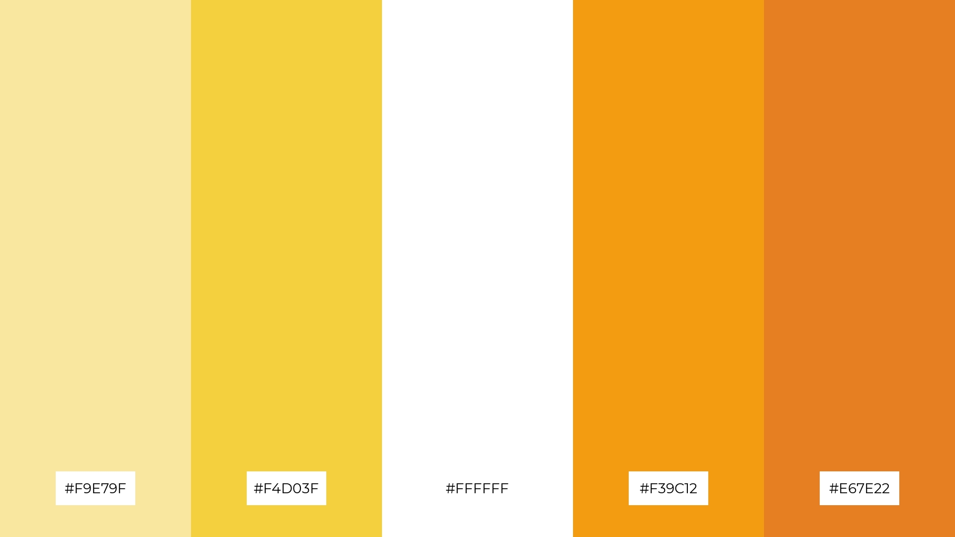
The ‘Lemon Meringue’ palette, with its vibrant yellows and warm oranges, evokes a sense of energy and optimism, making it perfect for designs that aim to uplift and inspire.
This palette would excel in product packaging for health and wellness brands, where the bright and cheerful colors can attract attention and convey a message of vitality and freshness.
3) Golden Hour
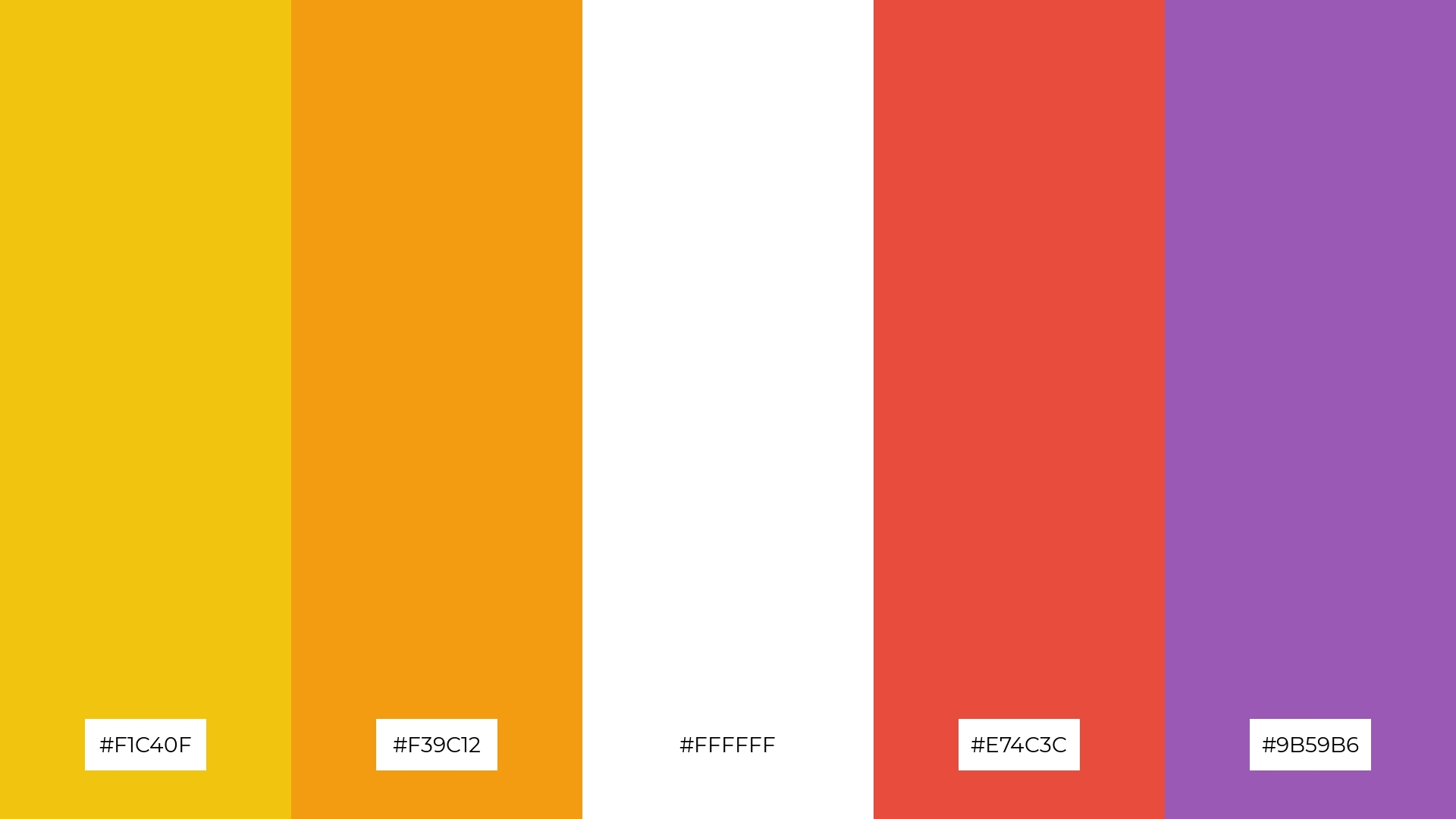
The ‘Golden Hour’ palette, featuring dominant colors like vibrant gold (#F1C40F) and warm orange (#F39C12), creates a striking and harmonious visual experience.
Ideal for eco-friendly interior spaces, this palette’s blend of white, red, and purple adds depth and balance, fostering a sense of warmth and tranquility.
4) Buttercream Bliss

The ‘Buttercream Bliss’ palette, with its mix of soft yellows, warm creams, and cool grays, offers a perfect balance of gentle and bold tones, creating a distinct and inviting mood.
Ideal for modern web designs, this palette can make websites feel welcoming and sophisticated, enhancing user experience and engagement.
5) Sunny Citrus
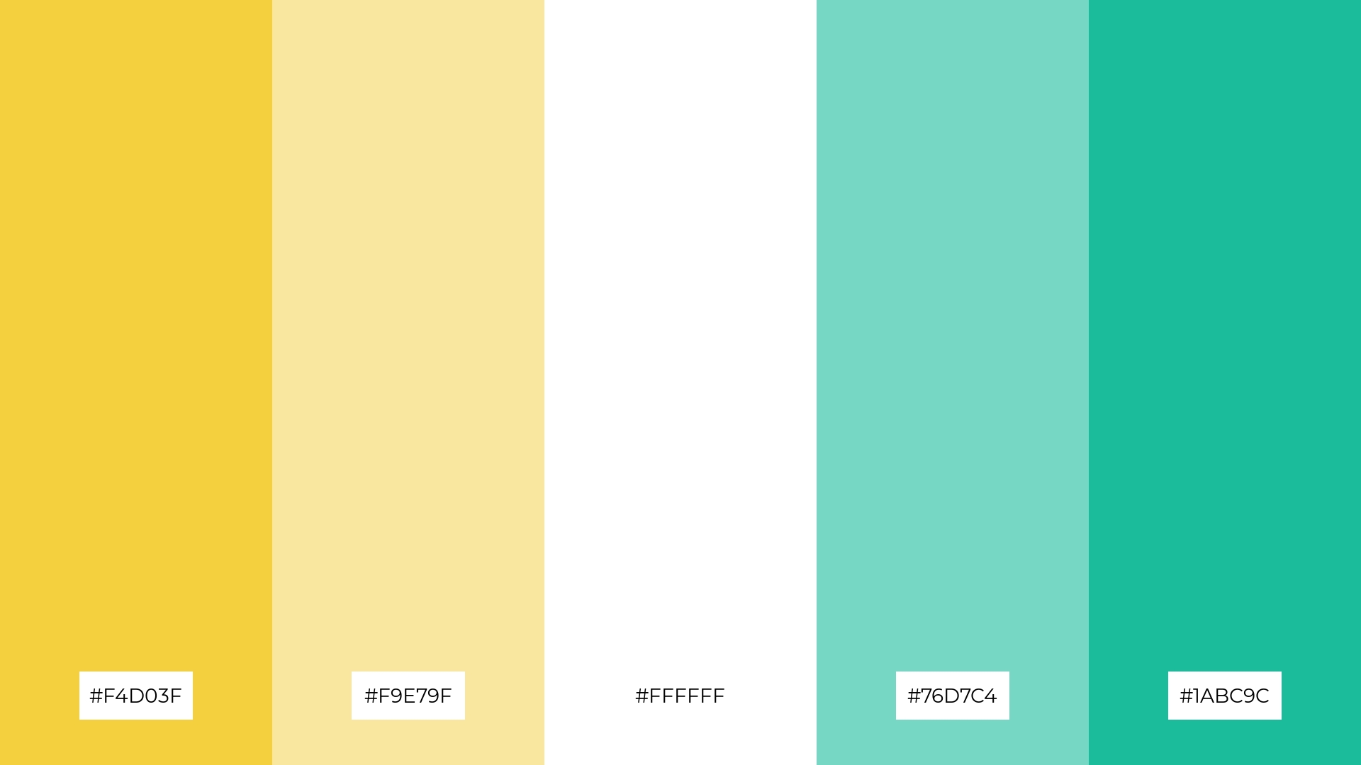
The ‘Sunny Citrus’ palette, with its vibrant yellows (#F4D03F, #F9E79F), crisp white (#FFFFFF), and refreshing greens (#76D7C4, #1ABC9C), creates an ambiance of lively freshness and invigorating energy.
This palette is perfect for summer wedding themes, where the bright and cheerful colors can enhance the joyous atmosphere and create a memorable, uplifting experience for guests.
6) Creamy Sunrise
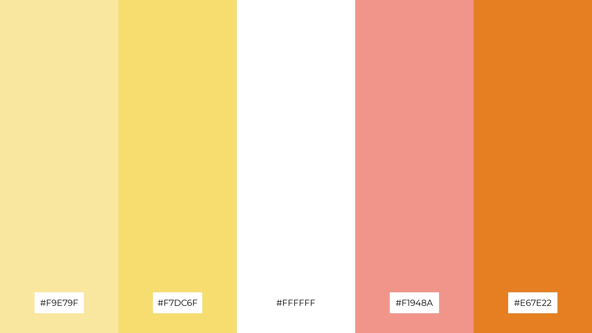
The ‘Creamy Sunrise’ palette, with its blend of soft yellows (#F9E79F, #F7DC6F), crisp white (#FFFFFF), and warm oranges (#F1948A, #E67E22), creates a harmonious and sophisticated mood, perfect for minimalistic branding that aims to convey elegance and subtlety.
This palette’s balanced mix of gentle and bold tones can also be used in bold event designs, where the vibrant colors can energize the atmosphere and make a lasting impression on attendees.
7) Daffodil Dream
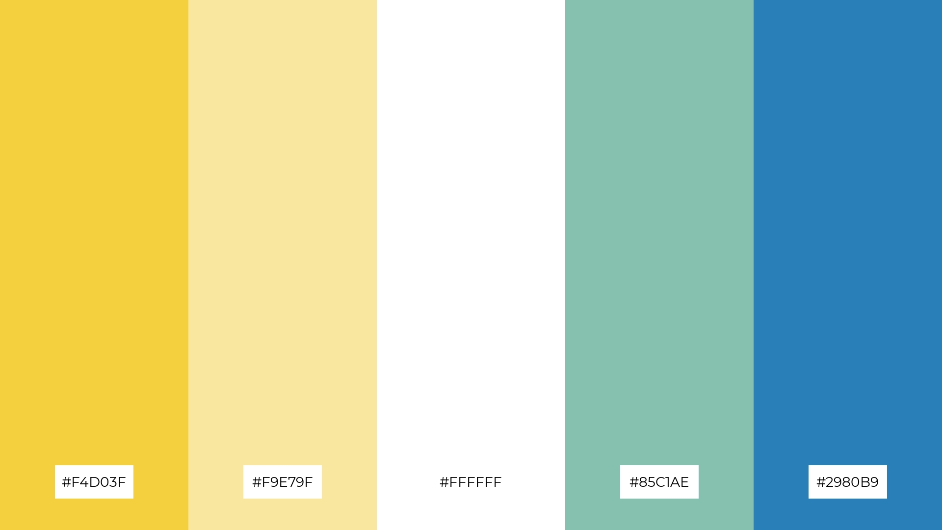
The ‘Daffodil Dream’ palette, with its vibrant yellows (#F4D03F, #F9E79F), crisp white (#FFFFFF), and contrasting cool tones of teal (#85C1AE) and blue (#2980B9), creates a dynamic visual interest through the interplay of warm and cool colors.
This palette is ideal for creative projects like magazine layouts or artistic websites, where the bold contrasts can draw attention and enhance the overall aesthetic appeal.
8) Soft Lemonade
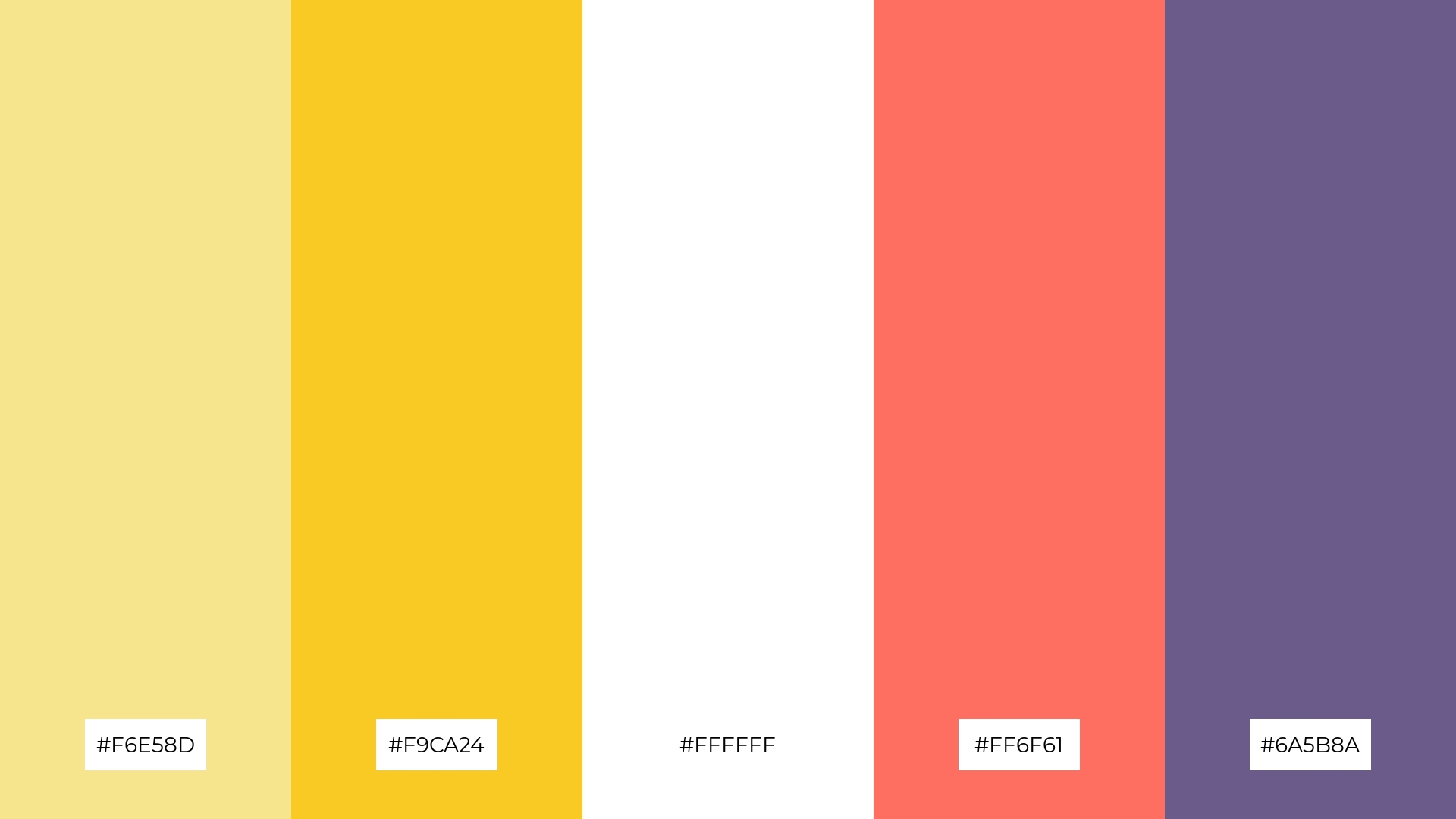
The ‘Soft Lemonade’ palette, with its gentle yellows (#F6E58D, #F9CA24) and crisp white (#FFFFFF), brings a sense of calm and serenity, making it perfect for spa branding that aims to create a relaxing and rejuvenating atmosphere.
Conversely, the vibrant combination of coral (#FF6F61) and deep purple (#6A5B8A) injects excitement and energy, ideal for dynamic marketing campaigns that seek to captivate and engage audiences with bold and memorable visuals.
9) Bright Horizon
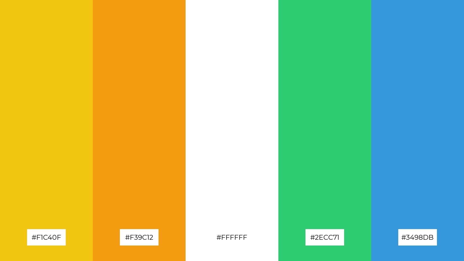
The ‘Bright Horizon’ palette, with its mix of vibrant gold (#F1C40F), warm orange (#F39C12), crisp white (#FFFFFF), refreshing green (#2ECC71), and cool blue (#3498DB), creates a lively and uplifting mood through its harmonious blend of softer and brighter tones.
This palette is ideal for seasonal promotions, where the energetic and cheerful colors can capture attention and convey a sense of excitement and renewal.
10) Vanilla Sunshine
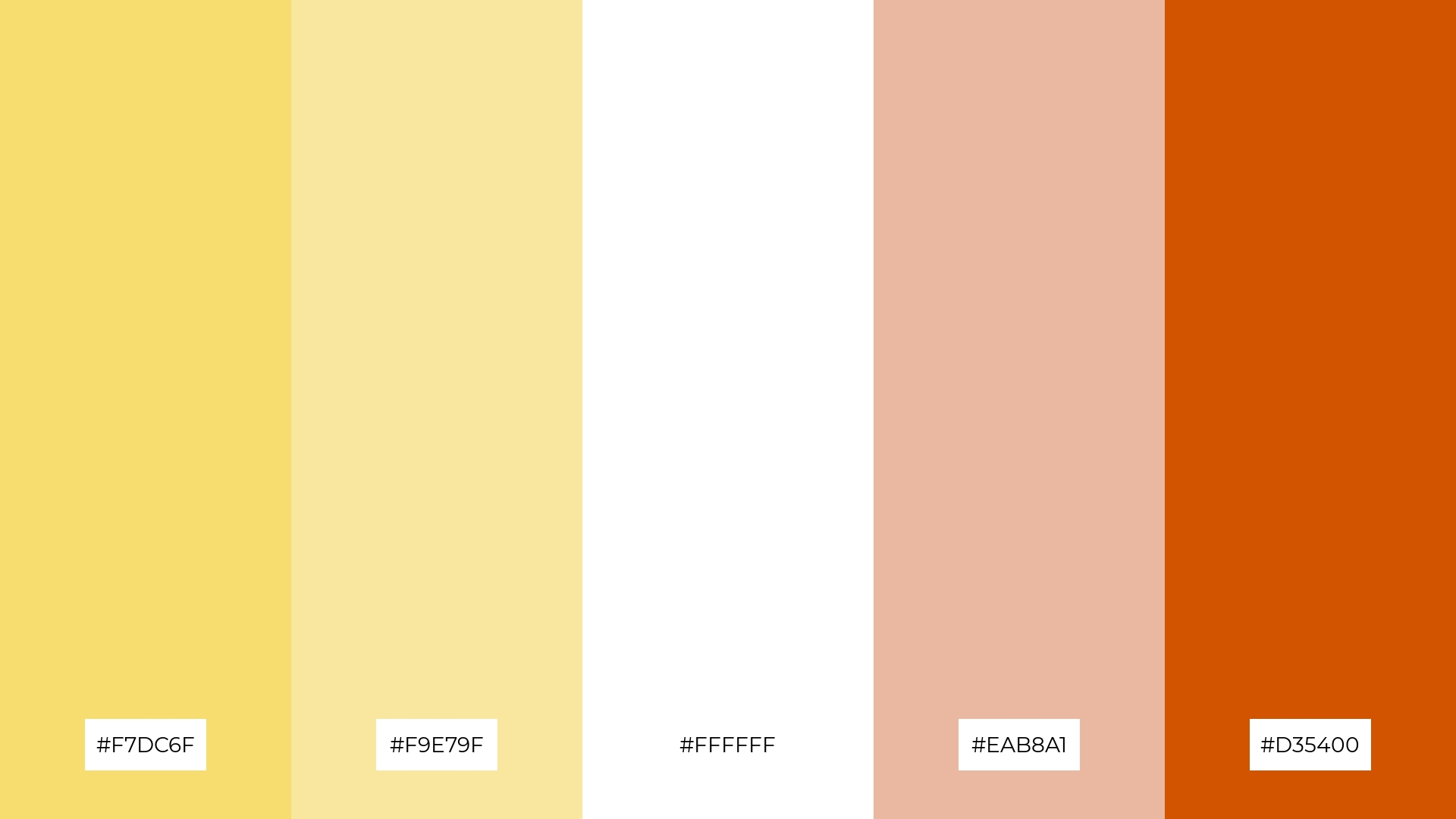
The ‘Vanilla Sunshine’ palette, with its blend of soft yellows (#F7DC6F, #F9E79F), crisp white (#FFFFFF), warm peach (#EAB8A1), and bold orange (#D35400), creates a visual flow that evokes feelings of joy and warmth, reminiscent of a sunny day.
This palette is ideal for lifestyle branding, where the cheerful and inviting colors can enhance the brand’s appeal, or for tech product packaging, where the vibrant hues can attract attention and convey a sense of innovation and energy.
11) Mellow Yellow
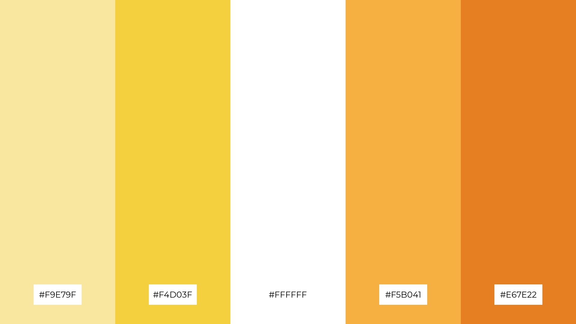
The ‘Mellow Yellow’ palette, with its blend of soft yellows (#F9E79F, #F4D03F), crisp white (#FFFFFF), and warm oranges (#F5B041, #E67E22), creates a welcoming effect by combining gentle and vibrant tones that evoke warmth and comfort.
This palette shines in boutique interiors, where the inviting colors can enhance the shopping experience, or in luxury e-commerce sites, where the dramatic hues can attract attention and convey a sense of sophistication and exclusivity.
12) Radiant Fields
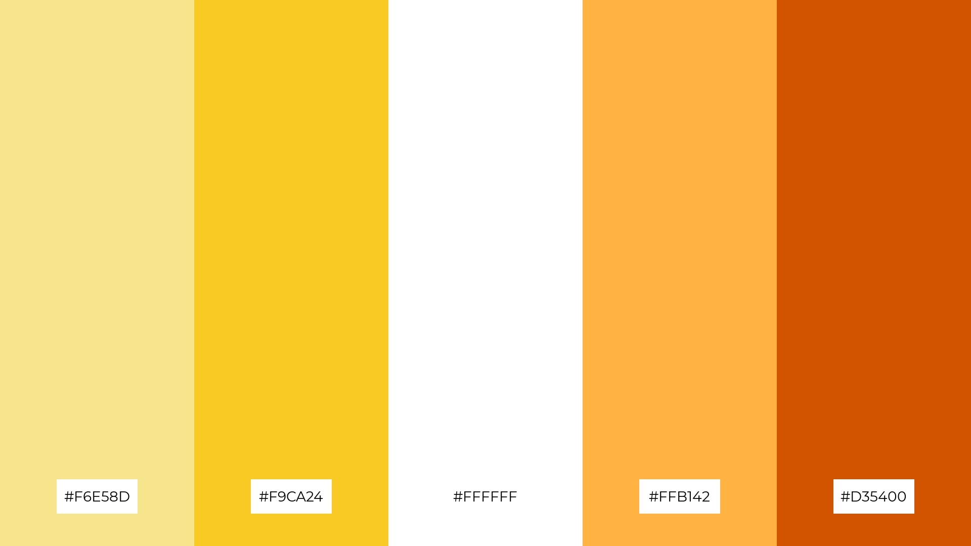
The ‘Radiant Fields’ palette, with its blend of soft yellows (#F6E58D, #F9CA24), crisp white (#FFFFFF), and vibrant oranges (#FFB142, #D35400), creates a dynamic interplay of warmth and brightness that evokes a sense of balance and energy.
This palette is perfect for casual apparel lines, where the cheerful and harmonious colors can enhance the brand’s appeal and convey a sense of youthful vibrancy and optimism.
13) Citrus Burst
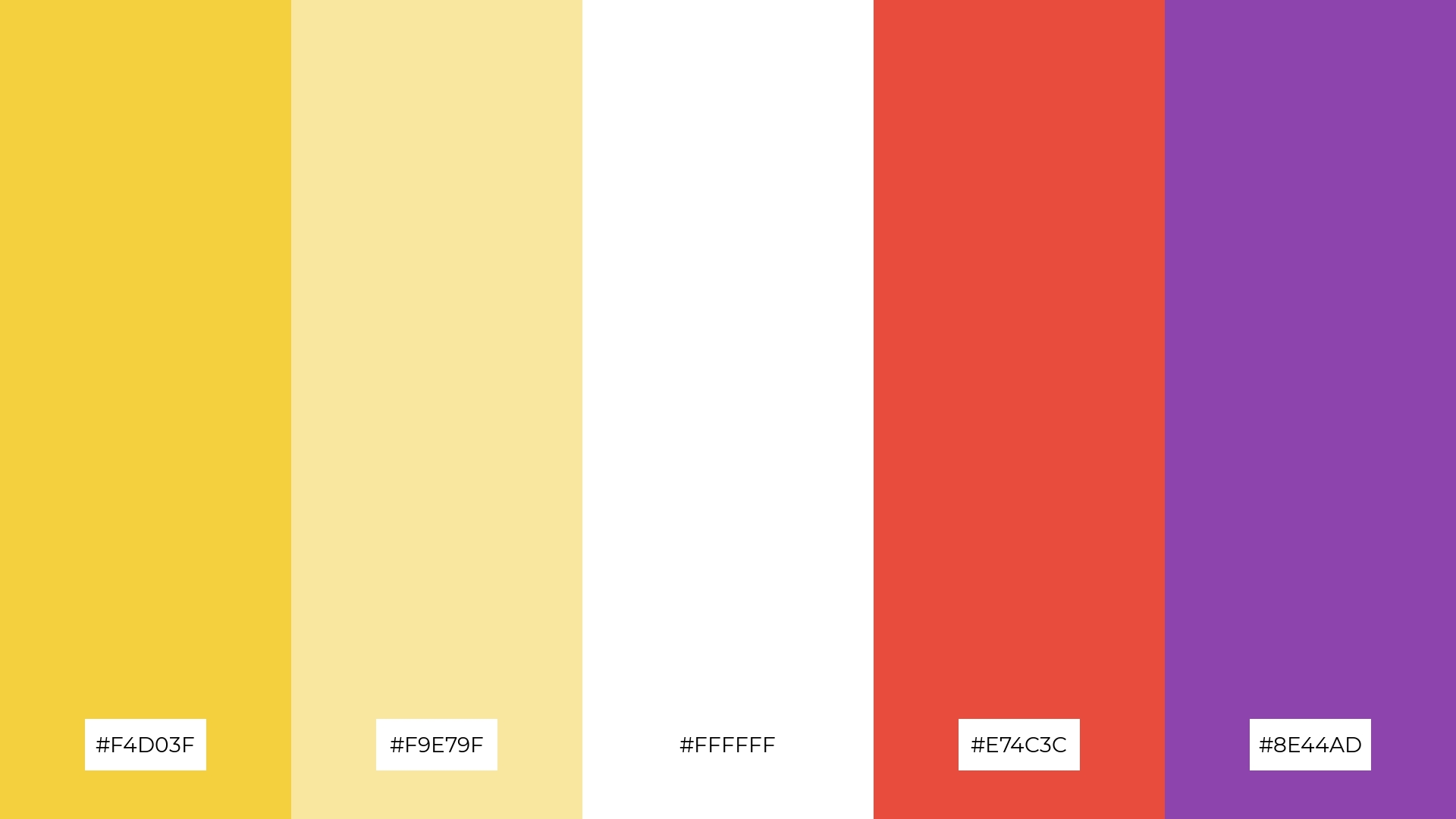
The ‘Citrus Burst’ palette, with its blend of warm yellows (#F4D03F, #F9E79F), crisp white (#FFFFFF), and cool tones of red (#E74C3C) and purple (#8E44AD), creates a vibrant and balanced mood that evokes both energy and sophistication.
This palette is ideal for artisan product branding, where the dynamic interplay of warm and cool colors can enhance the handcrafted appeal and convey a sense of creativity and quality.
14) Sunny Delight
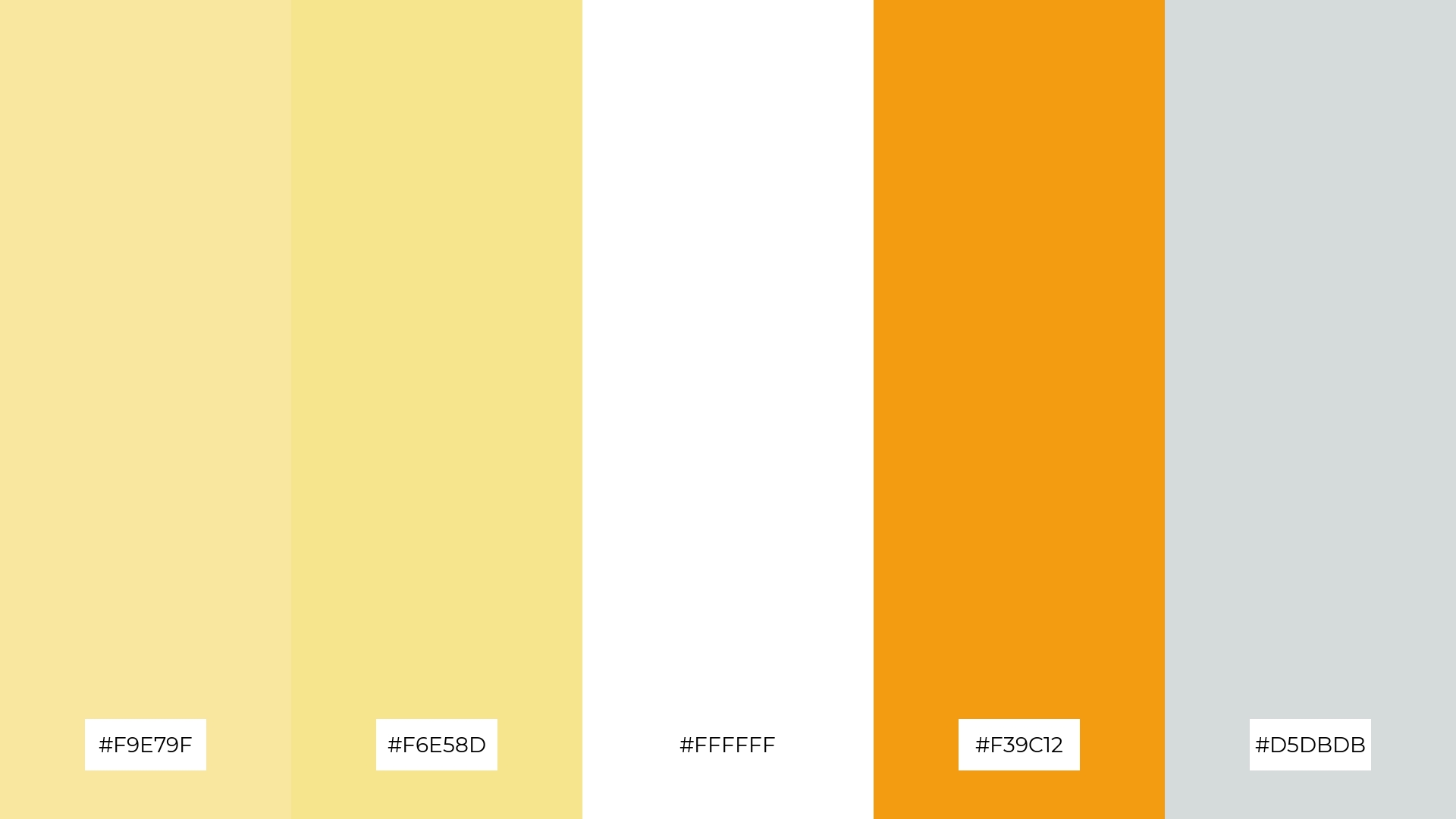
The ‘Sunny Delight’ palette, with its vibrant yellows (#F9E79F, #F6E58D), crisp white (#FFFFFF), warm orange (#F39C12), and soft gray (#D5DBDB), creates a dynamic interplay of bold and subtle tones that evoke a sense of warmth and sophistication.
This palette is perfect for restaurant menus, where the inviting and cheerful colors can enhance the dining experience by making the menu visually appealing and appetizing.
15) Lemon Sorbet
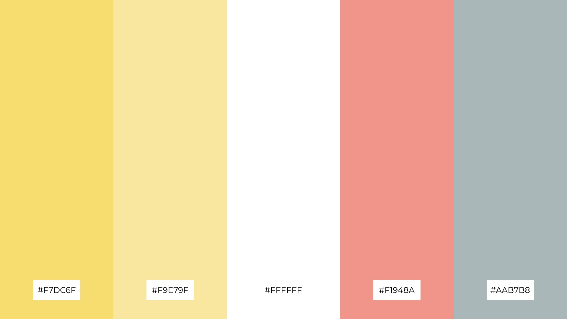
The ‘Lemon Sorbet’ palette, with its blend of soft yellows (#F7DC6F, #F9E79F), crisp white (#FFFFFF), warm pink (#F1948A), and cool gray (#AAB7B8), conveys a sense of harmony through its balanced mix of gentle and vibrant tones, creating a soothing and cohesive visual experience.
This palette is ideal for tech startups aiming to create a welcoming and innovative office space, or for cozy interior makeovers where the inviting colors can enhance the comfort and aesthetic appeal of living areas.
How to Use Yellow White Patterns in Design
In home decor, yellow and white color palettes can create a bright and airy atmosphere. Use white as the primary color for walls and larger furniture pieces, while incorporating yellow through accent pillows, rugs, and artwork to add warmth and vibrancy.
For marketing materials, yellow and white can make your designs stand out and convey a sense of optimism and clarity. Use white backgrounds to keep the design clean and professional, and add yellow elements like headers, icons, and call-to-action buttons to draw attention and guide the viewer’s eye.
In clothing design, yellow and white can create fresh and stylish looks. Pair white garments with yellow accessories or vice versa to achieve a balanced and eye-catching outfit that exudes confidence and positivity.
Ready to bring your yellow and white design ideas to life? Try creating these palettes using Piktochart and see how they can transform your projects. Get started with Piktochart today!


