
Brown and white color palettes offer a timeless and versatile combination that can elevate any design project. These hues blend seamlessly to create a sophisticated and warm aesthetic.
Whether you’re designing a website, an infographic, or a marketing campaign, the balance of brown and white can convey both elegance and simplicity. This article explores the various ways to effectively use brown and white in your designs.
Tips For Creating Brown White Color Palettes
Creating a balanced and visually appealing design with brown and white requires thoughtful consideration and strategic planning.
- Balance the Colors: Ensure that neither brown nor white dominates the design. Use white to create space and brown to add depth and warmth.
- Complementary Shades: Pair brown and white with complementary colors like beige, cream, or even muted greens to enhance the overall palette.
- Texture and Patterns: Incorporate textures and patterns to add visual interest. For example, a white background with brown accents can create a clean yet dynamic look.
- Versatility: Use different shades of brown, from light tan to deep chocolate, to create a versatile and layered design.
- Contrast: Leverage the high contrast between brown and white to highlight key elements and guide the viewer’s eye through the design.
- Consistency: Maintain a consistent color scheme across all design elements to ensure a cohesive and professional appearance.
15 Brown White Color Palettes
1) Rustic Charm
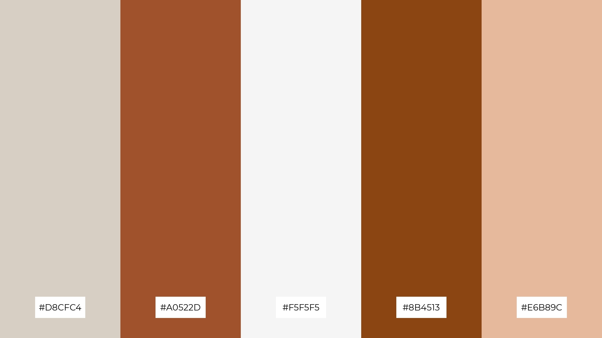
The ‘Rustic Charm’ palette, with its blend of soft neutrals and rich earthy tones, creates a warm and inviting mood that evokes a sense of comfort and nostalgia.
Perfect for interior decor, this palette’s harmonious interaction of colors like #D8CFC4 and #A0522D can transform a living space into a cozy retreat, highlighting its defining characteristic of timeless elegance.
2) Earthy Elegance
The ‘Earthy Elegance’ palette, with its blend of soft creams and rich browns, evokes a sense of warmth and calmness, making it ideal for creating a serene and inviting atmosphere.
This palette would excel in product packaging for organic or eco-friendly brands, where the natural tones can highlight the brand’s commitment to sustainability and quality.
3) Warm Embrace
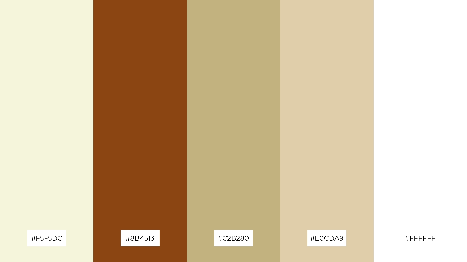
The ‘Warm Embrace’ palette features dominant colors like #F5F5DC and #8B4513, which create a soothing and grounded atmosphere, perfect for wellness branding.
These hues, combined with #C2B280, #E0CDA9, and #FFFFFF, enhance the palette’s harmony by blending soft neutrals with rich browns, making it ideal for eco-friendly interior spaces that aim to evoke a sense of natural tranquility.
4) Autumn Whisper
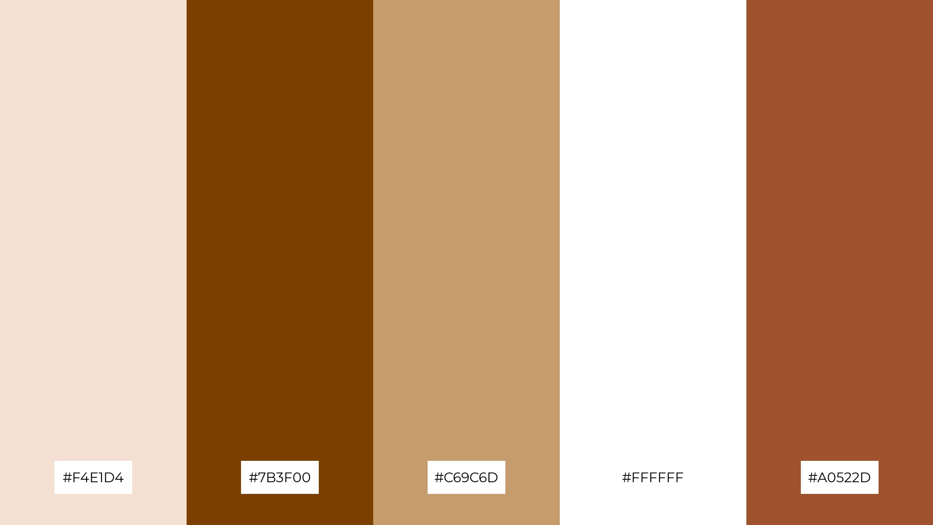
The ‘Autumn Whisper’ palette, with its mix of soft tones like #F4E1D4 and bold hues like #7B3F00, creates a distinct mood that balances warmth and sophistication.
This palette is ideal for designing inviting retail spaces or modern web designs, where the combination of soft and bold colors can enhance the overall aesthetic and draw in customers or users.
5) Cozy Retreat

The ‘Cozy Retreat’ palette, with its blend of #E8D8C3, #4E3B31, #C2B280, #F5F5F5, and #8B4513, creates a serene and inviting ambiance that is perfect for wedding themes, where the soft neutrals and rich browns can evoke a sense of timeless romance and elegance.
This harmonious combination of colors can also be effectively used in luxury fashion campaigns, where the sophisticated tones can highlight the opulence and refinement of high-end garments, making them stand out in a visually appealing manner.
6) Natural Harmony
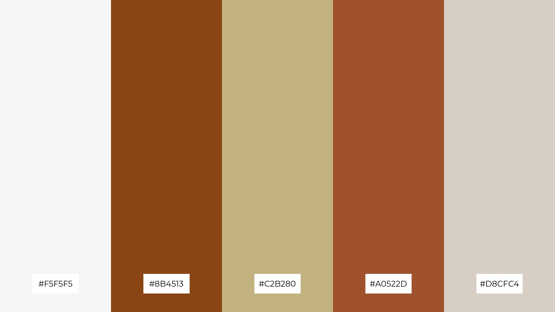
The ‘Natural Harmony’ palette, with its blend of #F5F5F5, #8B4513, #C2B280, #A0522D, and #D8CFC4, creates a sophisticated and grounded mood, making it ideal for minimalistic branding that aims to convey elegance and simplicity.
This harmonious combination of soft neutrals and rich browns can also be effectively used in bold event designs, where the natural tones can enhance the overall aesthetic and create a warm, inviting atmosphere for attendees.
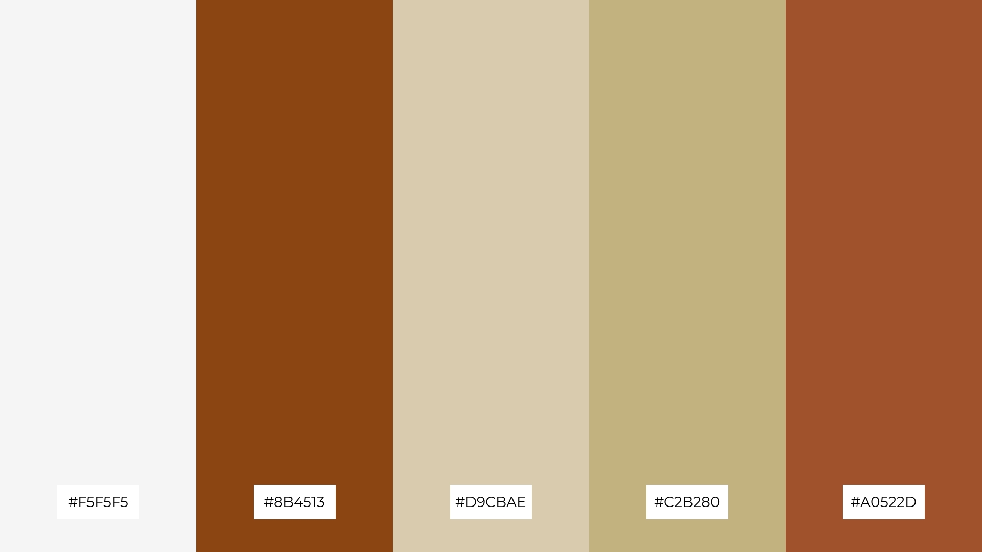
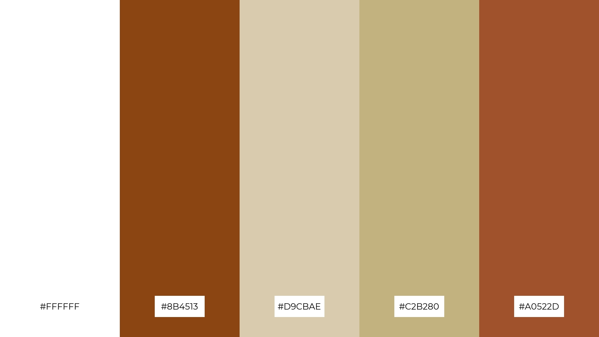
7) Timeless Tranquility
The ‘Timeless Tranquility’ palette, with its stark contrast between the crisp white (#FFFFFF) and the deep brown (#8B4513), alongside the softer tones of #C2B280, #D9CBAE, and #A0522D, creates a visually engaging and balanced design.
This palette is perfect for creative projects like magazine layouts or artistic websites, where the interplay of bold and subtle hues can draw attention to key elements while maintaining an elegant and cohesive aesthetic.
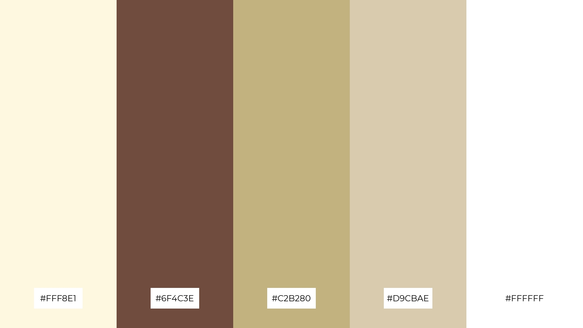
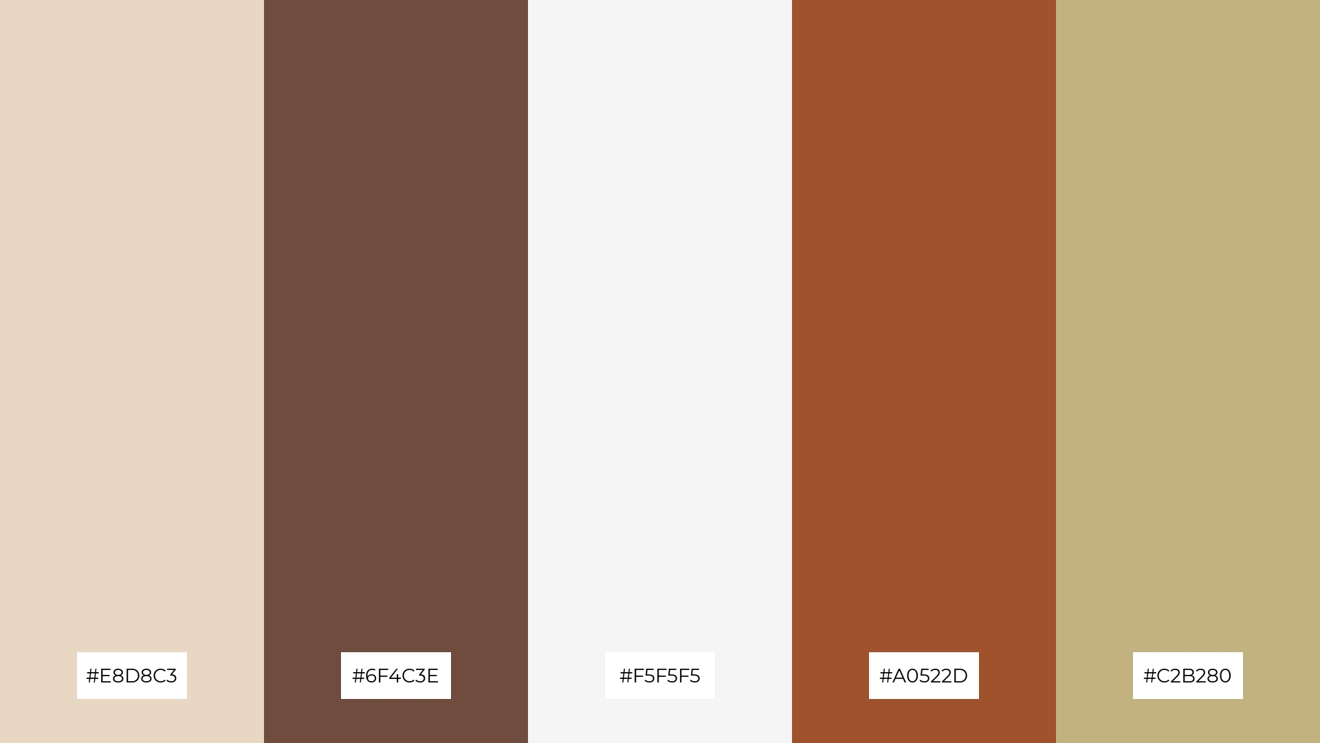
8) Vintage Vibes
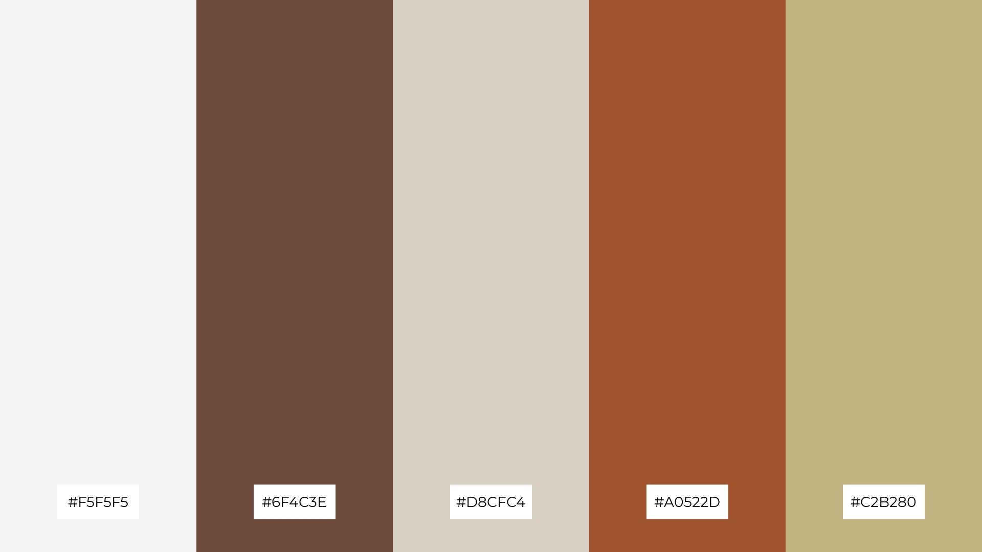
The ‘Vintage Vibes’ palette, with its blend of #F5F5F5, #6F4C3E, #D8CFC4, #A0522D, and #C2B280, can evoke a sense of calm when the softer tones are used predominantly, creating a serene and inviting atmosphere perfect for spa branding.
Conversely, the same palette can bring excitement and energy to vibrant marketing campaigns by emphasizing the richer hues like #A0522D and #6F4C3E, making the design visually striking and engaging.
9) Serene Landscape
The ‘Serene Landscape’ palette, with its softer tones like #E6D8C3 and #F5F5F5, creates a calming and peaceful atmosphere that is perfect for home decor, where a tranquil environment is desired.
Incorporating brighter hues like #C2B280 and #D9CBAE, this blend enhances the mood by adding warmth and subtle elegance, making it ideal for seasonal promotions that aim to evoke a sense of comfort and relaxation.
10) Rustic Sunset
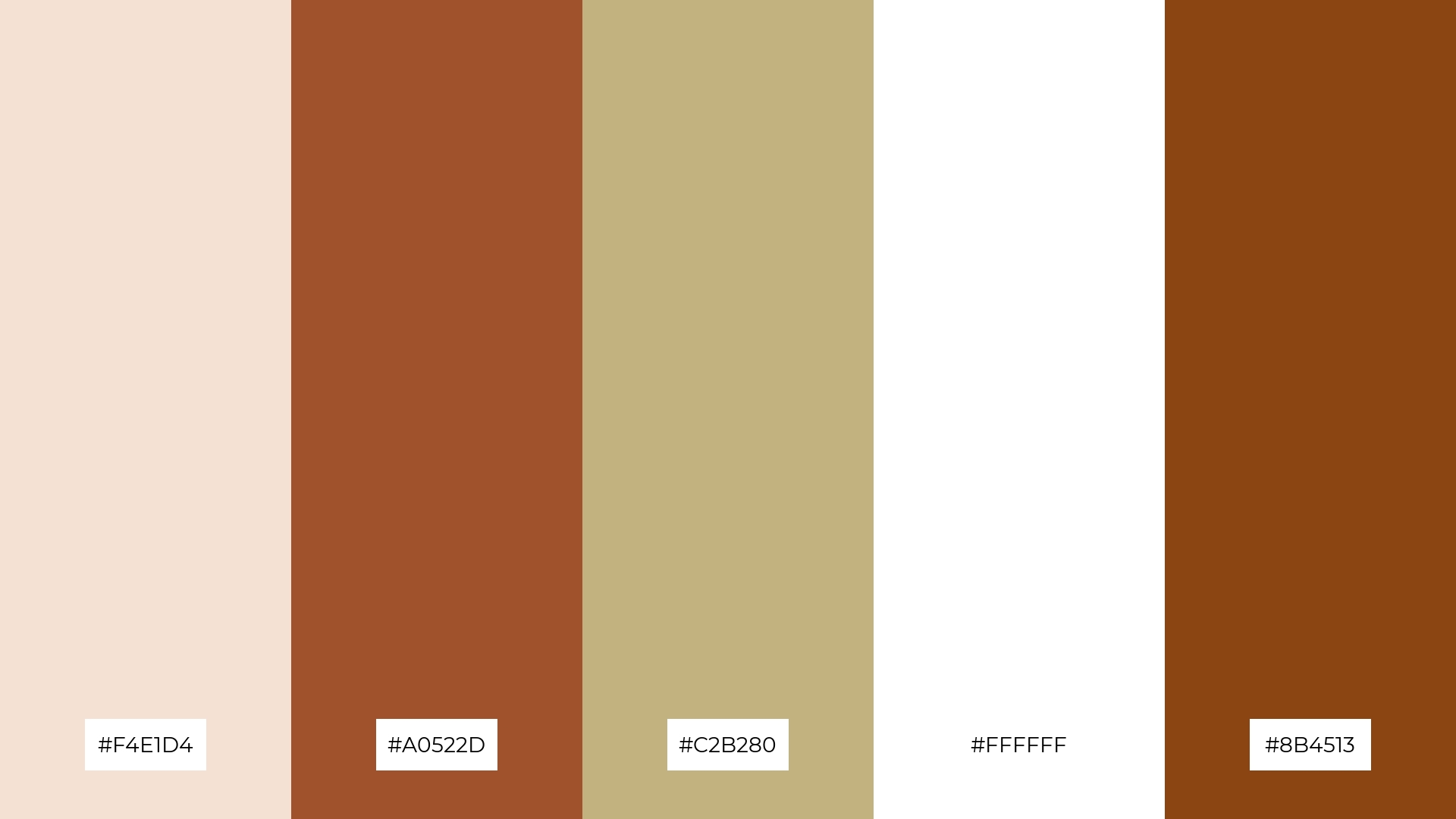
The ‘Rustic Sunset’ palette, with its blend of #F4E1D4, #A0522D, #C2B280, #FFFFFF, and #8B4513, creates a visual flow that evokes a sense of tranquility and warmth, making it perfect for designs that aim to convey comfort and relaxation.
This harmonious combination of colors can be effectively used in lifestyle branding, where the soothing tones can enhance the brand’s message of well-being, or in tech product packaging, where the rich and inviting hues can make the product stand out on the shelves while evoking a sense of reliability and sophistication.
11) Woodland Escape
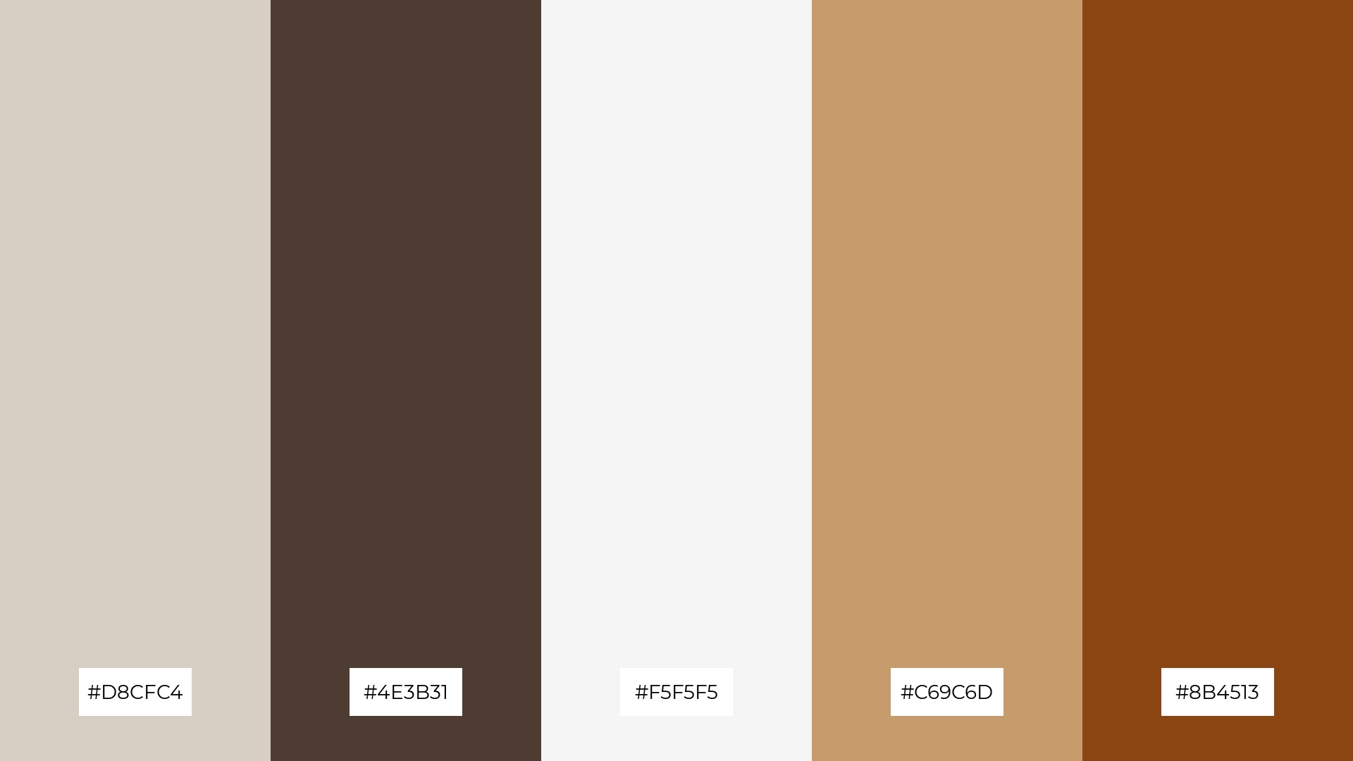
The ‘Woodland Escape’ palette, with its blend of #D8CFC4, #4E3B31, #F5F5F5, #C69C6D, and #8B4513, creates a welcoming effect by combining soft neutrals with rich, earthy tones that evoke a sense of natural tranquility and warmth.
This palette shines in boutique interiors, where the harmonious interaction of these colors can create an inviting and sophisticated atmosphere, perfect for enhancing the shopping experience and highlighting unique, high-end products.
12) Cozy Cabin
The ‘Cozy Cabin’ palette, with its blend of #F5F5F5, #8B4513, #D9CBAE, #C2B280, and #A0522D, creates a harmonious balance by combining soft neutrals with rich browns, evoking a sense of warmth and comfort.
This palette is ideal for casual apparel lines, where the inviting hues can enhance the brand’s message of relaxed elegance and everyday sophistication.
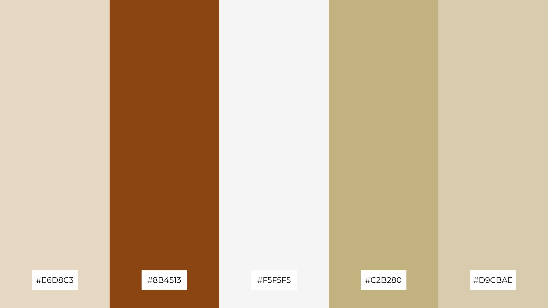
13) Earthy Tones
The ‘Earthy Tones’ palette, with its blend of warm hues like #A0522D and #C2B280 and cool tones like #E8D8C3 and #F5F5F5, creates a balanced and inviting mood that evokes a sense of natural harmony and sophistication.
This palette is perfect for artisan product branding, where the combination of warm and cool tones can highlight the craftsmanship and authenticity of handmade goods, making them stand out in a visually appealing and cohesive manner.
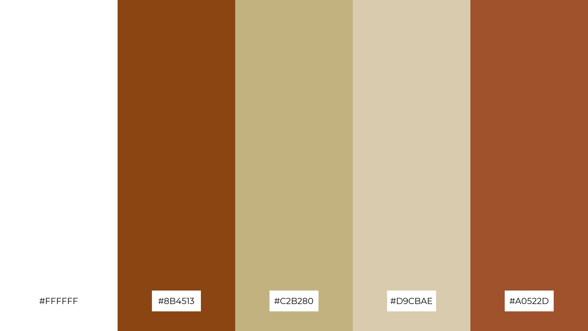
14) Natural Elements
The ‘Natural Elements’ palette, with its crisp white (#FFFFFF) and deep brown (#8B4513) alongside softer tones like #D9CBAE, #C2B280, and #A0522D, creates a dynamic interplay of bold and subtle hues that can enhance any design project.
This versatile combination is perfect for restaurant menus, where the rich browns can highlight key dishes while the softer tones provide a clean and inviting backdrop, making the overall presentation both elegant and appetizing.
15) Warm Woods
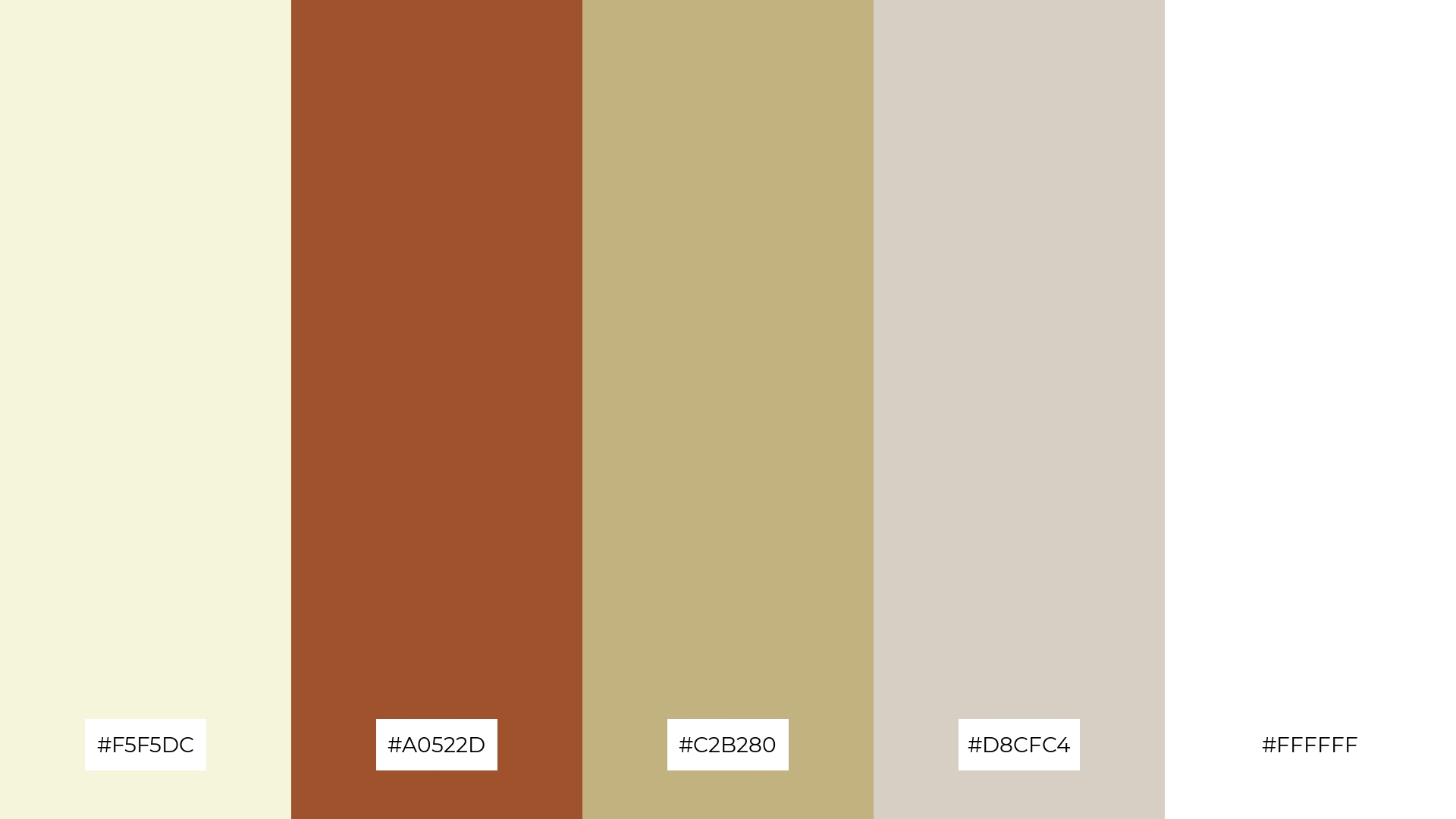
The ‘Warm Woods’ palette, with its blend of #F5F5DC, #A0522D, #C2B280, #D8CFC4, and #FFFFFF, conveys a sense of harmony when used in cozy interior makeovers, where the soft neutrals and rich browns create a balanced and inviting atmosphere.
Conversely, this palette can create a striking contrast in tech startup branding, where the interplay of light and dark hues can highlight innovation and modernity, making the design both visually engaging and sophisticated.
How to Use Brown White Patterns in Design
In home decor, brown and white color palettes can create a cozy and inviting atmosphere. Use white as the primary color for walls and larger furniture pieces to keep the space bright, while incorporating brown accents through wooden furniture, textiles, and decor items to add warmth and depth.
For marketing materials, the combination of brown and white can convey a sense of reliability and sophistication. Utilize white backgrounds to maintain a clean look and use brown for text, borders, and key elements to draw attention and create a professional appearance.
In clothing design, brown and white palettes can evoke a sense of timeless elegance. Opt for white garments with brown accessories or details to create a balanced and stylish look that is both modern and classic.
Ready to bring your design ideas to life? Try creating your own brown and white color palettes using Piktochart and see how these versatile hues can elevate your projects.


