 Piktochart Team
White, blue, and green color palettes offer a refreshing and versatile approach to design. These colors can evoke a sense of calm, clarity, and natural beauty.
Whether you're designing for digital or print, incorporating these hues can enhance the visual appeal and readability of your content. Let's explore how to effectively use white, blue, and green in your next project.
Creating a harmonious color palette with white, blue, and green can elevate your design to new heights.

The 'Ocean Breeze' color palette, with its soothing blend of light blues, teal, and white, creates a tranquil and refreshing mood reminiscent of a serene seaside escape.
Perfect for interior decor, this palette can transform a living space into a calming retreat, with the harmonious interaction of these colors evoking a sense of peace and relaxation.

The 'Serene Sky' color palette, with its blend of crisp white, soft aqua, and deep teal shades, evokes a sense of calmness and tranquility, making it ideal for wellness and spa branding.
This palette's soothing and refreshing tones would excel in digital branding for meditation apps or product packaging for organic skincare lines, creating an inviting and peaceful visual experience.

The 'Frosted Mint' color palette, featuring dominant shades of mint green and deep teal, creates a refreshing and invigorating visual experience.
Ideal for eco-friendly interior spaces, this palette's harmonious blend of cool tones fosters a sense of tranquility and natural elegance, making it perfect for promoting sustainability and wellness.

The 'Tranquil Waters' color palette, with its mix of soft whites and bold teals, offers a balanced and distinct mood that is both calming and invigorating.
This palette is ideal for creating inviting retail spaces or modern web designs, where the harmonious blend of colors can enhance the overall aesthetic and user experience.

The 'Coastal Calm' color palette, with its blend of #E0F7FA, #80DEEA, #009688, #004D40, and #FFFFFF, evokes a serene and refreshing ambiance reminiscent of a tranquil seaside escape.
This palette is perfect for wedding themes, where the harmonious interaction of these colors can create an elegant and peaceful atmosphere, making the special day even more memorable.

The 'Crystal Lagoon' color palette, with its blend of crisp white, soft aqua, and deep teal, creates a sophisticated and serene mood, perfect for minimalistic branding that aims to convey elegance and clarity.
This palette's harmonious interaction of colors can also be leveraged in bold event designs, where the deep teal and aqua shades add a touch of playfulness and vibrancy, making the event visually captivating and memorable.

The 'Minty Fresh' color palette, with its contrasting elements of soft pastels and bold teals, creates a dynamic visual interest that captures attention and adds depth to any design.
This palette is ideal for creative projects like magazine layouts or artistic websites, where the interplay of light and dark shades can enhance readability and provide a visually engaging experience.

The 'Aqua Dream' color palette, with its blend of #E0FFFF, #B2EBF2, #009688, #004D40, and #FFFFFF, can evoke a sense of calm when the lighter shades are used predominantly, creating a serene and soothing atmosphere perfect for spa branding.
Conversely, incorporating the bolder hues like #009688 and #004D40 can inject excitement and energy into vibrant marketing campaigns, making the design visually striking and engaging.

The 'Soft Serenity' color palette, with its blend of #FFFFFF, #B2DFDB, #009688, #00796B, and #004D40, features softer and brighter tones that create a calming and refreshing atmosphere.
This harmonious mix is ideal for home decor, where the soothing colors can transform any space into a serene retreat, or for seasonal promotions that aim to evoke a sense of tranquility and renewal.

The 'Gentle Waves' color palette, with its blend of #F0FFFF, #A7FFEB, #0097A7, #00796B, and #80DEEA, creates a visual flow that evokes a sense of tranquility and calm, making it perfect for designs that aim to soothe and relax the viewer.
This palette's serene and refreshing tones are ideal for lifestyle branding, such as wellness products or eco-friendly tech packaging, where the harmonious interaction of these colors can enhance the emotional appeal and convey a message of peace and sustainability.

The 'Celestial Waters' color palette, with its blend of #E0F7FA, #B2EBF2, #009688, #004D40, and #FFFFFF, creates a welcoming effect by combining soft, airy tones with deeper, grounding hues, making any design feel both inviting and sophisticated.
This palette shines in luxury e-commerce sites, where the harmonious interaction of these colors can enhance the user experience by providing a visually appealing and elegant atmosphere that encourages exploration and engagement.

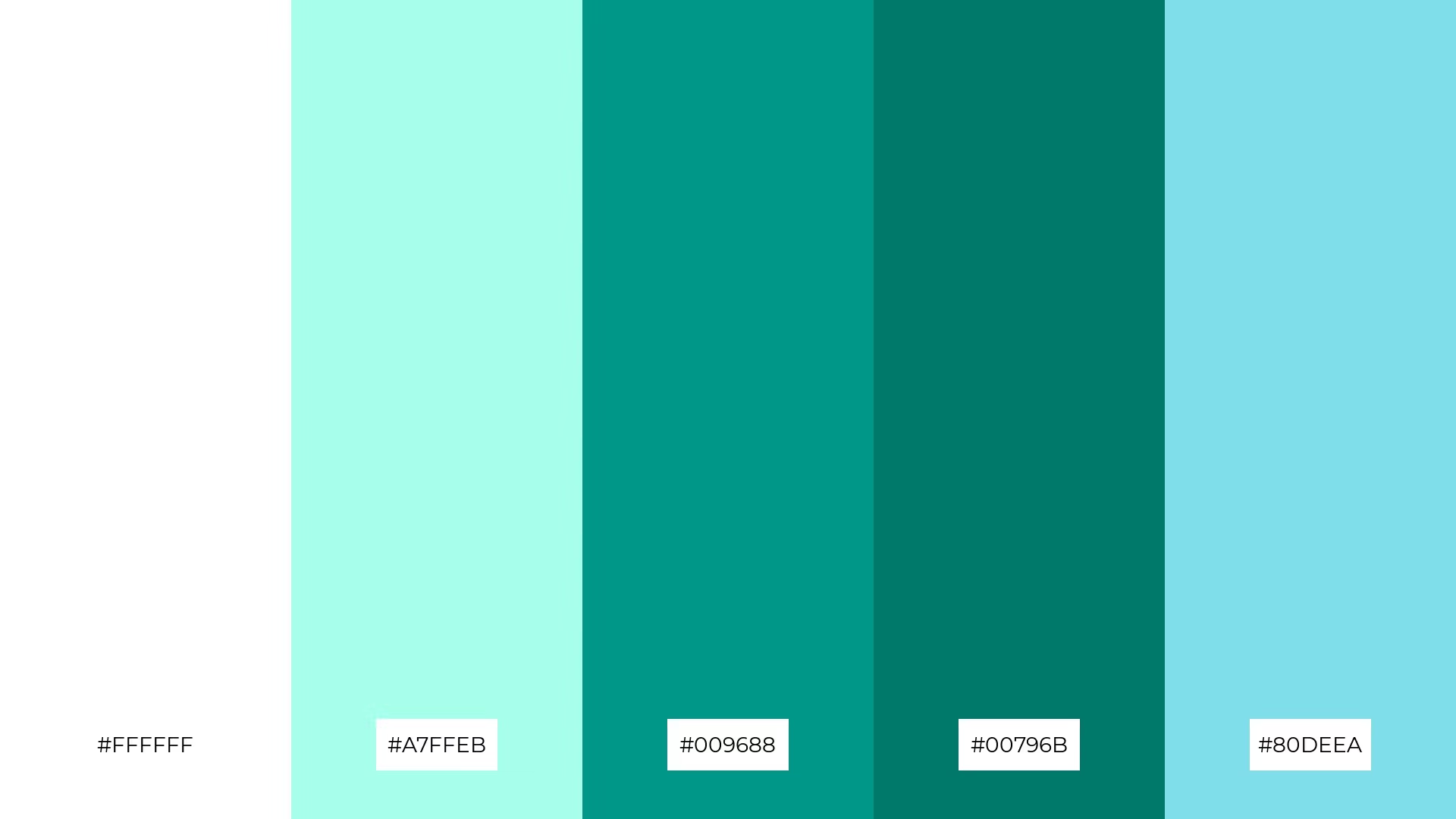
The 'Refreshing Oasis' color palette, with its blend of #FFFFFF, #A7FFEB, #009688, #00796B, and #80DEEA, creates a harmonious balance where the crisp white and soft aqua tones provide a refreshing backdrop, while the deeper teal and green hues add depth and sophistication.
This palette is ideal for sleek corporate branding, where the interplay of light and dark shades can convey professionalism and modernity, making the brand appear both approachable and authoritative.

The 'Ethereal Blue' color palette, with its blend of warm and cool tones, creates a balanced and inviting mood that is both calming and invigorating.
This palette is perfect for artisan product branding, where the harmonious interaction of these colors can enhance the handcrafted appeal and convey a sense of authenticity and quality.

The 'Dreamy Lagoon' color palette, with its blend of #E0F7FA, #B2EBF2, #009688, #004D40, and #FFFFFF, offers a dynamic interaction between soft, airy tones and bold, grounding hues, creating a visually captivating and balanced design.
This palette is perfect for festival marketing, where the vibrant teals and calming whites can create an inviting and energetic atmosphere, making promotional materials stand out and capture the festive spirit.

The 'Calm Reflections' color palette, with its blend of #FFFFFF, #A7FFEB, #009688, #00796B, and #80DEEA, conveys a sense of harmony when the lighter shades are used predominantly, creating a serene and cohesive visual experience.
This palette is ideal for tech startups aiming to create a modern and inviting user interface, or for cozy interior makeovers where the interplay of light and dark hues can add depth and warmth to the space.
In home decor, a white, blue, and green color palette can create a serene and inviting atmosphere. Use white as the primary color for walls and larger furniture pieces, while incorporating blue and green through accent items like cushions, rugs, and artwork to add depth and interest.
For marketing materials, this palette can convey professionalism and trust. Utilize white for backgrounds to keep the design clean, blue for headings to draw attention, and green for call-to-action buttons to encourage engagement. This combination ensures your message is clear and visually appealing.
In clothing design, a mix of white, blue, and green can create fresh and stylish outfits. Pair white tops with blue jeans and green accessories for a balanced look that is both modern and timeless. Experiment with different shades to find the perfect harmony for your collection.
Ready to bring your design ideas to life? Try creating your own white, blue, and green color palettes using Piktochart and see how these versatile hues can transform your projects.