Sapphire color palettes are a stunning choice for any design project, offering a range of deep blues that evoke elegance and sophistication. These palettes can transform a simple graphic into a visually captivating masterpiece.
From the rich hues of royal blue to the subtle shades of sky blue, sapphire color palettes provide versatility and depth. Whether you’re designing an infographic or a presentation, these colors can add a touch of class and professionalism.
Tips For Creating Sapphire Color Palettes
Designing with sapphire color palettes can elevate your visuals to new heights. Here are some practical tips to help you make the most of these stunning hues:
- Balance your colors: Use a mix of light and dark sapphire shades to create a harmonious and visually appealing design.
- Match complementary shades: Pair sapphire with colors like gold or coral to create striking contrasts that draw attention.
- Use neutral tones: Incorporate whites, grays, or blacks to balance the intensity of sapphire and avoid overwhelming the viewer.
- Experiment with gradients: Blend different sapphire shades to add depth and dimension to your design.
- Consider the context: Think about where and how your design will be used to ensure the sapphire palette fits the overall theme and purpose.
- Test versatility: Ensure your sapphire palette works well across various mediums, from digital screens to printed materials.
15 Sapphire Color Palettes
1) Ocean Depths
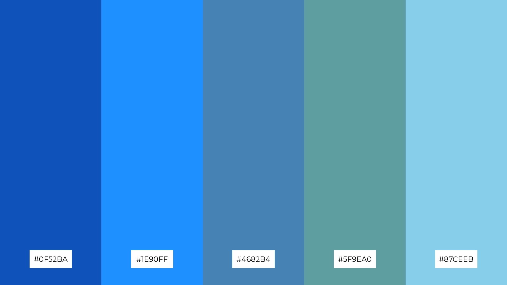
The ‘Ocean Depths’ color palette, with its range of blues from deep navy to light sky, creates a serene and calming mood that evokes the tranquility of the sea.
These colors interact seamlessly to produce a cohesive look, making them ideal for interior decor where a peaceful and refreshing atmosphere is desired, such as in a coastal-themed living room.
2) Twilight Sky
The ‘Twilight Sky’ color palette, with its blend of deep blues and purples, evokes a sense of calmness and mystery, reminiscent of the serene moments just after sunset.
This palette would excel in digital branding for wellness apps, where the soothing hues can create a tranquil user experience that encourages relaxation and mindfulness.
3) Sapphire Sunset
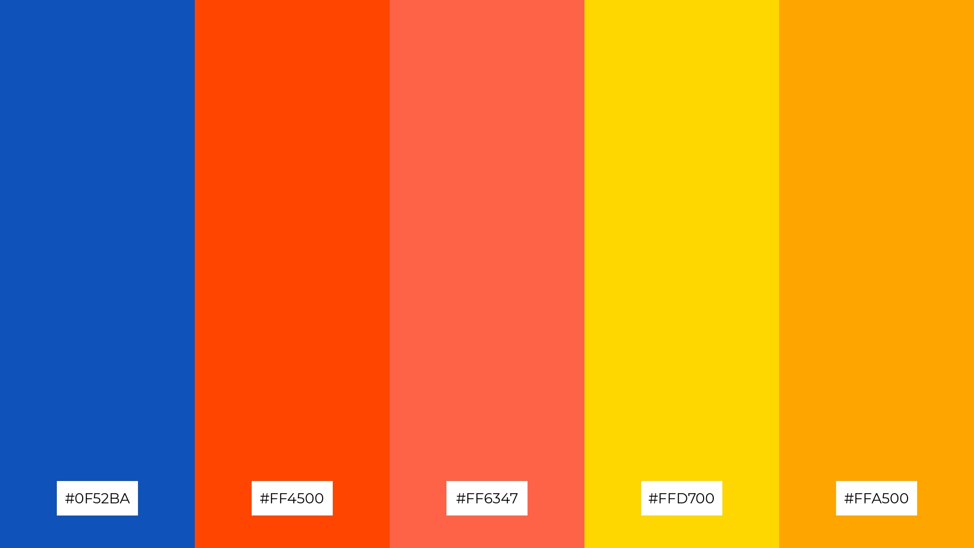
The ‘Sapphire Sunset’ palette features dominant colors like deep blue (#0F52BA), vibrant orange (#FF4500), and warm gold (#FFD700), creating a striking balance between cool and warm tones.
This harmonious blend is perfect for eco-friendly interior spaces, where the combination of natural hues can evoke a sense of balance and connection to the environment.
4) Midnight Sapphire
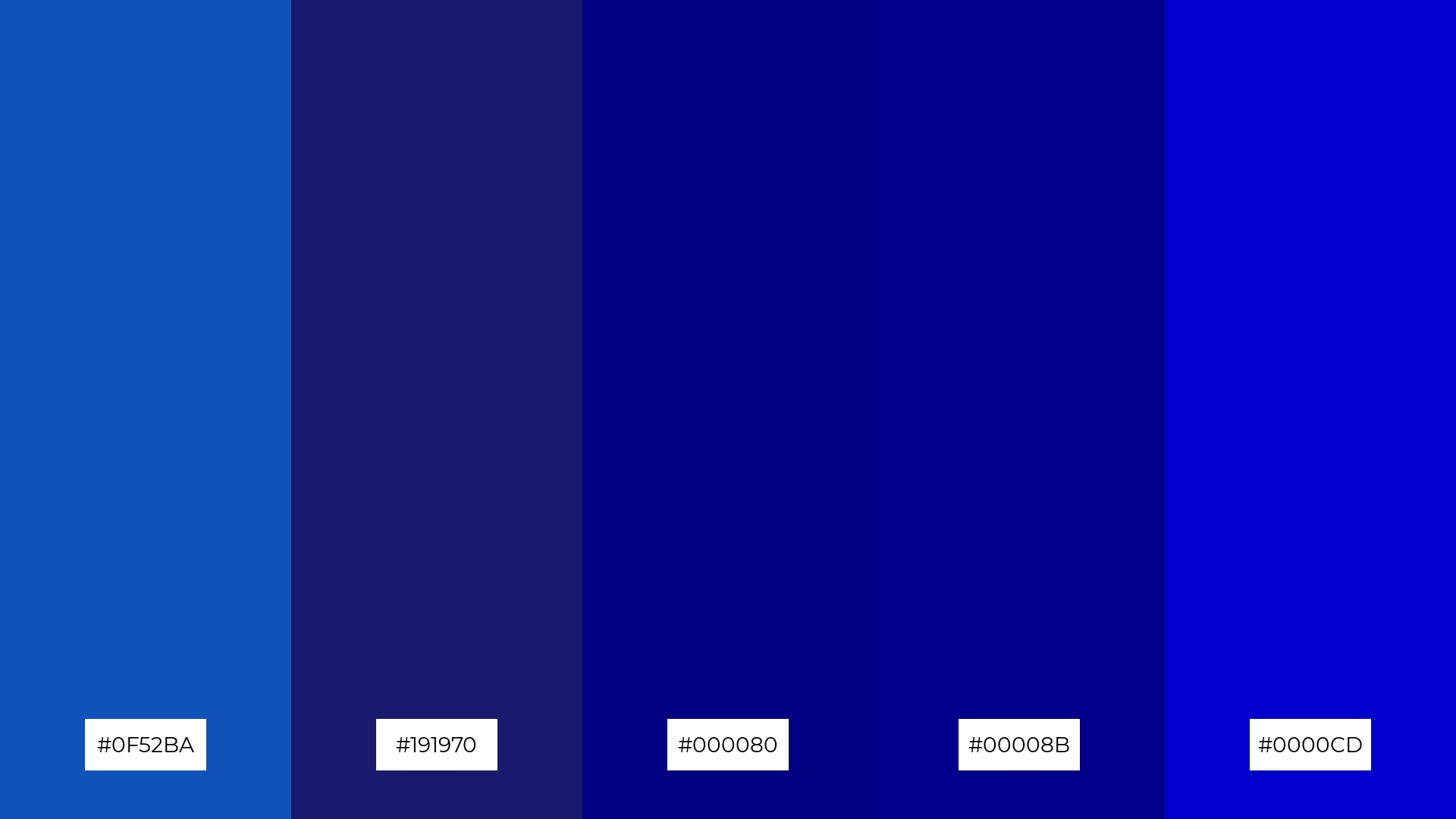
The ‘Midnight Sapphire’ palette, with its blend of soft and bold tones like #0F52BA and #00008B, creates a distinct mood that is both inviting and sophisticated.
This palette is ideal for modern web designs, where the rich blues can enhance user engagement and create a sleek, professional look.
5) Sapphire Forest
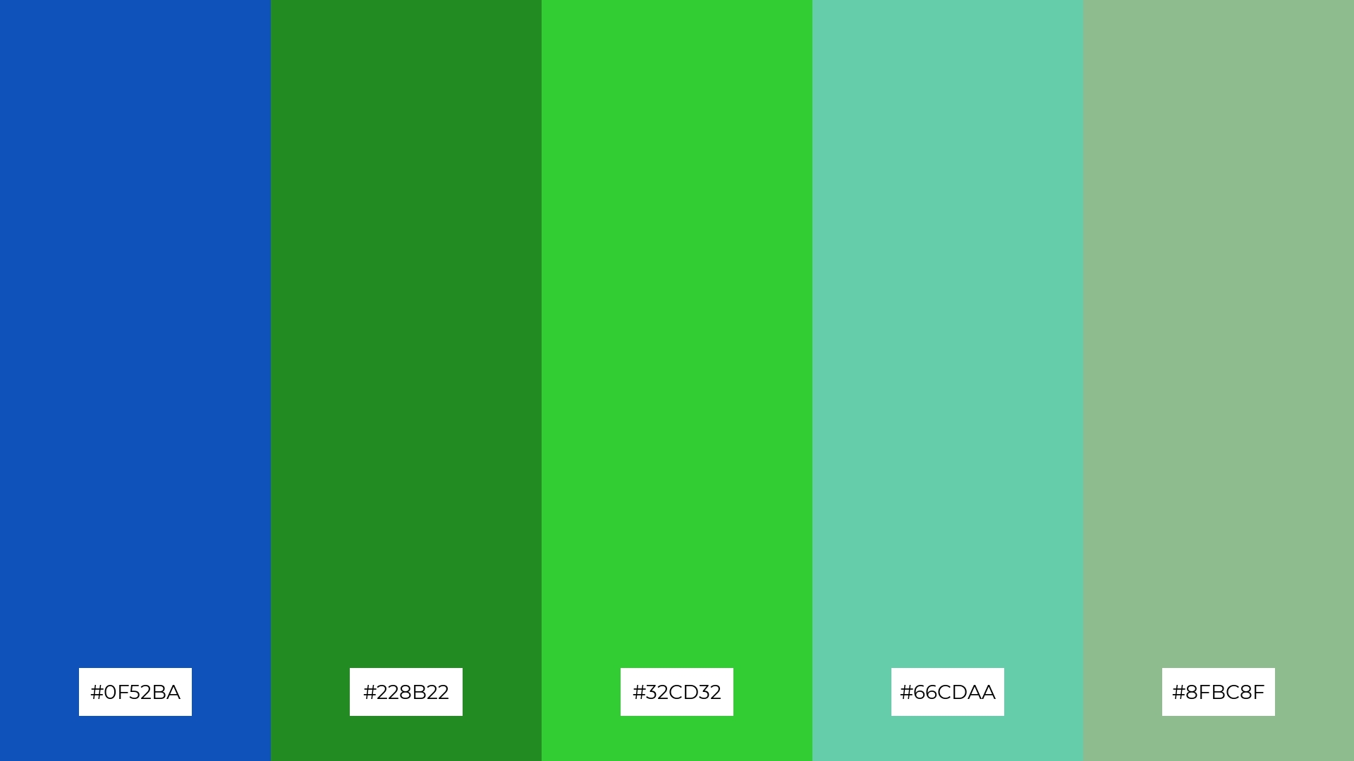
The ‘Sapphire Forest’ palette, with its blend of deep blue (#0F52BA) and various shades of green (#228B22, #32CD32, #66CDAA, #8FBC8F), creates a serene and refreshing ambiance reminiscent of a tranquil forest.
This harmonious combination is perfect for wedding themes, where the natural hues can evoke a sense of calm and elegance, making the event feel both intimate and luxurious.
6) Sapphire Blossom
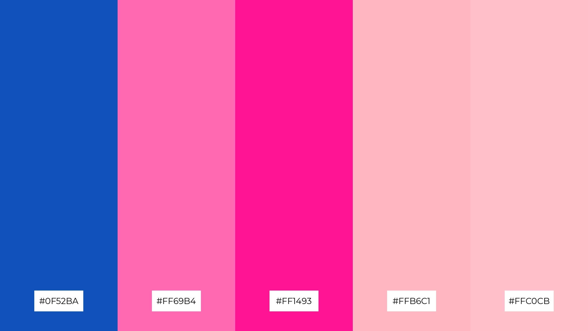
The ‘Sapphire Blossom’ palette, with its mix of deep blue (#0F52BA) and various shades of pink (#FF69B4, #FF1493, #FFB6C1, #FFC0CB), creates a vibrant and playful mood that can add a touch of whimsy to any design.
This color harmony is perfect for bold event designs, where the striking contrast between the cool blue and warm pinks can create an eye-catching and memorable visual experience.
7) Sapphire Sands
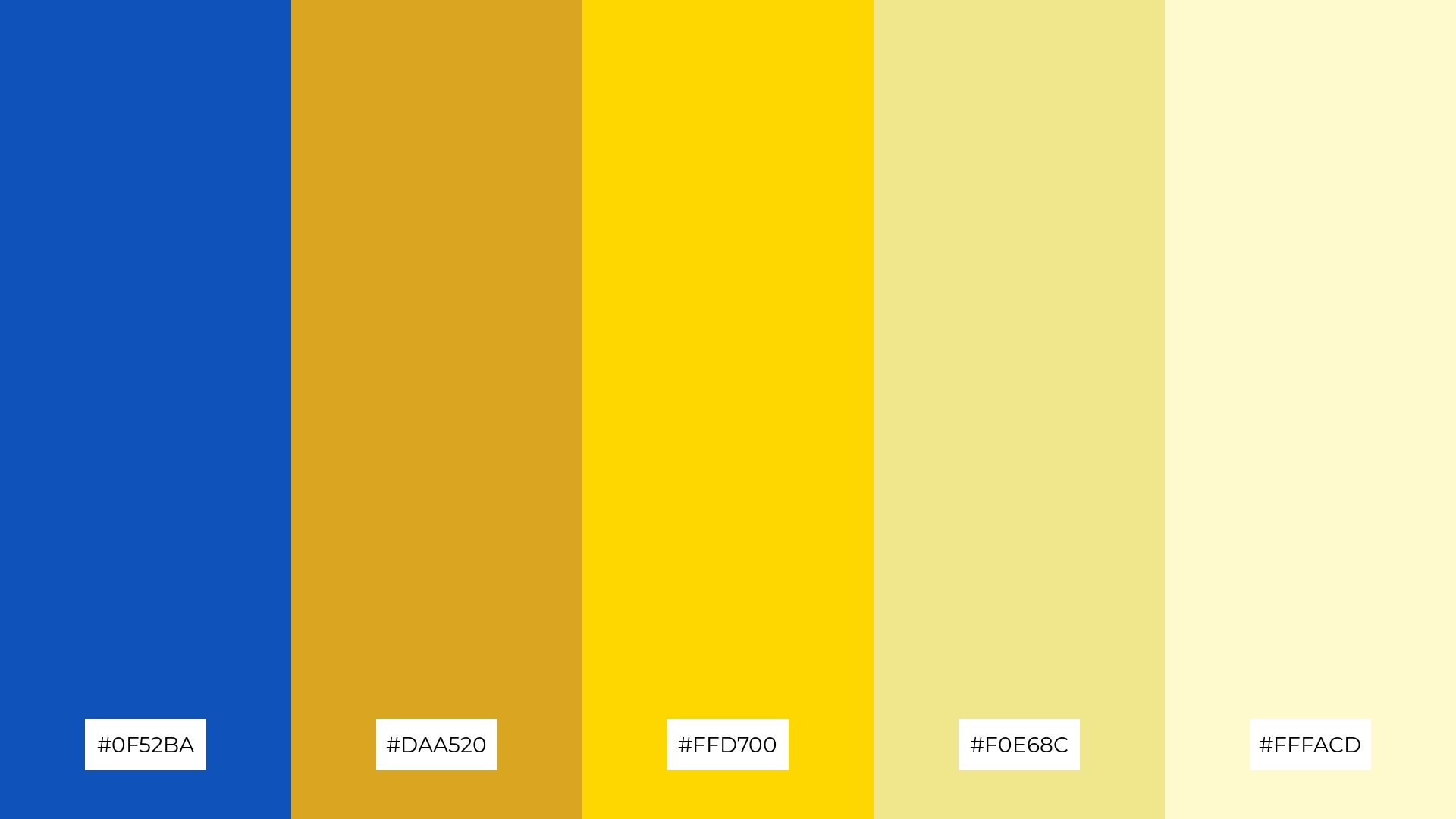
The ‘Sapphire Sands’ palette, with its mix of deep blue (#0F52BA) and warm gold tones (#DAA520, #FFD700, #F0E68C, #FFFACD), creates a striking contrast that adds visual interest and depth to any design.
This dynamic combination is perfect for creative projects like magazine layouts or artistic websites, where the interplay of cool and warm hues can captivate the audience and enhance the overall aesthetic appeal.
8) Sapphire Ice
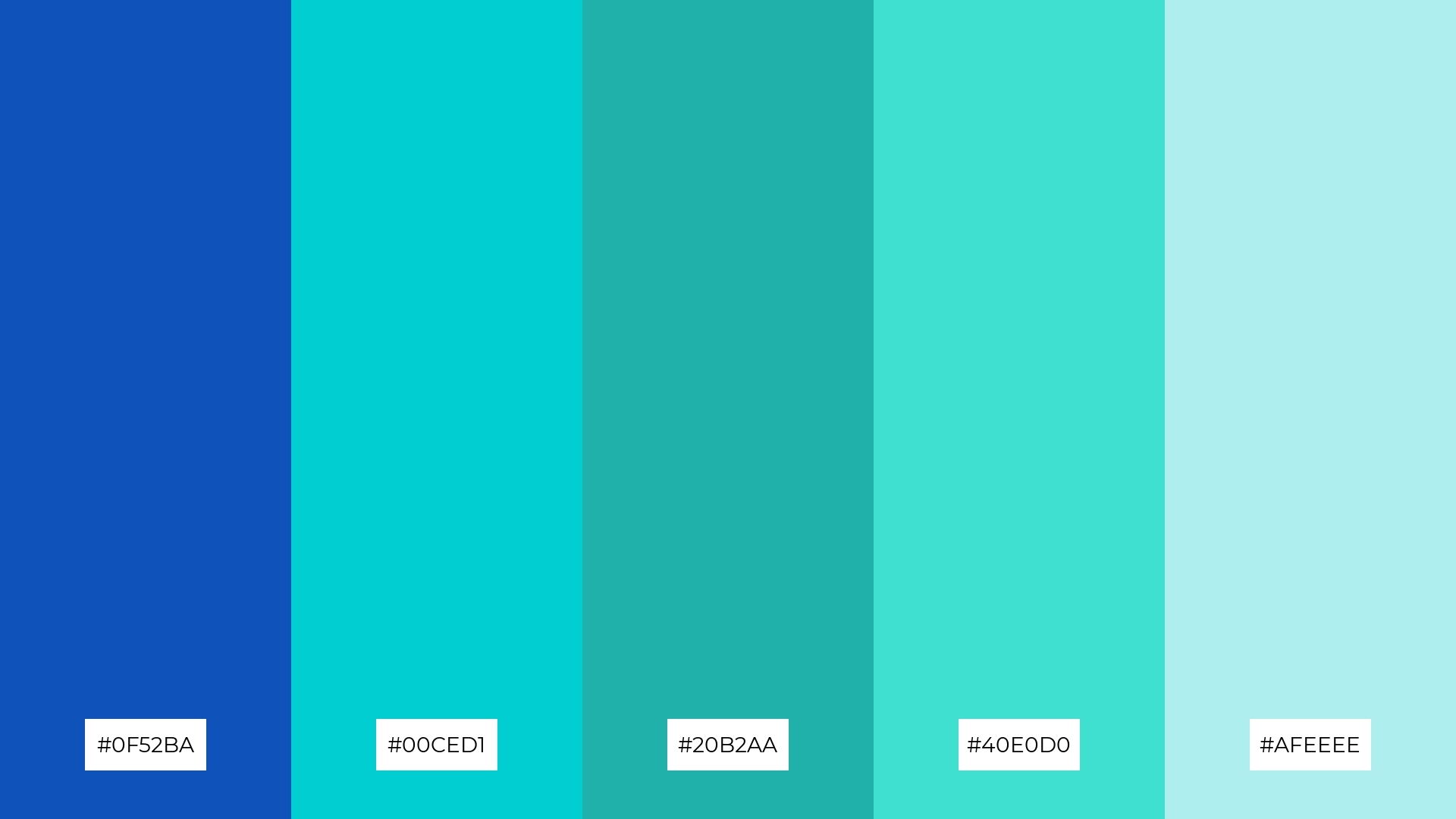
The ‘Sapphire Ice’ palette, with its blend of deep blue (#0F52BA) and various shades of turquoise and aqua (#00CED1, #20B2AA, #40E0D0, #AFEEEE), can evoke a sense of calm when used in soft gradients or paired with neutral tones.
This versatile palette is perfect for spa branding, where the cool, refreshing hues can create a serene and relaxing atmosphere, or for vibrant marketing campaigns, where the bright, energetic colors can capture attention and convey a sense of excitement.
9) Sapphire Flame
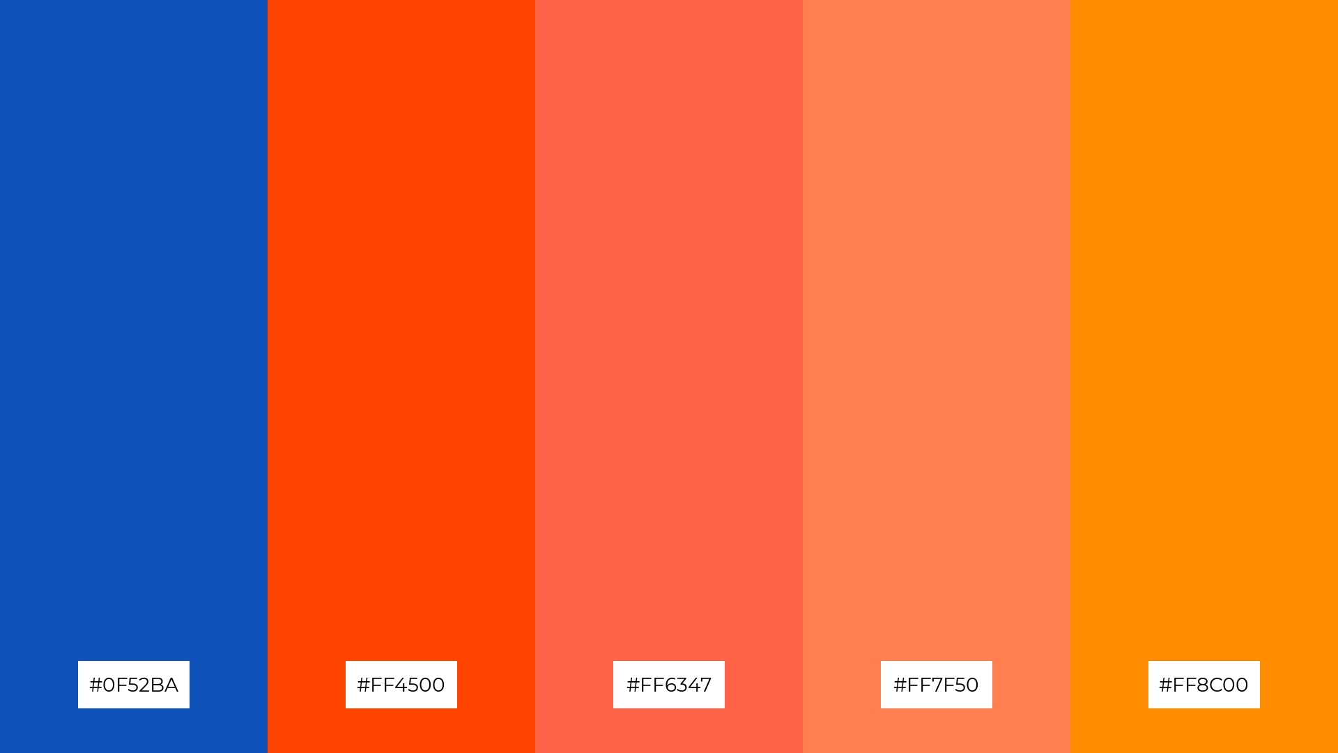
The ‘Sapphire Flame’ palette, with its mix of deep blue (#0F52BA) and brighter tones like #FF4500, #FF6347, #FF7F50, and #FF8C00, creates a vibrant and energetic mood that can invigorate any design.
This dynamic blend is perfect for seasonal promotions, where the striking contrast between the cool blue and warm oranges can capture attention and convey a sense of excitement and warmth.
10) Sapphire Meadow
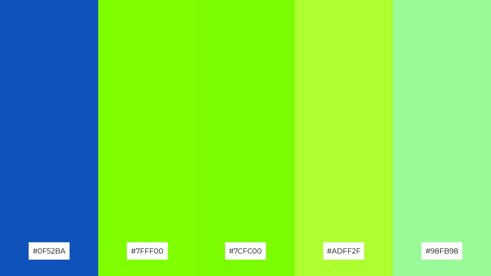
The ‘Sapphire Meadow’ palette, with its blend of deep blue (#0F52BA) and vibrant greens (#7FFF00, #7CFC00, #ADFF2F, #98FB98), creates a visual flow that evokes a sense of tranquility and rejuvenation, making it perfect for designs aimed at promoting relaxation and well-being.
This harmonious combination is ideal for lifestyle branding, such as eco-friendly product lines or wellness apps, where the soothing yet refreshing hues can enhance the user experience and convey a message of natural harmony and vitality.
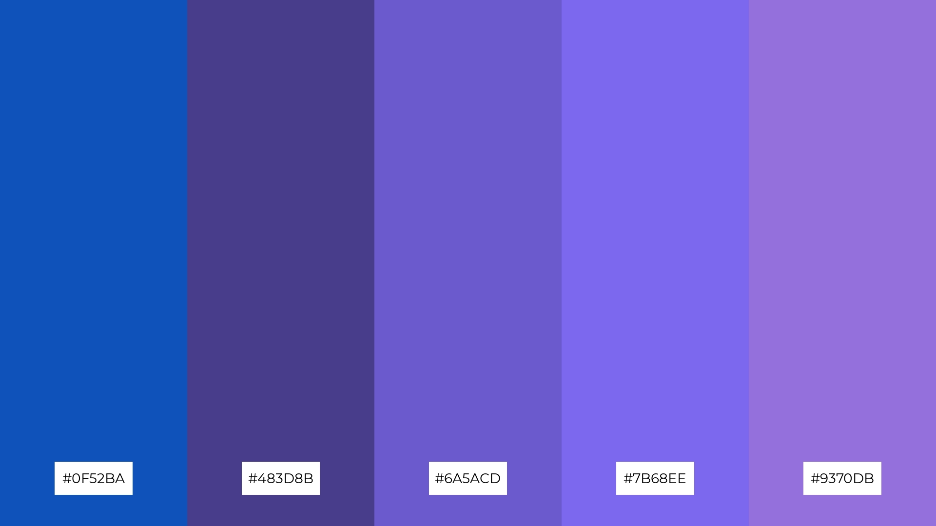
11) Sapphire Dream
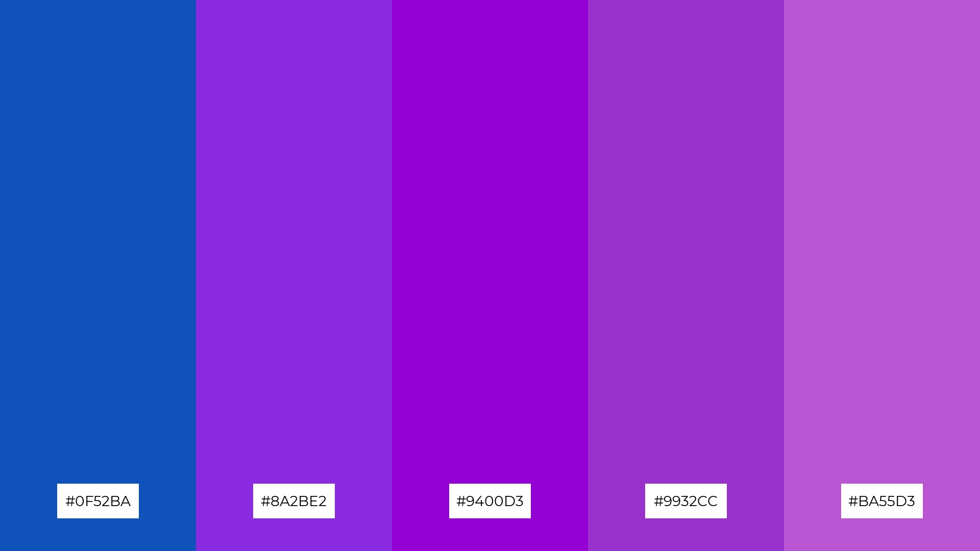
The ‘Sapphire Dream’ palette, with its blend of deep blue (#0F52BA) and rich purples (#8A2BE2, #9400D3, #9932CC, #BA55D3), creates a dramatic and luxurious effect that can captivate and engage viewers.
This striking combination is perfect for luxury e-commerce sites, where the opulent hues can enhance the perception of exclusivity and sophistication, making the shopping experience feel more premium and inviting.
12) Sapphire Mist
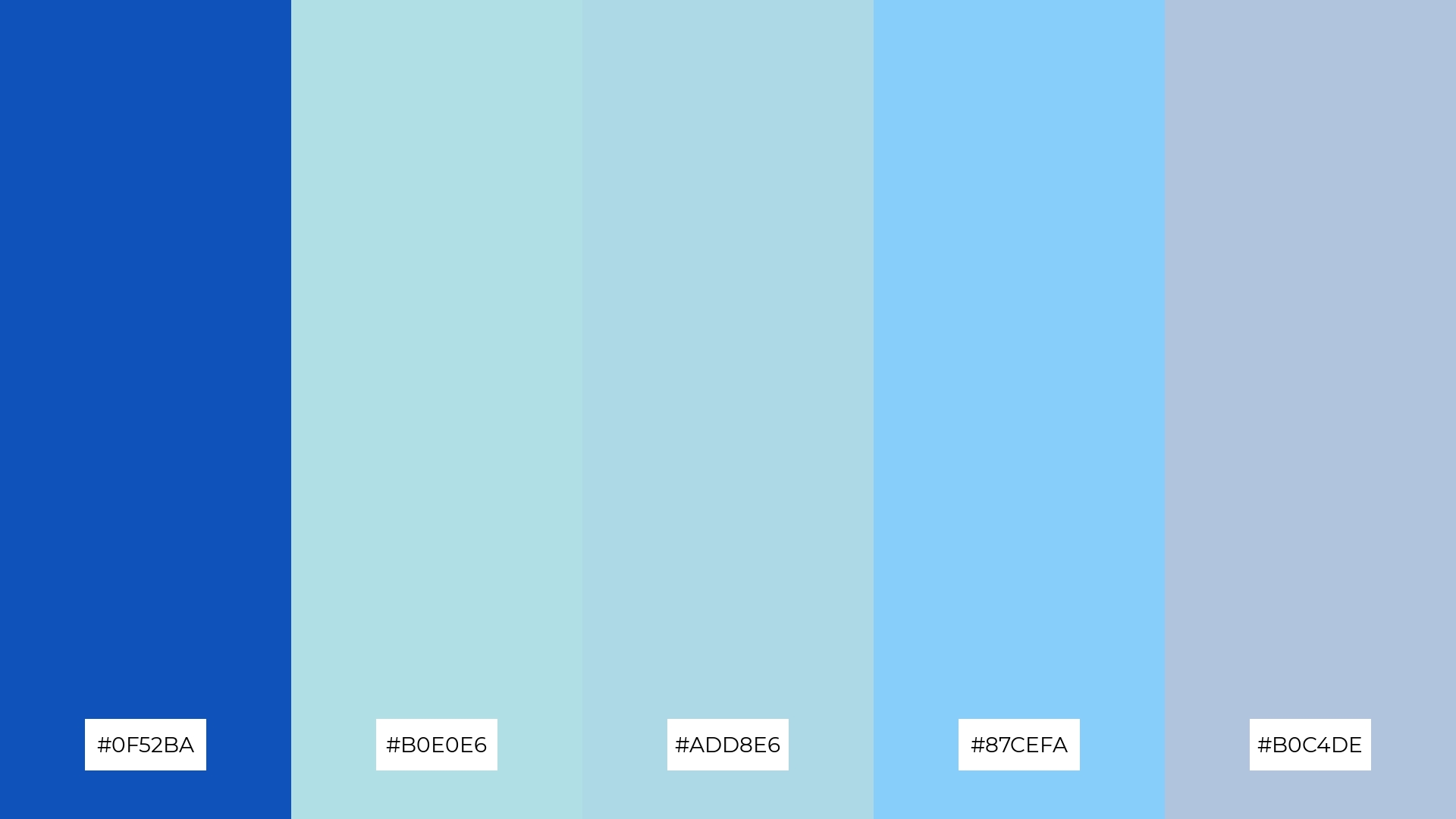
The ‘Sapphire Mist’ palette, with its blend of deep blue (#0F52BA) and lighter shades like #B0E0E6, #ADD8E6, #87CEFA, and #B0C4DE, creates a harmonious balance that evokes a sense of calm and serenity.
This soothing combination is perfect for sleek corporate branding, where the subtle contrasts between the deep and light blues can convey professionalism and trustworthiness while maintaining a modern and approachable aesthetic.
13) Sapphire Coral
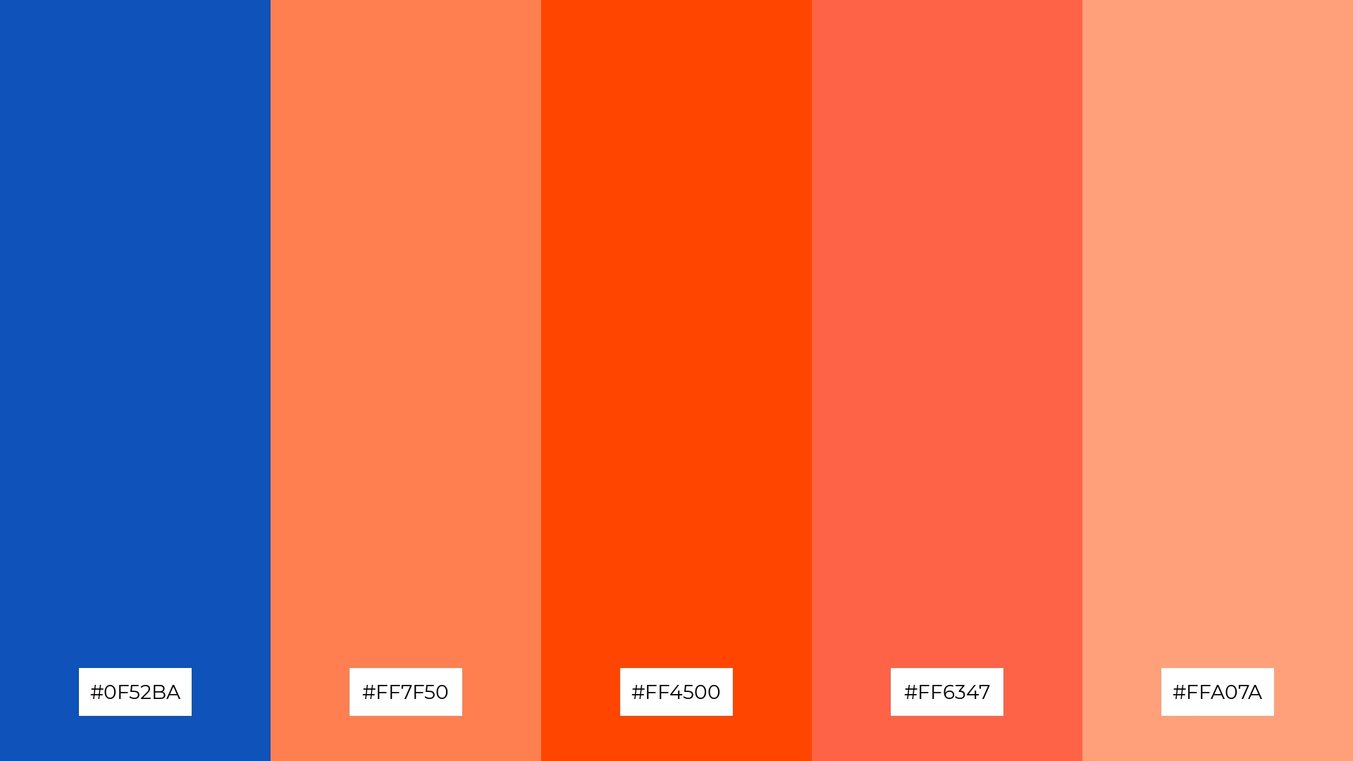
The ‘Sapphire Coral’ palette, with its blend of deep blue (#0F52BA) and warm coral tones (#FF7F50, #FF4500, #FF6347, #FFA07A), creates a vibrant and inviting mood that balances cool sophistication with energetic warmth.
This dynamic combination is perfect for artisan product branding, where the striking contrast between the cool blue and warm corals can highlight the craftsmanship and uniqueness of handmade goods, making them stand out in a crowded market.
14) Sapphire Twilight
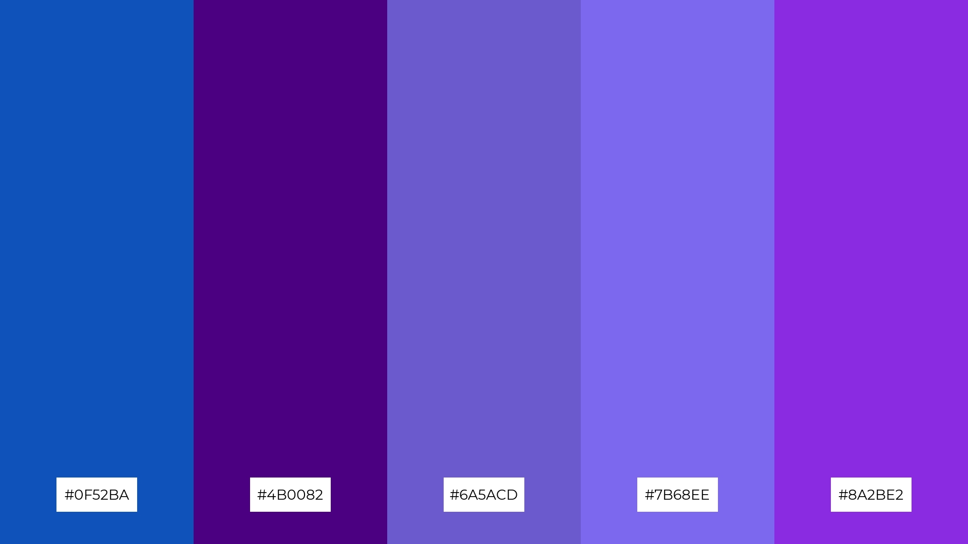
The ‘Sapphire Twilight’ palette, with its blend of deep blue (#0F52BA) and rich purples (#4B0082, #6A5ACD, #7B68EE, #8A2BE2), creates a dynamic interplay of bold and subtle hues that can evoke a sense of mystery and elegance.
This striking combination is perfect for festival marketing, where the vibrant and contrasting colors can capture attention and convey a sense of excitement and sophistication, making the event feel both exclusive and inviting.
15) Sapphire Harvest
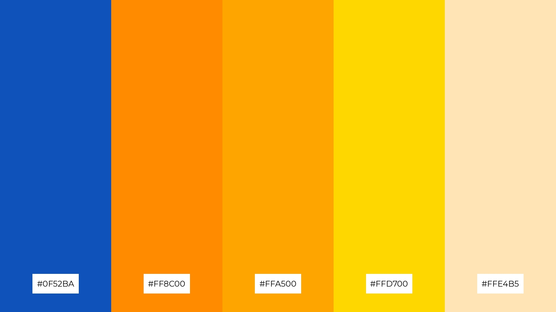
The ‘Sapphire Harvest’ palette, with its blend of deep blue (#0F52BA) and warm autumnal tones (#FF8C00, #FFA500, #FFD700, #FFE4B5), can convey a sense of harmony when used to create a balanced and inviting atmosphere.
This versatile combination is ideal for tech startups aiming to foster creativity and innovation, or for cozy interior makeovers where the warm hues can create a welcoming and comfortable space.
How to Use Sapphire Patterns in Design
In home decor, sapphire color palettes can be used to create a serene and sophisticated atmosphere. Pair deep blues with neutral tones like white or beige to balance the intensity and add a touch of elegance to any room. Consider using sapphire accents in throw pillows, rugs, or wall art to create focal points that draw the eye.
For marketing materials, sapphire palettes can convey professionalism and trustworthiness. Use a mix of light and dark sapphire shades to create visually appealing brochures, business cards, or social media graphics. Complement these hues with contrasting colors like gold or coral to make your designs stand out and capture attention.
In clothing design, sapphire colors can add a sense of luxury and depth. Incorporate these hues into your fabric choices for a rich, sophisticated look that can be both timeless and trendy. Pair sapphire with metallic accessories to enhance the overall aesthetic and create a polished, cohesive outfit.
Ready to elevate your designs with stunning sapphire color palettes? Try creating your own using Piktochart and see how these versatile hues can transform your projects.


