 Piktochart Team
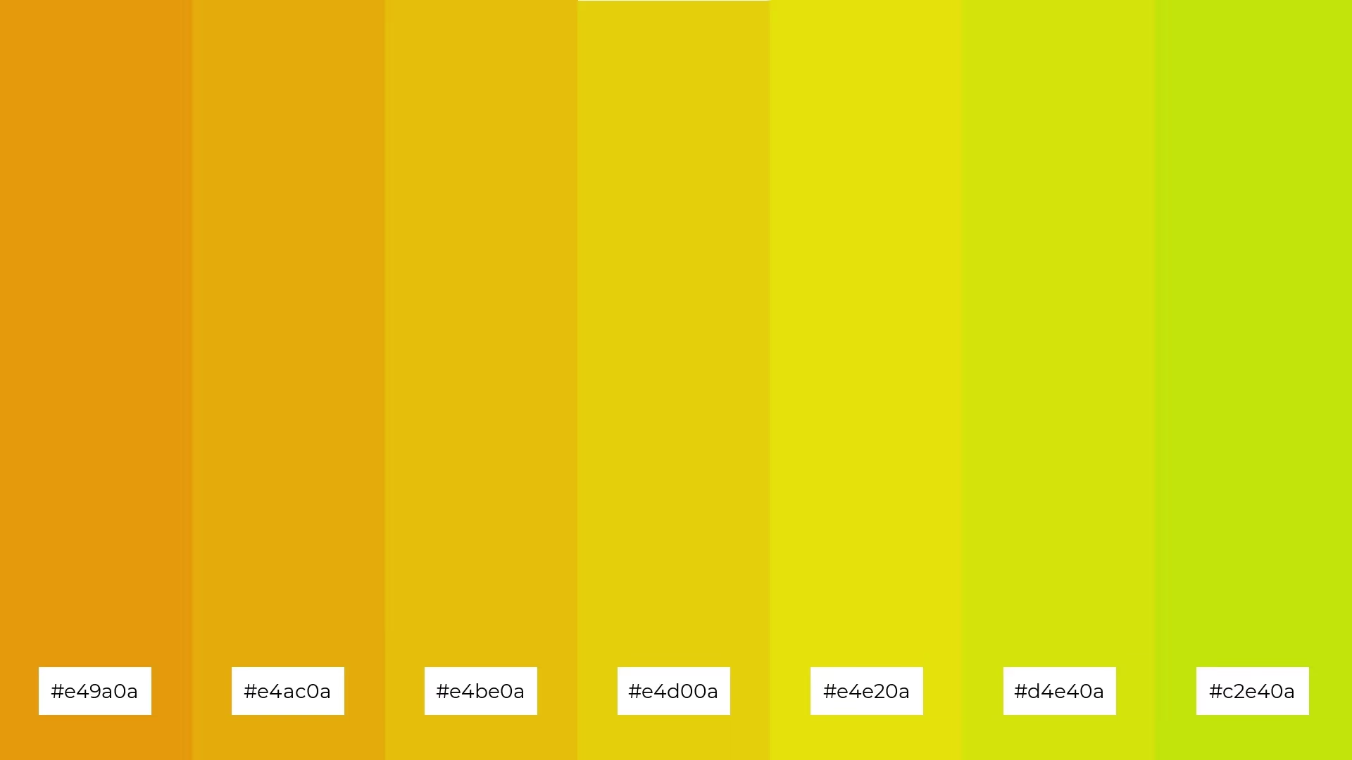
The color Citrine is a vibrant yellow-orange that exudes warmth and energy. Named after the gemstone, Citrine is reminiscent of the sun's golden rays and is often associated with positivity and clarity.
Citrine's origins can be traced back to ancient times when the gemstone was highly valued for its rarity and beauty. This color is perfect for creating cheerful and inviting spaces, making it an excellent choice for living rooms, kitchens, and creative workspaces.
Citrine is a striking yellow-orange hue that captures the essence of a sunlit morning, often seen in the vibrant petals of marigolds and the rich tones of autumn leaves. Its unique blend of warmth and brightness makes it stand out in any setting.

Citrine is commonly associated with the following attributes:
In various cultures, Citrine symbolizes prosperity and success. Historically, it was believed to carry the power of the sun, bringing warmth and vitality to those who wore it.
Here are some alternatives to the color Citrine:

Citrine and Teal (#e4d00a, #008080)
This combination pairs the warmth of Citrine with the cool, calming effect of Teal. The contrast between the vibrant yellow-orange and the deep blue-green creates a striking balance that is both eye-catching and harmonious. This duo is perfect for designs that need a touch of sophistication and energy.
Citrine, Coral, and Peach (#e4d00a, #ff7f50, #ffdab9)
Combining Citrine with Coral and Peach results in a warm, inviting palette that exudes positivity and cheerfulness. The blend of these colors creates a gradient effect that is visually appealing and perfect for creating a cozy, welcoming atmosphere. This trio works well in spaces meant for relaxation and socializing.
Citrine, Olive, and Forest Green (#e4d00a, #808000, #228b22)
Pairing Citrine with Olive and Forest Green brings a touch of nature into any design. The earthy tones of Olive and Forest Green complement the bright, sunny hue of Citrine, creating a balanced and refreshing look. This combination is ideal for projects that aim to evoke a sense of growth, renewal, and vitality.
Using citrine in your design can instantly uplift the mood and create a sense of warmth and energy. This vibrant yellow-orange hue communicates positivity, clarity, and optimism, making it perfect for spaces that need a cheerful and invigorating touch.
citrine is often applied in contexts where a lively and inviting atmosphere is desired. It is commonly used in living rooms, kitchens, and creative workspaces to foster an environment of creativity and enthusiasm. Additionally, citrine is a popular choice in branding and marketing materials to convey a message of success and prosperity.