Bronze color palettes bring a touch of elegance and warmth to any design project. This versatile hue can be used to create sophisticated and inviting visuals.
From rich, dark tones to lighter, shimmering shades, bronze offers a range of options for designers. Whether you’re working on a website, infographic, or presentation, incorporating bronze can elevate your work.
Tips For Creating Bronze Color Palettes
Designing with bronze can be both rewarding and challenging, but with the right approach, you can create stunning visuals.
- Balance with Neutrals: Pair bronze with neutral colors like white, beige, or gray to create a balanced and harmonious look.
- Complementary Shades: Use complementary colors such as teal or navy blue to make the bronze elements pop and add depth to your design.
- Gradients and Textures: Experiment with gradients and textures to add dimension and interest to your bronze color palette.
- Accent Colors: Incorporate accent colors like gold or copper to enhance the richness of bronze and create a cohesive theme.
- Versatility: Ensure your palette is versatile by including both light and dark shades of bronze, allowing for flexibility in different design contexts.
- Test and Iterate: Always test your color combinations in various settings and be prepared to iterate until you achieve the desired effect.
15 Bronze Color Palettes
1) Autumn Bronze
The ‘Autumn Bronze’ palette evokes a sense of warmth and coziness, with each shade blending seamlessly to create a harmonious and inviting atmosphere.
Perfect for interior decor, this palette’s defining characteristic is its ability to transform a space into a luxurious and comforting retreat, making it ideal for living rooms or bedrooms.
2) Desert Mirage
The ‘Desert Mirage’ palette, with its earthy tones and golden highlights, evokes a sense of warmth and tranquility, reminiscent of a serene desert landscape at sunset.
This palette would excel in product packaging for natural skincare brands, where the calming and inviting colors can convey a message of organic and soothing ingredients.
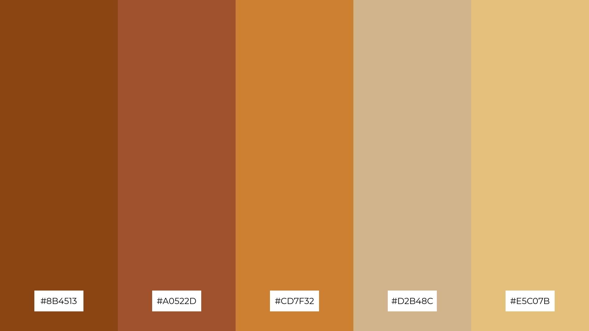
3) Rustic Elegance
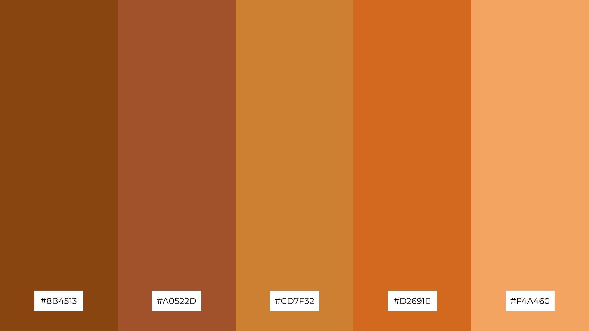
The ‘Rustic Elegance’ palette features dominant colors such as deep sienna (#8B4513), sienna (#A0522D), bronze (#CD7F32), chocolate (#D2691E), and sandy brown (#F4A460), creating a rich and cohesive visual experience.
These earthy tones harmonize beautifully, making the palette ideal for wellness branding, where the natural and soothing colors can evoke a sense of calm and well-being.
4) Sunset Glow
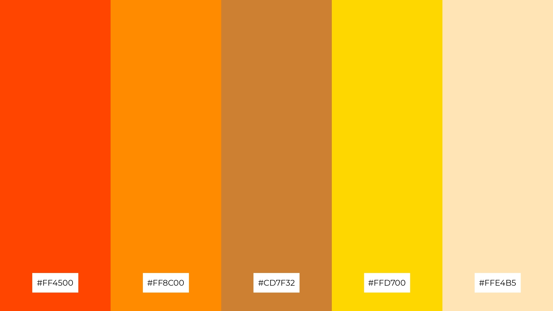
The ‘Sunset Glow’ palette, with its blend of soft and bold tones like #FF4500, #FF8C00, #CD7F32, #FFD700, and #FFE4B5, creates a distinct mood that is both vibrant and soothing.
This palette is ideal for creating inviting retail spaces or modern web designs, where the warm and dynamic colors can attract attention and evoke a sense of comfort.
5) Vintage Charm
The ‘Vintage Charm’ palette, with its deep reds and warm golds, creates an ambiance of timeless elegance and sophistication, perfect for evoking a sense of nostalgia and refinement.
This palette is ideal for luxury fashion campaigns, where the rich and harmonious colors can enhance the opulence and allure of high-end garments and accessories.
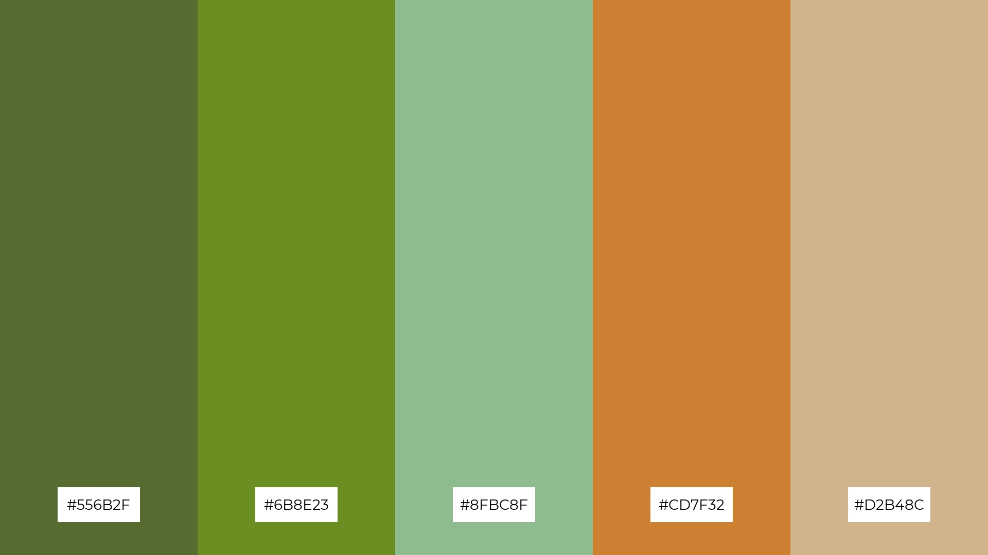
6) Earthy Tones
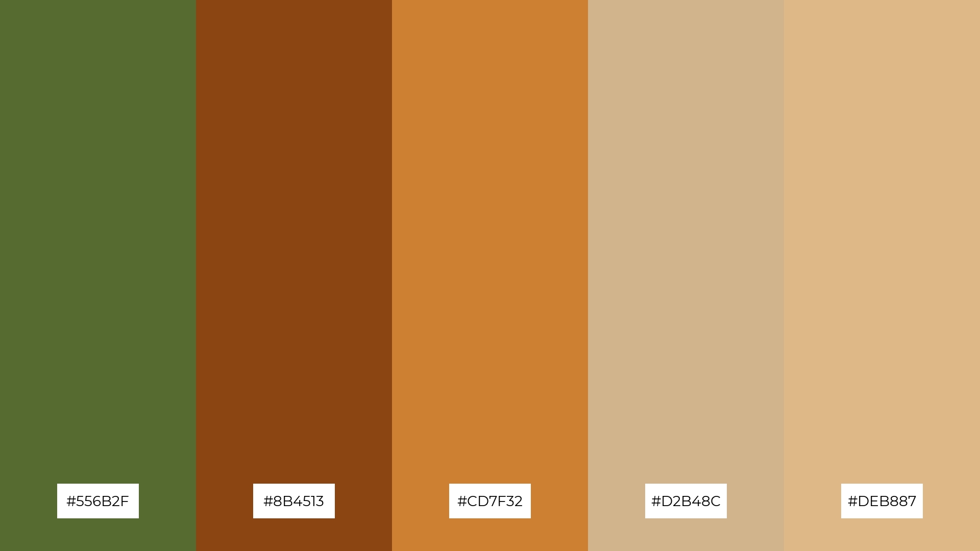
The ‘Earthy Tones’ palette, with its harmonious blend of olive drab (#556B2F), saddle brown (#8B4513), bronze (#CD7F32), tan (#D2B48C), and burly wood (#DEB887), can evoke a mood of sophistication and grounded elegance, making it perfect for minimalistic branding that seeks to convey a sense of stability and reliability.
Alternatively, this palette’s rich and warm hues can be utilized in bold event designs, where the natural and inviting colors can create an atmosphere of warmth and inclusivity, ideal for gatherings that aim to foster a sense of community and connection.
7) Golden Sands
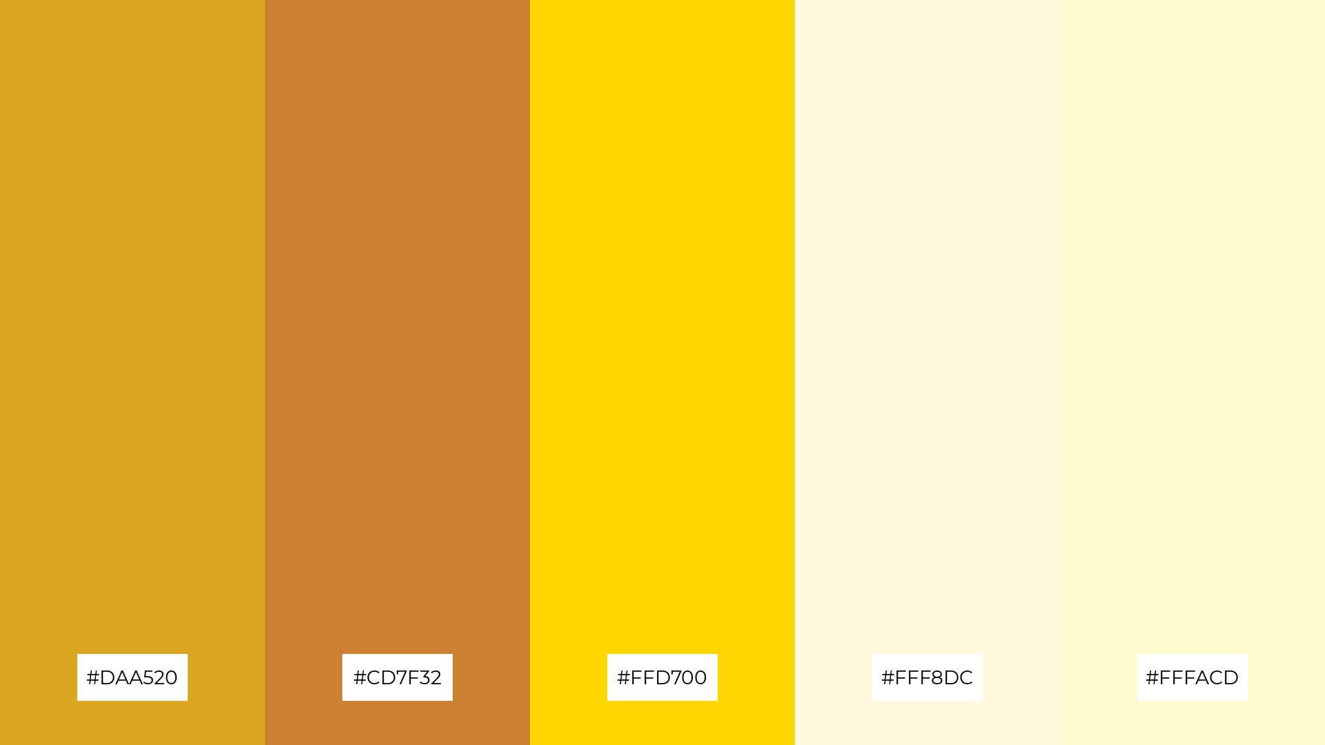
The ‘Golden Sands’ palette, with its mix of deep bronze (#CD7F32) and bright gold (#FFD700), contrasted by the light and airy shades of cornsilk (#FFF8DC) and lemon chiffon (#FFFACD), creates a dynamic visual interplay that captures attention and adds depth.
This palette is perfect for creative projects like magazine layouts or artistic websites, where the rich and varied hues can enhance the visual storytelling and create a captivating and engaging user experience.
8) Warm Harvest
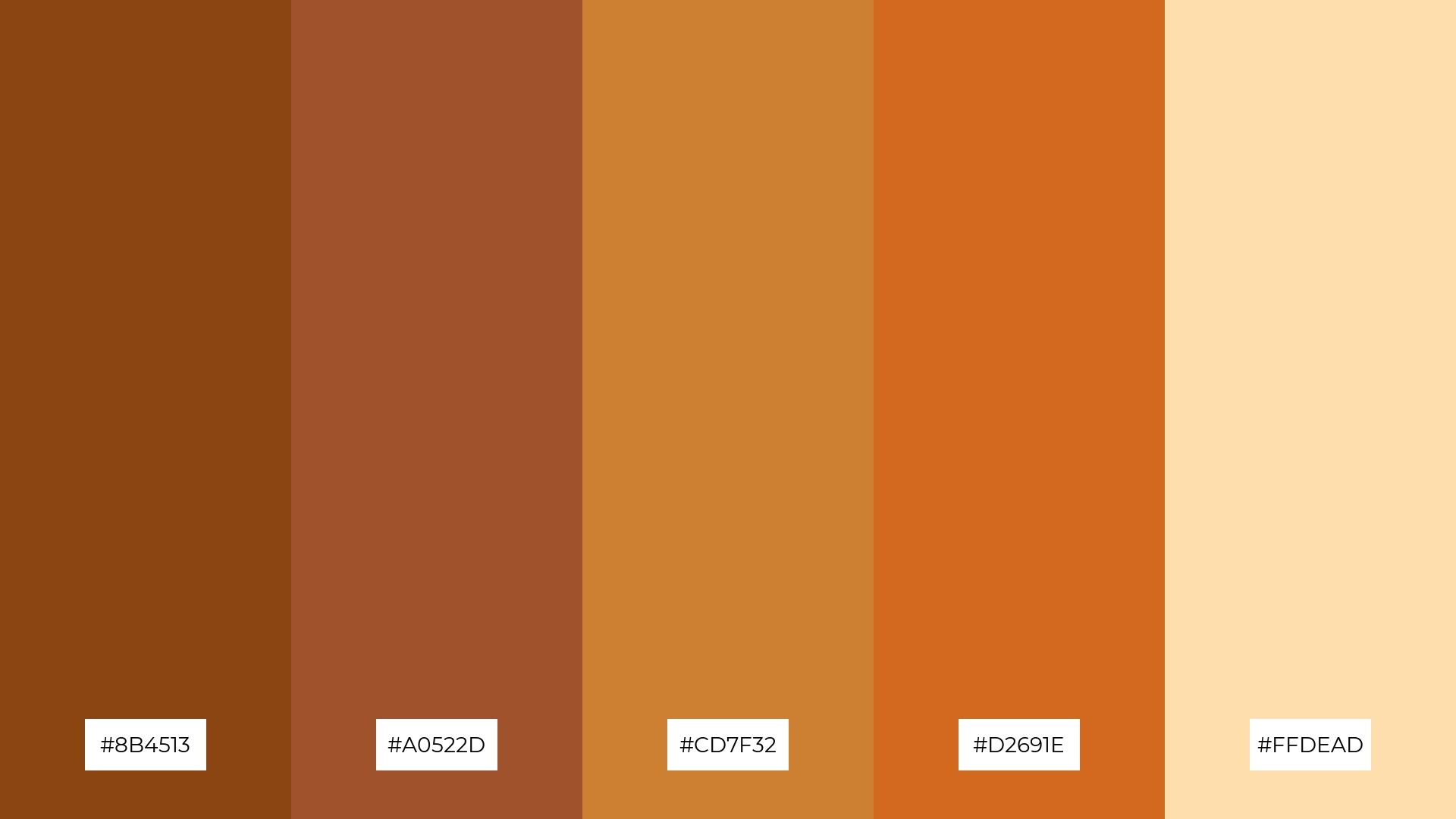
The ‘Warm Harvest’ palette, with its blend of deep sienna (#8B4513), sienna (#A0522D), bronze (#CD7F32), chocolate (#D2691E), and navajo white (#FFDEAD), can evoke a sense of calm when used in harmonious combinations, making it ideal for spa branding that seeks to create a serene and relaxing atmosphere.
Alternatively, the same colors can be combined in bold and contrasting ways to generate excitement and energy, perfect for vibrant marketing campaigns that aim to capture attention and convey a dynamic and lively message.
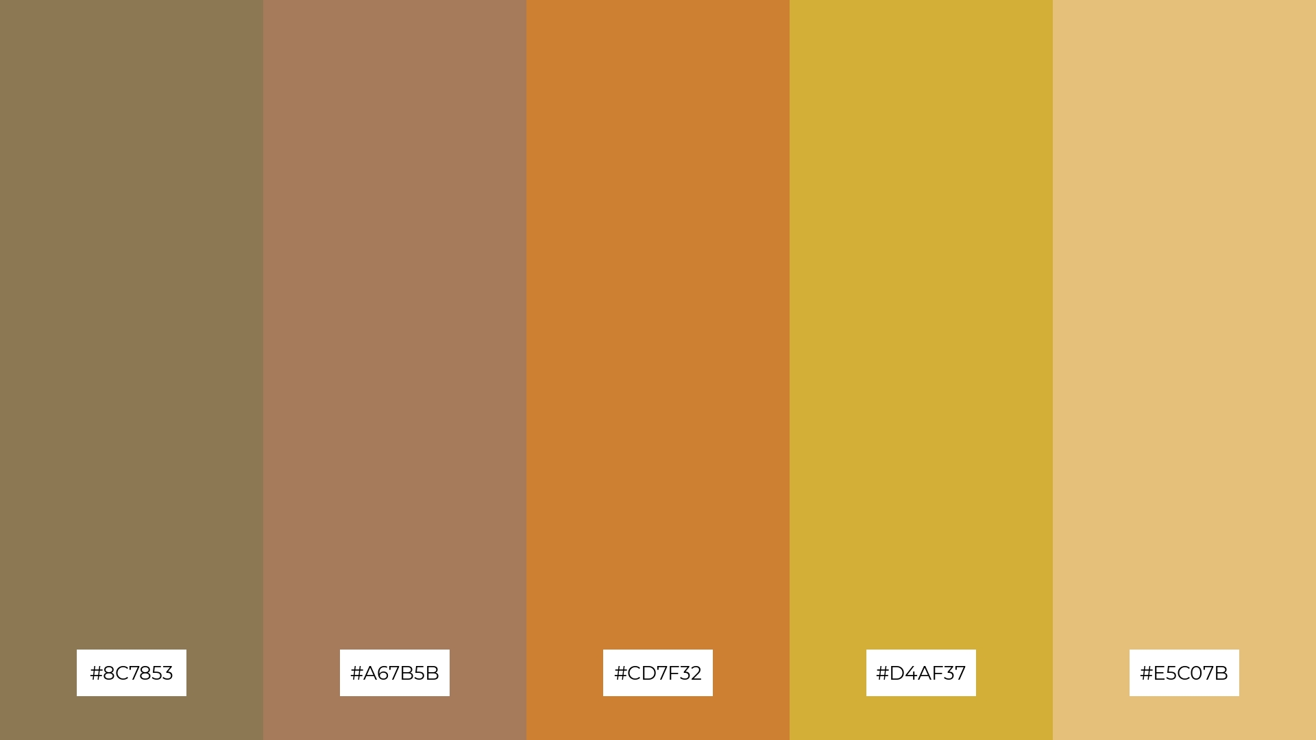
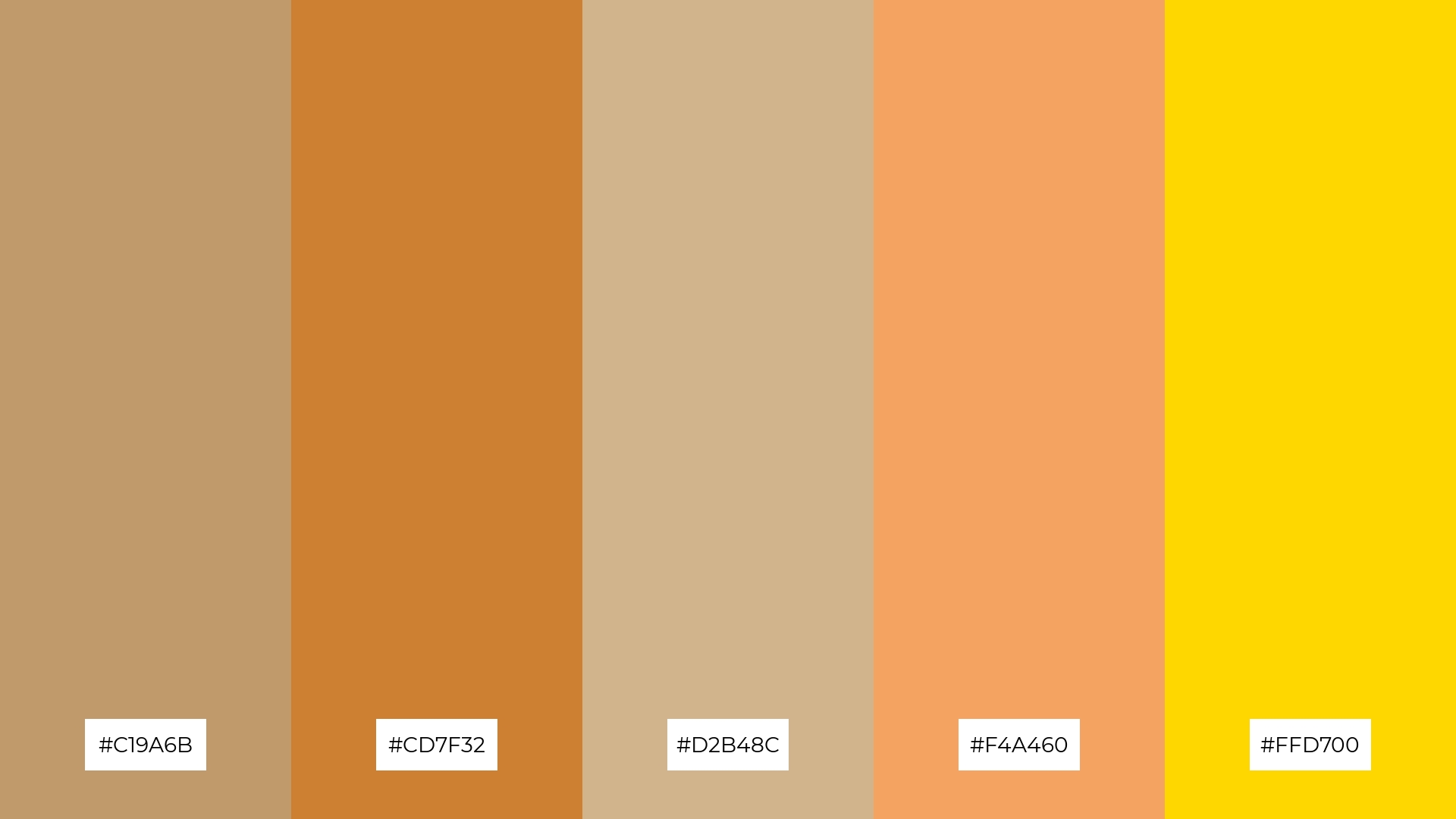
9) Antique Bronze
The ‘Antique Bronze’ palette, with its softer tones like tan (#D2B48C) and light golden brown (#E5C07B), creates a warm and inviting atmosphere that can evoke a sense of comfort and nostalgia.
This blend of hues is perfect for seasonal promotions, where the combination of bright and soft tones can capture the essence of autumn and create a visually appealing and cozy aesthetic.
10) Copper Glow
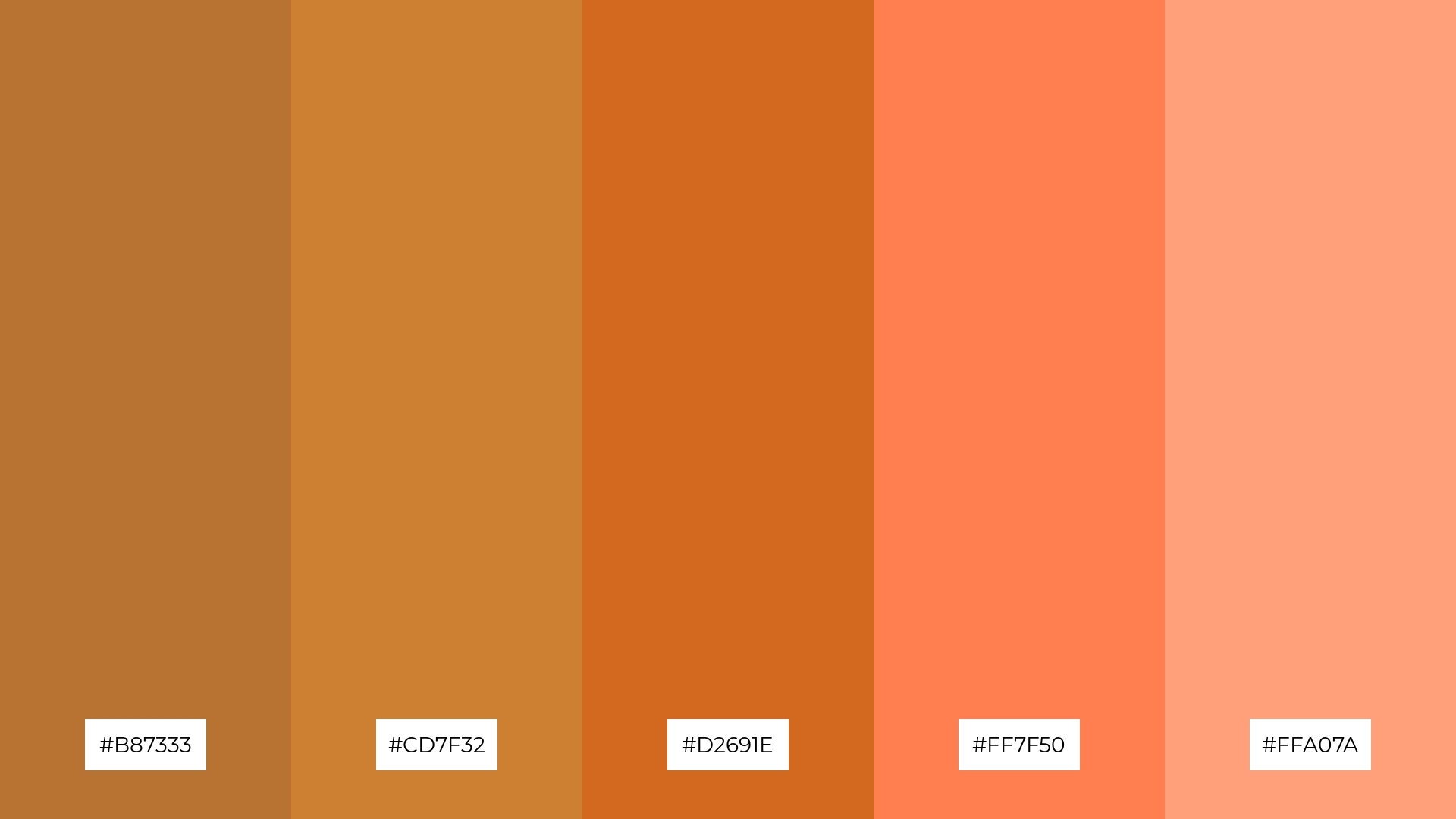
The ‘Copper Glow’ palette, with its harmonious blend of #B87333, #CD7F32, #D2691E, #FF7F50, and #FFA07A, creates a visual flow that evokes feelings of warmth and joy, making it perfect for designs that aim to uplift and energize.
This palette’s vibrant and inviting colors are ideal for lifestyle branding, where the cheerful hues can enhance the appeal of wellness products, or for tech product packaging, where the dynamic shades can convey innovation and excitement.
11) Forest Bronze
The ‘Forest Bronze’ palette, with its blend of olive drab (#556B2F), olive green (#6B8E23), dark sea green (#8FBC8F), bronze (#CD7F32), and tan (#D2B48C), creates a welcoming effect by combining earthy and metallic tones that evoke a sense of natural elegance and warmth.
This palette shines in boutique interiors, where the harmonious mix of greens and bronzes can create a sophisticated and inviting atmosphere, perfect for showcasing high-end products in a luxurious and serene setting.
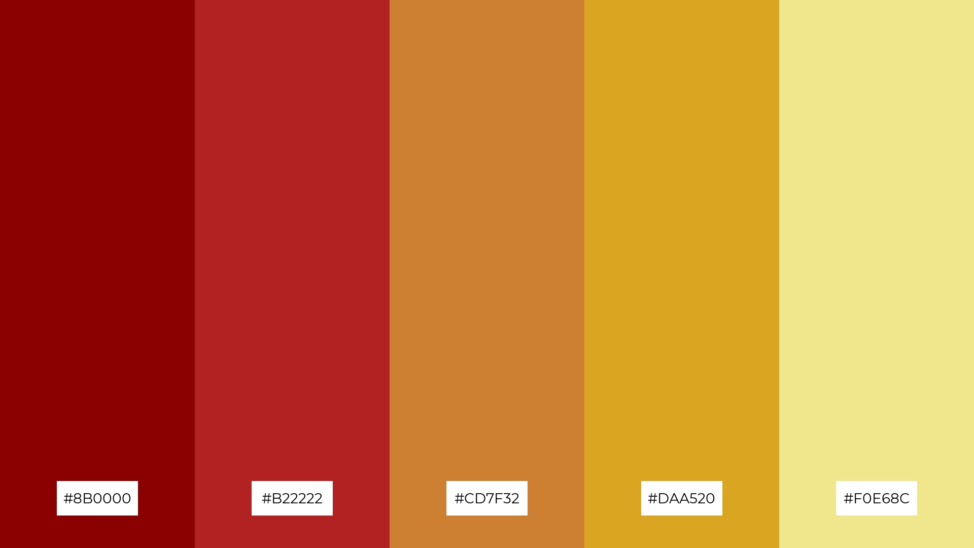
12) Regal Bronze
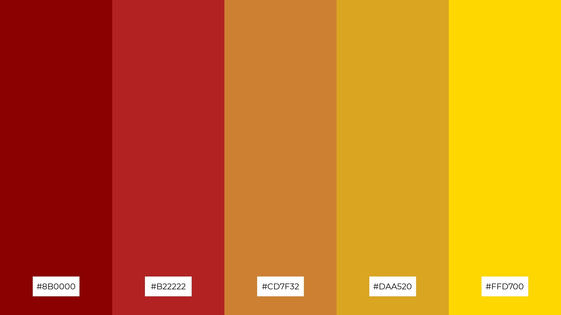
The ‘Regal Bronze’ palette, with its deep reds (#8B0000, #B22222) and shimmering golds (#CD7F32, #DAA520, #FFD700), creates a striking balance between boldness and elegance, making each hue stand out while harmonizing beautifully.
This palette is ideal for sleek corporate branding, where the rich and sophisticated colors can convey a sense of prestige and professionalism, enhancing the overall visual impact of the brand.
13) Bronze Twilight
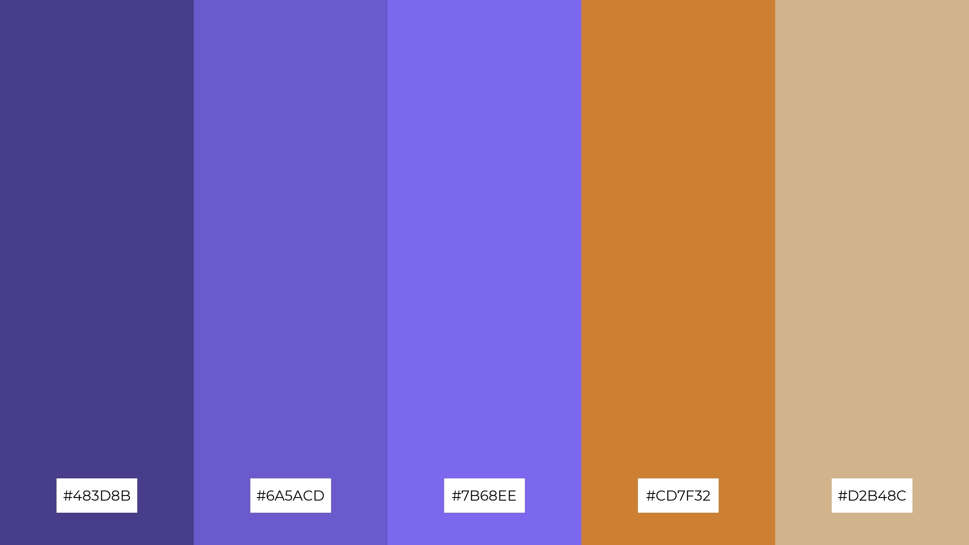
The ‘Bronze Twilight’ palette, with its blend of warm bronze (#CD7F32, #D2B48C) and cool twilight hues (#483D8B, #6A5ACD, #7B68EE), creates a balanced and serene mood that is both inviting and sophisticated.
This unique combination is perfect for artisan product branding, where the harmonious mix of warm and cool tones can convey a sense of handcrafted quality and timeless elegance.
14) Bronze Oasis
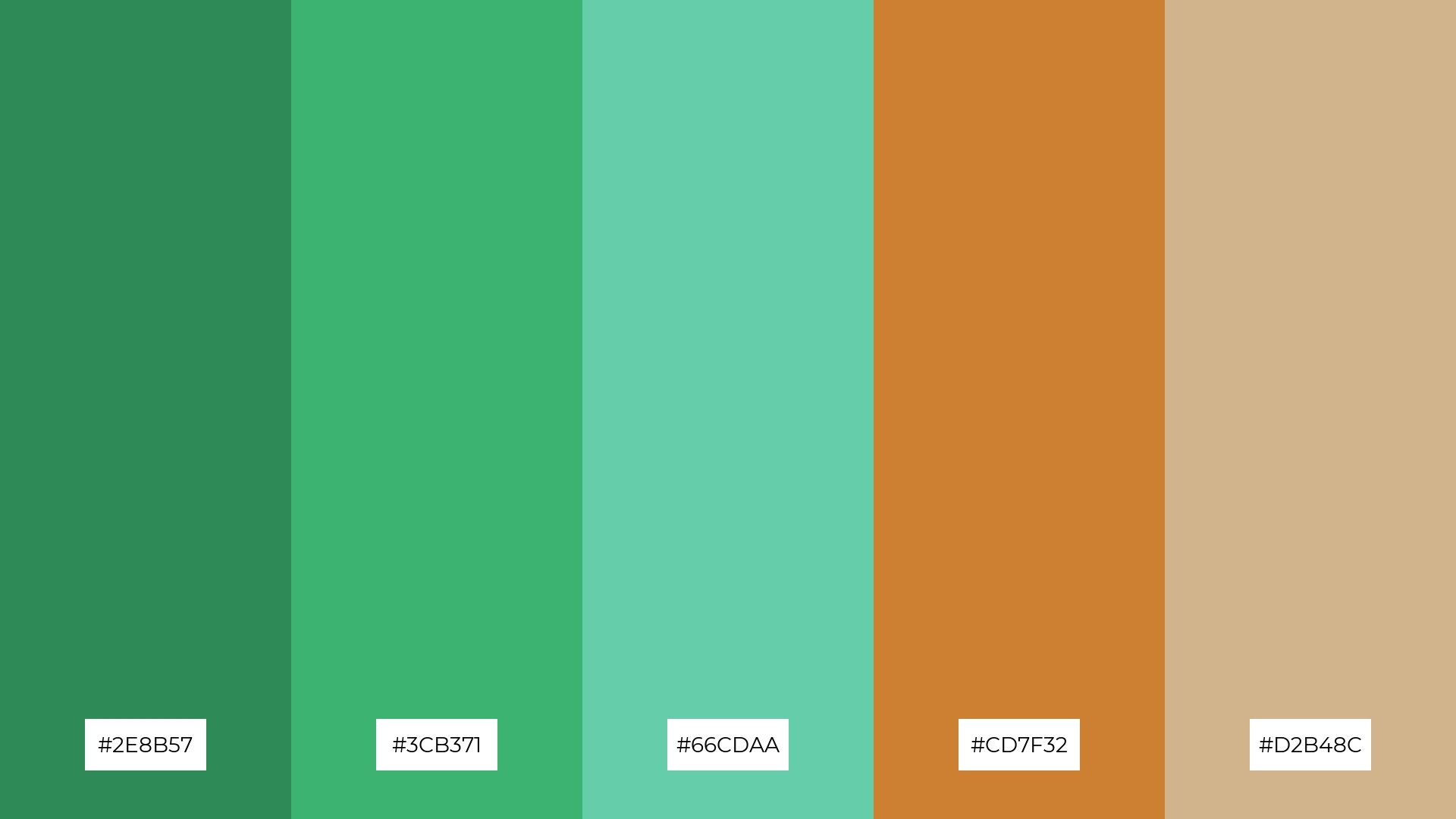
The ‘Bronze Oasis’ palette, with its dynamic interplay of #2E8B57, #3CB371, #66CDAA, #CD7F32, and #D2B48C, offers a bold yet harmonious blend of earthy and metallic tones that can create visually striking designs.
This palette is perfect for festival marketing, where the vibrant and inviting colors can capture attention and convey a sense of excitement and celebration.
15) Bronze Horizon
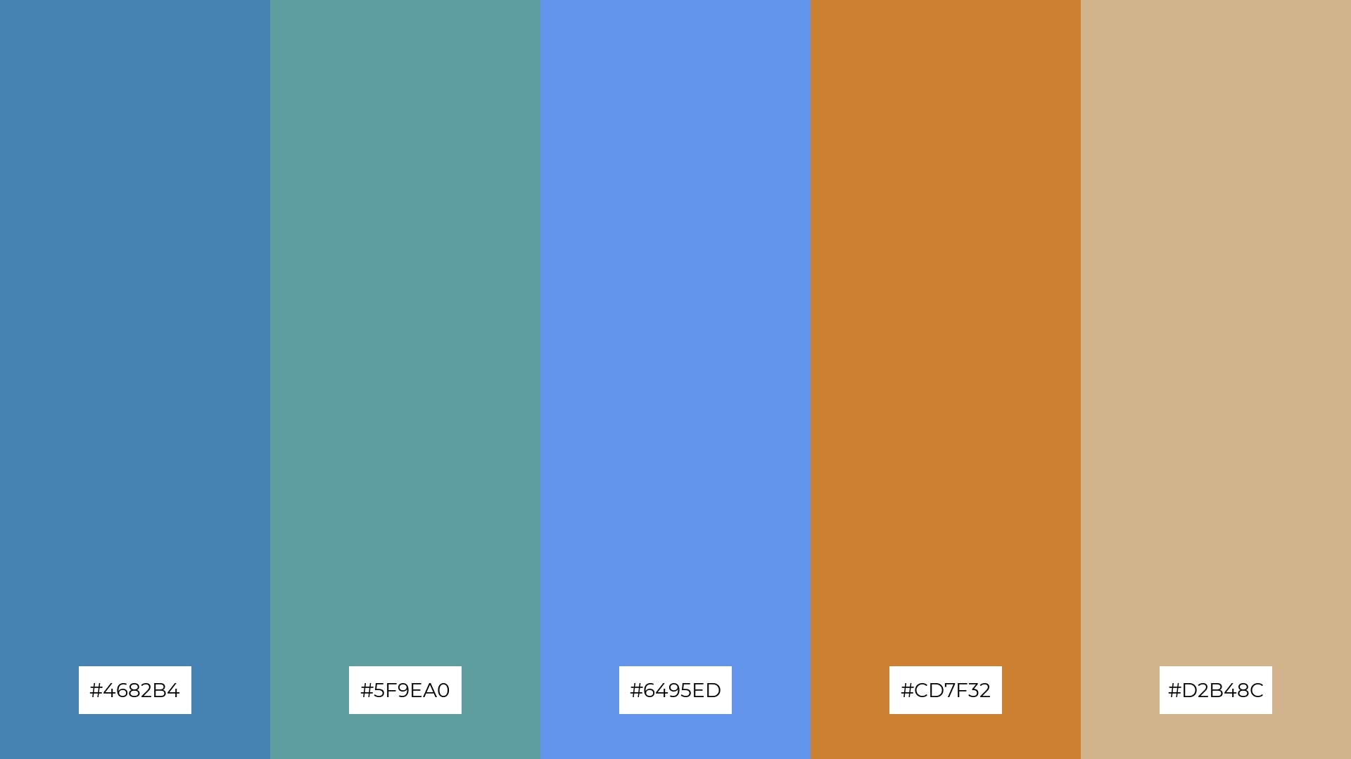
The ‘Bronze Horizon’ palette, with its blend of #4682B4, #5F9EA0, #6495ED, #CD7F32, and #D2B48C, conveys a sense of harmony through its balanced mix of cool and warm tones, creating a visually soothing effect.
This palette is ideal for tech startups aiming to create a modern and inviting office space, or for cozy interior makeovers where the harmonious colors can enhance the comfort and aesthetic appeal of a living area.
How to Use Bronze Patterns in Design
Bronze color palettes can add a touch of sophistication and warmth to home decor. Use bronze accents in furniture, lighting, and accessories to create a cohesive and inviting atmosphere. Pairing bronze with neutral tones like beige or gray can enhance the elegance of your space.
In marketing materials, bronze can be used to convey a sense of luxury and reliability. Incorporate bronze elements in your logos, brochures, and social media graphics to make your brand stand out. Combining bronze with complementary colors like teal or navy can add depth and interest to your designs.
For clothing, bronze hues can create a timeless and chic look. Use bronze in accessories like belts, shoes, or jewelry to add a subtle yet impactful touch to your outfits. Mixing bronze with rich fabrics like velvet or silk can elevate the overall aesthetic.
Ready to experiment with bronze color palettes in your designs? Try creating stunning visuals using Piktochart today!


