 Piktochart Team
Watercolor color palettes offer a unique blend of vibrancy and subtlety, making them a favorite among artists and designers alike. The fluidity and transparency of watercolors allow for endless creative possibilities.
Whether you're a seasoned artist or a beginner, understanding how to mix and match colors can elevate your work. This article delves into the essentials of watercolor palettes, helping you create stunning visual compositions.
Designing a watercolor color palette requires a keen eye for detail and a good understanding of color theory.

The 'Ocean Breeze' palette evokes a sense of calm and tranquility, with its cool blues and teals seamlessly blending to create a serene and cohesive look.
Perfect for coastal-themed interior decor, this palette's defining characteristic is its ability to transform any space into a peaceful retreat, reminiscent of a breezy seaside escape.

The 'Sunset Glow' palette, with its warm hues of gold and amber, evokes a sense of warmth and comfort, reminiscent of a serene evening sky.
This palette would excel in product packaging for artisanal goods, where the inviting colors can enhance the perception of quality and craftsmanship.

The 'Forest Whisper' palette features dominant colors like soft mint (#A8D5BA), moss green (#6B9A6E), and deep forest green (#4B7F4D), creating a harmonious blend that evokes the tranquility of nature.
Ideal for wellness branding or eco-friendly interior spaces, this palette's earthy tones foster a sense of calm and connection to the natural world, enhancing the overall aesthetic with a grounded, serene vibe.

The 'Lavender Dream' palette, with its blend of soft pastels and bold purples, offers a balanced and distinct mood that is both soothing and striking.
Ideal for modern web designs, this palette can create inviting and visually appealing digital experiences that captivate users and enhance engagement.

The 'Coral Reef' palette, with its vibrant shades of coral and peach, creates an ambiance of warmth and energy, making it perfect for lively and inviting designs.
Ideal for luxury fashion campaigns, this palette's dynamic colors can enhance the visual appeal of high-end products, adding a touch of sophistication and modernity.

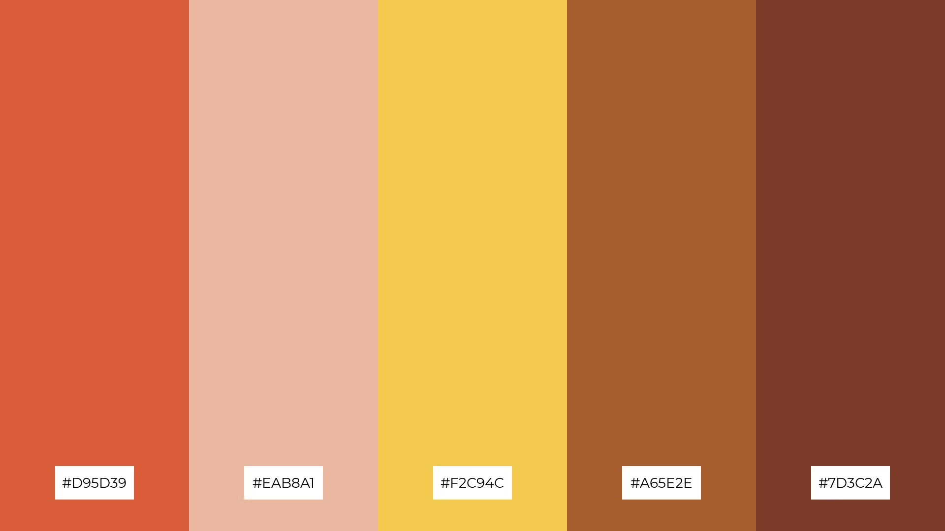
The 'Autumn Leaves' palette, with its rich hues of burnt orange (#D95D39), soft peach (#EAB8A1), golden yellow (#F2C94C), deep brown (#A65E2E), and dark maroon (#7D3C2A), creates a sophisticated and warm atmosphere, perfect for evoking a sense of nostalgia and comfort.
This palette is ideal for minimalistic branding, where the earthy tones can add a touch of elegance and timelessness, making it suitable for high-end products or refined event designs that aim to leave a lasting impression.

The 'Winter Chill' palette, with its cool tones of icy blue (#A4C8E1) and frosty white (#E1F0F6), contrasts beautifully with the deeper shades of slate gray (#A0B8C4) and misty blue (#C4D6E6), creating a visually engaging and balanced composition.
This palette is perfect for creative projects like magazine layouts or artistic websites, where the serene and crisp colors can enhance readability and provide a refreshing aesthetic that captivates the audience.

The 'Tropical Paradise' palette, with its vibrant oranges and soft peaches, can evoke a sense of excitement and energy when used in dynamic combinations, making it perfect for vibrant marketing campaigns that aim to capture attention and convey enthusiasm.
Conversely, when these colors are paired with softer shades, they can create a calming and inviting atmosphere, ideal for spa branding where the warm hues can enhance the sense of relaxation and tranquility.

The 'Mystic Night' palette, with its blend of deep purples (#4B3D6A) and soft lavenders (#D1C6E7), creates a mysterious yet inviting atmosphere that captivates the senses.
Ideal for seasonal promotions, this palette's rich and varied tones can evoke a sense of elegance and sophistication, making it perfect for winter-themed marketing campaigns or luxurious home decor projects.

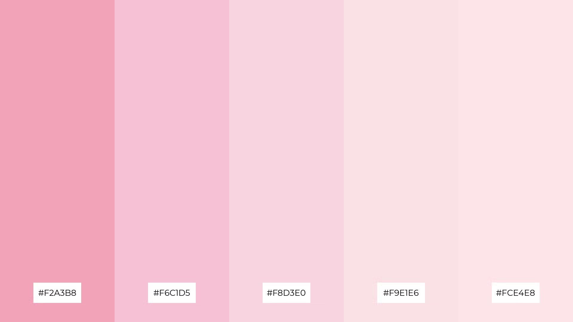
The 'Spring Blossom' palette, with its gentle progression from vibrant pink (#F2A3B8) to soft blush (#FCE4E8), creates a visual flow that evokes feelings of joy and renewal, reminiscent of blooming flowers in springtime.
This palette is ideal for lifestyle branding, where its uplifting and fresh colors can enhance the appeal of wellness products, or for tech product packaging, where the soft hues can convey a sense of innovation and user-friendliness.

The 'Desert Sands' palette, with its warm and muted tones of beige and cream, creates a welcoming and serene atmosphere that can make any space feel inviting and comfortable.
This palette shines in boutique interiors, where its subtle elegance can enhance the shopping experience, or in luxury e-commerce sites, where the sophisticated hues can elevate the perception of high-end products.

The 'Midnight Sea' palette, with its deep navy (#1D3F72) and vibrant blue (#2A6A9D) hues, contrasts beautifully with the lighter shades of sky blue (#4B9BC3), soft aqua (#A4D8E1), and frosty white (#E1F6F9), creating a balanced and harmonious visual experience.
This palette is ideal for sleek corporate branding, where the sophisticated and professional tones can enhance the brand's image, or for casual apparel lines, where the cool and refreshing colors can evoke a sense of calm and style.

The 'Berry Patch' palette, with its blend of warm magentas and cool pinks, creates a harmonious and inviting mood that is both vibrant and soothing.
This palette is perfect for artisan product branding, where the rich and varied tones can enhance the perception of handcrafted quality and uniqueness.

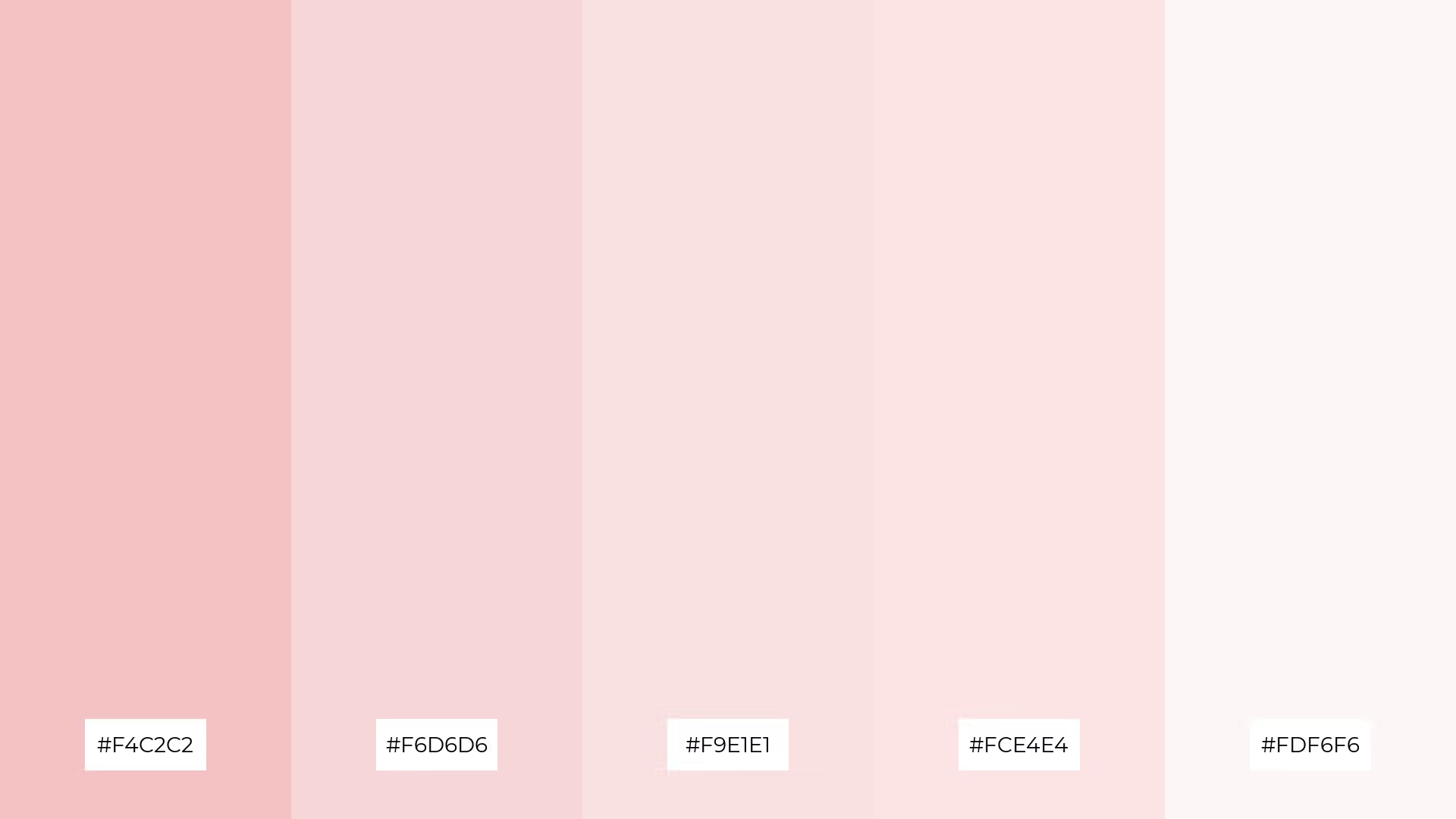
The 'Soft Pastels' palette, with its gentle hues of blush and cream, creates a delicate and harmonious visual experience that can evoke a sense of calm and elegance.
Ideal for restaurant menus, this palette's subtle yet sophisticated colors can enhance the dining experience by creating an inviting and refined atmosphere that complements the culinary offerings.

The 'Urban Jungle' palette, with its blend of deep greens (#4E6E58) and soft pastels (#E8F5E9), can convey a sense of harmony when used in tech startups, creating a balanced and refreshing workspace that fosters creativity and innovation.
Conversely, the contrasting shades within the palette can be utilized in cozy interior makeovers to create dynamic focal points, adding depth and interest to living spaces while maintaining a cohesive and inviting atmosphere.
Watercolor color palettes can bring a unique and artistic touch to home decor. Use soft, blended hues to create a calming atmosphere in living spaces, or opt for vibrant, contrasting colors to add energy and focal points to a room. Experiment with different combinations to find the perfect balance that complements your interior style.
In marketing materials, watercolor palettes can make your designs stand out. Use gradients and subtle transitions to create visually appealing backgrounds for brochures, flyers, or social media graphics. The fluidity of watercolors can convey a sense of creativity and sophistication, making your brand more memorable.
For clothing design, watercolor palettes offer endless possibilities. Incorporate soft pastels for a delicate and elegant look, or bold, saturated colors for a more dynamic and eye-catching effect. The versatility of watercolors allows you to create unique patterns and prints that can set your fashion line apart.
Ready to bring your designs to life with stunning watercolor palettes? Try creating your own using Piktochart and explore the endless creative possibilities.