 Piktochart Team
Violet color palettes offer a unique blend of sophistication and creativity, making them a popular choice for various design projects. From deep purples to soft lavenders, these hues can evoke a range of emotions and atmospheres.
Whether you're designing a website, creating an infographic, or working on a branding project, incorporating violet tones can add a touch of elegance and intrigue. Explore the versatility of violet and discover how it can transform your visual content.
Designing with violet can be both exciting and challenging, but with the right approach, you can create stunning and versatile color palettes.

The 'Twilight Garden' palette, with its rich indigo and vibrant violet shades, creates a mood of mystical elegance and serene beauty, perfect for evoking a sense of wonder and tranquility.
These colors interact harmoniously to form a cohesive look, making them ideal for use in interior decor where they can transform a space into a luxurious and calming retreat.

The 'Mystic Sunset' palette, with its vibrant hues of orange and pink, evokes a sense of warmth and energy, reminiscent of a breathtaking sunset.
This palette would excel in digital branding, where its lively and inviting colors can capture attention and convey a dynamic, youthful spirit.

The 'Enchanted Forest' palette, featuring dominant shades of deep green (#006400), forest green (#228B22), lime green (#32CD32), chartreuse (#7FFF00), and dark violet (#9400D3), creates a harmonious blend that evokes the lush, vibrant essence of nature.
This palette is particularly well-suited for wellness branding, where its calming greens and striking violet can convey a sense of tranquility and rejuvenation, making it ideal for eco-friendly interior spaces that aim to promote relaxation and well-being.

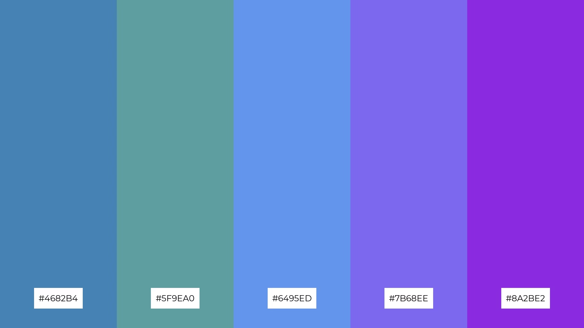
The 'Oceanic Dream' palette, with its blend of soft blues and bold purples, offers a balanced and distinct mood that can evoke both calmness and creativity.
This palette is ideal for modern web designs, where its inviting and dynamic tones can enhance user experience and engagement.

The 'Royal Elegance' palette, with its opulent golds and deep indigo, creates an ambiance of timeless sophistication and grandeur, perfect for evoking a sense of luxury and exclusivity.
This palette is ideal for high-end wedding themes, where its rich and regal tones can enhance the overall elegance and create a memorable, lavish atmosphere.

The 'Autumn Whisper' palette, with its blend of warm oranges and soft pinks, creates a harmonious and inviting atmosphere that can evoke feelings of both sophistication and playfulness.
This palette is particularly effective for bold event designs, where its vibrant and cohesive colors can capture attention and set a lively, yet elegant, mood.

The 'Celestial Night' palette, with its deep midnight blue (#191970) and vibrant blue-violet (#8A2BE2), creates a striking contrast that adds depth and visual interest to any design.
This palette is perfect for creative projects like magazine layouts or artistic websites, where its rich and dynamic hues can captivate audiences and enhance the overall aesthetic appeal.

The 'Floral Fantasy' palette, with its vibrant pinks (#FF1493, #FF69B4, #FFB6C1) and soothing purples (#DDA0DD, #8A2BE2), can evoke a sense of calm or excitement depending on the combination, making it versatile for various design needs.
This palette is particularly well-suited for spa branding, where the softer hues can create a tranquil atmosphere, or for vibrant marketing campaigns, where the bolder colors can capture attention and convey energy.

The 'Desert Mirage' palette, with its softer tones of burlywood (#DEB887) and tan (#D2B48C) alongside the brighter hues of sandy brown (#F4A460) and peru (#CD853F), creates a warm and inviting atmosphere that evokes the serene beauty of a desert landscape.
This blend of colors is ideal for home decor, where its earthy and vibrant tones can transform a space into a cozy and stylish retreat, or for seasonal promotions, where it can capture the essence of autumn and create a visually appealing and engaging campaign.

The 'Arctic Aurora' palette, with its cool and serene shades of cyan and turquoise, transitions smoothly into deeper blues and vibrant violet, creating a visual flow that evokes feelings of tranquility and wonder.
This palette is ideal for lifestyle branding, where its calming and refreshing colors can convey a sense of peace and rejuvenation, or for tech product packaging, where its modern and dynamic hues can capture attention and suggest innovation and reliability.

The 'Vintage Charm' palette, with its rich browns (#8B4513, #A0522D) and vibrant corals (#D2691E, #FF7F50) complemented by a striking violet (#8A2BE2), creates a welcoming yet dramatic effect that can evoke a sense of nostalgia and elegance in design.
This palette shines particularly well in boutique interiors, where its warm and inviting tones can create a cozy and sophisticated atmosphere, or in luxury e-commerce sites, where its bold and dynamic colors can capture attention and convey a sense of exclusivity and high-end appeal.

The 'Spring Blossom' palette, with its vibrant pinks (#FF69B4, #FFB6C1, #FFC0CB) and soft peach (#FFDAB9) contrasted by a striking violet (#8A2BE2), creates a harmonious blend that evokes a sense of freshness and vitality.
This palette is particularly well-suited for casual apparel lines, where its lively and balanced hues can convey a youthful and energetic vibe, making it perfect for spring and summer collections.

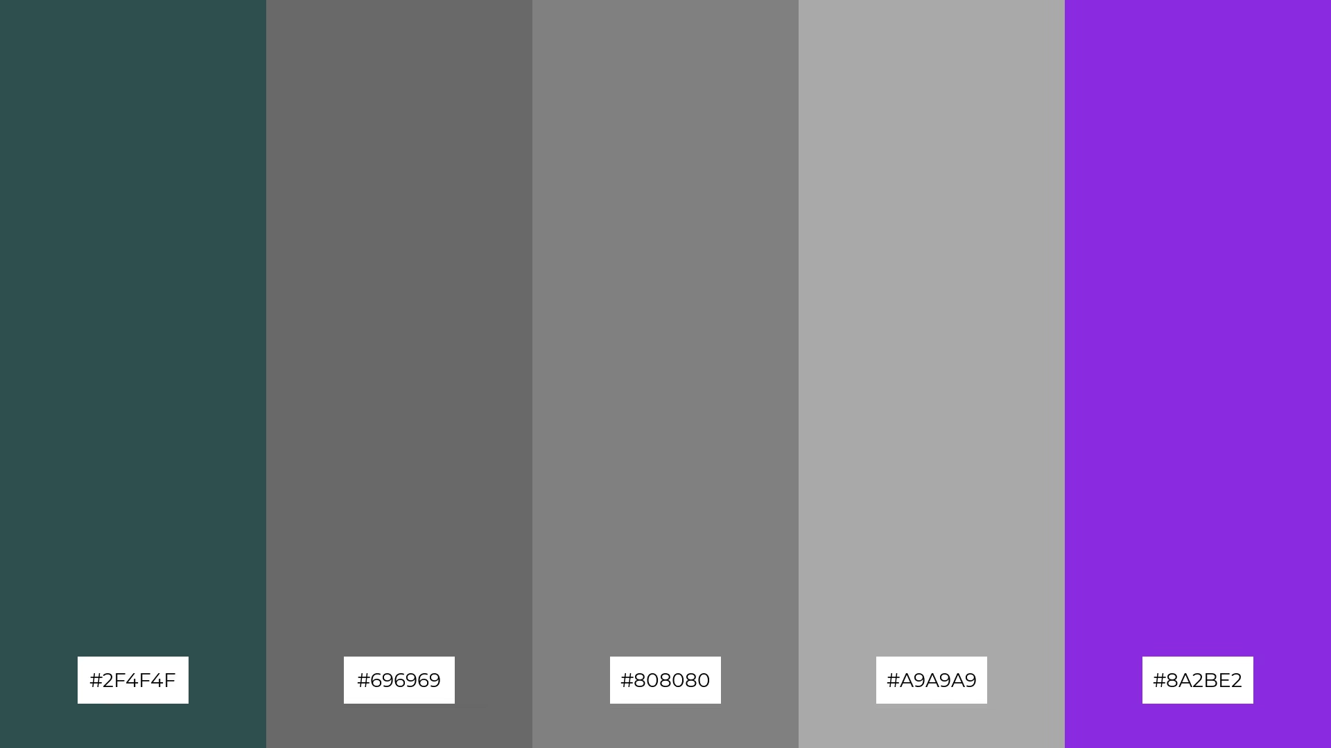
The 'Urban Chic' palette, with its blend of warm grays and striking violet, creates a sophisticated and modern mood that is both inviting and edgy.
This palette is particularly effective for artisan product branding, where its balanced tones can convey a sense of craftsmanship and contemporary elegance, making it ideal for high-end, handmade goods.

The 'Tropical Vibes' palette, with its vibrant greens (#00FF7F, #7CFC00, #ADFF2F, #32CD32) and striking violet (#8A2BE2), creates a dynamic and energetic visual experience that can capture attention and evoke a sense of excitement and freshness.
This bold and lively color combination is perfect for festival marketing, where its vivid hues can enhance the festive atmosphere and draw in crowds with its eye-catching and playful design.

The 'Galactic Voyage' palette, with its deep indigo (#483D8B) and vibrant violet (#8A2BE2), can convey a sense of harmony when used in gradient effects, creating a seamless and visually appealing transition that evokes a feeling of unity and balance.
This palette is ideal for tech startups, where its modern and dynamic hues can suggest innovation and forward-thinking, or for cozy interior makeovers, where its rich and soothing tones can transform a space into a tranquil and inviting retreat.
Violet color palettes can be a game-changer in home decor, adding a touch of luxury and tranquility to any space. Use deep purples for accent walls or furniture to create a focal point, while softer lavenders can be used for bedding and accessories to evoke a calming atmosphere.
In marketing materials, violet hues can capture attention and convey a sense of creativity and sophistication. Pairing violet with complementary colors like gold or yellow can make your designs pop, making them perfect for high-end branding or event promotions.
For clothing, violet tones can add a sense of elegance and uniqueness to your apparel line. Consider using a mix of deep and light violet shades to create visually appealing patterns that stand out in any collection.
Ready to transform your designs with stunning violet palettes? Try creating your own using Piktochart and see the difference it makes!