The allure of Tiffany Blue is undeniable, evoking a sense of elegance and timelessness. This iconic hue has transcended its origins to become a staple in design and branding.
Exploring Tiffany Blue color palettes can inspire creativity and add a touch of sophistication to any project. Whether you’re designing a logo, an infographic, or a website, this distinctive color can elevate your work.
Tips For Creating Tiffany Blue Color Palettes
Designing with Tiffany Blue can be both exciting and challenging, but with the right approach, you can create stunning and versatile color palettes.
- Balance with Neutrals: Pair Tiffany Blue with neutral colors like white, gray, or beige to create a clean and sophisticated look.
- Complementary Shades: Use complementary colors such as soft pinks or coral to add warmth and contrast to your design.
- Accent Colors: Incorporate metallics like gold or silver as accent colors to enhance the luxurious feel of Tiffany Blue.
- Gradients and Shades: Experiment with different shades and gradients of Tiffany Blue to add depth and dimension to your design.
- Consistency Across Elements: Ensure that the use of Tiffany Blue is consistent across all design elements to maintain a cohesive look.
- Versatility in Application: Use Tiffany Blue in various design contexts, from backgrounds to text highlights, to showcase its versatility.
15 Tiffany Blue Color Palettes
1) Ocean Breeze
The ‘Ocean Breeze’ color palette evokes a serene and refreshing mood, reminiscent of tranquil seaside landscapes and clear blue skies.
These colors interact harmoniously to create a cohesive look, perfect for interior decor that aims to bring a sense of calm and relaxation into a living space.
2) Minty Fresh

The ‘Minty Fresh’ color palette, with its vibrant greens and soothing teals, evokes a sense of rejuvenation and vitality, making it perfect for designs that aim to convey freshness and energy.
This palette would excel in product packaging for health and wellness brands, as well as in digital branding for eco-friendly initiatives, where the colors can highlight the natural and invigorating qualities of the products or services.
3) Tropical Lagoon
The ‘Tropical Lagoon’ color palette, featuring dominant hues like turquoise (#0ABAB5), gold (#FFD700), and coral (#FF4500), creates a vibrant and energetic atmosphere that is both eye-catching and harmonious.
This palette is ideal for wellness branding, where the lively colors can evoke feelings of vitality and positivity, making it perfect for promoting health and wellness products or services.
4) Serene Sky

The ‘Serene Sky’ color palette, with its blend of soft and bold tones like #0ABAB5 and #87CEEB, creates a distinct mood that is both calming and invigorating.
This palette is ideal for modern web designs, where the harmonious colors can create an inviting and visually appealing user experience.
5) Spring Blossom
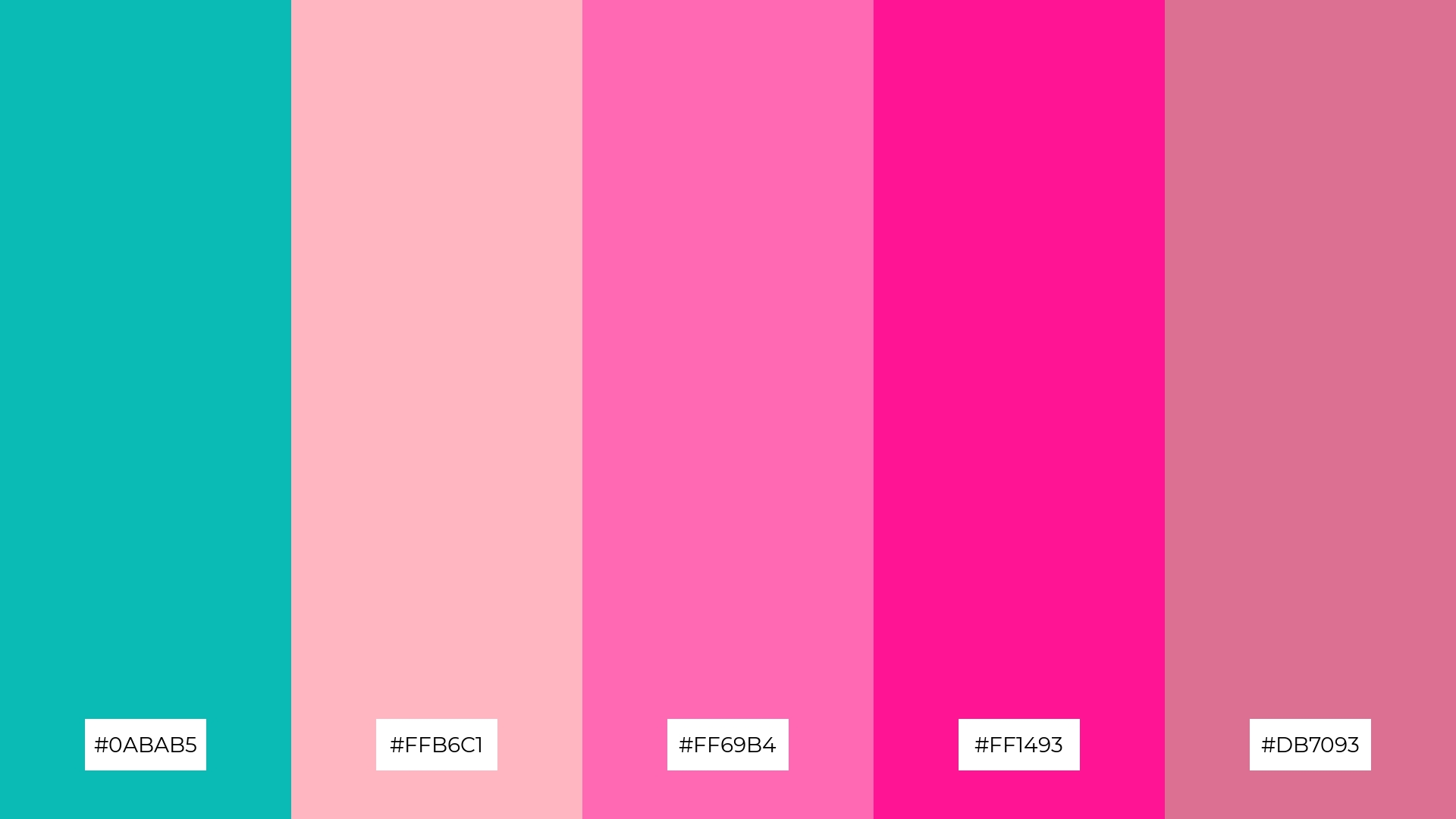
The ‘Spring Blossom’ color palette, with its blend of turquoise (#0ABAB5), light pink (#FFB6C1), hot pink (#FF69B4), deep pink (#FF1493), and pale violet-red (#DB7093), creates a vibrant and romantic ambiance that is perfect for wedding themes, evoking feelings of love and joy.
This palette’s harmonious interaction of soft and bold hues makes it ideal for luxury fashion campaigns, where the colors can highlight the elegance and sophistication of high-end designs.
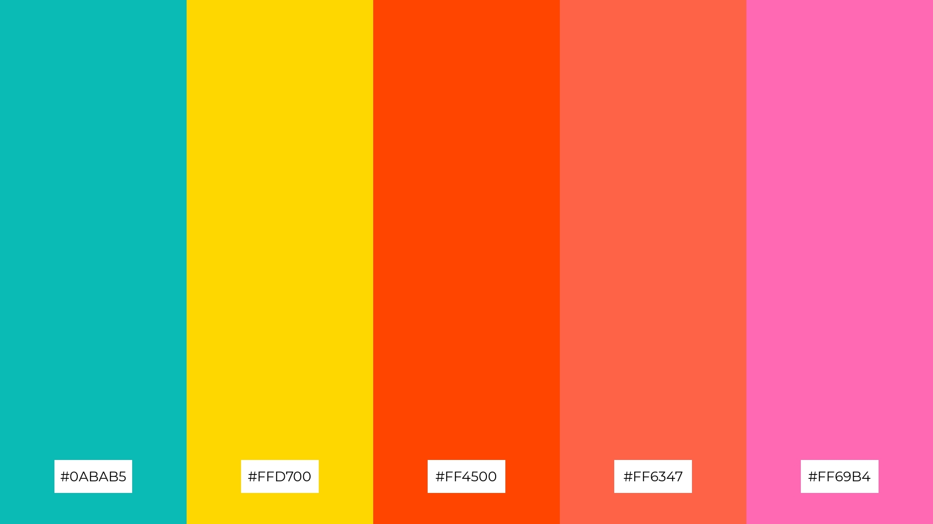
6) Coral Reef
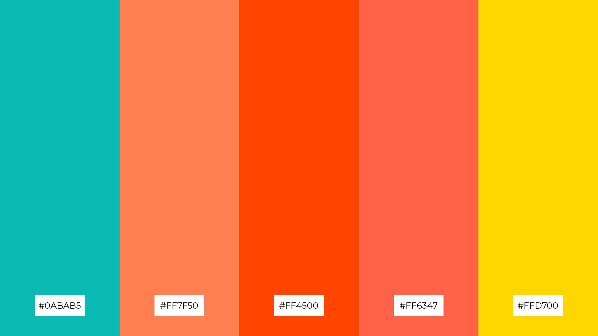
The ‘Coral Reef’ color palette, with its blend of turquoise (#0ABAB5), coral (#FF7F50), orange-red (#FF4500), tomato (#FF6347), and gold (#FFD700), creates a vibrant and playful mood that can energize any design project.
This palette is perfect for bold event designs, where the lively colors can captivate attention and evoke a sense of excitement and celebration.
7) Pastel Dream
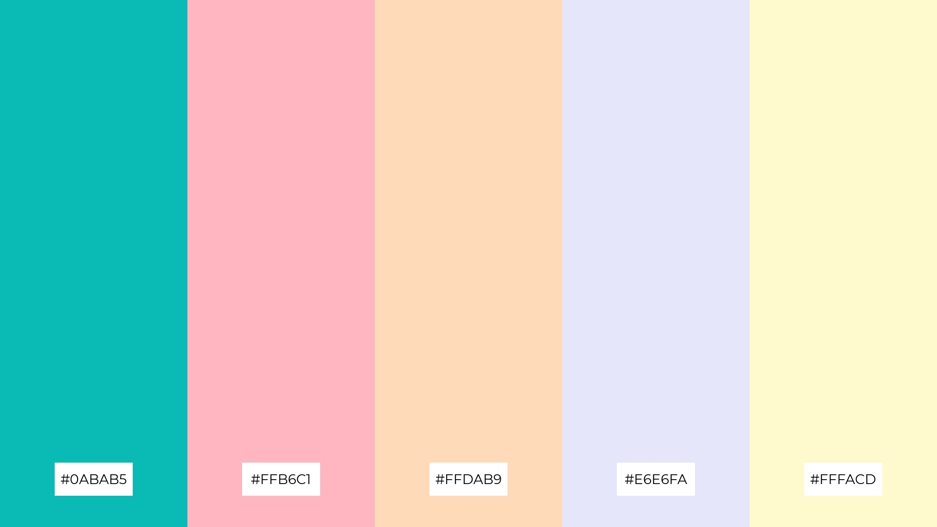
The ‘Pastel Dream’ color palette, with its mix of turquoise (#0ABAB5), light pink (#FFB6C1), peach (#FFDAB9), lavender (#E6E6FA), and light yellow (#FFFACD), combines contrasting elements that create a visually engaging and harmonious design.
This palette is ideal for creative projects like magazine layouts or artistic websites, where the soft yet vibrant colors can add a touch of whimsy and sophistication, making the content more appealing and memorable.
8) Sunset Glow
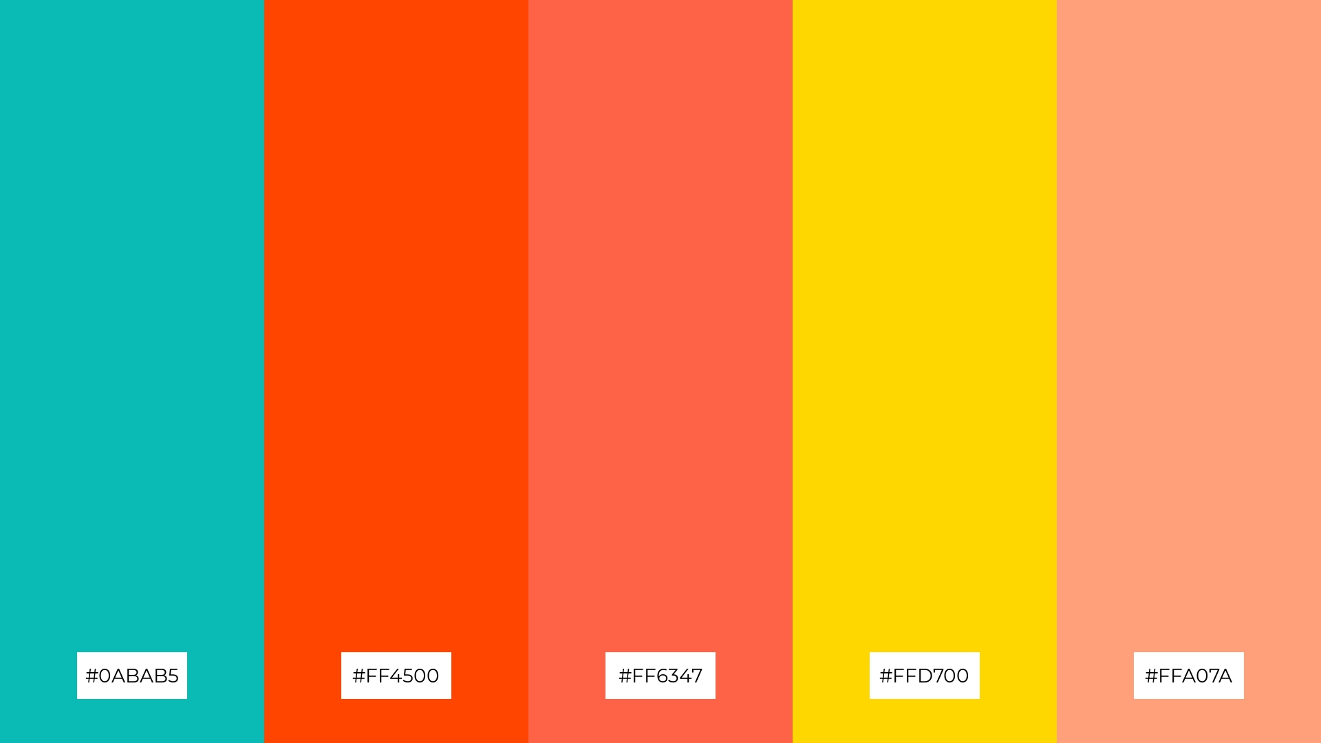
The ‘Sunset Glow’ color palette, with its blend of turquoise (#0ABAB5), orange-red (#FF4500), tomato (#FF6347), gold (#FFD700), and light salmon (#FFA07A), can evoke a sense of calm when the softer hues are combined, making it ideal for spa branding that aims to create a serene and relaxing atmosphere.
Conversely, the vibrant mix of these colors can generate excitement and energy, making it perfect for dynamic marketing campaigns that seek to capture attention and convey a lively, upbeat message.
9) Forest Whisper
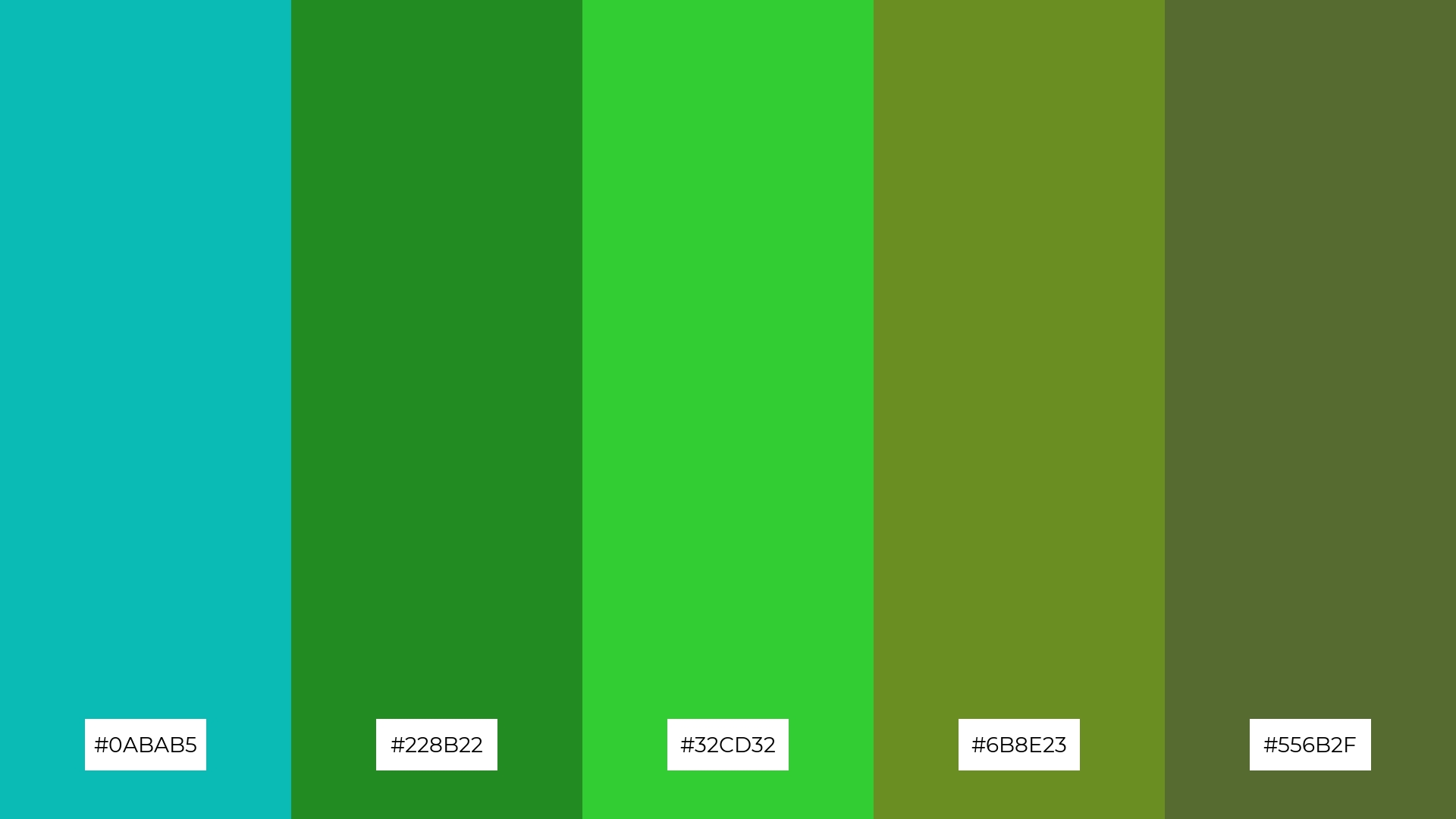
The ‘Forest Whisper’ color palette, with its blend of turquoise (#0ABAB5), forest green (#228B22), lime green (#32CD32), olive drab (#6B8E23), and dark olive green (#556B2F), combines both softer and brighter tones to create a balanced and natural aesthetic.
This harmonious mix evokes a sense of tranquility and freshness, making it ideal for home decor that aims to bring the calming essence of nature indoors or for seasonal promotions that highlight the rejuvenating qualities of spring and summer.
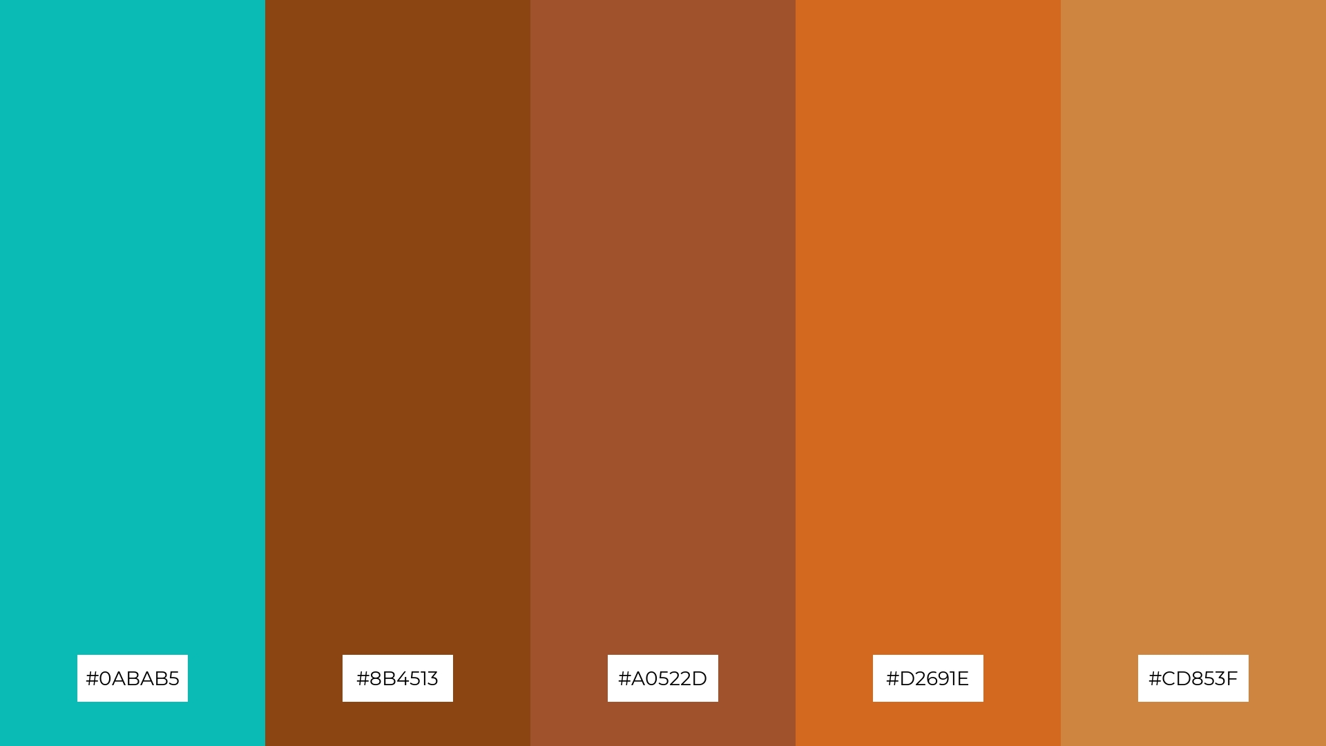
10) Vintage Chic
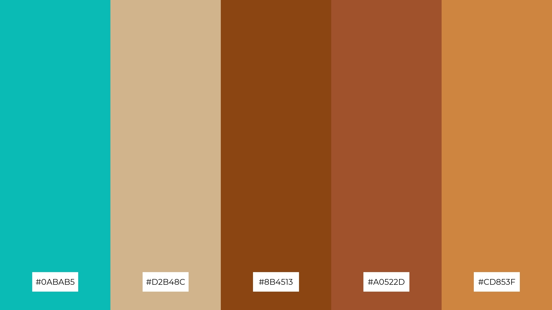
The ‘Vintage Chic’ color palette, with its blend of turquoise (#0ABAB5), tan (#D2B48C), saddle brown (#8B4513), sienna (#A0522D), and peru (#CD853F), creates a warm and nostalgic visual flow that evokes feelings of comfort and timeless elegance.
This palette is perfect for lifestyle branding, where the harmonious and emotionally rich colors can enhance the appeal of vintage-inspired products, or for tech product packaging, where the unique combination can convey a sense of reliability and sophistication.
11) Autumn Leaves
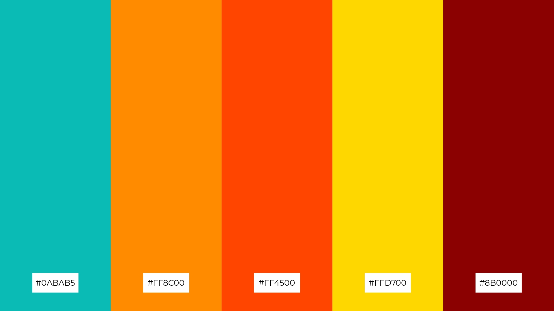
The ‘Autumn Leaves’ color palette, with its blend of turquoise (#0ABAB5), dark orange (#FF8C00), orange-red (#FF4500), gold (#FFD700), and dark red (#8B0000), creates a welcoming and dramatic effect by combining warm and vibrant tones that evoke the richness and warmth of the fall season.
This palette shines in boutique interiors, where the rich and inviting colors can create a cozy and luxurious atmosphere, or in luxury e-commerce sites, where the dramatic hues can captivate attention and convey a sense of exclusivity and sophistication.
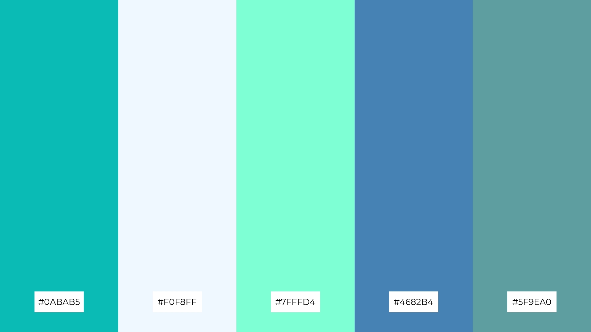
12) Winter Frost
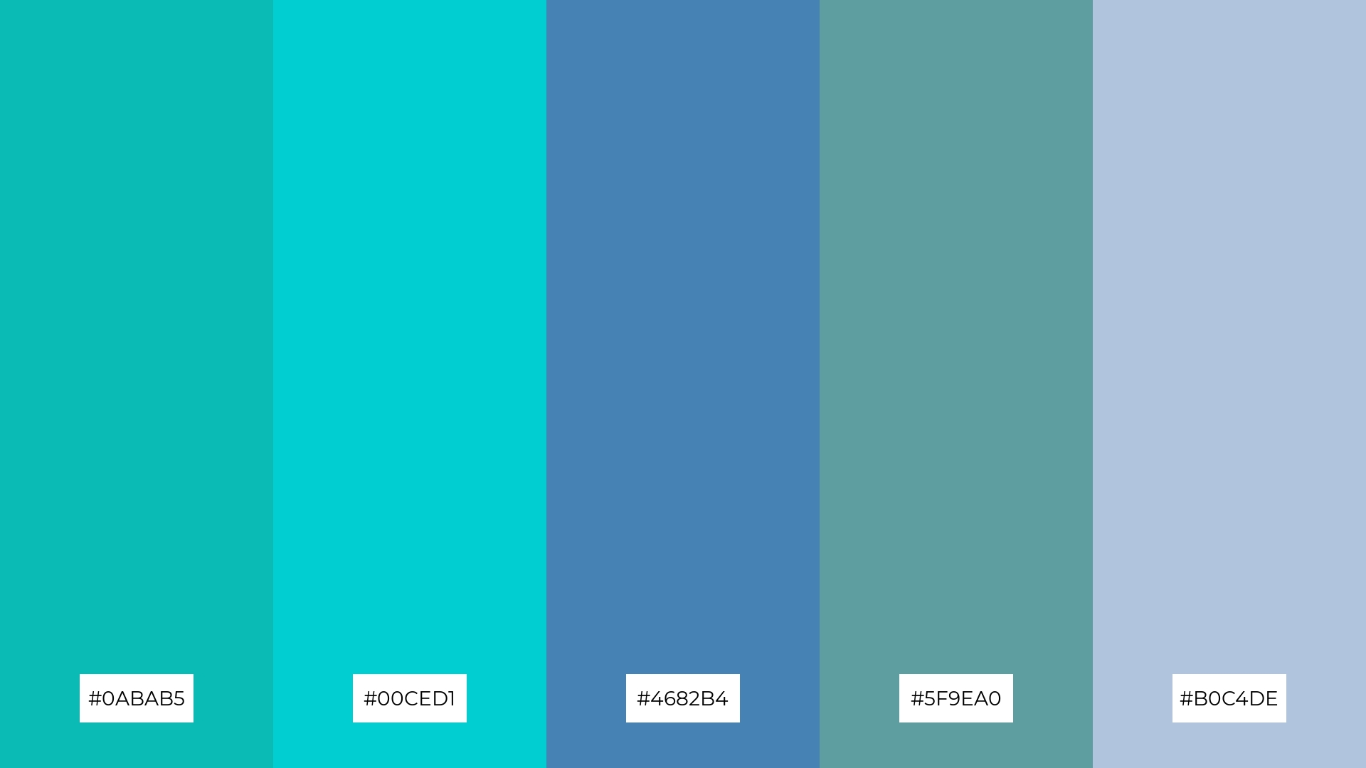
The ‘Winter Frost’ color palette, with its blend of turquoise (#0ABAB5), dark turquoise (#00CED1), steel blue (#4682B4), cadet blue (#5F9EA0), and light steel blue (#B0C4DE), creates a harmonious balance by combining cool, calming hues that evoke a sense of tranquility and sophistication.
This palette is ideal for sleek corporate branding, where the cohesive and professional tones can convey reliability and modernity, making it perfect for businesses aiming to project a polished and trustworthy image.
13) Candy Crush
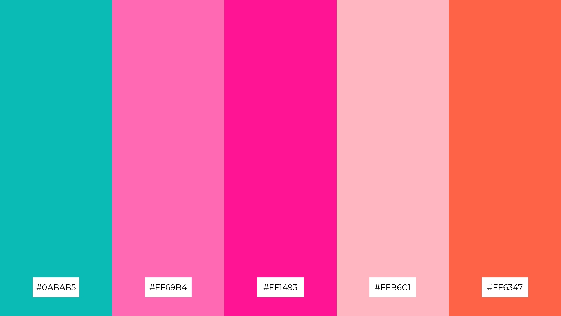
The ‘Candy Crush’ color palette, with its blend of turquoise (#0ABAB5), hot pink (#FF69B4), deep pink (#FF1493), light pink (#FFB6C1), and tomato (#FF6347), masterfully combines warm and cool tones to evoke a playful and energetic mood.
This vibrant palette is perfect for artisan product branding, where the lively colors can highlight the creativity and uniqueness of handmade goods, or for editorial layouts, where the dynamic hues can captivate readers and add a touch of whimsy to the content.
14) Earthy Tones
The ‘Earthy Tones’ color palette, with its blend of turquoise (#0ABAB5), saddle brown (#8B4513), sienna (#A0522D), chocolate (#D2691E), and peru (#CD853F), creates a dynamic interaction between bold and subtle hues, offering a rich and grounded aesthetic.
This palette is perfect for restaurant menus, where the warm and inviting colors can enhance the dining experience by evoking a sense of comfort and sophistication, making the dishes appear more appetizing and the overall ambiance more welcoming.
15) Royal Elegance
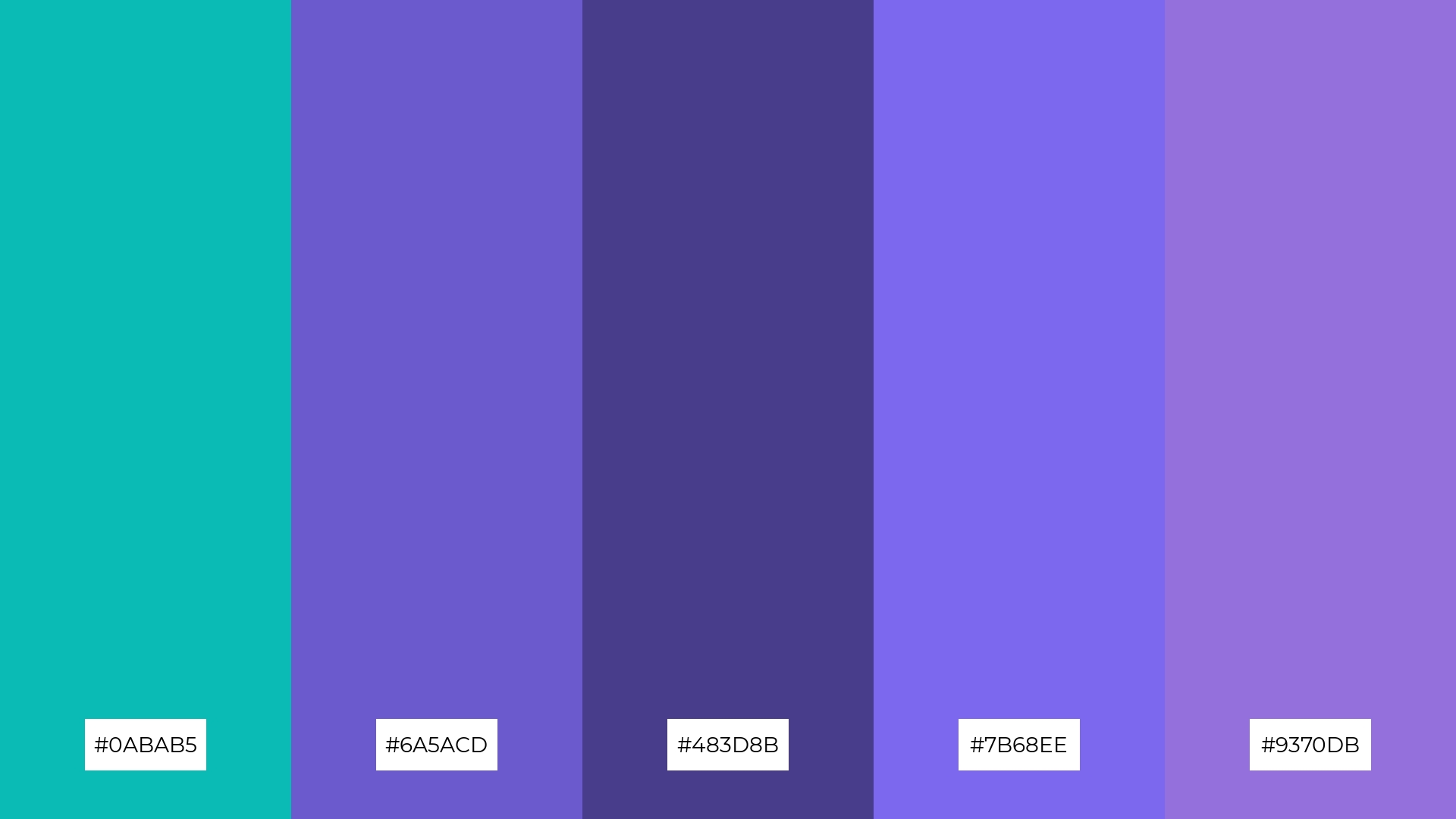
The ‘Royal Elegance’ color palette, with its blend of turquoise (#0ABAB5), slate blue (#6A5ACD), dark slate blue (#483D8B), medium slate blue (#7B68EE), and medium purple (#9370DB), conveys a sense of harmony through its cohesive mix of cool and regal tones, creating a sophisticated and balanced visual experience.
This palette is ideal for tech startups aiming to project innovation and reliability, or for cozy interior makeovers where the rich and elegant colors can transform a space into a luxurious and inviting retreat.
How to Use Tiffany Blue Patterns in Design
In home decor, Tiffany Blue can be used to create a serene and elegant atmosphere. Pair it with neutral tones like white or beige for a clean look, or add metallic accents for a touch of luxury. This color works beautifully in living rooms and bedrooms, bringing a sense of calm and sophistication.
For marketing materials, Tiffany Blue can make your brand stand out. Use it as a primary color in your logo or as an accent in promotional graphics to convey a sense of trust and elegance. Complement it with warm shades like coral or gold to add vibrancy and appeal to your campaigns.
In clothing design, Tiffany Blue can be both versatile and stylish. It pairs well with both casual and formal wear, making it a great choice for everything from summer dresses to business attire. Combine it with soft pinks or deep blues to create outfits that are both eye-catching and harmonious.
Ready to bring your designs to life with Tiffany Blue? Try creating your own color palettes using Piktochart and see how this iconic hue can elevate your projects.


