Teal green is a versatile and calming color that can add a touch of sophistication to any design. Its unique blend of blue and green makes it a popular choice for both digital and print media.
Whether you’re creating infographics, presentations, or social media graphics, incorporating teal green can elevate your visual content. Explore various teal green color palettes to find the perfect combination for your next project.
Tips For Creating Teal Green Color Palettes
Designing with teal green can be both exciting and challenging. Here are some practical tips to help you create stunning color palettes:
- Balance with Neutrals: Pair teal green with neutral colors like white, gray, or beige to create a balanced and harmonious look.
- Complementary Colors: Use complementary shades such as coral or peach to make teal green pop and add vibrancy to your design.
- Gradients and Shades: Experiment with different gradients and shades of teal green to add depth and dimension to your visuals.
- Accent Colors: Incorporate accent colors like gold or copper to add a touch of elegance and sophistication to your design.
- Versatility: Ensure your color palette is versatile enough to be used across various mediums, from digital screens to printed materials.
- Consistency: Maintain consistency in your color choices to create a cohesive and professional look throughout your project.
15 Teal Green Color Palettes
1) Ocean Breeze
The ‘Ocean Breeze’ color palette, with its deep and soothing shades of teal and aqua, evokes a sense of tranquility and freshness, reminiscent of a serene coastal retreat.
These colors interact harmoniously to create a cohesive and calming look, making them ideal for interior decor in spaces designed for relaxation, such as bedrooms or living rooms.
2) Tropical Lagoon
The ‘Tropical Lagoon’ color palette, with its rich and vibrant hues, evokes a sense of energy and vitality, reminiscent of lush, tropical landscapes.
This palette would excel in digital branding for eco-friendly products, where the dynamic and refreshing colors can convey a message of sustainability and natural beauty.
3) Minty Fresh
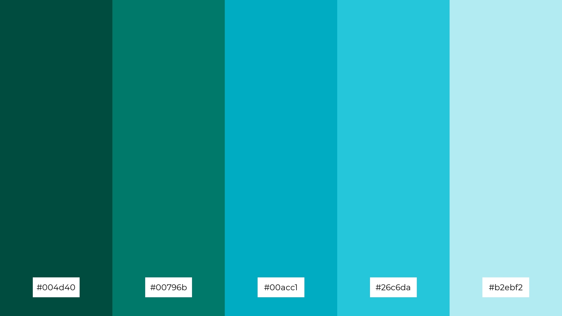
The ‘Minty Fresh’ color palette, featuring dominant shades like deep teal (#004d40) and vibrant aqua (#00acc1), creates a refreshing and invigorating visual experience.
These colors work together to produce a harmonious and balanced look, making the palette ideal for wellness branding, where the soothing and revitalizing hues can promote a sense of calm and well-being.
4) Forest Canopy
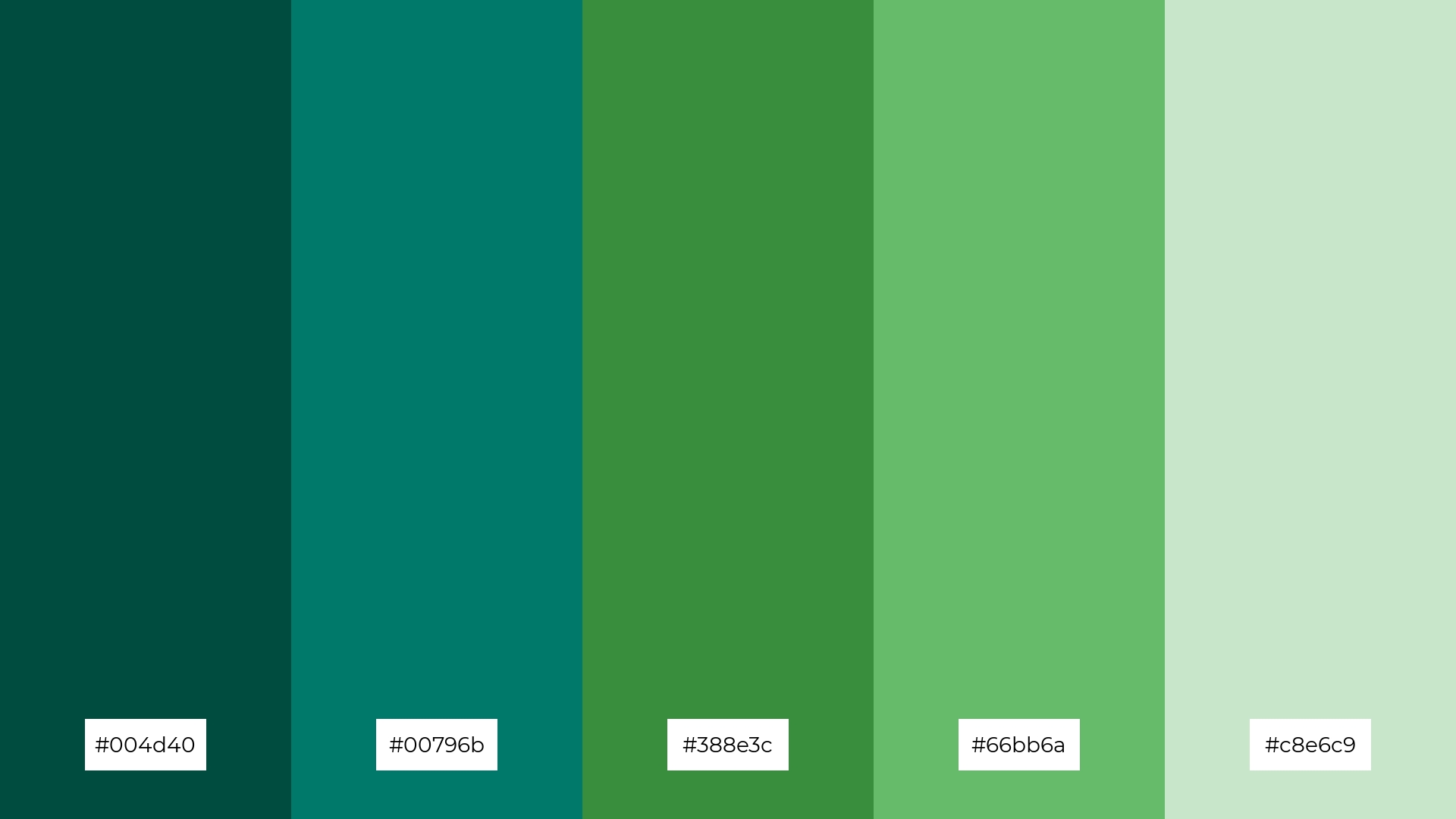
The ‘Forest Canopy’ color palette, with its blend of deep greens and soft pastels, offers a balance of soft and bold tones, creating a distinct and inviting mood.
This palette is ideal for creating inviting retail spaces or modern web designs, where the harmonious mix of colors can enhance the overall aesthetic and appeal.
5) Coastal Retreat
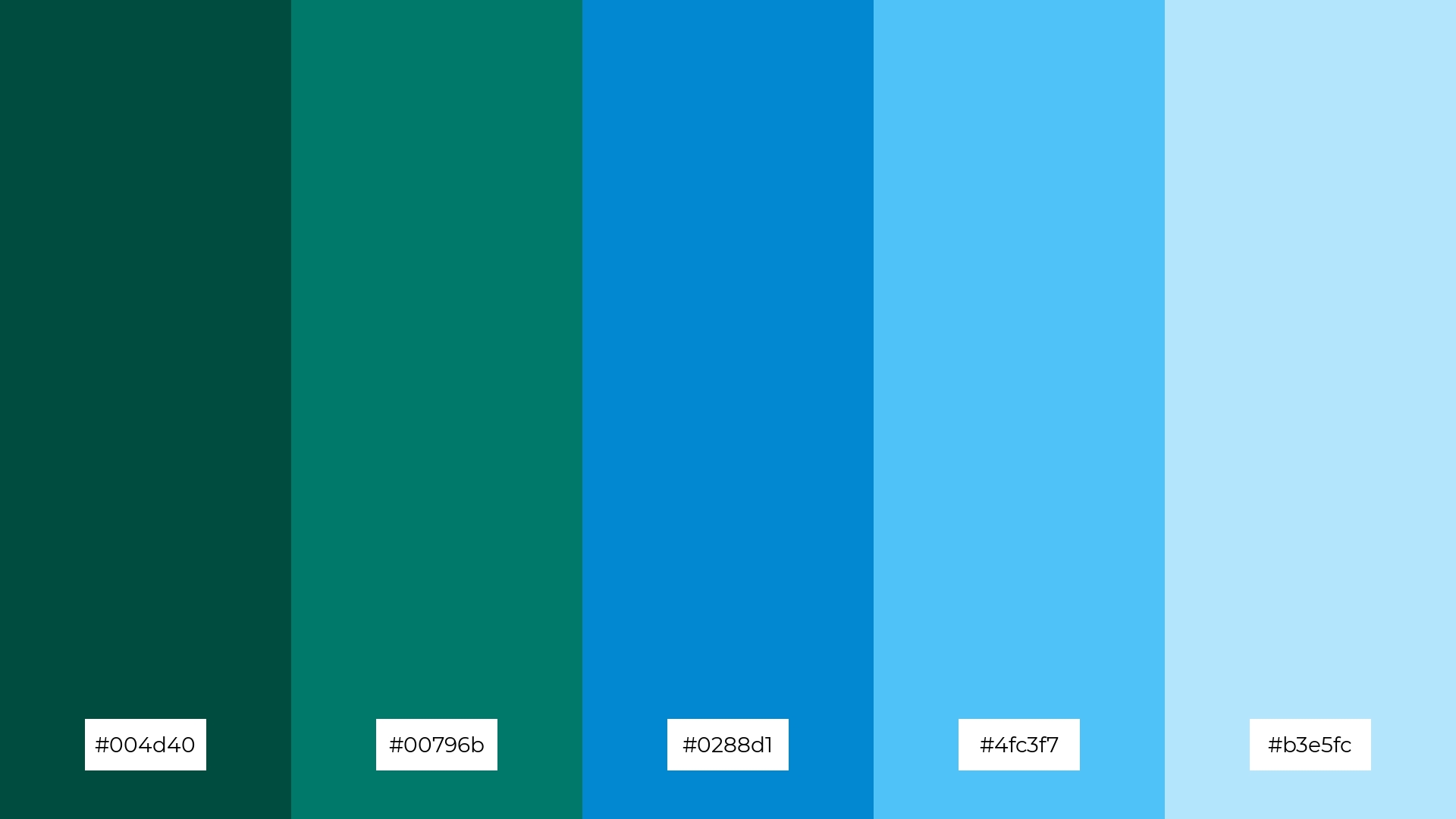
The ‘Coastal Retreat’ color palette, with its harmonious blend of deep teal (#004d40), rich turquoise (#00796b), and vibrant blue (#0288d1), evokes a serene and tranquil ambiance reminiscent of a peaceful seaside escape.
This palette is perfect for luxury fashion campaigns, where the calming and sophisticated hues can create an elegant and refreshing visual experience, capturing the essence of high-end coastal living.
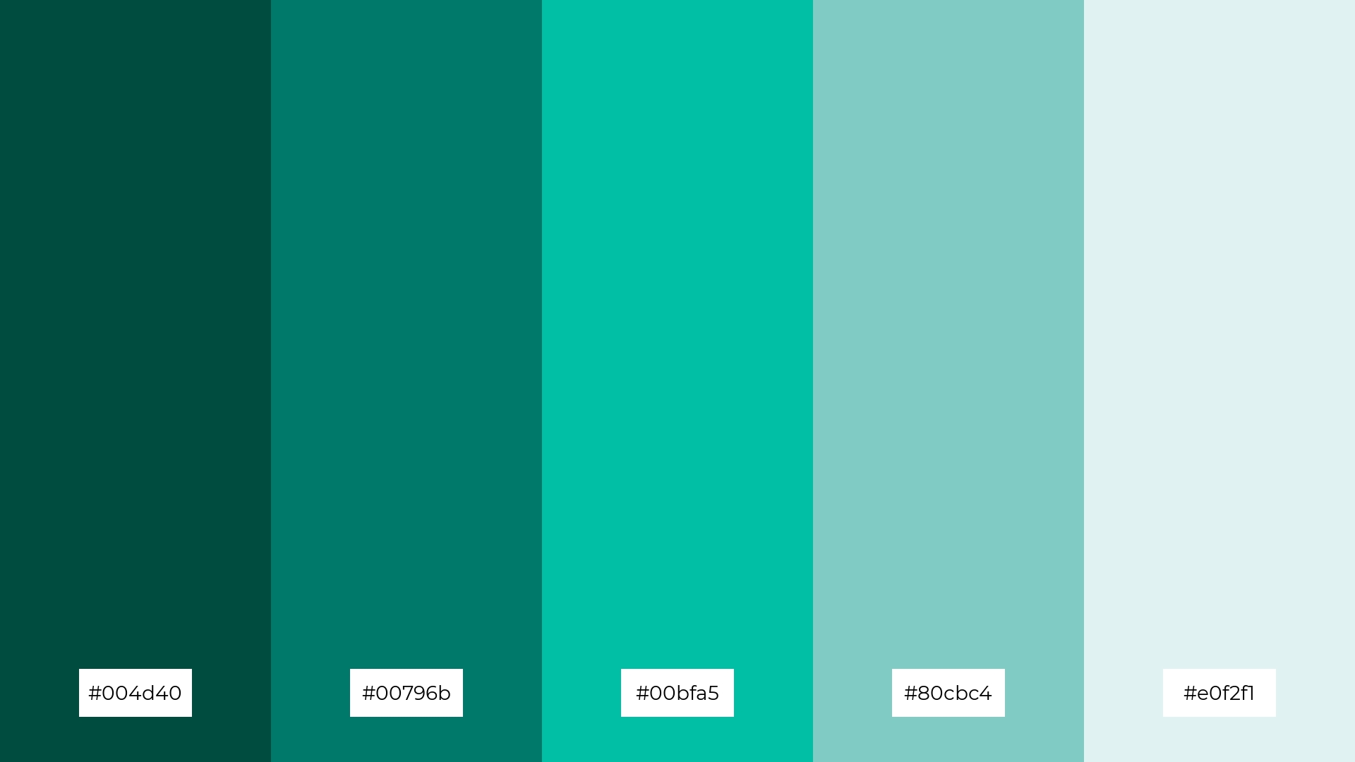
6) Serene Waters
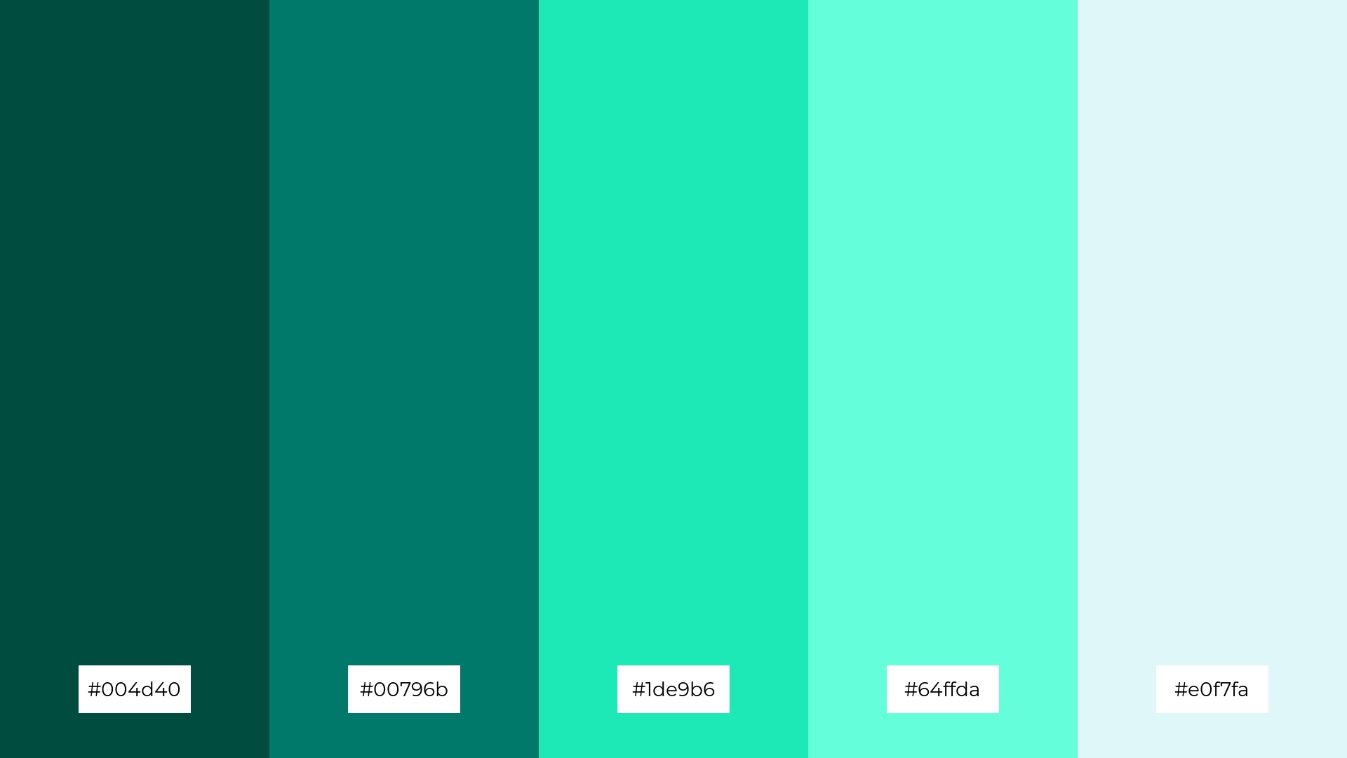
The ‘Serene Waters’ color palette, with its blend of deep teal (#004d40), rich turquoise (#00796b), and light aqua shades (#1de9b6, #64ffda, #e0f7fa), creates a harmonious and sophisticated mood, perfect for minimalistic branding that aims to convey elegance and tranquility.
This palette’s calming and refreshing hues can also be used in bold event designs, where the vibrant and soothing colors can enhance the overall aesthetic, making the event feel both lively and serene.
7) Emerald Isle

The ‘Emerald Isle’ color palette, with its deep and rich greens contrasted by lighter, more vibrant shades, creates a dynamic visual interest that captures attention and adds depth to any design.
This palette is ideal for creative projects like magazine layouts or artistic websites, where the interplay of bold and subtle hues can enhance the overall aesthetic and engage the audience effectively.
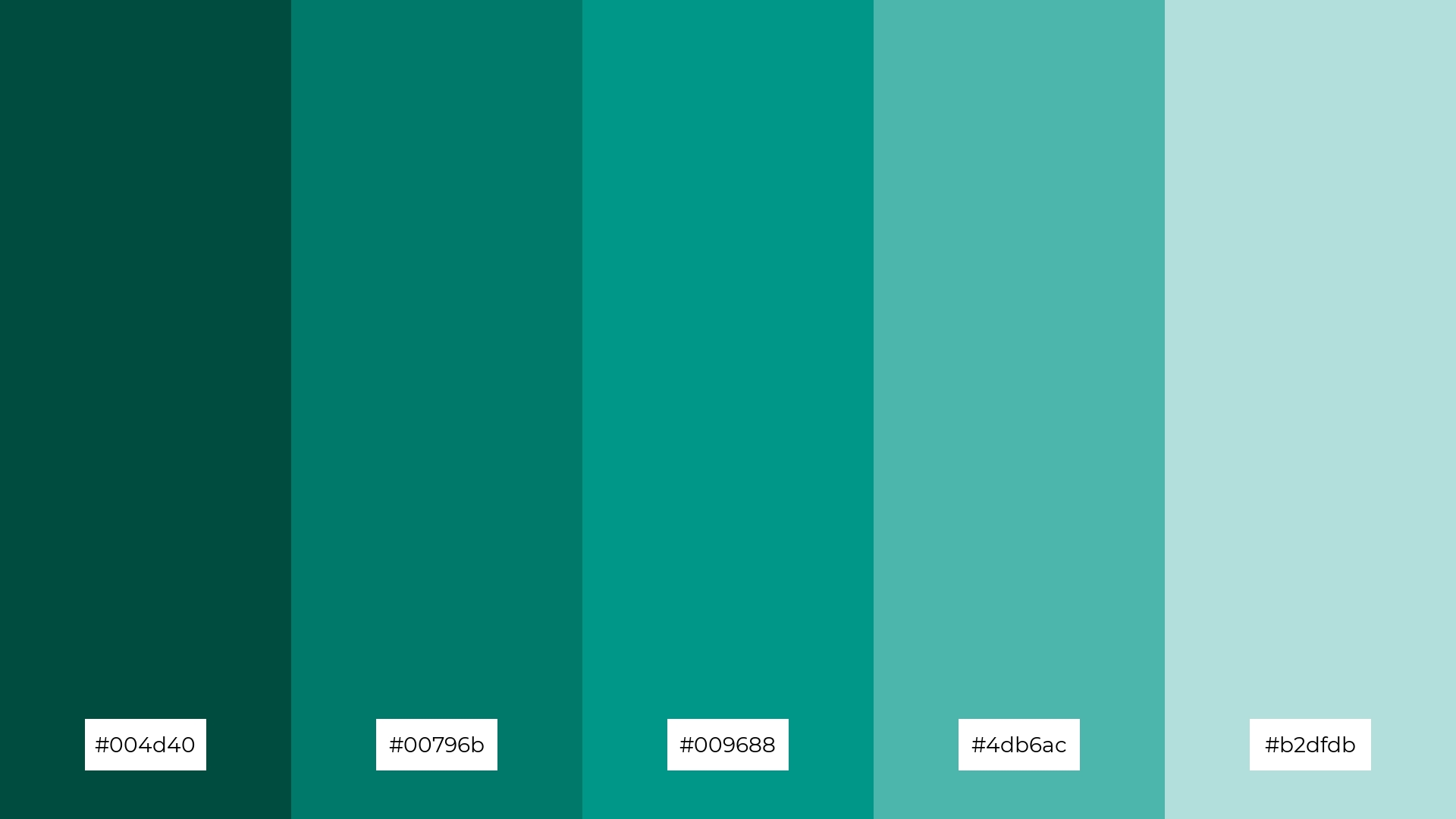
8) Aqua Dream
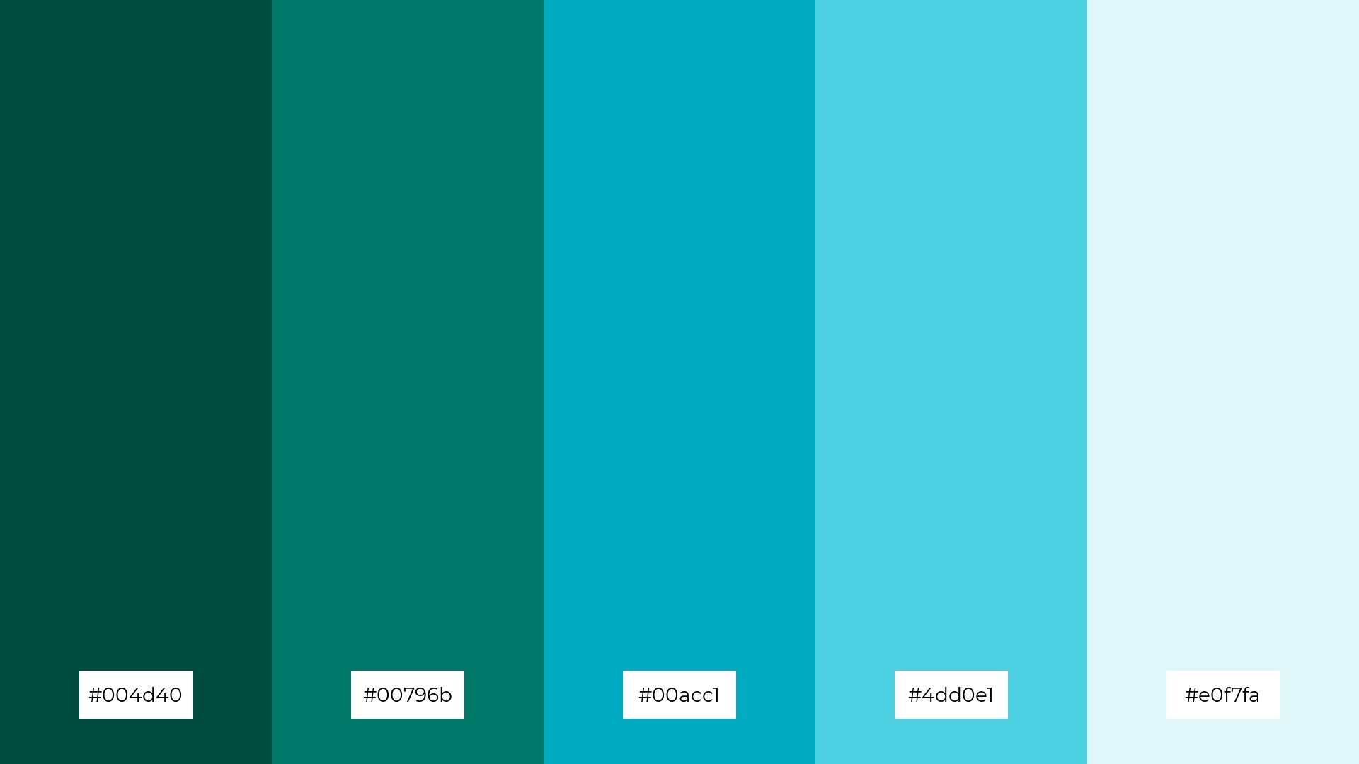
The ‘Aqua Dream’ color palette, with its blend of deep teal (#004d40), rich turquoise (#00796b), and vibrant aqua (#00acc1), can evoke a sense of calm and serenity, making it perfect for spa branding where the soothing hues promote relaxation and tranquility.
Conversely, the lighter shades of aqua (#4dd0e1) and light aqua (#e0f7fa) can bring a sense of excitement and energy, making this palette ideal for vibrant marketing campaigns that aim to capture attention and convey a refreshing and dynamic message.
9) Teal Sunset
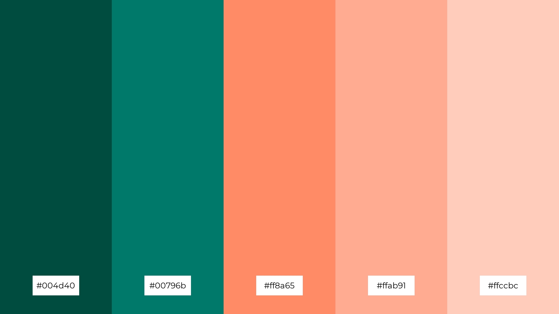
The ‘Teal Sunset’ color palette, with its blend of deep teal (#004d40), rich turquoise (#00796b), and bright coral shades (#ff8a65, #ffab91, #ffccbc), creates a vibrant yet soothing visual experience.
This harmonious mix of softer and brighter tones evokes a warm and inviting mood, making it ideal for seasonal promotions or home decor that aims to capture the essence of a serene sunset.
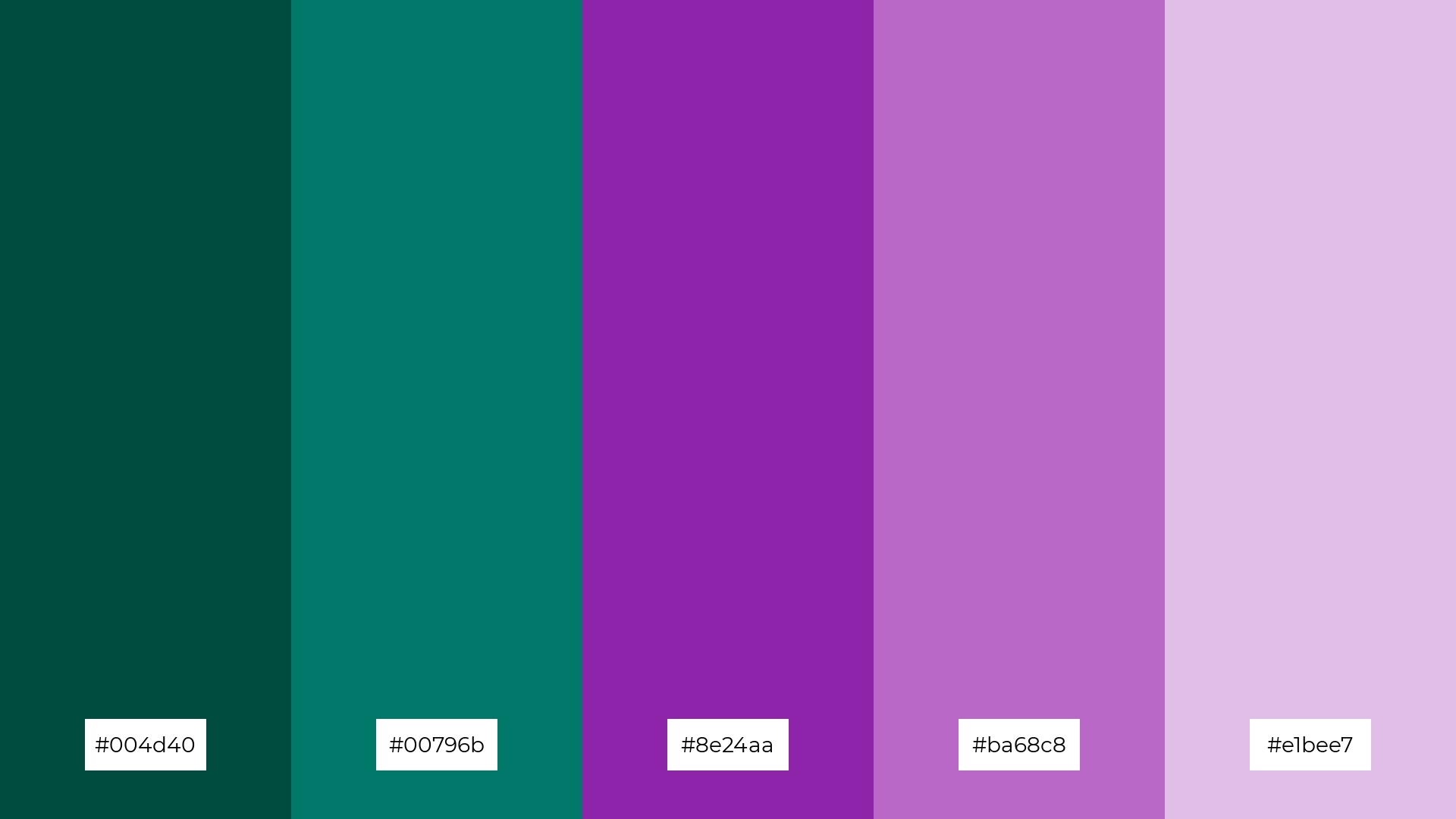
10) Mystic Forest
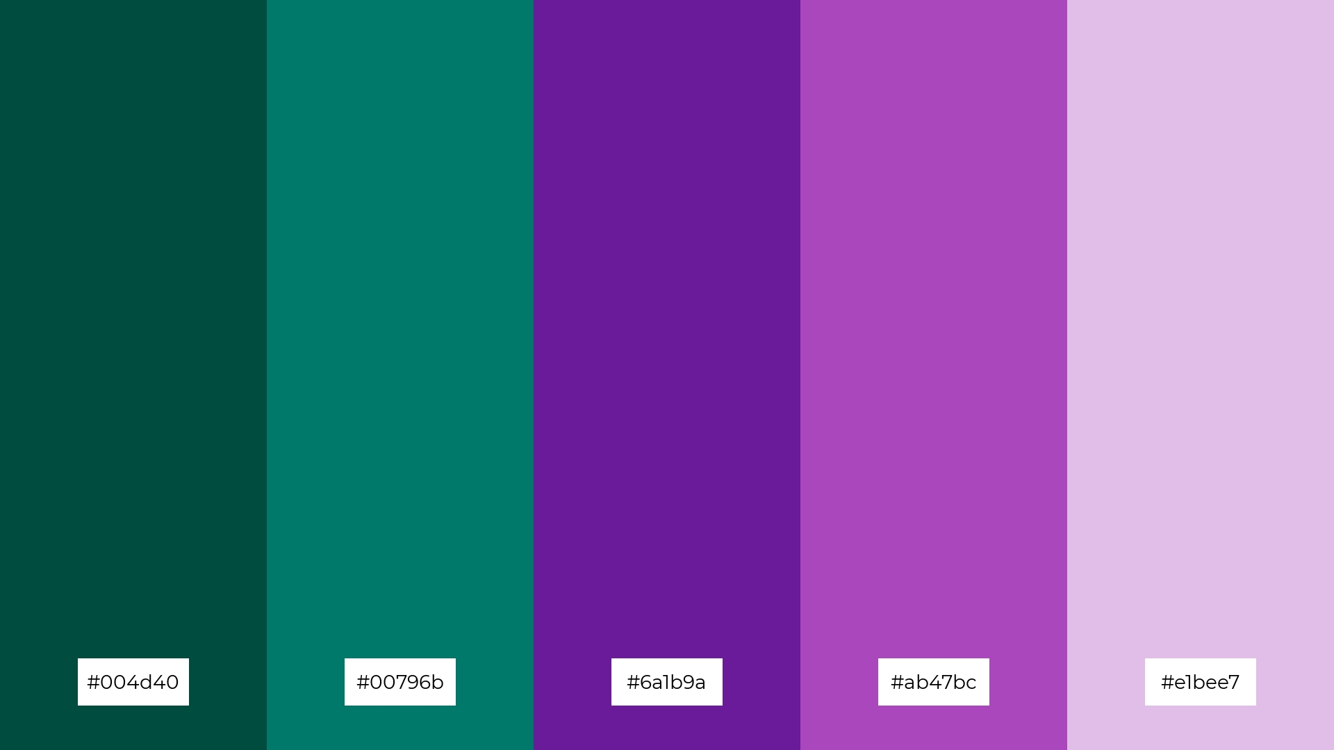
The ‘Mystic Forest’ color palette, with its deep teal (#004d40) and rich turquoise (#00796b) transitioning into vibrant purples (#6a1b9a, #ab47bc) and soft lavender (#e1bee7), creates a visual flow that evokes a sense of mystery and enchantment, blending tranquility with a touch of joy.
This palette is ideal for lifestyle branding, where the harmonious mix of calming and uplifting hues can enhance the appeal of wellness products, or for tech product packaging, where the dynamic colors can convey innovation and sophistication.
11) Coral Reef
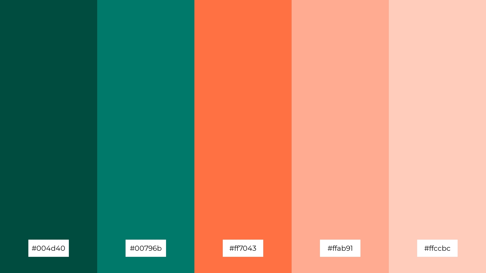
The ‘Coral Reef’ color palette, with its deep teal (#004d40) and rich turquoise (#00796b) contrasted by vibrant coral shades (#ff7043, #ffab91, #ffccbc), creates a welcoming yet dramatic effect that captivates and engages viewers.
This palette shines in boutique interiors, where the dynamic interplay of bold and soft tones can create an inviting and luxurious atmosphere, or in luxury e-commerce sites, where the vibrant colors can enhance the visual appeal and draw attention to high-end products.
12) Teal Twilight
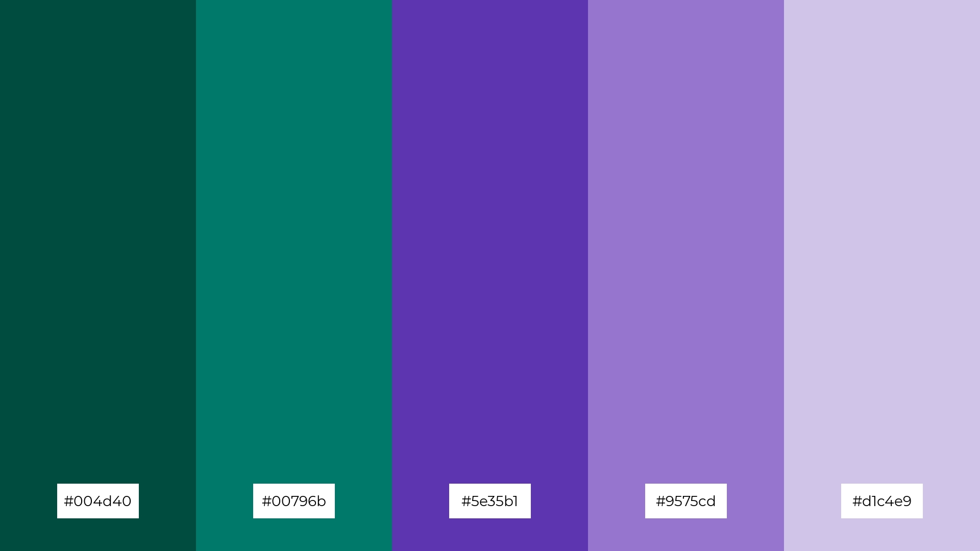
The ‘Teal Twilight’ color palette, with its deep teal (#004d40) and rich turquoise (#00796b) blending seamlessly into vibrant purples (#5e35b1, #9575cd) and soft lavender (#d1c4e9), creates a harmonious balance that evokes a sense of calm and sophistication.
This palette is perfect for sleek corporate branding, where the interplay of bold and subtle hues can convey professionalism and modernity, making a strong visual impact while maintaining an elegant and refined aesthetic.
13) Desert Oasis
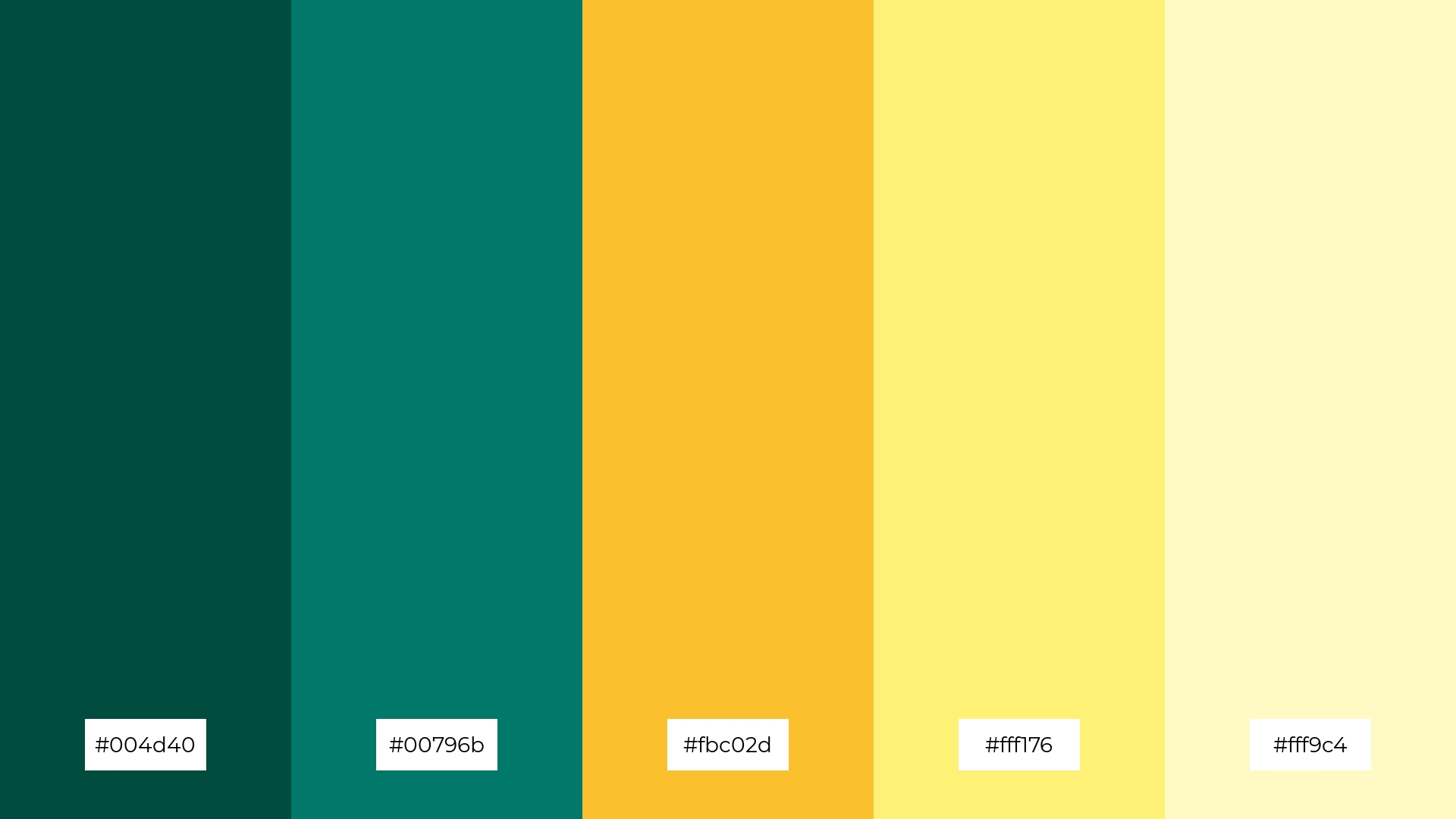
The ‘Desert Oasis’ color palette, with its deep teal (#004d40), rich turquoise (#00796b), and warm yellows (#fbc02d, #fff176, #fff9c4), blends warm and cool tones to evoke a sense of balance and tranquility.
This palette is perfect for artisan product branding, where the harmonious mix of vibrant and soothing hues can create a visually appealing and inviting aesthetic that captures the essence of handcrafted quality and natural beauty.
14) Teal Harmony
The ‘Teal Harmony’ color palette, with its deep teal (#004d40) and rich turquoise (#00796b) contrasted by vibrant purples (#8e24aa, #ba68c8) and soft lavender (#e1bee7), creates a dynamic interplay of bold and subtle hues that can captivate and engage viewers.
This palette is ideal for festival marketing, where the vibrant and harmonious colors can convey a sense of excitement and celebration, making promotional materials visually appealing and memorable.
15) Teal Sunrise
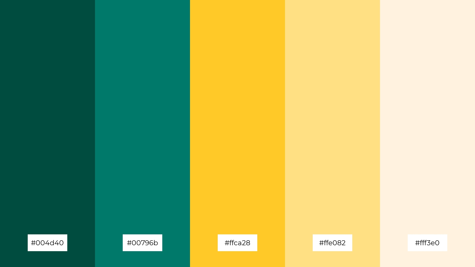
The ‘Teal Sunrise’ color palette, with its deep teal (#004d40) and rich turquoise (#00796b) contrasted by warm yellows (#ffca28, #ffe082) and soft cream (#fff3e0), conveys a sense of harmony through its balanced blend of cool and warm tones, creating a visually soothing and inviting atmosphere.
This palette is ideal for tech startups aiming to create a modern and approachable brand identity, or for cozy interior makeovers where the harmonious mix of vibrant and soft hues can enhance the warmth and comfort of living spaces.
How to Use Teal Green Patterns in Design
Teal green color palettes can transform home decor by creating a serene and sophisticated ambiance. Use deep teal for accent walls or furniture pieces to add depth, while lighter shades can be used for textiles and accessories to maintain a balanced and inviting atmosphere.
In marketing materials, teal green can convey a sense of trust and calmness. Pair it with complementary colors like coral or gold to make your designs stand out and capture attention. This combination is particularly effective for wellness and eco-friendly brands aiming to evoke a sense of natural beauty and tranquility.
For clothing, teal green offers a versatile option that suits various styles and seasons. Incorporate it into your wardrobe through statement pieces like jackets or dresses, or use it as an accent color in accessories to add a touch of elegance and sophistication.
Ready to create your own stunning teal green color palettes? Try using Piktochart’s intuitive design tools to bring your vision to life. Get started with Piktochart today and elevate your designs effortlessly.


