Teal blue is a versatile and calming color that can transform any design project. Its unique blend of blue and green hues makes it a popular choice for creating visually appealing graphics.
Whether you’re designing an infographic, a presentation, or a social media post, incorporating teal blue can add a touch of sophistication and tranquility. Explore the endless possibilities of teal blue color palettes to elevate your next project.
Tips For Creating Teal Blue Color Palettes
Designing with teal blue can be both exciting and challenging. Here are some practical tips to help you create stunning color palettes:
- Balance with Neutrals: Pair teal blue with neutral colors like white, gray, or beige to create a balanced and harmonious look.
- Complementary Shades: Use complementary colors such as coral or peach to make teal blue stand out and add vibrancy to your design.
- Gradients and Shades: Experiment with different shades and gradients of teal blue to add depth and dimension to your graphics.
- Accent Colors: Incorporate accent colors like gold or mustard to highlight key elements and create a focal point in your design.
- Versatility: Teal blue works well in both digital and print media, making it a versatile choice for various design projects.
- Consistency: Maintain consistency in your color palette to ensure a cohesive and professional look across all your design elements.
15 Teal Blue Color Palettes
1) Ocean Breeze
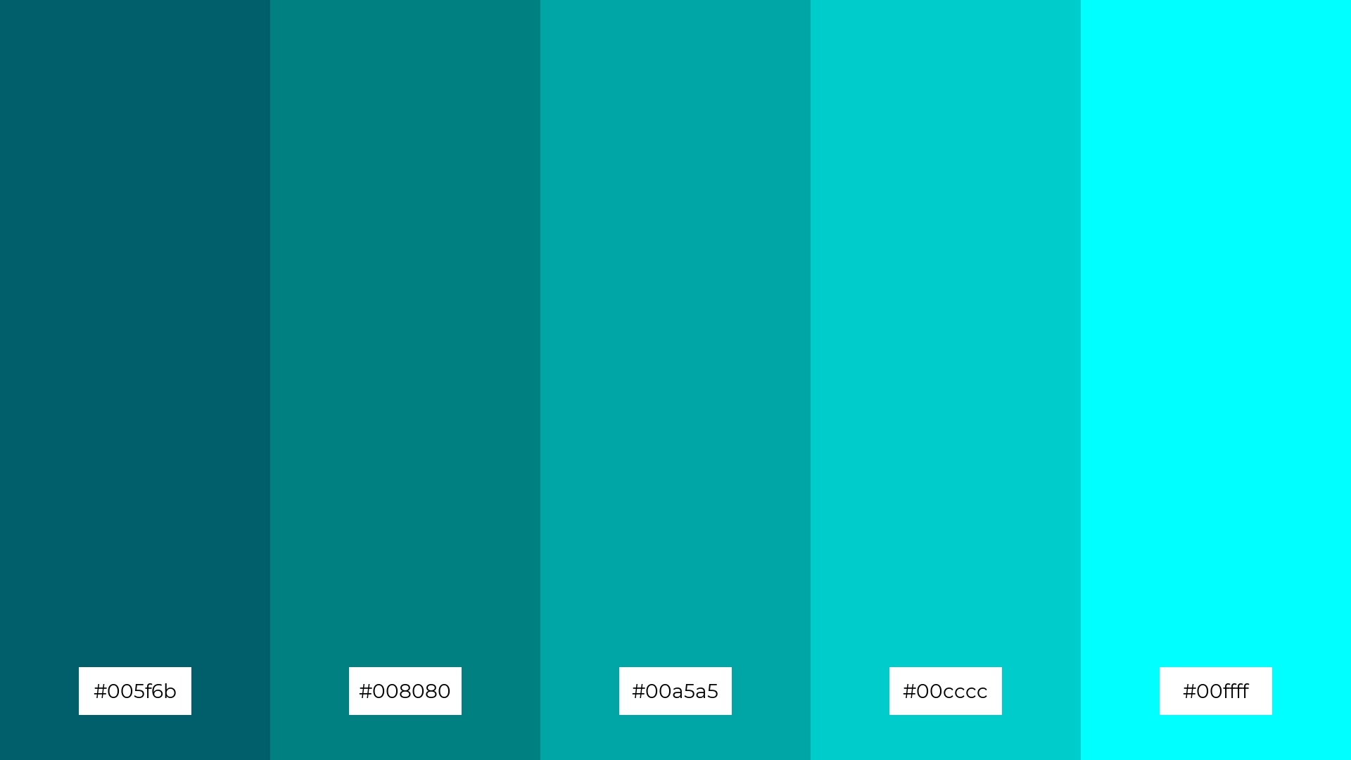
The ‘Ocean Breeze’ color palette evokes a serene and refreshing mood, reminiscent of tranquil seaside landscapes and the soothing rhythm of ocean waves.
These shades of teal and aqua interact harmoniously to create a cohesive and calming look, making them ideal for interior decor in spaces designed for relaxation, such as a coastal-themed living room or a spa retreat.
2) Tropical Lagoon

The ‘Tropical Lagoon’ color palette, with its rich and vibrant shades of teal and aqua, evokes a sense of energy and rejuvenation, reminiscent of lush tropical waters and sunlit lagoons.
This palette would excel in digital branding for wellness apps or eco-friendly product packaging, where the colors can convey a refreshing and invigorating experience to the audience.
3) Teal Sunset
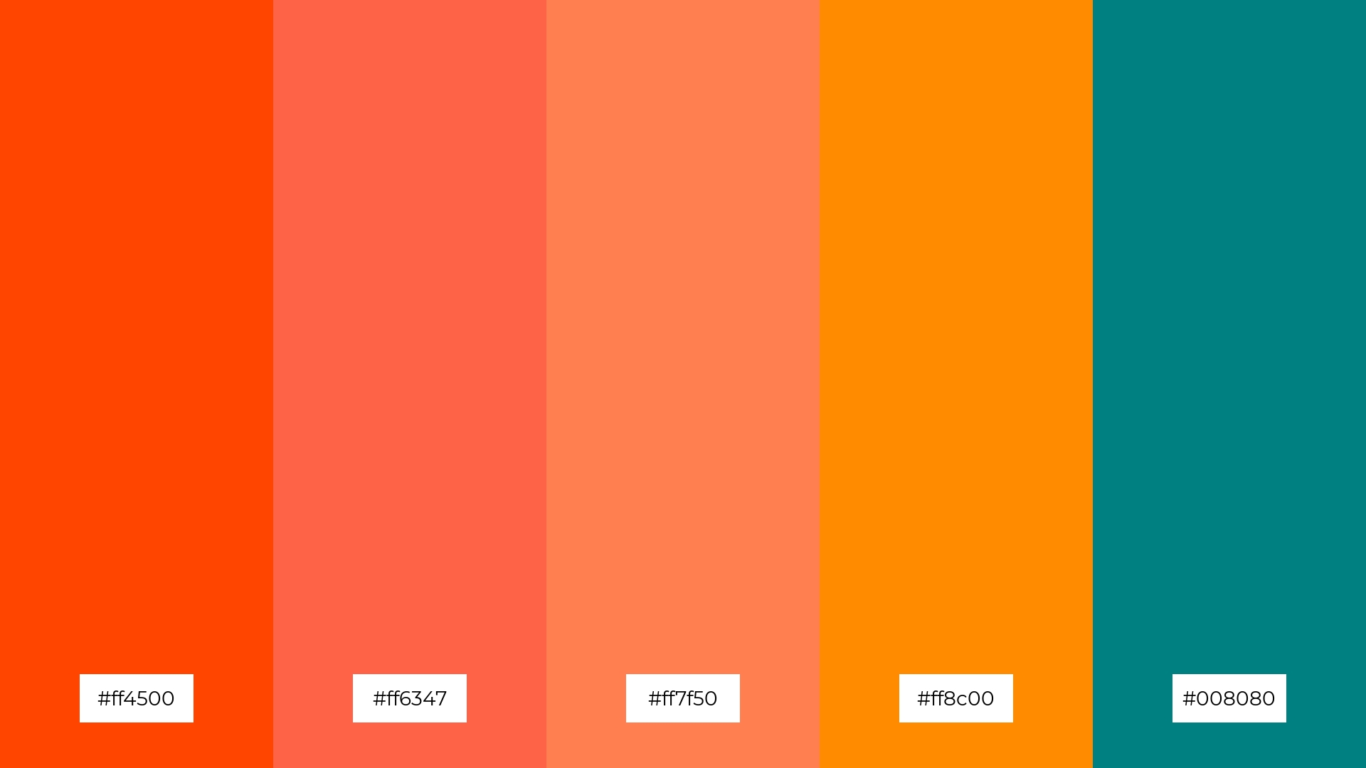
The ‘Teal Sunset’ color palette features dominant hues of vibrant oranges and a deep teal, creating a striking contrast that captures the essence of a dramatic sunset.
This combination of warm and cool tones brings a dynamic yet balanced harmony, making it perfect for wellness branding where the colors can evoke both energy and tranquility.
4) Coral Reef
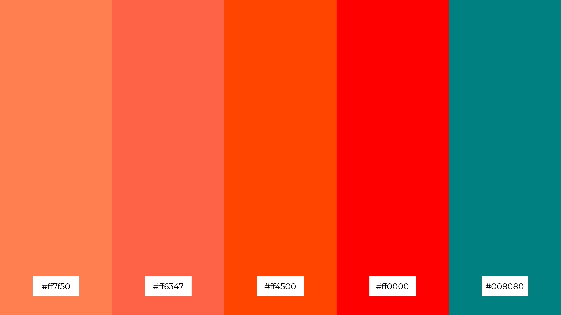
The ‘Coral Reef’ color palette, with its blend of soft corals and bold teals, offers a unique balance that creates a distinct and inviting mood.
This palette is ideal for designing modern web interfaces or creating inviting retail spaces where the colors can enhance the user experience and draw attention to key elements.
5) Minty Fresh
The ‘Minty Fresh’ color palette, with its spectrum of greens from soft mint to deep teal, creates a refreshing and invigorating ambiance that evokes a sense of renewal and vitality.
This palette is perfect for wedding themes, where the colors can bring a fresh and modern twist to traditional decor, creating an atmosphere of elegance and rejuvenation.
6) Deep Sea
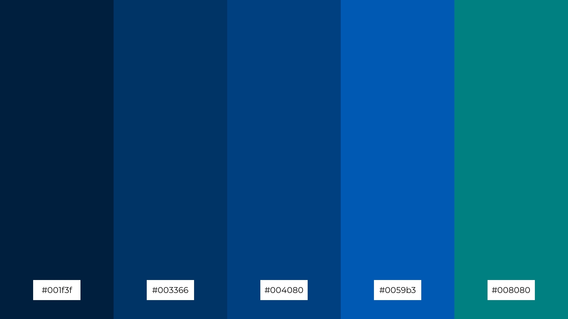
The ‘Deep Sea’ color palette, with its rich and deep shades of blue and teal, creates a sophisticated and calming atmosphere, perfect for minimalistic branding that aims to convey professionalism and trust.
These hues can also be used in bold event designs, where the interplay of dark and vibrant tones can evoke a sense of mystery and elegance, making a lasting impression on attendees.
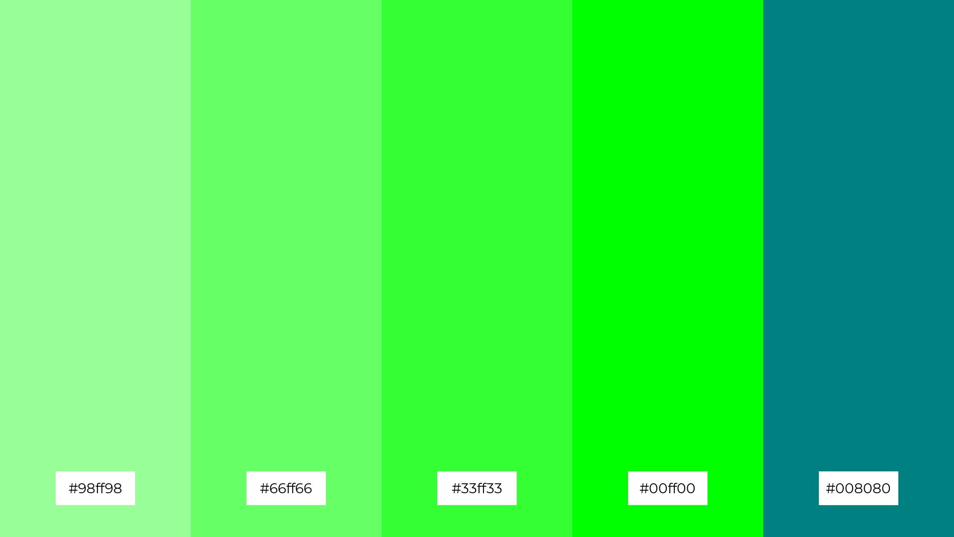
7) Teal Forest
The ‘Teal Forest’ color palette, with its varying shades of green from deep forest to bright lime, creates a striking contrast that adds depth and visual interest to any design.
This palette is perfect for creative projects like magazine layouts or artistic websites, where the dynamic interplay of these greens can draw attention and create a captivating visual experience.
8) Teal and Gold
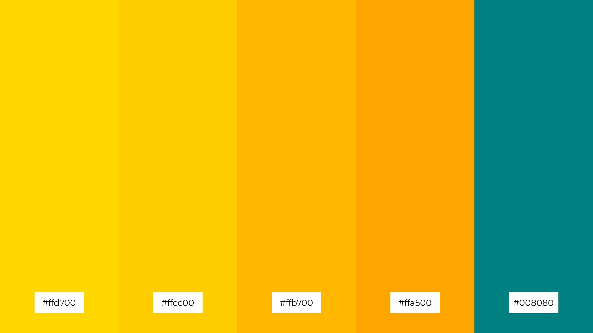
The ‘Teal and Gold’ color palette, with its rich and luxurious hues, can evoke a sense of calm when the deep teal is paired with the softer gold tones, making it ideal for spa branding where tranquility and relaxation are paramount.
Conversely, the vibrant gold shades combined with the striking teal can create an exciting and energetic atmosphere, perfect for vibrant marketing campaigns that aim to capture attention and convey a sense of luxury and dynamism.
9) Teal and Lavender

The ‘Teal and Lavender’ color palette, with its softer tones of lavender and brighter shades of teal, creates a soothing and uplifting ambiance that can evoke feelings of calm and rejuvenation.
This blend is ideal for home decor, particularly in bedrooms or living spaces, where the tranquil and refreshing hues can enhance relaxation and create a serene environment.
10) Teal and Peach

The ‘Teal and Peach’ color palette, with its harmonious blend of soft peach and vibrant teal, creates a visual flow that evokes feelings of joy and tranquility, making it perfect for designs that aim to uplift and soothe.
This palette is ideal for lifestyle branding, such as wellness products or tech product packaging, where the calming teal can convey trust and reliability, while the cheerful peach tones add a touch of warmth and approachability.
11) Teal and Rose
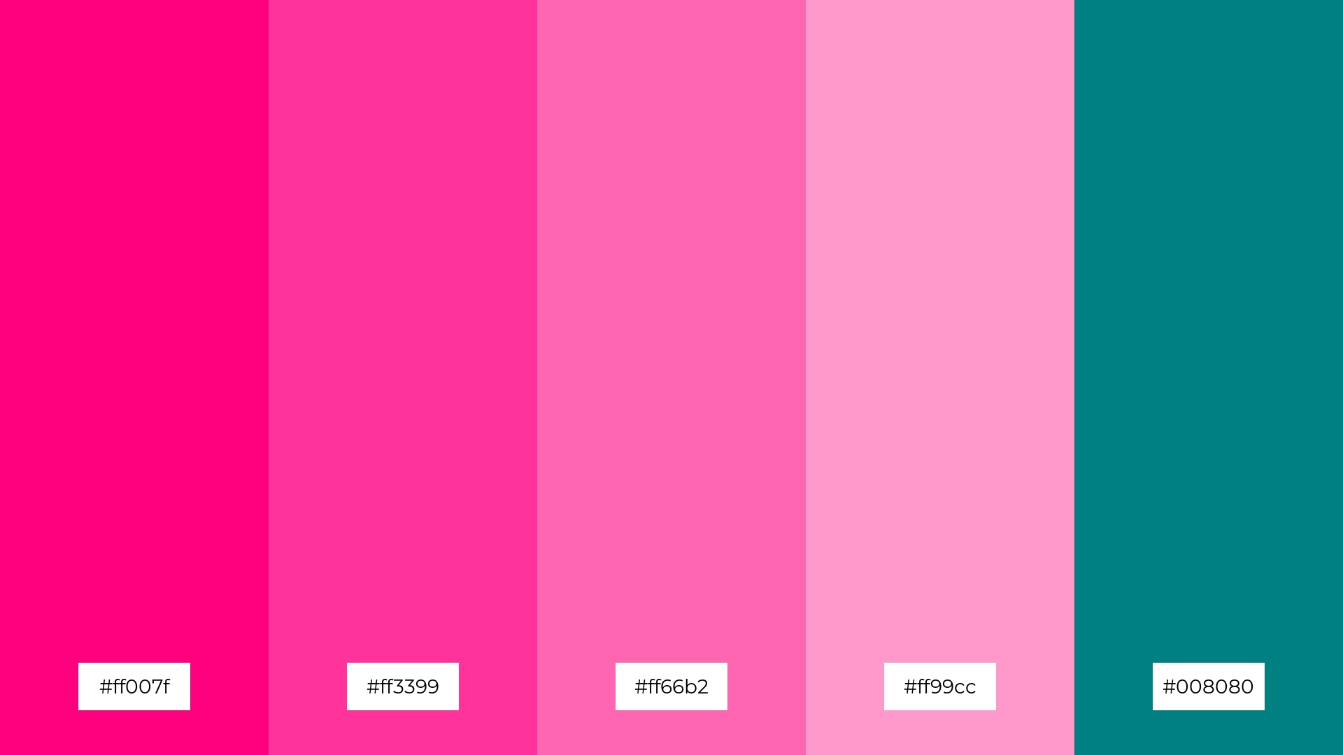
The ‘Teal and Rose’ color palette, with its vibrant and contrasting tones, creates a welcoming yet dramatic effect that can captivate and engage viewers.
This palette shines in boutique interiors or luxury e-commerce sites, where the bold teal and soft rose hues can evoke a sense of elegance and sophistication, enhancing the overall user experience.
12) Teal and Sand
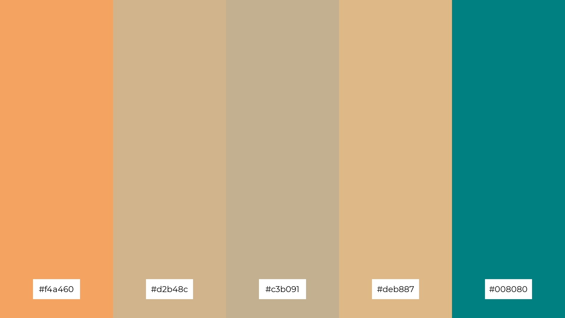
The ‘Teal and Sand’ color palette, with its blend of earthy sand tones and striking teal, creates a harmonious balance that evokes a sense of natural elegance and tranquility.
This palette is perfect for casual apparel lines, where the soothing sand hues can provide a neutral backdrop, allowing the vibrant teal accents to stand out and add a touch of sophistication.
13) Teal and Sky
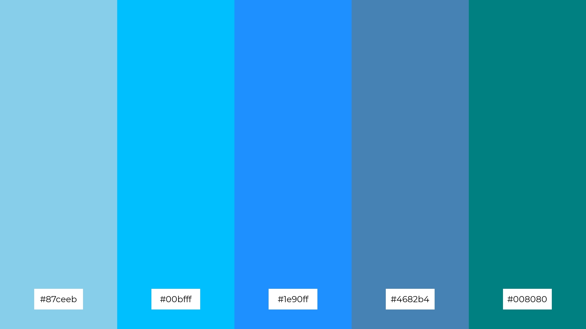
The ‘Teal and Sky’ color palette, with its blend of warm and cool tones, evokes a serene and uplifting mood, reminiscent of clear skies and tranquil waters.
This palette is perfect for artisan product branding, where the harmonious interplay of these hues can convey a sense of craftsmanship and natural beauty, enhancing the appeal of handmade goods.
14) Teal and Plum
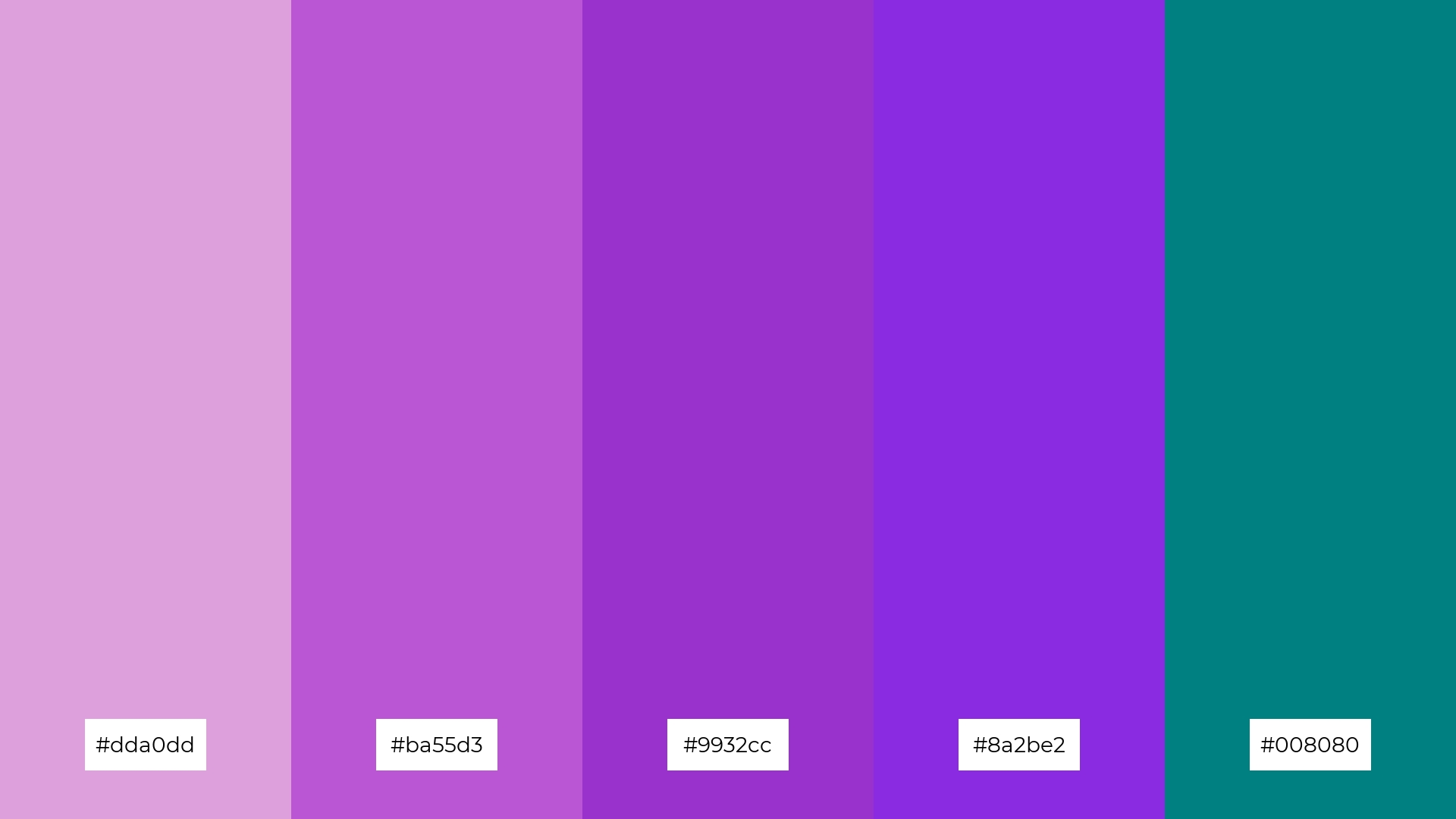
The ‘Teal and Plum’ color palette, with its rich and contrasting hues, creates a dynamic interplay that can evoke both boldness and subtle sophistication, making it ideal for eye-catching festival marketing materials.
This palette’s vibrant plum tones paired with the deep teal can add a touch of elegance and modernity to restaurant menus, enhancing the dining experience by creating a visually appealing and memorable impression.
15) Teal and Olive
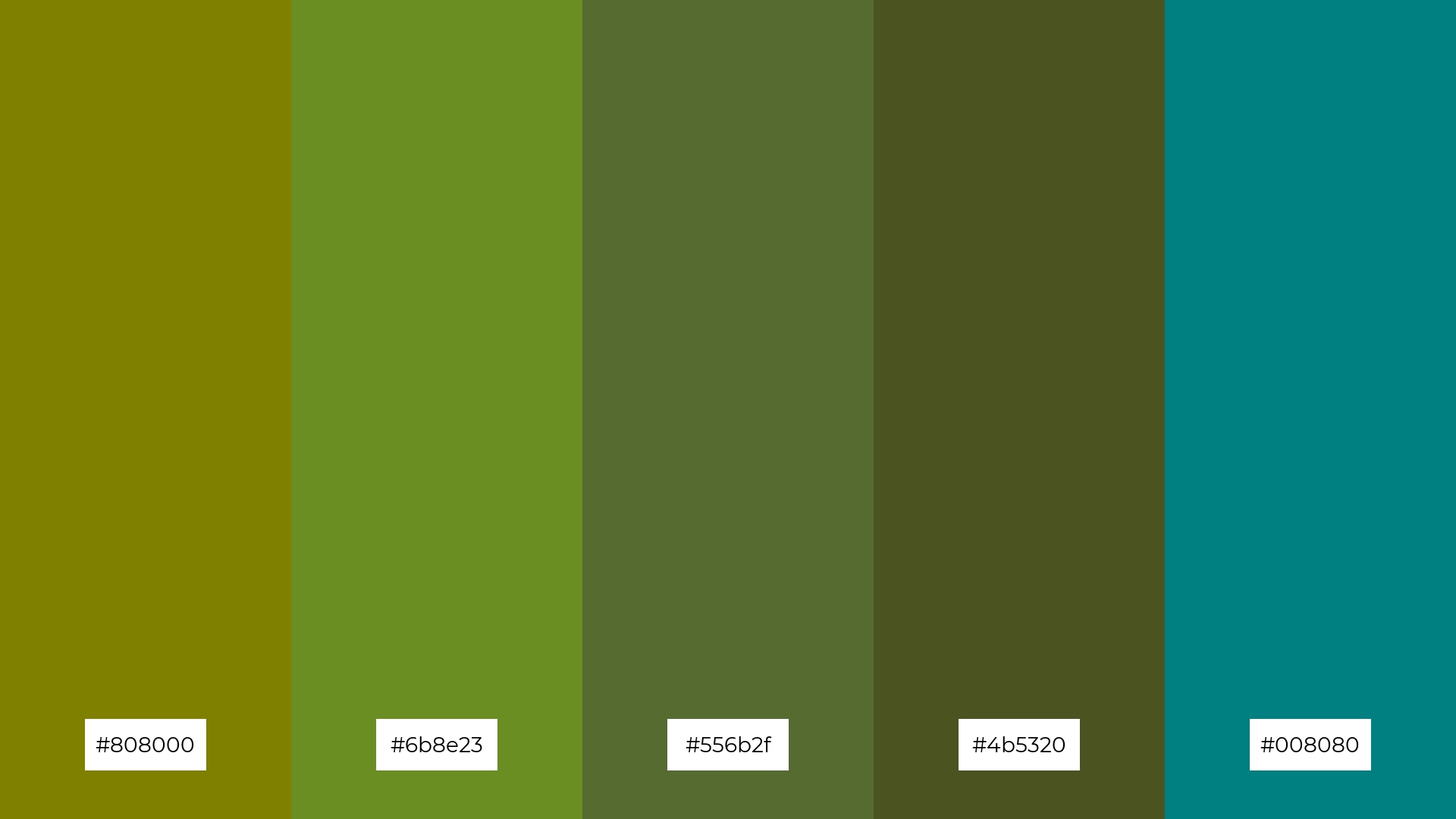
The ‘Teal and Olive’ color palette, with its blend of earthy olive tones and striking teal, creates a harmonious and balanced look that can evoke a sense of natural elegance and tranquility.
This palette is ideal for tech startups aiming to convey innovation and reliability, or for cozy interior makeovers where the warm olive hues can provide a comforting backdrop, allowing the vibrant teal accents to add a touch of sophistication and modernity.
How to Use Teal Blue Patterns in Design
Teal blue color palettes can be a game-changer in home decor, offering a serene and sophisticated ambiance. For a coastal-themed living room, pair teal blue with sandy beige and crisp white to evoke a tranquil seaside retreat. In bedrooms, combine teal with soft lavender or peach to create a calming and rejuvenating space.
In marketing materials, teal blue can convey trust and professionalism. Use it as a primary color in branding for wellness products or eco-friendly initiatives, complemented by vibrant accents like coral or gold to draw attention. For clothing lines, teal blue can add a touch of elegance and modernity, especially when paired with earthy tones like olive or sand.
Ready to elevate your design projects with stunning teal blue palettes? Try creating your own using Piktochart’s intuitive tools. Get started with Piktochart and bring your creative vision to life.


