 Piktochart Team
·

Updated on
November 26, 2024
Published on
November 25, 2024

Supernova color palettes are a vibrant and dynamic way to bring your designs to life. These palettes draw inspiration from the explosive beauty of supernovae, offering a spectrum of colors that can transform any project.
Whether you're creating infographics, presentations, or social media graphics, supernova color palettes provide a unique and eye-catching aesthetic. Their bold and radiant hues can help your content stand out and captivate your audience.
Designing with supernova color palettes can be both exciting and challenging. Here are some practical tips to help you make the most of these vibrant hues:

The 'Stellar Explosion' palette evokes a sense of energy and excitement, with its vibrant mix of fiery orange, golden yellow, and electric blue, balanced by the calming presence of white and the deep, mysterious purple.
Perfect for a modern interior decor project, this palette's dynamic interplay of colors can transform a living space into a lively and inviting environment, showcasing its ability to create a cohesive and visually stimulating atmosphere.

The 'Cosmic Dust' palette, with its rich indigo, vibrant pinks, and warm peach, evokes a sense of playful energy and youthful exuberance.
This palette would excel in digital branding for a trendy fashion startup, where its lively and inviting colors can capture the attention of a young, dynamic audience.
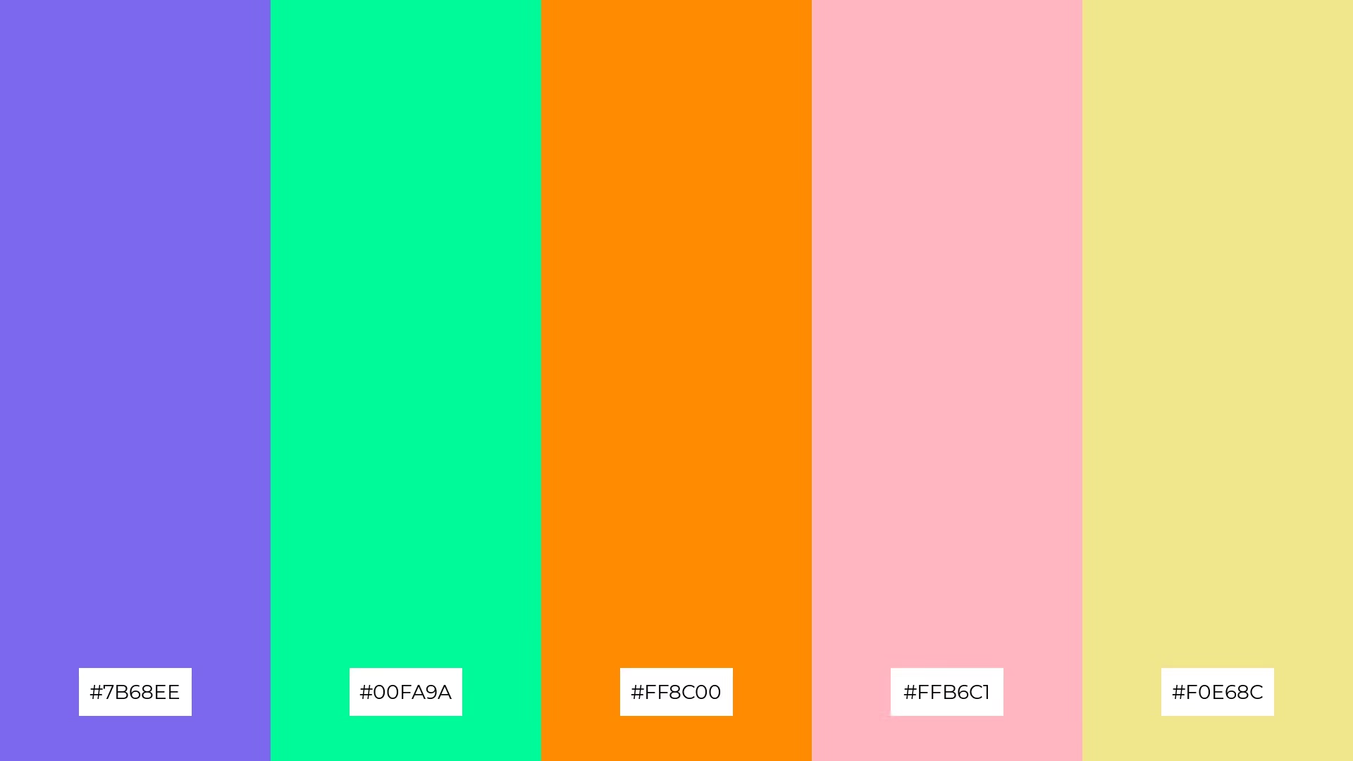
The 'Nebula Glow' palette features dominant colors such as the serene periwinkle (#7B68EE), refreshing mint green (#00FA9A), and vibrant dark orange (#FF8C00), complemented by soft pink (#FFB6C1) and pale yellow (#F0E68C), creating a balanced and harmonious visual experience.
This palette is ideal for wellness branding, where the calming and invigorating hues can evoke a sense of tranquility and rejuvenation, perfectly aligning with the ethos of health and well-being.

The 'Celestial Fire' palette, with its blend of bold red (#FF0000) and soft coral (#FF7F50), alongside the bright gold (#FFD700), lime green (#ADFF2F), and cool turquoise (#00CED1), offers a striking balance of intensity and subtlety, creating a distinct and captivating mood.
This palette is ideal for modern web designs, where its vibrant and inviting colors can enhance user engagement and create a visually appealing online presence.

The 'Galactic Waves' palette, with its blend of deep sky blue (#1E90FF), vivid aqua (#00BFFF), bright lime green (#32CD32), radiant gold (#FFD700), and fiery orange-red (#FF4500), creates a vibrant and energetic ambiance that is both refreshing and invigorating.
This palette is perfect for luxury fashion campaigns, where its dynamic and bold colors can highlight the sophistication and modernity of high-end designs, making a striking impression on discerning audiences.

The 'Radiant Burst' palette, with its vibrant mix of deep pink (#FF1493), fiery orange (#FF4500), bright gold (#FFD700), rich violet (#8A2BE2), and crisp white (#FFFFFF), creates a harmonious blend that can evoke a sense of playful sophistication, making it ideal for bold event designs.
This palette's dynamic and energetic colors can transform a minimalistic branding project into a visually striking and memorable experience, capturing the essence of modernity and creativity.

The 'Astral Harmony' palette, with its contrasting elements of deep slate blue (#6A5ACD), vibrant tomato red (#FF6347), bright gold (#FFD700), soft light sea green (#20B2AA), and crisp mint cream (#F5FFFA), creates a visually stimulating and balanced composition that draws the eye and maintains interest.
This palette is perfect for creative projects like magazine layouts or artistic websites, where its dynamic interplay of colors can enhance visual storytelling and create a captivating, modern aesthetic.

The 'Nova Spectrum' palette, with its blend of vibrant dark orange (#FF8C00), hot pink (#FF69B4), chartreuse green (#7FFF00), deep sky blue (#00BFFF), and crisp white (#FFFFFF), can evoke a sense of calm or excitement depending on the combination of colors used.
This versatile palette is perfect for spa branding, where the soothing mix of deep sky blue and crisp white can create a tranquil atmosphere, or for vibrant marketing campaigns, where the energetic combination of hot pink and chartreuse green can capture attention and invigorate the audience.

The 'Interstellar Dreams' palette, with its blend of soft pale yellow (#F0E68C) and bright gold (#FFD700), creates a warm and inviting atmosphere that can evoke feelings of comfort and joy.
This harmonious mix of colors is perfect for seasonal promotions, where the vibrant hues can capture the festive spirit and draw attention to holiday-themed designs.

The 'Quantum Radiance' palette, with its blend of soft coral (#FF7F50), deep pink (#FF1493), cool turquoise (#00CED1), vibrant lime green (#ADFF2F), and crisp white (#FFFFFF), creates a visual flow that evokes a sense of joy and tranquility, seamlessly transitioning from warm to cool tones.
This palette is ideal for lifestyle branding, where its dynamic and harmonious colors can enhance the emotional appeal of wellness products, or for tech product packaging, where the vibrant hues can make gadgets stand out on the shelves, capturing the essence of innovation and modernity.

The 'Celestial Canvas' palette, with its deep indigo (#4B0082), vibrant tomato red (#FF6347), bright gold (#FFD700), cool sky blue (#00BFFF), and soft beige (#F5F5DC), creates a dramatic yet welcoming effect by balancing bold and soothing tones.
This palette shines in boutique interiors, where its dynamic colors can create an inviting and luxurious atmosphere, enhancing the shopping experience and making a lasting impression on customers.

The 'Cosmic Symphony' palette, with its blend of deep sky blue (#1E90FF), dark orange (#FF8C00), hot pink (#FF69B4), lime green (#32CD32), and crisp white (#FFFFFF), creates a striking balance of vibrant and neutral tones, offering a visually engaging and harmonious experience.
This palette is perfect for casual apparel lines, where the dynamic interplay of bold and bright colors can create eye-catching designs that appeal to a youthful and energetic audience, making a memorable fashion statement.

The 'Supernova Shimmer' palette, with its blend of fiery orange (#FF4500), bright gold (#FFD700), rich violet (#8A2BE2), refreshing mint green (#00FA9A), and soft pale yellow (#F0E68C), masterfully combines warm and cool tones to evoke a mood of vibrant elegance and dynamic energy.
This palette is ideal for artisan product branding, where its unique mix of colors can highlight the craftsmanship and creativity of handmade goods, creating a visually captivating and memorable brand identity.

The 'Stellar Mirage' palette, with its blend of deep slate blue (#6A5ACD), vibrant pink (#FF1493), bold tomato red (#FF6347), soft sea green (#20B2AA), and delicate peach (#FFDAB9), creates a dynamic interplay of colors that can be both striking and harmonious.
This palette is perfect for festival marketing, where its vibrant and contrasting hues can capture the festive spirit and draw attention to event promotions, making a memorable impact on potential attendees.

The 'Nebula Dreams' palette, with its serene periwinkle (#7B68EE), vibrant dark orange (#FF8C00), refreshing sky blue (#00BFFF), lively lime green (#ADFF2F), and crisp white (#FFFFFF), can convey a sense of harmony when used in balanced proportions, creating a cohesive and tranquil visual experience.
This versatile palette is ideal for tech startups, where the dynamic interplay of colors can evoke innovation and creativity, or for cozy interior makeovers, where the soothing hues can transform a space into a welcoming and serene environment.
Supernova color palettes can be a game-changer in home decor, adding a burst of energy and personality to any space. Use bold hues like fiery orange and electric blue as accent walls or statement furniture pieces, while balancing them with neutral tones to maintain harmony.
In marketing materials, these vibrant palettes can make your brand stand out. Incorporate bright gold and deep sky blue in your brochures and social media graphics to capture attention and convey a sense of modernity and innovation.
For clothing design, the dynamic interplay of colors like hot pink and chartreuse green can create eye-catching and trendy apparel. Use these bold combinations to design standout pieces that appeal to a youthful and energetic audience.
Ready to bring your designs to life with Supernova color palettes? Try creating these vibrant palettes using Piktochart and transform your projects today!
The latest industry news, interviews, technologies, and resources.

Published on
November 25, 2024


