Steel blue is a versatile and sophisticated color that can add depth and elegance to any design. Its cool, muted tones make it a popular choice for both modern and classic aesthetics.
Whether you’re looking to create a calming atmosphere or a striking visual impact, steel blue color palettes offer a range of possibilities. From web design to interior decor, this hue can seamlessly blend with various styles and elements.
Tips For Creating Steel Blue Color Palettes
Designing with steel blue can be both exciting and challenging, but with the right approach, you can create stunning and versatile color palettes.
- Balance with Neutrals: Pair steel blue with neutral colors like white, gray, or beige to create a balanced and harmonious look.
- Complementary Shades: Use complementary colors such as soft yellows or warm oranges to make steel blue pop and add visual interest.
- Layering Tones: Incorporate different shades of blue, from light to dark, to add depth and dimension to your design.
- Accent Colors: Introduce accent colors like gold or copper to add a touch of luxury and sophistication to your palette.
- Versatility in Design: Experiment with steel blue in various design elements, from backgrounds to typography, to see how it enhances different aspects of your project.
- Test and Iterate: Always test your color combinations in different lighting conditions and on various devices to ensure consistency and appeal.
15 Steel Blue Color Palettes
1) Ocean Depths
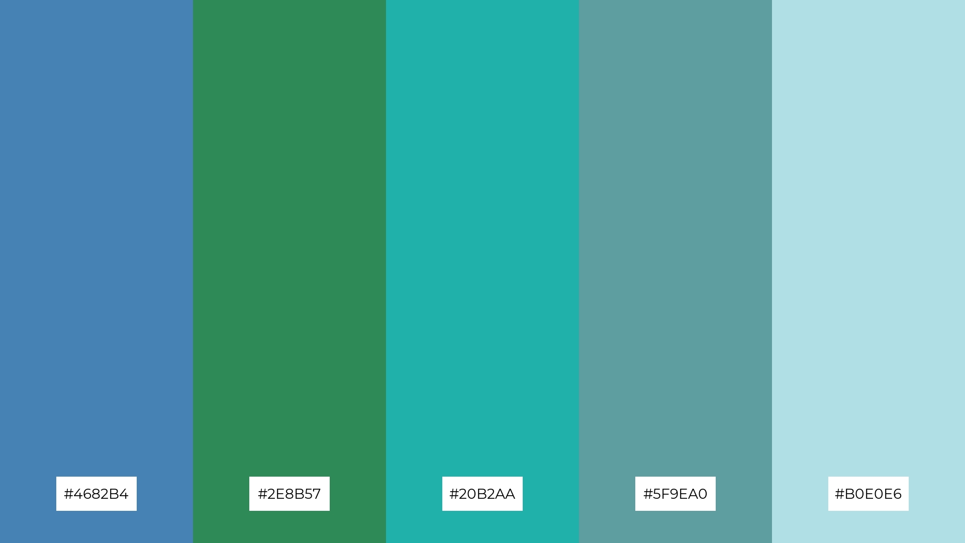
The ‘Ocean Depths’ color palette evokes a serene and refreshing mood, reminiscent of tranquil seaside landscapes and the calming influence of the ocean.
These colors interact harmoniously to create a cohesive look, perfect for a coastal-themed interior decor that emphasizes relaxation and natural beauty.
2) Twilight Sky
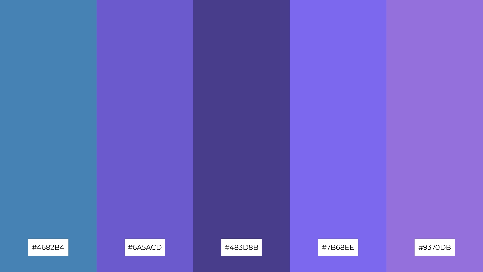
The ‘Twilight Sky’ color palette, with its blend of steel blue, slate blue, and medium purple hues, evokes a sense of calmness and tranquility, reminiscent of the serene moments just after sunset.
This palette would excel in digital branding for wellness apps or meditation websites, where creating a peaceful and inviting atmosphere is essential for user engagement.
3) Arctic Chill
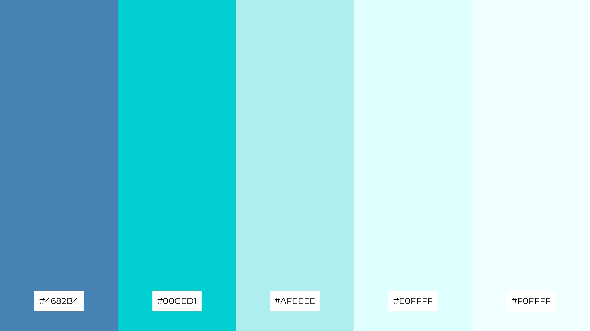
The ‘Arctic Chill’ color palette, featuring dominant hues like steel blue (#4682B4), dark turquoise (#00CED1), pale turquoise (#AFEEEE), light cyan (#E0FFFF), and azure mist (#F0FFFF), creates a refreshing and cohesive visual experience.
This palette’s cool and soothing tones are ideal for wellness branding or eco-friendly interior spaces, where a sense of calm and natural harmony is paramount.
4) Urban Dusk
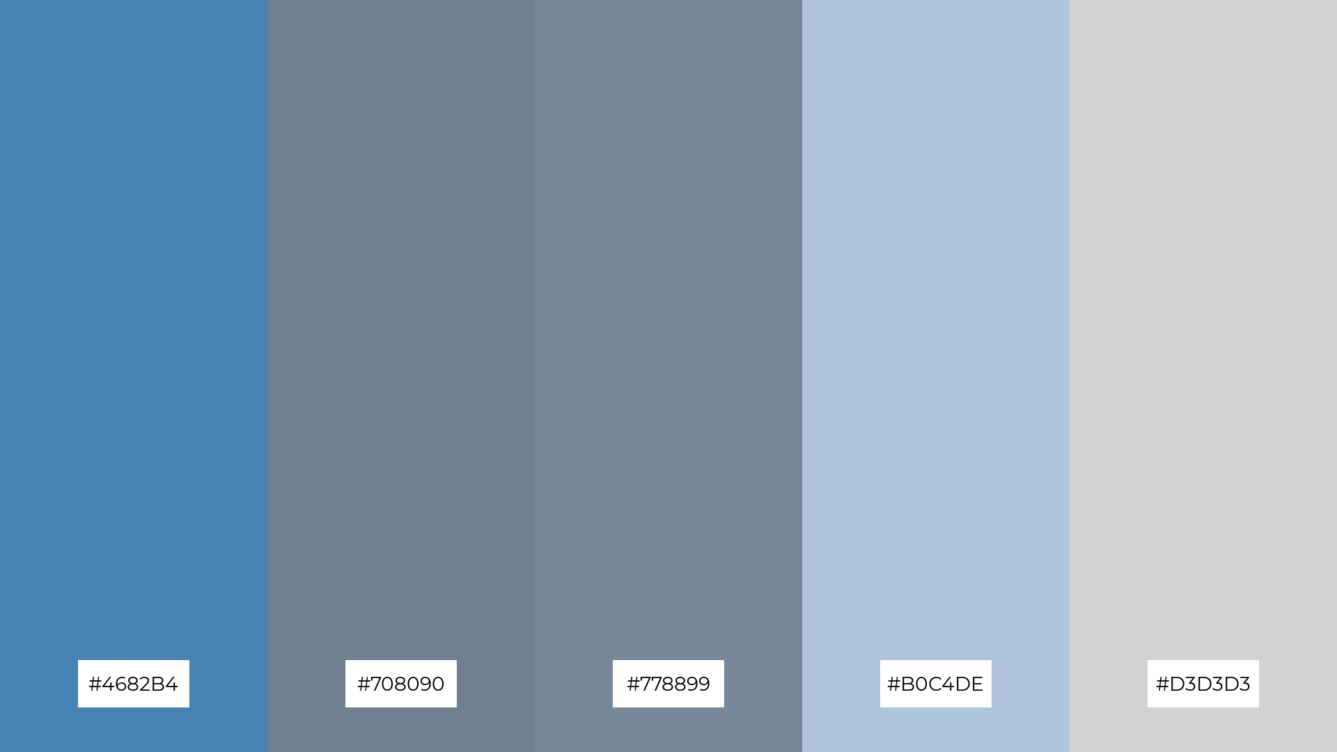
The ‘Urban Dusk’ color palette, with its blend of steel blue (#4682B4), slate gray (#708090), light slate gray (#778899), light steel blue (#B0C4DE), and light gray (#D3D3D3), offers a balance of soft and bold tones, creating a distinct and sophisticated mood.
This palette is ideal for creating inviting retail spaces or modern web designs, where the combination of these hues can enhance the overall aesthetic and draw in customers or users with its contemporary appeal.
5) Forest Stream
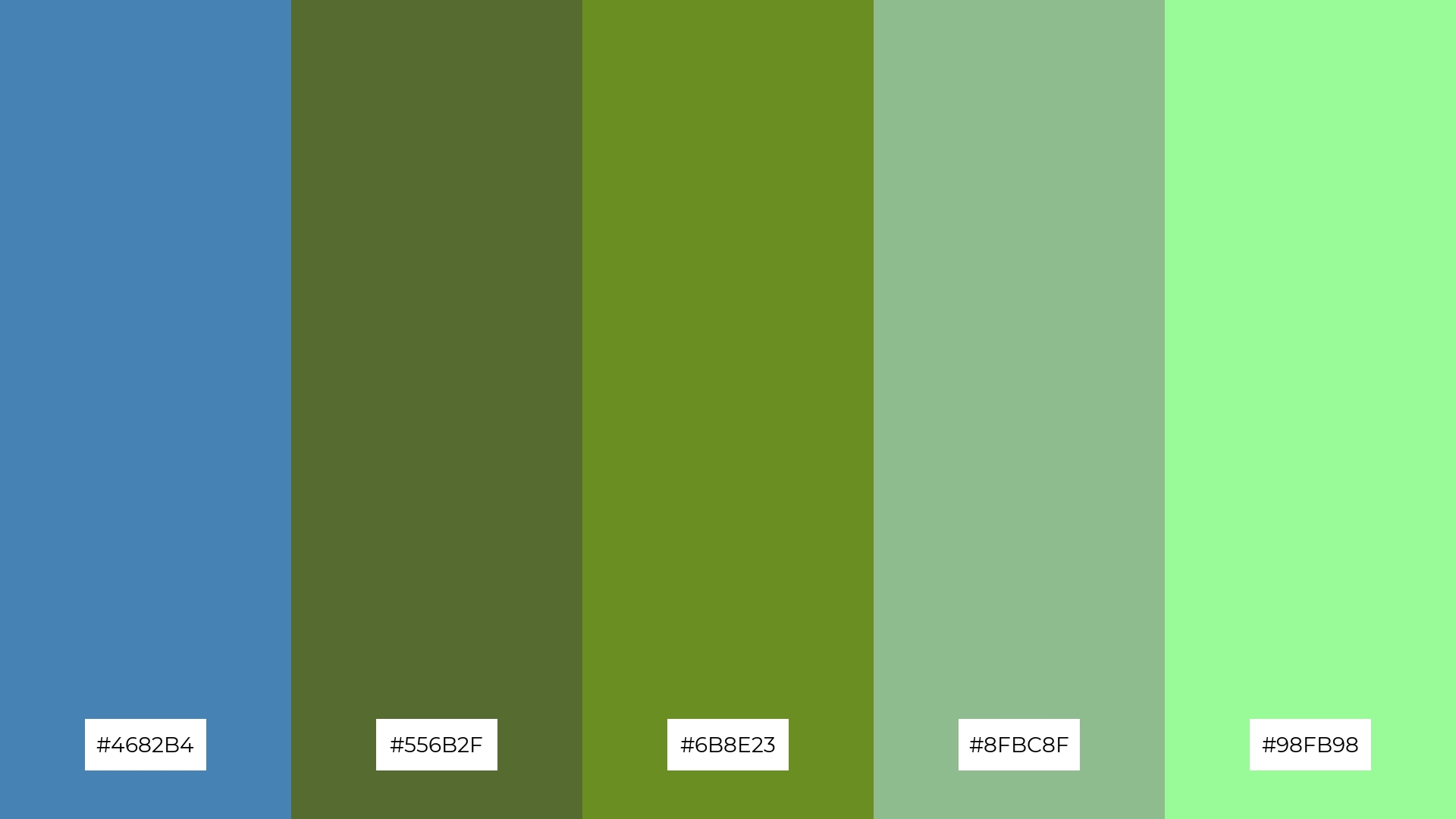
The ‘Forest Stream’ color palette, with its blend of steel blue (#4682B4), dark olive green (#556B2F), olive drab (#6B8E23), dark sea green (#8FBC8F), and pale green (#98FB98), evokes a serene and natural ambiance, reminiscent of a tranquil forest landscape.
This palette is perfect for creating a rustic wedding theme, where the harmonious interaction of these colors can enhance the natural beauty of the setting and provide a calming, yet elegant atmosphere for the celebration.
6) Sunset Waves
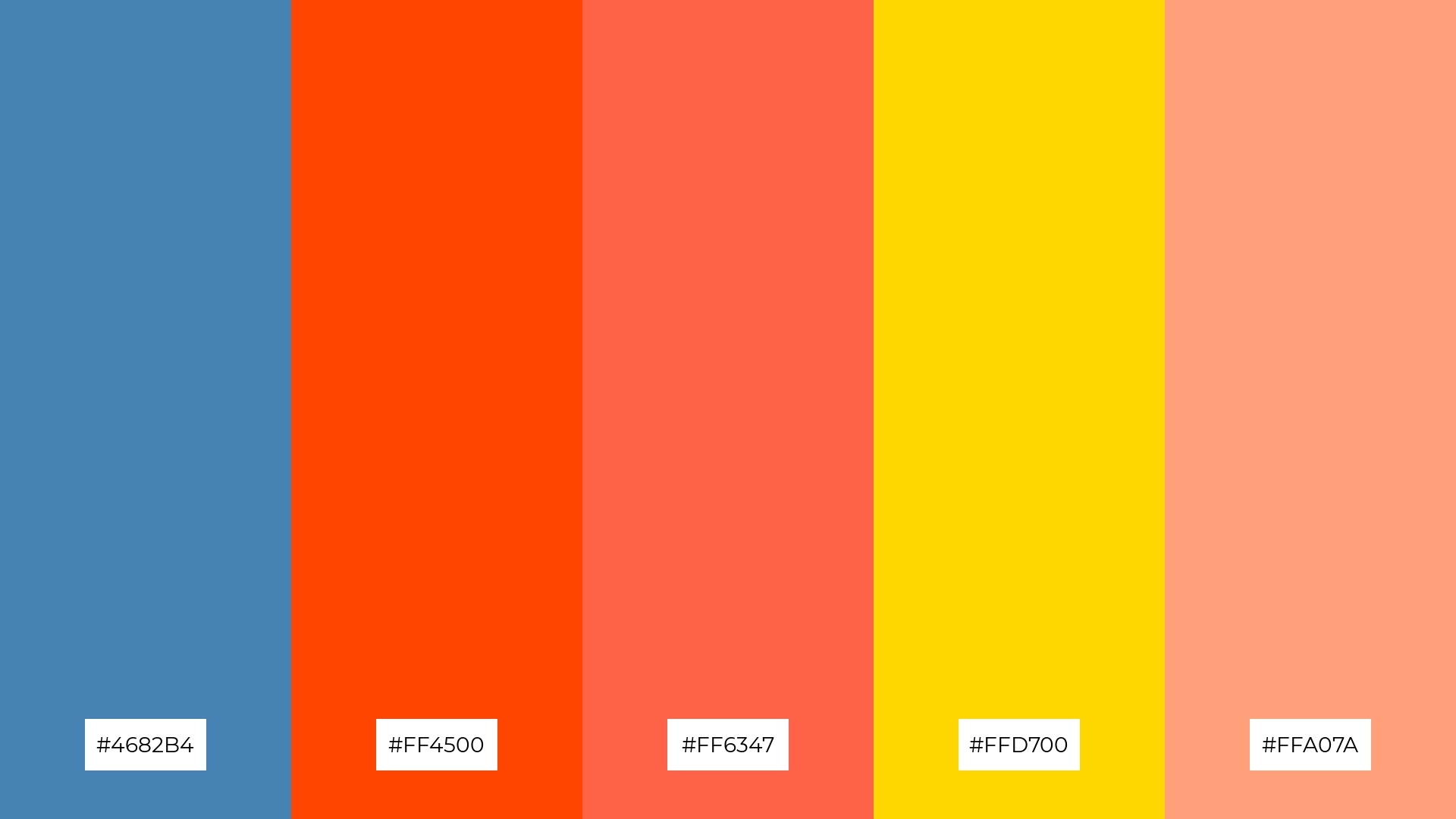
The ‘Sunset Waves’ color palette, with its blend of steel blue (#4682B4), orange red (#FF4500), tomato (#FF6347), gold (#FFD700), and light salmon (#FFA07A), creates a dynamic and vibrant harmony that can evoke a sense of energy and playfulness.
This palette is ideal for bold event designs, where the striking contrast and warm tones can enhance the festive atmosphere and leave a lasting impression on attendees.
7) Winter Frost
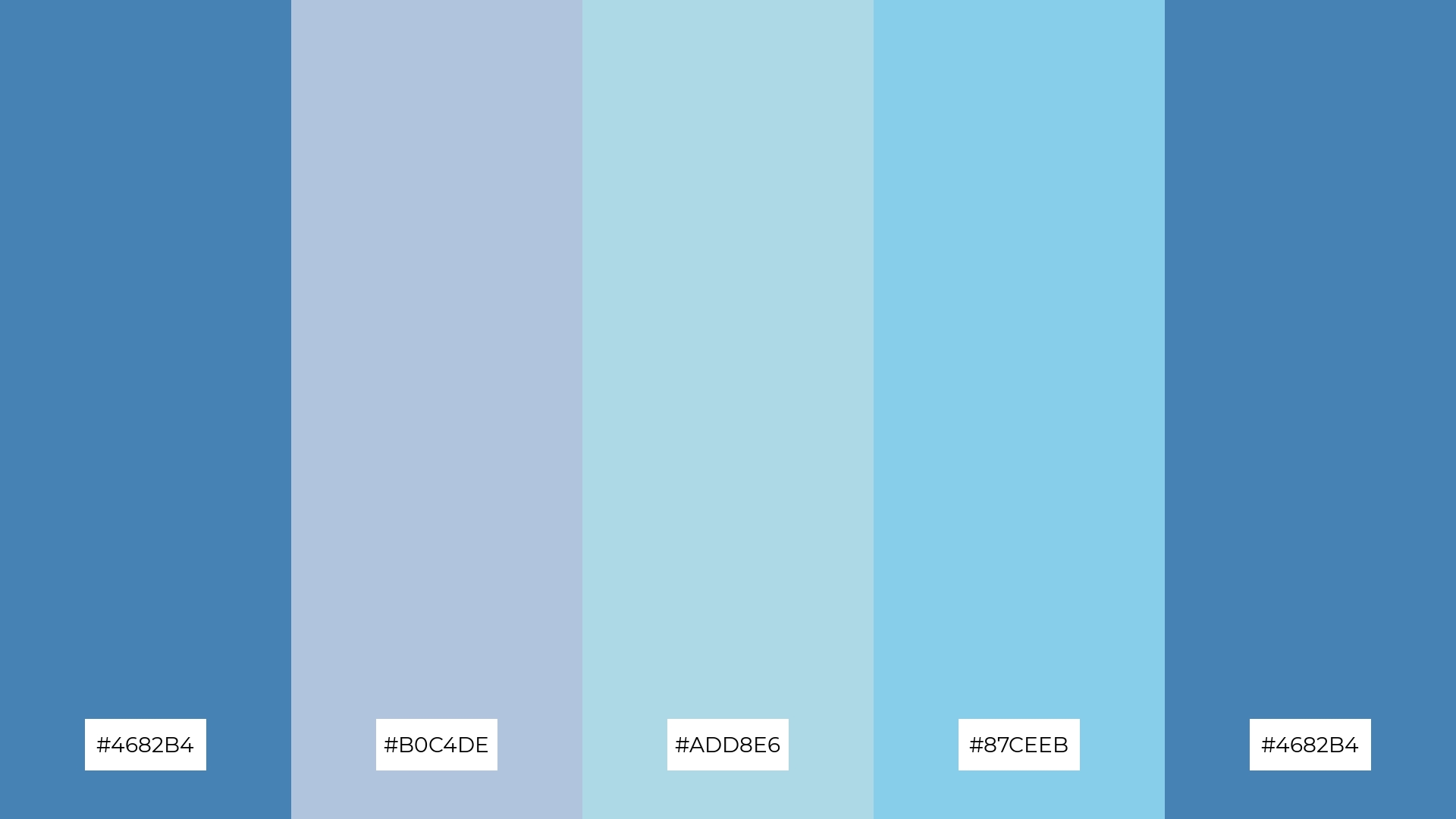
The ‘Winter Frost’ color palette, with its blend of steel blue (#4682B4), light steel blue (#B0C4DE), light blue (#ADD8E6), sky blue (#87CEEB), and steel blue (#4682B4), offers a striking contrast between deep and light hues, creating a visually engaging and dynamic composition.
This palette is perfect for creative projects like magazine layouts or artistic websites, where the interplay of these cool tones can add depth, sophistication, and a touch of elegance to the overall design.
8) Midnight Lagoon
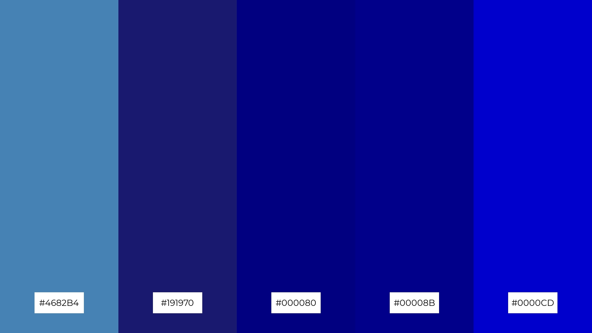
The ‘Midnight Lagoon’ color palette, with its blend of steel blue (#4682B4), midnight blue (#191970), navy (#000080), dark blue (#00008B), and medium blue (#0000CD), can evoke a sense of calm when used in spa branding, creating a serene and tranquil atmosphere for relaxation.
Alternatively, this palette can bring excitement and energy to vibrant marketing campaigns, where the deep and rich hues can capture attention and convey a sense of boldness and sophistication.
9) Coral Reef
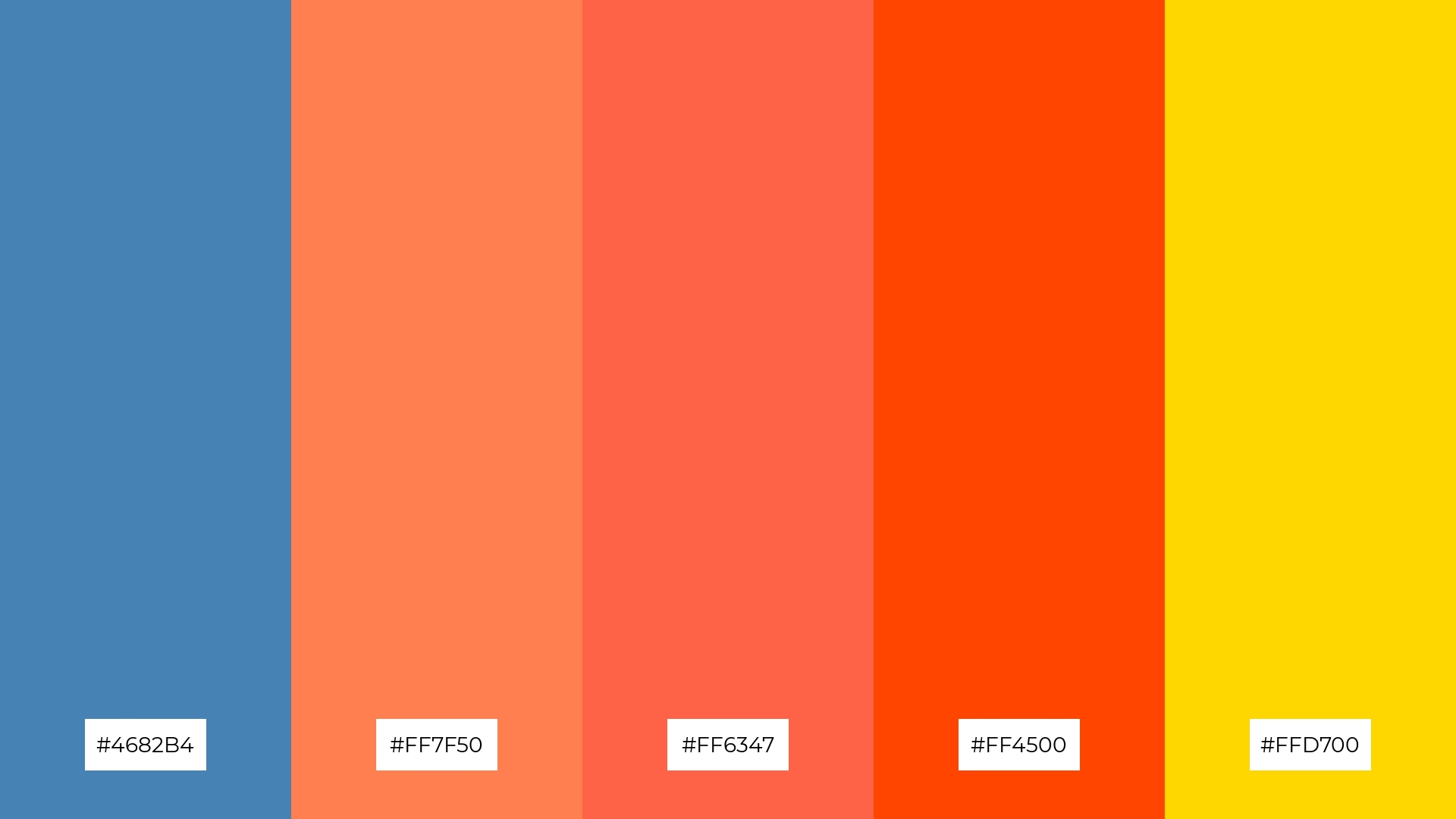
The ‘Coral Reef’ color palette, with its blend of steel blue (#4682B4), coral (#FF7F50), tomato (#FF6347), orange red (#FF4500), and gold (#FFD700), features a mix of softer and brighter tones that create a vibrant and lively atmosphere.
This dynamic combination is perfect for seasonal promotions, where the energetic hues can capture attention and evoke a sense of excitement and warmth.
10) Mountain Mist
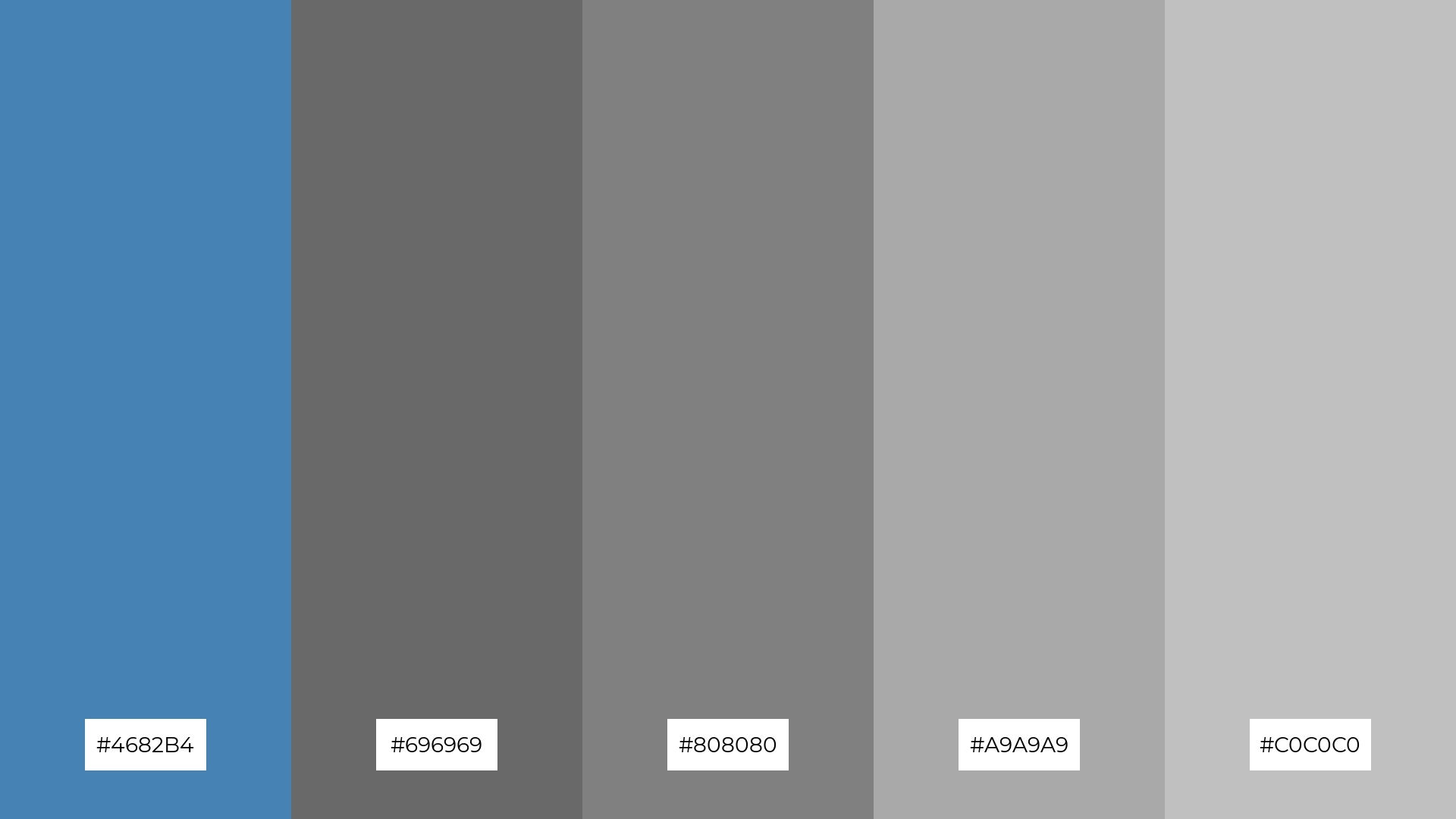
The ‘Mountain Mist’ color palette, with its blend of steel blue (#4682B4), dim gray (#696969), gray (#808080), dark gray (#A9A9A9), and silver (#C0C0C0), creates a visual flow that evokes a sense of tranquility and understated elegance, making it ideal for designs that aim to soothe and calm the viewer.
This palette’s serene and sophisticated tones are perfect for lifestyle branding, such as wellness products or minimalist home decor, as well as tech product packaging, where the subtle yet refined colors can convey a sense of reliability and modernity.
11) Spring Rain
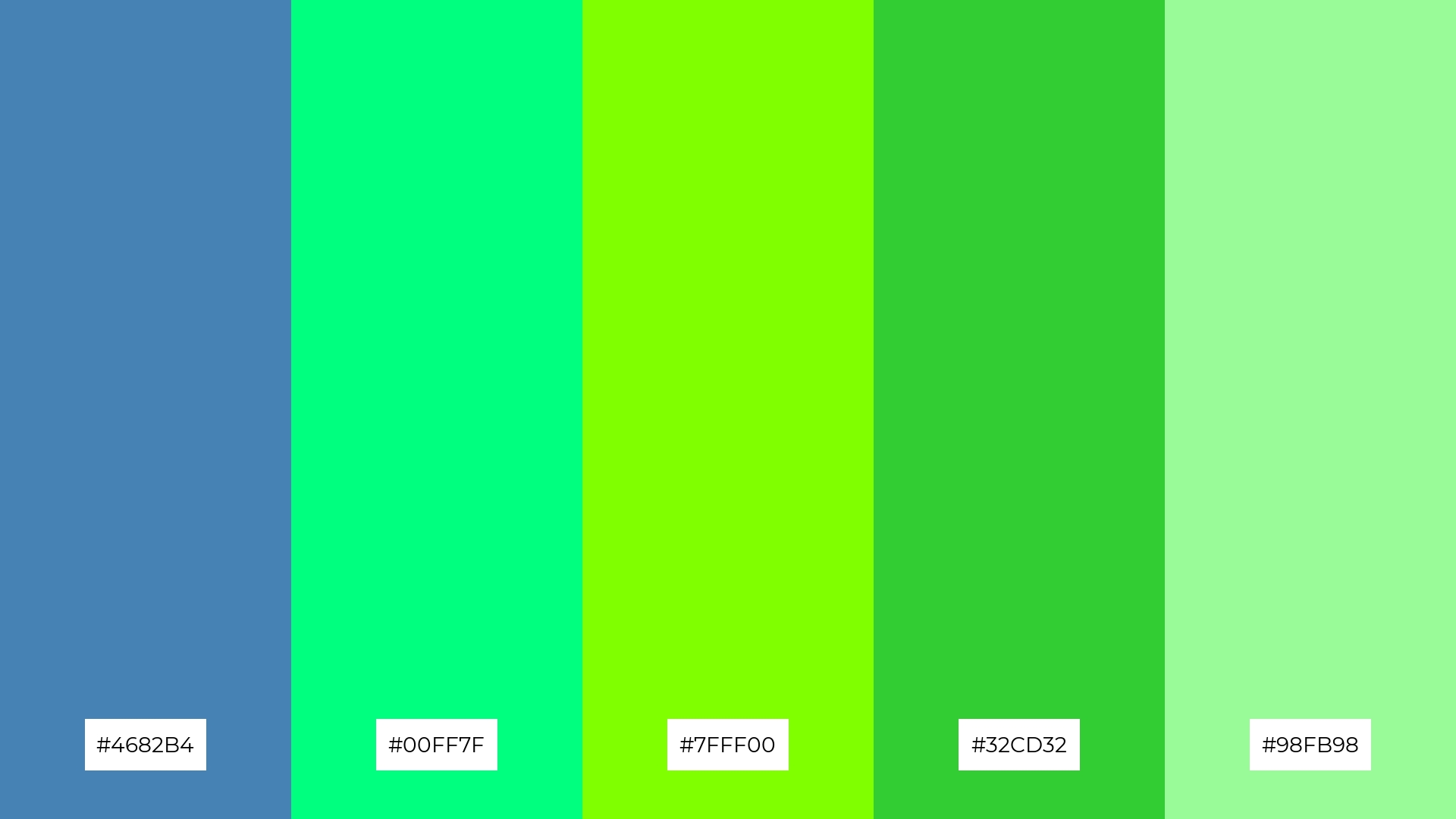
The ‘Spring Rain’ color palette, with its blend of steel blue (#4682B4), spring green (#00FF7F), chartreuse (#7FFF00), lime green (#32CD32), and pale green (#98FB98), creates a welcoming effect by combining cool and refreshing tones that evoke the rejuvenating essence of springtime.
This palette shines in boutique interiors, where the vibrant greens can enhance the natural light and create an inviting atmosphere, or in luxury e-commerce sites, where the sophisticated blend of hues can convey a sense of freshness and exclusivity.
12) Desert Mirage
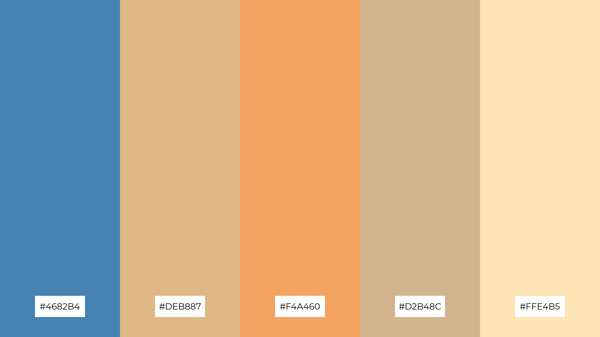
The ‘Desert Mirage’ color palette, with its blend of steel blue (#4682B4), burly wood (#DEB887), sandy brown (#F4A460), tan (#D2B48C), and moccasin (#FFE4B5), creates a harmonious balance by combining cool and warm tones that evoke the serene beauty of a desert landscape.
This palette is ideal for casual apparel lines, where the interplay of these hues can convey a sense of relaxed sophistication and natural elegance, making it perfect for brands aiming to capture a laid-back yet stylish aesthetic.
13) Berry Splash
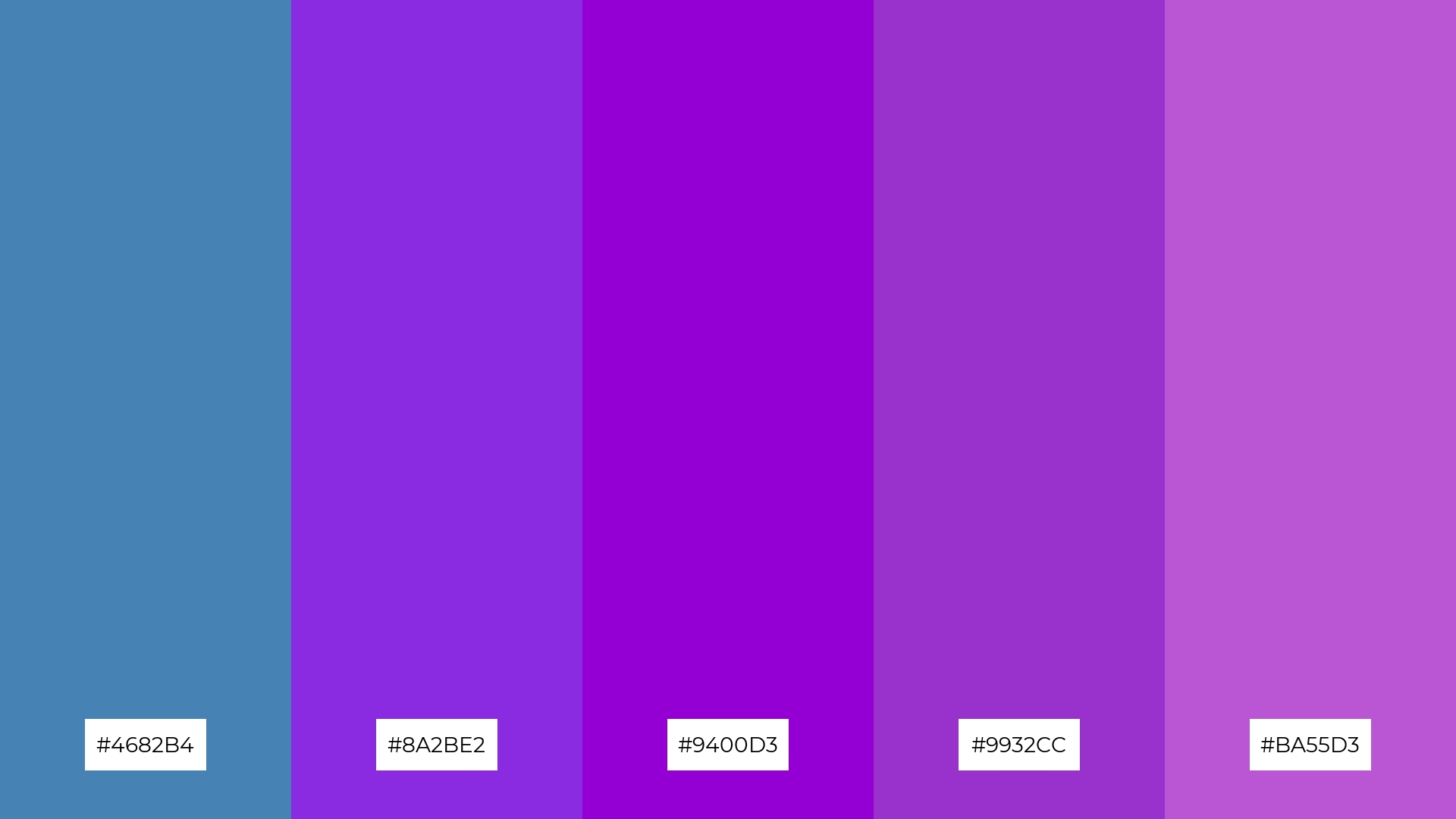
The ‘Berry Splash’ color palette, with its blend of steel blue (#4682B4), blue violet (#8A2BE2), dark violet (#9400D3), dark orchid (#9932CC), and medium orchid (#BA55D3), masterfully combines warm and cool tones to evoke a mood of vibrant sophistication and creative energy.
This palette is perfect for artisan product branding, where the dynamic interplay of these hues can highlight the uniqueness and craftsmanship of handmade goods, or for editorial layouts, where the rich and varied tones can add depth and visual interest to magazine spreads.
14) Autumn Breeze
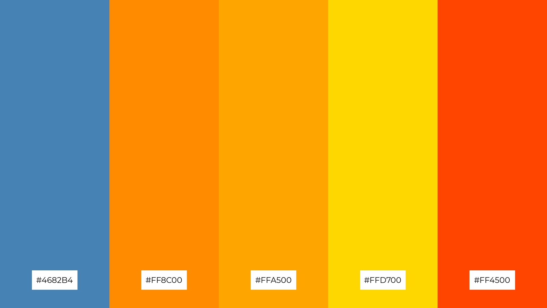
The ‘Autumn Breeze’ color palette, with its blend of steel blue (#4682B4), dark orange (#FF8C00), orange (#FFA500), gold (#FFD700), and orange red (#FF4500), creates a dynamic interplay of bold and warm tones that evoke the vibrant essence of fall.
This palette is perfect for festival marketing, where the striking contrast and rich hues can capture attention and convey a sense of excitement and seasonal celebration.
15) Tropical Sunset
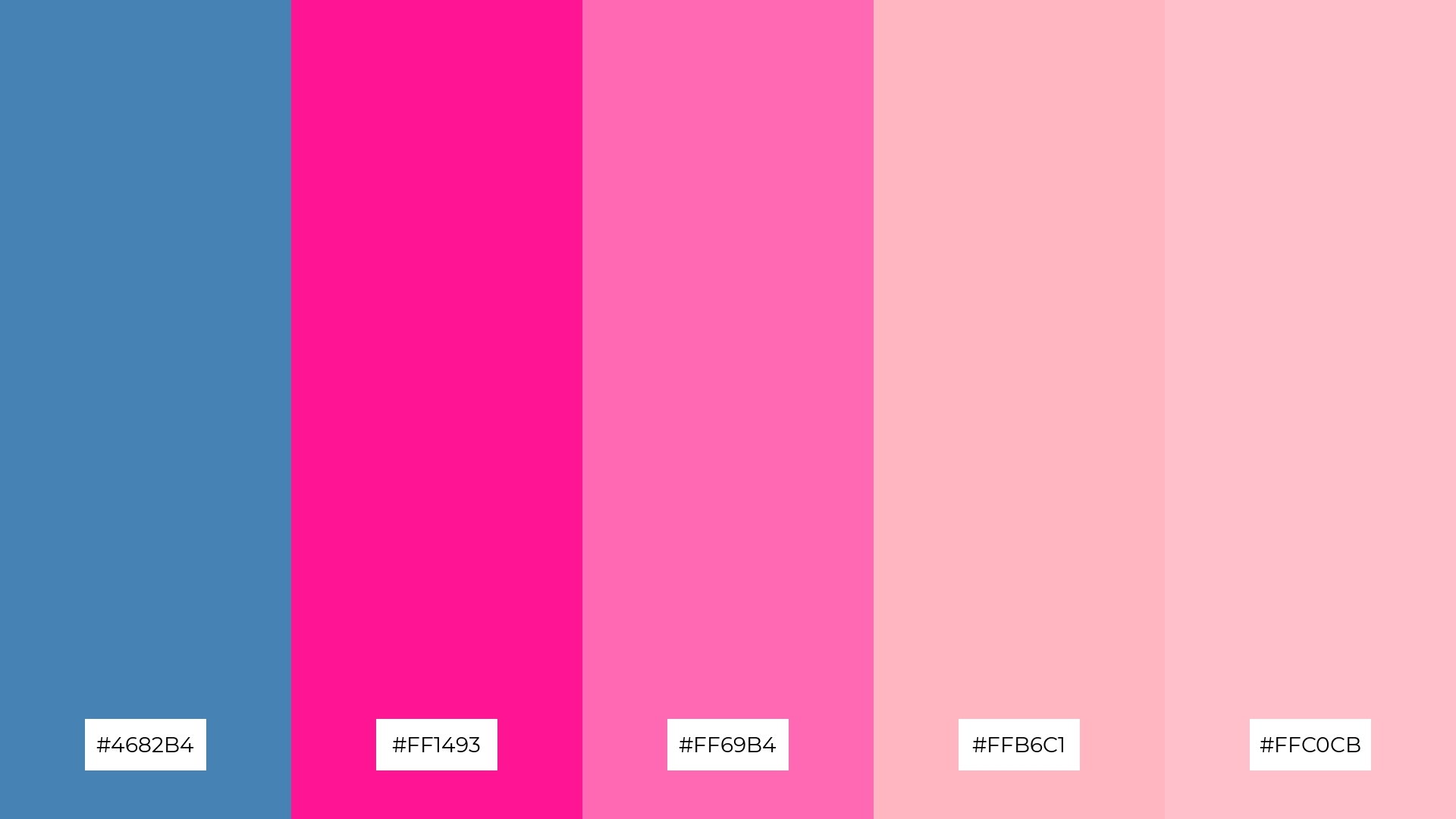
The ‘Tropical Sunset’ color palette, with its blend of steel blue (#4682B4), deep pink (#FF1493), hot pink (#FF69B4), light pink (#FFB6C1), and pink (#FFC0CB), conveys a sense of harmony through its seamless transition from cool to warm tones, creating a visually balanced and cohesive look.
This palette is ideal for tech startups aiming to create a vibrant and inviting brand identity, or for cozy interior makeovers where the playful yet sophisticated hues can enhance the warmth and comfort of the space.
How to Use Steel Blue Patterns in Design
Steel blue color palettes can be a game-changer in home decor, offering a serene and sophisticated ambiance. Use steel blue as a primary wall color and complement it with neutral furnishings and metallic accents to create a balanced and elegant space. For a more dynamic look, incorporate pops of complementary colors like soft yellows or warm oranges in your decor accessories.
In marketing materials, steel blue can convey professionalism and trustworthiness. Pair it with clean, white backgrounds and bold typography to create striking brochures, business cards, or social media graphics. Adding accent colors like gold or copper can elevate the design, making it more eye-catching and luxurious.
For clothing design, steel blue offers a versatile and timeless option. Use it as a base color for garments and layer with different shades of blue or contrasting colors to add depth and interest. This approach works well for both casual and formal wear, providing a sophisticated yet approachable look.
Ready to experiment with steel blue color palettes in your next design project? Try creating these stunning palettes using Piktochart and see how they can transform your designs.


