 Piktochart Team
Slate blue is a versatile and sophisticated color that can add depth and elegance to any design project. Its unique blend of blue and gray tones makes it a popular choice for both digital and print media.
Whether you're creating infographics, presentations, or social media graphics, slate blue palettes offer a range of options to suit various styles and moods. Let's explore how this captivating color can enhance your visual content.
Designing with slate blue can elevate your visual content, but it's essential to use it effectively.

The 'Twilight Garden' palette, with its rich indigo and violet hues, evokes a sense of mystery and enchantment, creating a mood that is both calming and intriguing.
These colors interact harmoniously to produce a cohesive look, making them ideal for a luxurious bedroom design where the deep, soothing tones can promote relaxation and a touch of elegance.

The 'Ocean Mist' palette, with its blend of serene blues and vibrant aquas, evokes a sense of calmness and tranquility, reminiscent of a peaceful seaside retreat.
This soothing color scheme would excel in digital branding for wellness apps or spa services, where the calming hues can create a relaxing and inviting user experience.

The 'Vintage Charm' palette features dominant colors such as rich sienna (#8B4513), warm tan (#D2B48C), and soft lavender (#6A5ACD), which together create a nostalgic and inviting atmosphere.
This harmonious blend is perfect for eco-friendly interior spaces, where the earthy tones and subtle pastels can evoke a sense of warmth and sustainability.

The 'Mystic Forest' palette, with its blend of deep greens and soft purples, offers a balance of soft and bold tones, creating a distinct and captivating mood.
This versatile color scheme is ideal for creating inviting retail spaces or modern web designs, where the harmonious mix of hues can enhance the overall aesthetic and draw in viewers.

The 'Sunset Glow' palette, with its vibrant oranges (#FF4500, #FF6347), soft lavender (#6A5ACD), and warm golds (#FFD700, #FFA07A), creates an ambiance of warmth and energy, reminiscent of a breathtaking sunset.
This dynamic color scheme is perfect for luxury fashion campaigns, where the bold and radiant hues can capture attention and convey a sense of opulence and sophistication.

The 'Autumn Leaves' palette, with its rich burgundy (#8B0000), fiery red (#B22222), and vibrant orange (#FF8C00, #FF4500), combined with the unexpected touch of soft lavender (#6A5ACD), creates a sophisticated yet playful mood that can captivate and engage viewers.
This dynamic color scheme is ideal for bold event designs, where the striking contrast and harmonious blend of warm and cool tones can create an inviting and memorable atmosphere.

The 'Winter Frost' palette, with its icy turquoise (#00CED1), deep steel blue (#4682B4), and soft lavender (#6A5ACD), juxtaposes cool and warm tones to create a visually engaging and dynamic color scheme.
This palette is perfect for creative projects like magazine layouts or artistic websites, where the contrasting elements can draw attention and add a layer of sophistication to the overall design.

The 'Spring Blossom' palette, with its mix of vibrant pinks (#FF69B4, #FF1493) and soft pastels (#FFB6C1, #DB7093), can evoke a sense of excitement and energy, making it perfect for vibrant marketing campaigns that aim to capture attention and convey a lively, youthful spirit.
Alternatively, when paired with the calming lavender hue (#6A5ACD), this palette can create a serene and soothing atmosphere, ideal for spa branding where the gentle colors can promote relaxation and a sense of tranquility.

The 'Desert Mirage' palette, with its softer gold (#DAA520) and bright lavender (#6A5ACD) tones, creates a warm and inviting atmosphere that is both comforting and visually appealing.
This harmonious blend of hues is perfect for seasonal promotions, where the rich and vibrant colors can evoke a sense of warmth and excitement, making it ideal for autumn-themed marketing campaigns or cozy home decor projects.

The 'Midnight Sky' palette, with its deep navy (#191970, #000080) and rich blues (#00008B, #0000CD), combined with the soft lavender (#6A5ACD), creates a visual flow that evokes a sense of tranquility and introspection, making it perfect for designs that aim to soothe and calm the viewer.
This serene and contemplative color scheme is ideal for lifestyle branding, such as wellness products or meditation apps, where the calming hues can enhance the user experience, or for tech product packaging, where the sophisticated and modern tones can convey reliability and innovation.

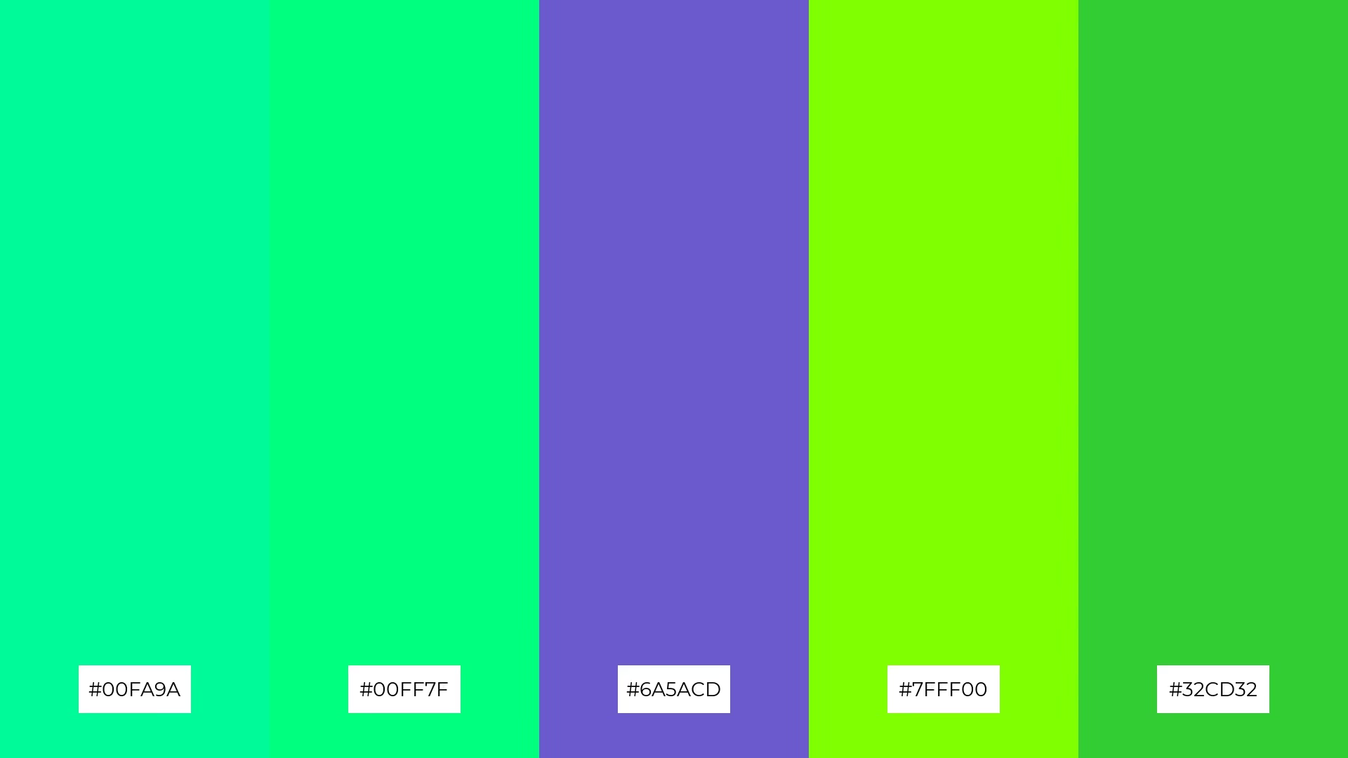
The 'Tropical Breeze' palette, with its vibrant greens (#00FA9A, #00FF7F, #7FFF00, #32CD32) and soft lavender (#6A5ACD), creates a welcoming and refreshing effect, perfect for designs that aim to evoke a sense of vitality and rejuvenation.
This dynamic color scheme shines in boutique interiors, where the lively hues can create an inviting and energetic atmosphere, or in luxury e-commerce sites, where the bold and harmonious tones can captivate and engage shoppers.

The 'Royal Elegance' palette, with its rich purples (#800080, #9370DB) and soft lavenders (#6A5ACD, #BA55D3, #DDA0DD), creates a harmonious balance that exudes sophistication and luxury.
This elegant color scheme is perfect for sleek corporate branding, where the refined hues can convey professionalism and a sense of high-end quality.

The 'Earthy Tones' palette, with its blend of warm sienna (#8B4513, #A0522D, #D2691E, #CD853F) and cool lavender (#6A5ACD), creates a balanced and inviting mood that evokes a sense of grounded elegance and natural beauty.
This versatile color scheme is perfect for artisan product branding, where the rich, earthy hues can highlight craftsmanship and authenticity, while the cool lavender adds a touch of sophistication and modernity.

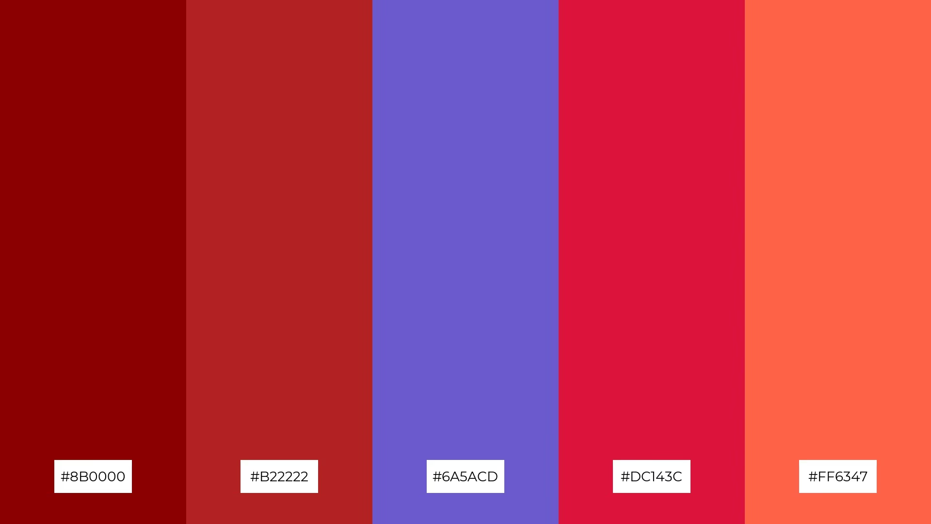
The 'Berry Delight' palette, with its rich reds (#8B0000, #B22222), vibrant crimson (#DC143C), and soft lavender (#6A5ACD), creates a dynamic interplay of bold and subtle hues that can captivate and engage viewers.
This striking color scheme is perfect for festival marketing, where the energetic and harmonious blend of colors can evoke excitement and draw attention to event promotions.

The 'Coastal Calm' palette, with its blend of serene blues (#4682B4, #5F9EA0, #87CEEB, #B0E0E6) and soft lavender (#6A5ACD), conveys a sense of harmony that can create a tranquil and cohesive atmosphere in any design.
This soothing color scheme is ideal for tech startups aiming to promote a calm and focused work environment or for cozy interior makeovers where the gentle hues can evoke a sense of relaxation and comfort.
In home decor, slate blue can be used to create a serene and sophisticated atmosphere. Pair it with neutral tones like beige or white for a clean look, or add metallic accents for a touch of luxury. This versatile color works well in both modern and traditional settings, making it a timeless choice for any room.
For marketing materials, slate blue can convey professionalism and trustworthiness. Use it as a primary color in your branding to create a cohesive and polished look. Complement it with soft yellows or muted oranges to make your designs stand out without overwhelming the viewer.
In clothing design, slate blue offers a chic and elegant option that suits various styles. Combine it with other cool tones like teal or lavender for a harmonious outfit, or use it as a base color with bold accessories to make a statement. Its versatility makes it a staple in any wardrobe.
Ready to experiment with slate blue palettes in your next design project? Try creating stunning visuals using Piktochart and see how this captivating color can elevate your work.