Blue and silver color palettes offer a sophisticated and modern aesthetic that can elevate any design project. These hues blend seamlessly to create a calming yet striking visual experience.
Whether you’re designing a website, an infographic, or a marketing campaign, the combination of blue and silver can add a touch of elegance and professionalism. This article explores the versatility and appeal of blue and silver color palettes in various design contexts.
Tips For Creating Blue Silver Color Palettes
Designing with blue and silver can be both exciting and challenging. Here are some practical tips to help you create stunning color palettes:
- Balance the Colors: Ensure that neither blue nor silver dominates the design. Use a 60-30-10 rule, where 60% is the primary color, 30% is the secondary color, and 10% is an accent.
- Match Complementary Shades: Pair blue and silver with complementary colors like white or light gray to create a cohesive look. This helps in maintaining harmony and visual interest.
- Use Gradients: Incorporate gradients that transition smoothly between blue and silver. This technique can add depth and dimension to your design.
- Consider the Context: Think about where your design will be used. For digital screens, opt for brighter shades of blue and silver. For print, choose more subdued tones to ensure clarity.
- Test Versatility: Experiment with different shades and tints of blue and silver to see how they work in various contexts. This will help you create a versatile palette that can be adapted to different projects.
- Incorporate Textures: Adding textures like metallic finishes or subtle patterns can enhance the visual appeal of blue and silver palettes, making your design more engaging.
15 Blue Silver Color Palettes
1) Ocean Breeze
The ‘Ocean Breeze’ color palette evokes a serene and refreshing mood, reminiscent of a tranquil seaside escape.
These shades of blue and silver interact harmoniously to create a cohesive look, making them ideal for interior decor in spaces designed for relaxation, such as a coastal-themed living room.
2) Silver Lining
The ‘Silver Lining’ color palette, with its blend of light gray, steel blue, powder blue, cadet blue, and silver, evokes a sense of calmness and sophistication, making it perfect for creating a serene and inviting atmosphere.
This palette would excel in digital branding for wellness apps or websites, where the calming hues can enhance user experience and promote a sense of tranquility.
3) Twilight Sky
The ‘Twilight Sky’ color palette, featuring dominant shades of slate blue, light steel blue, silver, steel blue, and light sky blue, creates a balanced and serene visual experience.
This harmonious blend is ideal for eco-friendly interior spaces, where the calming and natural hues can foster a sense of tranquility and connection to the environment.
4) Frosted Dreams

The ‘Frosted Dreams’ color palette, with its blend of soft and bold tones like #F0F8FF, #C0C0C0, #ADD8E6, #4682B4, and #B0E0E6, creates a distinct mood that is both inviting and dynamic.
This palette is ideal for modern web designs, where the balance of gentle and striking hues can enhance user engagement and create a visually appealing experience.
5) Winter Wonderland

The ‘Winter Wonderland’ color palette, with its blend of #B0E0E6, #C0C0C0, #1E90FF, #A9A9A9, and #87CEEB, evokes a serene and tranquil ambiance reminiscent of a peaceful winter landscape.
This palette is perfect for luxury fashion campaigns, where the cool and sophisticated hues can create an elegant and refined visual experience, enhancing the allure of high-end garments.
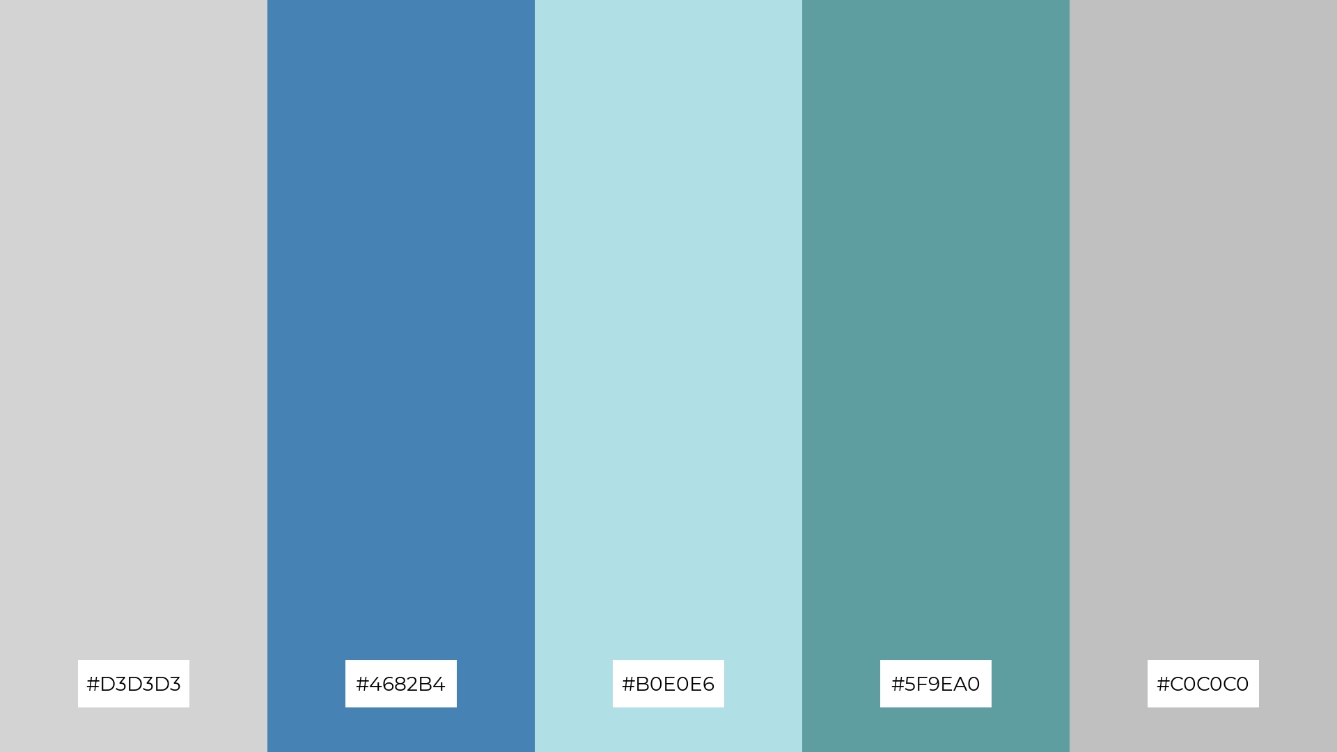
6) Serene Waters

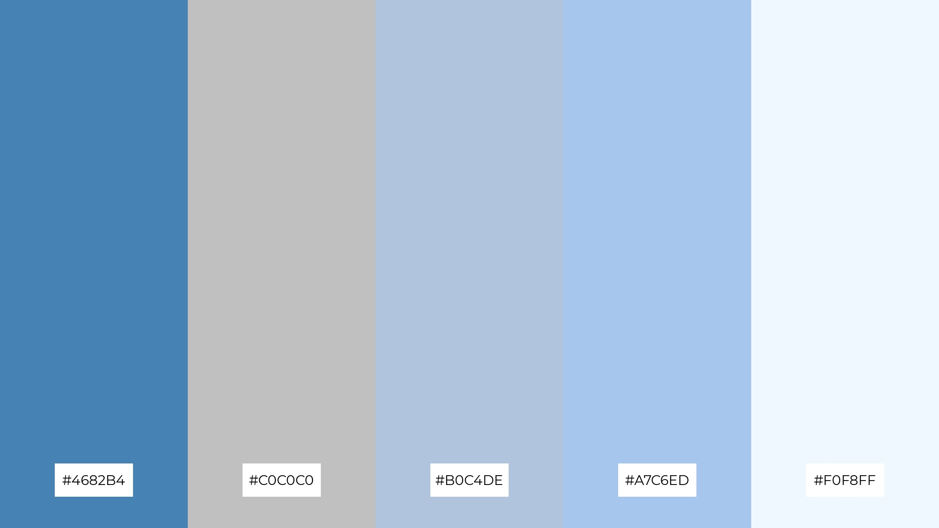
The ‘Serene Waters’ color palette, with its blend of #5F9EA0, #C0C0C0, #4682B4, #B0C4DE, and #A7C6ED, creates a harmonious and sophisticated visual experience that can evoke a sense of calm and elegance.
This palette is ideal for minimalistic branding, where the subtle yet refined hues can enhance the brand’s identity and convey a sense of understated luxury.
7) Silver Waves

The ‘Silver Waves’ color palette, with its contrasting elements of bold #1E90FF and soft #B0E0E6, creates a dynamic visual interest that captivates the viewer’s attention.
This palette is perfect for creative projects like magazine layouts or artistic websites, where the interplay of vibrant and subtle hues can enhance the overall aesthetic and engage the audience effectively.
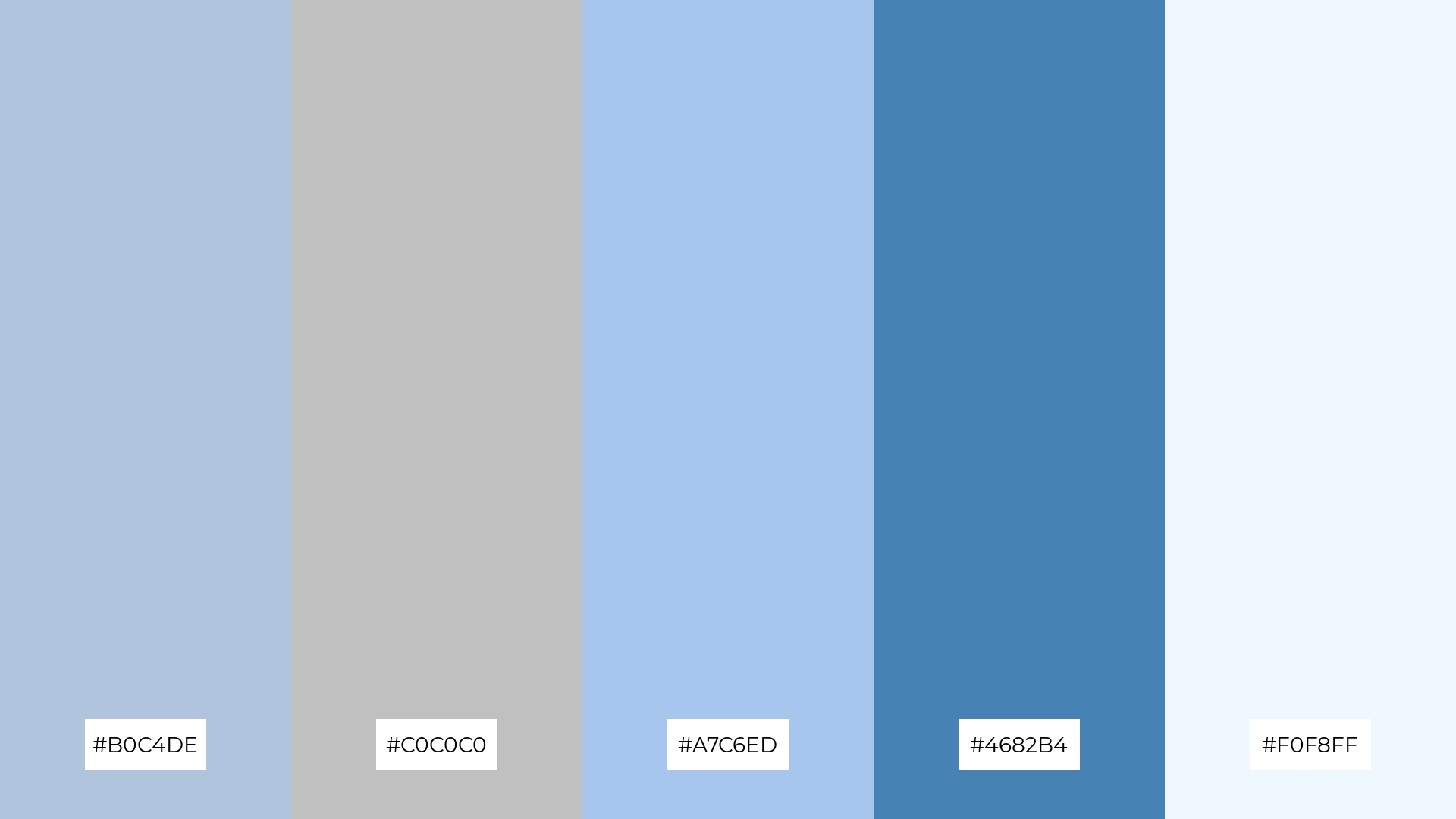
8) Celestial Harmony
The ‘Celestial Harmony’ color palette, with its blend of #4682B4, #C0C0C0, #B0C4DE, #A7C6ED, and #F0F8FF, can evoke a sense of calm when used in soft gradients and subtle transitions, making it ideal for spa branding where tranquility and relaxation are paramount.
Conversely, the same palette can bring excitement and vibrancy when the bolder shades like #4682B4 are paired with the lighter hues, perfect for dynamic marketing campaigns that aim to capture attention and energize the audience.
9) Ethereal Mist
The ‘Ethereal Mist’ color palette, with its softer tones of #B0C4DE and #C0C0C0, combined with the brighter hues of #87CEEB and #1E90FF, creates a balanced and uplifting visual experience.
This blend of colors evokes a serene yet invigorating mood, making it ideal for home decor projects that aim to create a tranquil and refreshing atmosphere or for seasonal promotions that seek to capture the essence of a bright, airy spring day.
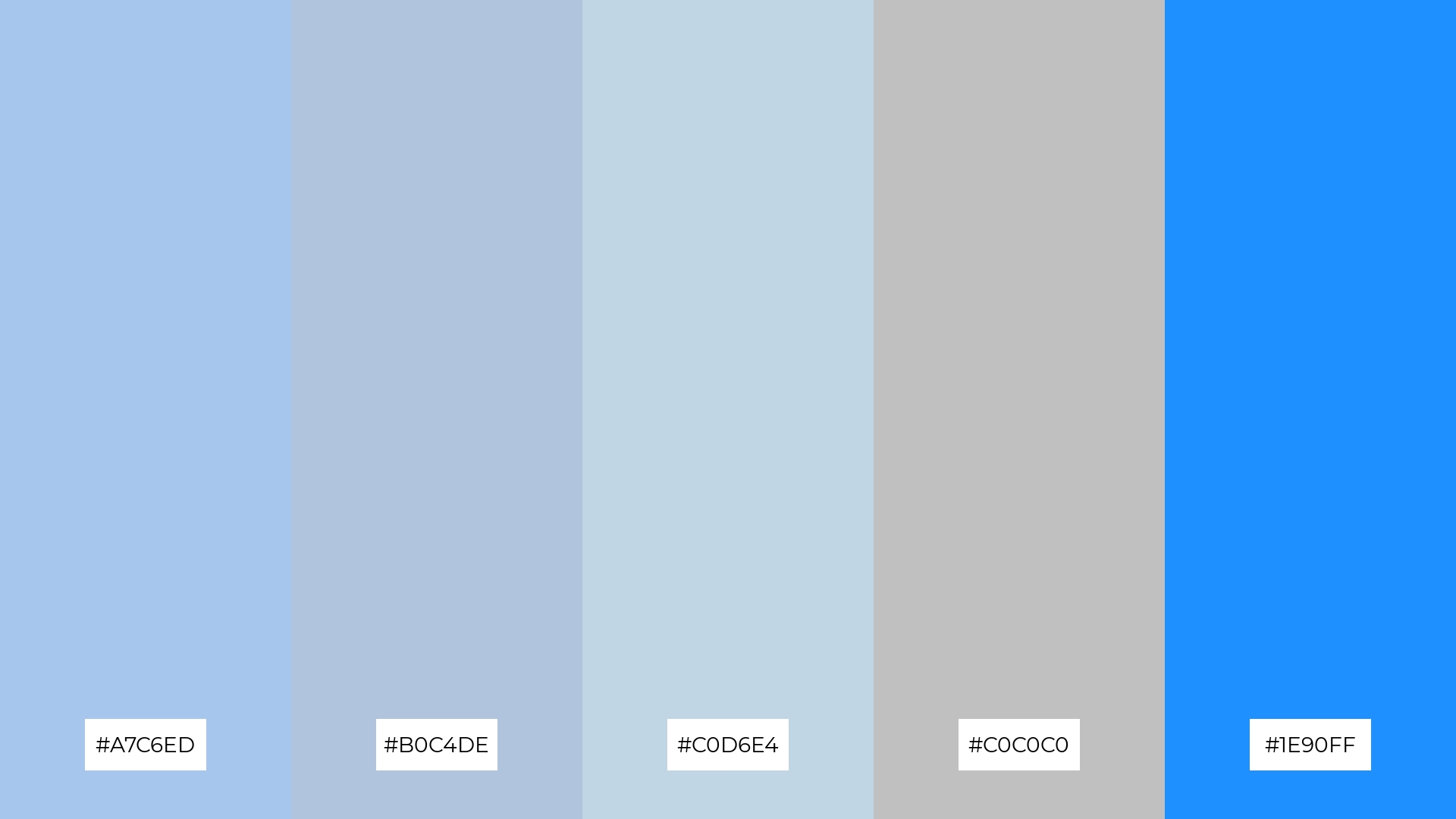
10) Sapphire Dreams
The ‘Sapphire Dreams’ color palette, with its blend of #1E90FF, #C0C0C0, #B0E0E6, #A7C6ED, and #D3D3D3, creates a visual flow that evokes a sense of tranquility and calm, making it perfect for designs that aim to soothe and relax the viewer.
This palette is ideal for lifestyle branding or tech product packaging, where the serene and sophisticated hues can enhance the product’s appeal and convey a sense of modern elegance and reliability.
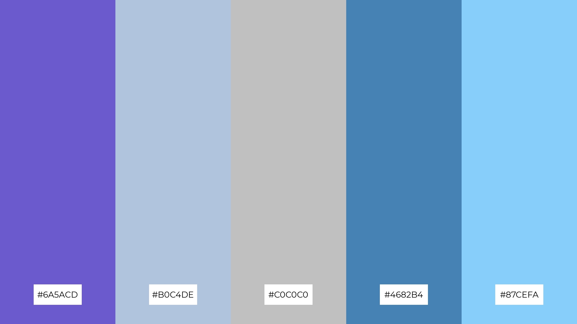
11) Silver Moonlight

The ‘Silver Moonlight’ color palette, with its blend of #C0C0C0, #4682B4, #B0C4DE, #A9A9A9, and #87CEFA, creates a welcoming effect through its harmonious mix of soft and bold tones, making it ideal for boutique interiors where a serene yet sophisticated ambiance is desired.
This palette also excels in luxury e-commerce sites, where the dramatic interplay of these hues can enhance the visual appeal and create an elegant, high-end shopping experience that captivates and engages customers.
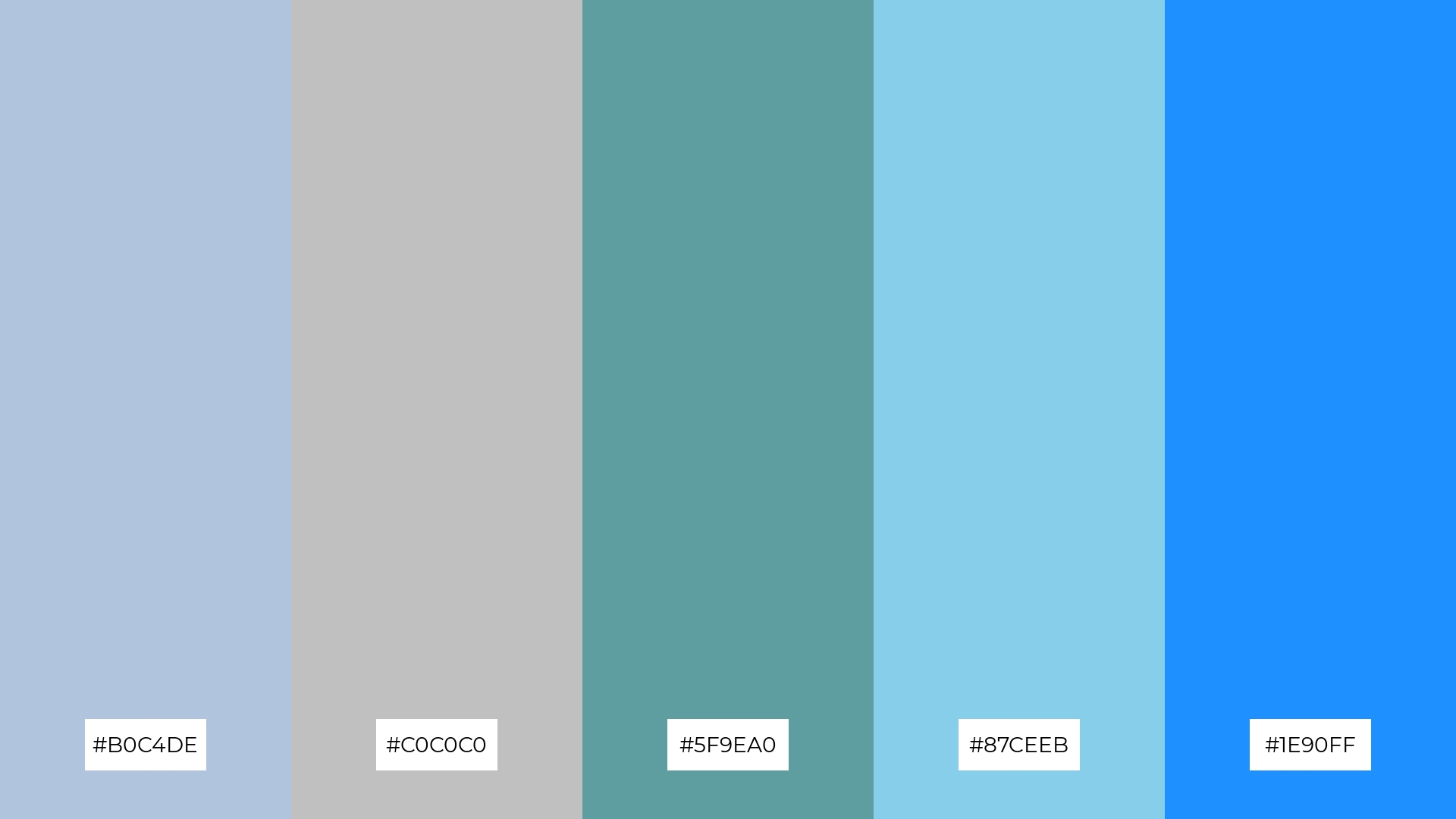
12) Tranquil Seas
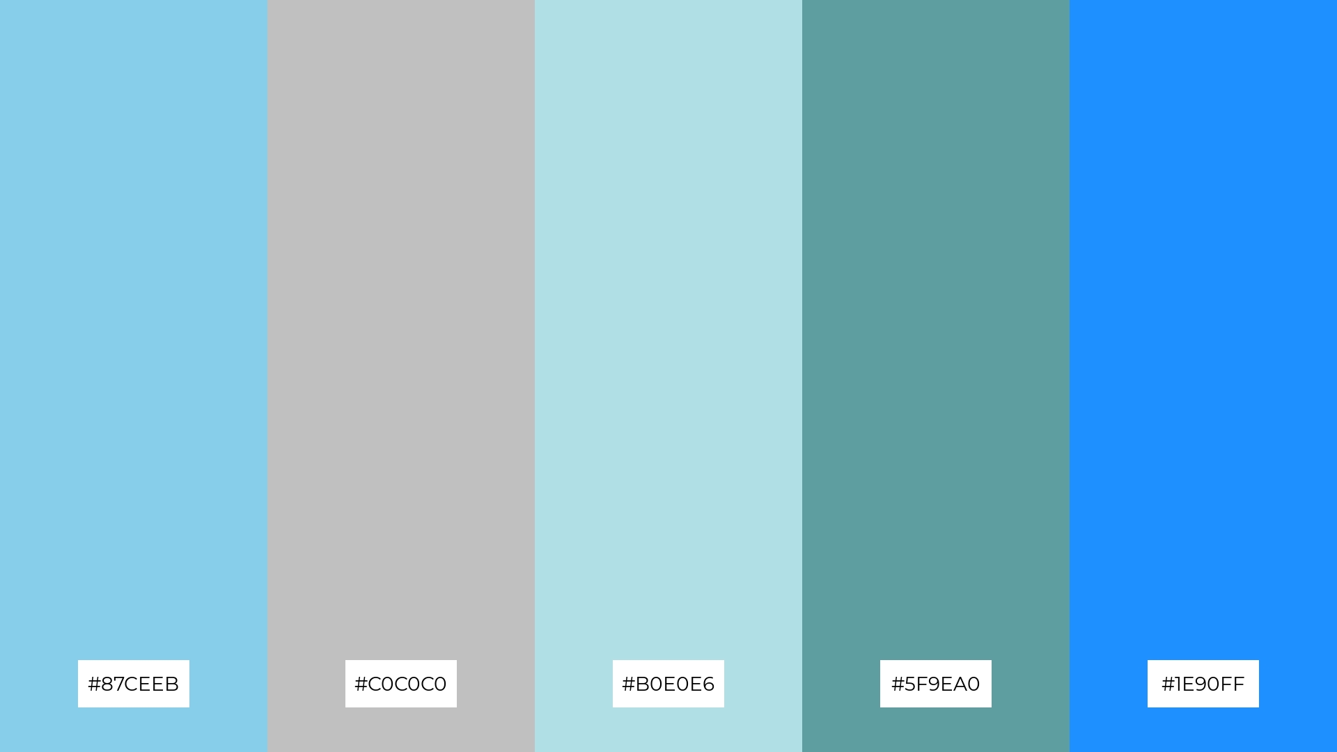
The ‘Tranquil Seas’ color palette, with its blend of #87CEEB, #C0C0C0, #B0E0E6, #5F9EA0, and #1E90FF, creates a harmonious balance through the interaction of soft and bold hues, evoking a sense of calm and serenity.
This palette is ideal for sleek corporate branding, where the sophisticated and balanced colors can enhance the brand’s professional image while maintaining a modern and approachable aesthetic.
13) Arctic Chill
The ‘Arctic Chill’ color palette, with its blend of warm and cool tones like #B0C4DE, #C0C0C0, #A7C6ED, #4682B4, and #F0F8FF, evokes a mood of serene sophistication and balanced tranquility.
This palette is uniquely suited for artisan product branding, where the harmonious mix of hues can enhance the handcrafted appeal and convey a sense of refined elegance and authenticity.
14) Azure Reflections

The ‘Azure Reflections’ color palette, with its blend of #4682B4, #C0C0C0, #B0E0E6, #A9A9A9, and #87CEFA, creates a dynamic interplay between bold and subtle hues, offering a versatile range of visual experiences.
This palette is perfect for festival marketing, where the vibrant and calming shades can capture attention and evoke a sense of excitement and serenity, enhancing the overall appeal of promotional materials.
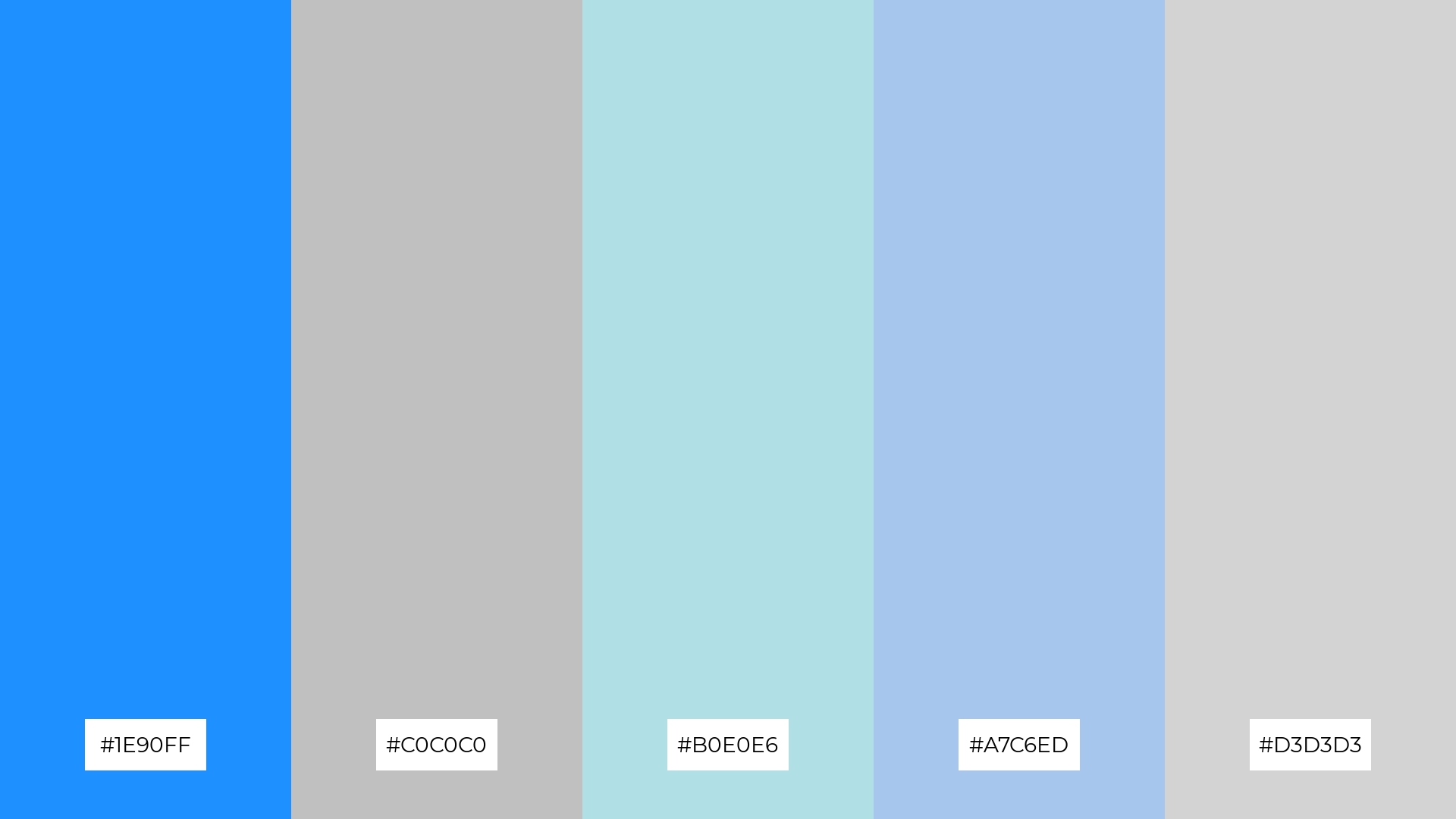
15) Silver Horizon
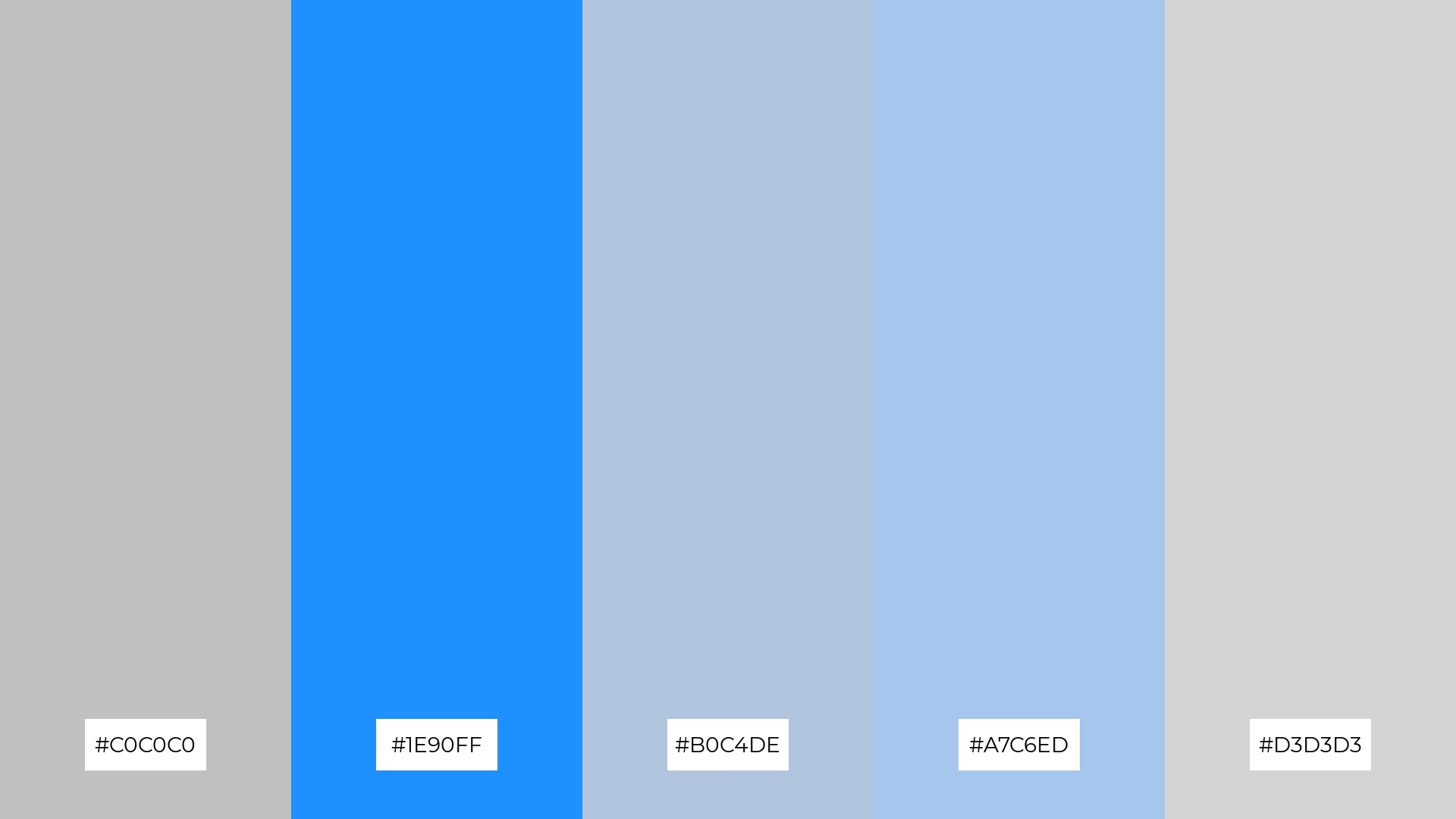
The ‘Silver Horizon’ color palette, with its blend of #C0C0C0, #1E90FF, #B0C4DE, #A7C6ED, and #D3D3D3, conveys a sense of harmony through its balanced mix of cool and neutral tones, creating a cohesive and calming visual experience.
This palette is ideal for tech startups aiming to project a modern and innovative image, or for cozy interior makeovers where the soothing hues can enhance the comfort and tranquility of the space.
How to Use Blue Silver Patterns in Design
Blue and silver color palettes can transform home decor by creating a serene and sophisticated atmosphere. Use these hues in living rooms or bedrooms to evoke a sense of calm and elegance. Pairing blue walls with silver accents like cushions or picture frames can add a touch of luxury and modernity to any space.
In marketing materials, blue and silver can convey professionalism and trustworthiness. These colors are perfect for corporate branding, where the cool tones can enhance the brand’s image and appeal. Use blue as the primary color for backgrounds and silver for text or icons to create a clean and polished look.
For clothing, blue and silver palettes can create stylish and versatile outfits. A silver accessory paired with a blue dress or suit can add a chic and contemporary touch. These colors are ideal for both casual and formal wear, offering a balance of sophistication and modernity.
Ready to create your own stunning blue and silver color palettes? Try using Piktochart to bring your design ideas to life. Get started now and explore the endless possibilities!


