Old Rose color palettes evoke a sense of timeless elegance and subtle sophistication. This muted pink hue, often associated with vintage charm, can transform any design into a classic masterpiece.
Whether used in graphic design, home decor, or fashion, Old Rose offers a versatile and enduring appeal. Its soft, romantic tones make it a favorite choice for those looking to add a touch of nostalgia to their projects.
Tips For Creating Old Rose Color Palettes
Designing with Old Rose can be both inspiring and challenging. Here are some practical tips to help you create stunning color palettes:
- Balance with Neutrals: Pair Old Rose with neutral colors like beige, gray, or white to create a balanced and harmonious look.
- Complementary Shades: Use complementary colors such as soft greens or muted blues to enhance the Old Rose and make it stand out.
- Accent with Bold Colors: Introduce bold colors like deep burgundy or navy blue as accents to add depth and interest to your design.
- Monochromatic Scheme: Create a monochromatic palette by using different shades and tints of Old Rose for a cohesive and elegant design.
- Texture and Patterns: Incorporate textures and patterns in Old Rose to add dimension and visual interest to your project.
- Versatility in Application: Experiment with Old Rose in various design elements such as backgrounds, typography, and illustrations to see how it enhances different aspects of your work.
15 Old Rose Color Palettes
1) Vintage Romance
The ‘Vintage Romance’ color palette, with its soft and muted tones, creates a mood of gentle nostalgia and understated elegance, perfect for evoking a sense of timeless beauty.
These colors interact harmoniously to produce a cohesive look, making them ideal for use in interior decor where they can transform a space into a serene and inviting retreat.
2) Blush Garden
The ‘Blush Garden’ color palette, with its blend of soft pinks and cool blues, evokes a feeling of serene calmness and gentle warmth.
This palette would excel in digital branding for wellness apps, creating a soothing and inviting user experience that promotes relaxation and tranquility.
3) Antique Elegance
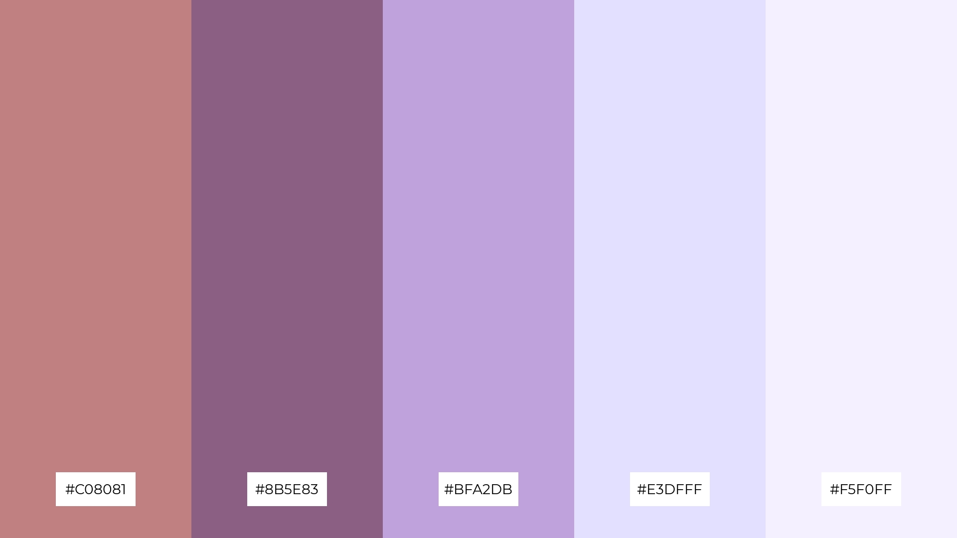
The ‘Antique Elegance’ color palette, featuring dominant shades of #C08081 and #8B5E83, creates a rich and sophisticated ambiance that exudes timeless charm.
These colors, when combined with the softer tones of #BFA2DB, #E3DFFF, and #F5F0FF, produce a harmonious blend perfect for eco-friendly interior spaces, where they can foster a sense of calm and refined tranquility.
4) Rosewood Charm
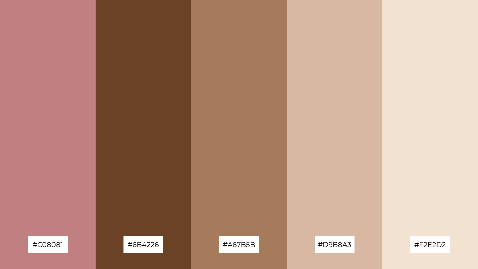
The ‘Rosewood Charm’ color palette, with its blend of soft hues like #D9B8A3 and #F2E2D2, balanced by the bold tones of #6B4226 and #A67B5B, creates a distinct mood of warmth and sophistication.
This palette is ideal for creating inviting retail spaces, where the harmonious mix of colors can enhance the shopping experience by making the environment feel both welcoming and stylish.
5) Soft Petals
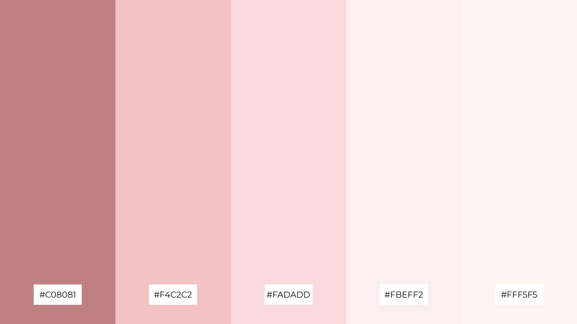
The ‘Soft Petals’ color palette, with its harmonious blend of #C08081, #F4C2C2, #FADADD, #FBEFF2, and #FFF5F5, evokes a serene and delicate ambiance, perfect for creating a tranquil and inviting atmosphere.
This palette is ideal for wedding themes, where the soft and romantic tones can enhance the overall elegance and charm of the event, making it a memorable and visually stunning celebration.
6) Rustic Blush
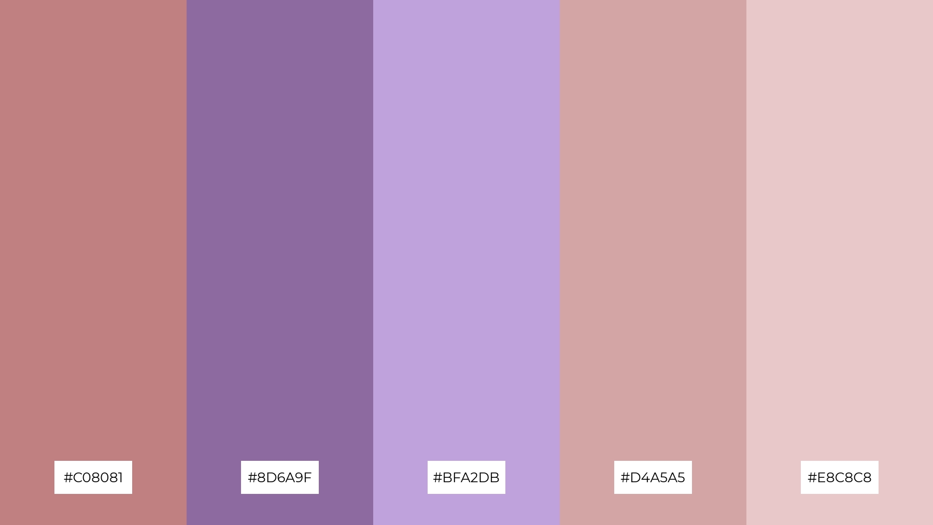
The ‘Rustic Blush’ color palette, with its harmonious blend of #C08081, #8D6A9F, #BFA2DB, #D4A5A5, and #E8C8C8, creates a sophisticated and serene mood, perfect for minimalistic branding that seeks to convey elegance and subtlety.
This palette’s muted yet rich tones can also be effectively used in bold event designs, where the combination of these colors can enhance the ambiance, making the event feel both inviting and stylish.
7) Timeless Beauty

The ‘Timeless Beauty’ color palette, with its contrasting elements of warm #C08081 and cool #A3C4BC, creates a dynamic visual interest that captivates the viewer’s attention.
This palette is perfect for creative projects like magazine layouts or artistic websites, where the blend of these colors can enhance the overall aesthetic and make the design stand out.
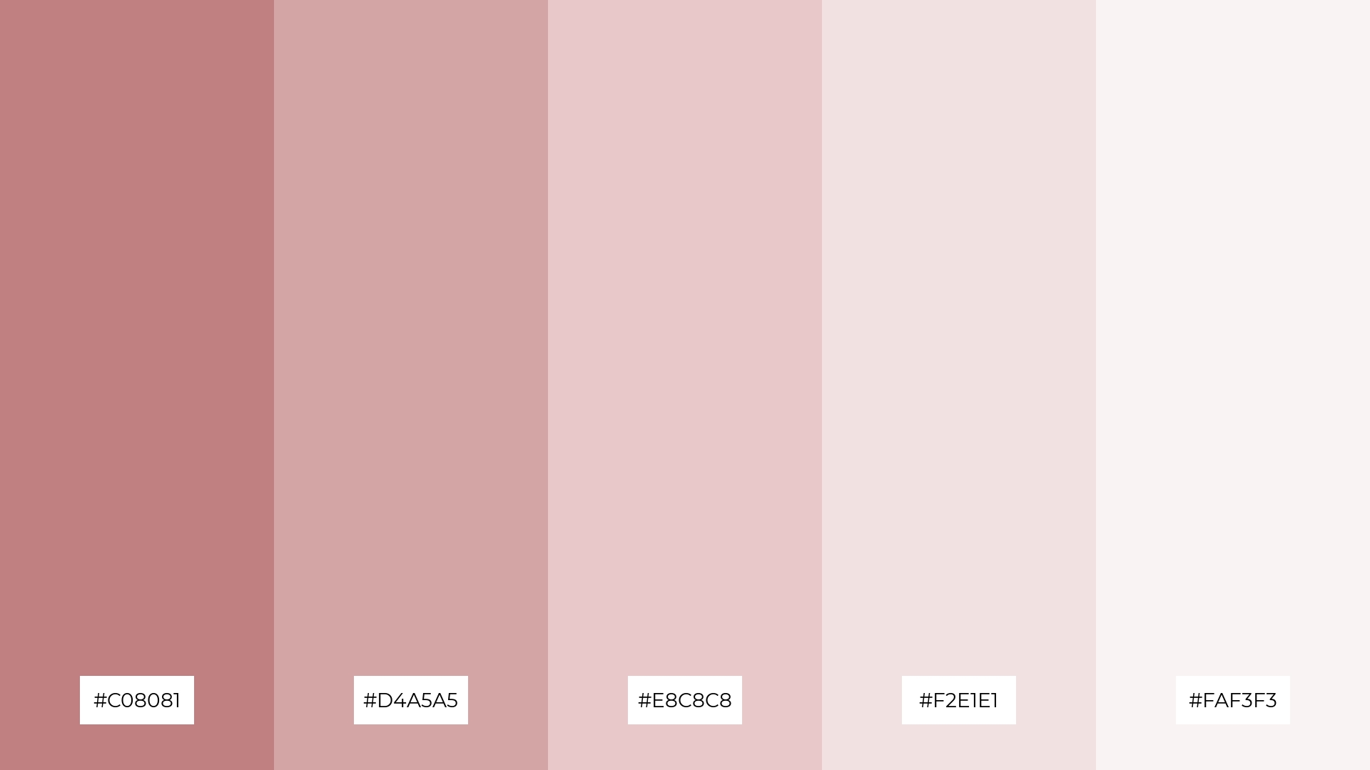
8) Rose Quartz
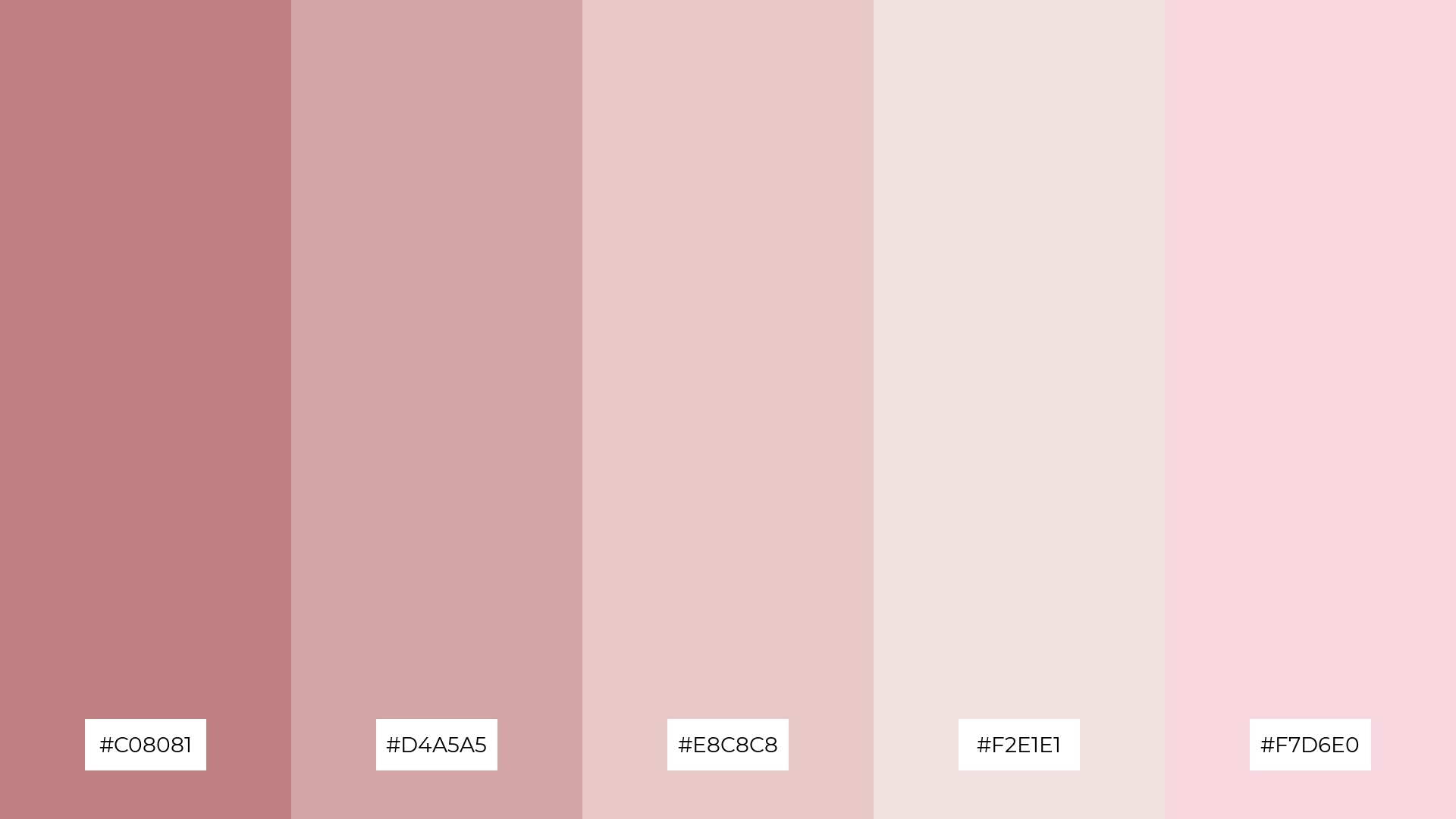
The ‘Rose Quartz’ color palette, with its blend of #C08081, #D4A5A5, #E8C8C8, #F2E1E1, and #F7D6E0, can evoke a sense of calm when used in soft, harmonious combinations, making it ideal for spa branding that seeks to promote relaxation and tranquility.
Conversely, when these colors are paired with more vibrant hues, they can create an exciting and dynamic visual experience, perfect for vibrant marketing campaigns that aim to capture attention and convey energy.
9) Dusty Rose
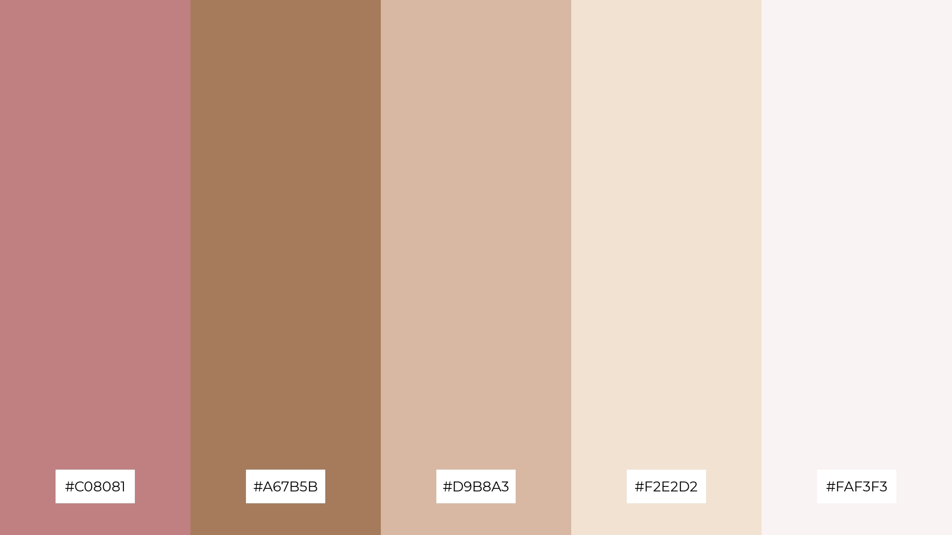
The ‘Dusty Rose’ color palette, with its softer tones of #D9B8A3, #F2E2D2, and #FAF3F3, creates a gentle and inviting ambiance that exudes warmth and comfort.
This blend of hues is perfect for home decor, where the combination of soft and bright tones can transform any space into a cozy and stylish retreat, making it ideal for seasonal promotions that aim to evoke a sense of homely elegance.
10) Classic Blush
The ‘Classic Blush’ color palette, with its seamless gradient from the rich #C08081 to the delicate #FFF5F5, creates a visual flow that evokes a sense of tranquility and gentle joy, making it perfect for designs that aim to soothe and uplift the viewer.
This harmonious blend of colors is ideal for lifestyle branding, where the serene and inviting tones can enhance the appeal of wellness products, or for tech product packaging, where the soft hues can convey a sense of elegance and user-friendliness.
11) Rosewood Elegance
The ‘Rosewood Elegance’ color palette, with its rich blend of #C08081, #6B4226, #A67B5B, #D9B8A3, and #F2E2D2, creates a dramatic yet welcoming effect by combining deep, bold tones with softer, more inviting hues.
This palette shines in boutique interiors, where the harmonious mix of colors can enhance the shopping experience by making the environment feel both luxurious and inviting.
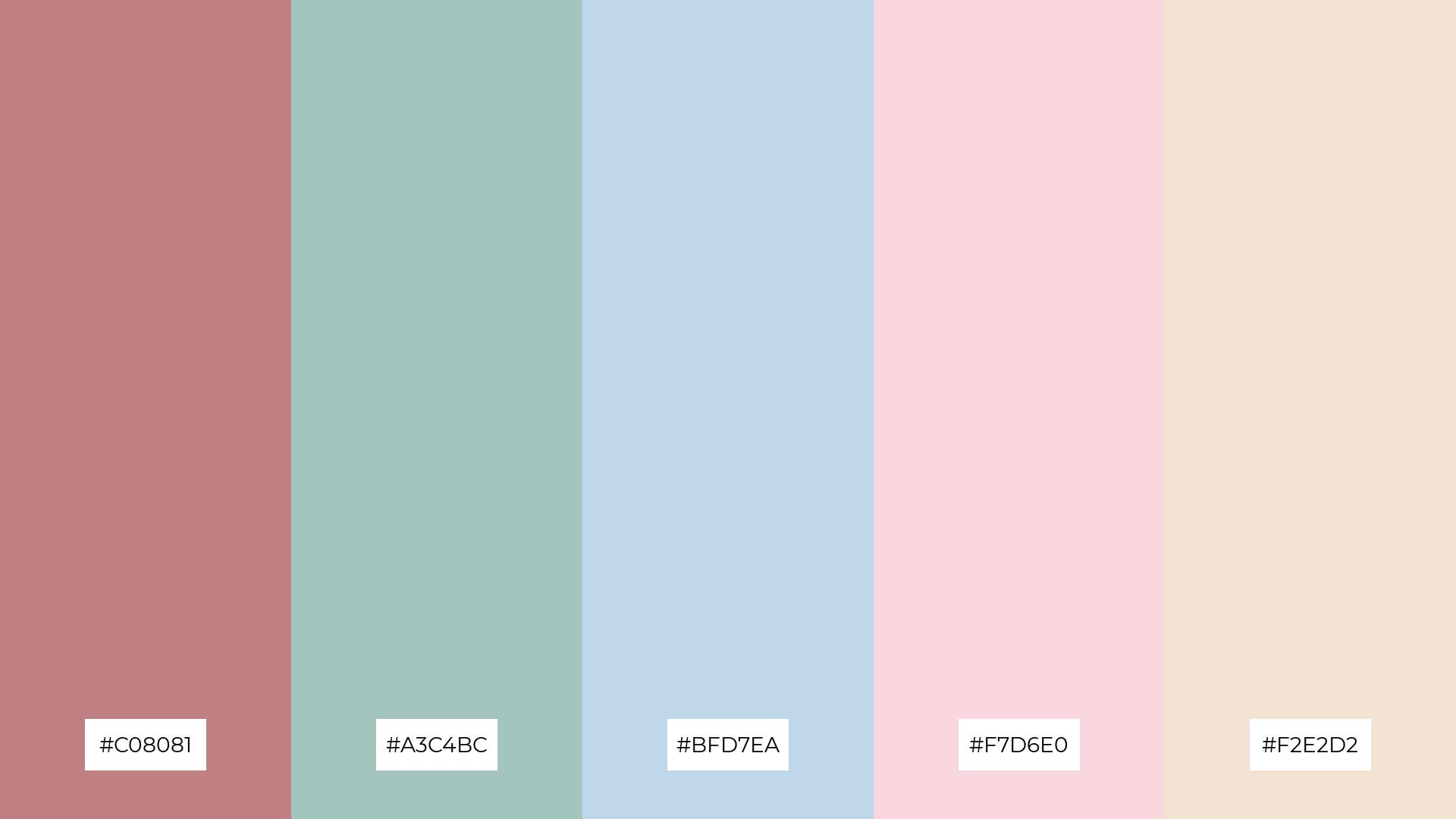
12) Blush Harmony
The ‘Blush Harmony’ color palette, with its blend of #C08081, #A3C4BC, #BFD7EA, #F7D6E0, and #F2E2D2, creates a feeling of balance by combining warm and cool tones that interact harmoniously to produce a serene and cohesive visual experience.
This palette is perfect for casual apparel lines, where the soft and inviting hues can enhance the overall aesthetic, making the clothing feel both stylish and comfortable.
13) Vintage Blush
The ‘Vintage Blush’ color palette, with its blend of warm #C08081 and cool #8B5E83, creates a balanced and nostalgic mood that evokes a sense of timeless elegance and subtle sophistication.
This palette is perfect for artisan product branding, where the harmonious mix of colors can enhance the handcrafted appeal and convey a sense of quality and authenticity.
14) Soft Elegance
The ‘Soft Elegance’ color palette, with its blend of #C08081, #F4C2C2, #FADADD, #FBEFF2, and #FFF5F5, creates a dynamic interplay between bold and subtle hues, offering a versatile range that can evoke both warmth and sophistication.
This palette is ideal for restaurant menus, where the harmonious mix of colors can enhance the dining experience by making the menu feel both inviting and elegant, perfectly complementing a refined culinary atmosphere.
15) Rustic Charm
The ‘Rustic Charm’ color palette, with its blend of #C08081, #8D6A9F, #BFA2DB, #D4A5A5, and #E8C8C8, conveys a sense of harmony when used in cohesive designs, creating a balanced and inviting atmosphere.
This palette is ideal for cozy interior makeovers, where the warm and cool tones can transform a space into a serene retreat, or for tech startups aiming to create a welcoming and user-friendly brand identity.
How to Use Old Rose Patterns in Design
Old Rose color palettes can bring a touch of vintage charm to home decor. Use this muted pink hue on accent walls or soft furnishings to create a cozy and inviting atmosphere. Pair it with neutral tones like beige or gray to maintain a balanced and sophisticated look.
In marketing materials, Old Rose can evoke a sense of elegance and nostalgia. Incorporate it into your brand’s color scheme for a timeless appeal, or use it in promotional graphics to stand out with a subtle yet impactful design. Complementary shades like soft greens or muted blues can enhance the overall aesthetic.
For clothing design, Old Rose offers a versatile option that can be both romantic and modern. Use it in fabric patterns or as a primary color for garments to create a stylish and cohesive collection. Bold accents like deep burgundy or navy blue can add depth and interest to your designs.
Ready to create your own stunning Old Rose color palettes? Try using Piktochart’s intuitive design tools to bring your vision to life. Start designing with Piktochart today.


