
Exploring lime green color palettes can invigorate your design projects with a fresh and vibrant touch. This zesty hue is perfect for creating eye-catching visuals that stand out.
Whether you’re designing infographics, presentations, or social media graphics, lime green offers a versatile and energetic option. Dive into the world of lime green to discover how it can transform your creative endeavors.
Tips For Creating Lime Green Color Palettes
Designing with lime green can be both exciting and challenging. Here are some practical tips to help you create stunning color palettes:
- Balance with Neutrals: Pair lime green with neutral colors like white, gray, or beige to avoid overwhelming your design.
- Complementary Colors: Use complementary shades such as purple or magenta to create a striking contrast that enhances the vibrancy of lime green.
- Gradients and Shades: Experiment with different gradients and shades of lime green to add depth and dimension to your design.
- Accent Colors: Incorporate lime green as an accent color to highlight key elements without dominating the entire palette.
- Consistency: Maintain a consistent color scheme throughout your project to ensure a cohesive and professional look.
- Versatility: Test your color palette across various mediums and devices to ensure it remains effective and visually appealing in different contexts.
15 Lime Green Color Palettes
1) Tropical Oasis
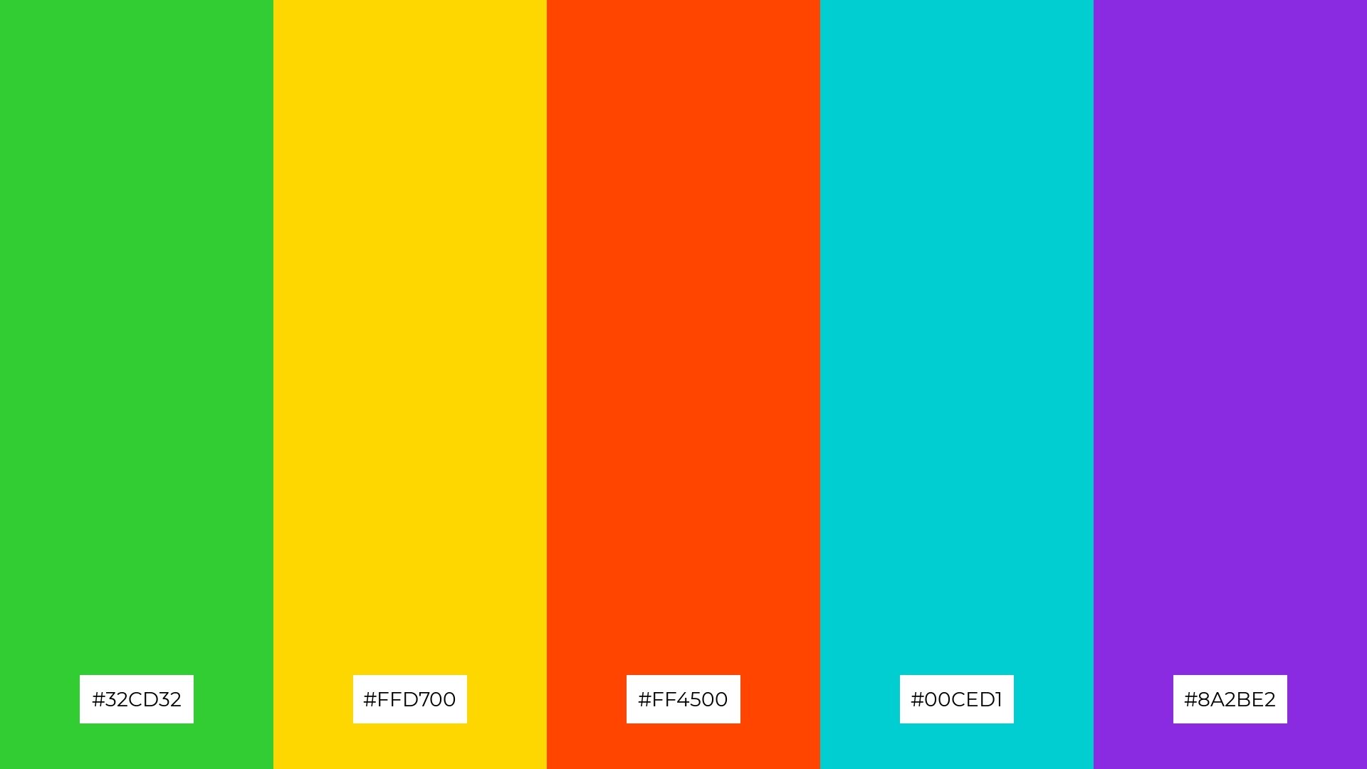
The ‘Tropical Oasis’ palette, featuring vibrant hues like lime green (#32CD32), golden yellow (#FFD700), and fiery orange (#FF4500), evokes a lively and energetic mood, reminiscent of a sun-soaked paradise.
These colors interact harmoniously with the cool tones of turquoise (#00CED1) and deep violet (#8A2BE2), creating a cohesive and balanced look perfect for fashion designs that aim to capture the essence of a tropical getaway.
2) Fresh Meadow
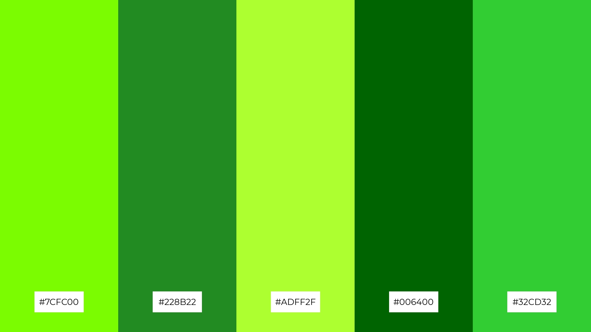
The ‘Fresh Meadow’ palette, with its blend of lime green (#7CFC00), forest green (#228B22), and yellow-green (#ADFF2F), evokes a sense of rejuvenation and vitality, reminiscent of a lush, thriving landscape.
This palette would excel in digital branding for eco-friendly products, where the vibrant greens can convey sustainability and a connection to nature.
3) Citrus Burst

The ‘Citrus Burst’ palette, featuring dominant colors like lime green (#32CD32), orange (#FFA500), and tomato red (#FF6347), creates a vibrant and energetic harmony that can invigorate any design.
This palette is particularly effective for wellness branding, where the lively and refreshing hues can evoke feelings of health, vitality, and positivity.
4) Spring Garden
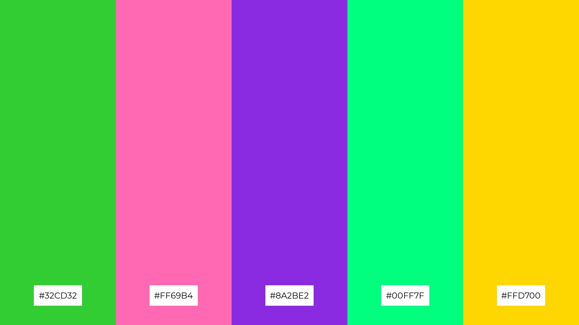
The ‘Spring Garden’ palette, with its mix of lime green (#32CD32), hot pink (#FF69B4), deep violet (#8A2BE2), spring green (#00FF7F), and golden yellow (#FFD700), offers a balance of soft and bold tones, creating a distinct and inviting mood.
This palette is ideal for creating inviting retail spaces or modern web designs, where the vibrant and harmonious colors can attract attention and evoke a sense of freshness and energy.
5) Electric Lime
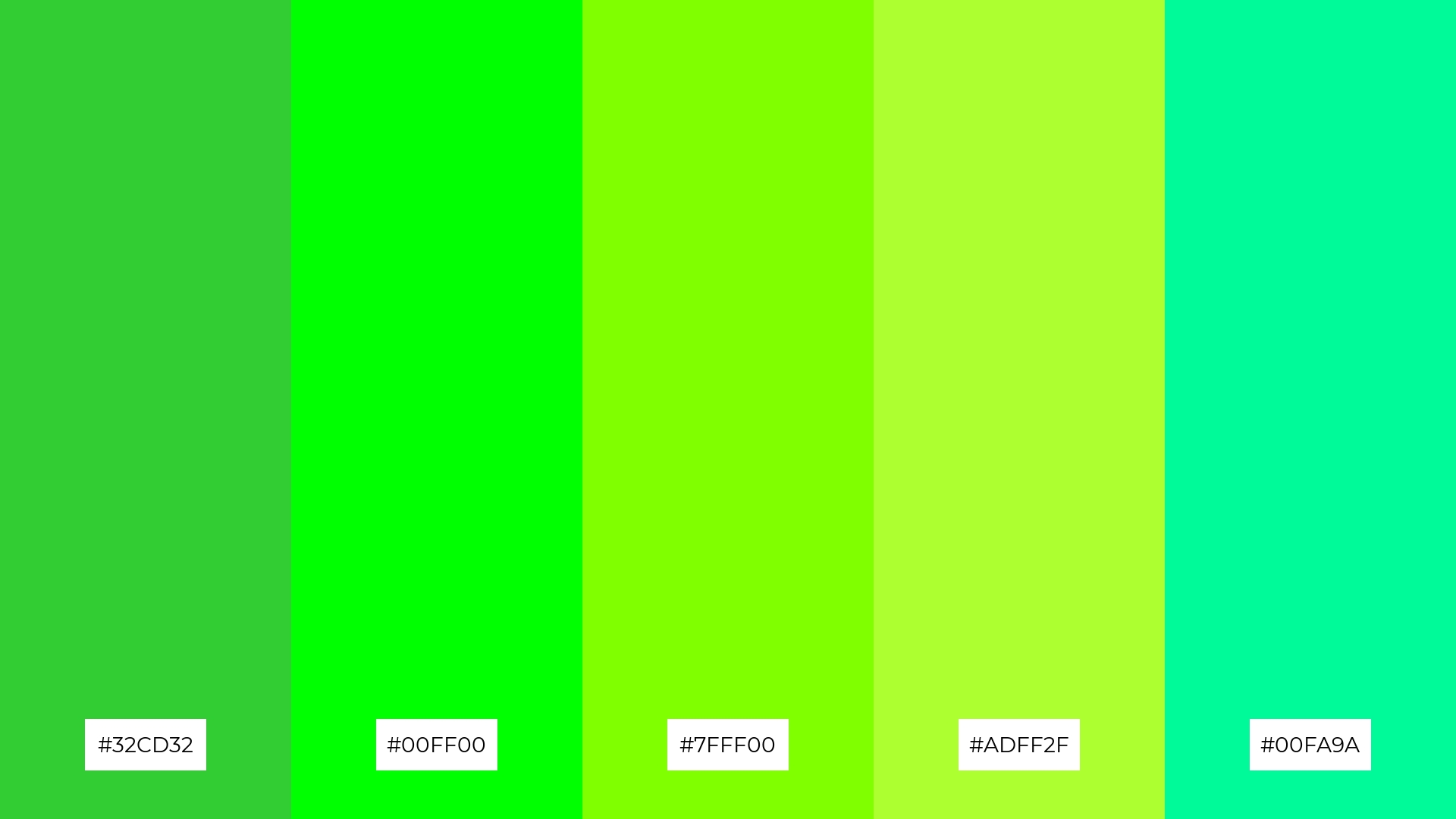
The ‘Electric Lime’ palette, with its dynamic blend of lime green (#32CD32), neon green (#00FF00), chartreuse (#7FFF00), yellow-green (#ADFF2F), and medium spring green (#00FA9A), creates an ambiance of high energy and modern vibrancy, perfect for cutting-edge tech branding.
This palette’s bold and electrifying hues can be uniquely applied to luxury fashion campaigns, where the striking colors can highlight innovative designs and make a powerful visual statement.
6) Neon Jungle
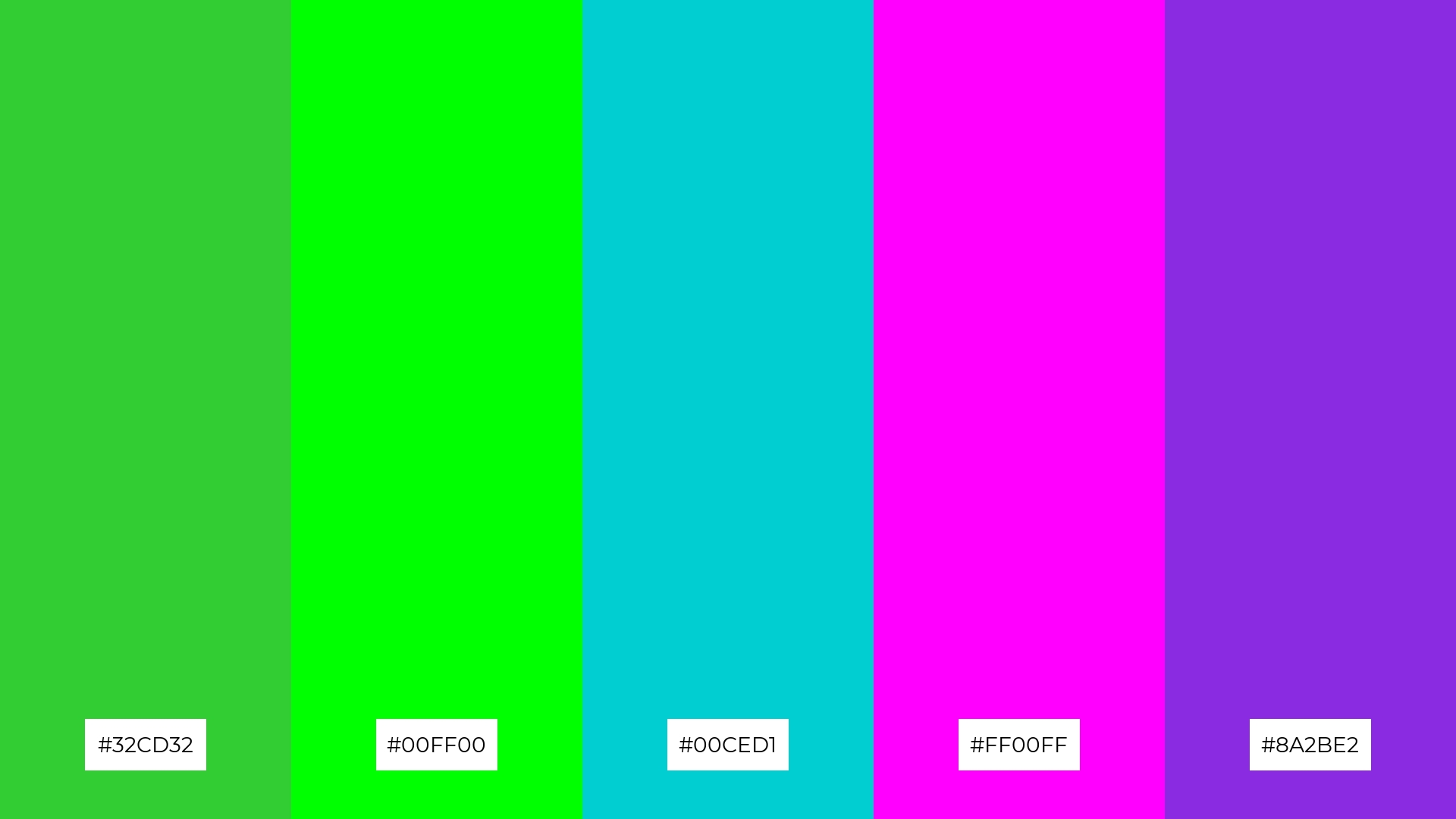
The ‘Neon Jungle’ palette, with its vibrant mix of lime green (#32CD32), neon green (#00FF00), turquoise (#00CED1), magenta (#FF00FF), and deep violet (#8A2BE2), creates a dynamic and playful atmosphere that can energize any design project.
This bold and eclectic color harmony is perfect for event designs that aim to captivate and excite attendees, making it an excellent choice for music festivals or tech conferences where a lively and engaging visual identity is essential.
7) Lime Sorbet
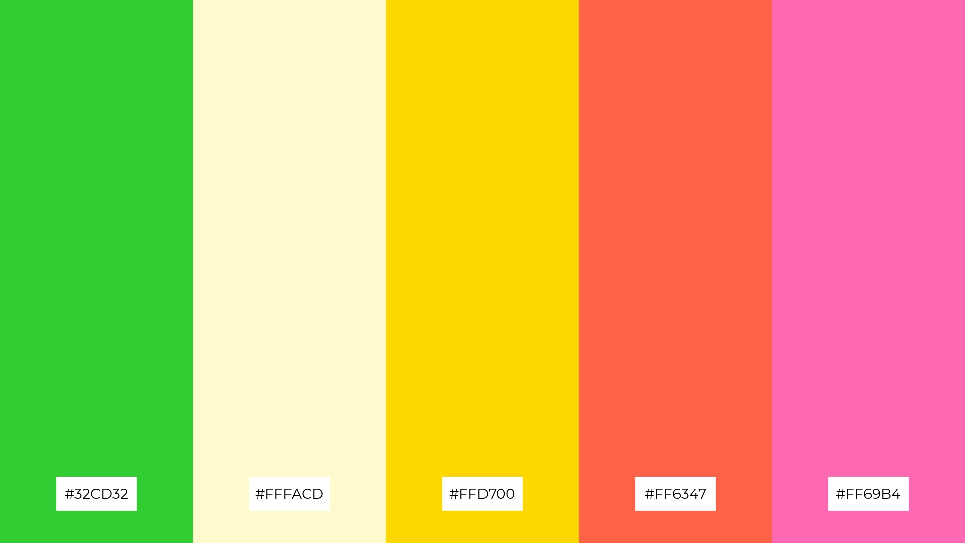
The ‘Lime Sorbet’ palette, with its mix of lime green (#32CD32), light yellow (#FFFACD), golden yellow (#FFD700), tomato red (#FF6347), and hot pink (#FF69B4), combines contrasting elements that create a visually stimulating and dynamic composition.
This vibrant and eclectic palette is ideal for creative projects like magazine layouts or artistic websites, where the bold contrasts can draw attention and enhance the overall aesthetic appeal.
8) Forest Glow
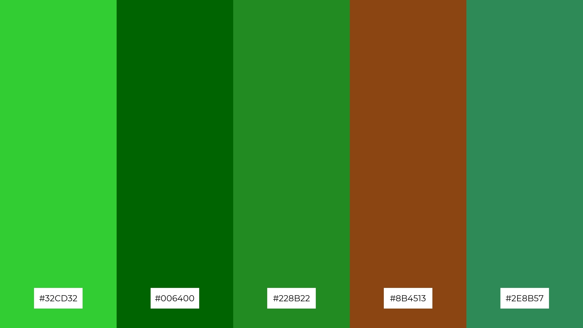
The ‘Forest Glow’ palette, with its blend of lime green (#32CD32), dark green (#006400), forest green (#228B22), saddle brown (#8B4513), and sea green (#2E8B57), can evoke a sense of calm when the deeper greens and browns are emphasized, creating a serene and grounded atmosphere perfect for spa branding.
Conversely, by highlighting the brighter lime and sea greens, this palette can inject excitement and vibrancy into marketing campaigns, making it an excellent choice for brands looking to convey energy and freshness.
9) Lime Splash
The ‘Lime Splash’ palette, with its softer and brighter tones like lime green (#32CD32), spring green (#00FF7F), and yellow-green (#ADFF2F), creates a refreshing and uplifting mood that can invigorate any space.
This vibrant blend is ideal for home decor or seasonal promotions, where the lively hues can evoke a sense of renewal and energy, making it perfect for spring or summer themes.
10) Vibrant Lime
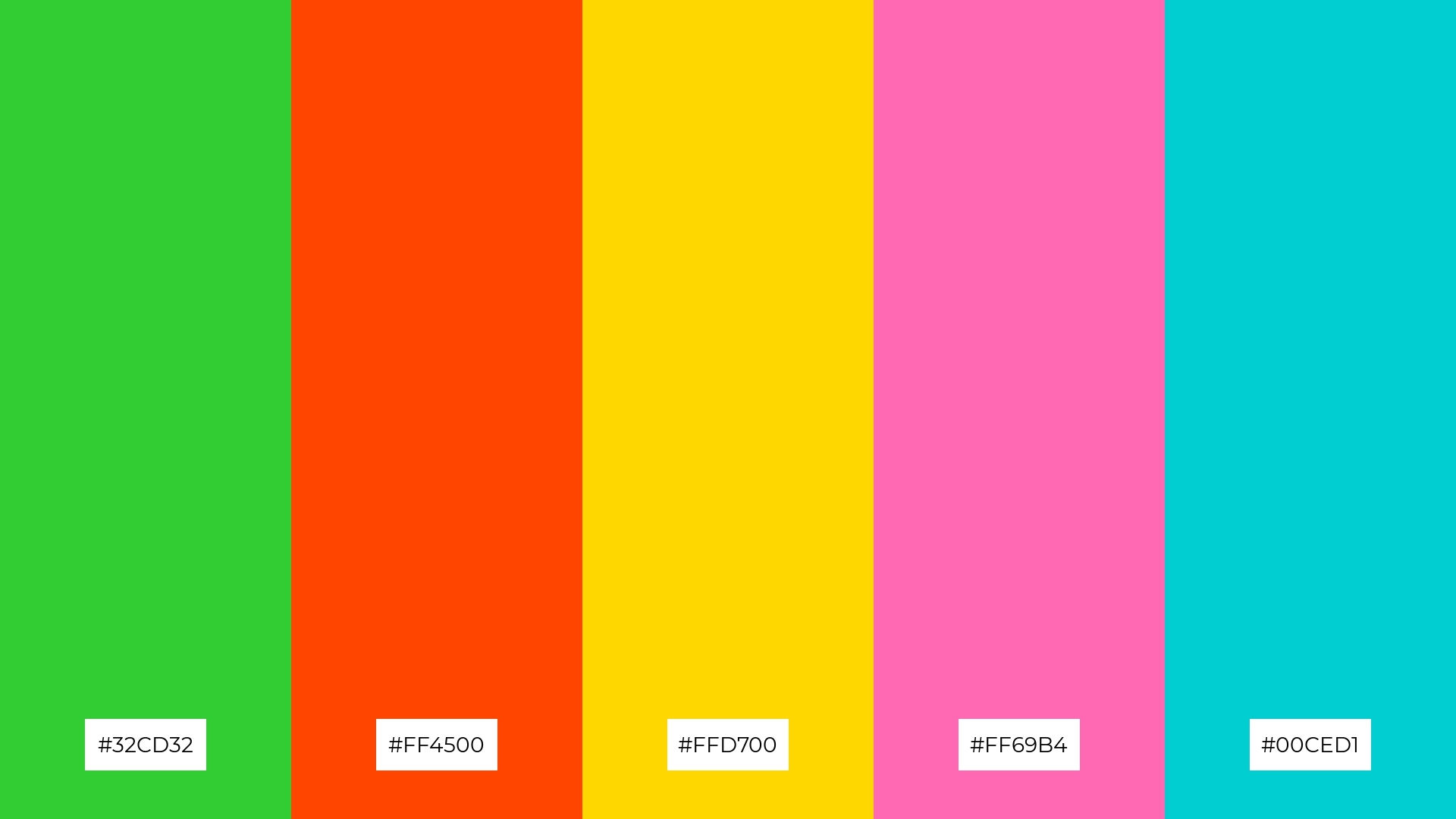
The ‘Vibrant Lime’ palette, with its dynamic mix of lime green (#32CD32), fiery orange (#FF4500), golden yellow (#FFD700), hot pink (#FF69B4), and turquoise (#00CED1), creates a visual flow that evokes feelings of joy and excitement, making it perfect for designs that aim to uplift and energize.
This lively and emotionally impactful color combination is ideal for lifestyle branding or tech product packaging, where the vibrant hues can attract attention and convey a sense of innovation and positivity.
11) Lime Punch
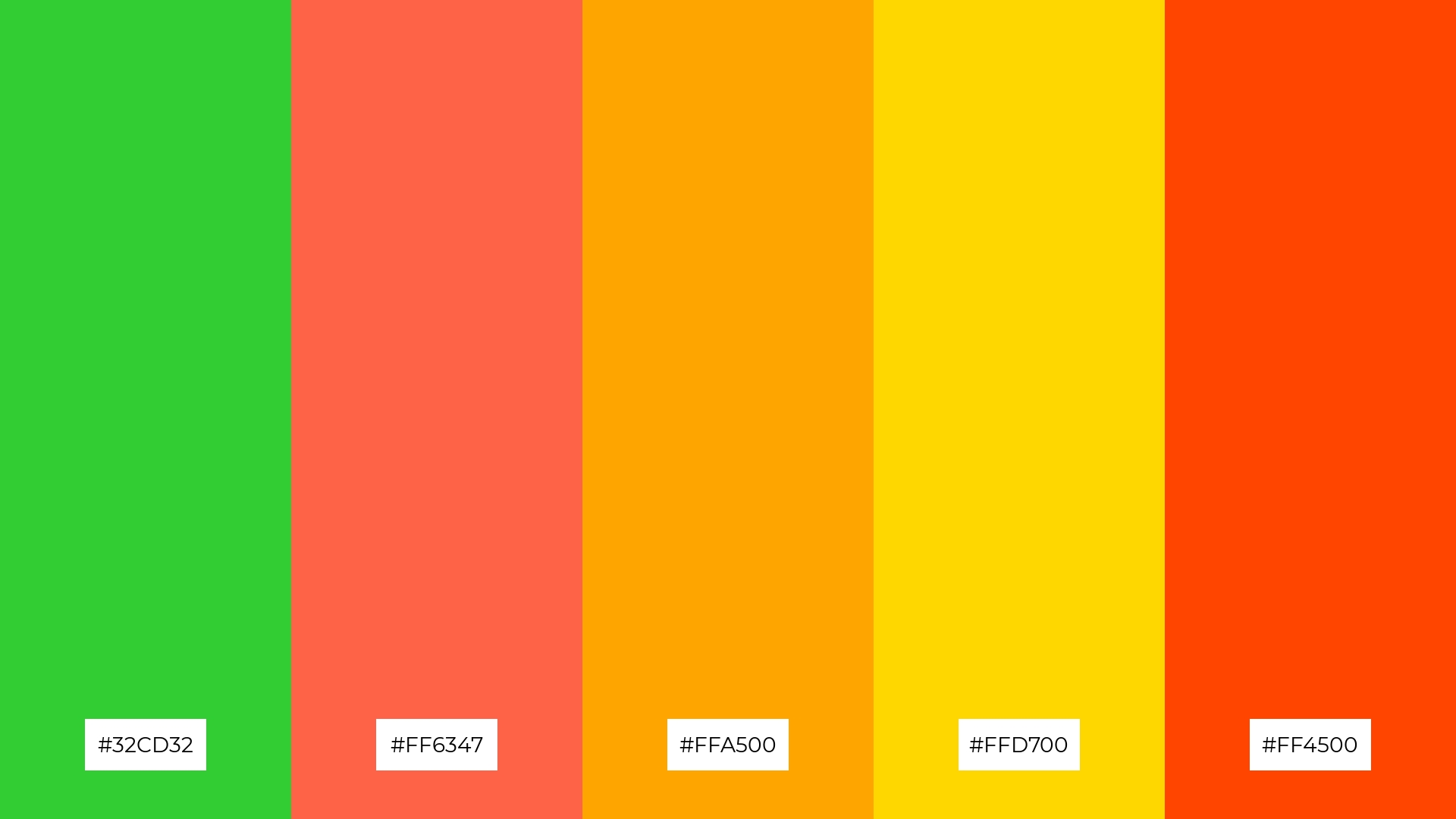
The ‘Lime Punch’ palette, with its vibrant mix of lime green (#32CD32), tomato red (#FF6347), orange (#FFA500), golden yellow (#FFD700), and fiery orange (#FF4500), creates a dramatic and eye-catching effect that can instantly energize any design.
This bold and dynamic color combination is perfect for luxury e-commerce sites, where the striking hues can captivate visitors and convey a sense of excitement and exclusivity.
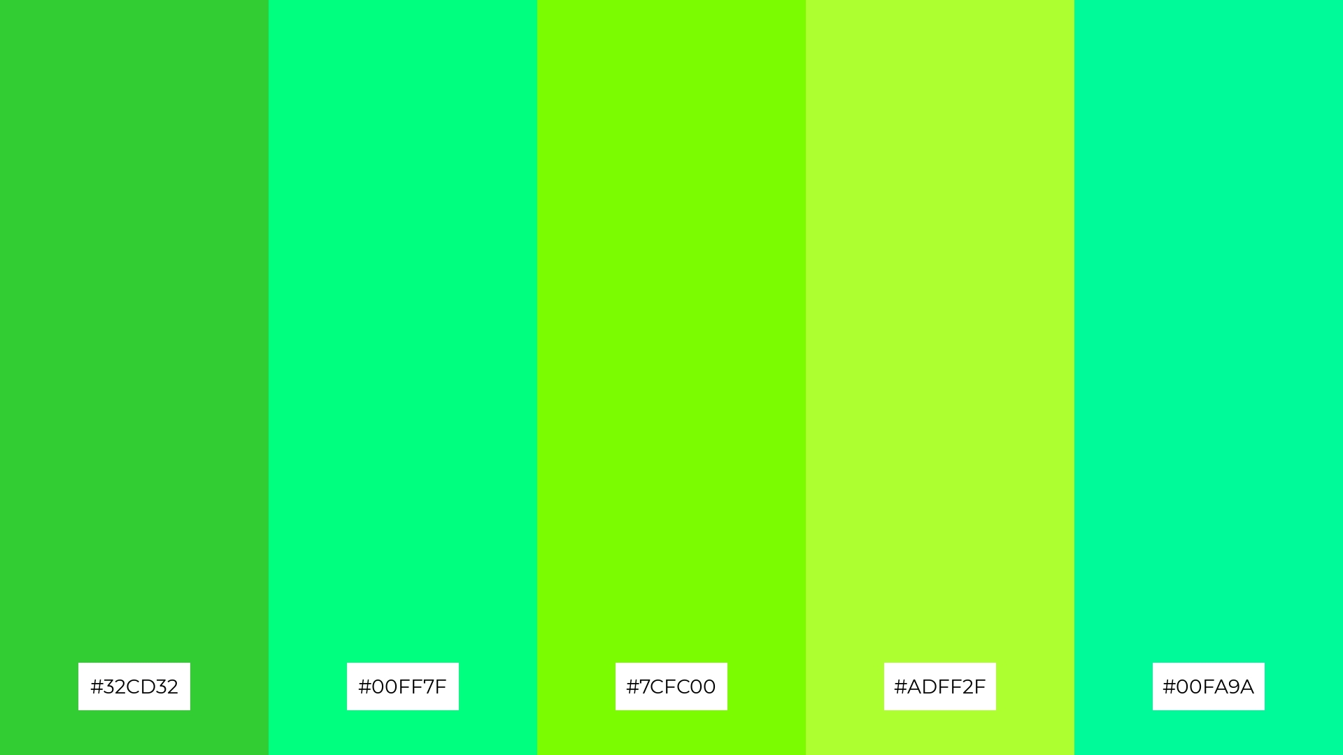
12) Lime Twist
The ‘Lime Twist’ palette, with its harmonious blend of lime green (#32CD32), neon green (#00FF00), chartreuse (#7FFF00), yellow-green (#ADFF2F), and medium spring green (#00FA9A), creates a balanced yet vibrant visual experience that can energize any design.
This dynamic and refreshing color combination is perfect for casual apparel lines, where the lively hues can convey a sense of fun and playfulness, making the clothing stand out in a crowded market.
13) Lime Delight
The ‘Lime Delight’ palette, with its blend of warm tones like golden yellow (#FFD700) and tomato red (#FF6347) alongside cool hues like lime green (#32CD32) and light yellow (#FFFACD), creates a balanced and inviting mood that is both vibrant and harmonious.
This unique color combination is perfect for artisan product branding, where the warm and cool tones can evoke a sense of handcrafted quality and modern elegance, making the products stand out in a competitive market.
14) Lime Breeze
The ‘Lime Breeze’ palette, with its dynamic mix of lime green (#32CD32), spring green (#00FF7F), lawn green (#7CFC00), yellow-green (#ADFF2F), and medium spring green (#00FA9A), creates a refreshing and invigorating visual experience that can be both bold and subtle depending on the application.
This versatile color combination is perfect for festival marketing, where the vibrant hues can capture attention and convey a sense of excitement and energy, making the event feel lively and inviting.
15) Lime Pop
The ‘Lime Pop’ palette, with its mix of lime green (#32CD32), fiery orange (#FF4500), golden yellow (#FFD700), hot pink (#FF69B4), and turquoise (#00CED1), can convey a sense of harmony when used in balanced proportions, creating a cohesive and visually appealing design.
This vibrant and contrasting color combination is ideal for tech startups looking to create an energetic and innovative brand identity, or for cozy interior makeovers where the lively hues can add a touch of modern flair and warmth.
How to Use Lime Green Patterns in Design
In home decor, lime green can be used to create a refreshing and lively atmosphere. Pair it with neutral tones like white or beige to balance its vibrancy, or use it as an accent color to highlight specific areas or pieces of furniture.
For marketing materials, lime green can draw attention and convey a sense of energy and innovation. Combine it with complementary colors like purple or magenta to create striking visuals that stand out in advertisements, brochures, or social media graphics.
In clothing design, lime green can add a playful and modern touch. Use it in patterns or as a bold statement piece to create eye-catching fashion items that appeal to a youthful and trendy audience.
Ready to experiment with lime green in your designs? Try creating your own lime green color palettes using Piktochart and see how this vibrant hue can transform your projects.


