Exploring the world of pink and gray color palettes opens up a realm of sophisticated and versatile design possibilities. These hues, when combined, create a balance that is both modern and timeless.
Whether you’re designing for digital or print, pink and gray can add a touch of elegance and subtlety to your projects. This article delves into how to effectively use these colors to enhance your visual storytelling.
Tips For Creating Pink Gray Color Palettes
Creating a stunning pink and gray color palette requires a thoughtful approach to balance and harmony.
- Balance the Dominance: Ensure that neither pink nor gray overwhelms the design. Use one as the primary color and the other as an accent to maintain visual equilibrium.
- Complementary Shades: Pair pink and gray with complementary colors like white or black to add depth and contrast. This can make your design more dynamic and engaging.
- Consider the Mood: Light pinks and grays can evoke a soft, calming effect, while darker shades can add a sense of sophistication and drama. Choose shades that align with the desired mood of your project.
- Texture and Patterns: Incorporate textures and patterns to add interest and complexity. For instance, a gray background with pink floral patterns can create a visually appealing contrast.
- Versatility in Application: Use pink and gray in various elements like backgrounds, typography, and icons. This versatility ensures that the color palette can adapt to different design needs.
- Test and Iterate: Always test your color combinations on different devices and mediums. This helps ensure that the colors look consistent and appealing across all platforms.
15 Pink Gray Color Palettes
1) Blush Serenity

The ‘Blush Serenity’ palette, with its soft pinks and muted grays, creates a tranquil and inviting atmosphere that is both soothing and elegant.
Perfect for interior decor, this palette’s harmonious blend of colors can transform a living space into a serene retreat, highlighting its ability to evoke calmness and sophistication.
2) Misty Rose
The ‘Misty Rose’ palette, with its blend of soft pinks and grays, evokes a sense of warmth and calmness, making it ideal for creating a welcoming and soothing atmosphere.
This palette would excel in digital branding for wellness and lifestyle blogs, where the gentle hues can enhance the user experience by promoting relaxation and tranquility.
3) Soft Elegance
The ‘Soft Elegance’ palette, featuring dominant colors like #F5B7B1 (soft pink) and #C0C0C0 (silver gray), creates a harmonious blend that exudes both warmth and sophistication.
This palette is particularly effective in wellness branding, where the gentle hues can foster a sense of calm and well-being, making it ideal for creating serene and inviting environments.
4) Urban Chic
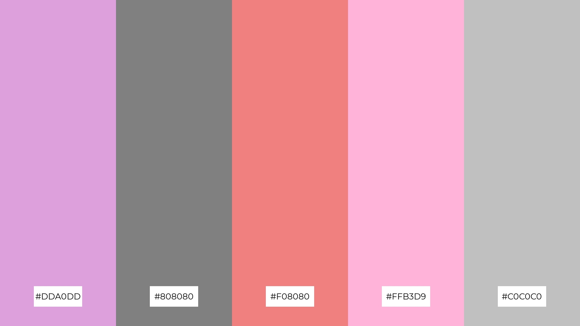
The ‘Urban Chic’ palette, with its mix of soft lavender (#DDA0DD) and bold coral (#F08080), alongside neutral grays (#808080, #C0C0C0) and a touch of pink (#FFB3D9), offers a balanced blend of tones that create a distinct and contemporary mood.
This palette is ideal for modern web designs, where the combination of soft and bold hues can create an inviting and dynamic user experience, or for retail spaces aiming to evoke a chic and stylish atmosphere.
5) Dusty Petals
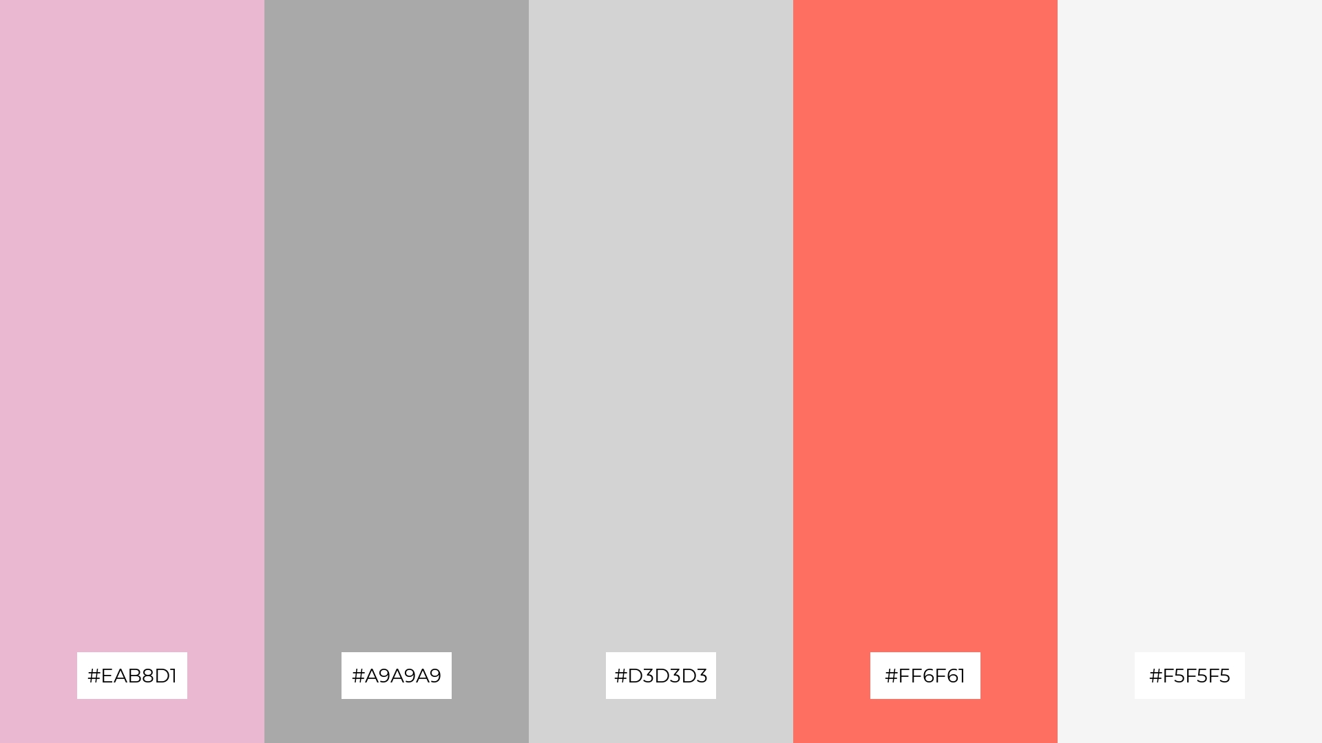
The ‘Dusty Petals’ palette, with its blend of soft pinks (#EAB8D1), muted grays (#A9A9A9, #D3D3D3), vibrant coral (#FF6F61), and crisp white (#F5F5F5), creates an ambiance of understated elegance and warmth.
This palette is perfect for luxury fashion campaigns, where the harmonious mix of gentle and bold hues can highlight the sophistication and allure of high-end designs.
6) Rose Quartz
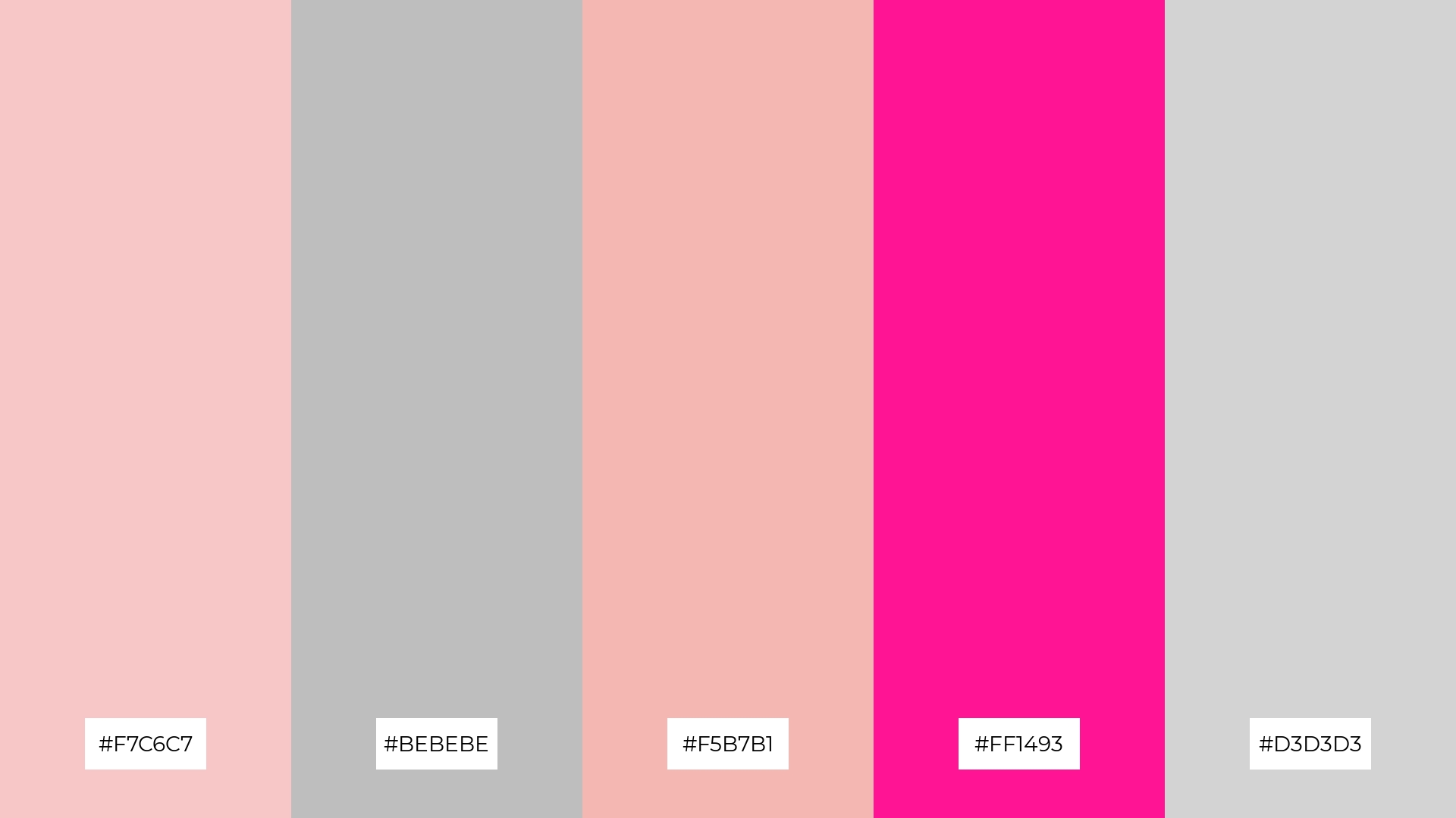
The ‘Rose Quartz’ palette, with its blend of soft pinks (#F7C6C7, #F5B7B1), neutral grays (#BEBEBE, #D3D3D3), and a bold pink (#FF1493), creates a harmonious balance that can evoke a sense of both sophistication and playfulness, making it versatile for various design needs.
This palette is particularly effective for minimalistic branding, where the subtle hues can convey elegance and simplicity, while the vibrant pink adds a touch of boldness, making it ideal for creating a memorable and refined brand identity.
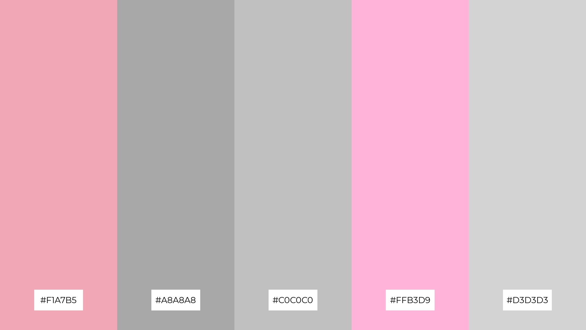
7) Vintage Charm
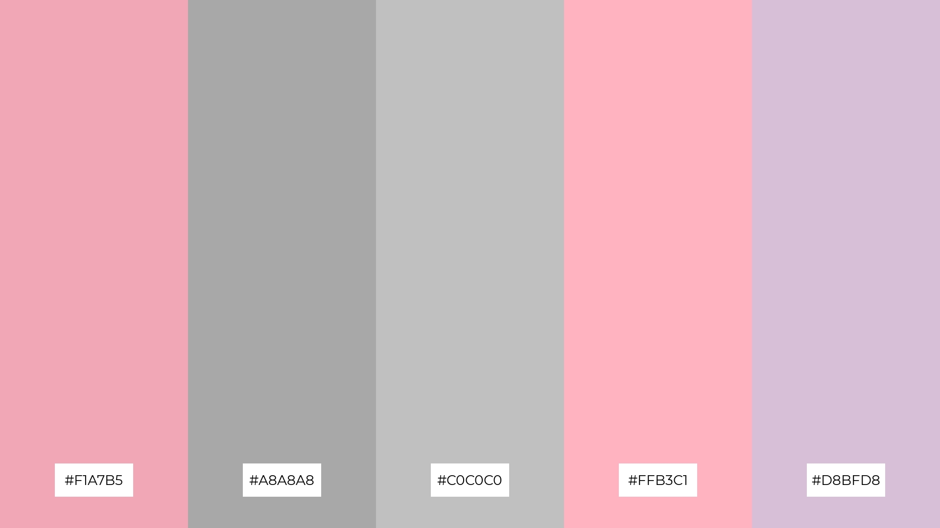
The ‘Vintage Charm’ palette, with its blend of soft pinks (#F1A7B5, #FFB3C1) and muted grays (#A8A8A8, #C0C0C0), contrasted by the delicate lavender (#D8BFD8), creates a visually intriguing balance of warmth and subtlety.
This palette is ideal for creative projects like magazine layouts or artistic websites, where the harmonious mix of gentle and muted hues can enhance the visual appeal and create a sophisticated, timeless aesthetic.
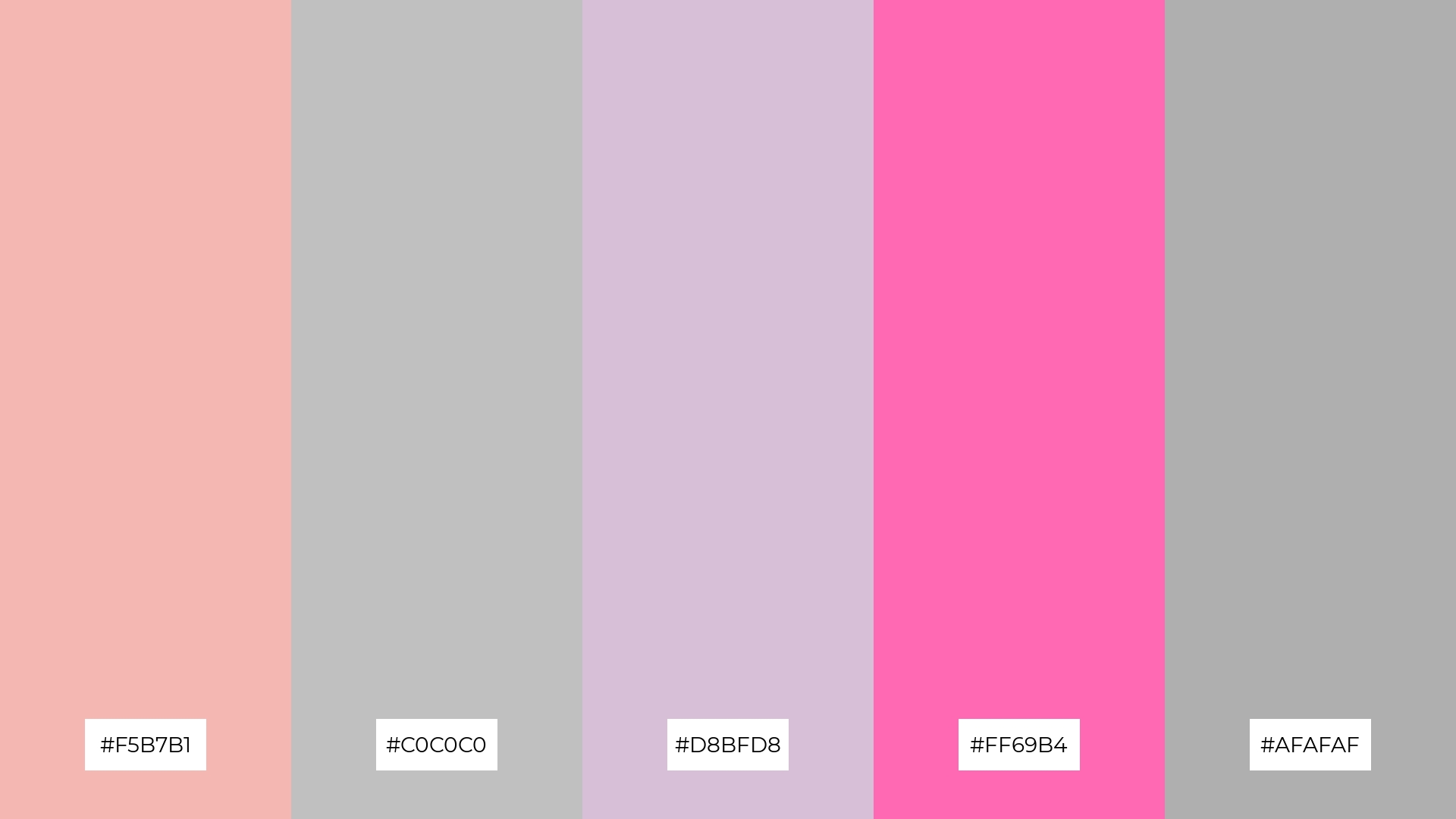
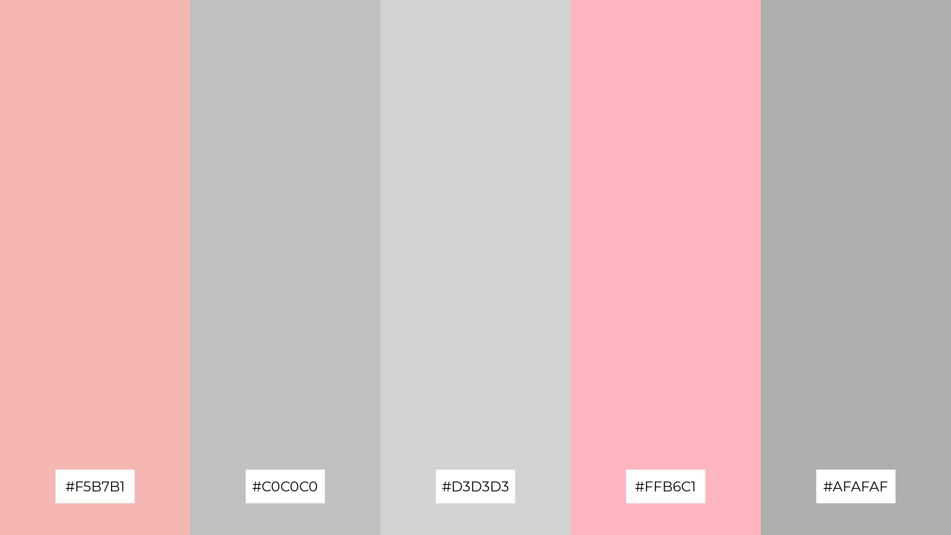
8) Elegant Blush
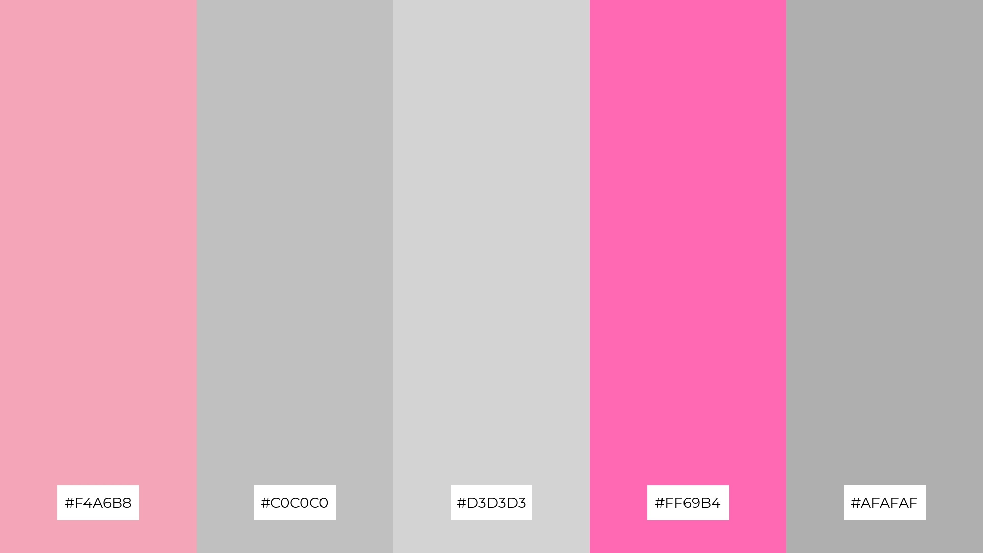
The ‘Elegant Blush’ palette, with its blend of soft pinks (#F4A6B8) and muted grays (#C0C0C0, #D3D3D3, #AFAFAF), can create a calming and serene atmosphere, perfect for spa branding where tranquility and relaxation are paramount.
Conversely, the inclusion of a bold pink (#FF69B4) in the ‘Elegant Blush’ palette can inject a sense of excitement and vibrancy, making it ideal for dynamic marketing campaigns that aim to capture attention and evoke a lively, energetic response.
9) Modern Romance
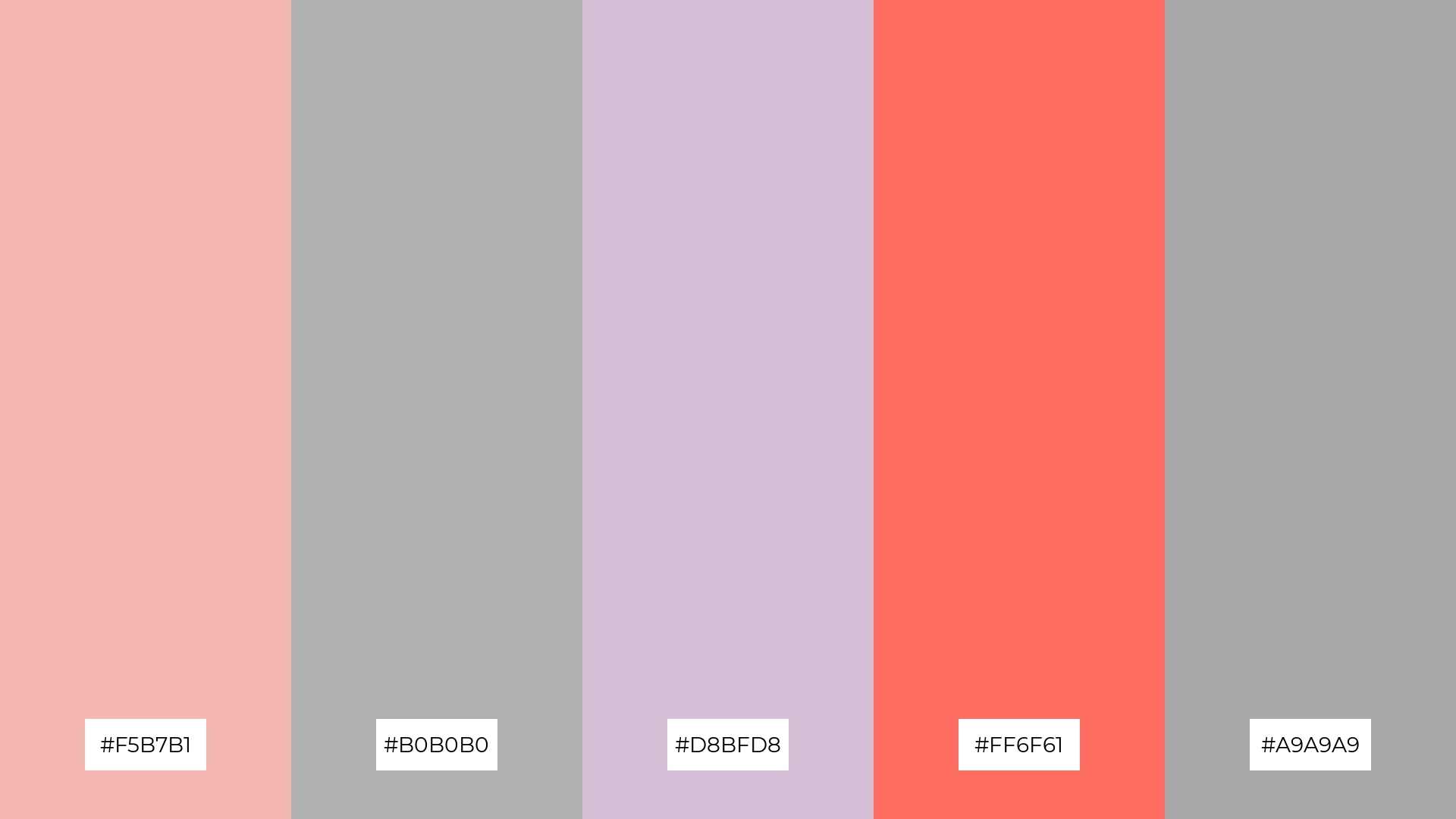
The ‘Modern Romance’ palette, with its blend of soft pinks (#F5B7B1) and muted grays (#B0B0B0, #A9A9A9), complemented by the delicate lavender (#D8BFD8) and vibrant coral (#FF6F61), creates a harmonious and inviting atmosphere.
This palette is ideal for seasonal promotions, where the mix of gentle and bold hues can evoke a sense of warmth and excitement, making it perfect for capturing the essence of festive occasions.
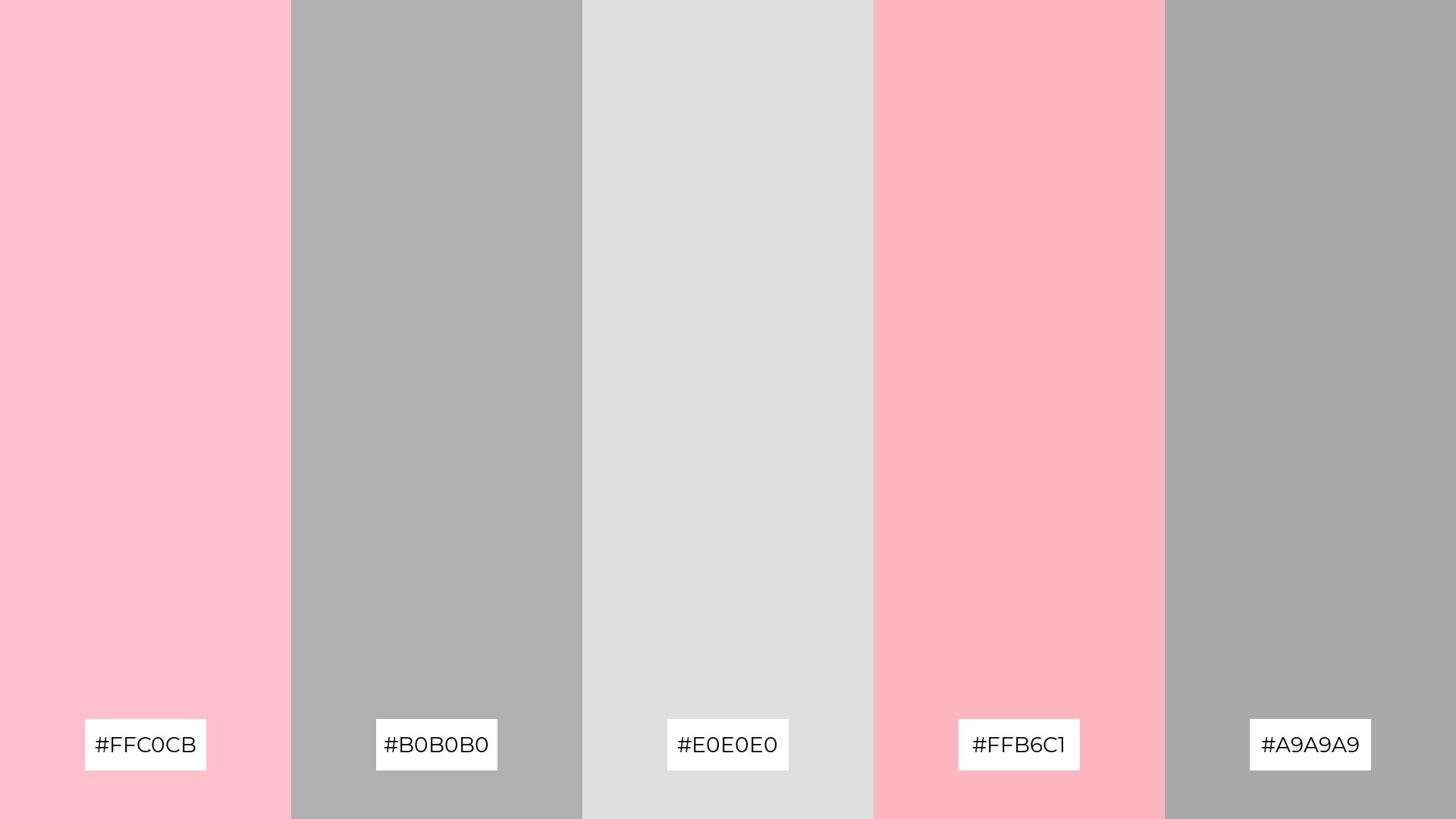
10) Whispering Pink
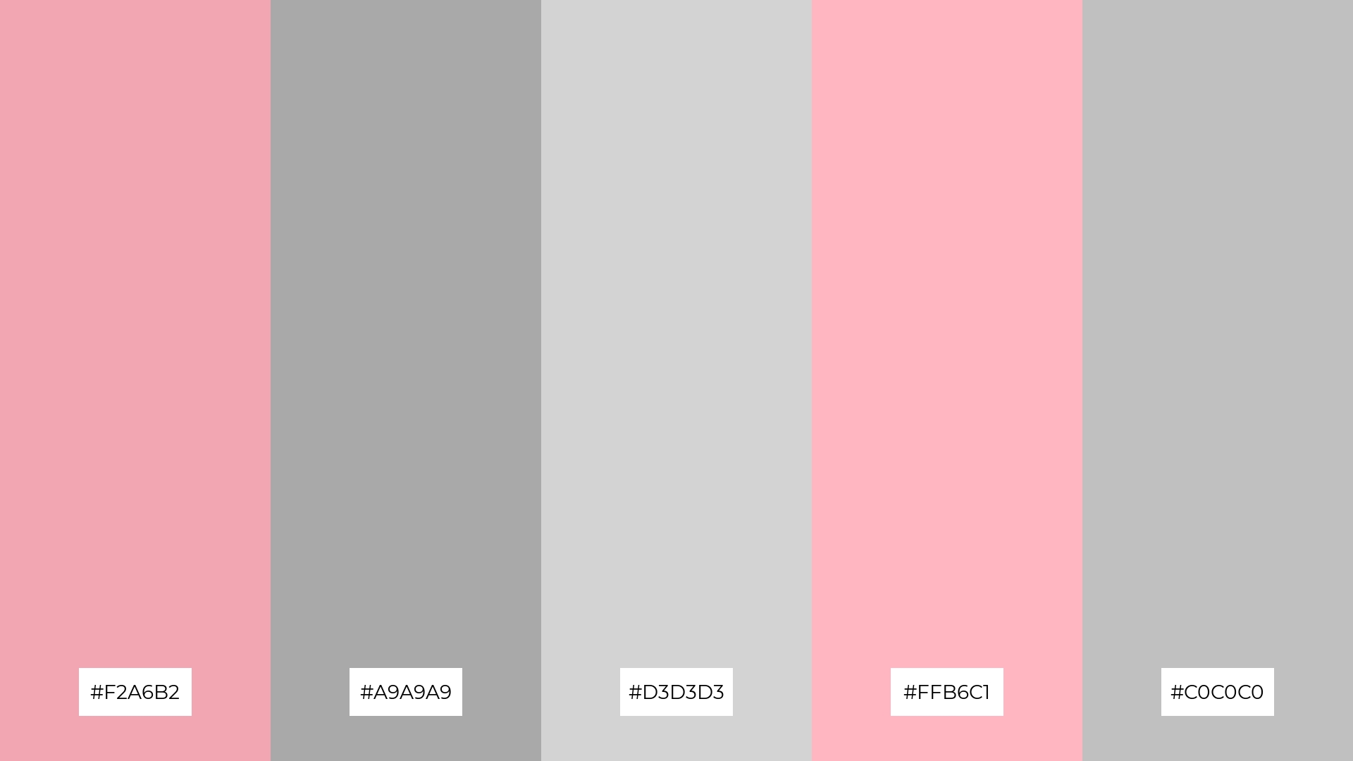
The ‘Whispering Pink’ palette, with its blend of soft pinks (#F2A6B2, #FFB6C1) and muted grays (#A9A9A9, #D3D3D3, #C0C0C0), creates a visual flow that evokes a sense of tranquility and understated joy, making it perfect for designs that aim to soothe and uplift.
This palette is ideal for lifestyle branding, where the gentle hues can enhance the perception of calmness and well-being, or for tech product packaging, where the subtle yet sophisticated colors can convey a sense of modern elegance and reliability.
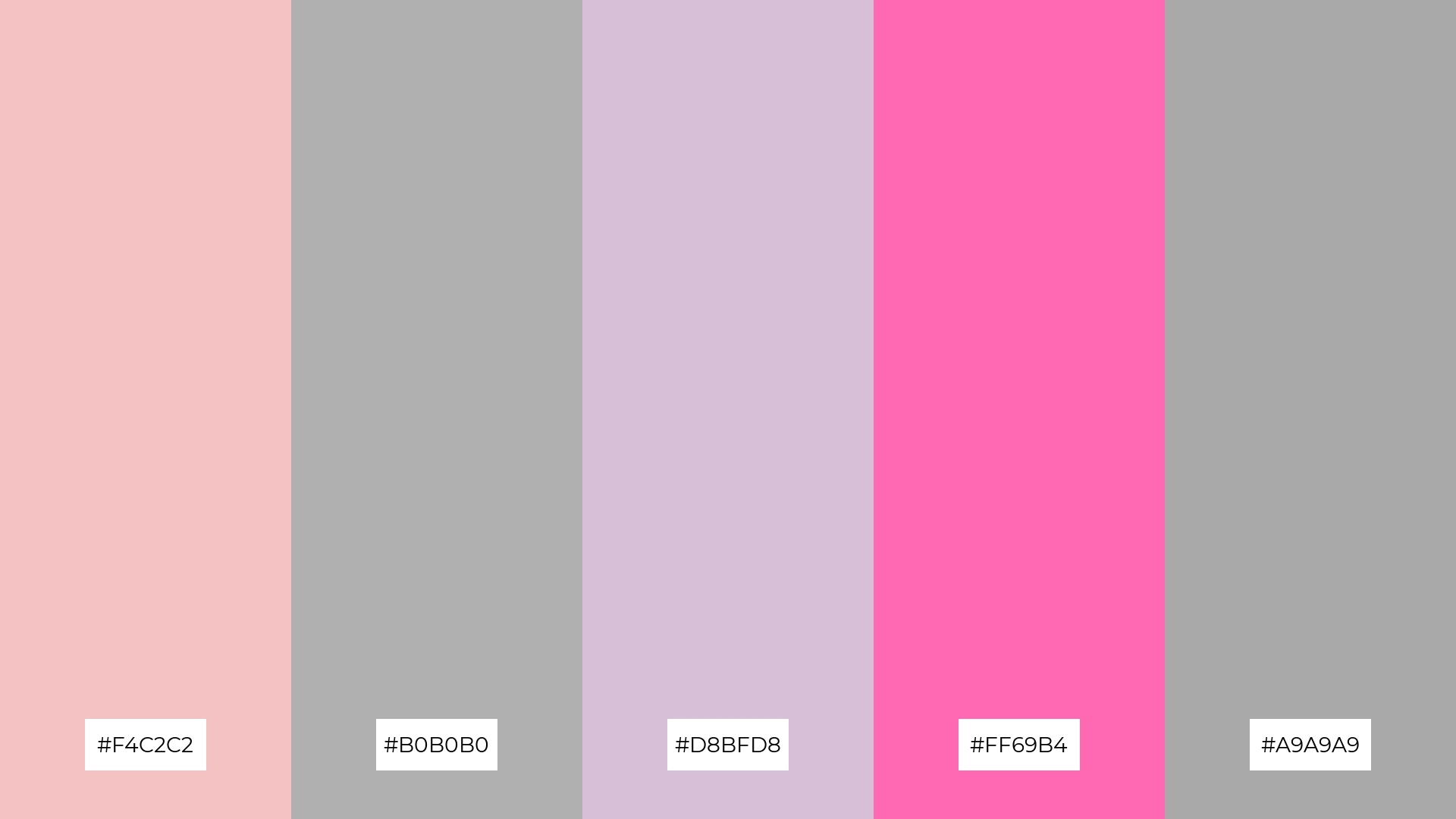
11) Chic Harmony
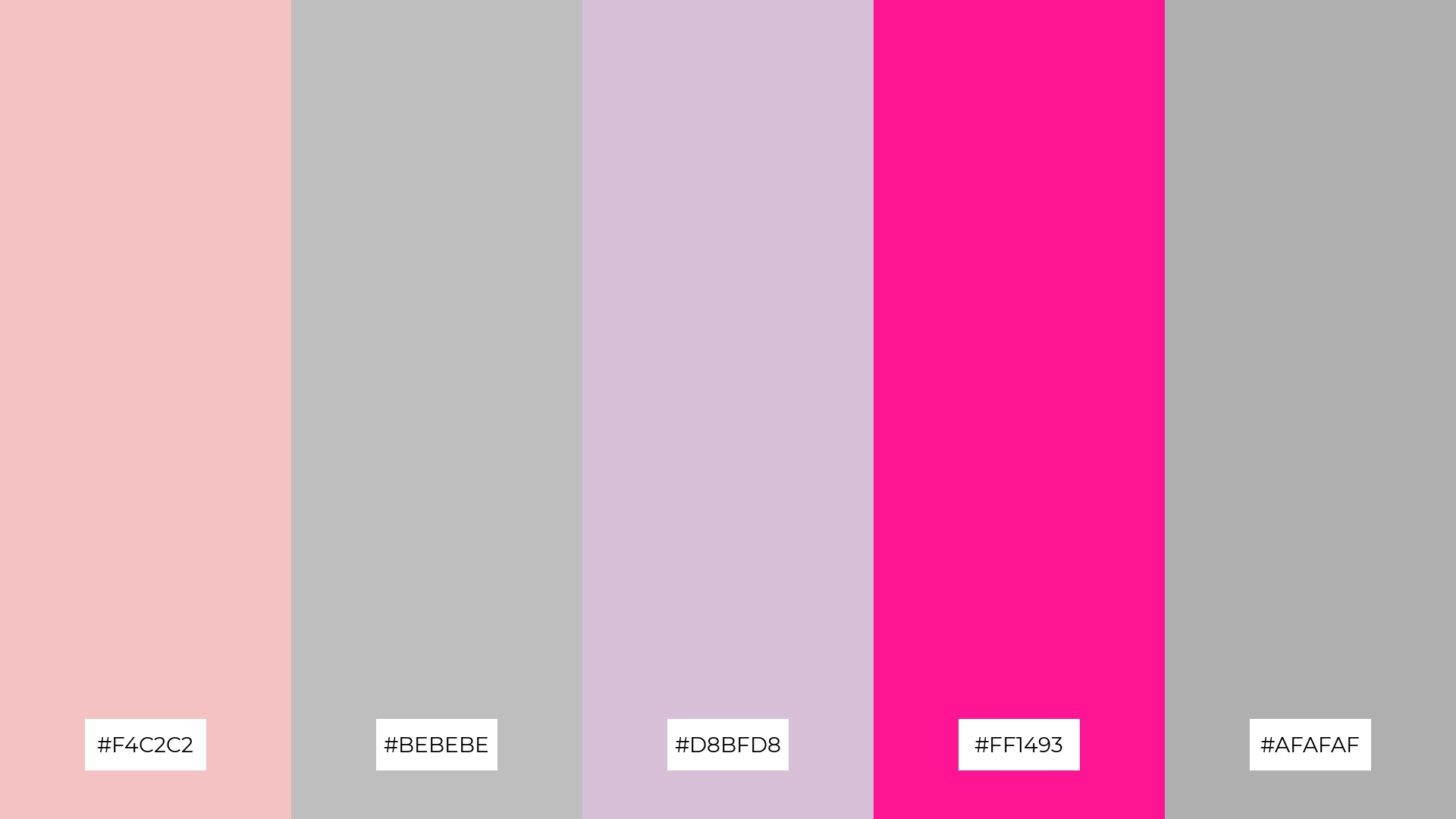
The ‘Chic Harmony’ palette, with its blend of soft pinks (#F4C2C2), neutral grays (#BEBEBE, #AFAFAF), delicate lavender (#D8BFD8), and bold pink (#FF1493), creates a welcoming yet dramatic effect by balancing gentle hues with striking accents.
This palette shines in luxury e-commerce sites, where the harmonious mix of soft and bold tones can enhance the user experience by evoking a sense of sophistication and allure, making it perfect for high-end fashion or beauty brands.
12) Subtle Bloom
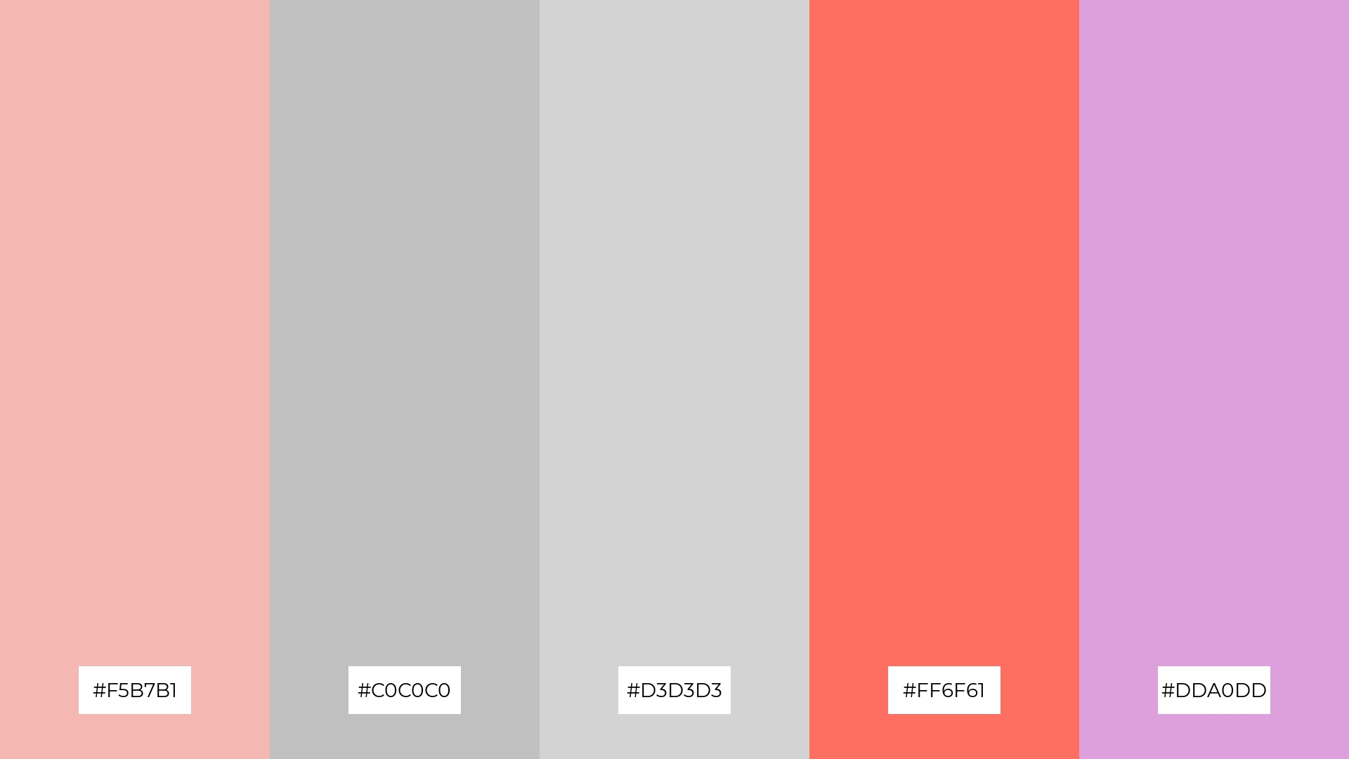
The ‘Subtle Bloom’ palette, with its soft pinks (#F5B7B1), neutral grays (#C0C0C0, #D3D3D3), vibrant coral (#FF6F61), and delicate lavender (#DDA0DD), creates a harmonious balance that evokes both warmth and sophistication.
This palette is particularly fitting for casual apparel lines, where the gentle hues can enhance the perception of comfort and style, while the vibrant coral adds a touch of playful energy, making it perfect for creating a relaxed yet chic brand identity.
13) Serene Blush
The ‘Serene Blush’ palette, with its blend of warm pinks (#F1A7B5, #FFB3D9) and cool grays (#A8A8A8, #C0C0C0, #D3D3D3), creates a balanced and calming atmosphere that evokes a sense of tranquility and understated elegance.
This palette is particularly effective for artisan product branding, where the harmonious mix of warm and cool tones can enhance the perception of handcrafted quality and sophisticated design, making it perfect for creating a memorable and refined brand identity.
14) Timeless Elegance
The ‘Timeless Elegance’ palette, with its blend of soft pinks (#F4C2C2), neutral grays (#B0B0B0, #A9A9A9), delicate lavender (#D8BFD8), and bold pink (#FF69B4), creates a dynamic interplay of subtlety and vibrancy that can elevate any design project.
This palette is particularly effective for restaurant menus, where the harmonious mix of gentle and striking hues can enhance the dining experience by evoking a sense of sophistication and modernity.
15) Dreamy Pastels
The ‘Dreamy Pastels’ palette, with its blend of soft pinks (#F5B7B1, #FFB6C1) and muted grays (#C0C0C0, #D3D3D3, #AFAFAF), conveys a sense of harmony by creating a soothing and balanced visual experience that can evoke feelings of calm and tranquility.
This palette is ideal for cozy interior makeovers, where the gentle hues can transform a space into a serene retreat, or for tech startups aiming to create a welcoming and user-friendly interface that promotes relaxation and ease of use.
How to Use Pink Gray Patterns in Design
In home decor, pink and gray color palettes can create a serene and sophisticated atmosphere. Use soft pinks for accent walls or decor items, while neutral grays can serve as the primary color for furniture and larger surfaces. This combination can transform any living space into a tranquil retreat.
For marketing materials, pink and gray can add a touch of elegance and modernity. Use pink for call-to-action buttons and highlights, while gray can provide a clean and professional backdrop. This balance ensures that your marketing content is both eye-catching and refined.
In clothing design, pink and gray palettes offer versatility and style. Soft pinks can be used for casual wear, while muted grays can add a touch of sophistication to formal attire. This combination is perfect for creating a balanced and fashionable wardrobe.
Ready to create your own stunning pink and gray color palettes? Try using Piktochart to bring your design ideas to life. Get started now!


