Apricot color palettes bring a warm, inviting touch to any design project, blending the soft hues of peach and orange. This versatile color can evoke feelings of comfort and creativity, making it a popular choice for various applications.
Whether you’re designing a website, creating an infographic, or working on a branding project, apricot tones can add a unique and appealing aesthetic. Explore the potential of apricot color palettes to enhance your visual storytelling and captivate your audience.
Tips For Creating Apricot Color Palettes
Designing with apricot can be both exciting and rewarding, especially when you know how to balance and complement this warm hue effectively.
- Balance with Neutrals: Pair apricot with neutral colors like white, beige, or gray to create a harmonious and sophisticated look.
- Complementary Shades: Use shades of blue or teal as complementary colors to apricot. This contrast can make your design pop and add visual interest.
- Gradients and Variations: Experiment with different shades of apricot, from light peach to deep orange, to create depth and dimension in your design.
- Accent Colors: Incorporate accent colors like gold or bronze to enhance the warmth of apricot and add a touch of elegance.
- Versatile Combinations: Mix apricot with pastel colors for a soft, inviting look, or with bold colors for a more vibrant and energetic design.
- Test and Iterate: Always test your color palette on different devices and backgrounds to ensure it looks great in various contexts.
15 Apricot Color Palettes
1) Sunset Apricot
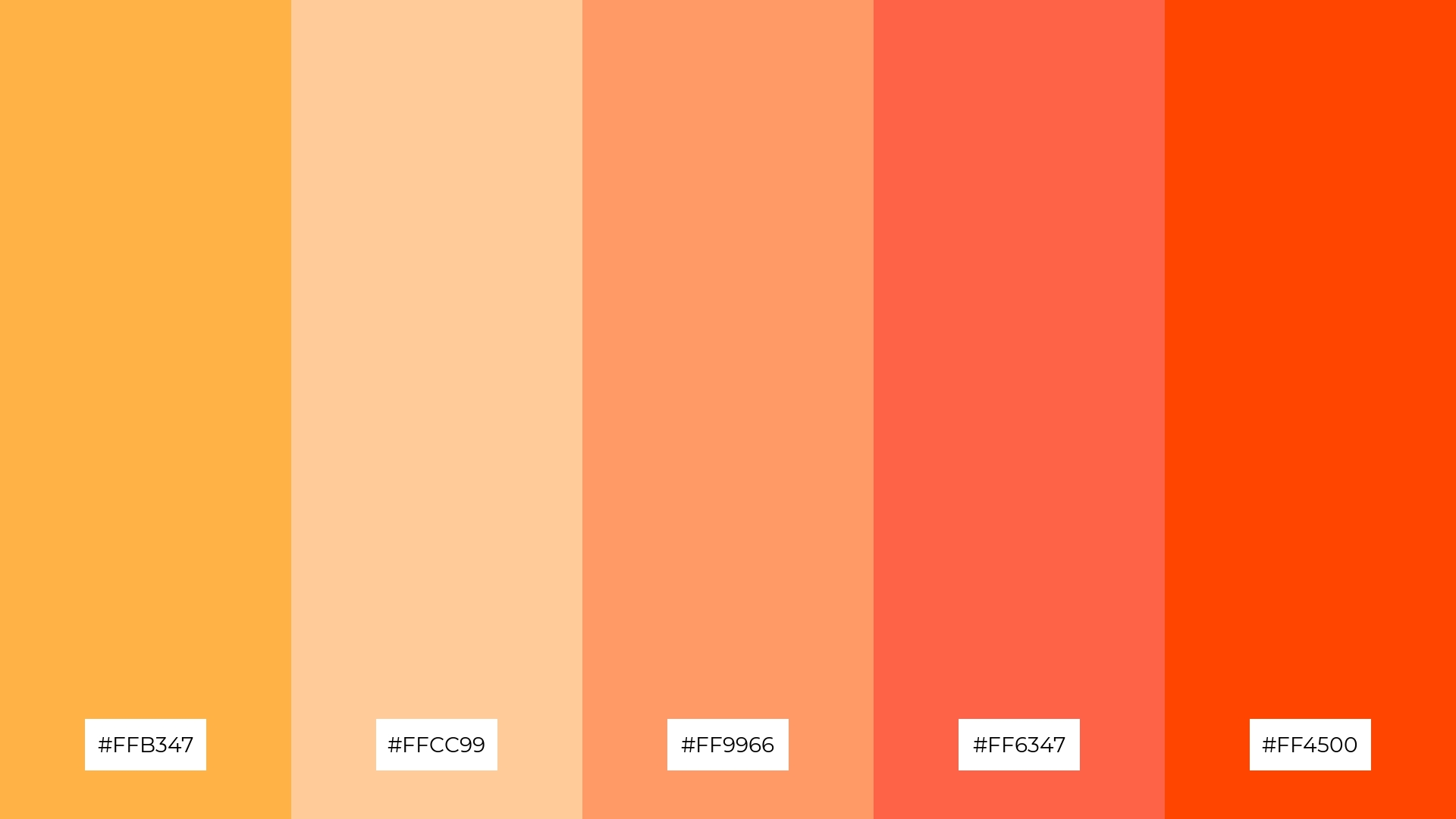
The ‘Sunset Apricot’ palette, with its blend of #FFB347, #FFCC99, #FF9966, #FF6347, and #FF4500, creates a warm and inviting mood reminiscent of a serene sunset, perfect for evoking feelings of comfort and relaxation.
In interior decor, this palette can be used to create a cozy and vibrant living space, where the harmonious interaction of these hues brings a cohesive and dynamic look that highlights the room’s warmth and energy.
2) Apricot Blossom
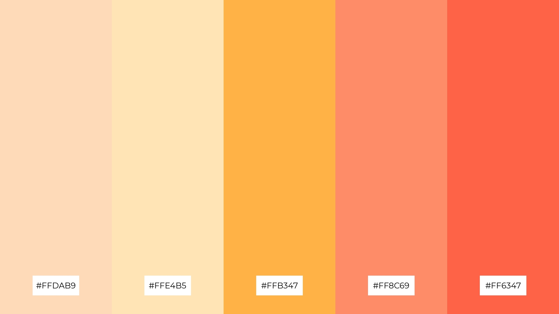
The ‘Apricot Blossom’ palette, with its blend of #FFDAB9, #FFE4B5, #FFB347, #FF8C69, and #FF6347, evokes a sense of warmth and calmness, making it ideal for creating inviting and serene atmospheres.
This palette would excel in product packaging for wellness and beauty products, where the soothing and warm tones can enhance the perception of comfort and relaxation.
3) Apricot Sorbet
The ‘Apricot Sorbet’ palette, featuring dominant colors like #FFB347 and #FFCC99, creates a soft and inviting atmosphere that exudes warmth and comfort.
This harmonious blend is perfect for wellness branding, where the gentle hues can evoke a sense of tranquility and well-being, making it an ideal choice for eco-friendly interior spaces.
4) Apricot Dream
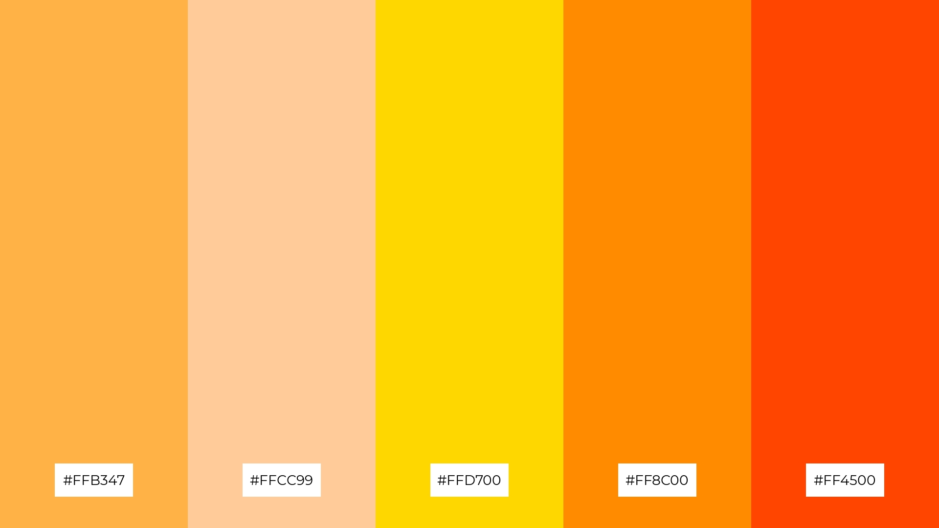
The ‘Apricot Dream’ palette, with its mix of #FFB347, #FFCC99, #FFD700, #FF8C00, and #FF4500, offers a perfect balance of soft and bold tones, creating a distinct and captivating mood.
This palette is ideal for creating inviting retail spaces or modern web designs, where the harmonious blend of hues can enhance the overall aesthetic and draw in the audience.
5) Apricot Sunrise
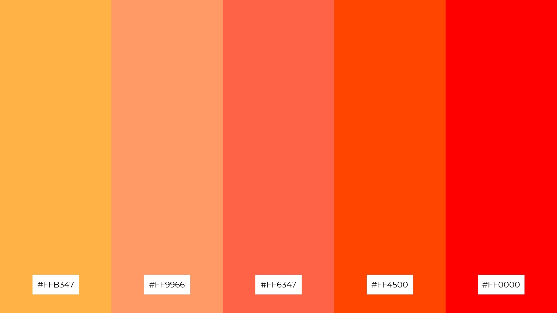
The ‘Apricot Sunrise’ palette, with its blend of #FFB347, #FF9966, #FF6347, #FF4500, and #FF0000, creates a vibrant and energetic ambiance that can invigorate any design project.
This dynamic combination is perfect for luxury fashion campaigns, where the bold and warm hues can highlight the elegance and sophistication of high-end products.
6) Apricot Delight
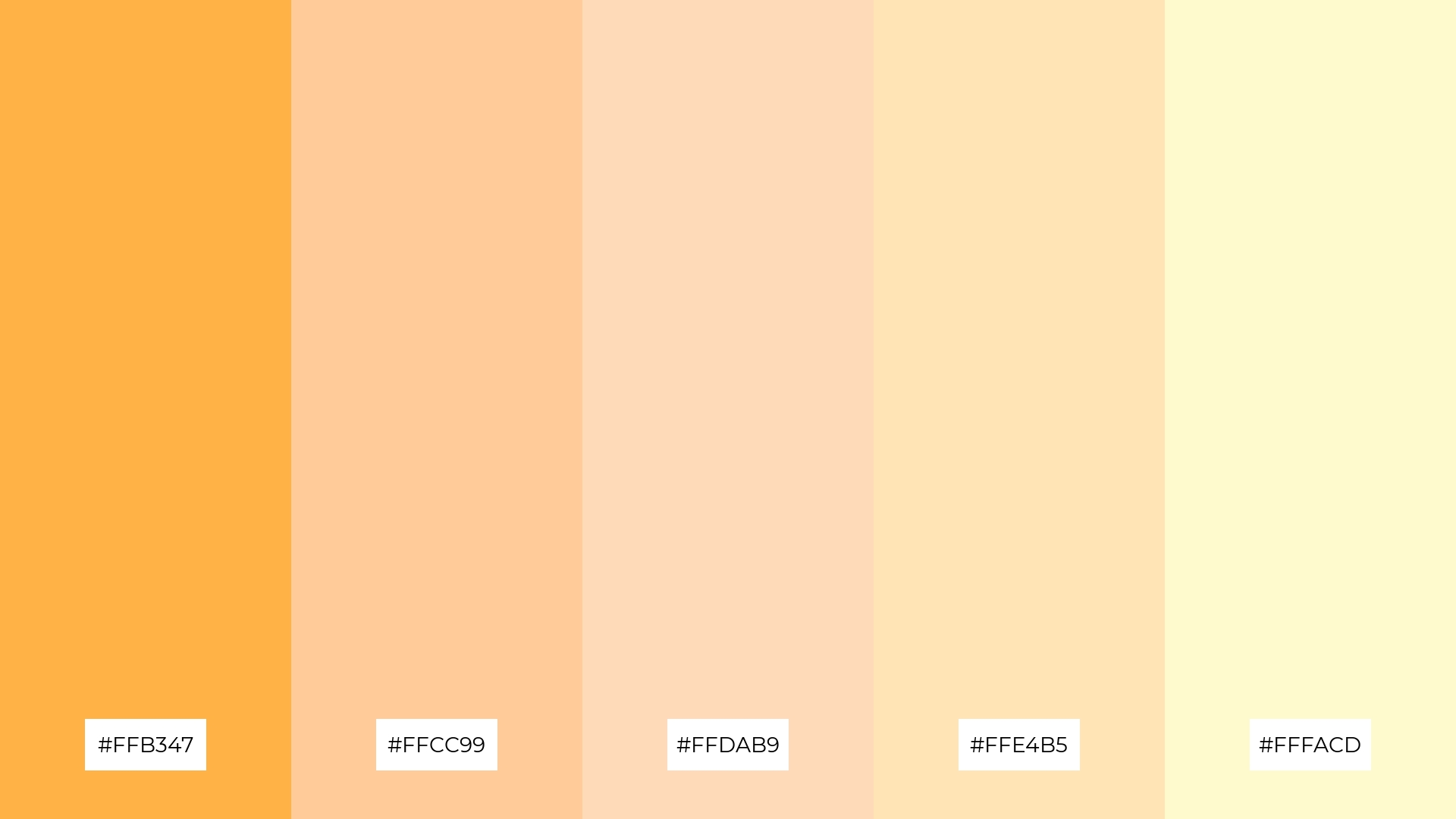
The ‘Apricot Delight’ palette, with its harmonious blend of #FFB347, #FFCC99, #FFDAB9, #FFE4B5, and #FFFACD, creates a sophisticated yet playful mood, making it versatile for various design applications.
This palette is particularly effective for minimalistic branding, where the soft and warm tones can convey elegance and simplicity, or for bold event designs, where the vibrant hues can add a touch of excitement and energy.
7) Apricot Glow
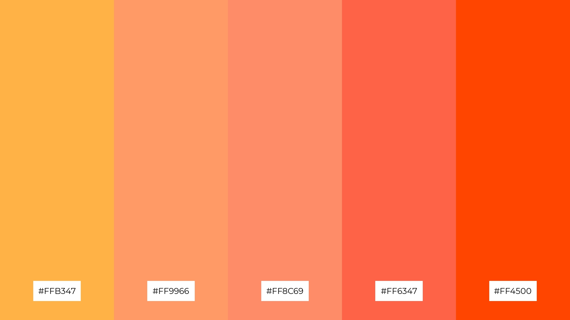
The ‘Apricot Glow’ palette, with its mix of #FFB347, #FF9966, #FF8C69, #FF6347, and #FF4500, combines both soft and bold hues to create a striking visual contrast that captivates the viewer’s attention.
This dynamic palette is perfect for creative projects like magazine layouts or artistic websites, where the interplay of warm tones can add depth and vibrancy, making the design both engaging and memorable.
8) Apricot Fields

The ‘Apricot Fields’ palette, with its blend of #FFB347, #FFD700, #FFFF00, #ADFF2F, and #7FFF00, can evoke a sense of calm when the softer apricot and yellow tones are paired together, creating a serene and soothing atmosphere.
Conversely, the vibrant green and yellow hues in this palette can bring excitement and energy, making it an excellent choice for vibrant marketing campaigns that aim to capture attention and convey a lively, dynamic message.
9) Apricot Breeze

The ‘Apricot Breeze’ palette, with its softer tones like #FFE4C4 and #FFF5EE, creates a light and airy mood that evokes a sense of calm and relaxation.
This blend is ideal for home decor, where the gentle hues can enhance the feeling of tranquility and comfort, making any space feel more inviting and serene.
10) Apricot Harmony
The ‘Apricot Harmony’ palette, with its seamless transition from the soft #FFB347 to the bold #FF4500, creates a visual flow that evokes feelings of joy and warmth, making it perfect for uplifting and positive design projects.
This palette is ideal for lifestyle branding, where the harmonious blend of hues can convey a sense of comfort and happiness, or for tech product packaging, where the vibrant colors can attract attention and communicate innovation and energy.
11) Apricot Sunset
The tones in ‘Apricot Sunset’ create a welcoming effect by blending warm hues that evoke the comforting glow of a sunset, making any design feel inviting and cozy.
This palette shines in boutique interiors, where the dramatic and vibrant colors can enhance the luxurious and sophisticated ambiance, drawing customers into an elegant shopping experience.
12) Apricot Meadow
The hues in ‘Apricot Meadow’ interact to create a feeling of balance by blending the warm apricot and yellow tones with the refreshing greens, resulting in a harmonious and vibrant palette.
This palette is fitting for casual apparel lines, where the lively and balanced colors can convey a sense of energy and freshness, making the clothing line appealing and dynamic.
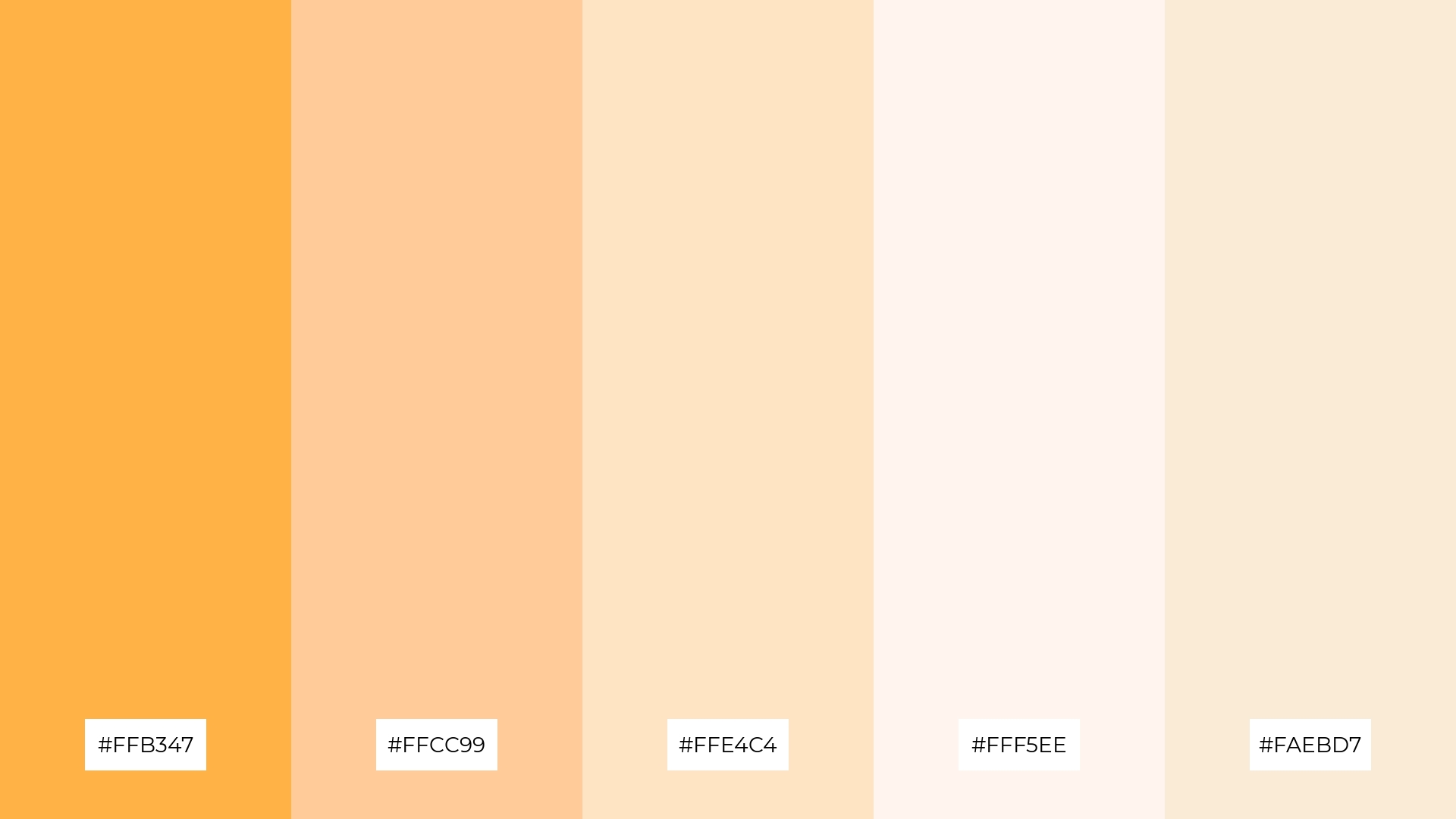
13) Apricot Mist
The ‘Apricot Mist’ palette, with its blend of #FFB347, #FFCC99, #FFE4C4, #FFF5EE, and #FAEBD7, seamlessly combines warm and cool tones to evoke a serene and balanced mood.
This unique palette is perfect for artisan product branding, where the harmonious interaction of these hues can enhance the perception of handcrafted quality and timeless elegance.
14) Apricot Radiance
The ‘Apricot Radiance’ palette, with its vibrant mix of #FFB347, #FF9966, #FF8C69, #FF6347, and #FF4500, creates a dynamic interplay of warm hues that can either stand out boldly or blend subtly, depending on the design context.
This palette is perfect for festival marketing, where the energetic and inviting colors can capture attention and convey a sense of excitement and celebration.
15) Apricot Twilight
The ‘Apricot Twilight’ palette, with its blend of #FFB347, #FF9966, #FF6347, #FF4500, and #FF0000, can convey a sense of harmony when used in gradients or layered designs, creating a smooth transition that evokes warmth and unity.
This palette is ideal for tech startups aiming to create a welcoming and innovative brand identity, or for cozy interior makeovers where the rich and warm hues can enhance the feeling of comfort and sophistication.
How to Use Apricot Patterns in Design
In home decor, apricot color palettes can be used to create a warm and inviting atmosphere. Pairing apricot with neutral tones like beige or white can enhance the coziness of a living space, while adding accents of gold or bronze can elevate the room’s elegance.
For marketing materials, apricot hues can capture attention and convey a sense of warmth and friendliness. Use apricot as a background color or in key elements to make your designs stand out, and combine it with complementary colors like teal or navy to create a striking visual contrast.
In clothing design, apricot palettes can bring a fresh and vibrant look to casual apparel lines. Mixing apricot with pastel shades can create a soft, inviting aesthetic, while pairing it with bold colors can add energy and excitement to your designs.
Ready to experiment with apricot color palettes in your next design project? Try creating these palettes using Piktochart and see how they can transform your visuals.


