 Piktochart Team
·

Updated on
September 4, 2024
Published on
August 1, 2024

A top-notch Sales Report is crucial in your professional life, as it helps you understand overall sales activity, identify issues in the sales process, and make informed business decisions. Utilizing Sales Report templates, like those found on Piktochart, can simplify the process and help you create visually appealing and effective reports.Before diving into creating your own Sales Reports, it's essential to explore the 8 best examples of Sales Reports for inspiration. This will provide you with valuable insights on crafting impactful and informative reports that cater to your audience's needs.
A sales report is a vital tool for tracking sales activity and evaluating the impact of that activity over a specific time frame. It enables sales managers and stakeholders to understand overall sales performance, identify issues in the sales process, and make informed business decisions. Sales reports are particularly useful in situations such as measuring the effectiveness of promotional campaigns, identifying sales trends for forecasting, motivating the sales team, and providing a snapshot of sales KPIs for the sales operations team. See the 11 Sales Report Templates & Examples page for more details.
Here are the top 8 Sales Report examples:

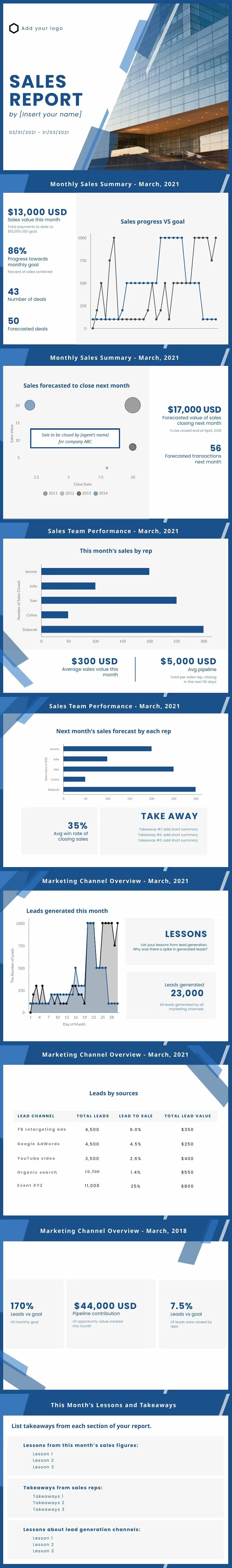
The Monthly Sales Report example presents a concise and contemporary design that is visually engaging and easy to comprehend. The layout is structured to highlight essential sales data, ensuring that stakeholders can quickly grasp the key insights from the report.
The Monthly Sales Report Presentation example features a sleek and modern design that is both visually appealing and easy to digest. The layout is organized to emphasize crucial sales data, ensuring that stakeholders can quickly understand the key insights from the report.

The Monthly Sales Report (Landscape) example exhibits a clean and contemporary design that is both visually appealing and easy to read. The layout is optimized for landscape orientation, ensuring that your sales data is presented in a spacious and organized manner.

The Quarterly Sales Report example demonstrates a clean and modern design that is both visually appealing and easy to read. The layout is optimized for presenting sales data over a three-month period, ensuring that your report effectively communicates the key insights from each quarter.

The Blue Lines Pattern with Orange Graphs Daily Report example features a clean and modern design that is both visually appealing and easy to read. The layout is optimized for presenting daily sales data, ensuring that your report effectively communicates the key insights from each day.

The Purple Monthly Sales Report - DWK-X4hjijo example exhibits a clean and modern design that is both visually appealing and easy to read. The layout is optimized for presenting monthly sales data, ensuring that your report effectively communicates the key insights from this specific time period.

The Minimalist Beauty Product Sales Report Chart in Beige example showcases a clean and modern design that is both visually appealing and easy to read. The layout is optimized for presenting sales data related to beauty products in a professional and engaging manner, ensuring that your report effectively communicates the key insights to your audience.

The Minimalist Beige & Orange Sales Report Chart example showcases a clean and modern design that is both visually appealing and easy to read. The layout is optimized for presenting sales data in a professional and engaging manner, ensuring that your report effectively communicates the key insights to your audience.
Here is a 5-step process to create a great Sales Report:
Here are five things to avoid when creating a Sales Report, along with examples and tips on how to prevent these issues:
If you need help generating Sales Reports, look no further than Piktochart, an online platform trusted by millions of users. Piktochart simplifies the process of creating infographics, presentations, posters, and other visual content, turning complex data into clear visuals. With its AI-powered infographic maker, you can generate professional designs in seconds, tailored to your brand's voice. To start creating with Piktochart, simply sign up and explore the user-friendly platform.
The latest industry news, interviews, technologies, and resources.

Published on
November 25, 2024


