 Piktochart Team
When it comes to creating visually stunning designs, the right color palette can make all the difference. Burgundy and rose gold are two hues that, when combined, exude elegance and sophistication.
These colors are perfect for a variety of design projects, from wedding invitations to corporate branding. Their rich, warm tones create a sense of luxury and timelessness.
Designing with burgundy and rose gold can elevate your project to new heights of elegance and sophistication.

The 'Elegant Evening' palette, with its blend of deep burgundy, soft rose, and warm neutrals, creates a mood of refined sophistication and understated luxury.
Perfect for an upscale fashion collection, these colors interact seamlessly to produce a cohesive look that exudes timeless elegance and modern charm.

The 'Vintage Charm' palette, with its blend of deep burgundy, muted pinks, and soft neutrals, evokes a sense of warmth and nostalgia, reminiscent of cherished memories and timeless elegance.
This color scheme would excel in product packaging for artisanal goods, where its inviting and sophisticated tones can enhance the perceived quality and craftsmanship of the items.

The 'Blush & Burgundy' palette, featuring dominant colors like #B76E8D and #A45A3D, creates a harmonious blend of warmth and sophistication.
This color scheme is ideal for wellness branding, where its soothing and elegant tones can foster a sense of calm and luxury.

The 'Autumn Romance' palette, with its mix of deep burgundy, soft pinks, and warm neutrals, offers a balance of soft and bold tones, creating a distinct mood of cozy sophistication.
This color scheme is ideal for creating inviting retail spaces or modern web designs, where its harmonious blend can enhance the ambiance and user experience.

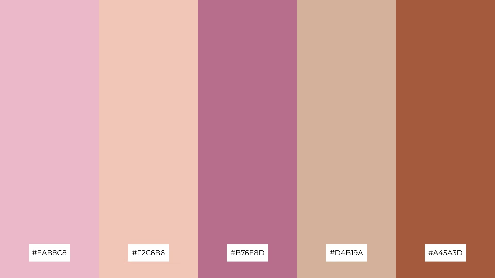
The 'Regal Sunset' palette, with its harmonious blend of #B76E8D, #A45A3D, #EAB8C8, #D4B19A, and #F2C6B6, evokes a serene yet vibrant ambiance, perfect for creating a tranquil yet lively atmosphere.
This color scheme is ideal for luxury fashion campaigns, where its rich and soothing tones can enhance the elegance and allure of high-end garments.

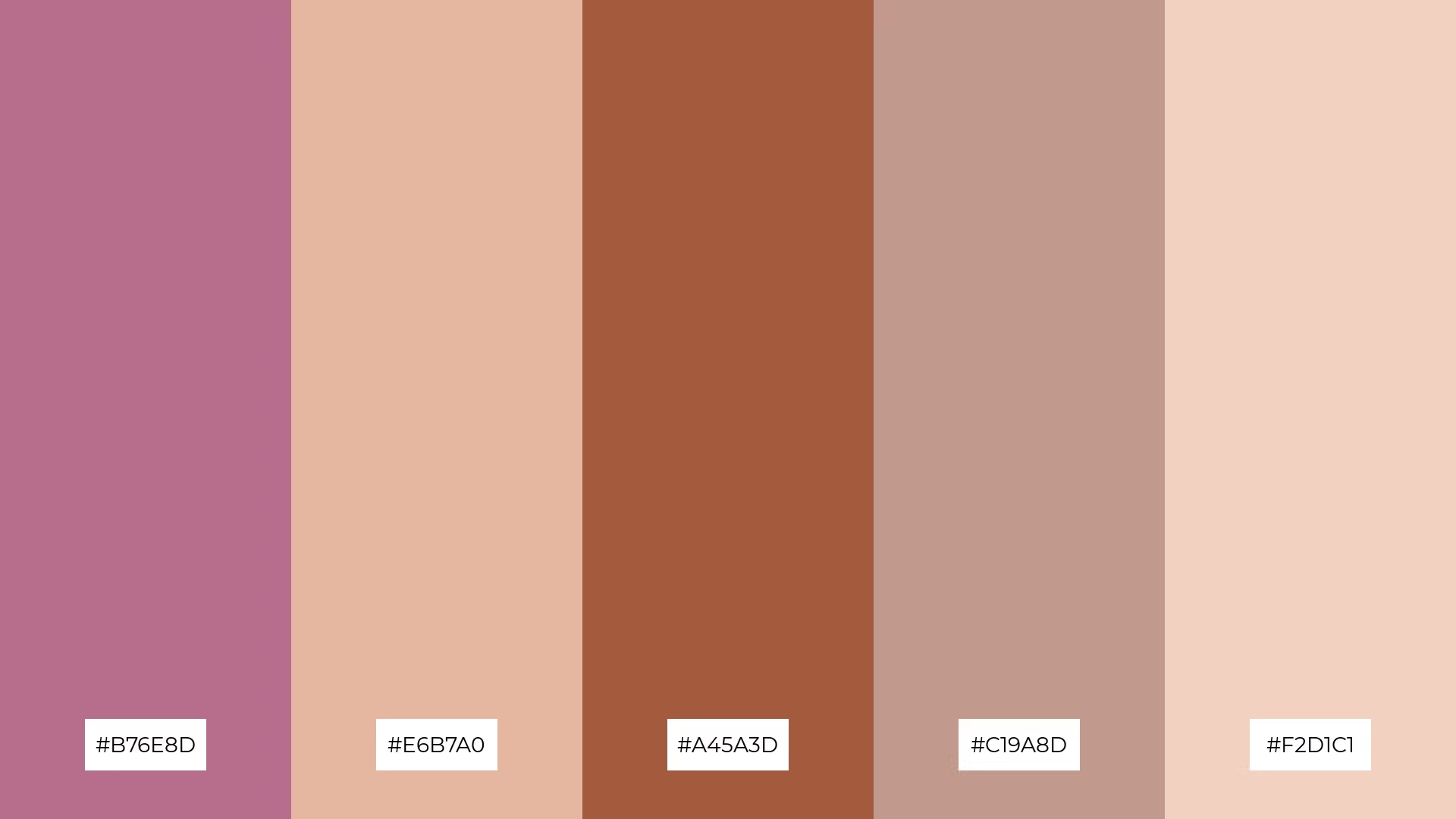
The 'Rustic Elegance' palette, with its blend of #7A2A2A, #B76E8D, #E6B7A0, #C19A8D, and #F2D1C1, creates a harmonious balance that exudes a mood of refined sophistication and understated charm.
This color scheme is perfect for minimalistic branding, where its elegant and muted tones can convey a sense of timeless quality and subtle luxury.

The 'Soft Whispers' palette, with its blend of #EAB8C8, #D4B19A, #B76E8D, #F2C6B6, and #F2E1D4, combines soft pastels and rich tones to create a visually engaging contrast that draws the eye and adds depth to any design.
This color scheme is ideal for creative projects like magazine layouts or artistic websites, where its harmonious yet contrasting elements can enhance the visual appeal and create a captivating user experience.

The 'Chic Blossom' palette, with its blend of #B76E8D, #E6B7A0, #A45A3D, #C19A8D, and #F2D1C1, can evoke a sense of calm when the softer tones are used predominantly, creating a serene and inviting atmosphere perfect for spa branding.
Conversely, when the bolder hues are emphasized, this palette can inject excitement and energy into vibrant marketing campaigns, making it ideal for eye-catching advertisements and dynamic social media content.

The 'Golden Hour' palette, with its softer tones like #F2C6B6 and #EAB8C8, creates a warm and inviting atmosphere that exudes comfort and tranquility.
This blend of hues is perfect for home decor, where its serene and cozy mood can enhance the ambiance of living spaces, making it ideal for seasonal promotions that aim to evoke a sense of warmth and relaxation.

The 'Dreamy Dusk' palette, with its blend of #8B3A3A, #D4B19A, #F2C6B6, #C19A8D, and #EAB8C8, creates a visual flow that evokes a sense of tranquility and warmth, making it perfect for designs that aim to soothe and comfort.
This harmonious combination of colors is ideal for lifestyle branding, where its calming and inviting tones can enhance the emotional appeal of wellness products, or for tech product packaging, where it can convey a sense of reliability and user-friendliness.

The 'Timeless Beauty' palette, with its blend of #B76E8D, #EAB8C8, #A45A3D, #F2D1C1, and #D4B19A, creates a welcoming effect through its harmonious mix of warm and soft tones, making any design feel inviting and elegant.
This color scheme shines in boutique interiors, where its sophisticated and dramatic hues can enhance the luxurious ambiance and create a memorable shopping experience.

The 'Serene Escape' palette, with its blend of #7A2A2A, #C19A8D, #F2C6B6, #E6B7A0, and #B76E8D, creates a harmonious balance where the deep burgundy anchors the design while the softer tones add a touch of warmth and elegance.
This color scheme is ideal for sleek corporate branding, where its sophisticated and balanced hues can convey professionalism and modernity, making a lasting impression on clients and stakeholders.

The 'Whimsical Garden' palette, with its blend of warm and cool tones like #EAB8C8, #F2C6B6, #B76E8D, #D4B19A, and #A45A3D, creates a balanced and enchanting mood that is both inviting and refreshing.
This color scheme is perfect for artisan product branding, where its harmonious mix of hues can enhance the handcrafted quality and unique charm of the items, making them stand out in a crowded market.

The 'Enchanted Forest' palette, with its dynamic interplay of #8B3A3A, #C19A8D, #D4B19A, #F2D1C1, and #E6B7A0, offers a rich tapestry of bold and subtle hues that can create a visually captivating experience.
This color scheme is perfect for festival marketing, where its vibrant and earthy tones can evoke a sense of excitement and natural beauty, drawing in attendees with its enchanting allure.

The 'Luxe Harmony' palette, with its blend of #B76E8D, #E6B7A0, #C19A8D, #F2C6B6, and #A45A3D, conveys a sense of harmony through its balanced mix of warm and cool tones, creating a cohesive and sophisticated look.
This color scheme is ideal for tech startups aiming to create a modern and inviting office space, or for cozy interior makeovers where its rich and soothing hues can enhance the ambiance and comfort of living areas.
In home decor, a burgundy and rose gold palette can create a luxurious and inviting atmosphere. Use burgundy for statement pieces like sofas or accent walls, and complement them with rose gold fixtures and accessories to add a touch of elegance and warmth.
For marketing materials, this color combination can make your brand stand out. Utilize burgundy for bold headlines and rose gold for subtle accents or borders to create a sophisticated and memorable design that captures attention.
In fashion, burgundy and rose gold can be used to create stunning clothing collections. Pair a burgundy dress with rose gold accessories for a chic and cohesive look that exudes confidence and style.
Ready to bring your design ideas to life? Try creating these stunning color palettes using Piktochart and elevate your projects with ease.