 Piktochart Team
·

Updated on
November 21, 2024
Published on
November 19, 2024

Retro color palettes are making a comeback, infusing modern designs with a nostalgic touch. These palettes draw inspiration from past decades, offering a unique blend of vintage charm and contemporary appeal.
From the bold hues of the 80s to the muted tones of the 70s, retro color schemes can transform any project. They evoke a sense of familiarity and warmth, making them a popular choice for designers looking to create visually striking and emotionally resonant work.
Designing with retro color palettes can be both exciting and challenging.

The 'Vintage Sunset' palette creates a warm and inviting mood, blending the soft pastels and rich tones to evoke a sense of nostalgia and comfort.
Perfect for interior decor, this palette's harmonious interaction of colors can transform a living space into a cozy, retro-inspired haven, highlighting its ability to balance vibrancy with subtlety.

The '70s Groove' palette, with its blend of warm oranges and cool blues, evokes a sense of dynamic energy and playful nostalgia, making it perfect for designs that aim to capture attention and spark joy.
This vibrant color scheme would excel in product packaging, where its bold and contrasting hues can make products stand out on the shelves, drawing consumers in with its retro yet modern appeal.

The 'Retro Pop' palette features dominant colors like the vibrant #FF3D00, the cheerful #FFAB40, the bright #FFD600, the refreshing #00BFAE, and the striking #3D5AFE, creating a lively and energetic visual experience.
This harmonious blend of bold and contrasting hues makes it ideal for wellness branding, where the dynamic colors can evoke feelings of vitality and positivity, enhancing the overall appeal and effectiveness of the brand's message.

The 'Pastel Dreams' palette, with its blend of soft pinks, purples, blues, and greens, offers a perfect balance of gentle and bold tones, creating a distinct and soothing mood.
Ideal for modern web designs, this palette can make websites feel inviting and user-friendly, enhancing the overall user experience with its calming yet vibrant colors.

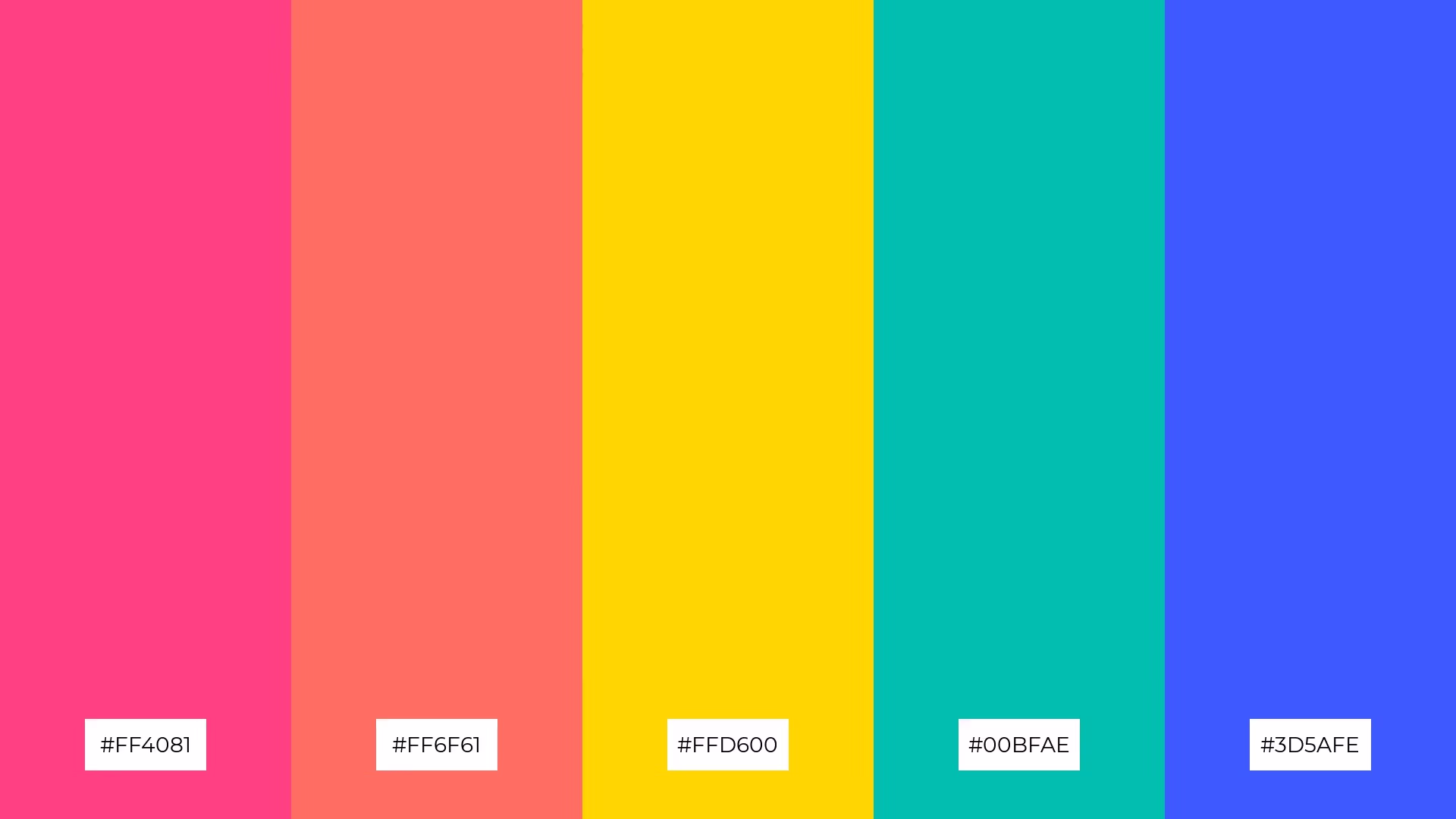
The 'Disco Fever' palette, with its vibrant mix of #FF4081, #FFAB40, #FFD600, #00BFAE, and #3D5AFE, creates an energetic and lively ambiance, perfect for capturing the essence of a high-energy event or celebration.
This dynamic color scheme is ideal for luxury fashion campaigns, where its bold and contrasting hues can make designs stand out, exuding confidence and modernity while drawing attention to the intricate details of high-end garments.

The 'Classic Americana' palette, with its rich reds, vibrant yellows, deep blues, lush greens, and regal purples, creates a sophisticated yet playful mood, making it versatile for various design contexts.
This harmonious blend of colors is perfect for bold event designs, where the striking hues can capture attention and evoke a sense of excitement and elegance, ensuring the event stands out with a memorable visual impact.

The 'Retro Candy' palette, with its mix of vibrant #FF6F61, soft #F8BBD0, bright #FFAB40, refreshing #B2EBF2, and calming #C5E1A5, creates a striking visual contrast that captivates the eye and adds depth to any design.
This dynamic combination is perfect for creative projects like magazine layouts or artistic websites, where the playful yet balanced hues can enhance visual storytelling and engage audiences with a lively and memorable aesthetic.
The 'Funky Fresh' palette, with its mix of #FF4081, #FF6F61, #FFD600, #00BFAE, and #3D5AFE, can evoke a sense of calm when the cooler tones like #00BFAE and #3D5AFE are paired together, creating a soothing and refreshing visual experience.
Conversely, combining the vibrant hues of #FF4081 and #FFD600 can infuse a design with energy and excitement, making this palette ideal for vibrant marketing campaigns that aim to capture attention and inspire action.

The 'Earthy Tones' palette, with its softer hues like #D7CCC8 and #EFEBE9, creates a calming and grounded atmosphere, perfect for designs that aim to evoke a sense of tranquility and natural beauty.
This blend of muted and brighter tones makes it ideal for home decor, where the subtle colors can enhance the coziness and warmth of a living space, or for seasonal promotions that seek to convey a serene and inviting mood.

The 'Neon Nights' palette, with its vibrant mix of #D5006D, #FF6F00, #FFD600, #00BFAE, and #1E88E5, creates a dynamic visual flow that evokes feelings of excitement and modernity, making it perfect for capturing attention and sparking joy.
This energetic color scheme is ideal for tech product packaging, where its bold and contrasting hues can make products stand out on the shelves, drawing consumers in with its futuristic and lively appeal.

The 'Retro Floral' palette, with its blend of #F48FB1, #F8BBD0, #E1BEE7, #BBDEFB, and #C5E1A5, creates a welcoming effect by combining soft pastels that evoke a sense of calm and elegance.
This harmonious mix of colors is perfect for boutique interiors, where the gentle hues can enhance the cozy and inviting atmosphere, making customers feel at ease and encouraging them to linger longer.
The '80s Vibes' palette, with its mix of #FF3D00, #FFAB40, #FFD600, #00BFAE, and #3D5AFE, creates a dynamic interplay of warm and cool tones, achieving a perfect balance that is both eye-catching and harmonious.
This vibrant color scheme is ideal for casual apparel lines, where the bold and contrasting hues can infuse clothing designs with a sense of fun and nostalgia, appealing to fashion-forward consumers looking for a retro yet modern look.

The 'Warm Nostalgia' palette, with its blend of #FF7043, #FFB74D, #A8D8B9, #6B5B95, and #F7CAC9, masterfully combines warm and cool tones to evoke a sense of comfort and timeless elegance.
This versatile color scheme is perfect for artisan product branding, where its harmonious hues can enhance the handcrafted appeal and create a memorable, inviting visual identity.
The 'Soft Pastels' palette, with its gentle blend of #F8BBD0, #E1BEE7, #BBDEFB, #B2EBF2, and #C5E1A5, creates a soothing and harmonious visual experience, perfect for designs that aim to evoke a sense of calm and elegance.
This subtle yet captivating color scheme is ideal for restaurant menus, where the soft hues can enhance the dining experience by creating a welcoming and sophisticated atmosphere that encourages patrons to relax and enjoy their meal.
The 'Retro Chic' palette, with its blend of #FF6F61, #D9A44D, #A8D8B9, #6B5B95, and #F7CAC9, conveys a sense of harmony when the softer tones like #A8D8B9 and #F7CAC9 are paired together, creating a soothing and balanced visual experience.
Conversely, using the vibrant #FF6F61 alongside the deep #6B5B95 can create a striking contrast, making this palette ideal for tech startups looking to capture attention with bold branding or for cozy interior makeovers that aim to blend comfort with a touch of modern flair.
Retro color palettes can be a game-changer in home decor, adding a nostalgic yet modern touch to any space. For a cozy living room, consider using muted tones from the 'Vintage Sunset' palette to create a warm and inviting atmosphere. Pair these colors with neutral furniture to balance the vibrancy and make the space feel harmonious.
In marketing materials, bold retro hues can capture attention and evoke a sense of nostalgia. The '70s Groove' palette, with its dynamic mix of warm oranges and cool blues, is perfect for eye-catching product packaging or vibrant social media graphics. Use these contrasting colors to highlight key information and draw the viewer's eye to important elements.
For clothing design, retro palettes can infuse garments with a sense of fun and nostalgia. The '80s Vibes' palette, with its mix of bold and contrasting hues, is ideal for casual apparel lines that aim to stand out. Combine these colors in patterns or accents to create a playful yet stylish look that appeals to fashion-forward consumers.
Ready to bring these retro color palettes to life in your designs? Try creating your own unique palettes using Piktochart. Get started today and transform your projects with a touch of nostalgic charm!
The latest industry news, interviews, technologies, and resources.

Published on
November 25, 2024


