Pop Art color palettes are a vibrant and dynamic way to bring energy and excitement to your designs. Known for their bold hues and striking contrasts, these palettes can transform any project into a visual masterpiece.
Inspired by the works of iconic artists like Andy Warhol and Roy Lichtenstein, Pop Art color schemes often feature bright primary colors and playful combinations. Whether you’re designing a poster, infographic, or social media graphic, incorporating Pop Art colors can make your work stand out.
Tips For Creating Pop Art Color Palettes
Designing with Pop Art color palettes requires a keen eye for balance and creativity.
- Balance Bold and Neutral Colors: Use bold colors for focal points and neutral shades to balance the overall design, ensuring it doesn’t overwhelm the viewer.
- Match Complementary Shades: Pair complementary colors like blue and orange or red and green to create striking contrasts that draw attention.
- Use Repetition: Repeat certain colors throughout your design to create a cohesive look and guide the viewer’s eye across the piece.
- Experiment with Saturation: Play with different levels of saturation to add depth and dimension to your design, making it more visually interesting.
- Create Versatile Designs: Choose a color palette that can be easily adapted for various formats, from digital screens to printed materials, ensuring consistency across all platforms.
- Test Your Palette: Before finalizing, test your color combinations in different lighting conditions and on various devices to ensure they look great everywhere.
15 Pop Art Color Palettes
1) Bold & Bright

The ‘Bold & Bright’ color palette, featuring hues like #FF6F61 and #6B5B95, creates a mood that is both energetic and sophisticated, making it perfect for designs that aim to captivate and inspire.
In fashion, this palette’s interplay of vibrant and muted tones can be used to craft eye-catching yet harmonious outfits, with each color complementing the others to form a cohesive and stylish look.
2) Comic Strip Vibes
The ‘Comic Strip Vibes’ color palette, with its mix of soft pastels and vibrant hues, evokes a sense of playful energy and youthful exuberance, making it ideal for designs that aim to capture attention and convey a fun, lighthearted mood.
This palette would excel in digital branding for children’s products or playful product packaging, where the bright and cheerful colors can create an inviting and engaging visual experience.
3) Retro Neon

The ‘Retro Neon’ color palette, featuring dominant hues like #DFFF00 and #FF007F, creates a striking visual impact with its blend of electric and vibrant tones.
This palette’s harmonious mix of neon colors is perfect for wellness branding, where the energetic and uplifting shades can evoke a sense of vitality and rejuvenation.
4) Electric Dreams

The ‘Electric Dreams’ color palette, with its mix of vibrant hues like #FF3D00 and #00E676, alongside softer tones like #FFEA00, offers a balanced and distinct mood that is both dynamic and inviting.
This palette is ideal for modern web designs, where the combination of bold and soft colors can create an engaging and visually appealing user experience.
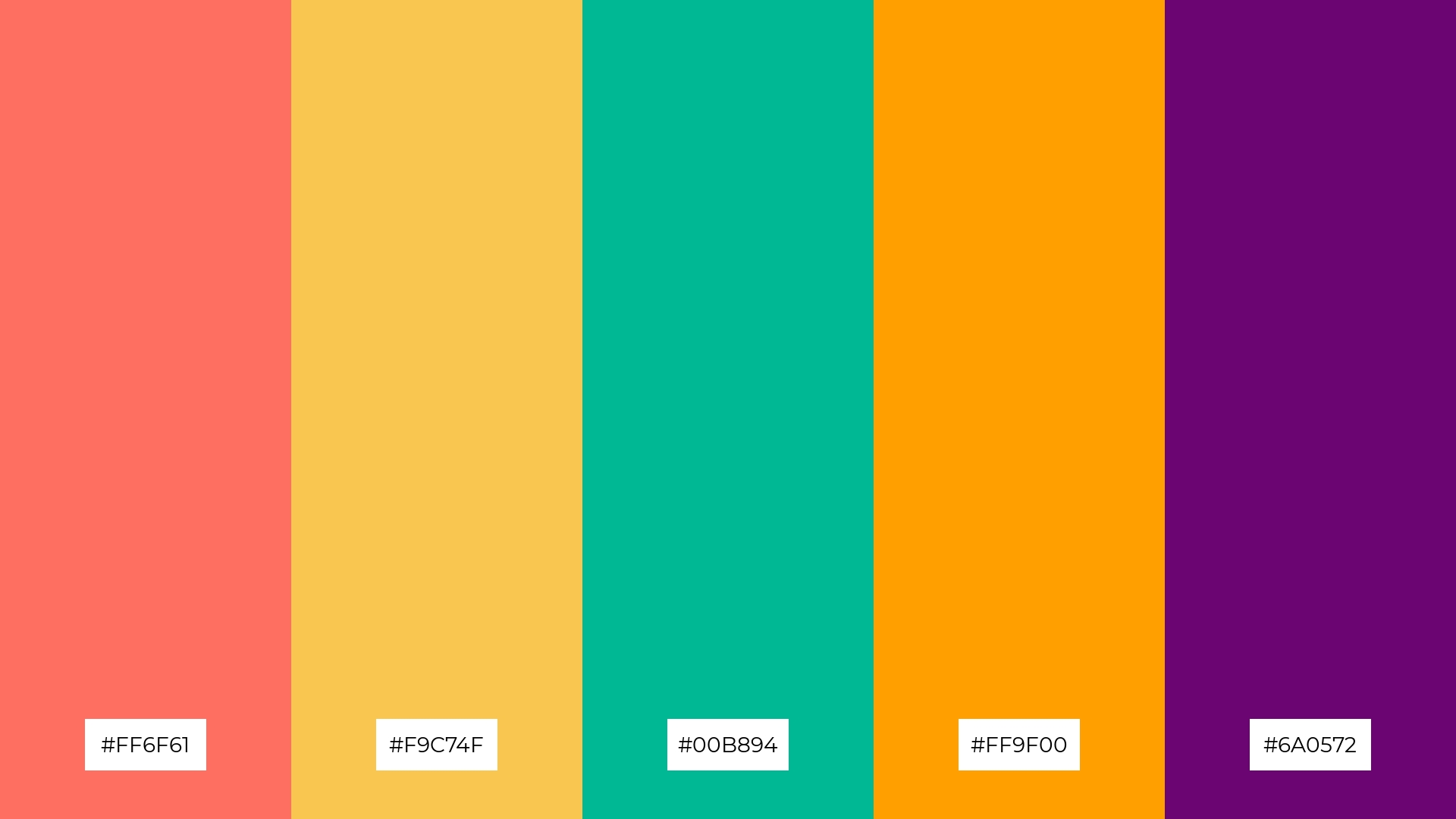
5) Pop Culture Explosion
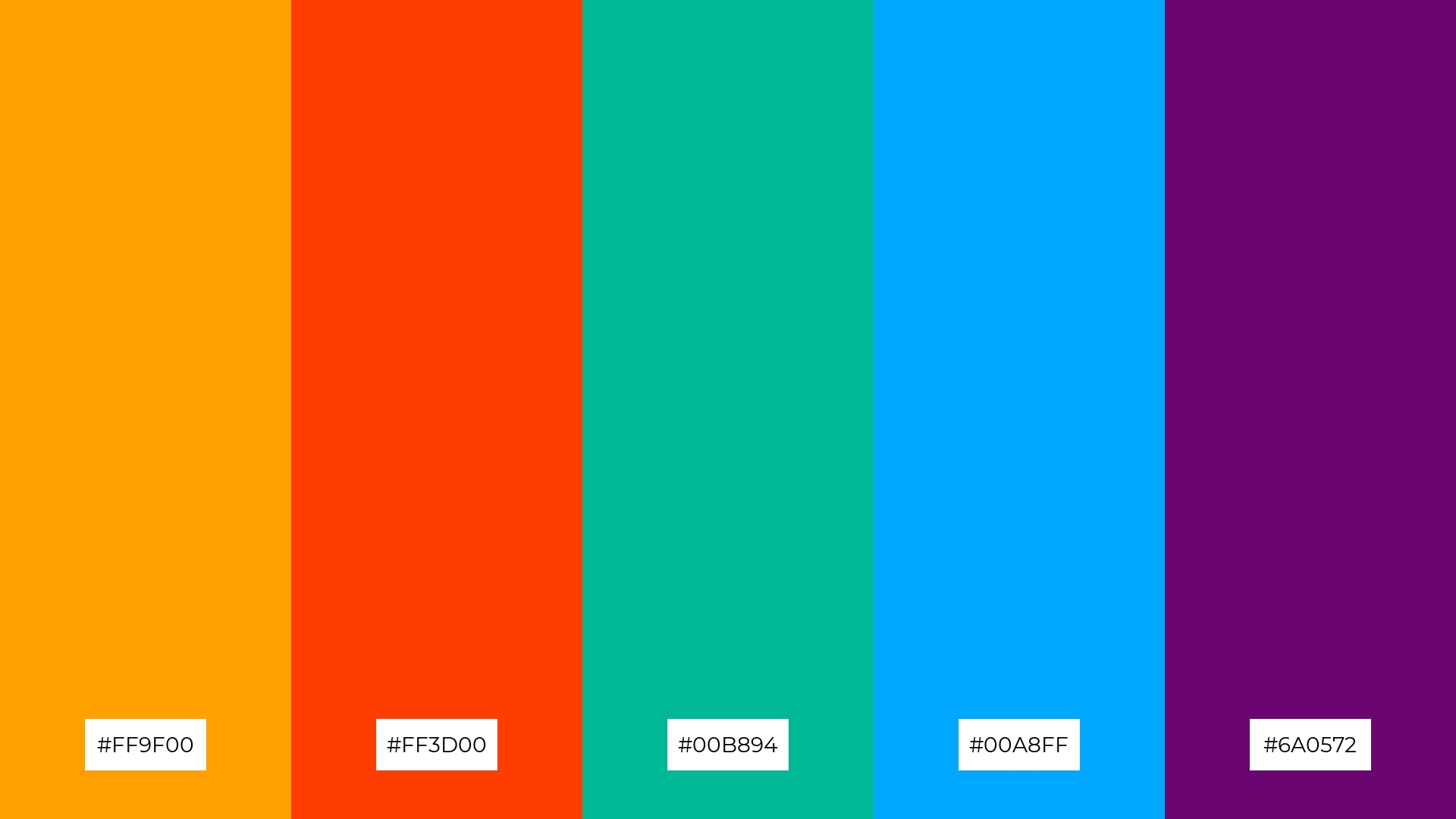
The ‘Pop Culture Explosion’ color palette, with its vibrant mix of #FF9F00, #FF3D00, #00B894, #00A8FF, and #6A0572, creates an atmosphere of energetic vibrancy, perfect for designs that aim to captivate and invigorate.
This dynamic palette is ideal for luxury fashion campaigns, where the bold and lively colors can be used to craft striking visuals that exude confidence and modernity.
6) Vibrant Contrast
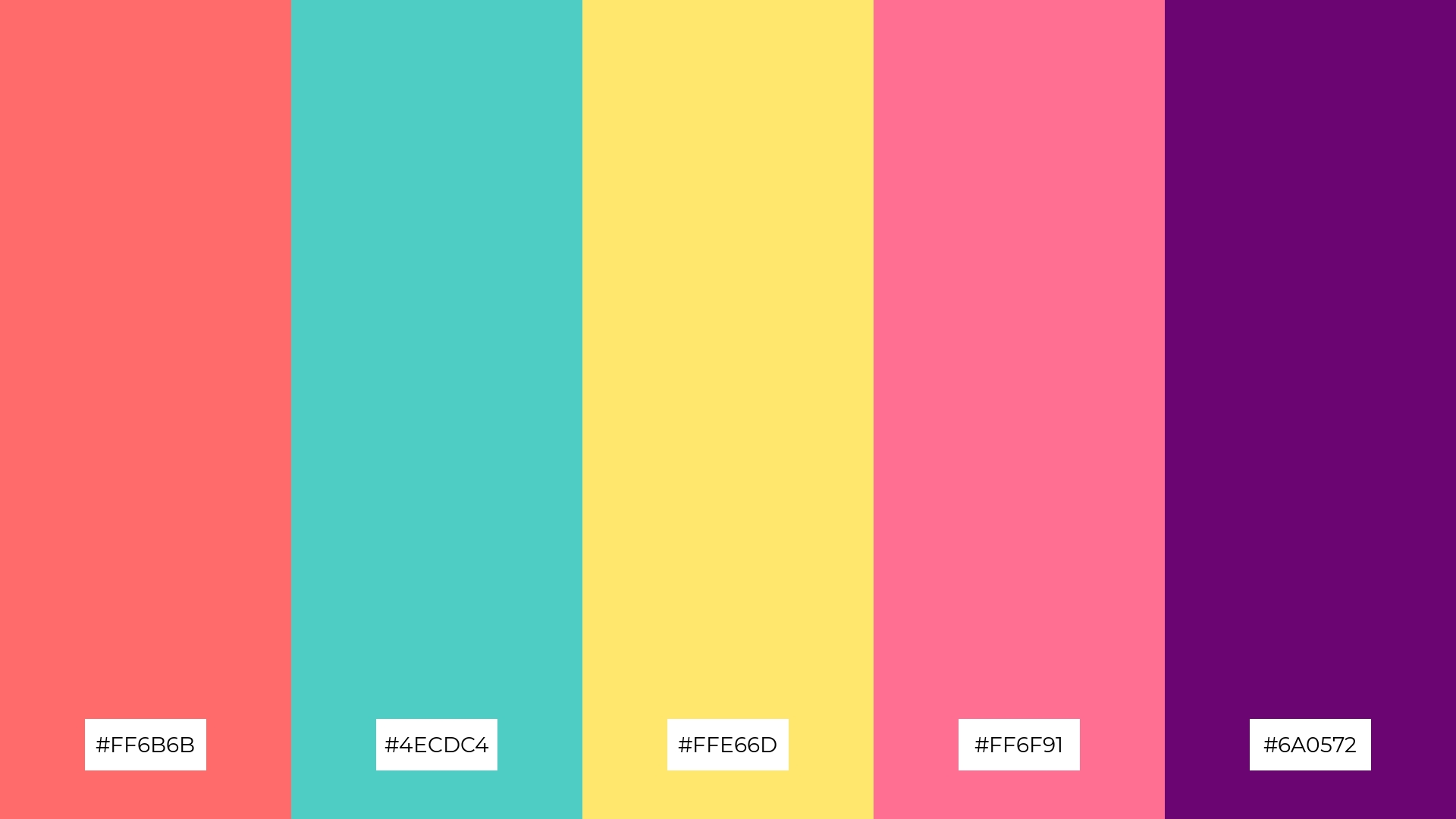
The ‘Vibrant Contrast’ color palette, with its mix of #FF6B6B, #4ECDC4, #FFE66D, #FF6F91, and #6A0572, creates a dynamic harmony that can evoke a mood of playful sophistication, making it ideal for designs that aim to be both eye-catching and elegant.
This palette is perfect for bold event designs, where the striking contrasts and vibrant hues can be used to craft an atmosphere of excitement and modernity, ensuring the event stands out and leaves a lasting impression.
7) Whimsical Wonderland
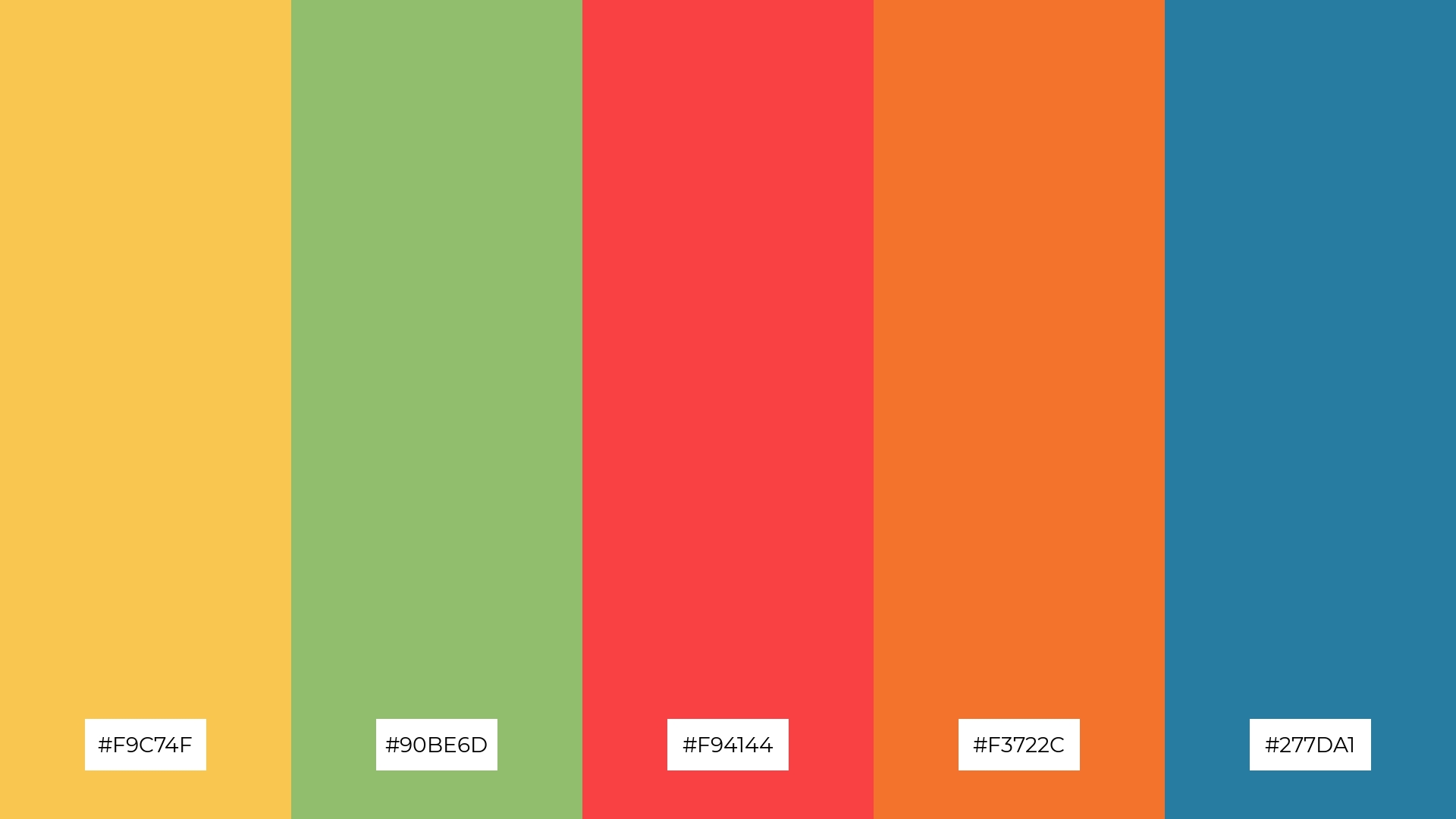
The ‘Whimsical Wonderland’ color palette, with its contrasting elements of warm hues like #F9C74F and #F94144 against cooler tones like #90BE6D and #277DA1, creates a visually stimulating and dynamic composition.
This palette is perfect for creative projects such as magazine layouts or artistic websites, where the vibrant contrasts can be used to craft engaging and visually captivating designs that draw the viewer’s attention.
8) Candy Coated

The ‘Candy Coated’ color palette, with its mix of soft pastels like #FFB3BA and #D4A5A5 alongside bold hues like #392F5A and #6A0572, can evoke a sense of calm or excitement depending on the combination used.
This versatile palette is perfect for spa branding, where the soothing pastels can create a tranquil atmosphere, or for vibrant marketing campaigns, where the striking contrasts can capture attention and energize the audience.
9) Funky Fusion
The ‘Funky Fusion’ color palette, with its mix of softer tones like #90BE6D and brighter hues like #F94144, creates a lively yet balanced mood that is both refreshing and invigorating.
This blend is ideal for seasonal promotions, where the vibrant and harmonious colors can capture the essence of the season and draw attention to the products or events being highlighted.
10) Graphic Groove
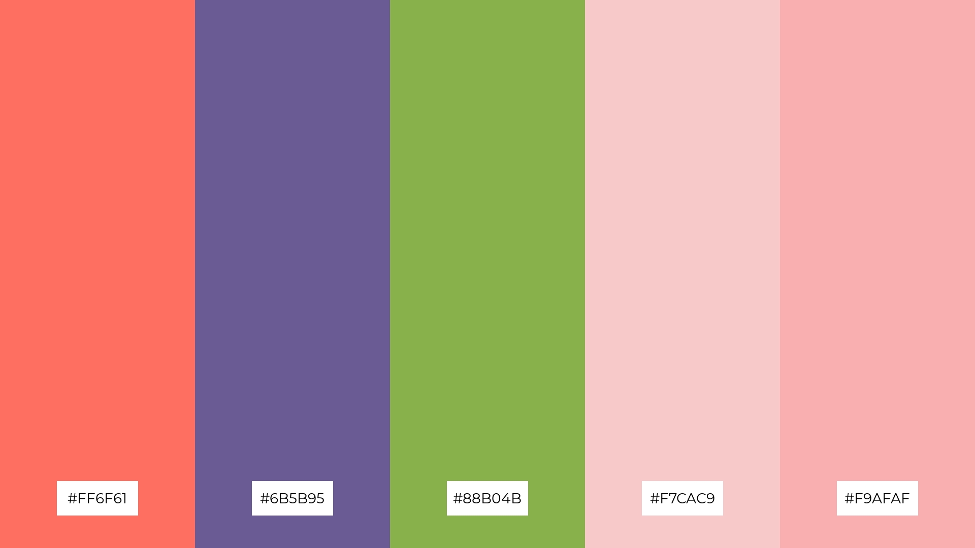
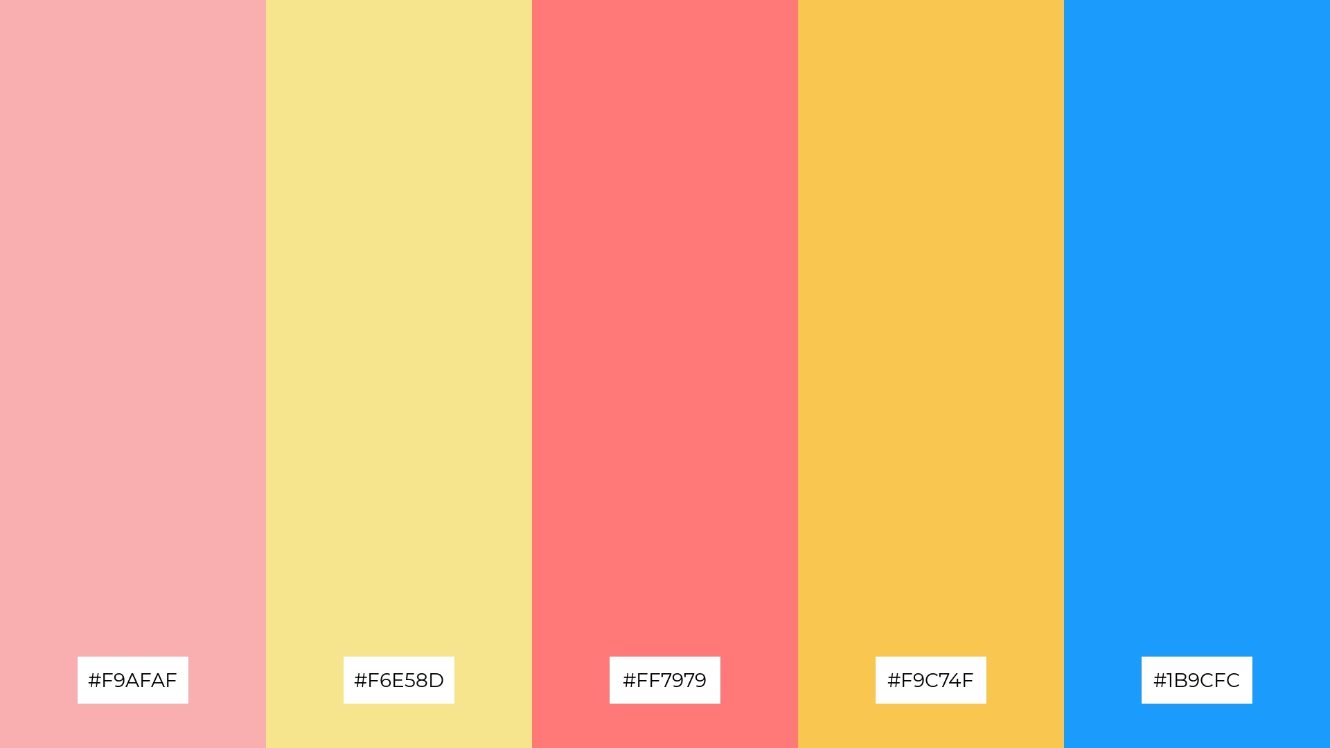
The ‘Graphic Groove’ color palette, with its blend of #FF6F61, #6B5B95, #88B04B, #F7CAC9, and #F9AFAF, creates a visual flow that evokes a sense of joy and tranquility, seamlessly transitioning from vibrant to soothing hues.
This palette is ideal for lifestyle branding or tech product packaging, where the harmonious mix of energetic and calming colors can create an inviting and emotionally engaging experience for the audience.
11) Daring Duo
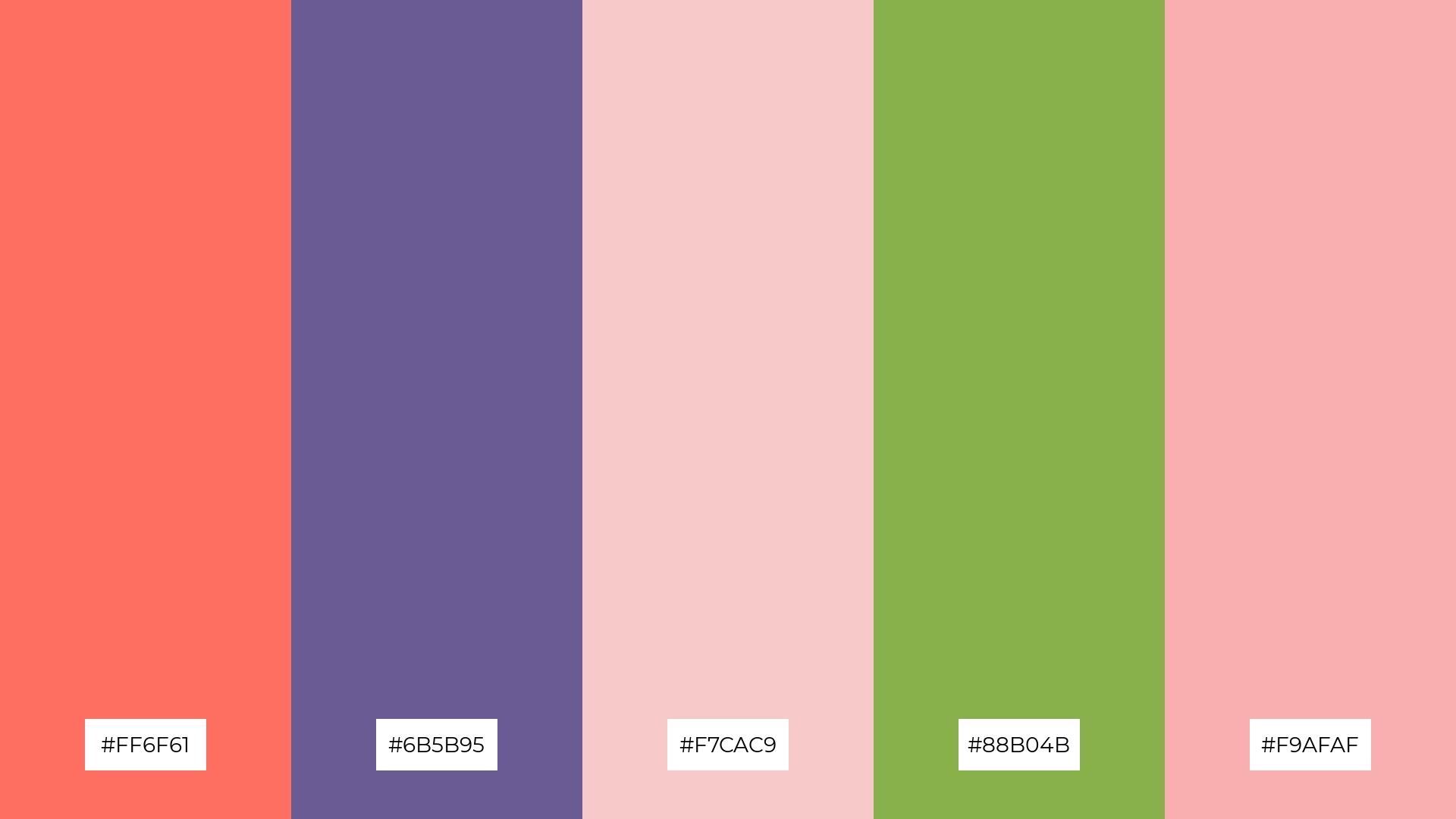
The ‘Daring Duo’ color palette, with its blend of #FF6F61, #6B5B95, #F7CAC9, #88B04B, and #F9AFAF, creates a welcoming effect through its harmonious mix of warm and cool tones, making it perfect for boutique interiors where a cozy yet sophisticated atmosphere is desired.
This palette also shines in luxury e-commerce sites, where the dramatic contrasts between vibrant and muted hues can captivate visitors and enhance the overall shopping experience, evoking a sense of elegance and exclusivity.
12) Color Pop
The hues in the ‘Color Pop’ palette, such as #FF6F61 and #F9C74F, interact by balancing warm and cool tones, creating a visually appealing contrast that is both vibrant and harmonious.
This palette is perfect for casual apparel lines, where the dynamic mix of colors can create eye-catching and trendy designs that appeal to a youthful and energetic audience.
13) Playful Palette
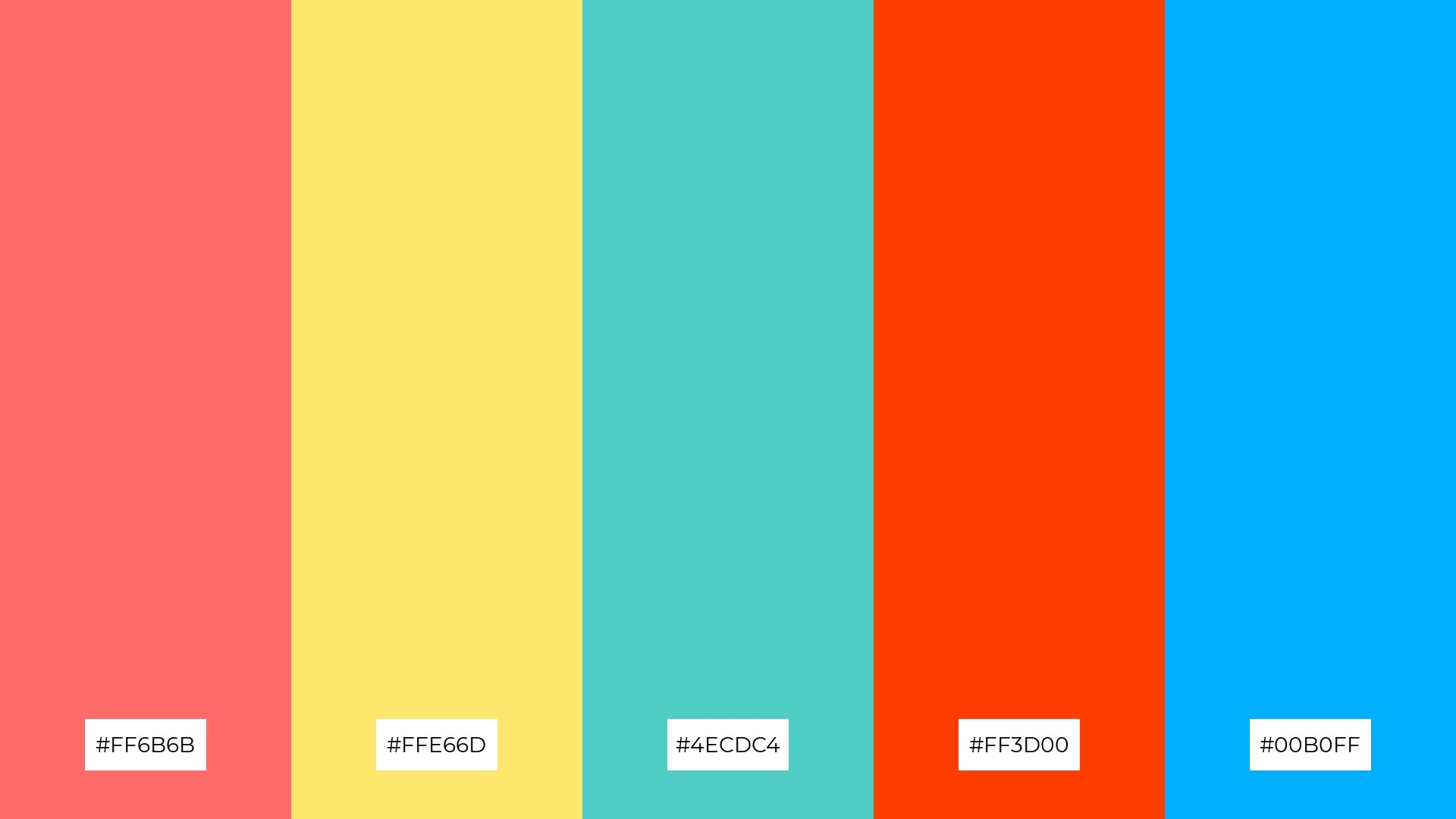
The ‘Playful Palette’ blends warm tones like #FF6B6B and #FF3D00 with cool hues like #4ECDC4 and #00B0FF, creating a vibrant and dynamic mood that is both energetic and refreshing.
This palette is perfect for artisan product branding, where the lively mix of colors can highlight the creativity and uniqueness of handcrafted items, making them stand out in a crowded market.
14) Artful Adventure
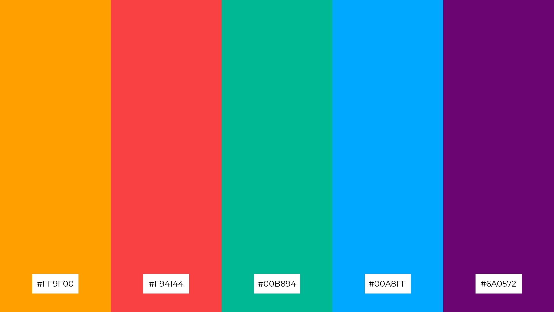
The ‘Artful Adventure’ color palette, with its vibrant mix of #FF9F00, #F94144, #00B894, #00A8FF, and #6A0572, creates a dynamic interplay of bold and subtle hues that can evoke a sense of excitement and creativity.
This palette is perfect for festival marketing, where the striking contrasts and lively colors can capture the festive spirit and draw attention to event details, ensuring a memorable and engaging visual experience.
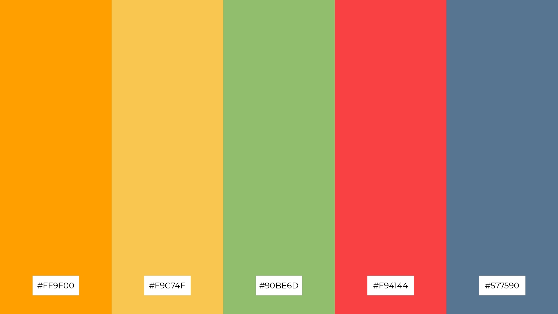
15) Kaleidoscope

The ‘Kaleidoscope’ color palette, with its mix of #FF6F61, #F9C74F, #90BE6D, #F3722C, and #277DA1, can convey a sense of harmony through its balanced blend of warm and cool tones, creating a visually cohesive and inviting atmosphere.
This palette is ideal for tech startups, where the vibrant and dynamic colors can energize the workspace and foster creativity, or for cozy interior makeovers, where the harmonious hues can create a warm and welcoming environment.
How to Use Pop Art Patterns in Design
Incorporating Pop Art color palettes into home decor can transform any space into a vibrant and lively environment. Use bold colors for accent walls or statement furniture pieces, and balance them with neutral tones to avoid overwhelming the room. Experiment with playful combinations to create a dynamic and visually stimulating atmosphere.
For marketing materials, Pop Art colors can make your designs stand out and capture attention. Use bright primary colors for headlines and key visuals, while maintaining a cohesive look with complementary shades. This approach can create striking contrasts that draw the viewer’s eye and convey a sense of energy and excitement.
In clothing design, Pop Art palettes can be used to craft eye-catching and trendy outfits. Mix and match vibrant hues with more subdued tones to create a balanced yet bold look. This technique can help you design pieces that are both fashionable and unique, appealing to a wide range of audiences.
Ready to bring your designs to life with Pop Art color palettes? Try creating your own vibrant and dynamic palettes using Piktochart today!


