 Piktochart Team
Pixel art color palettes are essential tools for artists looking to create vibrant and visually appealing pixel art. These palettes help in selecting the right colors to bring out the best in your designs.
Understanding how to use color palettes effectively can significantly enhance the quality of your pixel art. Whether you're a beginner or a seasoned artist, mastering color selection is crucial for creating stunning visuals.
Designing an effective color palette for pixel art requires a blend of creativity and strategy.

The 'Retro Dreams' palette, with its vibrant hues of #FF6F61, #6A5ACD, #FFD700, #00BFFF, and #FF1493, evokes a nostalgic yet energetic mood, reminiscent of vintage aesthetics blended with modern flair.
These colors interact harmoniously to create a cohesive look, making them ideal for fashion design, where the bold and contrasting shades can be used to craft eye-catching, retro-inspired outfits that stand out.

The 'Neon Glow' palette, featuring the electrifying shades of #39FF14, #FF007F, #00FFFF, #FF8C00, and #FF00FF, evokes a sense of high energy and modern vibrancy, perfect for capturing attention and creating a dynamic visual impact.
This palette would excel in digital branding, where its bold and bright colors can be used to create striking logos, eye-catching social media graphics, and engaging website designs that stand out in the digital landscape.

The 'Pastel Pixels' palette, featuring the soft and soothing shades of #FFB6C1, #B0E0E6, #FFFACD, #E6E6FA, and #FFDAB9, creates a gentle and harmonious visual experience.
This palette is ideal for wellness branding, where its calming and serene colors can be used to evoke a sense of tranquility and well-being, making it perfect for creating a peaceful and inviting atmosphere.

The 'Earthy Tones' palette, with its mix of #8B4513, #D2691E, #F4A460, #DEB887, and #FFE4B5, offers a balance of soft and bold tones, creating a distinct and grounded mood.
This palette is ideal for creating inviting retail spaces, where the warm and natural colors can evoke a sense of comfort and authenticity, enhancing the overall shopping experience.

The 'Ocean Depths' palette, with its harmonious blend of #1E90FF, #4682B4, #5F9EA0, #20B2AA, and #00CED1, evokes a serene and tranquil ambiance reminiscent of the deep sea's calming influence.
This palette is perfect for wedding themes, where its soothing and elegant shades can create a romantic and peaceful atmosphere, making the special day even more memorable.

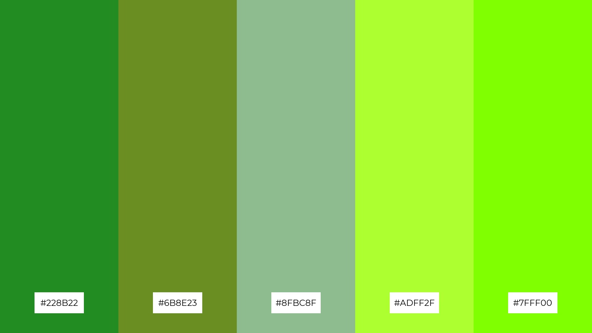
The 'Forest Fantasy' palette, with its harmonious blend of #228B22, #6B8E23, #8FBC8F, #ADFF2F, and #7FFF00, creates a sophisticated yet playful mood, balancing deep greens with vibrant lime shades to evoke a sense of natural elegance and lively energy.
This palette is ideal for minimalistic branding, where its refined and fresh colors can be used to craft sleek, modern designs that stand out while maintaining a connection to nature and simplicity.

The 'Sunset Vibes' palette, with its contrasting elements of fiery oranges and warm yellows, creates a dynamic and visually stimulating effect that captures the essence of a breathtaking sunset.
This palette is perfect for creative projects like magazine layouts or artistic websites, where its vibrant and energetic colors can be used to draw attention and create a memorable visual experience.

The 'Cyberpunk City' palette, with its electrifying mix of #00FFFF, #FF00FF, #FF1493, #8A2BE2, and #FF4500, can evoke a sense of calm or excitement depending on the combination, where cooler tones like #00FFFF and #8A2BE2 bring tranquility, while the vibrant hues of #FF00FF and #FF4500 inject energy and dynamism.
This versatile palette is perfect for vibrant marketing campaigns, where the bold and contrasting colors can be used to create eye-catching advertisements and dynamic social media graphics that captivate and engage audiences.

The 'Vintage Chic' palette, featuring the softer tones of #DDA0DD, #E6E6FA, #FFF0F5, #F5DEB3, and #FFE4E1, creates a delicate and nostalgic mood that evokes a sense of timeless elegance and subtle charm.
This blend of pastel and neutral shades is ideal for home decor, where its gentle and inviting colors can be used to craft cozy, vintage-inspired interiors that feel both warm and sophisticated.

The 'Candy Land' palette, with its vibrant mix of #FF69B4, #FFB6C1, #FFD700, #FF4500, and #FF1493, creates a joyful and energetic visual flow that evokes feelings of happiness and excitement.
This palette is perfect for lifestyle branding or tech product packaging, where its bright and playful colors can be used to create eye-catching designs that appeal to a youthful and dynamic audience.

The 'Mystic Night' palette, with its deep and rich tones of #4B0082, #483D8B, #6A5ACD, #7B68EE, and #8A2BE2, creates a dramatic and sophisticated effect that can transform any design into a captivating visual experience.
This palette is perfect for luxury e-commerce sites, where its opulent and mysterious colors can be used to craft an elegant and inviting atmosphere that appeals to discerning customers seeking high-end products.

The 'Warm Hearth' palette, with its blend of #CD5C5C, #D2691E, #F4A460, #FFE4C4, and #FFF5EE, creates a harmonious balance by combining rich, earthy tones with soft, neutral shades, evoking a sense of warmth and comfort.
This palette is ideal for casual apparel lines, where its inviting and cozy colors can be used to design clothing that feels both stylish and approachable, perfect for everyday wear.

The 'Galactic Voyage' palette, with its blend of warm golds and cool blues, creates a balanced and otherworldly mood that evokes a sense of cosmic adventure and mystery.
This palette is perfect for artisan product branding, where its unique combination of colors can be used to craft visually striking and memorable packaging that stands out on the shelves.

The 'Floral Garden' palette, with its vibrant mix of #FF69B4, #FFB6C1, #FFD700, #ADFF2F, and #FF6347, creates a dynamic interplay of bold and subtle hues that evoke the lively and refreshing essence of a blooming garden.
This palette is perfect for festival marketing, where its energetic and cheerful colors can be used to design eye-catching posters, banners, and social media graphics that capture the festive spirit and attract a diverse audience.

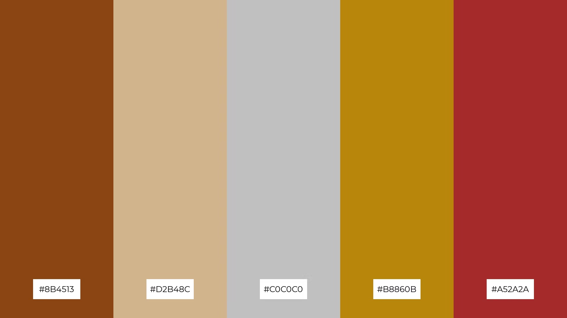
The 'Steampunk Dreams' palette, with its blend of #8B4513, #D2B48C, #C0C0C0, #B8860B, and #A52A2A, conveys a sense of harmony through its cohesive mix of earthy and metallic tones, creating a balanced and unified visual experience.
This palette is ideal for tech startups looking to infuse their branding with a unique, vintage-inspired aesthetic or for cozy interior makeovers where the warm and industrial colors can create an inviting yet sophisticated atmosphere.
Using pixel art color palettes in design can elevate your projects by adding a unique and visually appealing touch. For home decor, consider using palettes like 'Vintage Chic' to create cozy and sophisticated interiors. The soft, pastel tones can be used for wall art, throw pillows, and other decorative elements to evoke a sense of timeless elegance.
In marketing materials, vibrant palettes such as 'Neon Glow' can make your advertisements and social media graphics stand out. The bold and bright colors are perfect for capturing attention and conveying a sense of energy and modernity. Similarly, for clothing design, palettes like 'Warm Hearth' can be used to create stylish yet approachable apparel that feels both inviting and fashionable.
Ready to bring your designs to life with stunning pixel art color palettes? Try creating your own palettes using Piktochart and see how they can transform your projects. Get started with Piktochart today!