 Piktochart Team
·

Updated on
November 26, 2024
Published on
November 25, 2024

Choosing the perfect color palette for your picnic can set the tone for a memorable outdoor experience. From vibrant hues to calming pastels, the right combination of colors can enhance the ambiance and make your picnic visually appealing.
Whether you're planning a casual gathering or a themed event, selecting a cohesive color scheme is essential. Let's explore some inspiring picnic color palettes that can elevate your next outdoor adventure.
Designing a captivating color palette for your picnic doesn't have to be daunting. Here are some practical tips to help you create a visually stunning and harmonious setup:

The 'Sunny Meadow' palette, with its warm yellows and oranges paired with soft greens and neutrals, creates an inviting and cheerful mood that evokes the feeling of a sunlit meadow in full bloom.
Perfect for a spring-themed interior decor, this palette's harmonious blend of vibrant and soothing tones can transform any living space into a bright and welcoming haven, making it ideal for living rooms or sunrooms.

The 'Berry Bliss' palette, with its rich shades of magenta and pink, evokes a sense of warmth and energy, making it perfect for creating vibrant and inviting atmospheres.
This color scheme would excel in digital branding for beauty products or fashion lines, where the bold and lively hues can capture attention and convey a sense of modernity and excitement.

The 'Rustic Charm' palette features dominant colors like deep brown (#8B4513), warm sienna (#D2691E), and sandy brown (#F4A460), which create a grounded and earthy feel, complemented by the soft cream (#FFF5E1) and olive drab (#BDB76B) for a balanced and harmonious look.
This palette is ideal for eco-friendly interior spaces, where the natural and warm tones can foster a sense of tranquility and connection to nature, enhancing the overall ambiance and promoting a sustainable lifestyle.

The 'Ocean Breeze' palette, with its mix of deep blue (#0077BE), bright sky blue (#00BFFF), and soft azure (#87CEFA), balanced by the gentle hues of light cyan (#E0FFFF) and Alice blue (#F0F8FF), offers a harmonious blend of bold and soft tones that evoke a serene yet invigorating atmosphere.
This versatile color scheme is perfect for modern web designs, where the calming blues can enhance user experience and the vibrant accents can draw attention to key elements, creating an inviting and engaging digital space.

The 'Garden Party' palette, with its blend of tomato red (#FF6347), golden yellow (#FFD700), pale green (#98FB98), light pink (#FFB6C1), and lavender blush (#FFF0F5), creates a vibrant and cheerful ambiance reminiscent of a blooming garden in spring.
This lively color scheme is perfect for wedding themes, where the harmonious mix of bold and soft hues can enhance the romantic and festive atmosphere, making the celebration both elegant and joyful.

The 'Autumn Harvest' palette, with its rich oranges (#FF8C00, #FF4500), soft peaches (#FFDAB9, #FFE4B5), and deep brown (#8B4513), creates a warm and inviting atmosphere that exudes both sophistication and comfort.
This color scheme is ideal for bold event designs, where the vibrant and earthy tones can enhance the festive mood and create a memorable and visually striking experience for attendees.

The 'Lavender Fields' palette, with its mix of soft lavender (#E6E6FA), rich plum (#DDA0DD), and deep orchid (#BA55D3), contrasted by the bold hues of medium purple (#9370DB) and light khaki (#F0E68C), creates a visually captivating and dynamic composition.
This versatile color scheme is perfect for creative projects like magazine layouts or artistic websites, where the harmonious blend of soothing and vibrant tones can enhance visual interest and engage the audience effectively.

The 'Tropical Escape' palette, with its coral (#FF7F50) and tomato red (#FF6347) hues, can create an exciting and energetic atmosphere, perfect for vibrant marketing campaigns that aim to capture attention and evoke a sense of adventure.
Conversely, the inclusion of golden yellow (#FFD700), lime green (#32CD32), and light sea green (#20B2AA) can bring a sense of calm and relaxation, making this palette ideal for spa branding that seeks to promote tranquility and rejuvenation.

The 'Vintage Picnic' palette, with its softer tones of silver (#C0C0C0) and light gray (#D3D3D3) contrasted by the brighter hues of dark gray (#A9A9A9) and dim gray (#696969), creates a balanced and nostalgic ambiance.
This blend of muted and bright shades is perfect for home decor, where the subtle elegance and timeless appeal can enhance the coziness and charm of any living space, making it ideal for seasonal promotions that aim to evoke a sense of warmth and comfort.

The 'Citrus Splash' palette, with its vibrant oranges (#FFA500, #FF4500), sunny yellow (#FFD700), zesty green (#ADFF2F), and soft ivory (#FFFAF0), creates a dynamic visual flow that evokes feelings of joy, energy, and freshness.
This lively color scheme is perfect for lifestyle branding or tech product packaging, where the bold and cheerful hues can capture attention and convey a sense of innovation and vitality, making the products stand out in a competitive market.

The 'Sweet Treats' palette, with its blend of light pink (#FFB6C1), hot pink (#FF69B4), deep pink (#FF1493), pastel pink (#FFC0CB), and lavender blush (#FFF0F5), creates a welcoming and playful atmosphere that can make any space feel inviting and cheerful.
This vibrant and charming color scheme is perfect for boutique interiors, where the mix of soft and bold pinks can enhance the shopping experience by creating a visually appealing and luxurious environment.

The 'Forest Retreat' palette, with its deep forest green (#228B22), olive drab (#6B8E23), and pale green (#8FBC8F) hues, contrasted by the crisp mint cream (#F5FFFA) and warm tan (#D2B48C), creates a harmonious balance that evokes a sense of tranquility and natural elegance.
This versatile color scheme is perfect for casual apparel lines, where the earthy and soothing tones can enhance the brand's connection to nature and promote a relaxed, yet stylish aesthetic.

The 'Coastal Calm' palette, with its blend of warm teal (#4682B4) and cool aqua (#AFEEEE) tones, evokes a serene and balanced mood that captures the essence of a tranquil seaside escape.
This soothing color scheme is perfect for artisan product branding, where the harmonious mix of warm and cool hues can enhance the handcrafted appeal and convey a sense of calm and authenticity.
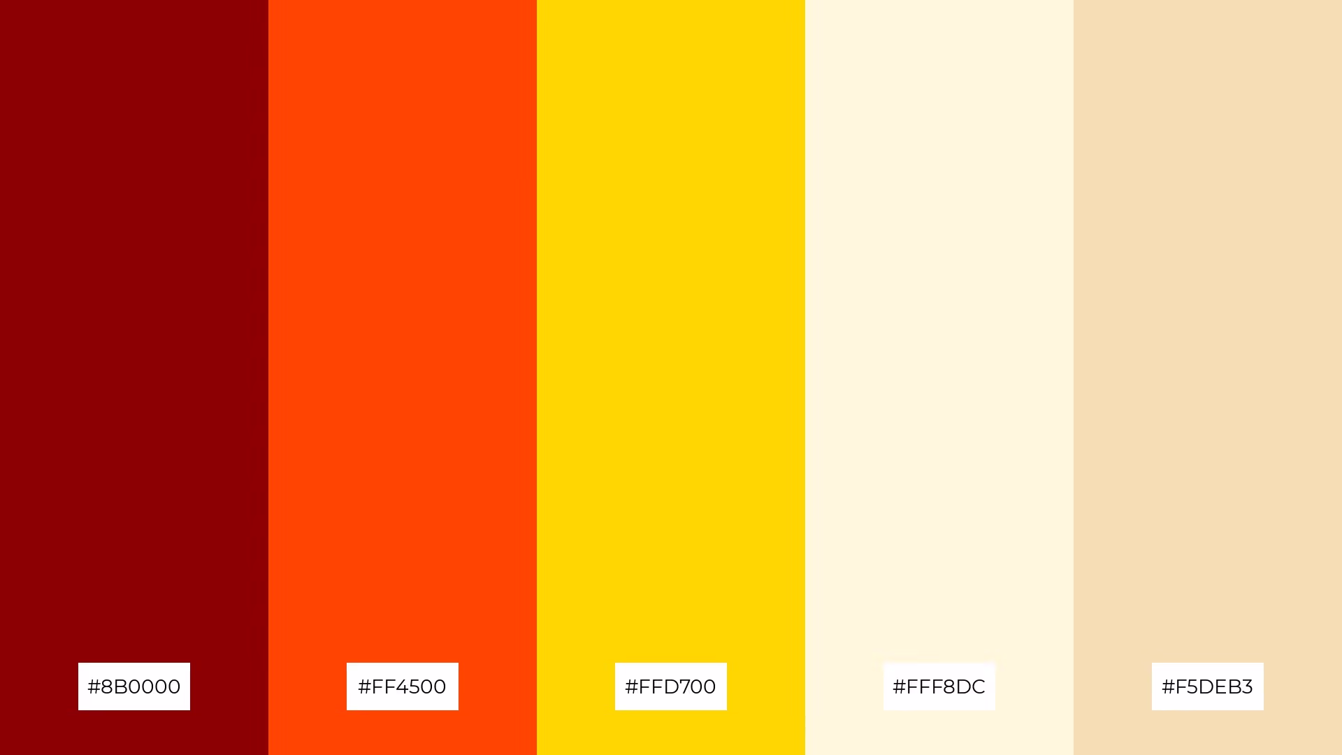
The 'Picnic Basket' palette, with its deep crimson (#8B0000), fiery orange (#FF4500), and golden yellow (#FFD700) hues, creates a dynamic and bold visual interaction that can capture attention and evoke a sense of warmth and excitement.
This vibrant color scheme is perfect for festival marketing, where the energetic and inviting tones can enhance the festive atmosphere and make promotional materials stand out, drawing in crowds and creating a memorable experience.

The 'Whimsical Wonderland' palette, with its blend of hot pink (#FF69B4), medium orchid (#BA55D3), and medium purple (#9370DB), contrasted by the soft lavender (#E6E6FA) and lavender blush (#FFF0F5), creates a harmonious yet dynamic visual experience that can evoke both excitement and tranquility.
This versatile color scheme is ideal for tech startups aiming to create a vibrant and engaging user interface, or for cozy interior makeovers where the playful and soothing tones can transform a space into a whimsical and inviting haven.
Incorporating picnic color palettes into your design projects can add a fresh and vibrant touch. For home decor, consider using the 'Sunny Meadow' palette to create a cheerful and inviting living space. Pairing warm yellows and soft greens with neutral tones can transform any room into a bright and welcoming haven.
When designing marketing materials, the 'Citrus Splash' palette can capture attention and convey a sense of energy and innovation. Use the vibrant oranges and zesty greens to highlight key elements and create a dynamic visual flow that stands out in a competitive market.
For clothing lines, the 'Forest Retreat' palette offers a harmonious blend of earthy and soothing tones. Deep forest green and pale green hues can enhance the brand's connection to nature, promoting a relaxed yet stylish aesthetic. Ready to bring these palettes to life? Try creating your own using Piktochart and elevate your design projects today!
The latest industry news, interviews, technologies, and resources.

Published on
November 25, 2024


