 Piktochart Team
Peacock color palettes are a vibrant and captivating choice for any design project. Inspired by the iridescent feathers of the peacock, these palettes offer a rich blend of blues, greens, and purples.
Using peacock colors can add a touch of elegance and sophistication to your visuals. Whether for infographics, presentations, or social media graphics, these palettes can make your designs stand out.
Designing with peacock color palettes can be both exciting and challenging. Here are some practical tips to help you create stunning visuals:

The 'Tropical Oasis' palette evokes a refreshing and tranquil mood, with its blend of cool blues and greens complemented by warm, sandy tones and a pop of vibrant yellow.
These colors interact harmoniously to create a cohesive look, perfect for a beach-themed interior decor that highlights the serene and invigorating essence of a coastal retreat.

The 'Mystic Feathers' palette, with its blend of soft blues, purples, and neutral tones, evokes a sense of calmness and serenity, making it ideal for designs that aim to soothe and relax the viewer.
This palette would excel in digital branding for wellness apps or product packaging for skincare lines, where a tranquil and inviting aesthetic is essential to attract and retain customers.

The 'Jewel Tones' palette features dominant colors such as deep teal (#1F3A3D), soft blue (#A7C6D9), and vibrant coral (#F9AFAF), which together create a rich and balanced visual experience.
This harmonious blend is perfect for eco-friendly interior spaces, where the deep teal can evoke a sense of nature, the soft blue adds tranquility, and the vibrant coral injects a touch of lively energy.

The 'Enchanted Garden' palette, with its mix of soft greens, blush pinks, and warm neutrals, offers a perfect balance of gentle and bold tones, creating a distinct and inviting mood.
This palette is ideal for designing modern web interfaces or creating inviting retail spaces that aim to evoke a sense of warmth and sophistication.

The 'Oceanic Dream' palette, with its deep teal (#005B5C), vibrant green (#009B77), and soft lime (#A4D65E), combined with the gentle cream (#F6F1D3) and bright yellow (#F9C74F), creates a serene yet invigorating ambiance, reminiscent of a tranquil seaside escape.
This harmonious blend is perfect for luxury fashion campaigns, where the deep teal and vibrant green can evoke a sense of sophistication, while the soft lime and bright yellow add a touch of refreshing energy, making the designs both elegant and lively.

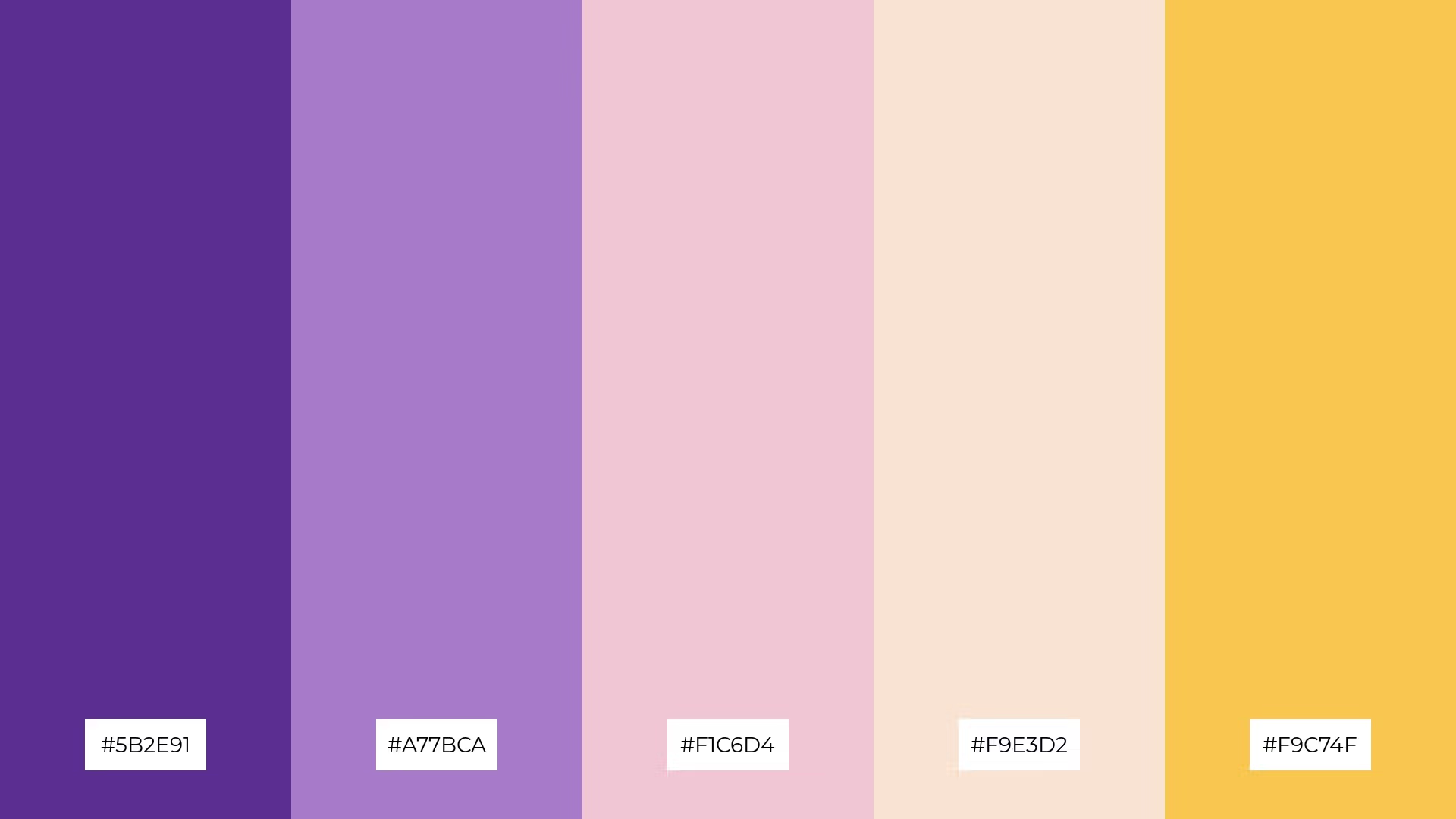
The 'Regal Plumage' palette, with its deep plum (#5B2E91), soft lavender (#A77BCA), and delicate pink (#F1C6D4), creates a sophisticated and elegant mood, perfect for minimalistic branding that aims to convey luxury and refinement.
In contrast, the addition of warm cream (#F9E3D2) and vibrant yellow (#F9C74F) injects a playful energy, making this palette equally suitable for bold event designs that seek to captivate and delight attendees with a lively and inviting atmosphere.

The 'Celestial Glow' palette, with its deep blue (#1D4E89) and soft blue (#A7C6ED) contrasted against warm cream (#F0E1D2), vibrant pink (#F9B5B0), and bright yellow (#F9C74F), creates a dynamic interplay of cool and warm tones that captivates the viewer's attention.
This palette is ideal for creative projects like magazine layouts or artistic websites, where the contrasting elements can be used to highlight key sections, draw the eye to important content, and add a touch of sophistication and vibrancy to the overall design.

The 'Vibrant Tropics' palette, with its energetic coral (#FF6F61) and sunny orange (#FFB74D) paired with the calming aqua (#A7D3D2) and soft beige (#F2E6D5), can evoke either a sense of excitement or tranquility depending on the combination used.
This versatile palette is perfect for spa branding, where the soothing aqua and beige can create a serene atmosphere, or for vibrant marketing campaigns, where the lively coral and orange can capture attention and energize the audience.

The 'Serene Waters' palette, with its soft aqua (#A7D3D2), gentle beige (#F2E6D5), and bright yellow (#F9C74F), creates a calming yet uplifting atmosphere, perfect for evoking a sense of tranquility and warmth.
This blend of tones is ideal for home decor, where the soothing aqua and beige can create a peaceful retreat, while the bright yellow adds a touch of cheerful energy, making it equally suitable for seasonal promotions that aim to capture a refreshing and inviting mood.

The 'Ethereal Hues' palette, with its blend of deep blue (#4B8BBE), soft blue (#A1C6EA), warm cream (#F0E1D2), delicate lavender (#D9B5E0), and rich purple (#6A4C93), creates a visual flow that evokes a sense of tranquility and subtle joy, making it perfect for designs that aim to soothe and uplift the viewer.
This harmonious combination is ideal for lifestyle branding, where the calming blues and warm cream can create a serene and inviting atmosphere, or for tech product packaging, where the delicate lavender and rich purple can add a touch of sophistication and elegance, appealing to a modern and discerning audience.

The 'Sunset Mirage' palette, with its blend of energetic coral (#FF6F61), sunny orange (#FFB74D), bright yellow (#F9C74F), calming aqua (#A7D3D2), and deep blue (#4B8BBE), creates a welcoming yet dramatic effect by combining warm, inviting tones with cool, grounding hues.
This palette shines in boutique interiors, where the vibrant coral and orange can energize the space, while the calming aqua and deep blue add a touch of sophistication, making it perfect for creating a luxurious and inviting shopping experience.

The 'Peacock Paradise' palette, with its deep teal (#007A8E) and vibrant turquoise (#00B2A9) contrasted against the soft aqua (#A7D3D2), warm beige (#F2E6D5), and bright yellow (#F9C74F), creates a dynamic interplay of cool and warm tones that evokes a sense of both balance and lively contrast.
This harmonious blend is perfect for casual apparel lines, where the deep teal and vibrant turquoise can add a touch of sophistication, while the soft aqua and bright yellow inject a playful energy, making the designs both stylish and approachable.

The 'Lush Tropics' palette, with its blend of deep green (#2E8B57), soft mint (#A8D8B9), warm blush (#F4C2C2), gentle peach (#F9D5A0), and rich apricot (#EAB8A1), creates a harmonious interplay of warm and cool tones that evokes a sense of natural elegance and refreshing vitality.
This palette is ideal for artisan product branding, where the deep green and soft mint can convey a sense of organic authenticity, while the warm blush and gentle peach add a touch of handcrafted charm, making the designs both sophisticated and inviting.

The 'Radiant Jewel' palette, with its deep plum (#5B2E91), soft lavender (#A77BCA), delicate pink (#F1C6D4), warm cream (#F9E3D2), and vibrant yellow (#F9C74F), creates a dynamic interplay of bold and subtle tones that can captivate and delight the viewer.
This palette is perfect for festival marketing, where the deep plum and vibrant yellow can draw attention and create excitement, while the soft lavender and warm cream add a touch of elegance and sophistication to the overall design.

The 'Ocean Breeze' palette, with its deep teal (#005B5C), vibrant green (#009B77), soft lime (#A4D65E), gentle cream (#F6F1D3), and bright yellow (#F9C74F), can convey a sense of harmony when the cool tones are balanced with the warm hues, creating a cohesive and tranquil visual experience.
This palette is ideal for tech startups aiming to create a fresh and inviting brand identity, or for cozy interior makeovers where the deep teal and vibrant green can add sophistication, while the soft lime and bright yellow inject a touch of refreshing energy.
Peacock color palettes can transform home decor by adding a touch of elegance and vibrancy. Use deep teals and rich purples for accent walls or statement furniture pieces, while incorporating soft blues and greens in textiles and accessories to create a balanced and inviting space.
For marketing materials, peacock colors can make your designs stand out and capture attention. Pair vibrant turquoise with warm golds for eye-catching flyers, or use a gradient of blues and purples in digital ads to create a sophisticated and modern look.
In clothing design, peacock palettes can add a sense of luxury and playfulness. Combine deep teal with bright yellow for a bold and stylish outfit, or mix soft aqua with warm beige for a more subtle and elegant ensemble.
Ready to bring these stunning peacock color palettes to life? Try creating your own designs using Piktochart's intuitive tools. Get started today and elevate your visuals with the captivating beauty of peacock colors!