Pastel pink color palettes have become a staple in modern design, offering a soft and soothing aesthetic that appeals to a wide range of audiences. This versatile hue can be used to create everything from elegant infographics to eye-catching social media graphics.
Whether you’re designing for a brand or a personal project, incorporating pastel pink can add a touch of sophistication and warmth. Let’s explore how this gentle color can transform your visual content.
Tips For Creating Pastel Pink Color Palettes
Designing with pastel pink can be both exciting and challenging. Here are some practical tips to help you create stunning color palettes:
- Balance with Neutrals: Pair pastel pink with neutral colors like white, beige, or gray to maintain a clean and sophisticated look.
- Complementary Shades: Use complementary colors such as mint green or soft lavender to create a harmonious and visually appealing palette.
- Accent Colors: Introduce bold accent colors like navy blue or deep burgundy to add depth and contrast to your design.
- Gradients and Ombres: Experiment with gradients and ombre effects to add dimension and interest to your visuals.
- Versatility: Ensure your palette is versatile by testing it across different mediums, from digital screens to printed materials.
- Consistency: Maintain consistency in your color usage to create a cohesive and professional look throughout your project.
15 Pastel Pink Color Palettes
1) Blush Garden
The ‘Blush Garden’ palette, with its delicate shades of pink ranging from soft blush to vibrant hot pink, creates a mood of romantic elegance and playful charm.
Perfect for a spring wedding theme, these colors interact seamlessly to produce a cohesive and enchanting atmosphere, making every detail from floral arrangements to bridesmaid dresses feel harmoniously connected.
2) Cotton Candy Sky
The ‘Cotton Candy Sky’ palette, with its soft and warm hues, evokes a sense of calmness and nostalgia, reminiscent of serene sunsets and carefree summer days.
This palette would excel in digital branding for wellness apps or product packaging for artisanal goods, where a soothing and inviting aesthetic is essential to attract and comfort the audience.
3) Rose Petal Dream

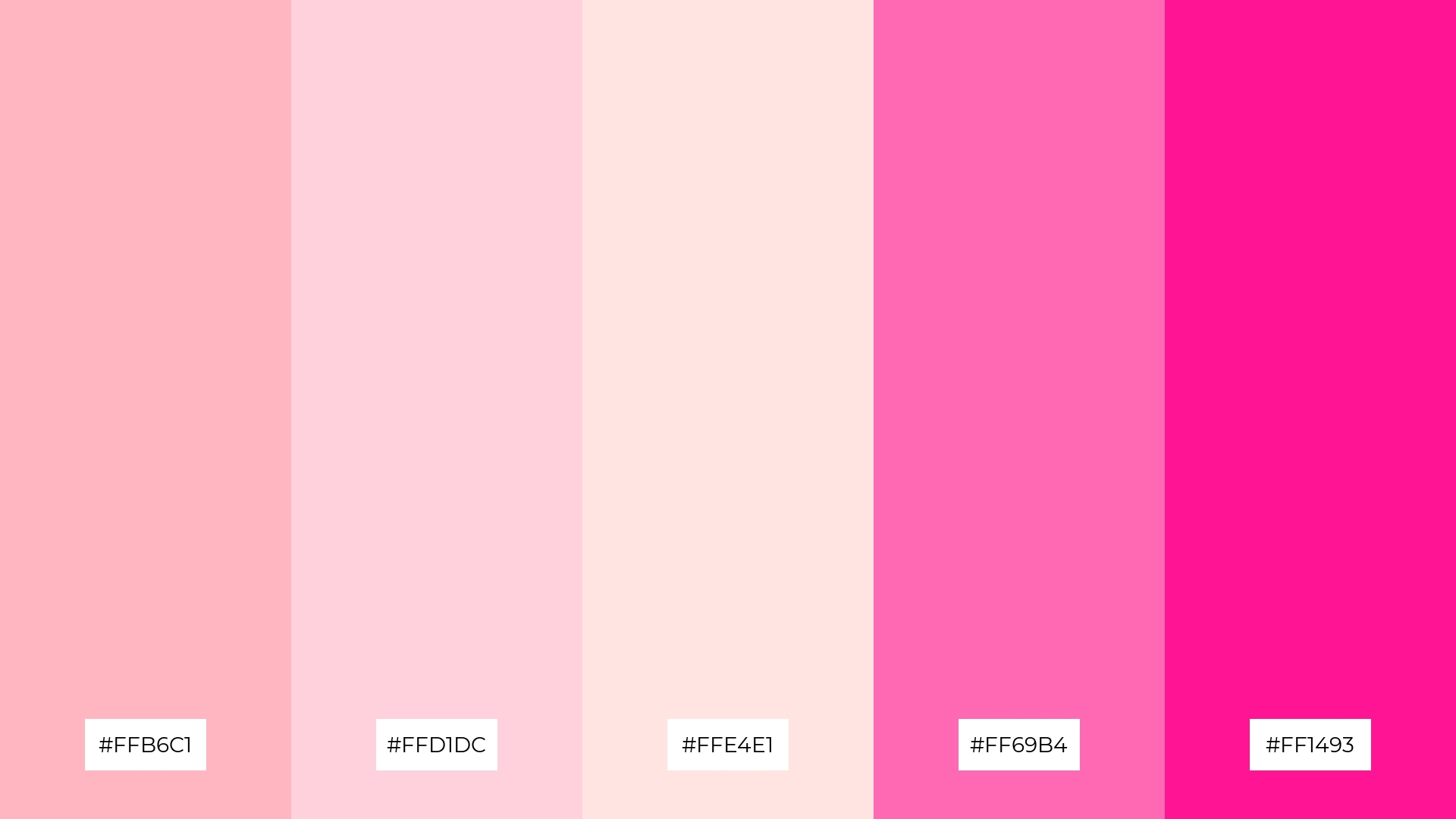
The ‘Rose Petal Dream’ palette features dominant colors such as light pink (#FFB6C1), pink (#FFC0CB), hot pink (#FF69B4), deep pink (#FF1493), and pale violet-red (#DB7093), creating a vibrant yet cohesive visual experience.
These shades work together to evoke feelings of warmth and passion, making this palette ideal for wellness branding, where a nurturing and energetic atmosphere is crucial to engage and comfort the audience.
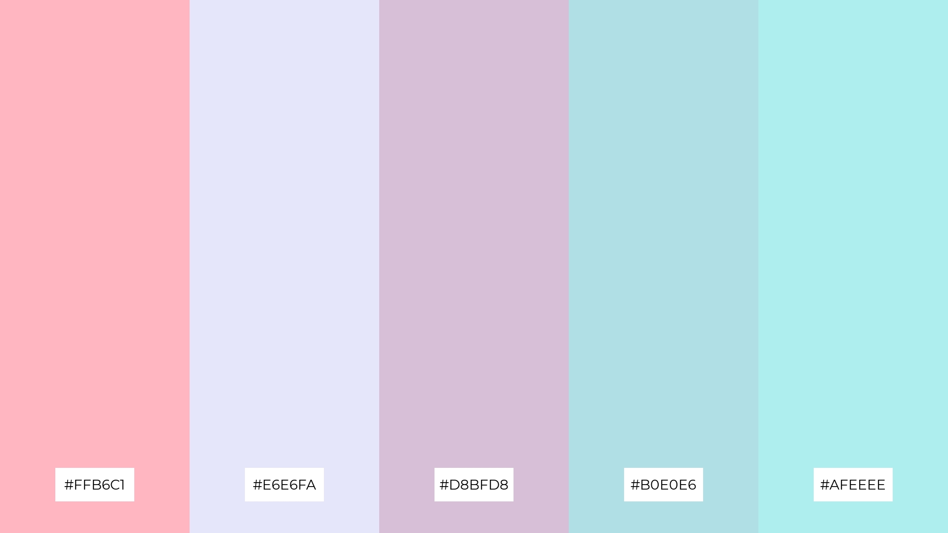
4) Soft Spring
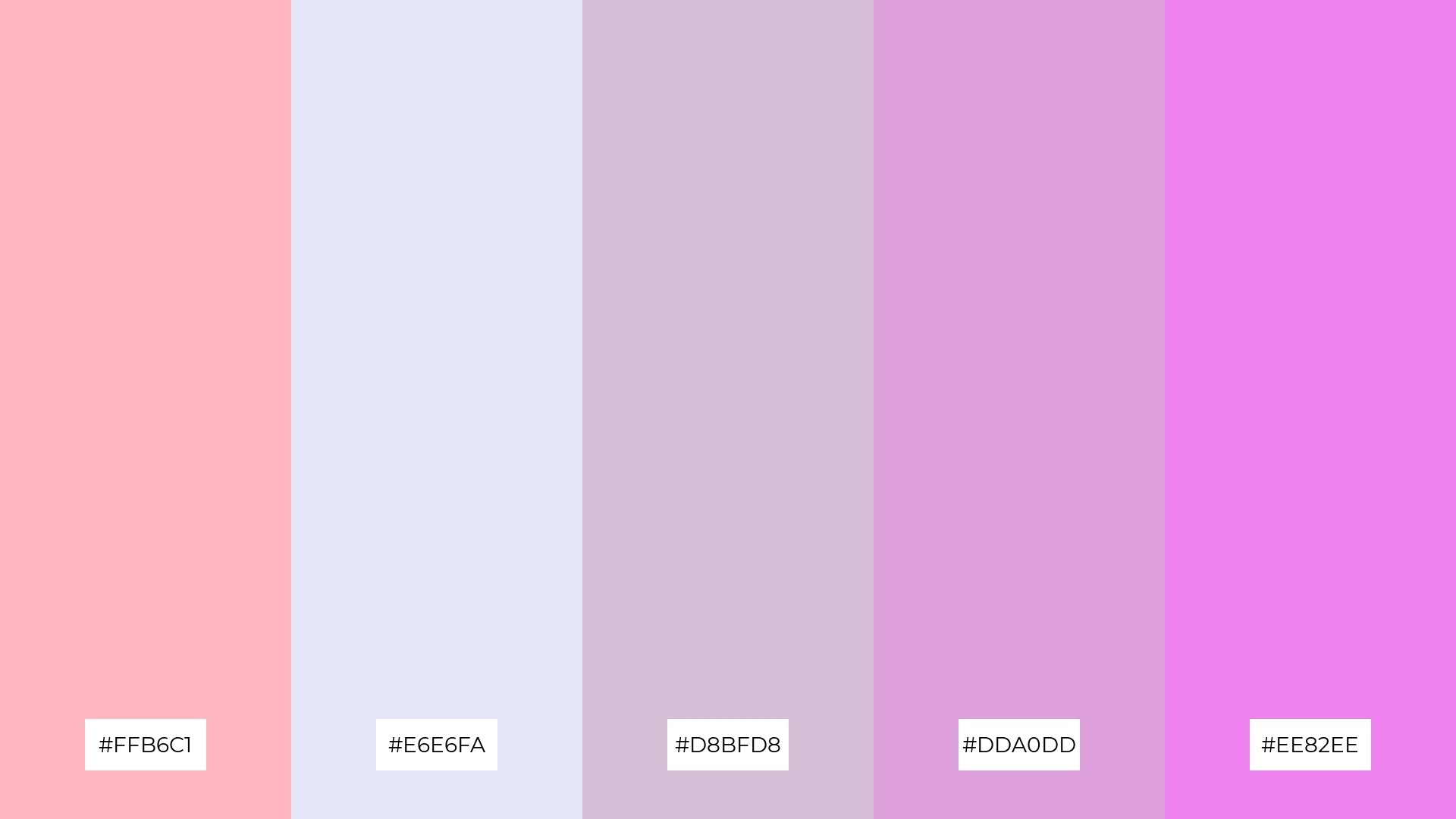
The ‘Soft Spring’ palette, with its blend of light pink (#FFB6C1), lavender (#E6E6FA), thistle (#D8BFD8), plum (#DDA0DD), and violet (#EE82EE), offers a balance of soft and bold tones, creating a distinct mood that is both calming and invigorating.
This palette is ideal for creating inviting retail spaces or modern web designs, where the combination of gentle and vibrant hues can enhance the overall aesthetic and draw in the audience.
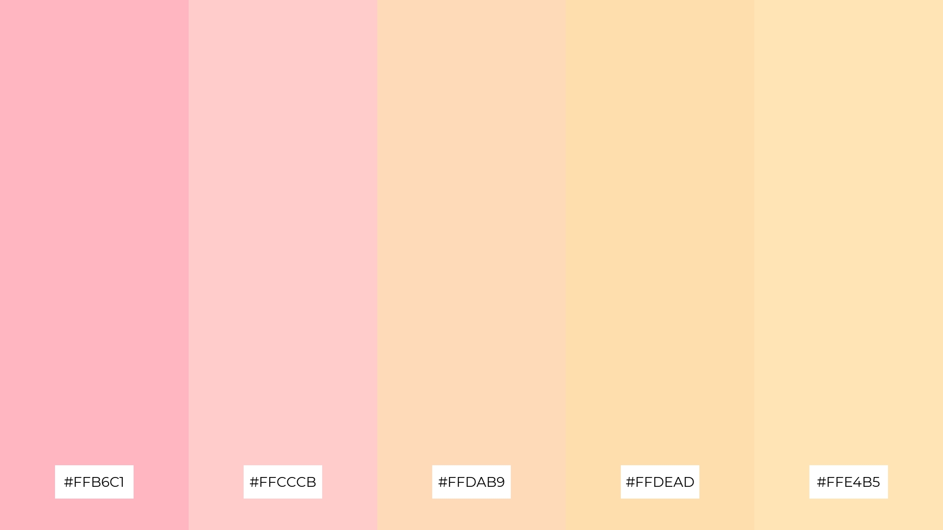
5) Pastel Sunset
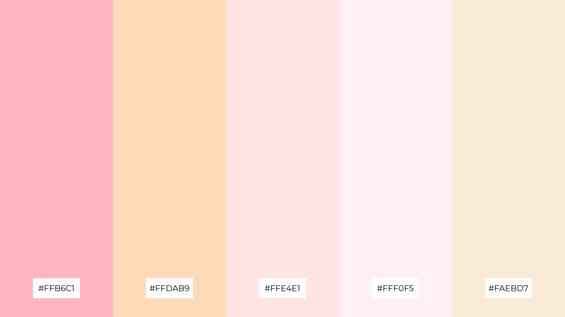
The ‘Pastel Sunset’ palette, with its harmonious blend of light pink (#FFB6C1), peach puff (#FFDAB9), misty rose (#FFE4E1), lavender blush (#FFF0F5), and antique white (#FAEBD7), creates a serene and tranquil ambiance, perfect for evoking a sense of calm and relaxation.
This soothing combination is ideal for luxury fashion campaigns, where the gentle hues can enhance the elegance and sophistication of the designs, making them feel both timeless and inviting.
6) Pink Lemonade
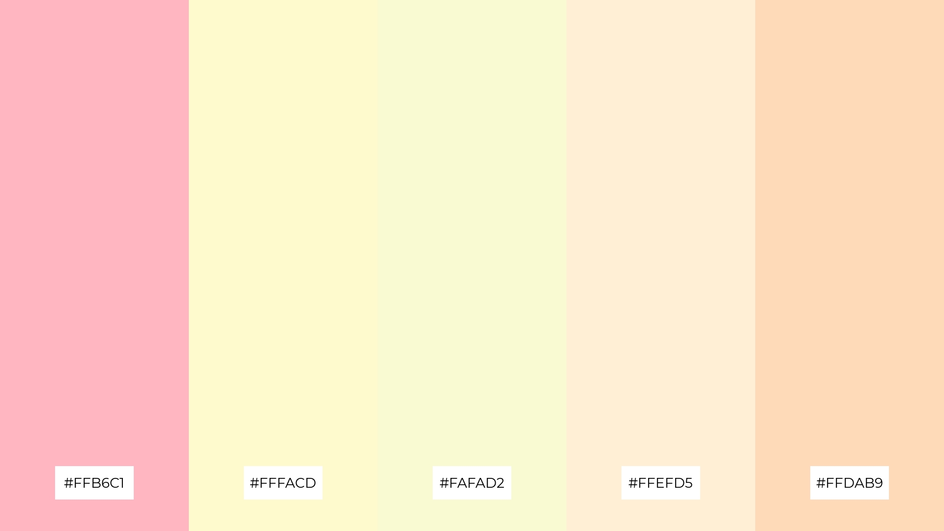
The ‘Pink Lemonade’ palette, with its blend of light pink (#FFB6C1), lemon chiffon (#FFFACD), light goldenrod yellow (#FAFAD2), papaya whip (#FFEFD5), and peach puff (#FFDAB9), creates a harmonious and playful mood that can add a touch of whimsy to any design.
This palette is perfect for minimalistic branding, where the soft and cheerful colors can convey a sense of approachable sophistication, making it ideal for lifestyle blogs or boutique product lines.
7) Cherry Blossom
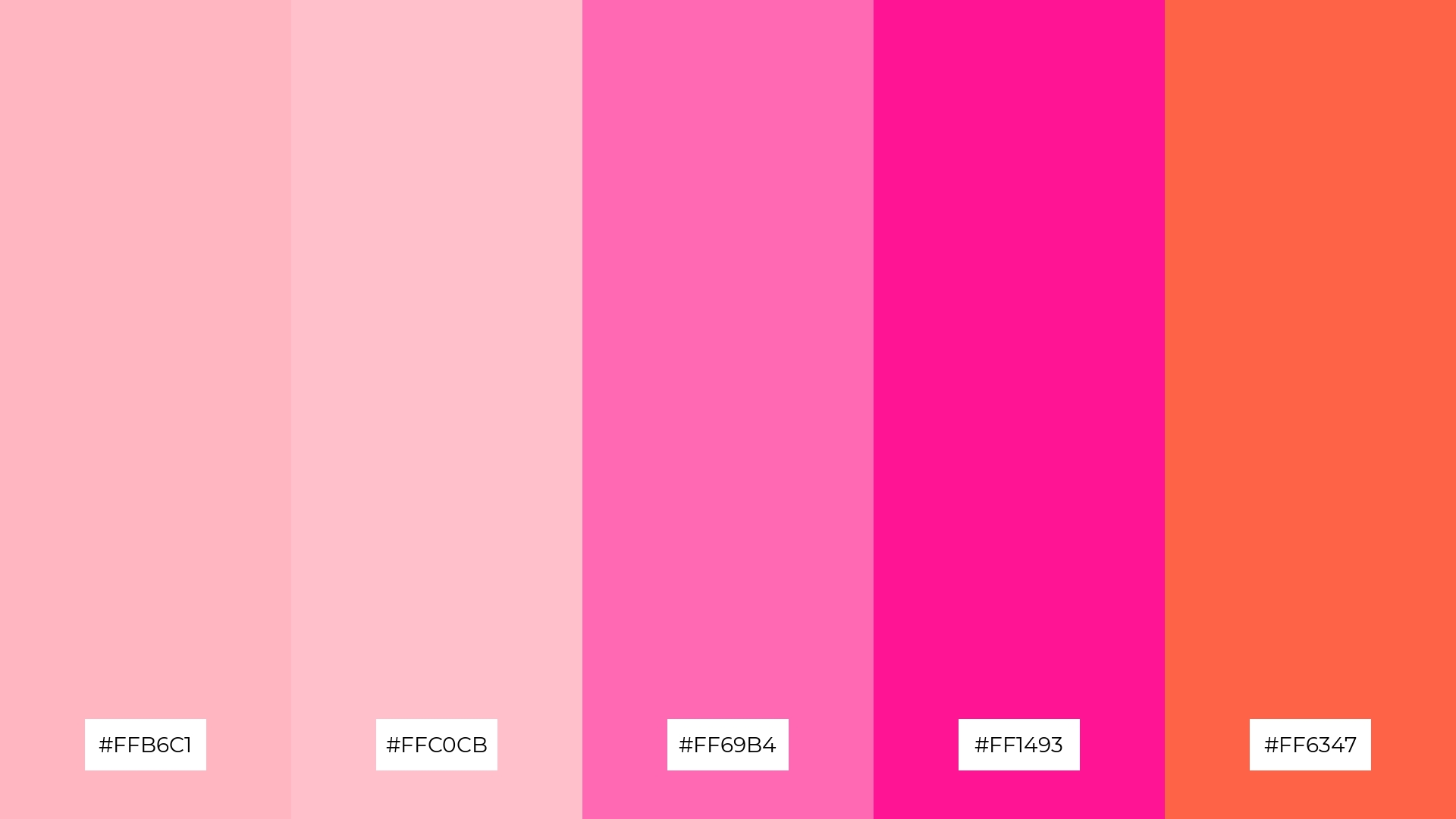
The ‘Cherry Blossom’ palette, with its mix of light pink (#FFB6C1), pink (#FFC0CB), hot pink (#FF69B4), deep pink (#FF1493), and tomato (#FF6347), offers a striking contrast between soft and bold hues, creating a dynamic and visually engaging experience.
This vibrant combination is perfect for creative projects like magazine layouts or artistic websites, where the interplay of gentle and intense colors can captivate the audience and enhance the overall aesthetic appeal.
8) Dreamy Pastels
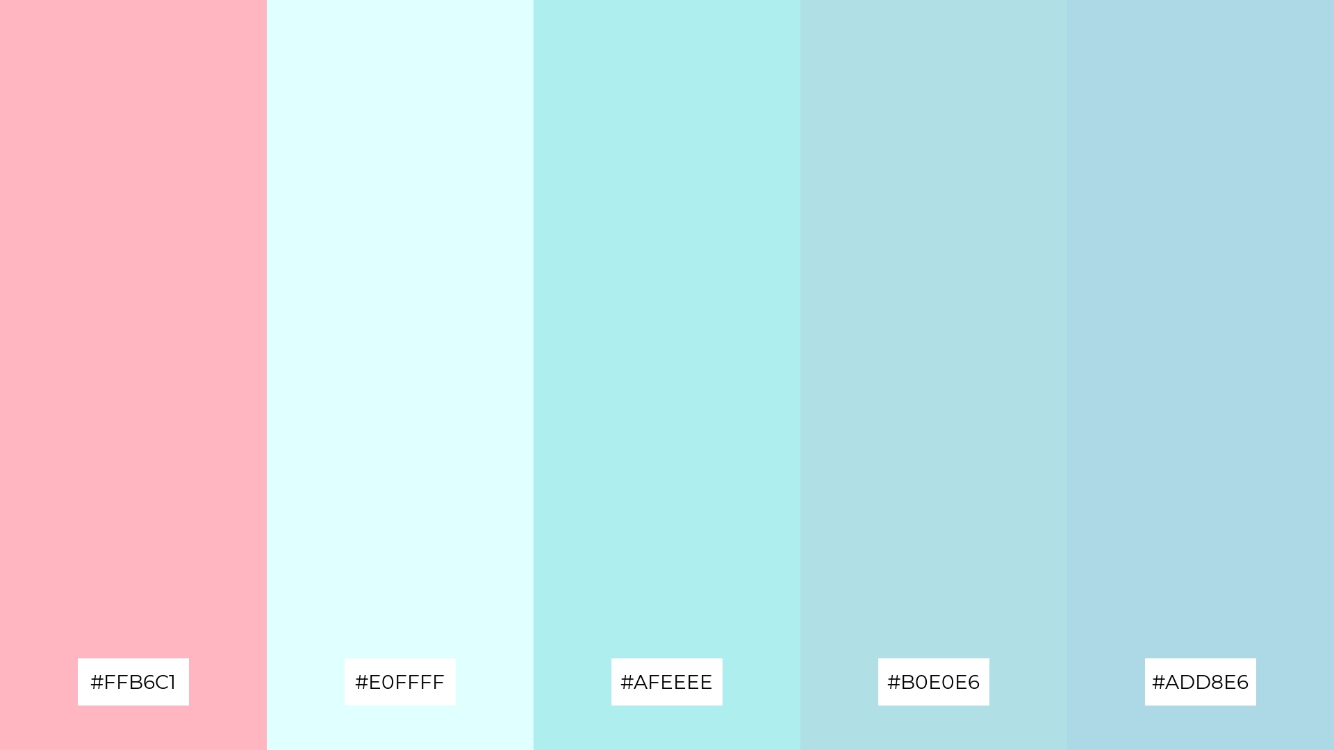
The ‘Dreamy Pastels’ palette, with its blend of light pink (#FFB6C1), light cyan (#E0FFFF), pale turquoise (#AFEEEE), powder blue (#B0E0E6), and light blue (#ADD8E6), can evoke a sense of calm when used together, making it perfect for spa branding where a serene and relaxing atmosphere is essential.
Alternatively, combining these colors in a more dynamic way can create an exciting and fresh look, ideal for vibrant marketing campaigns that aim to capture attention and convey a sense of youthful energy.
9) Sweet Sorbet

The ‘Sweet Sorbet’ palette, with its softer tones like light pink (#FFB6C1) and lavender blush (#FFF0F5), creates a gentle and inviting atmosphere that exudes warmth and comfort.
This blend of hues is perfect for home decor or seasonal promotions, where the bright and soothing colors can enhance the overall mood, making spaces feel cozy and welcoming.
10) Ballet Slippers
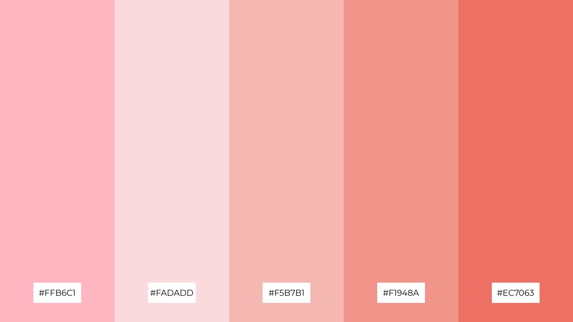
The ‘Ballet Slippers’ palette, with its gentle progression from light pink (#FFB6C1) to the deeper hues of #EC7063, creates a visual flow that evokes feelings of joy and tranquility, making it perfect for designs that aim to soothe and uplift the audience.
This harmonious blend of colors is ideal for lifestyle branding or tech product packaging, where the soft and inviting tones can enhance the user experience by conveying a sense of calm and approachable sophistication.
11) Pink Sands
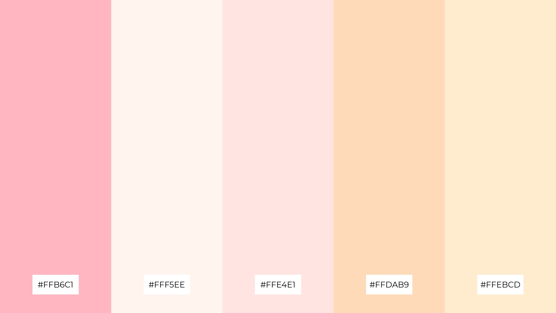
The ‘Pink Sands’ palette, with its blend of light pink (#FFB6C1), seashell (#FFF5EE), misty rose (#FFE4E1), peach puff (#FFDAB9), and blanched almond (#FFEBCD), creates a welcoming effect by combining soft and warm tones that evoke a sense of comfort and elegance.
This palette shines in boutique interiors, where the gentle hues can enhance the overall ambiance, making the space feel inviting and luxurious, perfect for attracting discerning customers.
12) Petal Parade
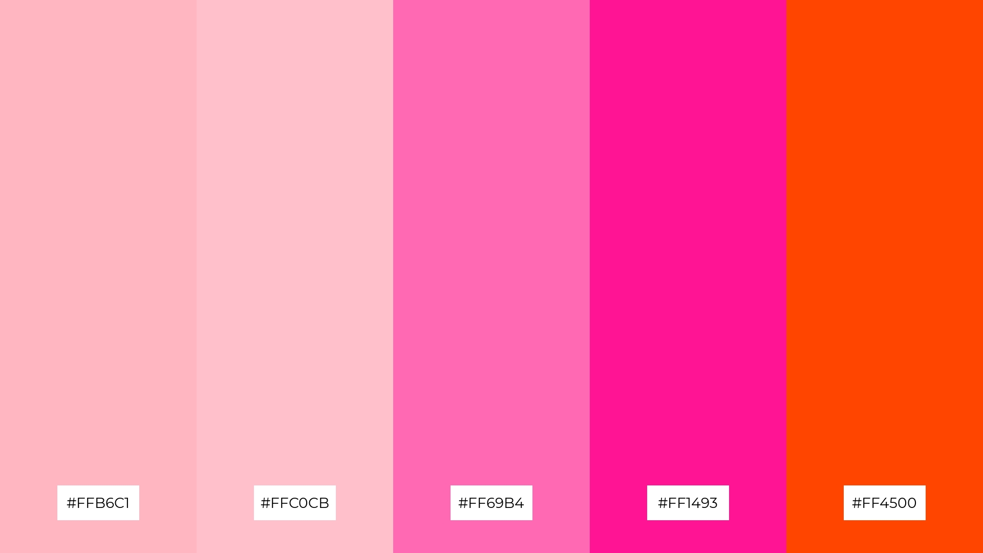
The ‘Petal Parade’ palette, with its blend of light pink (#FFB6C1), pink (#FFC0CB), hot pink (#FF69B4), deep pink (#FF1493), and orange-red (#FF4500), creates a dynamic interplay of soft and bold hues that balance each other beautifully.
This vibrant combination is perfect for casual apparel lines, where the mix of gentle and intense colors can add a playful yet stylish touch to the designs, making them stand out in a crowded market.
13) Pastel Rainbow
The ‘Pastel Rainbow’ palette, with its blend of light pink (#FFB6C1), lavender (#E6E6FA), thistle (#D8BFD8), powder blue (#B0E0E6), and pale turquoise (#AFEEEE), masterfully combines warm and cool tones to evoke a mood of serene elegance and playful sophistication.
This versatile palette is perfect for artisan product branding, where the harmonious mix of gentle hues can enhance the handcrafted quality and unique charm of the products, making them feel both timeless and inviting.
14) Pink Frosting

The ‘Pink Frosting’ palette, with its blend of light pink (#FFB6C1), very pale pink (#FFD1DC), misty rose (#FFE4E1), lavender blush (#FFF0F5), and antique white (#FAEBD7), creates a dynamic interplay of soft and subtle hues that evoke a sense of delicate elegance and warmth.
This harmonious combination is perfect for restaurant menus, where the gentle colors can enhance the dining experience by creating an inviting and sophisticated atmosphere, making every meal feel like a special occasion.
15) Soft Blush
The ‘Soft Blush’ palette, with its blend of light pink (#FFB6C1), pale pink (#FADADD), and deeper hues like #EC7063, can convey a sense of harmony when used in tech startups, creating a welcoming and innovative atmosphere that fosters creativity and collaboration.
Alternatively, this palette can create a striking contrast in cozy interior makeovers, where the mix of soft and bold pinks adds depth and warmth, making spaces feel both inviting and dynamic.
How to Use Pastel Pink Patterns in Design
Pastel pink color palettes can transform home decor by adding a touch of elegance and warmth. Use light pinks for walls and furniture to create a serene and inviting atmosphere, while incorporating deeper pink accents in cushions or artwork to add depth and interest.
In marketing materials, pastel pink can evoke a sense of calm and approachability. Pair it with neutral backgrounds and bold typography to create eye-catching flyers or social media posts that stand out without overwhelming the viewer.
For clothing design, pastel pinks can add a playful yet sophisticated touch. Combine soft pink fabrics with complementary colors like mint green or lavender to create stylish and harmonious outfits that appeal to a wide audience.
Ready to bring your pastel pink visions to life? Try creating these stunning palettes using Piktochart and elevate your design projects today!


